
By Adam Henson
In the rapidly evolving landscape of connected devices, responsive web design continues to be crucial in web development.
Not long ago the term "responsive web design" was non-existent. But today, most of us have had to adopt it to some extent.
According to Statistica, as of 2019, 61% of all Google search visits take place on a mobile device. In September of 2020 Google will change its search algorithm to prioritize mobile friendly websites.
In this post I'll cover the following:
- What is responsive web design?
- The viewport meta tag and what it does
- Effective techniques used in responsive web design to accommodate mobile and tablet devices
- Tools to help simulate and monitor mobile and tablet user experience
What is Responsive Web Design? (RWD)
Responsive web design is an approach that focuses on a website user’s environment. The user's environment will depend on which device they have connected to the internet.
There are many device characteristics that provide opportunities for user-centric focus. Some of these include:
- network connection
- screen size
- type of interaction (touch screens, track pads)
- graphic resolution.
Before responsive web design was popular, many companies managed an entirely separate website that received traffic forwarded based on the user-agent.
But in responsive web design the server always sends the same HTML code to all devices, and CSS is used to alter the rendering of the page on the device.
Regardless of the two strategies above, the first step in creating a website for phone or tablet is to ensure the browser knows the intention. This is where the viewport meta tag comes into play.
The Viewport Meta Tag to Identify a Mobile Website
The meta viewport tag instructs the browser how to adjust the page to the width of each device.
When the meta viewport element is absent, mobile browsers will display web pages with default desktop settings. This results in a seemingly zoomed out, unresponsive experience.
Below is a standard implementation:
<meta name="viewport" content="width=device-width,initial-scale=1"/>
Now that the browser knows what's going, we can utilize popular techniques to make our website responsive. ?
CSS Media Queries for Different Screen Sizes and Orientations
If you're new to responsive web design, media queries are the first, most important CSS feature to learn. Media queries allow you to style elements based on viewport width. One popular CSS strategy is to write mobile styles first and build on top of them with more complex, desktop specific styles.
Media queries are an important part of responsive web design commonly used for grid layouts, font sizes, margins, and padding that differ between screen size and orientation.
Below is an example of a common use case of mobile first styling in which a column is 100% width for smaller devices, but in larger viewports is 50%.
.column {
  width: 100%;
}

@media (min-width: 600px) {
  .column {
    width: 50%;
  }
}
The code above is a simple example, but what it's actually doing is pretty interesting.
- In considering mobile first, the "column" element is set to have a width of 100%;
- By using a
min-widthmedia query, we define rules specifically for viewports with a minimum width of600px(viewports wider than600px). So, for viewports wider than600px, our column element will have a width that is 50% of its parent.
Although media queries are essential for responsive web design, many other new CSS features are also becoming widely adopted and supported in browsers. Flexbox is one of these new, important CSS feature in terms of responsive web design.
What is Flexbox?
You might be wondering - "what does Flexbox do"? The better question is - "what can't Flexbox do"? What's the easiest way to vertically center with CSS? Flexbox. How do you create a responsive grid layout? Flexbox. How can we achieve global peace? Flexbox.
The Flexbox Layout (Flexible Box) module provides a more efficient way to lay out, align and distribute space among items in a container, even when their size is dynamic (hence the word “flex”).
In the below example we combine media queries as explained above to create a responsive grid.
<style>
  main {
    background: #d9d7d5;
    display: flex;
    flex-wrap: wrap;
    justify-content: space-between;
  }

  div {
    background: #767775;
    flex-basis: 100%;
    height: 100px;
    margin-bottom: 0.5rem;
  }

  @media (min-width: 600px) {
    main {
      flex-wrap: nowrap;
    }

    div {
      flex-basis: 33%;
    }
  }
</style>
<main>
  <div></div>
  <div></div>
  <div></div>
</main>
We accomplish the following with this code:
- Establish a flexbox layout with
display: flexin ourmaincontainer element. - Style for mobile first. We set the
mainelement toflex-wrap: wrapwhich allows child elements to wrap within our flexbox layout as illustrated below in figure 1. We setflex-basis: 100%on ourdivelements to ensure they encompass 100% of the parent width in the flexbox layout (figure 1). - Style for larger devices like tablets and desktop. We utilize a media query similar to our example in the previous section to set our container
mainelement toflex-wrap: nowrap. This makes sure that child elements do not wrap and that they maintain a column within a row type of layout. By settingdivtoflex-basis: 33%within the media query - we establish columns that are 33% the width of the parent. - In this example the magic would appear in larger devices with our combined media query and flexbox rules. Because we defined
display: flex, and because we didn't override the rule within the media query, we have a flexbox layout for mobile, tablet, and desktop. The media queryflex-basis: 33%and inheriteddisplay: flexrules will give us a recognizable flexbox layout as seen in figure 2. In the past, to achieve this column type of layout, we would need to do some serious heavy lifting and write tangles of CSS.
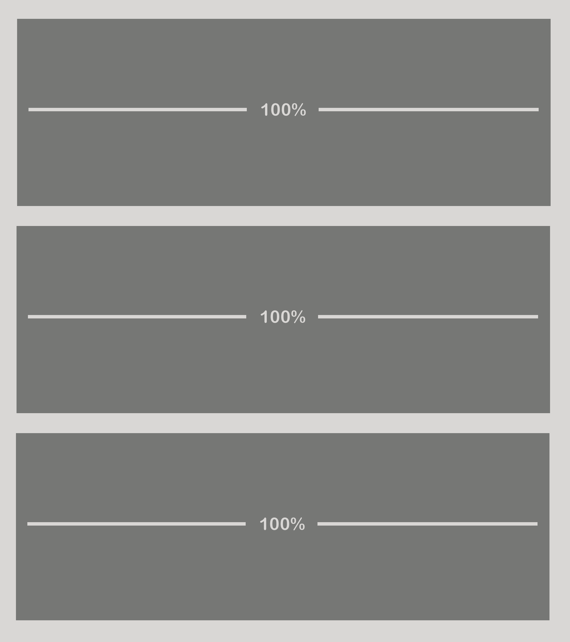 Figure 1: Mobile flexbox grid example
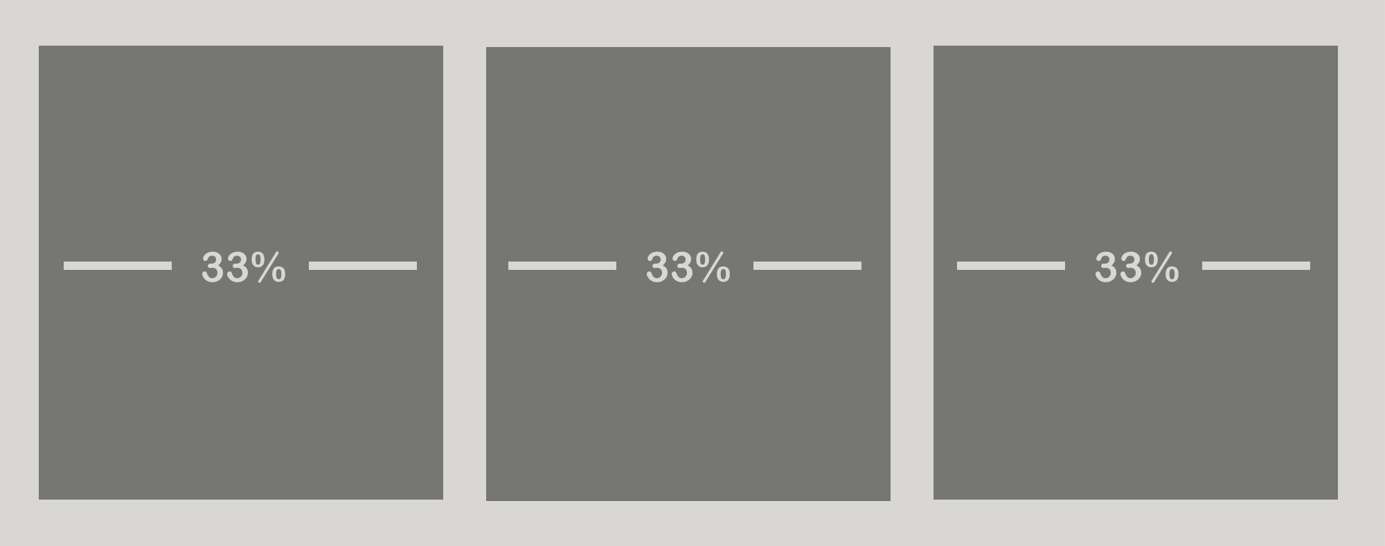 Figure 2: Desktop flexbox grid example
Flexbox provides a great way of achieving varying, fluid layouts. In some cases we might not have such freedom in vertical space. We may need to fit an element within a fixed height. In this situation, we have another technique at our disposal - horizontal scroll.
Horizontal Scrolling with Overflow Scroll
There may come a time that you have content overflowing the viewport without a graceful way of handling it. Behold... overflow scroll to the rescue. ?
Common uses for this technique include scrollable menus and tables. Below is an example of a scrollable menu.
Responsive Web Design RWD Responsive menu Overflow scroll example This is a lot of content! Yes we have another item<style>
menu {
background: #d9d7d5;
padding: 0.25rem;
overflow-y: scroll;
white-space: nowrap;
}
span {
background: #767775;
color: #ffffff;
display: inline-block;
margin: 0.25rem;
padding: 0.5rem;
}
</style>
<menu>
<span>Responsive Web Design</span>
<span>RWD</span>
<span>Responsive menu</span>
<span>Overflow scroll example</span>
<span>This is a lot of content!</span>
<span>Yes</span>
<span>we</span>
<span>have</span>
<span>another</span>
<span>item</span>
</menu>
How'd you do that!? Let's take a deeper dive.
overflow-y: scrollis the key ingredient of this recipe. By specifying it child elements will overflow the horizontal axis with scrolling behavior.- Not so fast! Although you may think
overflow-ywould be enough, we have to also tell the browser not to wrap the child elements withwhite-space: nowrap?
Now that we have a few RWD layout techniques up our sleeve, let's take a look at elements that pose challenges specific to their visual nature - images and video.
Responsive Images
By using modern image tag attributes we can accommodate a range of devices and resolutions. Below is an example of a responsive image.
<style>
  img {
    max-width: 100%;
  }
</style>

<picture>
  <source type="image/webp" srcset="https://my-image.com/my-image-100.webp 1x, https://my-image.com/my-image-200.webp 2x">
  <source type="image/png" srcset="https://my-image.com/my-image-100.png 1x, https://my-image.com/my-image-200.png 2x">
  <img alt="my image" src="https://my-image.com/my-image-200.png" loading="lazy" width="100" height="100">
</picture>
This is doing a lot of things. Let's break it down:
- By setting
max-width: 100%the image will scale up or down based on its container width. - By using a combination of
picture,source, andimgtags we are actually only rendering one image and are only loading the best fitting image based on the user's device. - WebP is a modern image format that provides superior compression for images on the web. By utilizing
sourcewe can reference a WebP image to use for browsers that support it, and anothersourcetag to reference a PNG version of the images that don't support WebP. srcsetis used to tell the browser which image to use based on the device's resolution.- We establish native lazy loading by utilizing the
loading="lazy"attribute / value pair.
Responsive Video
Responsive video is another subject that has inspired a large number of articles and documentation.
One key strategy to establish responsive images, video, iframes and other elements involves the use of aspect-ratio. The aspect ratio box is not a new technique and quite a useful tool to have up your sleeve as a web developer.
This article provides a solid demonstration about how to achieve "fluid" width videos. Let's take a look at the code and break it down.
<style>
  .videoWrapper {
    position: relative;
    padding-bottom: 56.25%; /* 16:9 */
    height: 0;
  }

  .videoWrapper iframe {
    position: absolute;
    top: 0;
    left: 0;
    width: 100%;
    height: 100%;
  }
</style>

<div class="videoWrapper">
  <!-- Copy & Pasted from YouTube -->
  <iframe width="560" height="349" src="http://www.youtube.com/embed/n_dZNLr2cME?rel=0&hd=1" frameborder="0" allowfullscreen></iframe>
</div>
In this example we have a YouTube video embed as an iframe and a div container with videoWrapper class. This code is doing a lot... let's dig in.
position: relativeon the container element allows child elements to utilize absolution positioning relative to it.height: 0combined withpadding-bottom: 56.25%is the key ingredient here which establishes a dynamic behavior, enforcing a16:9aspect ratio.position: absolute,top: 0andleft: 0set on the iframe creates a behavior in which the element positions itself absolutely relative to its parent... sticking it to the top left.- And finally width and height of 100% makes the child, iframe element 100% of its parent. The parent,
.videoWrappertakes full control of establishing this aspect ratio layout.
I know... it's a lot. There's more we can do to make video and images look the best on phones and tablets. I'd encourage research on those topics independently in addition to this.
Okay, now that we're masters of responsive web design, how can we test what we've done? Fortunately, we have a number of tools to simulate and monitor user experience on a variety of devices.
Tools to Simulate and Monitor Responsive Websites
There are a variety of useful tools to help us create websites with responsive web design. Below are a couple that I find especially useful.
Chrome DevTools Mobile Emulation
Chrome's DevTools provides mobile emulation of a range of tablet and mobile devices. It also provides a "responsive" option which allows you to define a custom viewport size.
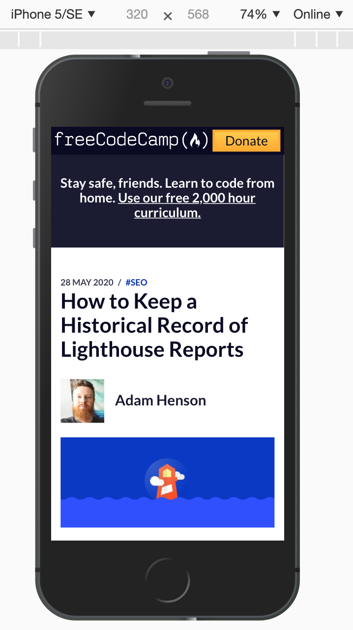 Figure 3: Chrome DevTools mobile and tablet device emulation
Monitoring Mobile Website Performance with Foo
Lighthouse is an open-source tool that provides a way of analyzing website performance specific to a device.
Foo uses Lighthouse behind the scenes to monitor website performance and provides feedback for analysis. You can setup monitoring for both desktop and mobile devices to get continuous feedback about how responsive your website is.
For example, a Lighthouse report will callout images that are improperly loaded based on device.
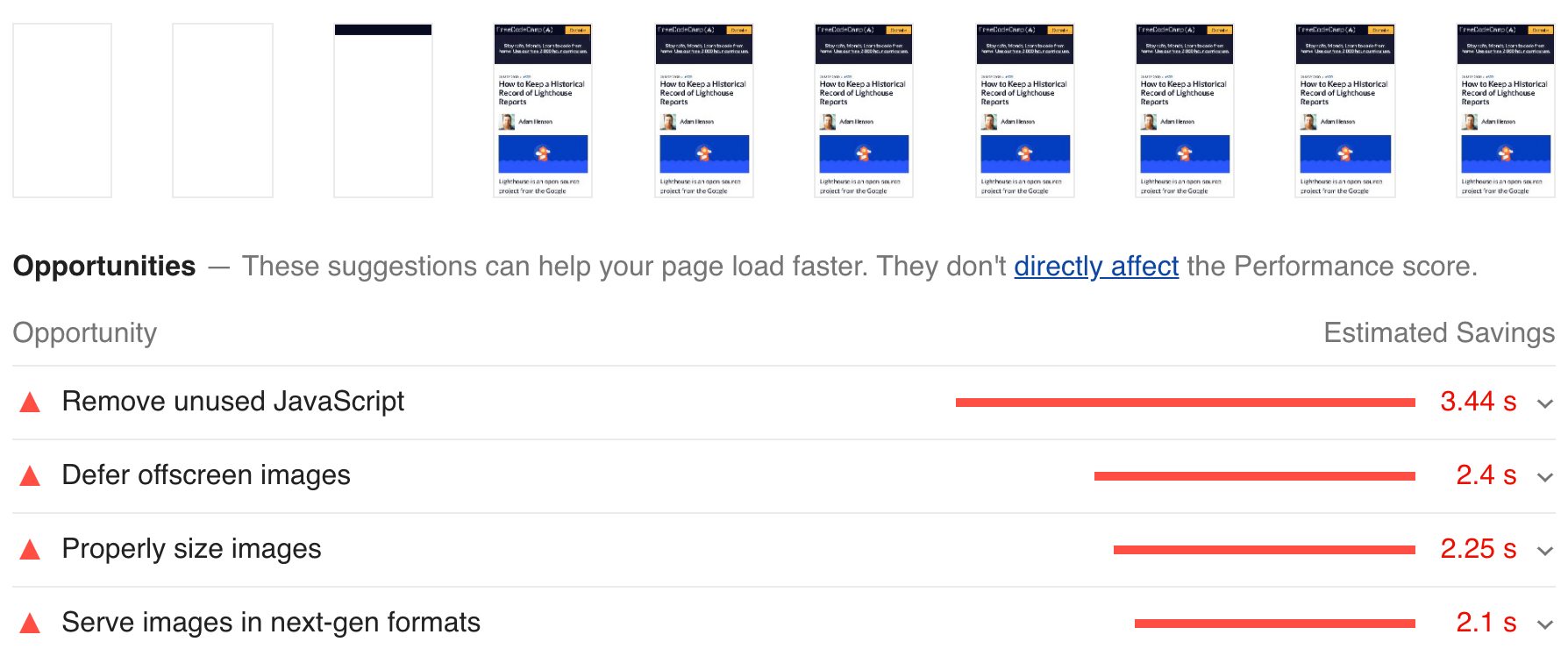 Figure 4: Lighthouse report with mobile device emulation
Conclusion
Responsive web design will continue to rapidly evolve, but if we stay on top of current trends we can provide the best experience for our users. I hope these tools and techniques are helpful!
Not only will our website users benefit from a versatile design but also search engines will rank our web pages higher.