
When the internet was still young, website visitors used desktop and then laptop computers with wide screens to access websites.
Then when smart phones were developed, mobile phone users had to endlessly zoom and scroll to access and view different parts of those same websites.
Thankfully, this is no longer the case these days due to the revolutionary introduction of Responsive Web Design.
In this article, I will take you through the evolution of Responsive Web Design, the various integrations that have made it possible, and how you can start to use it in your coding projects for a better user experience.
What is Responsive Web Design?
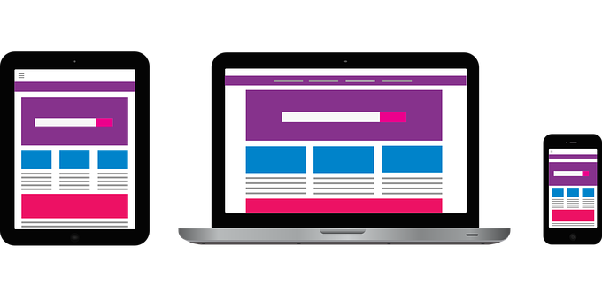
Responsive web design makes web pages render properly on a wide variety of device screen sizes without cutting short or distorting the content.
This doesn't mean a website will appear exactly the same way on a phone as on a laptop, for example. Rather, it means that the content of the web page adapts to different screen sizes – from large screens (desktops and laptops) to medium screens (tablets) to mobile screens (phones of various screen sizes).
And it does this all while retaining the same content (just perhaps arranged differently to fit each screen).
The Evolution of Responsive Web Design
In the past, people mostly used desktops and laptops to view content online, because websites were optimized for those screens only.
But as more and more people started using mobile phones to surf the web, people started grumbling about the poor display and layouts they were seeing.
This meant one thing for web designers and developers: websites needed to be optimized for mobile, too!
In the last decade, the number of website users on mobile began to surpass that of desktops and laptops for the first time. So everyone from tech giants to small businesses started embracing a responsive web design approach.
Developers and designers also created the shiny new mobile-first design as well. This meant that the developers made the websites for mobile devices first, and desktop later.
This often meant a separate website for mobile devices and larger screens, with the same server system but different domains.
The original website, for example, could be examplewebsite.com, and the mobile version would be examplewebsite.mobi, or m.examplewebsite.com.
The user's device would be detected by ready-made scripts and then the appropriate domain would be rendered. This practice still exists today.
Apart from the two-domain method, web designers and developers can create a website for a particular screen size first (it could be desktop, tablet, or mobile), and then add what are called media queries to make the website adapt to different screen sizes. This is the mobile-first approach.
How to Make Your Site Responsive
Integrating responsive web design approaches into a project includes every part of the code – within the HTML <head> element, the HTML structure, the CSS, and even the JavaScript.
I will describe these processes as clearly and in as much detail as possible.
Set the Viewport in the Head
<meta name="viewport" content="width=device-width, initial-scale=1.0">
Since HTML plays a huge role in defining the structure of a web page, then it definitely has something to do with making websites respond (adapt) to different screen sizes.
You'll need to include the meta viewport empty element in the head section of any web page that you want to optimize for different screen sizes.
This tells the browser to render the width of the web page to the exact width of the device. So, if the device has a width of 1200px, the web page width will be 1200px. If the device has a width of 720px, the web page width will be 720px, and so on.
This prevents annoying zooming in and zooming out that mobile phone users experienced in the past, which wasn't good for user experience.
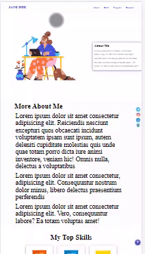
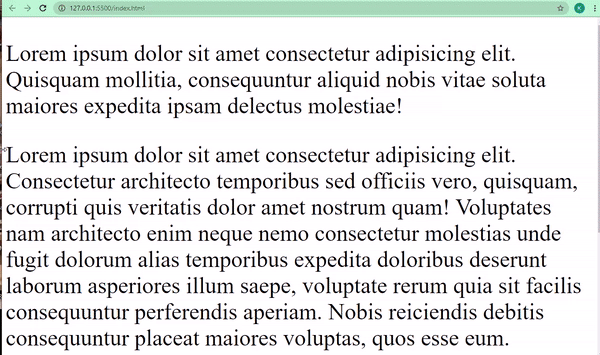
Below is how a website looks on small phones without the <meta> viewport element:
And here's how the same website with the <meta> viewport element looks on small phones:
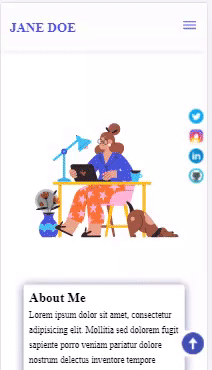
If you are wondering which website this is, it’s a free portfolio website template I made for beginners. I will make it available to all freeCodeCamp readers very soon – so, stay tuned. :)
But the <meta> viewport element is not all you need to make a website adapt to different screen sizes. There's more.
CSS Media Queries
The most crucial tool you'll use to make your sites responsive is CSS3 Media Queries. Media queries let you write the same CSS code in different ways for multiple screens.
With media queries, you tell the browser to display the content in a particular way on a particular screen.
The basic syntax of a media query looks like this:
@media screen and (max-width: 720px) {
  /*CSS codes go here*/
}
This tells the browser to execute the CSS code written within the media query when the screen width is below a 720 pixel breakpoint. The breakpoint can usually be any value between 1200 pixels and 320 pixels.
In the code snippets below, I’m instructing the browser to change the background-color to dark-grey, and the color to blue when the screen width is below 768 pixels.
<body>
    <p>
      Lorem ipsum dolor sit amet consectetur adipisicing elit. Quisquam
      mollitia, consequuntur aliquid nobis vitae soluta maiores expedita ipsam
      delectus molestiae!
    </p>

    <p>
      Lorem ipsum dolor sit amet consectetur adipisicing elit. Consectetur
      architecto temporibus sed officiis vero, quisquam, corrupti quis veritatis
      dolor amet nostrum quam! Voluptates nam architecto enim neque nemo
      consectetur molestias unde fugit dolorum alias temporibus expedita
      doloribus deserunt laborum asperiores illum saepe, voluptate rerum quia
      sit facilis consequuntur perferendis aperiam. Nobis reiciendis debitis
      consequuntur placeat maiores voluptas, quos esse eum.
    </p>

    <p>
      Lorem ipsum dolor sit amet consectetur, adipisicing elit. Minus fugiat,
      nemo rem facere cumque error. Aliquam consequatur nobis cupiditate atque!
      Fugiat amet facere magni, nulla pariatur ut ullam, vel est eum voluptatum
      dicta quis dignissimos labore repellendus. Maiores deserunt quas tempore
      impedit, corporis quae amet blanditiis voluptatum laudantium magni ipsa!
    </p>
</body>
 @media screen and (max-width: 768px) {
        body {
          background-color: #333;
          color: #3498db;
        }
     }
Several other breakpoints exist for different devices.
320 - 480px for small phones such as iPhone 6, 7, and 5
478 - 768px for Tablets and iPads
1025 - 1200px for desktops and large screens
Some extra-large screens and TVs can take more than 1200px.
Responsive Text
Since text size won't be the same on a mobile phone as it is on a desktop, text must be made to scale down as the device screen width reduces.
You can do this within the media query for each screen. And one of the ways to make it easier is to use relative units (%, rem, and em) instead of an absolute unit such as px.
In the HTML and CSS code snippets below, I instruct the browser to make the font size of the text 3rem on big screens, and 1.5rem on screens below a width of 768pixels:
<p>
   Lorem ipsum dolor sit amet consectetur adipisicing elit. Quisquam
   mollitia, consequuntur aliquid nobis vitae soluta maiores expedita ipsam
   delectus molestiae!
</p>

<p>
   Lorem ipsum dolor sit amet consectetur adipisicing elit. Consectetur
   architecto temporibus sed officiis vero, quisquam, corrupti quis veritatis
   dolor amet nostrum quam! Voluptates nam architecto enim neque nemo
   consectetur molestias unde fugit dolorum alias temporibus expedita
   doloribus deserunt laborum asperiores illum saepe, voluptate rerum quia
   sit facilis consequuntur perferendis aperiam. Nobis reiciendis debitis
   consequuntur placeat maiores voluptas, quos esse eum.
</p>

<p>
   Lorem ipsum dolor sit amet consectetur, adipisicing elit. Minus fugiat,
   nemo rem facere cumque error. Aliquam consequatur nobis cupiditate atque!
   Fugiat amet facere magni, nulla pariatur ut ullam, vel est eum voluptatum
   dicta quis dignissimos labore repellendus. Maiores deserunt quas tempore
   impedit, corporis quae amet blanditiis voluptatum laudantium magni ipsa!
</p>
@media screen and (max-width: 768px) {
        p {
          font-size: 1.5rem;
        }
      }
Responsive Images
Just like text, images must scale down as screen width reduces, too.
Images have a fixed width and height, so when they are larger than the viewport width (screen width), a user typically has to scroll to see the whole thing, which creates a bad user experience.
Developers get around this by setting a max-width of 100% for all images and displaying them as block-level elements (images are inline elements by default).
You can set this for the images in your code individually, but to foster DRY (Do not repeat yourself) principles, you should do it in your resets for all images.
 img {
        display: block;
        max-width: 100%;
      }
Another way to make images responsive is to use the picture element in HTML. With this element, you can tell the browser to display different images that correlate to the width on different devices.
<picture>
      <source
        media="(max-width: 1100px)"
        srcset="freecodecamp-large-logo.jpg"
      />
      <source
        media="(max-width: 900px)"
        srcset="freecodecamp-medium-logo.jpg"
      />
      <source media="(max-width: 760px)" srcset="freecodecamp-small-logo.jpg" />
      <img
        src="freecodecamp-large-logo.jpg"
        alt="freeCodeCamp"
        style="max-width: 100%"
      />
</picture>
- On a screen of size 1100px width and below, freecodecamp-large-logo will be shown
- On a screen of size 900px width and below, freecodecamp-medium-logo will be shown
- On a screen of size 760px width and below, freecodecamp-small-logo will be shown
If the screen width meets none of the conditions, freecodecamp-large-logo will be shown.
Responsive Layout
The layout of any web page determines how the content is displayed in the browser.
In the past, developers had to use tables, which were not easy to control. Then came float and clearfix, which were also difficult to manage.
The introduction of CSS Grid and Flexbox revolutionized layouts and gave more relevance to responsive design.
Flexbox
With CSS flexbox, responsive design gained more relevance because, with it, you don't have to add too many media queries unlike when you use floats for a layout.
Immediately when a display of flex is assigned to the containing element, the element direction is rendered on the row by default.
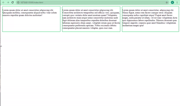
You can later use a media query to set the direction to a column for smaller screens with the flex-direction property. The flex-direction property value has to be explicitly set to a column.
You can also layout the way you want the content on the web page to render with properties such as flex-grow and flex-shrink. These two properties make the element they contain grow as the screen viewport (width) increases and shrink as the viewport decreases. How cool is that?
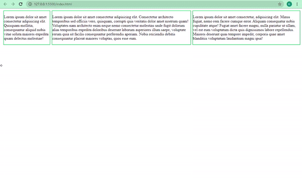
In the code snippets below, the direction of the different pieces of text in their respective containers will be a row on screens higher than 768 pixels in width, and a column when the width is lower than 768 pixels.
I was able to do it by displaying the whole items inside the body element as flex.
<body>
    <div class="container-one">
        <p>
            Lorem ipsum dolor sit amet consectetur adipisicing elit. Quisquam
            mollitia, consequuntur aliquid nobis vitae soluta maiores expedita ipsam
            delectus molestiae!
        </p>
    </div>

    <div class="container-two">
        <p>
        Lorem ipsum dolor sit amet consectetur adipisicing elit. Consectetur
        architecto temporibus sed officiis vero, quisquam, corrupti quis veritatis
        dolor amet nostrum quam! Voluptates nam architecto enim neque nemo
        consectetur molestias unde fugit dolorum alias temporibus expedita
        doloribus deserunt laborum asperiores illum saepe, voluptate rerum quia
        sit facilis consequuntur perferendis aperiam. Nobis reiciendis debitis
        consequuntur placeat maiores voluptas, quos esse eum.
        </p>
    </div>

    <div class="container-three">
        <p>
        Lorem ipsum dolor sit amet consectetur, adipisicing elit. Minus fugiat,
        nemo rem facere cumque error. Aliquam consequatur nobis cupiditate atque!
        Fugiat amet facere magni, nulla pariatur ut ullam, vel est eum voluptatum
        dicta quis dignissimos labore repellendus. Maiores deserunt quas tempore
        impedit, corporis quae amet blanditiis voluptatum laudantium magni ipsa!
        </p>
    </div>
</body>
body {
          display: flex;
      }

      div {
          border: 2px solid #2ecc71;
          margin-left: 6px;
      }

      @media screen and (max-width: 768px) {
        body {
          flex-direction: column;
        }
    }
CSS Grid
CSS grid is more or less a hybrid and more powerful form of flexbox. Many have argued that whatever you're doing with Flexbox, you can do in fewer lines of code with Grid.
With CSS grid, you get to create flexible grids in a more straightforward way as you can define the columns and rows you want with the grid-auto-flow property set to either column or row.
You can do the same thing that we did in the Flexbox example this way with Grid:
body {
          display: grid;
          grid-auto-flow: column;
          gap: 6px;
      }

      div {
          border: 2px solid #2ecc71;
          margin-left: 6px;
      }

      @media screen and (max-width: 768px) {
        body {
            grid-auto-flow: row;
        }
     }
You can learn more about Flexbox and Grid in the freeCodeCamp CSS curriculum.
Conclusion
As internet users now access websites on mobile phones more than on desktops and laptops, responsive design is the way to go when it comes to making modern websites.
Knowing Responsive Design best practices will set you apart from other developers as you will be able to make websites that adapt to different screen sizes within the same HTML, CSS, and JavaScript files.
I hope this article has given you the insights you need to make responsive real-world websites.
Thank you for reading, and keep coding.