By Jared Tong
What do The New York Times’ developers get wrong about the hamburger menu, and what do Disney’s and Wikipedia’s get right?
As far as I know, I’ve found only one way to style the hamburger menu’s open state that supports iOS Safari. (Presumably, you want a mobile view to work on iPhone!)
It’s all about how the hamburger menu is positioned.
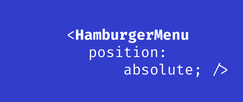
The Problem with Many Hamburger Menus
If your hamburger menu has no need for scroll… Congratulations! The CSS solution you’re thinking of now will probably work just fine: position the sidebar absolutely out of and into the view-port when the user clicks on the menu icon.
If your menu has more items than the view-port can display at once, this is what happens when your hamburger menu is positioned absolutely:
If you don’t want to watch the video, I’ll try and describe it in words.
- Scrolling within the
position: absolutemenu is unpleasant: it does not scroll smoothly, and when it reaches the end of scroll, it does not bounce in that satisfying, patented rubber-band way. Try the hamburger menus on New York Times, or Pitchfork. - If you over-scroll in the hamburger menu, iOS Safari will scroll the body instead. Try the sidebar on Viki.
- An alternative is to use
position:fixedand-webkit-overflow-scrolling: touchon the sidebar. Even then, if you tap beyond the menu, like scrolling on the sliver of main content exposed beside the sidebar, you will lose the ability to scroll within the menu. Try the hamburger menu on Grab.
Notice how sometimes iOS scrolls the menu, sometimes it scrolls the body behind the menu? Frustrating!
And FWIW, you can break the scroll on Apple.com too. An easy way to trigger the scroll on the hamburger menu is to use your phone horizontally.
The Solution
Basically, the key thing you must remember about the Menu’s final, open state is this: instead of positioning the menu absolutely, it will be the main content that is positioned once the sidebar is opened. In other words, instead of positioning the menu, position everything else!
Here is that in code, alongside explanatory comments:
<html><head></head><body> <div class="sidebar">Hamburger menu links go here</div> <div class="main-content"><button class="hamburger-menu-icon" onClick="toggleSidebar()">?</button></div></body></html>
/* Arbitrary CSS variable values for explanatory purposes */:root { --sidebar-width: 100px; --sidebar-bg-colour: blue;}.sidebar { display: none; position: relative; width: var(--sidebar-width);}@media (max-width: 767px) { html.sidebar-is-open .sidebar { display: block; /* The sidebar is just rendered in default position, as it appears in the document flow */ } html.sidebar-is-open .main-content { position: fixed; /* It is the main content that is positioned. This is the crux of the implementation. The rest is all sugar. Cons: the body will scroll to the top, losing your user's scroll position */ /* prevents resizing from its original full-screen width */ bottom: 0; left: 0; right: 0; top: 0; width: 100%; overflow: hidden; } /* Optional enhancement: make the over-scroll on iPhone the same color as the sidebar */ html.sidebar-is-open body { background-color: var(--sidebar-bg-colour); } .sidebar { background-color: var(--sidebar-bg-colour); }}
const documentElement = document.querySelector("html");const contentElement = document.querySelector(".main-content");const sidebarElement = document.querySelector(".sidebar");const sidebarIsOpen = () => documentElement.classList.contains("sidebar-is-open");const openSidebar = () => { /* How you trigger the change is up to you */ documentElement.classList.add("sidebar-is-open");};const closeSidebar = () => { documentElement.classList.remove("sidebar-is-open");};const toggleSidebar = () => { sidebarIsOpen() ? closeSidebar() : openSidebar();};
Conclusion
So far I’ve found two big players who get it right: Wikipedia and Disney USA.
Try their hamburger menus on iOS and see what a great experience the scrolling is!
Hopefully you can spread the word, and fix hamburger menus from now on.
If you’re more of a beginner, you can find an explanation of what a hamburger menu is and how to build a hamburger menu from scratch on my blog.