

Transparency plays an important role in front end development. It lets you choose how transparent the elements on your web pages appear.
You can adjust transparency in several ways – because of course, in CSS, there are multiple ways to do the same thing.
The CSS opacity property is the first way that might come to your mind to change transparency. But this property can't come to the rescue all the time, especially when there is a background image with text in it that you want to make transparent.
So in this article, I’m going to show you the various ways you can adjust transparency so you can start implementing it in your coding projects.
Image Transparency with the CSS Opacity Property
To make an image transparent, you can use the CSS opacity property, as I mentioned above. The basic syntax of the opacity property is shown in the code snippet below:
selector {
          opacity: value;
      }
The opacity property takes values from 0.0 to 1.0, with 1 being the default value for all elements. The lower the value, the more transparent. So if an element is given an opacity of 0, it would be invisible.
You can find examples of different opacity values in the code snippets below:
<img src="freecodecamp.png" alt="freecodecamp-logo" />
I have added some CSS to center everything on the page:
body {
        display: flex;
        align-items: center;
        justify-content: center;
        margin: 0 auto;
        height: 100vh;
      }


 img {
        opacity: 1;
      }
An opacity value of 1 is the default, so the image appears like this:

img {
     opacity: 0.5;
   }
This code gives us 50% opacity, and you can see that the logo has faded a bit:

img {
        opacity: 0;
      }
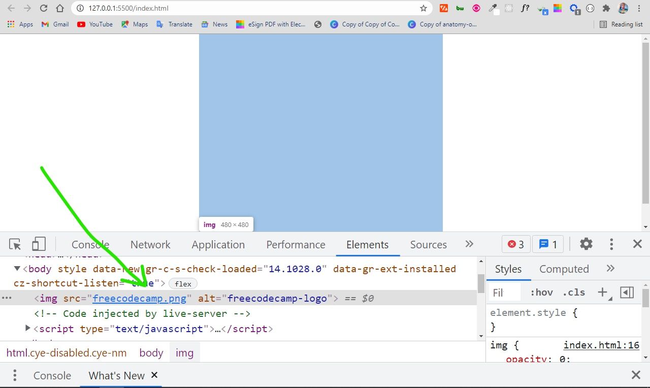
With an opacity of 0, the image is 100% transparent, so it becomes invisible:

The only way to be sure the image is on the page is to inspect it with your browser devtools:
You can use this opacity value to do a lot of things – for example, you can use it to include text over a hero image on a website.
You might be wondering why you would want to make content invisible with an opacity value of 0. Well, it can be useful in animations, and in building HTM + CSS + JavaScript games as well.
You'll definitely want to use CSS positioning to help you align things. I'll discuss this in the next parts of the article.
Background Image Transparency in HTML and CSS
CSS offers a way to set the background image for a container element with the background-image property, so you don’t necessarily have to do it with the CSS. This means you can also place text in the container as well.
<div class="showcase">
      <h1>A group of ring-tailed lemurs</h1>
</div>
body {
      display: flex;
      align-items: center;
      justify-content: center;
      margin: 0 auto;
      height: 100vh;
    }
    .showcase {
      background-image: url("ring-tailed-lemurs.jpeg");
      height: 400px;
      width: 500px;
      background-position: center;
      background-repeat: no-repeat;
      background-size: cover;
      opacity: 0.6;
    }
The downside of this approach is that the opacity is set for the container where the image and text are. So, the opacity affects the text as well, not only the image. This is probably not what you want!
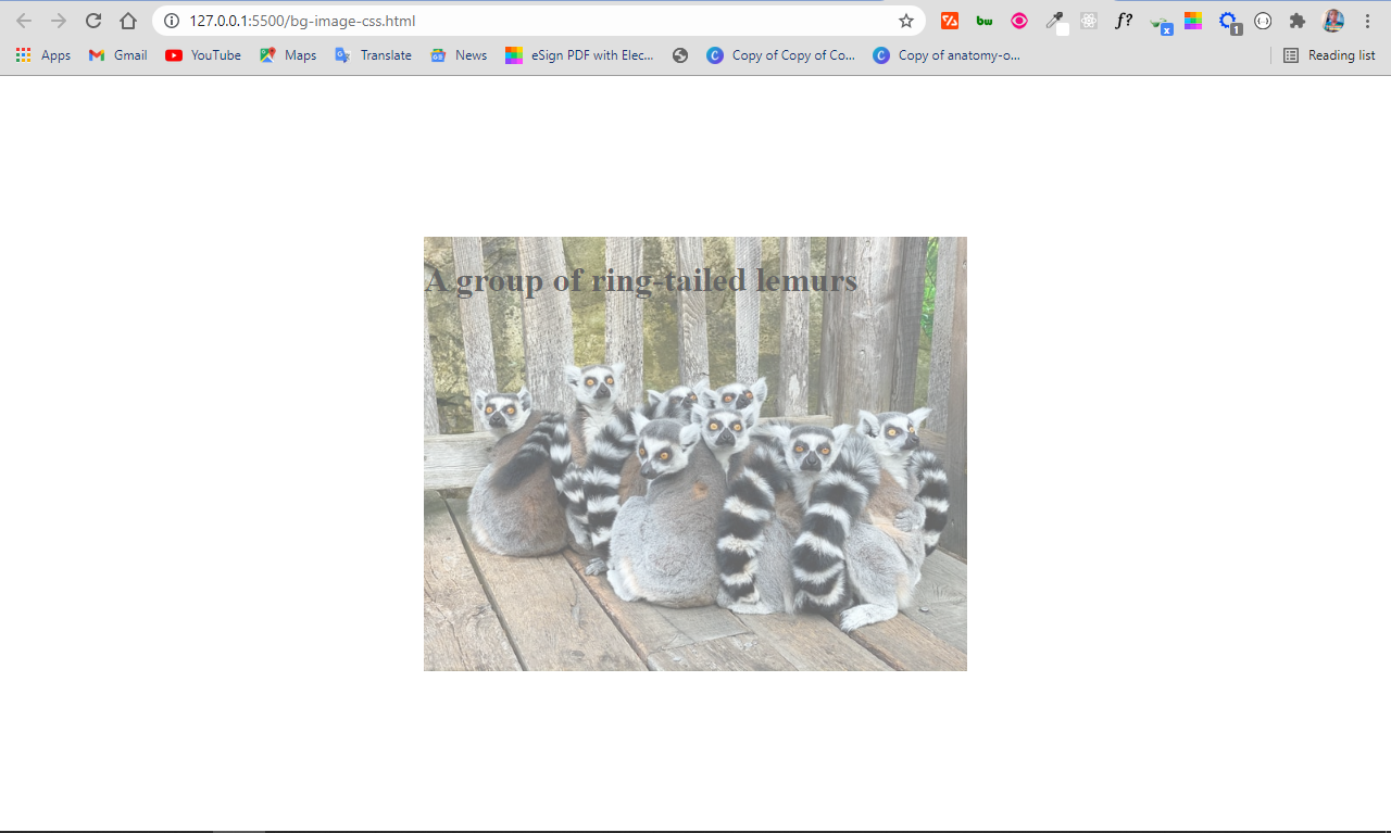
The solution
By default, when you apply an opacity to a container, the descendants inherit it as well.
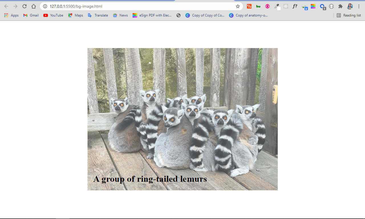
A workaround in this situation is to set the background image in the HTML. This makes it easy to apply the opacity to the image only, instead of setting the background image for the container in the CSS.
This time around, the image and the text will be separated, so the text will not inherit the value set for the opacity.
This means you also have to use CSS positioning to align the text within the image.
<div class="showcase">
   <img src="ring-tailed-lemurs.jpeg" alt="lemurs" class="bg-image" />

   <h1 class="bg-img-title">A group of ring-tailed lemurs</h1>
</div>
body {
      display: flex;
      align-items: center;
      justify-content: center;
      margin: 0 auto;
      height: 100vh;
    }
    .showcase {
      position: relative;
    }

    .bg-image {
      opacity: 0.7;
    }

    .bg-img-title {
      position: absolute;
      top: 420px;
      left: 20px;
    }
In the CSS code snippet above, I use flexbox to center everything on the page.
The container div element with the class of showcase is positioned relative, so you can position the h1 text absolute within it. This will push the h1 text to the top-left corner of the image. The top and left properties are then used to push the text to the bottom-left corner of the image.
If you are wondering what the top and left properties are, they are the properties you get access to when you use the display property.
In addition to these two, you also get access to the right and bottom properties. They let you position an element anywhere.
In the end, the image is opaque and the text is not affected:
Conclusion
In this article, you learned how to use the opacity property of CSS to make images transparent.
As CSS remains tricky and a bit weird, it's helpful to combine the opacity property with other CSS features such as positioning in order to put it into proper use.
Apart from CSS positioning, you can also use the opacity property with CSS pseudo-elements such as ::before and ::after, which is sort of a hacky way of doing things.
Thank you for reading, and keep coding.