By Enabled Solutions
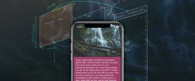
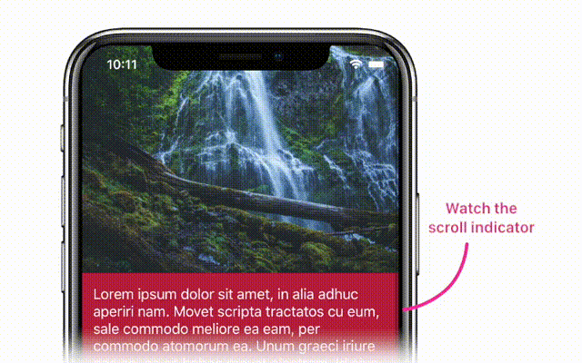
Check the image below. This is a cool effect.
And it’s really easy to build in iOS using Auto Layout. I wanted to write about this because the effect is so simple. And Auto Layout makes its implementation so elegant that I think you ought to know about it.
If you want to follow along, you can clone the demo project at our starting point and implement the effect as you read along. You’ll need Xcode 9 as we’re going all-in on iOS 11 for this example.
git clone https://github.com/TwoLivesLeft/StretchyLayout.gitcd StretchyLayoutgit checkout Step-1
Here’s how we’ll do it:
- Start with the basic non-stretchy app
- Modify the view hierarchy to add the necessary constraints to
make it stretchy - Add polish to the app
The non-stretchy app
Here’s the view hierarchy for the basic version of the app. You can see it has three main views. There’s the header UIImageView, which is the container for the text, and the long UILabel containing our text content. The bright red lines represent our Auto Layout constraints. There’s also a UIScrollView and the root view of our view controller.
We’re going to build this using an Auto Layout framework called SnapKit. SnapKit is a simple iOS framework that makes Apple’s Auto Layout API…sane. It’s dead simple to use, and makes programming with Auto Layout genuinely pleasurable.
Most of the code will live in viewDidLoad of our StretchyViewController class. Below you can see how the initial constraints are set.
Our views are declared as private members:
private let scrollView = UIScrollView()private let infoText = UILabel()private let imageView = UIImageView()
Our view controller’s view has a scroll view as its first subview, followed by the text and image views. It also has a backing view which provides us with
the red background behind the text.
//Pin the edges of the scroll view to// our view controller’s viewscrollView.snp.makeConstraints { make in
make.edges.equalTo(view)}
//Pin the top of our image view to the scroll view// pin the left and right to the view controller’s view// give it an aspect ratio constraint by constraining// its height to its width with a multiplierimageView.snp.makeConstraints { make in
make.top.equalTo(scrollView) make.left.right.equalTo(view) make.height.equalTo(imageView.snp.width).multipliedBy(0.7)}
//Pin the backing view below the image view and to the// bottom of the scroll viewtextContainer.snp.makeConstraints { make in
make.top.equalTo(imageView.snp.bottom) make.left.right.equalTo(view) make.bottom.equalTo(scrollView)}
//Pin the edges of the text to the text container view, this// will force the text container to grow to encompass the// text’s heightinfoText.snp.makeConstraints { make in
make.edges.equalTo(textContainer).inset(14)}
Note: To get the code at this point, do git checkout Step-1
A brief aside
We used SnapKit above. SnapKit is great — so here’s a primer on how it works.
You access the snp member object on any UIView.
You call makeConstraints which accepts a closure, and the closure is given a ConstraintMaker object (called make here).
You then use the make object to pin edges or anchors of one view to any other view, layout guide, or constant.
myView.snp.makeConstraints { make in
make.edges.equalTo(view)}
This will pin the edges of myView to the edges of view.
It’s readable and concise. Use this instead of the default Auto Layout API.
Making it stretchy
So how do we go from this (not stretchy) to this (stretchy)?
It’s important for the stretch effect that Auto Layout will solve constraints
regardless of whether your views are siblings or elsewhere in the hierarchy.
It only matters that they have a common ancestor.
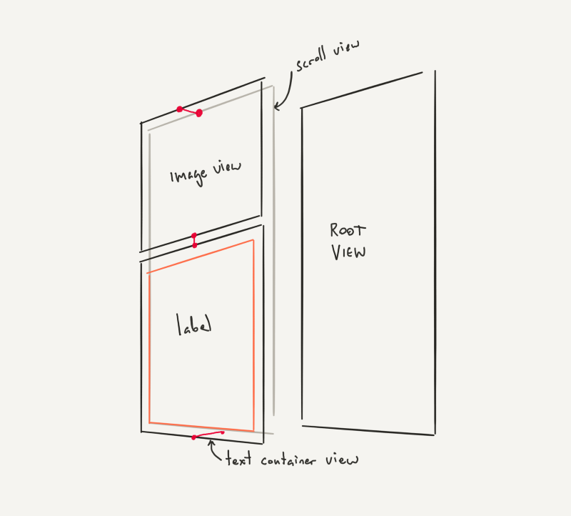
But here’s a key element: views within scroll views can be constrained to views outside of scroll views. That’s how we will make this work.
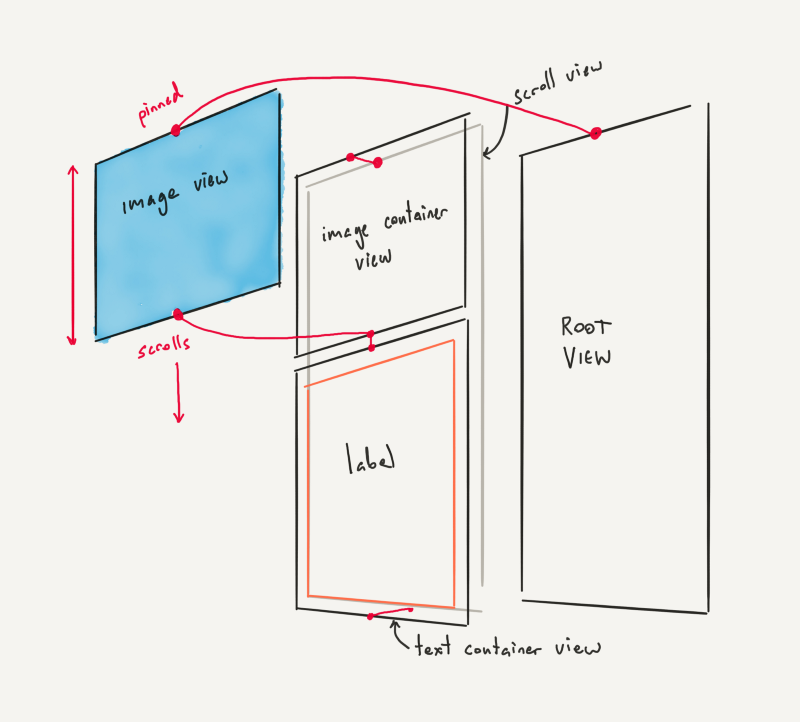
In the above diagram, the bright red lines represent our constraints. Note how the top of the image view is now pinned all the way back — outside the scroll
view — to the top of the root view. But its bottom is pinned to the bottom of the image container view, which is inside the scroll view. This means that
when the scroll view scrolls, our image view will stretch to satisfy its constraints.
So for our first step, we’ll replace our UIImageView with an empty container view.
let imageContainer = UIView()imageContainer.backgroundColor = .darkGrayscrollView.addSubview(imageContainer)
imageContainer.snp.makeConstraints { make in
make.top.equalTo(scrollView) make.left.right.equalTo(view) make.height.equalTo(imageContainer.snp.width).multipliedBy(0.7)}
Then we’ll add our image view as a subview of our scroll view. But we’re going to pin its top edge to our view’s top edge — not our scroll view’s top. The container we just added above is pinned to our scroll view’s top edge.
scrollView.addSubview(imageView)
imageView.snp.makeConstraints { make in
make.left.right.equalTo(imageContainer)
//** These are the key lines! ** make.top.equalTo(view) make.bottom.equalTo(imageContainer.snp.bottom)}
Above you can see the lines that make this work. Our image container view
scrolls exactly how the original non-stretchy app scrolled. But we’ve added our actual image view above that container. And we’ve pinned its bottom
to the container bottom, while its top is pinned to the view controller’s view.
This means that when you drag down in the scroll view, the top of the image
“sticks” to the top of the screen and the whole image just gets bigger. And
because we’re using imageView.contentMode = .scaleAspectFill , we’re going to see the image content scale up within the image view as we over-scroll the scroll view.
Note: To get the code at this point do git checkout Step-2
But there’s a bug
If you run this code, dragging down on the screen with your finger produces
the desired effect: the image scales up and bounces back. But if you scroll up
to read the text …well, you’ll realize that you can’t.
Why?
Because when we scroll up, we are compressing the UIImageView into a
zero-height line. Its top must be equal to the view’s top, and its bottom must be equal to the text backing view’s top. So this means the scroll view will continue to “scroll,” but we won’t see the changes. This is because the backing view is jammed up against the image view, which is refusing to move above the top of the root view despite the scroll view scrolling.
Auto Layout is technically solving our constraints, but it’s not what we want.
Fixing the bug
We have to change how we constrain the image view. Here’s the change:
imageView.snp.makeConstraints { make in
make.left.right.equalTo(imageContainer)
//** Note the priorities make.top.equalTo(view).priority(.high)
//** We add a height constraint too make.height.greaterThanOrEqualTo(imageContainer.snp.height).priority(.required)
//** And keep the bottom constraint make.bottom.equalTo(imageContainer.snp.bottom)}
Notice how we now have a top constraint, a bottom constraint, and a height
constraint? This is one of the awesome things about Auto Layout: we can have
conflicting constraints and they will be broken in priority order. This is necessary to achieve the effect we want.
First, we keep our original constraint. The top of our image view is pinned to
the top of our view. We give this a priority of .high.
We then add an additional constraint: the height of our image must be greater
than or equal to the height of the image container behind it (recall that our image container has the aspect ratio constraint). This has a .required priority.
So what happens when we scroll up?
Well, the image can’t get smaller. Our height constraint has a higher priority
than the top constraint. So when we scroll up, Auto Layout will break the
lowest priority constraint in order to solve the system. It will break the top
constraint, and our scrolling behaviour will revert to normal. This allows us
to scroll up and read the text.
Note that you can also remove the height constraint in this instance and simply set the top constraint priority to .high. This will allow iOS to break the top constraint and compress the image view to zero height. Given the
.scaleAspectFill content mode, this creates a parallax-like effect. Try it out. You might prefer the way it looks.
Note: To get the code at this point do git checkout Step-3
Polishing the details
There are three jarring problems we should fix while we’re here.
1. Text over-scrolling
If we over-scroll past the bottom of the view, we get to see the ugly
grey background of our view controller. We can use the exact same method to
stretch our backing view out when we over-scroll past the bottom of the view.
I won’t go into the code, since it’s basically the same technique as the image view above. We add an additional text backing view behind our text container, and then pin its bottom edge to the root view’s bottom edge.
Note: To get the code at this point do git checkout Step-4
2. Respecting the safe area
On iPhone X, our text overlaps the home indicator. We disabled the automatic content inset adjustment of our scroll view in order to let our image content go right to the top of the screen. So we’ll have to manually handle the bottom inset using the new safeAreaInsets property in iOS 11.
We also want to use safeAreaInsets to adjust our scroll view’s scrolling indicators. This way they won’t run into the curved edges of the screen on iPhone X.
To fix these two issues, we’ll override viewDidLayoutSubviews and manually set the bottom inset of the scroll view. iOS 11 would normally do this for us automatically, but we don’t want to inset the top. We want our header image flush behind the status bar.
We have told iOS 11 not to touch our scroll view by setting itscontentInsetAdjustmentBehavior to .never.
override func viewDidLayoutSubviews() { super.viewDidLayoutSubviews()
//** We want the scroll indicators to use all safe area insets scrollView.scrollIndicatorInsets = view.safeAreaInsets
//** But we want the actual content inset to just respect the bottom safe inset scrollView.contentInset = UIEdgeInsets(top: 0, left: 0, bottom: view.safeAreaInsets.bottom, right: 0)}
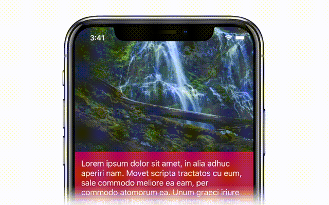
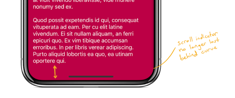
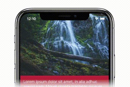
This gives us the following appearance when scrolled all the way to the end.
Note that the scroll indicator is no longer lost behind the curve, and we get
much more space above the home indicator.
Note: To get the code at this point do git checkout Step-5
3. Hiding the status bar when needed
Our text is overlapping the status bar when we scroll up. This looks gross.
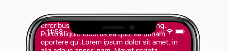
Let’s hide the status bar with a cool animation when the user scrolls the text into the status bar area. It’s quite easy to detect this, and I think the effect looks great.
How do we do this?
- We convert the
textContainer’s rect to screen coordinates. - We check if the minimum Y of that frame is less than the view’s top safe area inset. This indicates that the text container is moving into the status bar area.
- If so, we hide the status bar. If not, we show the status bar.
We perform this check in the scrollViewDidScroll(_:) method of theUIScrollViewDelegate. So we make our StretchyViewController implement this delegate and set itself as the delegate for its scroll view.
Here’s the code for the status bar check:
//MARK: — Scroll View Delegate
private var previousStatusBarHidden = false
func scrollViewDidScroll(_ scrollView: UIScrollView) { //** We keep the previous status bar hidden state so that // we’re not triggering an implicit animation block for every frame // in which the scroll view scrolls if previousStatusBarHidden != shouldHideStatusBar {
UIView.animate(withDuration: 0.2, animations: { self.setNeedsStatusBarAppearanceUpdate() })
previousStatusBarHidden = shouldHideStatusBar }}
//MARK: — Status Bar Appearance
override var preferredStatusBarUpdateAnimation: UIStatusBarAnimation { //** We use the slide animation because it works well with scrolling return .slide}
override var prefersStatusBarHidden: Bool { return shouldHideStatusBar}
private var shouldHideStatusBar: Bool { //** Here’s where we calculate if our text container // is going to hit the top safe area let frame = textContainer.convert(textContainer.bounds, to: nil) return frame.minY < view.safeAreaInsets.top}
Note: To get the code at this point do git checkout Step-6
What we’ve covered
- You can pin pretty much anything to anything else, and your views will
stretch to satisfy your constraints. - This will work even if you’re scrolling.
- Constraints are broken in priority order, so don’t be afraid to experiment
with conflicting constraints. - Use SnapKit!
Simeon Saëns leads Enabled’s mobile development activities with a strong focus on design and human-computer interaction. Simeon is also called to meet with clients to understand their needs and develop technical solutions.
Follow Simeon on Twitter