Type Families
Type families are ranges of typeface designs. Each family is a variation of a basic style of alphabet. There are hundreds or maybe even thousands of typeface families.
Reference-style:

History
The concept families of type hadn’t formed when typefaces were first invented, and all fonts were roman designs. During the early years of the 16th century, cursive type was introduced. Cursive was also called italic, named after Italy, where the idea was popularized. Romans were one style of type and italics were another, like serif and sans serif, and there were still no typeface families.
Punctuation
Punctuation gives type emotion, and gives indications on when to stop, slow down, and much more.
There are seven types of font families
- Old Style
- Transitional
- Modern
- Slab Serif
- Sans Serif
- Decorative
- Script-Cursive
Combining Typefaces
Font Pairing Basics
Which fonts look good together and which ones don’t? If you’ve ever struggled with this question, you’re not alone. Learn how to pair different fonts and styles by getting familiar with these clever combos!
Try these steps one by one
- Pair a regular and bold font to create a subtle contrast
- Balance a script font with a bold font
- Pair a tall and short font to create visual interest
- Pair fonts with different weights to create a strong contrast
- Pair a regular and italic font to create emphasis
There are no hard and fast rules for choosing typefaces, but you can often avoid having to choose new typefaces by styling an existing typeface to create a visual hierarchy. When in doubt, keep it simple.
Designers follow different philosophies to determine when and how to combine typefaces.
Anchor or Role Typeface
If your project involves large amounts of text, choose an anchor typeface for the body text. This anchor typeface will guide the rest of your design choices as you make continuous tests and refinements for different combinations of typefaces against your anchor.
Contrasting Typefaces
For text-light projects, having clear hierarchical roles for a font is not as great a concern as visual impact. Pair contrasting typefaces such as serif plus sans-serif. Designers often share their favorite typeface pairs, so search and experiment until you create a pleasing result.
Typeface Families
Many type foundries create typefaces with extensive extra features like multiple weights and cases, decorative glyphs, serif and sans-serif versions, etc. You can use a single type family like this to ensure consistent design while creatively using those extra features to provide extra emphasis or decoration that might otherwise require another typeface. Typeface families are often a great compromise of visual consistency and typographic flexibility.
Type Classifications
Almost all typefaces fall into one group or another. This system of classifying typefaces developed in the nineteenth century. Each typeface has it’s own visual structure, influences, intent and historical significance.
The basic classification of typefaces is as follows:
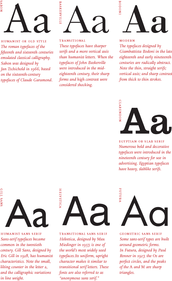
- Serifs: These typefaces have small extensions, which embellish the basic structure of a typeface. Serif typefaces have existed since the beginning of type. They are visible in Old style and Humanist type serifs like Garamond. Baskerville, another serif typeface belongs to the transitional era. Bodoni and Rockwell are part of Modern and Slab serif(Egyptian) styled typefaces.
- Sans-serif : Sans means without. These typefaces are devoid of those small extensions, hence without serif. Examples include Gill sans which has Humanist connotations, Helvetica with it’s transitional characteristics and so on.
- Script: Letter forms developed in close relation to human handwriting are script typefaces. They are flexible in nature with varying stroke widths. Example : Bistro Script, Shelly, Minstral etc.
- Blackletter : A bold script style of calligraphy used heavily during the renaissance. Example: Fraktur
- Decorative: Typefaces which do not fit in other categories are decorative in nature. Built for specific use cases which largely consist of headlines, posters etc.
In addition, three main groups to classify type corresponding to different time periods in art and literature are as follows:
- Humanist letter forms belong to the renaissance period of around 15th & 16th century. They closely mimic calligraphy and human hand movement. Old serifs followed humanist letter forms. Examples of humanist type are : Sabon, Centaur, Adobd Jenson, Gill Sans etc.
- Transitional letter forms are part of the baroque era. They represent a transition from old style humanist typefaces to modern typefaces. Examples are : Baskerville, Times Roman, Helvetica etc.
- Modern letter forms, are part of the enlightenment period of around 18th-19th century. They depict a radical shift from traditional typography to a more abstract design. Examples are : Bodoni, Futura etc.
 Source: Thinking with Type by Ellen Lupton