
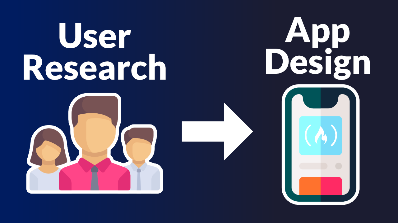
If you want to design your app in the best way possible, it is important to really understand the needs of your users. This can be done through user research.
We just published a UI / UX design course on the freeCodeCamp.org YouTube channel that will teach you how to use Figma to design a web app based on the needs of users.
Joseph Brendan developed this course. Joseph is a great instructor who has taught thousands of people on his YouTube channel.
In this course you will learn how to use the d.school design thinking process and self process management to come up with design solutions. You will develop a Fintech app from scratch.
Here are the sections in this course:
- Outline Breakdown
- Workflow Breakdown In FigJam
- User Empathy ( Empathize )
- Creating User Experience Survey With Google Forms
- Creating User Personas
- Creating Problem Statement
- Ideate
- Prototype Analysis
- User Goals & User Tasks
- Information Architecture
- Low Fidelity Prototyping
- High Fidelity Prototyping
- Creating Style Library
- Creating Component Library
- Prototype Presentation & Assignments
Watch the full course below or on the freeCodeCamp.org YouTube channel (2-hour watch).
Transcript
(autogenerated)
In this course you will improve your user interface and user experience design skills by building a mobile app.
Instructor, Joseph Brendan is a great designer and great teacher.
Hey, guys, my name is Joseph, Brandon.
And in this course, I am going to show you how to design a mobile app from scratch.
Now, this mobile app will be a stock investing mobile app that users can use to invest in the stocks of companies that they would like to invest in.
So here is a demonstration of the app that we are going to design.
Now over here, we have the splash screen of the app, which is what's going to show up when you launch the app.
Now, let's go to the next page here.
Now, this is the page where the user will have to select their next action, which is either to log in as an existing user or to get started as a new user.
So I'll go ahead and click on get started, just like a new user would do.
And here on this page, the new user will be required to sign up to this application with an email address, a phone number and a password.
Now, when the new user doors that the new user will be taken to this page, where the new user will have to enter a verification code that's been sent to the phone number of that new user.
Now, when the phone number of the new user is verified, it means that the new user is now a registered user on this application, and the next thing the user is going to do is to click on the Proceed button here.
And when the user does that, the user will be taken to the homepage of the application, which is this page here.
And here on the homepage of this application.
Over here, the account balance of the user will be displayed here.
Also, the user will have a button here that can be used to fund the account on this application.
And right over here, the user will have a list of recent transactions that they have carried out on this application.
Now coming down here, the user will see a banner here that they can click on to get a referral link that can be used to invite friends to have an account on this app.
Now, at the bottom here, we have the navigation section of this app.
Currently, we are on the homepage of the app.
Now let's navigate to the InVEST page, which is the page where the user will have the features that they can use to invest in stocks.
So I'd come here, and I'll click on invest.
When I do that, I'll be taken to the InVEST page, which is this.
And over here on the InVEST page, you can see that we have a display of cash and assets owned by the user.
And right after that, over here, we have a list of top stocks that the user can invest in.
And also, we have the investment portfolio of that user over here, which is a list of all the investments that the user had made on this app.
Now let's say the user is trying to invest in one of the stocks listed here, let's say this one, yeah.
Now, if the user clicks on it, the user will be taken to the details page of that stock that they clicked on.
And on this details page, we are going to have information about the stock and the company that owns the stock.
Now if the user likes what they see here, the user will go ahead to click on the InVEST button here.
And when the user clicks on that button, the user will be required to enter the amount that they wish to invest in that stocks with.
Now when the user enters the amount and the user clicks on the Proceed button here, the user will see a summary of the investment that they are about to make.
And when the user is okay with what they see here in the summary.
The user will be required to enter their secrets pin here, and then click on the InVEST button here.
And when the user does that, it means that the investment has been successful.
So this app that I just demonstrated here is what we are going to design in this course from scratch.
Now before we start designing this app, I would love to break down the stages of our workflow for this project, so that you can understand In the execution process of designing products that are actual business solutions.
So here are the stages of our workflow.
First things first, the stakeholders of this project, which is the owner of the project, or the company we are working for, will present us with a problem that they would want us to design for.
Now, when they present these problems on us, they are also going to tell us about the users, which are the people facing the problem that they want us to design for.
Now, after that, the stakeholders will state their expected goals for the project.
Now after the stakeholders presents a problem and states, their expected goals to us, the next stage of our workflow will be for us, the UX designers to empathize with the users.
Now after we empathize with the users patient problem, we are going to create what we call a problem statement.
And after creating this problem statements, the next stage of our workflow will be the stage where we will have to come up with ideas that can be best business solutions to the problems highlighted in the problem statement.
Now, when we are able to get an idea for the problems in the problem statement, the next action will be for us to design that idea into a testable prototype.
And after designing that idea into a testable prototype, we will go ahead to test the design to be sure that it is able to solve the problems in the problem statement.
So let's get to work.
Now outcome here in figma.
And I'll use a fig jam file to walk on all the analytical parts of our workflow.
So let's create a fig jam file.
And to do that, come here and click on the new fig jam File button there.
When you do that, you have created a junk file as easy as that.
And I'd like to mention that if you are new to using fie jam, you have nothing to worry about.
It's a really simple tool to use.
Just follow along, and you'd see that at the end of this course, you would be good with using feature.
So I'll close this.
And the next thing I'll do after creating a fifth gem file is to give the fifth gem file a name.
So I'll call this stocks, big jam, you can call it whatever you want to call it.
Now after giving this junk pile in him.
The next thing to do is to outline the stages of our workflow here in peach jam.
So let's do that.
So first things first out, zoom into 200% outcome here to zoom in and out Select Zoom to 200% here.
And when I zoom in to 200% out, use a square shape here to write down a headline for our workflow.
So I would keep this there, I would select the text to now so that I can write my text.
And I would say, workflow stages, then outcome here, and I'll align the text to the left.
And I'll change the color of the rectangle to this.
And that.
Okay, so the next thing I'll do is to have sticky notes, were out outline the workflow stages in.
So to create a sticky notes in peach jam, I would come here and now select the sticky note tool here.
When I select it out, come here and out, click on the big jam Canvas to have this.
Now let's select this.
And let's expand the width to align with our sticky notes.
So first things first, I will change the color of my sticky notes to this, then I'll click on this Add text placeholder here.
So that I can write down all of those workflow stages that I talked about.
So I would like to make this a list.
And I'd like it to be a bulleted list.
So I would come here and I would select the bulleted list property here.
Then I would write down the first workflow stage, which is this, it says stakeholders present the problem and the users facing the problem.
Now I'll create another list item, which is going to be the next stage of our workflow.
And that's going to be where the stakeholders will define the goals for this project.
So I would say define goals.
Let's come here.
Let's create some space here.
Now let's outline the next stage of our workflow.
After the goals are defined, we view X designers will empathize with the users.
So let's come here.
Let's create the space also.
Now After we the UX designers empathize with the users, the next stage of our workflow will be where we are going to create a problem statement.
So I would say, creates problem statements.
So let's come here, let's create the space.
Now after we create a problem statements, the next stage of our workflow will be the stage, where we are going to come up with an idea that can solve the problems listed in the problem statement.
Now, after we come up with a best idea that can solve the problems in the problem statement, the next stage of our workflow will be the stage where we are going to design that idea into a testable prototype.
So I would say design prototype here.
And after we design that idea into a testable prototype, we are going to move over to the next stage of our workflow, which is going to be the stage where we are going to test that idea that we have designed into a prototype.
So I would just call that test and have that spaced.
Now we have outlined our workflow stages here.
So just to make this better, I would select all of these and I would make all of the text bold.
To have that outcome here, I would select this text, and I'll make it bold also.
Now zoom back to 100%.
To see what we have, and this is okay, so I'll use the hand tool, which is this, you can come here to click on it to select it or just press the H key on your keyboard to have it selected.
And now grab and shift a canvas to this point.
So now we have outlined our workflow stages here right.
Now the next thing to do is for AWS to outline all of the actions that will be taken on that each of this workflow stage.
So this means that we are now going to break down each of these stage one after another, so that we know what actions to take at each of these stage and how to optimize for our results.
So I would select the Move tool here by clicking on it or by pressing the V key on my keyboard to select it.
And I would come here, I would select the square tool there so that I can create this shape like this.
And over here, I would write a text inside this shape.
And that text will be this first stage out select all of this text here, then I'll use CTRL.
C, if you are using a Mac, its command C, I would use that to copy that text.
And I'll paste it inside this question like this.
Now expand this to this point.
Now this is the first stage of our workflow right outcome here now.
And I'd have a sticky note here, right under that.
Now in this sticky note out write out what's going to happen at this stage, which is the first stage of our workflow.
Now this stage is the stage where the stakeholders will present the problem to us.
And also let us know about the users that they want us to design for.
So in this course, I would like us to assume that we have a stakeholder somewhere or we have a company somewhere that wants us to design an app that you can use to invest in stocks for them, right.
So I'll paste this in here in this sticky note, which says users find it really hard to invest in stocks using existing investment apps due to information overload and complex presentation of information on the apps.
Now, who are the users, the users are stock investors in Nigeria.
So this so having this here means that the stakeholders have presented us with a problem and the users facing the problem.
So this is sorted.
So let's change the color of the sticky notes.
Something like this to differentiate it from this one here.
And let's come here.
Let's change this, to that to differentiate it also.
So this is the first stage of our workflow.
And we have seen what's going to happen here at this stage.
So let's look at the next stage here, which is the stage where the stakeholders will define the goals of the project.
So I would come here, I would select this and now duplicate it to duplicate is Ctrl D.
If you are using a Mac, its command D.
So I'll duplicate this and our habits to here.
I will take out this text inside this shape.
And out writes define goals there.
I can have in brackets saved by stakeholders.
So I'll keep this here.
Now outcome here also out duplicates these and out habits, they're right on the dish shape, which is a square shape, right.
So inside the sticky notes, I'll take all of these out and out.
also assume that we have stakeholders somewhere who sent us the goals.
That's the ones for this project.
So let's assume that the stakeholders sent us this as their goal.
And it says, research and help us us simplify every task needed to make a stock investment.
So what we have here so far is this, the stakeholders have presented us with a problem and B users facing the problem.
And they have gone ahead to define their expected goal for this project.
And the expected goal is that they want us to research and help users simplify every task needed to make a stock investment.
So let's move over to the next stage of our workflow, which is the stage where we the UX designers will have to empathize with the users facing the problem.
So I would come here, I'll duplicate this, I would have this here.
And I would say empathize.
Now I have this here also.
And I'll take out all we have here.
And at this empathize stage, this is actually the stage where we the UX designers will now get to work.
So what do we do at this stage? What are the actions that we need to carry out at this stage, so that we can say that we have properly empathized with the users facing the problem.
So what we are going to do is to interview the users face to face or send out surveys digitally to the users.
The purpose for that is so that we can understand the problems from the perspective of the people facing the problem.
Now after that, we are going to create what we call user personas, all under this empathize stage.
So out, make this a list, just like this, to have that organized properly.
And when we are done with the empathize stage, by carrying out these two actions here, the next thing we are going to do is to move over to the next stage of our workflow, which is the stage where we will have to create a problem statements.
So I would come here, I would have this here.
And I'll change that to create problems statements, and have this stay here.
So at this stage, where you the UX designer will be needed to create a problem statements, what you do to create a problem statements, it's easy, just state the problem of the users with all you have gathered from the previous stage, which is the empathize stage.
So after you have interviewed the users to understand the problems from their perspective, and you have created user personas for each of the user, what you do is you'd use all of that data to properly state the problem that the users are facing.
Now when you create the problem statement, which is you stating the problem properly, the next thing you do is to move to the next stage of our workflow, which is the idea stage.
Now, when you get to the idea stage, let's have this here.
When we get to the idea stage, the actions that you take at the idea stage are simple actions.
All you'd have to do with this, launch a brainstorming session, then during the brainstorming session, vote for the best idea, when you vote for the best idea, select the idea with the highest votes.
And there you have gotten an idea that you can then take to the next stage of our workflow, which is the stage where we are going to design that best idea into a testable prototype.
So before we go there, let's select this and let's make it a list like this.
Now, let's come here and let's look at the next stage here, which is the design prototype stage.
And when you get to this stage, what are the actions that you need to take for you to properly design a workable prototype, we are going to look at the actions now.
So out have this the here I'll take all of these out.
And the actions that we are going to take to properly design a prototype are all of this.
First things first, we are going to create an information architecture for the best idea that we got from the idea stage.
When we create that in commission architecture, we are going to use that information architecture to create what we call a low fidelity prototype.
Now, after we create that low fidelity prototype, we are going to test the low fidelity prototype.
And when the test is successful, we are going to go ahead to create a high fidelity prototype for that best idea that we got from the idea stage.
Now, after we create the high fidelity prototype, we are going to move over to the next stage of our workflow, which is the stage where we are going to need to test that high fidelity prototype.
So I would come here, I'd have this here, I would say test prototype.
And I'll bring this here, I can just say usability testing here.
And that's all.
Let's come here, let's make all of these illest.
And that's okay.
So what we have here is a proper breakdown of our workflow.
So I like to connect all of this so that we understand that these stages are to be followed one after another.
So I would select the connector tool here, you can see where my mouse cursor is on, click on it to select it, I would come here out, select this point, click hold and drag.
And I would connect with this other point here, I would select this also connected here.
I'll do that for all of these other items.
Also, I would have all of them connected.
So we are going to design our products by following the breakdown of this workflow.
So now that we have outlined our workflow stages, and we have broken down all of our workflow stages like this, the next thing we need to do is to start executing each of the actions that we have outlined here, one after another.
So let's get to work.
So the first stage of our workflow here is the stage where the stakeholders will present us with the problem and the user space in the problem, right.
And as you can see, that stage is sorted, because I assumed that a stakeholder presented us with this problem and the users facing the problem.
So this stage is sorted.
Now over to the next stage, which is the stage where the stakeholders will state their expected goals for the project.
And that is sorted also, as you can see here, I also assumed that the stakeholders has stated the expected goals to us, which is to research and help us simplify every task needed to make a stock investment.
Now over to the next stage, which is the stage where we the UX designers will get to work.
And that is the empathize stage.
And under the empathize stage here, these are the actions that we need to take.
The first action is to interview the users face to face, or send out surveys digitally to the users.
Now in this course, since this is a lesson, I can't show you how to set up a face to face interview.
But I'll show you how to create a digital survey using Google Forms.
So let's do that.
So I would come here in my browser, and I would open a new tab, then come here, I would click on this menu icon here so that I can access my Google Apps out scroll down and out, click on forms here.
And when I do that, I would come here and I would click on Blank there, then a blank form will be created for me.
Now I'll give this form a title.
I can call it stock app UX survey.
And that's its outcome here also, and I'll give the form a name.
So I can call the form stock up UX survey also, or you can give it any name at all that you want to give it.
Now the next thing I would need to do is to have a form description just to describe what the survey form is all about.
So outcome here, and I'll have this and it says this survey is carried out by best technologists.
And it is aimed at improving the experience of users who want to invest in stocks from an app without having complex steps.
Now you can come up with a better description when you are doing this in real life.
Now after that out, start passing in the fields that I want the users to give me a response to, and the first field out have here will be an email field.
I'd like to collect the email address of everyone that will take part in the survey.
So that's going to be my first field here.
So to collect email addresses outcome here.
I'll click on settings here.
Then I'll expand responses here.
You can see the responses section here, I'll expand it.
Then in front of this collect email addresses option here, I'll turn on this toggle button, just like that.
And that's sorted.
Now when I come back here, you will see that we have an email field here, which is going to require the user to enter their email address here.
And as you can see, there is a red Asterix there, showing that this is a mandatory field, which means that anyone taking this survey must have to enter their email address.
Now let's move over to the next question that we are going to ask anyone taking the survey? And that's going to be us asking them to enter their full name.
Yeah.
So I would come here, when I type that in, I would change this from multiple choice to shut answer just like that, then I would come here and I would turn on this toggle button to make this field a required field, meaning that anyone taking this survey must have to enter their full name.
And that's sorted.
So I would come here and I would click on the plus sign here to add another question.
Just like that, then this question will be country of residence.
Now, this is important, because coming from what the stakeholders presented us as a problem and the user space in the problem, we could see that the stakeholders are actually trying to solve a problem for people living in Nigeria.
So it is important to ask anyone taking the survey from where they reside.
So if someone from Germany takes the survey, by mistake or happenstance, then it means that when we are collecting the data from the survey, we are actually going to ignore that person's imputes.
Because the person is not based in Nigeria.
So that's why it's going to be important to ask this question.
So I would come here and I would make this required also.
Now make sure this is set to short answer also, then I would come here and I would click on this button to add another question.
Now this question is going to be us asking anyone to can be surveyed enter their age.
And this is also important, because usage of apps, and the experience behind the usage of apps differs by age range.
So I would ask this question, and I would set this to short answer, then I would make this a required question.
So I would go ahead and add another question option here.
So that I can ask my next question, which is going to be us asking whoever is taking the survey to enter their profession? I would keep this short answer.
And I'll make this required.
Then I'll add another question here.
And this question is going to be us asking, have you invested in stocks from a mobile app? Now this is going to be a yes or no answer.
And Google Forms automatically suggest this because I have a question mark at the end of the question.
Now outcome here, and I'll click on yes as my first option.
And I'll click on No as my second option, and that's going to be fine.
Then I'll come here and now make this is a required question.
Then I'll add another question here, which is going to be select the goals you always love to achieve when investing in stocks from a mobile app.
Now, I'll have that in brackets.
Same select more than one.
Now outcome here, and I'll make sure this is a checkbox option.
Now mimicking this checkbox option is because I want the person taking the survey to select more than one answer.
So I would come here, I'll type in my first option, which is going to be invest quickly.
My second option will be found my wallet with more than one option.
The third option will be withdraw my dividends quickly, the fourth option will be easily access transaction history.
And the final option here will be to save time.
So this is me asking anyone taking this survey to tell us what they would love to achieve more when using a mobile app to invest in stocks.
So these are all the options that they can choose from and from the answers they select.
We the UX designers will understand what to focus on when designing and what not to focus on when designing.
So I would come here and I would make this a required question also.
And that's fine.
And I'll add another question here.
Which is going to be me asking anyone taking this survey this question it says select the frustrations you face when investing with the app you are currently using to invest so out also good Give them the option to select more than one answer here.
And I'd have checkboxes selected here.
So the first option here will be complex and unnecessary graphs, the second one will be long time to invest.
And the third option will be excessive ambiguity of information.
The fourth option will be on friendly user interface.
And the final option will be difficulty in funding wallets or accounts.
Now, this is us asking whoever is taking the survey to tell us the problems that they have with any investment app that they're currently using.
Now from what they would select here, we the UX designers will understand the problems to tackle and what to completely avoid when designing our own investment up.
So outcome here and I would make this a required question also.
And the final question, or the final request out have in this survey is to have the person taking the survey to upload their picture.
Now, this is not going to be a mandatory field, we are going to make it optional if they like the upload if they like they don't.
So I would come here out, click on the plus sign that add question.
And I'd come here and select File Upload.
Now outcome here, and I'll click on Continue.
And I would come here and I'd say upload your image.
And I would make sure this is not set to required.
That's because I want it to be optional.
And that's fine.
So at this stage, I'd like for us to preview this survey to see how it will look like when it is sent out to the people facing the problem.
So I would come here, and I would click on this button here, you can see where my mouse cursor is on, when I click on it, I would have a preview of the survey.
And this is it here.
It looks okay.
So let's come back here.
And let's click on send.
When you click on Send, you'd have this pop up show up here.
Now you'd come here and you'd edit this message, just in case you want to send this as an email to whichever person you want to send it to.
So you would come here and you'd say, vest, technologies there, you put in your own company's name, best technologies, has invited you to fill in a survey for UX research, or whatever you want to say there.
And that's fine.
Now this option is only when you want to send this survey form an email directly to people, you would come here and you type in their email address.
Let's say you type this in, you would use comma then type in the next email and the next email and the next email.
Now, if you don't want to send this as an email, you have the option of sending this also adds a link.
Now this option will make it possible for you to put this link up on your social media or send it through WhatsApp or send it through any other app to the public so that anyone that stays in Nigeria can stumble upon the link and take the survey.
Now to do that, come here and click here.
When you click there, you'll see the link here.
Now come here and click on this checkbox that says shorten URL.
When you do that, you'd have a shorter link.
Now you'd come here and just copy this link.
When you copy it, then you can post it on LinkedIn, you can post it on Twitter, you can post it anywhere you want to post it, you can send it to anyone.
And when they click on the link, they will be taken to the survey form for them to take the survey.
Now when they take the survey, you will be having the option to see the responses here.
All you do is come back to the form, click on responses and you'd see all of the responses over here.
Currently, I have zero responses.
So what's going to happen is out take this survey myself, I would take it twice, so that I would have two responses.
And I'll use those two responses to continue our research process.
Now take note in real life, you'd have more than two responses.
So I'll pause this video here.
I would go ahead and out.
Take the survey myself twice.
So I have taken the survey by myself twice.
And these are my responses.
As you can see here we have this field that says who has responded and these are the emails of the people that have responded and these are their full names and all of that now, this summary tab here in the responses section will just give you a full summary of all the responses.
Now for you to attend to one response at a time, come here and click on the individual tab appear.
When you do that, then you can come here and select the individual responses based on their email addresses.
Currently, this email is and@xyz.com.
And, and all of these responses here, all of these answers are the answers of this particular user.
If you want to see the answer from any other user, come here and select that with the email of that user.
If I select chicks@xyz.com, you will see that I would have all of this show up here.
Now, as you can see here, this is the email of chooks.
And this is the full name of trucks, trucks, EK, and the country and city of residence is Nigeria, Enugu, the age is 24.
The profession is importer.
Have you invested in stocks? Yes.
Have you invested in stocks from a mobile app? Yes.
Select the goals you always love to achieve when investing in stocks from a mobile app.
And Chuck said to invest quickly to one my wallet with more than one option to easily access transaction history and to save time.
Now, the next question here is select the frustrations you face when investing with the app you are currently using to invest.
And chucks says, long time to invest complex and unnecessary graphs, excessive ambiguity of information and non friendly user interface.
Now, for the other user, which is n, you can see the email of the user here and the name of the user is M for lucky.
And the country and city of residence is Nigeria Lagos.
I know in my initial survey form, I did not include city of residence, actually.
But I just had to include that so that I can target the particular location where the user is staying.
And the age is 24.
The professional is mural artist.
Have you invested in stocks? Yes.
Have you invested in stocks from a mobile app? Yes, select the goals you always love to achieve when investing in stocks from a mobile app and MCs to invest quickly to find my wallet with more than one option is the access transaction history save time and for this question here and select long time to invest complex and unnecessary graphs, excessive ambiguity of information and non friendly user interface.
Now at the bottom here, you would also see that the date of submission and the time of submission is recorded.
So I'll come back here.
And I'd also like to let you know that you can, you can export this response to a spreadsheet.
Now, I would advise you that if you want to do that, come here, click on summary, then click on create spreadsheets.
When you do that, you'd have this option to select, create a new spreadsheet or select existing spreadsheets.
Now, if this is your first time, just create a new spreadsheet.
Now I'll keep that now out, keep that selected, come here and out, click on Create.
When I do that, I'll have a new tab launched.
And as you can see, all of my responses has been exported into the spreadsheets.
Now you can also choose to come here and make your analysis from the spreadsheets.
And that's okay.
So after you create your surveys and send them out and the users or the people that you sent them out to send in their responses, you would go ahead to create what we call user personas for each and every user that sent in a response.
So at this stage, I'd like us to see how to create user personas and take notes.
Creating user personas is an action you take while you're at the empathize stage.
Now just understand that this empathize stage is the stage where you get to know the users better and understand their frustrations better.
And that's because it's only when you understand a problem better that you can come up with a better solution for that problem.
So let's go ahead and let's see how to create user personas for each of the user that sent in a response to our survey.
So I would come here now.
And I would select the text tool here.
And I'd have this here, I would say user personas, I would keep that selected.
I'll change this text from a normal text to a sub heading text.
And I'd make this bold, then I would come here and I'll change the color of this text to that.
So this is going to be our user persona section.
Let's duplicate this.
Let's come up here.
Let's call this section, workflow break down.
However you want to call it, it's fine.
That's okay.
So I'll just scroll down to the user persona section.
And the first thing I'd have here is the image of the user that I want to create a persona for.
So I would come here, I would select the square tool here to have a square shape here, which I am going to use to place the image of that user in.
Now this is necessary, whether the user sends in an image or not, you can just have these here, if the user does not send in an image, then you leave this blank, go ahead and do the rest.
But if the user sends in an image, then you place the image in here.
Now there's one way to place an image into a shape here in feature, all you have to do is keep the shape selected, right click on it, then go to plugins and use the Unsplash plugins for that.
So I would come here, I would launch that plugin.
And I would come in here and I'll type in African woman.
So I can have an image of an African woman show up there.
So I'd come here and out select this.
And that's okay.
So the next thing to do is to have all of these details about this person who has this image.
Now the name here is an felucca, the country and city is Nigeria, Lagos the age is 24 Professional mural artists.
Now, over here, I would say an is a mural artist resident in Lagos, Nigeria, and is also a stock investor who invests in stocks with existing stock investing apps in Nigeria.
And this is like his summary about her personality.
Now, I'll go ahead and out highlight her frustrations with the existing investment apps that she used in Nigeria and out also highlights the goals that she aims to achieve with an investment app.
So outcome here, now have this here, outpaced this.
And over here, these are the things that she wishes that she had as an experience with an investment app.
And these are her current frustrations.
Now all of these details about an was gotten from the response that she gave us when she took this survey that we created.
So you can see how this connects.
So let's go ahead and let's create a user persona for the other user that took the survey.
So that is going to be chooks.
So I would come here, I would have this shape here.
And I would run the Unsplash plugin on that shape.
And I would type in African man.
And I would go with this here.
And that's okay.
So I would have this hair for chooks.
This is his name, and his country and city, age, profession, and all of that out also highlight his goals and frustrations.
And that's fine still.
So what we have done so far is this, we have concluded the empathize stage, we have gotten to know about the problem from the perspective of the users.
And we have created user personas for each user that took our survey.
So we are going to move ahead to the next stage of our workflow here, which is the stage where we are going to create a problem statement based on all we have gathered during the empathize stage.
Now this really makes sense because you can create a better problem statement when you understand the problem better.
And the way to understand the problem better is to empathize with the people facing the problem.
And that's what we have done.
So let's go ahead and let's create a problem statement based on what we have learned.
So I'll duplicate this outcome here, I'd say problem statements.
And for me going by all we have learned from the empathize stage, this is my problem statement.
My problem statement states that users are frustrated with existing investment apps, as a result of excessive ambiguity of information and complex steps.
These consents negatively affect the experience of these users.
Now, this is my problem statements and this is the problem that our try solve.
So, if we come up here, you will see that we have empathized with the users and we have created a problem statement.
So the next stage of our workflow is the idea stage, which is the stage where we have to come up with an idea that can solve the problems that we have in the problem statement and what actions are we to take at this stage.
So at the idea stage, the first thing we are going to do is to set up a brainstorming session where we are going to invite other designers, product managers, business managers Lawyers, software engineers, and so on and so forth.
Now, when we invite all of these people, we are going to present them with enough information about the problems in the problem statement, and ask them to come up with ideas that can possibly solve the problems in the problem statement.
Now, when each and every one of these people that we have invited, come up with an idea, the next thing to do is to read out all of these ideas to everyone and call a vote for the best idea.
Now, the idea with the highest votes should be selected.
And when that is done, it means that you are ready to move to the next stage of our workflow, which is the stage where you'd have to design that idea into a testable prototype.
So before we move over to this stage here, I'd like to come here out also highlights that this stage is the idea stage.
This is the idea stage.
And since this is going to be a brainstorming session stage, and obviously I can't have a brainstorming session here in this lesson, it's going to be something that you'd set up with the people you want to set it up with, beat on Zoom discord, beat real life, anyhow, you want to set it up, that's fine.
So I'll just highlight this stage here.
And what I'm going to do is, I would assume that I conducted a brainstorming session offline, just so that we can learn better.
And I'd also assume that during that brainstorming session, we arrived at an idea.
So I'd have this here selected idea.
And I would paste this as our selected idea.
Now this is the selected idea for this course, it says Create an investment app where graphs are represented with text, where users will have the option to fund the account and wallet via bank transfer or their debit cards, where recent transaction history will be easily accessible.
And were plain and easy to understand English will be mostly used.
Now if you look at this idea, you'd see that this idea solves the problems that we have in this problem statements.
And this problem statement was gotten from all we learned during the empathize stage.
And we were able to learn all we learned during this stage because we created a survey form and sent out the survey to use us so you can see how everything connects.
So now that we have an idea that we can use to solve the problem, the next stage here is the design prototype stage.
And at this stage, the actions that we need to take all of these First things first, we need to create an information architecture for this best idea that was selected during the idea stage.
So I would come here, I would scroll down to this point.
And I would have this here, I'd say information architecture.
Now before we create the information architecture, let's understand what an information architecture is and why it is important to create one.
So the information architecture of a mobile app is the way you organize and arrange information on the mobile app that will help the users have that mobile app to accomplish their task on that mobile app without a bad experience.
So it is in the information architecture, that you will decide what features and what information we exist on each page of the app, and each step of the app.
So let's go ahead.
And let's create an information architecture for this idea.
Now, the way to start creating your information architecture is to first of all, define the goals of the users who will use the app, then define the task that the users have to complete to achieve their goals on the app.
So outcome here, and I'd have this here.
So this here is the goal of the user to invest with a good experience.
Now the user task here are the actions that the user will have to take to achieve this goal.
Now, what are the task, the user will have to sign up to the application as a new user or log in as an existing user then fund their account or their wallet, then use the fund that they have in their account or wallet to invest in any stock of their choice.
So if they can accomplish this task, this task and this task, it means that they have achieved that goal on that app.
So after defining the goals of the user and stating the task that the user has to complete to achieve that goal, we are going to go ahead to create our information architecture flow, and for the sake of time out, speed up this process, and I'll explain it so that you can understand.
So what we have here is our information architecture flow.
And our zoom in so that I can break down this flow one after another and also show you how to come up with a flow like this.
This is the start point of the flow.
This is where the user launches the app.
So when the user launches the app, the user will have two options, one to sign up and want to log in.
So let's go with the signup flow here.
Now, if the user is trying to sign up, the user will be required to sign up with their email address, phone number and password.
And after this step, the user will have to verify their phone number.
Now, after the phone number is verified, the user will be taken to the homepage of the application.
When the user gets to the homepage of the application, the user will have all of these options here.
And the first route or the first option here will be the menu icon, which will be on the homepage.
The user will also have the account balance displayed on the homepage, the user will have a fund account option that they can use to fund the account still on the homepage.
And still on the homepage.
The recent transactions by the user will be displayed there on the homepage.
Now, still, on the homepage, we are going to have a referral banner.
Still on the homepage, we are going to have an invest route that the users can take if they wish to invest in stocks.
Now still, on the homepage, we are going to have a transact option, just in case the user wishes to deposit or withdraw.
So all of this is on the homepage.
Now let's look at the flow of the first item here, which is the Menu icon.
Now if the user clicks on the menu icon, which is on the homepage, the user will see all of these options, recent transactions, card management, investment portfolio request statements and settings.
Now, just for the sake of those who don't know what a menu icon is, if you go to an app or a website, using your mobile phone, you would always have this icon here at the top that when you click on it, you'd have a drop down or you'd have a menu bar sliding from the left or from the right now, that's what we call the Menu icon.
And most mobile apps have that.
So this is going to be all that we show up when the user accesses the menu icon route now for the account balance, or that's going to show a base available balance.
And that's all.
Now for the fund accounts option.
This is the flow, the user will have to choose a method.
And this is important for the experience.
Because from our user research, it was clear to us that the users actually want an experience where they would have the option to fund their account with more than one option.
So when they choose a method, then they would go ahead to find the account with that method that they have chosen.
So that's what the fund accounts route right now for the recent transactions route.
All the user will have when they access a recent transaction will be the transaction details.
And that's okay.
Now we have the referral banner option here.
And when the user access the routes, they would have a referral promo code that they can copy you know and send to a friend to join the app for all of that and all of that.
And that's fine.
Now we have the InVEST route here.
When a user accesses this route, the user will see a list of stocks that they can invest in and will also see their stock portfolio that they had invested in.
So if the user access one of the stocks that's been listed, the user will see the detail for that stock.
And if they like what they see in the detail, they will go ahead to invest.
And that's a good flow.
So if you come here, we have this route here, which is the transact route.
When the user accesses this route, the user will have the option to make a deposit, which is also like funding the account you get.
And the user will also have the option to make a withdrawal from the account.
So this is just the basic information architecture flow for this app.
And it is always important for you to create this information architecture, so that you will understand and organize the steps that the user will take on the app.
It is also important so that you can also streamline the core features that each page Your app will have.
Now if you remember, that was the signup proud, the login routes is still the same, because all you have to do here to login is just enter your email address and your password, then you'll be taken to the homepage.
Still, when you get to the homepage, every other theme is the same.
So that's that if you have any questions on the information architecture here, draw my attention to it.
And I'm there to help.
So if you come here now, in our flow breakdown, you'd see that under the design prototype stage, we have created our information architecture.
The next action at this stage is to create a low fidelity prototype of the best idea using the information architecture.
Now before we do that, I'd love to explain what a low fidelity prototype is.
So a low fidelity prototype is a dummy version of your final design for an app.
Now, the question you may ask is this, why do we need to design a dummy version? Now this is it.
Designing a dummy version is important because at this stage of trying to figure everything out, your design, and your design process can be subject to lots of changes, and imputes from the stakeholders.
Now, it's just like building a dummy house first, before you build the main house.
Now, if you use paper to build a dummy house first, before building the main house, it's going to be a lot easier when the owner of the house comes to make a correction or comes to make a change.
Since it's a paper, you don't have much to lose, all you have to do is just tear it and put it back in seconds.
But if you go ahead to build the main house first, and the owner of the house comes and says, Okay, I don't want this design here, I don't want that there, it means that you'd have to break down that part of the house and rebuild that part of the house with all of the resources that you have put into building that part of the house.
And that's going to be a lot more hectic compared to you using a paper to just build a prototype or a model of the house.
So that's basically what a low fidelity prototype is.
And that's why it is important for you to have a low fidelity prototype, then take that to the stakeholders for correction and changes and imputes and all of that.
Now, when the low fidelity prototype has been accepted and agreed on, then you can go ahead to design the real app itself, which is the high fidelity prototype.
So let's go ahead and let's see how to create a low fidelity prototype of our best idea.
So we are going to do that using a figma design file.
So I would come here, I would go to figma.
And I'll create a new design file.
And I'll call this stock investment app.
And out come here and out, rename the page one to low fidelity.
And this page is going to contain all our low fidelity screens.
So let's go ahead and let's start.
So to design low fidelity screens is easy.
And it is easy because you don't need a design system for that.
Like you don't need a style library.
To do that.
You don't need a component library.
To do that.
You don't need all of that, all you have to do is focus on the user task.
So if you come here, you'd see that our user task on this app is to sign up a login on your account or wallet and invest.
And if a user accomplish all of these tasks, it means that the user will achieve their goal on this app, which is to invest in stocks.
So we are going to design a low fidelity screams around these user task.
So let's come back here and I've picked my design file.
And let's see what it is to create low fidelity screams, all you have to do is select the frame tool, then go with any template of your choice, I would go with iPhone 13 Promax, and not have that.
So the next thing I'll do is to just come here.
And since this is going to be the splash screen, I'll just have this logo stay here out align it to the center, horizontally and to the center vertically, then I would go ahead to create the login screen, the signup screen and all of that.
And actually, the way I like doing it is this, I like to segment the screams into categories using the user task.
This section or this segment should be four authentication screens.
So I'll go ahead, speed up this process and have other screens here.
Then I'll explain how I came about all of that.
Now before I do that, I may have missed something here.
I know some people who are new to fit jam may not understand how these connectors are created.
Now all you have to do is use the connector to select it, click on the point, then you connect it anyhow, you want to connect it, you can take your connector anywhere, connect any shape that you are trying to connect, and that's fine.
And when your connector is created, you can actually play around with it, you can click on it to select it, grab the points, take it up, take it down, anyhow, you want to play around with it, it's fine.
Now you can also select the connector and change the color of the connector, just like this.
So all of these connection lines were created using the connector tool here.
So let's go back to our figma design file.
And out pause this video here and come back with all of our low fidelity screams, then I'll explain further.
So what we have here are low fidelity screens for the authentication task.
So let's zoom in.
As you can see, here, we have the splash screen, which is this.
Now after the splash screen, we have this screen where the user will have to choose that authentication action, which is either to login or to sign up.
Now to create this button here, you don't need to use an auto layout or any of that, all you just have to do is select the rectangle to like this created anyhow, you want to create it, then come here, select the text to and you can just say login or sign up or whatever you want to have.
They're just like this.
That's how I created this.
And I did not have to come up with a color.
And it's advisable for you not to use colors when creating your low fidelity screams.
And that's because if you have colors chosen, it may distract the stakeholders when you are presenting the low fidelity screams to them at this stage, all you should focus on is the user experience.
So having colors or making the low fidelity screams look good, may distract the stakeholders away from the user experience.
So that's how I came up with the buttons there.
And here also, this impute fields, I just use the rectangle, the rectangle to create a rectangle shape there, I added a stroke.
And I took out the field color and I had that then I had a text inside there saying email just like that.
And this button, we know how to do that.
I duplicated all of this.
And I had one more field here for the phone number.
And my button is still here.
Then here we have this field for a verification code.
And over here I have the Verify button that Okay, so all of the screens here are for the authentication task.
Now let's scroll down to the next task, which is going to be the fund wallets task.
And that task actually will happen from the homepage.
So that's why I created a low fidelity version of our homepage.
So you can see that we don't have too much of information here.
So if I scroll down, you'll see that I have the fund accounts pop up action here.
Now this element is going to show up when a user clicks on fund accounts here.
When they do that, this pop up will show up for them to choose the method that they want to fund the account with.
And that's okay, so this is easy to create, just have a rectangle like this and have your text inside of it.
Then the background of this navigation section is also a rectangle that I had across the screen like this, and I changed the color to something like this, just like that.
That's easy.
So over here, this is a rectangle also with a text on it.
And I have a rectangle here with a corner radius of 16 px.
And that's okay here, we know how to create a button.
And this is just text.
Now for this icon here, I got that from an icon plugin, I used the feather icons plugin to have that sorted.
So this task is complete, we have the font accounts button here, which if a user clicks on it, you will have this pop up show up like this.
Now let's move over to the next task on our app.
And the next task here is to invest.
So if I come here, and I scroll down, you'll see that I have this screens for the InVEST task.
Now this is the section for that we have this page here we have this icon we have this text here.
Now I have this section which is like the list of stocks to invest in.
I have this search bar here.
I have this search field here which is also easy to create.
All you have to do is create a rectangle give it a corner reduce of let's say 16 Or let's say 816 is a lot.
Then come here take out the the fill color and give it a stroke Hello, and you have that, then you have a text inside there, that's really easy to create, then I have the list of stocks here.
So I just have a rectangle here also with this text on top of it.
So it's also easy to create, all you have to do is just have something like this, then give it a canary use of 16, then take the color down the beats to this point, then have your text written on top of its plot away, then keep this here, then have this plus 234 percent.
They're all any number that you're okay with.
So that's how I created this.
And if you scroll down, you'll see that we have the your stock portfolio section, which has this also, we know how to create this.
And over here we have the navigation section.
And that's okay.
So the next page here, let's zoom out a bit.
The next page here is the stock Details page.
Now, this is all assuming that a user is interested in this stock here, you can see where my mouse cursor is on.
So if a user is interested in this stock, and the user goes ahead to click on it, this details page will show up for the stock showing the details of that stock and the company that owns the stock, you'd have the company logo here.
And you'd have the stock percentage and all of that there, you'd have the interest for that stock, minimum cap volume, about the company, the valuation rank and all of that, then you'd have an invest button here.
And I think by now we know how to create all of the elements here.
Now, if a user clicks on the InVEST button, they would go to this page where they would have to enter the amounts that they wish to invest in that stocks with.
And I believe on this page here, we know how to create all of the elements that we have here.
Now, if a user clicks on the next button here, after entering, the amount they wish to invest in that stocks with the user will be taken to the next page here, which is going to display the summary of the investments they're about to make.
Over here, they would have the amount that they typed in here, display here, the minimum cap, the interest value, and so many other details, and so many other details that are not listed here.
Now, if the user is okay with that, the user clicks on the Proceed button, and the next page that user will be taken to is the success page indicating that that investment is successful.
Now the user will have the option to click on the back to home button here.
And that's that it means that that task, which is the Invest task has been successful.
So for us to properly present low fidelity screens like this for testing and for impute and for opinions.
And for all of that.
For us to properly do that, it means that we need to make a prototype of this low fidelity screens, so that we can present them properly for testing and for imputes from the stakeholders.
So let's go ahead and let's do that.
I'll click on the prototype option here.
So let's start with the splash screen.
So out select out, click on the splash screen to select it.
When the splash screen is selected, you'd have this point here, all you have to do is click on it, hold it and drag it to the screen of destination.
So I would want the users to go from the splash screen to this screen here.
Now when I connect this splash screen to this other screen here, you'll see that figma will bring up this interaction details card for us.
So that we can set the mode of our interaction.
So over here I have the On Click event.
And the action for that onclick event is a navigate to action.
So what this means is that when the splash screen is clicked, we are going to navigate to this screen here, which is iPhone that in Promax two, this is the name here actually, you can actually it is advisable for you to rename all of your screens, that's the best way to do it.
So this practically means when the splash screen is clicked on, navigate to this other screen, which is this one here.
Now we have an animation section here that we can set the animation of that transition or the animation of that navigation.
So currently to set instance, I can come here and set this to smart animate, then set this to ease in and out and out.
Set the animation delay time to 800 milliseconds, just type in 800 there and press the Enter key on your keyboard and figma will add the milliseconds for you.
Now this animation settings is optional.
The most important thing here is that we have set the event and the action that will be triggered by that event, then we have sets to destination frame for that action.
And that's okay.
So that's sorted.
Now outcome here, out, click on this button.
And I will say, okay, when a user clicks on this login button, they should go to the login screen, which is this.
Now for the Interaction Details, ugly with set like this.
This is the setting we had before now.
So I'll leave it set like that.
Now, for the sign up button.
When a user clicks on the sign up button, it means the user is a new user.
So I would like that user to be taken to the signup page, which is this one here.
Now, when the user goes to the login page, and the user enters their email and their password, it means that they would have to click on the login button.
And when they click on the login button, I'd like them to go straight to the home page, which is this.
Now remember, for a user to log in, it means the user is an existing user.
Now, when a user selects the Sign Up option here, it means the user is a new user, and the user will have to enter their email address, phone number and password right.
Now when they do that, it means they would have to have their phone number verified first.
So when the user clicks on sign up, the user will be taken to the verification code page.
And when the user's phone number is verified, the user will then be taken to the homepage.
And that's fine.
So you have seen that we have created the authentication flow.
So let's come over here on the homepage, let's work on the next task.
Now the next task is to fund the accounts, right.
And to fund the accounts, the user will have to click on the fund accounts button.
Now when they do that, we are going to want a pop up to show up on the screen.
And that pop up should show this card here that will that will require the user to choose the method that they want to fund their accounts with.
Let's come here in our Interaction Details.
Over here, it's an On Click event.
That's okay.
Now, over here, we have the Navigate to option.
And that's not what we want, we want a popup to show up on that same screen, we don't want the user to leave that page that the user is on, we want the user to still stay on that page, but have a pop up show up.
So how do we make that happen, we are going to change this from navigates to to open overlay.
When we change it to open overlay, we are going to come here and select the center option, because I would want this pop up to stay at the center of the screen here.
So over here, I would keep this selected, which is closed when clicking outside and out.
Also keep this add background behind overlay options selected, then for the opacity of the background overlay out, keep it set to 25%.
Now for the animation, you can still keep it set instance or come here and select any other option of your choice.
So that's okay.
And we are okay with that.
Now, if a user selects bank transfer or debit card, they will be taken to another page where they would have to process that transaction method.
So you can also come here, if you don't mind, let's click on Design, you can come here and duplicate this page and and create a low fidelity screen for that you can call these bank transfer.
And you can have whichever element you want to have here.
And you can go ahead to have the debit card page also that the user will go to when they select the debit card option here.
But that's not the point here.
So I'll take this out.
Now we are done with the fund wallet task.
So the next task is the Invest task.
And this task will happen from the homepage.
It is when the users go to the homepage, that they would click on this invest option here for them to go to the InVEST page so that they can invest in stocks.
So from this homepage here, outcome held click on prototype.
From this homepage here, I would select this invest button here.
And I'll create a connection to this page.
And that's okay.
So when a user clicks on that invest button at the navigation section there on the homepage, that user will be taken to this page here, which is the Invest page where the user will see the list of stocks that they can invest in and their stock portfolio.
So if a user comes to this invest page, the task we want them to complete is to invest So let's say the user is cool with this stock here and the user wishes to invest in this stock, I would select it, then I would create a connection like this.
This means that when the user clicks on this stock, the user will go to the stock details page for that stock.
And when the user is okay with that stock details that the user sees here, the user will click on the InVEST button here.
And the user will go here to this other page, where the user will have to enter the amount that they wish to invest in that stocks with.
And when the user enters the amount they wish to invest with, the user will click on the Next button, which will take the user to this page here where the user will see a summary of the investment the user is about to make.
And when the user is okay with all the user sees here, the user will click on proceed and the investment, which is the task will be completed.
So what we have here is we are done creating a low fidelity screens.
And we can present a low fidelity screens for testing now.
So how do we do that, I would come here, I would select the splash screen, because that's where the whole journey starts from right? When I select it, I would come here, and I would click on this presents button here to have that presented, a new tab will be launched for that.
So I would come here, and I would click on the Enter full screen option here you can see where my mouse cursor is on.
Now, this is the presentation, I would present to the stakeholders, which are my employers or the owners of the app.
So I will take this presentation to them to demonstrate the user experience that I have come up with that will enable the users to accomplish their task on this app.
So I would go from here, I would click on this screen.
And I'll explain to the stakeholders at this point that existing users can click on login.
And new users can click on sign up.
So I would demonstrate these as a new user, I would say okay, when they click on sign up, they would come here enter their email, phone number and password.
When they click on the Sign up button, they would have to enter a verification code.
And when they are verified, they would go to the homepage.
Now, if they want to invest, it means they have to fund the account.
So I would click on the fund account button to demonstrate to them that in this case, now we have a bank transfer method and debit card method, I would say okay, if the users go ahead to fund to fund the accounts, then it means the users are ready to invest.
So for them to invest, they would come down here and click on the InVEST button there.
When we use that those that the user will see list of stocks that they can invest in.
And if the user chooses to invest in any of the stock, let's use this, for example, they would click on it, when they click on it, the user will be taken to the stock details page for that stock.
And when the user is satisfied with the details of the stock, the user will click on the InVEST button here, then the user will be required to enter the amount they wish to invest in that stocks with when the user does that, the user will click on the Next button here.
And when the user clicks on that next button, the user will see a summary of the investment they are about to make.
And if the user is satisfied, the user clicks on the Proceed button here and the investment will be successful.
And when the user is done, the user clicks on back to home, and the user will be taken back to the homepage.
So a presentation like this will really reveal the experience that the user will have using this product.
So if your low fidelity prototype has been accepted by the stakeholders, it means that it is now time for you to go ahead and start the process of designing your high fidelity prototype, which is going to be like the real design version of your app, or the final design version of your app.
And it is at that stage that you'd focus on themes like colors, typography, effects, components, library style library, and all of that.
So in this course, let's assume that our stakeholders gave us a pass for these low fidelity screams and they are okay with it.
Let's assume that our stakeholders now want us to go ahead to design the real version of the app.
So what do we do? Let's click on Design.
Come here.
Create a new page and call this Hi Fi deleting.
So at this stage, I'd like to welcome everyone to the most interesting part, which is the part where we start building our designs from scratch.
So first things first, I'll go ahead to create my style library.
And I will start by creating my typography styles.
So I will do that using the Material Design version to guide.
So I would come over here, I would go to material.io.
And when I come here out, click on Design.
When I click on Design out, come here on the left side, and I'll click on typography, then I would select the type system.
And when I do that, I would come here.
So the first thing that I would have set is the typeface or font family that I want to use for this project.
For this project, I would love to use the rubric font family.
So I would come here, and I would select it here for headlines and subtitles, then I would go ahead to select it here for body and captions, just like that.
Now I'll use the data here in this type scale to create my typography styles.
Now let's start with creating headline textiles for this project.
Now since this is a mobile app project, I won't see the need to have a headline one text, same for the headline to text.
So I would go with the headline for textile as my own headline one textile just because this is a mobile app design and this size of text is going to look too big for a mobile app.
So I would come here out click on headline for and I would use these details here.
So I would come here I'll create a frame here where my textiles are going to stay in so I would say headline one a duplicate this out say headline one bold.
So outloud say headline two now this is me getting everything set before I start applying the details that out get here from the type scale generator.
So outcome here out, duplicate this and out see headline to bold and out come here out have this out see a headline three.
And this is going to be headline three bold, and that's going to be that for my headline textiles for this project.
Now I'll go ahead to have my body textiles.
So I would come here out, prepare this for body large.
And I'd have this be a body large bold textile, then I would go with body small here.
And I'd have this as Bodhi small bald.
Now this is my own style.
And this is my own pattern.
I am not saying this is the standard out there.
I'm just doing this because this is what I feel will give me the best design.
Now come here.
This will be for my button text and I'll have a caption text.
So after having all of this set out, come here out select the headline one text here.
And I will use the headline for textile here in material design.
Just like I said I would use this for my headline one textile.
So the font family sets Rubik, the width is set to Normal, which is regular, the size is set to 35.
And the letter spacing is set to 0.25 px.
So I would go ahead and I would have all of these sets.
So I would come here keep this selected, how to set this to Rubik and how to set this to regular and for the letter spacing out come here and out set this to 0.25 px, and for the size out set it to 35 px.
Now I'll use these same settings for this headline one text for the headline, one bold text, the only difference will be that this is going to be a bold text and this is going to be a regular text.
So I would select this.
Now to set this to 35.
I would set this to beak and I'll keep it set to bold like I said, and I'll make this 0.25 px and that's okay, so I'll go ahead and now do same for headline to headline three body large body large bowed down to the caption text.
Now for the headline to text here, I would come here in material design and I would use the headline five textile for my own headline to textile.
So the font families Rubik, the weight is normal, the size is 24.
So I would set the size to 24.
And for the weights out, keep it set regular and for the font family.
I'll keep it set to Rubik.
Now the letters business zero px, so I can just keep it set at 0% or just come in here and type in zero px, and that's fine.
I would use the same setting for the headline to bold, but the difference will be that this is going to be a bold text So I would come here, I would set this to 24.
Send this to Rubik.
Keep this set to zero, keep the letter spacing set to zero, and then keep this sets bold.
So I can have that.
Now for my headline three text.
If I come here, I'll use the headline six textile here for my own headline pre text.
So I would keep this set Rubik, this set to medium size set to 20.
So I'll keep the size set to 20.
And for this, I'll keep it set to medium and outside this to Rubik.
Then for the letter spacing, it sets 0.15 px.
So I would come here, I would say 0.15 px.
And that's going to be cool.
Then for the headline three bold, I would have the same sentence there.
But the only difference as usual will be that this is going to be a bold text.
So I would come in here, outside this to rubik cube assets board.
And for the size, I think it's 20 px, and for the letter spacing is 0.15 px.
So I'll type that in.
And I'll keep this set to 20 Just like this.
And that's okay.
So for the body large text, come here and use the body one textile here, you can see that the size is 16 px, the width is normal, and the letter spacing is 0.5 px.
So I'd come here, keep this here, I would set the letter spacing to 0.5 px outsets, the weights to regular and outset these to 16.
And out set this to Rubik and that's okay, for the body large board, you know what to do already, how to set this to 16, set these to 0.5 px, set this to bold, then set this to Rubik.
And that's it.
So I'll go ahead and out, have my body small text here.
And if I come here and material design out, use the body to textile here material design for that.
So I'll keep it set to normal set the size to 14 and the letter spacing to 0.25 px.
So I would have this set to 0.25 px, I'd set this to 14, out set this to Rubik, and I'd set this to regular.
So I'd have this here.
And this is going to be 14 0.25.
And this is going to be Rubik.
And that's sorted.
Now for the button text.
I'll keep this here.
If you come here, you'd see that the button text here has a size of 14 px and a letter spacing value of 1.25 px with a weight that is set to medium.
Now, over here, material design to the button text is all in uppercase.
But in my case, I won't have my text stay in uppercase.
And I think in material design version three, the button text is not represented in uppercase.
So I would go ahead and I'd have this set of 14.
And the letter spacing is pretty big.
So I would have that set to 1.25 px.
And this will be set to medium with the font family sets to Rubik.
And that's what we have here.
Now for the caption text, it's going to be set to 12 px with a letter spacing value of zero points for PX and a normal weight.
So I would come here, I'll keep this here.
And now I have this sets regular, this will be 0.4 px.
And this will be set to 12 Just like this.
And the font family will be set Rubik.
So this is going to be a caption text.
So at this stage, what I'll do is I'll go ahead to save all of these styles that I have created to my style library.
And I think we all know how to do that by now.
So I would speed this process up, I would select this column here, and I would call this headline one out go ahead fast forward this part of the course and come back.
So this is it, I have created and saved the textile that I would need for this project.
So I would come here and I would rename this frame typography styles, just for better documentation, you know, now when I click on my empty canvas, you would see that I have all of my saved textiles over here.
Now let's go ahead and let's create a color styles out.
We'll name this frame to color styles.
I'd save that now out create my color styles based on my meat.
I want to make use of the Material Design Guide to create my color styles.
And that's because you can actually do that.
You can create your color styles your textiles you can create any of your styles without using the Material Design Guide And you can actually mix it, you can create your textiles with the Material Design Guide and have your color styles created from your own inspiration.
So outcome here, I'd like to have a background color here.
So I'll use this my background color, or have a text stay at the top here to indicate that this is for my background color, I would select this text and I would make use of one of my saved textiles.
So I'll go with the body large text there.
So for my background color style, I'd like to use this color.
And that's good.
Let's zoom into this point.
So we can see clearly, and after having a background color, I'll duplicate this use this here, I would love to have a surface color.
And for my surface color, I'd like it to be this color here, you can use any color of your choice, this is my own choice.
So I'll duplicate this, and have this day here.
And this time, I'd like to have a surface text column, you can call this an on surface color, actually.
So I'd like to have a surface text color, which is going to be the color that I'll use to write text on the surface color.
So I'd like this to be white.
Actually, I know this may not be visible.
But I'd like that to be whites just like that.
So I would duplicate this.
Now for us to make this visible out, select it and add a shadow effect.
The next color that out heavier, we called the off text column.
And that's my own choice, I'd like to have another color for my text.
So I would use this shade for my off text color.
And duplicate this.
And I'd have another color here, which is going to be my error column.
And obviously, this is going to be a red color.
So I'll use this shade of red for that, then I'd have this here.
And I'd like to have a second surface color.
And I'd like that color to be just like this.
And that's fine.
So I have selected all of the color styles that I would want for this project.
So I would go ahead and I would save all of these styles to my style library.
And I think we all know how to do that.
So I would select this column here.
And I'd call that background color, I would speed up this process and I would come back to it.
So as you can see, I am done creating and saving my color styles.
And these are my color styles here.
So that's sorted.
The next thing I'd like us to do is to go ahead and create the grid style that we are going to use for this project.
So to do that, I would use a mobile layout, I would use the iPhone pattern Promax layout, so I would have the iPhone 10 Promax layout here, I would rename it to mobile grid style out zooming to this point, I'll keep it selected, then I'll add a layout grid property to it, just like that, then I'd have this big column grid.
Now I have the count before I would have the margin be 16 out have the gotta be 16.
And for the color out go with something like this.
Now, we are sorted for the column grid.
So I would go ahead and add a row grid property to it.
I'll keep it selected still come here.
Now to add another grid property that outset, as a row grid property, just like this out, set the count to 800.
And out set the stretch to center out set the gutter property to zero out come here, I will set the height property to eight.
And that's because I want the space between the row lines to be eight px, then outcome here now change the color something like this.
And that's going to be okay for me.
So I would keep this selected.
Come here.
And I'll save this grid style as my grid style for this project.
So I'll click on style there.
And I'll call this mobile grid style.
You can call it whatever you want to call it.
Now we have three styles saved to our style library, we have our textiles, we have our color styles, and we have agreed styles.
So I would like for us to go ahead and create shadow styles for this project.
To do that, I would come here out have a frame here.
Then I would rename this to shadow styles, when I renamed that to shadow Stiles out have some rectangles right inside that frame.
And the rectangle is just to display the shadow effects and how it's going to look like.
So I'll keep that selected.
I'll make the corner radius to have a value of eight.
I'll give it this column.
And I'll duplicate this and have this here.
I'll just have three shadow effect styles.
So I'll keep that there and outcome here in material design.
Now, go to the homepage out, click on the Search icon there and I'll type in shadow.
When I press the enter key out, have these results show up.
So I would come here, I would click on this link here, that's going to take me to material design version one, bear out make use of the recommendations that they have there for creating shadow styles.
So I would click on that link.
Now come here, and I would use this shadow recommendations that's under the sketch section.
So I want to go with the one DP elevation table here, I'll scroll down, and I'll make use of the 16 DP elevation table.
So I'll use these values here to create my shadow styles.
So I'll create a key shadow and an ambient shadow.
Now on that key shadow, you can see that we have two types of key shadow styles.
We have the Umbra key shadow style and the penumbra key shadow style.
So I'll create an ombre key shadow style first, and for that the Opacity value is set to 14.
So I would come out keep this selected, I would add an effect property, and I would set the Opacity value here to 14, and the X property is set to zero with the Y property set to 16.
So outcome here for the Y property out set this to 16, the X property has already set to zero.
Now the block properties 24, and the spread properties too.
So for the block property out, set it to 24.
And for the spread property out set it to.
And here we have our umbrella key shadow effect.
So I would go ahead and create for the panel, Brad key shadow effect and the MPs shadow effects.
So I would speed up this process also, and I'll come back when I'm done.
So these are the shadow styles that I have created.
So I'll go ahead and out, save them to my style library, the way to do that is pretty easy.
Select this rectangle there, then come here in the Effects section, click on that style icon there.
And you can call this whatever you want to call it out call this light shadow out cold this other one here, mid shadow, and out cold this peak shadow and that's okay.
So far, I have my textiles created, I have my color styles created, I have my effects styles created and I have my grid styles created.
Now at this stage, we are ready to start designing the components for our app.
So I would like us to go ahead and start that.
So the method I would like to use in the designing of our components will go like this, I'd like for us to design our components based on the user task of this app.
Now the first task I'd like us to look at is the authentication task.
So for this task, I'd like us to design all of the components that will be needed to complete this task.
So let's come up here, let's have a text here, I would zoom in to 200.
And I would have a text here, this is going to be the section where I would have all of my authentication components.
So I would come here, I would select this textile to have that there.
So for the authentication task, we have the login form and the signup form.
So for the login form, which components do we have there, we have the input field, and we have the button.
So I would go ahead to design the input field.
So I would come here, I'll just say, inputs.
Now this is going to be my placeholder.
So I would come here and I'll use the body small text for that.
And I would keep it selected, then create an auto layout on it.
Now when I create an auto layout, and it out, add the fill color, like this, then I'll just stretch it to this point.
Now I'll still keep this auto layout selected, come here and make sure that the content of the auto layout is aligned to the left.
And that's fine.
Now for the corner radius property, I would give it a corner radius value of eight to have that now outcome here and I would rename this to impute field.
Now while this is here, I'll select the background color for the input field itself, then the text here, I'll give it this off text color here.
And I'd like this input field to have a stroke color, which is going to be the color of the off text also.
So I can have this.
Now this is sorted, we are done with creating a imputes field.
This impute field is what we are going to reuse for the collection of emails, passwords, phone numbers, so I'll go ahead keep it selected and out, come here and click on Create components.
Now the next thing to create will be our button components.
So I would come here and I would have this text here and for that text outcome here now to select the button text for that Now I'll keep the text selected and I'll create an auto layout on the text.
Now outcome here, for the Button Auto Layout out, make sure the padding around items value is set to 16.
Now, same happened for this, the padding around items value for this input field is also 16.
So take note of that.
Now for this button components outcome here now give it this color, which is the surface color.
Now for the text, their outcome here, and I'll give it the surface text color, which is white.
Now outcome here, I would select the button auto layout, come here, now align the content of that auto layout to stay at the center.
Still keep it selected, come here and give it a corner radius of eight.
And there we have our button components created.
So I would come here out, rename this to button, then come here and click on Create components.
And there we have created our button components.
Now the next component I'd like for us to create here under the authentication task will be the input field, but the users will have to impute their verification code in now that input field will not look like this, it's going to look different.
So I'd like for us to go ahead and do that.
So I would come here, out of habit text here, let's just say zero.
And I'll keep the number selected, then go ahead and create an auto layout on that number.
Now I'll keep the auto layout I just created selected, come here and align the content of the auto layout to stay at the center of the auto layout, then I'd come here and add the fill color to that auto layout.
Now I'd come here, I would select the pencil.
And I'll just draw a line horizontally, then I'd click on Done.
And this line I just created here will be grabbed and taken into that auto layout that has that number zero.
And you can see that the line is placed here.
Now what I'll do is this outcome here, inside this auto layout, now I would select this straight line that I created, which is called vector one here, when I select it, I would come here and now change its horizontal resizing value from fixed width to fill container.
So that I can have that now I have a problem here, the padding around value for this auto layout is really big.
So I would select the auto layout outcome here and I would set it eight.
When I set it to eight, it's going to look like this.
Now I'd like it to be like this, because if I am placing these components on my screen, I would most likely increase the width.
And as you can see, when I increase the width, the number zero just stays the way it is.
But the line itself stretches across the container, which is actually what I want.
So this is okay, now, now seems the verification code will be a four digit verification code, I like to have this component go into four places.
I'll go ahead and do that.
So I'll keep this component selected.
And I'll create another auto layout on top of it like this.
Now this auto layout that I just created is called prim to out, keep it selected, come here and now it sets its direction property to horizontal direction.
When I set that to horizontal direction, I would come here and I would set the padding around items value to zero, just like that.
Now outcome here now expand the frame to auto layout.
Now just so that I can access the frame one Auto Layout inside of it.
Now when I select that frame one Auto Layout inside of it, I'll duplicate it.
And you can see that I have duplicated this into four places.
Now I'll come back here how to select the frame to auto layout, and how to set the spacing between items value to zero, just to have this now let's check to see if this auto layout itself is a responsive auto layout.
So I'll keep it selected still an outcome here and I'll try to expand it.
And as you can see if I expanded horizontally, the layout itself is not responding to that expansion.
So I would Ctrl Z to go back to how we were before.
And at this stage, what I'm going to do is this out, select the individual sub Auto Layout inside this main Auto Layout out select this one, which is frame one outcome here now to set its horizontal resizing value to pill container.
And I'll do that for all of them just like that.
Now when I select the frame to auto layout now and I increase the size horizontally, you will see that it's all responsive.
And that's what I want.
So I would keep this here, I would rename these two, verification imputes keep it selected, come here and click on Create component and that's sorted.
So at this stage, I'd like for us to go ahead and create our authentication screams.
So let's create a section for that.
Not a page actually.
I'd say authentication screams authentication Hi Fi screens just like this.
So I would come here, I'd have an iPhone that in Promax screen here, and I would rename this, make sure you rename your layout at this stage.
So I would rename this to splash.
And we all know what the splash screen is.
Yeah, that's the screen you see, when you launch an app for outcome here, I'll change the color of the splash screen to this.
And on the splash screen, I'd like for us to have the logo of the brand.
And the logo of this brand is really easy.
It's just VXS t, just like that.
So I would keep the text selected outcome here, now go with the headline to bold, and I'd work with this.
So I'll keep that text selected, come here and align it horizontally and align it vertically.
And that's okay.
So this is our splash screen.
So after the splash screen, the next screen to create will be the screen where the user will have to select the authentication action.
So I will duplicate the splash screen, I'll take this out.
And I'll change the color of this screen now to this, then come here and rename it of selection.
You can call it whatever you want to call it.
Now over here, out, bring in the button components out, go to my Assets panel out, bring this in and out, align it to the center horizontally, now expand it to this point.
Now for me to expand it properly, I would need to apply my grid style on this layout.
So I would come here and now apply my mobile grid style here.
So that I can use this as my guide to properly expand these buttons.
So I'd like the button to take up two column grids.
And that's what I have here.
So I would come here, I'll change the text to login.
And I would bring in another button components here.
And I'll change these to get started.
Now outcome here, select this button components and change its color to this just to make a difference.
So I would keep this here.
And I'll keep this here.
And that's fine.
So I would select this, and now align it to the center vertically.
And I'd bring this in place this Get Started button right under this login button.
But I'll use the row grid to ascertain the space value out give to that.
So I have 1234 rows here, and it's into four places is 32.
So I have a 32 px bottom margin space between this login button and the get started button.
Now I think the row grid is not really visible.
So I would come here, I'd go to my row grid saved style, I'd click on Edit style out, select rows and out, increase the opacity of that color to 20.
So this is sorted, this cream is sorted.
Now if the user goes ahead to click on the login button here, it means the user will go to the login page, right.
So I'll create that now.
So let's zoom in.
Let's take this out.
And let's click on layers and change the name of this frame to log in page.
And what I'll do is this when I zoom in, I'll bring this here.
So what I'll do is I'll just have logo stay here, out, come here now to select headline to bold, that's too big out GUI headline three board, that's okay.
So out align it to stay at the center horizontally, and I'll bring it down to this point, then I'll change the color to this.
Now what I'll do next is to have my login form created.
And I'll do that with my input field here, which is this.
Now I'd like this input field to stretch from here to here, just like that.
Now, this input field would have a label here.
So I'll just give it a label here that says enter email address.
I'll keep label here.
Now the space between this liberal and this input field is 16 px have two row spaces between this label text and this input field.
Now for the input field, I'll change the placeholder text from inputs to enter email address.
That's okay.
So I would come here, I'd have another input field here, which is going to be used for the password.
So I'll change the placeholder here to enter password.
And I'll give this input field its own label or duplicate this.
And first of all, I would say okay, the space between this input field and this liberal text should be 1234568 times six is 48.
So I'd like a 48 px margin space between this input field and this liberal text.
So that's sorted.
Now I'd like a 16 px space between this liberal text and this impeach field.
So I would come here and I'll edit this from enter email address and password.
That's okay.
let's align this properly.
So the next thing I'd have here is the login button.
So I'll bring a button component here.
And for this button components, I'd like to have your margin space here of that two px.
So it's going to be 1234.
So I'll bring this here, place this there.
And let's zoom out, let's stretch this to this point and stretch this to this point, then I'll change the text of the button to login.
Let's see how it looks.
Okay, this doesn't look really good, the spacing is not really consistent.
So I'll zoom out.
And I'd have the space between this label text and this input field to be 32 px, actually, so it's going to be 1234.
So I'd have that stay there.
And I'd have this stay here.
Then I'd have 123456, which is 48 px.
So let's see.
Hi, looks.
So this looks okay.
Now, I like us to have a text here, which is going to be the forgot password.
txt, forgot password.
So let's keep this here.
And let's have that stay 16 px away from this input field and 16 px away from this button component.
So I would select the text, and I would make sure it is a body small text.
And that's okay.
So I'll just zoom out, you can see that we have that.
So I would go ahead and create the signup page for our authentication task.
So I would come here, I'll click on layers, and I would rename this to sign up page.
And if you come here, the only difference we are going to have here is the fact that we are going to have an additional input field to collect the user's phone number.
So this means that I'll take this out for now, take this out for now.
And I'd have another placeholder here, which is going to have a margin top space of 32 px, which is 1234.
I'll bring this here and out, bring in an input field, which is going to stay here, then out, stretch the input field to this point.
Now I'll use this second input field to collect the user's phone number.
And I'll change the placeholder here to phone number, then I'll use this thought imputes field to collect the user's password, just like that.
Now I'll go ahead and I'll bring in a button here.
And this button is going to have a 48 px margin top space, it's going to be 123456.
I'll bring this here.
And I'll change the text here to sign up.
So I'll zoom out, I'll keep this selected out, stretch this to this point and out, stretch these to this point.
And that sorted, so we have created a login screen and our signup screen.
Now when the users click on the Sign Up button here, the users will be taken to that page where they would have to enter the verification code that was sent to their phone number.
So we are going to go ahead to create that page.
So I would come here and out rename this verification page.
And I'll take all of this out over here.
After the logo, I would have a rectangle that's going to be that's going to be this big.
I like the rectangle to be 48 px tall rectangle, just like this out, zoom out, or have this here and out, stretch the rectangle to this point.
And I'd have the rectangle have this background color.
Now on this rectangle, I would have a text that says a verification code has been sent to just like that.
So I'll keep this text here.
And I'll use a body small text for that, then out align the text to the center horizontally, then I'll keep this text aligned to the horizontal center of the page, just as the like this.
And that's okay.
And that's okay.
So I'll go ahead and bring in that input components for the verification code.
But before I do that, let's change the color of this text.
So I would come here, and I'll give you this color.
Then I'll click on the Assets panel now and I'll bring in this component.
Now for this component, I'll keep it selected First things first, I'll change the color of that components out, select the individual items inside the components.
And now change these to the background color that we have.
Just like this.
And that's okay.
Now for the lines that we have, I'll change the color of all those lines to this.
And for the numbers.
I'll change the color of the numbers to this.
And that's okay.
So I would keep this selected.
Now increase the width to this point.
So let's zoom in.
So now we can organize this properly.
So I will keep this here and how to snap the heights.
This points just like this.
So I'd have a placeholder text there.
That's going to say enter very occasion code, just like this.
And now change the color of that text to this.
So let's go ahead, and let's change the color of this label text that we have here to this, change this to this, come here, change this to this and change this to this.
Now for the Enter password text here, I'll change this also.
And for the Forgot Password text, I'll change this.
And that's okay.
Now, let's go back to our verification code page.
And let's have this button come up to this point.
So it's going to be 123456.
Out keep this here, and I just have a verified text, just like that.
So at this stage, we have created a verification page for our authentication task.
Now when the users click on the Verify button, we are going to need a pop up that would show up on the screen to let the users know that their verification has been successful.
Now, how do we create that pop it simple outcome here, I would select the frame to now creates a pop up just like this.
Now the reason I'm creating this here is so that I can use the width of this layout to set the width of this pop up.
Now the definite way to do this is this, if you come here, and you select this page, you will see that the width is 428.
Now the margin space on this layout is 16.
Here, and 16 here, which is 32, right, so to get the container space here, and use the width of the container space for this, my pop would be me subtracting 32 from 428.
So I would just select this outcome here, I would say four to eight minus 32.
And that's going to be the width for my pop.
And this is it as easy as that.
So I would come here and I'll give it a corner radius of eight, then I would go ahead and I'll give it this background color, when I give it this background color, then I'll have a text right inside that layout that's going to say, pull number verified, or whatever you want to say.
So I would come here and I would select a better textile.
For that, I would go with the body large textile just like this out, align it to the center horizontally, now out bring in the button components here and out have a Proceed button here that the user will click on to go to the homepage.
And we are done creating this.
So I would select this, go to the Layers tab and out, call this verify popup just like that.
So that pop up is going to show up when the user enters their verification code here and click on the Verify button.
So I'll grab this now.
And I'll place it here.
And that's fine.
So at this stage, I'd like to say that we are done with creating all of the screens that we need for our authentication task.
So this is going to take us to the next task of our app.
And that task is actually the fund task where users will have to fund their wallets or their accounts so that they can invest.
So I would come here, and I'd have this here.
I'll change this to fund accounts.
So all of the components that are heavier will be the components that will aid the user to fund their accounts on this app.
So let's go ahead and let's do that.
Now what you need to take note of is this, for a user to fund the account, the user will have to go to the homepage of the app first, right? Because it is from the homepage, that dude see the fund account button.
So what does this mean? This means that we need to create components for the homepage and have our homepage sorted first, before we handle different account routes.
So let's go ahead and let's do that.
On the homepage, the first component that we are going to have will be a card components that will display the balance that we have in our account.
And it is still on that card components that we are going to have the one account button.
So let's go ahead and let's create that.
So I would have a text here is going to say primary accounts, I would keep that text selected.
And I would set the typography style to body small boat.
Now let's zoom in to 200.
So this is it.
Now outcome here and I'll create another text, which is going to be like the account number or the account ID I would say this and I'll keep that selected also.
Now I would set this to body small.
So now I would select both of these, and I'll create an auto layout on the both of them.
Now when that auto layout is created out make sure that the padding around items value is set to zero for now.
Now outcome here How to select this text and how to set its horizontal resizing value to fill container out, select this here, and how to set its horizontal resizing value to fill container.
And for the height outcome here and out sets the height property here to auto height to make it balanced.
Now we have this created to outcome here, I'll add a fill color to this.
Now, I'll duplicate this, I'll bring this here.
And I'll change this text to account balance, or let's just say available balance.
Actually, that's not the account balance, I would say available balance, and here I'll write down the available balance, that's fine.
So I'll keep this here also.
Now, what I'll do is I would select these two auto layouts, and now add an auto layout on the both of them for this new auto layout that I have created, I would come here and I would set the spacing between items value to 24.
And out select this auto layout that inside this new auto layout, and how to set its horizontal resizing value to fill container.
And I'll do that for this also.
Now I would select this new auto layout and add a fill color of white to it to have this now you can see that this is actually responsive.
And that's okay.
Now, I'd like to bring in a button component and place it inside this auto layout so that that button will be used for the font accounts action.
So I would come here and bring in a button component here, then how to select that button component in the in the design tree here, hold it and grab it into this frame seven auto layout, which is our auto layout.
And you can see that the button component is placed inside this auto layout.
Now I'd like this button component to look different.
So I would keep it selected.
Come here and I would set its top padding value to eight and its bottom padding value to eight.
So I can have this now change this text to font accounts, just like this.
And that's okay.
Now I'll go to the feather icons plugin.
And I look for an icon that out place on the right side to make the components just look better.
Let's come in here, let's just type in home.
I'll bring this in actually bring this here and replace it here.
Now I would select all of these and I'll create an auto layout on all of them.
Now a new auto layout called frame eight has been created.
Now inside this frame eight auto layout, we have this auto layout here and this icon.
So I would select this auto layout now that's inside the frame.
It's auto layout.
And now to set the value for its horizontal resizing property to fill container.
And I'll leave this set to fixed we know how to select the frame.
It's Auto Layout now, which is a main Auto Layout now, and I would come here and I would set the spacing between items value to 24.
When I do that, I would come here and add a fill color to this.
Now add the fill color to the auto layout to have this.
And the final thing I'll do here is to come here and set the padding around items value to 16.
When that's done, I'll give it a corner radius of eight.
To have this now I can expand this to this point like this.
And you can see that this component is responsive.
And that's that.
So let's go ahead and let's play around with the colors of the elements on this component.
So I would select this text here, and I'll give it this color, I would select this now give it this color do same for this and do same for this then for this out select the icon itself, and that's fine.
So I would rename this to balance card, or whatever you want to call it.
I will keep it selected and now click on Create components.
And here we have our components created.
So on the home page Still, I'd like to display a list of recent transactions that's been carried out on the app.
So let's go ahead and let's create a component that's going to serve that purpose.
So I'd come here out create a text out call that deposit come here now to select the body large bold text then I'd come here now create another text and I'd have this which is going to be a dates that deposit happened.
So how to select these two text and how to create an auto layout on the both of them.
Now how to select this text inside the auto layout and how to set its horizontal resizing value to fuel container.
Now do that for this also.
Now out select the auto layout and how to set it spacing between items value to four.
And that's okay.
Now for this deposit text.
I'll change the color to this.
And for the date here.
I'll change its color To this, and that's okay.
So I'll keep this here.
And the next thing I'll do is to have a frame here, that's going to be 48 by 48.
I'll keep it selected and out, give it a corner radius of 100.
To make it round, then I'll go to the feather icons plug in and out have an icon there, that signifies incoming, which is this, I would select this icon now, and I'll place it on top of this 48 by 48 px frame that I created.
When I placed it there, I would come here now to set its constraints value two center for the horizontal axis and center for the vertical axis.
And that's okay.
Now select this frame, which is now a circle and out set its color, let's set it to green like this.
And for the icon, outset, it's colored this and that's okay.
Now for this frame, now that I have created, I'll bring you to our PC here, and how to select all of this and out create an auto layout on the both of them.
Now for this new auto layout, I would come here and I would set it spacing between items value to 16.
And I would come here now to set its alignments value to the center just like this.
Now out keep it selected to come here and add a fill color to it just like this.
Now I would come here now and I would create this text.
And this text is going to be a body large bold text, I would come here and create another text, which is going to just like display the balance out keep that selected and out make it a caption text, just like this.
Now to select both of them, create an auto layout on the both of them and sets the spacing between items value to for now to select the text inside the auto layout now and how to set its horizontal resizing value to feel container to have that and that's sorted.
So I'll select this now and I'll give it a fill color of white.
Now for the color of the text out set this to something lights like this.
And this will be something like that.
Now what I'll do is I'll select all of these and I'll create an auto layout on all of them.
First things first out align the content of the auto layout to stay at the center, then I'll add a fill color to the auto layout to have this now for the spacing between items value of this new auto layout.
Now, I like to set it to 76.
And that's okay.
Now for the padding around items value, I'd like to set this to eight.
And that's okay.
Now let's check to see if this auto layout is responsive.
As you can see, it's not.
So let's sort that out.
And to sort it out is really easy.
I would select this frame here, this auto layout here, I would select this auto layout here.
And I'll set its horizontal resizing value to fill container.
Now when I set this to fill container out, select the auto layout that's inside it, which is frame eight and out set its horizontal resizing value to fill container also, now I'll make sure all of these sets of field container so I'll select the items to be sure that they are also set to feel container.
Now when I select the frame 12 Now, which is our major frame, you would see that this is now responsive.
And that's okay, so I'll keep it selected, come here and now set the corner radius value to eight.
And I have this I'd like to duplicate this to have a withdrawal component where the circle is going to be red and the icon is going to be different.
So I would set the position of this icon to let's set it to 180.
That's the angle position.
That's what I'm setting here.
Or you can call it the rotation property of that icon.
So I'm setting it to 180 degrees.
And I'll change this with roll.
Then you can change all of these details.
If you want to change them out, select the circle itself, which is this frame, and I'll change the color to this and that's okay.
So outcome here out, select this out, rename this to withdraw our card, keep it selected, make it a component, okay, that's supposed to be deposit card.
So out select this column here and out, rename this to deposits card.
Keep it selected.
Come here and click on Create components.
Then select this.
Rename this to weave Travel Card, keep it selected and make it a component and that's sorted.
Still on the homepage.
We are going to have a banner that will be used to copy referral links.
So I would go ahead and out creates that.
So I'd have this text here.
that's going to see invites your friends out, keep that selected.
And I would go with this textile here, which is the body large bold textile.
And I'd have another text here, that's going to be invite your friends with this pack code.
And I'll go with the caption textile here.
And that's cool.
So I would select this, when I select it, I would create an auto layout, and outcome out sets the spacing between items value to eight, then out, select the text items inside this auto layout and how to set these to fill container.
And I'll do that for this also.
Now the next thing I'd like to do is to have a frame layout here, that's going to be 48 by 48.
And I'll keep it selected still out, give it a corner, reduce value of 100, then come here and give it that color.
Now I would go over to the feather icons plugin and Outlook one and I would look for an icon I can use on that.
So I like to use this icon here, I would select it, or bring it here and place it on this frame layout.
Now when I placed there, I would make sure it's at the center, then I'd come here now to set its horizontal constraints value to center and its vertical constraints value to center.
And that's okay, now select that icon, then I'll set its color to this.
And that's okay now to select all of this creates an auto layout on it.
So I would come here and I would align the contents of that auto layout to always stay at the center.
Now I'll keep this auto layout selected, and I'll give it a fill color which is going to be the background color like this.
Now, I would select this auto layout that is inside this main auto layout.
Now as you can see, it's the brim 12 auto layout that has this text, when I select it out, come here, and I'll set this to fill container.
And when I select the main auto layout, now you'd see that this is a responsive auto layout, which means we are good to go.
Now for the spacing between items value of this auto layout, I like to set it to 24.
And for the padding around items value, I'd like to set it to 16.
To have that, then come here and set the corner reduce value to eight.
And here we have a component.
So I would keep this selected.
Now rename this to refer our banner, then come here and click on Create component to make it a component.
And that's okay.
Now on our homepage, we have one final component, which is going to be a very interesting components to create.
And that's going to be the navigation components on our homepage, which is going to be at the bottom.
So let's see how we can create that components before we put our homepage screen together.
So I would come here and I would get the home icon from the feather icons plugin.
I'll type in home there, I'll bring this in.
Now I'd like to zoom in at this point so that you can see clearly, when I placed this icon here, I would come here and I would create a text.
And I'll call that home.
Now for this home text, I would create an auto layout on it.
And I would set the padding around items value for that auto layout zero, then set its alignment position to the center.
Now select the Home text that is inside this auto layout.
And now to set its horizontal resizing value to fill container.
Now out keep this text auto layout here, then I would select the Home icon and that text auto layout.
And I will create an auto layout on the both of them.
Now this auto layout is frame 15.
What I'll do now is I would come here and I would set the spacing between items value for this auto layout to for when I do that, I would come here now to set the alignments of the contents in that auto layout to always be at the center.
Now outcome here and how to select the Home auto layout and how to set its horizontally resizing value to fill container.
And that's okay, just stretch this and it's going to be sorted.
Now at this stage.
What I'll do is this out have a frame layout here.
That's going to be 48 by 48.
And I'll grab this pre empting Auto Layout now and I'll place it on this 48 by 48 px frame layout, make sure it's at the center.
When I place it at the center, I would select the frame 16 frame layouts, which is our 48 by 40.
It's layouts now and I would make it an auto layout.
Now when I make it an auto layout, I'll bring it here and I'll rename this to Home link.
Now after I rename it to HomeLink outcome here and now set its alignment to the center so that the content of that auto layout will always be at the center.
Now the padding top value is set to three out, set it to four, just so that we are going to have even numbers all around, I would set this to four also, and this outset four, and this outsets.
Four, just to have this.
So at this stage, what I'd like to do now is to have other navigation links.
So I'll keep this home link Auto Layout selected, and I'll create another auto layout on top of it.
Now this auto layout that I just created has a padding around items value of 16.
Yeah, I'll leave it set to 16.
Because actually, that's what it's supposed to be now outcome here out, expand this new auto layout, and how to select the Home link or to layout and I'll duplicate it like this into three places.
And that's because I want to have just three items there.
Now outcome here, I'll change this from home to invest.
And I'll change this from home to transact.
Let's select our frame 16.
And let's add the fill color to it to have this.
So if I expand the frame 16, you'd see that the icon and the text is just that it's not responsive.
So I'd like to change that.
So to change that out, select this home link sets these to fill container, select this, do that also select this and do that also.
Now when I select frame 16, and I increase the width horizontally, you would see that this text wrap into the next line is actually fixed.
So for this icons, let's go ahead and let's change this icon to a better icon and these two are better icon.
So I would come here, I would go to the feather icons plugin.
And I would like to have this icon.
So I'll bring this here.
And I would come in here and I will trace the auto layout that has that you can see it's still called Home link, I'll change that to invest link, when I change it to invest link, you'd see that to have the home icon inside here.
So I would come here now, I would select this bar chart icon now.
And I'll take it inside the InVEST link auto layout.
Now place it right inside here.
And you can see that it is here at the bottom.
So I would select the Home icon and out, delete it with the delete key on my keyboard, then come here, grab this invest icon, hold it and take it upwards like this.
So I'll go ahead and I'll do same for the transact link here.
So I'll keep this selected.
Come here out, rename this to bottom navigation, keep it selected and click on Create components and that components has been created.
So at this stage, we can go ahead to make use of all of these components in designing our homepage.
So to design our homepage, out, come here out, select the frame to and I'll bring in an iPhone fatin Promax frame here.
Now zooming to this point, now I would select this iPhone 13 Pro Max frame, rename this to home.
When I do that, I would come here and how to apply the grid style on it.
And when I do that, let's zoom in to 200.
out go ahead and I would bring in the menu icon using the feather icons plugin.
So I'll use that one there.
Now whenever you bring in an icon and you want to place it into a layout, make sure the icon is inside that layout here in the design tree.
As you can see, currently, this icon which is aligned justified is not placed inside this layout, which is our homepage.
So what I'll do is I would come here in the design tree, click on it to select it, hold it and drag it into the home layout.
And as you can see it is now inside the home layout.
So I would come here, and I'll place this here.
So I would count it row spaces from the top 1234567 and eight.
And that's okay.
So I'll have a text here.
So I can come here and I can say hi and for laka.
Now I'd like to call your attention to something important.
And that is the fact that as you can see here, I have the name of the user written here, which is N for lucky.
Now the question you should ask is this, how did I arrive at displaying the name of the user here when in the signup form, I did not collect the name of the user.
If you remember, in my signup form, I only collected the email address the phone number and the password of the user, which means that the app itself does not have a record of the name of the user.
So the question you'd ask, which is no malice.
How did I arrive at displaying the name of the user here? Now this is going to be your first assignment in this course, because I'd like you to come here in the authentication section here and refactor the authentication flow here.
To collect the name of any user that's signing up to this app.
Now I'll leave this open without giving you a guide on how to do that.
I'd like to see your thoughts process on how to refactor this authentication process with the best experience.
And also with the fact that you would collect the name of any user signing up to this application.
If you think coming here and adding another field for the name collection is fine, go ahead and do that.
If you have another idea that can make the experience better, go ahead and implement that.
Now when you implement the name collection in the authentication task here, go ahead tagged me on social media for my comments.
That's your first assignment in this course, then I can have another text here.
I'll bring this here.
Now the next thing I'd like to have here is the balance card.
So I would come here in the Assets panel, and I'll bring this component in like this.
Now, I'd like to have four row spaces between this text and the balance card.
But before I do that, I like to keep this balance card selected, then come here and apply my shadow style that I saved.
So it so I would go with image shadow like this.
Now let's zoom into this point.
And let's make sure we have four row spaces.
And that's okay, let's zoom out.
Now what we are going to do is to stretch this to this point.
And that's going to be successful because our components is a responsive component.
So nothing is going to break.
And this is okay.
So I would come here at the bottom here, out, snap this to this roll line.
And that's sorted.
So the next thing I'm going to have here is a text that's going to say recent transactions out, keep that selected and out go with a body large bold text.
So I'll make sure I have 1234 Group spaces there.
And that's sorted.
So I'd have that there.
And I would select a different color for that.
I'll go with this.
Now for this also out have this color set this now just in case I forget to set the color of the text as I proceed, you go ahead and do that.
So I would select this icon also now change the color to this, that's okay.
Now right on that this will be sent transactions text out have those transaction cards there.
So I'll bring this in, which is the opposite cut out, give me the shadow style outcome here.
I'll give it a meet shadow style there.
Let's zoom out to this point.
And I'll just stretch this to this end here.
And I'll make sure this snaps properly too.
And that's not going to be a problem because a component is responsive.
So let's look at the space in between this card and this text out zooming, you can see we have 123 I'll make this four.
Let's zoom out.
Okay, that's actually too far away.
So I'll bring this here, I'll have two row spaces.
Okay.
So I would have this one here.
So I'd have two spaces from this text to this card.
And if I select the text, you'd see that I have one row space and two space before this card.
And that's okay.
So what I'll do now is I would go ahead, I'll duplicate this.
And when I duplicated, I'd make sure I have just one row space, which is SPX, I'll bring in this other one, which is four, which is for a withdrawal event.
Outcome.
Yeah, I'll give it a meet shadow out, zoom out and out, snap this to this points.
And I'll make sure it's just eight px space.
So I'll bring this here and that's okay.
Now I'll have just three recent transactions here.
So I'll go ahead and bring in this referral banner and upload it here.
So I'll make this snap to the end also, just the other point, now zooming, and I'll make sure I have a consistent space in here.
So I'll have a 48 px margin space over here, which is going to be six row spaces, right.
So I'd have 123456.
So I'll bring this in place here.
So I'll zoom out, and at this point, what I'll bring in will be a bottom navigation components.
I bring it up let's see here.
Let's zoom in and let's make sure this is properly placed.
As you can see I have properly placed this so I would keep it selected.
Come here and I'll change the fill color to this out select this, change the fill color to do this, select this select this I'll change the fill color to this now select the icon itself now change the fill color to this or do that for this also.
And I'll do that for this also.
Now for the text out select the text and I'll change the fill color to this and that's okay.
Now for the text color of this navigation link.
I like the text color actually to be pure white so that it can be really present there.
And I think this is better.
And that's it.
So we have just designed our homepage now using the components that we created.
So I would also advise that while designing, it's also good most times to test what you're designing, so I would select this column here, and I would click on present to see how this is going to look like actually.
So this doesn't look good like this, I like to present this inside an iPhone device.
So outcome here, click on prototype, click on prototype Settings and select a device here, which is iPhone 13 products.
When I do that outcome, help select this layout once more, and I'll click on present again, that's going to sort it.
And this is what we have, this looks good, you can come here and present this in full screen just like this, to see it better.
So let's go ahead and let's keep designing our application.
So I'll press the Escape key on my keyboard to go out of that full screen display and not come back here.
So the next action I'd like to design for will be the action of the user clicking on different accounts button.
So when the user clicks on the fund accounts button, I'd like to display a pop up that will allow the user choose the method in which they would like to fund the account with and that's easy, because we have actually created a pop up before.
So I would come here, I'll duplicate this pop pop, and I'd have the Pop Pop stay here.
And right inside this pop up here, I would have one button here, which is going to say bank transfer.
And I'd have another button here that's going to present the option to fund the account with a debit card.
So I'd have this the here and now expand this to this point.
Now expand this to this point.
I'd also keep this here and expand this to this point.
Now to expand this to this point, I'll keep it selected and how to center it horizontally.
So outcome here, I'll bring this downwards.
And I'd have it textured that's going to say select method.
So I'll change the color of that text to this.
And that's going to be cool.
So I would select this pop now, and I would rename it from verify pop to bond method pop up, keep it selected, and I would make it a component.
And that's going to be it.
So when the users click on bond account here, they would have this pop pop show up asking them to choose the method in which they would like to fund their account with now let's say the select the bank transfer method, they will be taken to the page where they would have that happen.
So for that out creates that page now.
So I would come here, I'll duplicate this, and I would rename it bank transfer, when I rename it to bank transfer, I would come here and I would take all of these outs.
And I would also take the bottom navigation out also.
So what I'd have here is an icon that will direct the users back to the previous page.
So I would go to further icons.
When I come here, I would scroll down, and I would select this icon for that.
So I'll take this out.
And I'll bring this here.
And as you can see, this icon is not inside this layout.
That's why this smart guy is not active.
So I would come here, I would select this icon and I'll take it into these layouts, just like this.
Now when I select it, and I move it around, you'd see that the smart guide is active.
So I'll make sure that I have it spaces from the top 12345678.
And that's correct.
So I will keep that icon select and I'll change the color of the icon vector to this.
And that's okay.
The next thing I'd have here is a title for this page.
That's going to say bank transfer, you can call it whatever you want to call it.
So I'll use the headline three bold text for that.
I'll keep that there how to center this horizontally actually, to be sure it's at the center horizontally.
And that's fine.
Now I'd come here, and I'd have bits here.
So I would have these details here.
So what I'll do is I'd make sure I have 1234.
Okay, I'd have it's row spaces there, I'd have 12345678.
So what we are going to have here is the destination account details where the user should make the bank transfer to so here's the account number.
Here's the account name and here is the bank name.
And that's it.
So I would come here and I'd have a button component here, out align it to the center and I would stretch it to this point and stretch it to this point also, I would have 123 456.
So I have seven, and eight.
So I'd have a two row spaces there.
Now what I'd have on this button will be copy account number.
So the user can just click on this button to copy the account number here.
So I have sorted the routes for funding the account on this app with bank transfer.
So let's go ahead and let's create the page where the user will use to fund the account with their debit card.
So outcome here, so I will change this debit debit card, or align this to the center, that's okay, I'll take this out, then I'd come here, I'll take this out also, then I'd have all of this here.
So I would have it row spaces from this icon also.
So let's zoom in so that we can count better.
So I would have 12345678.
I'll keep this here.
And I'd have one two, I'll have that there.
out, zoom out.
So this is going to be the page that will enable the user fund their accounts on this app with a debit card.
So what we have here is, the user will enter the amount and have the option to select that they want to use the existing card that they have on this app, or they would like to add another card.
So let's fix some alignment issues here.
Let's keep this there, come here and keep this here also, then come here, balance that's there.
And keep that there.
Also, I would also come here and make sure that this is sorted also here.
So for the action of adding another card, we are going to see how to do that as we proceed for now let's go ahead and let's have a button component here, align that to the center horizontally, keep that there, keep that there, then for the text out, say font accounts.
And that's that.
So if the users click on the font accounts button, they would have this pop up show up for them to choose the method they want to use, when they select the bank transfer method, they would have this page show up, if they select the debit card method, they would have this page show up also, they would have this page show up.
Now, if the user clicks on this fund accounts button, when they want to fund the account with a debit card, the user will be taken to another page, which is going to indicate that the account has been successfully funded.
So I'll duplicate this to have that there.
Now, before we work on that page, I'd like to change the name of this page from bank transfer to debit card transfer.
Now for this page here, out, rename it to transfer successful.
Come here, I'll take all of these outs.
I'll take this out also.
And I'd have a frame here, which is going to be 100 by 100 frame, that's how it's going to look like that's quite small.
So I'll make this 240 by 240.
And I'll just work with this.
So I'll give it this color.
And I'll give it a corner radius of 200 to make it a circle.
And I'll go over to the feather icons plugin.
And over here in the feather icons plug in out bring in this icon, and that icon will be placed on top of this frame.
Now go ahead and use the Scale tool to scale that icon to this point, just like this.
Now, when you scale the icon, make sure that the constraints of that icon is set to the center horizontally and the center vertically.
So I would come here now I would select this icon and I'll change the color of that icon to this when our habit text here that would say count funded successfully, or you can have whichever text you want to have they that's fine.
So I would come here and I'll change the color of this to that.
So after that, I would have a button component here, that will redirect the user to the InVEST page.
So I would say invest.
Now when they get this page, they would have the option to click on the InVEST button here to go straight to the InVEST page where they can invest.
So that's the next page we are going to look at we are going to look at creating the InVEST page where users can invest in stocks.
So to create that page, it means that we need to create the components that the page will need.
So let's go ahead and let's see how to create the components for that page.
So for the InVEST page, the first component I would have there will be a little card component that will be used to display the cash amount that the user has.
So I would come here and I would create that.
This is the fund accounts component section here.
So I would have the invest component section here.
And to create that card, I would have this here, I would say cash.
And I'll use the body small textile for that.
And I'd have an amount here, just any amounts.
Okay, so I would use body large bold here, then I'll just select the both of them, I would create an auto layout on the both of them, make sure the padding around items value is set to zero, then I'll come here and I'll add the fill color to it.
To have that now select the cache text and set the horizontal resizing value to fill container and do that for this or that text on the here, which is the amount of cash that the user has.
Now when that's sorted, select the auto layout, and then come here and set the space in between items value to for now, I'll go over to the feather icons plug in, and I'd look for an icon that I can use to represent cash there.
So I would scroll down and I'll look for one of the icons here.
So I am going to make use of this icon here, I would select it, I'll bring it here, then I would select both of these and out create an auto layout on the both of them the outcome here.
And I would make sure that the alignment value for this auto layout is set to be top left corner of the auto layout.
So I would keep this auto layout selected, I would add a fill color to it.
And I would set the spacing between items value to eight, then set the padding around items value to eight, then come here and I'd have the corner radius value set it also.
So over here, I would select this auto layout inside the main Auto Layout now.
And I would set its horizontal resizing value to feel container.
And when I do that, you will see that this component will be irresponsive components just the way I want it to be.
Now let's go ahead and let's set the colors for this.
So I will set the color of this to that now set this to this now for this icon out set the color of this icon to this.
So I'll keep this here, I'll duplicate it, when I duplicate it out, go ahead, change these two assets, then I'll leave the value here just like this, or you can change it if you want to change it.
Now the next thing I'd like to do is to take out that icon and have another icon there.
So I would go to further icons.
And I would have this selected for that.
So I'll bring this here, let's go to the Layers tab here.
And I would select the briefcase icon here, which is this, I would select it here.
And I'll take it into the frame 19 Auto Layout, just like this.
And you can see that it is staying here on the right side of the auto layout, I would grab it and I'll take it to the left side.
Now I'll select this one, and I'll delete it.
And I have that.
So I would select this icon now and I'll change the color of this icon.
And this is sorted.
So I would rename this to cash card, whatever you want to call it is okay.
And I would rename this to assets card.
And that's okay.
So I would select this, make it a component, select this, make it a component.
So let's go ahead and let's create the other components that we are going to need on the InVEST page.
So the next component, our need on the InVEST page will be an input field component that the user can use to search for top stocks that they would like to invest in.
So we have an input field here already created, it's already a component.
So what I'm going to do is out duplicate it, I'll bring it down here.
And I'll keep this here.
Now when you duplicate the components like this, the duplicates will be a child components.
Now, I wouldn't love to work with this as a child components.
So what I'm going to do is out out keep the components selected, right click on it and out select detach instance.
Now when I select detach instance, you would see that this is back to a regular auto layout.
So I would come here, and I would change the name to such impute field, then what I'm going to do is I would go to further icons now bring in a search icon, which is this out, grab it and drop it inside this auto layout, which is the search input field auto layout.
Now the issue is this.
I want this search icon to be smaller than this, because it's quite too big.
And as you can see it has increased the height of the impute field.
So I'll keep the icon selected.
Come here, and I'll set this to 12.
And I'll set this to 12.
And that I have that now I think 12 is too small outside this to 16.
And out set this to 16.
And that's sorted.
So the next thing is this, I'd like this icon to stay on the right side of this impute field.
So how do we do that? Just select the search input field auto layout.
Come here.
Click on the alignment and padding property.
then change this property from packed to space between, and that's going to be sorted.
Now let's change the color of that icon.
I'll change it from black to this.
Now I can select it now and make it a component.
And as you can see, it can be used just the way you'd like it to be used.
So let's go ahead and let's create the next component that we are going to have on our invest page.
So the next components will be the components that will display the list of stocks that are available to invest in, in this app.
So let's come here, let's have some space here, I'll use the brand fetch plugin.
To pull up the logo of a brand, I'd have this Come here, I'll type in dangoty, or press the Enter key on my keyboard.
And I'd have this here.
So I would select this out, click on it to select it, and I'd have it there in my canvas.
So I'll bring this here, and I'll make it a 24 by 24 frame logo just like this.
Now when I make it 24 by 24.
The next thing I'd love to have is the price of this stock, I would have that out select the caption text for that, then I would have this, then I would have this, make sure I use the caption text for that also, then I'll create an auto layout on this and I'll set the padding around items value to zero.
Now out select the text inside this auto layout and set its horizontal resizing value to fuel container.
Now, I'd like to have an icon here that will indicate decline or increase.
So I would go to the feather icons plugin.
And I would bring this icon in, and I place it here.
Now I'll make this icon a 16 by 16 icon just like this, when I plus here, how to select both of them.
Now create an auto layout on the both of them.
Now for the spacing between the auto layout, it's going to be set to four.
Now to select this auto layout that's inside this framlington Auto Layout, I am talking about the auto layout that has this number here, I would select it, when I select it, outset its horizontal resizing value to fill container, then out select the frame 19 Auto Layout now, and now add a fill color to it.
Now let's go ahead and let's select this icon.
And let's make the color to be green just indicates progress.
Yeah, so I would come here now, I would select both of these and create an auto layout on the both of them.
Now for this auto layout here, I would set the spacing between items value to eight, it's already set it for me.
So I'll just leave it set to eight.
Then I'll come here and I'll add if fill color.
To have this outcome here.
Out select this text now, which is inside this new auto layout and outset it's horizontal resizing value to fill container.
And for this outset, it's horizontal resizing values fill container.
Now when I select this frame 20 Auto Layout, as you can see here, it's a frame 20 Auto Layout, when I select it, and I resize it, you would see that it's a responsive auto layout, just like this.
And that's what I want, actually.
So I'll bring this here.
Now I'll go ahead to create a text that will signify the title of that stock, I'll just call it dang.
Now I'd come out set this to body large bold, and I'd have this day here with this text.
Now what I'll do is I would select this and this text, and I'll create an auto layout on both of them.
Now outcome here now add the fill color to this auto layout first, then come here and align the contents of that auto layout to the center.
After that, I would set the spacing between items value of that auto layout to eight to have this now bring this here and I'd have this here.
The next thing to do is to have all of these selected, then out add an auto layout on all of them.
Now for this new auto layout.
Now, I would set the spacing between items value to eight, then come here, select this auto layout and set its horizontal resizing value to fill container, then how to select the auto layout now and now add a fill color to it to have this now for the padding around items value, I would set it to eight and set the corner radius value to eight, just like this.
Now if I expand this, you'd see that I have this component looking just like this.
And this is okay.
So I want to select it out, name this stock list and out make it a component.
That's fine.
Now the next component I'd like to have there on the InVEST page will be a component that will be used to display the list of stocks that the user have invested literally the stock portfolio of the user.
So I would come here let's zoom in one small out have a 48 by 48 px frim going out, give it a corner radius of 100 to make it around, then I'll give it this color.
Now out, go to the brand fetch plugins, and out, look for the paystack logo, which is this.
Now outcome here, I would right click on this paystack logo, I like to pick out the background color.
So I'll use the Remove BG plugin.
for that.
I'll keep the logo selected, and I'll make it a 24 by 24 px logo, just like this, and I'll place it right at the center of this circular frame that we have created.
Now when you place that on top of that circular frame, make sure to set the constraints value for the horizontal axis to the center and for the vertical axis to the center.
So the next thing to do is to go ahead and I'd say pay stack, I'll keep it selected, come here.
And I'll use the body large bold text for that.
And right under this, paste that text out have plus 345, just to represent the appreciation value of that stock.
So I'll keep it selected and outcome here.
And I'll go with the body small text.
Now I'd make this to have a green color, just like this and for the paste that text and make it to have this color.
So I would select both of these, first of all, create an auto layout, make this space in between items value to be set to four, then out select this text, set it to fill container.
And for this outset to fill container also now out expand this, and that's fine.
Now the next thing to do is to select all of this, create an auto layout on all of them.
When I create an auto layout on this outcome, how to set the spacing between items value to eight, and out add the fill color to that to have this now when I set this to eight outcome here and out set the pattern around items value to eight.
Now I'd like for us to check to see if this is a responsive auto layout.
And as you can see, it's not and that's because I have not set the horizontal resizing value for this auto layout inside of it to feel container.
So when I set this to fill container, and I come here now you'll see that we have a responsive layout.
So I'll keep it selected outcome here.
Now it sets the corner radius value to eight.
And then we have our portfolio listing component.
So I would say portfolio portfolio list.
And I'll click on Create components.
So I think we have created all of the components that we are going to need on our invest page.
So at this stage, I'd like for us to go ahead and create our invest page.
So I would come here now out, select this out, duplicate it out, rename this to invest.
And I'd come here and take all of this out.
And now leave the bottom navigation components, this time around outcome here, what I'd have first will be that cash card.
So I'd have 1234 space before that.
But to see cash card, I'll bring the cash card in here.
And for this cash card, I'll change the fill color of this cash card to this out, select this and I'll change this also to this, I'll change the text color here to this.
And for this, I'll change this to that.
So I'll go ahead now.
And I'll bring in the Assets card.
And I'll do the same to that also come here, I'll change the color of that to this.
And this will be changed to this, change this to this and this to this.
And that's okay.
So what I'll do now is out arrange all of this to stay organized.
So I'd like this to take up two columns.
And I'd like this to come here and take up two columns.
So let's zoom in to be sure that this is properly organized.
So this is not properly organized.
And that's because I want four row spaces before this.
So I will bring this down here.
When I select this, I'd have 1234 And this is okay.
So I'll bring this here.
And I'll bring this down here.
So this is sorted, we have this section sorted.
So the next section of this page will be the section where I would write a text that's going to say top stocks to invest in.
So I would have eight row spaces before this.
So I would say 12345678.
I don't have this to hear.
Now for the text here.
I'd like this text to be a body large text, not a body large bold text.
Now after this text, I'd like to have that search field.
So I would snap this to this point.
And I would go ahead to bring in that search impute field which is this and I'll just have only an eight px space between this text here and the input field.
So out come here stretch these to this point.
And I'll change the placeholder fetch.
So let's change this from stock to stocks.
And that's fine.
So the next component I'd like to have is the stock list components.
So I'll keep this here, and actually give it a shadow effect so that we can see that clearly.
So let's zoom in.
So I would give it two spaces, one, two, and that's fine.
So out, snap this perfectly.
And I would like this stop here.
And I would like this also, to stop here.
Let's zoom out.
So I would duplicate this and have this house.
And let's duplicate this here.
Let's duplicate this hair also.
So let's zoom in to confirm that all our components are aligned perfectly.
So you can see this is okay, this is okay.
This is okay.
And this is okay.
So that looks okay, now on have a stock portfolio section.
Now, to differentiate the two sections out, bring in the button components, and I would use it for something different this time around.
So I would have 1-234-567-8910 1112 spaces.
So I'd have 12 Row spaces here, I would zoom out, out stretch this to the end like this, I would come here and align the content of this button now to the left, then I would set its top padding value to eight and the bottom padding value to eight.
Now what I have here will be stock portfolio.
Now to make this look different, I'll keep this selected, come here now to set the corner reduce value to zero, just like this.
Now what are we going to have here, we are going to have the paste back component here.
So let's zoom in.
And let's make sure this is properly organized.
So I'd have 1234 space before this.
And that's okay, outcome here.
Now give it a shadow effect, just like this now out, keep this selected, come here, now change the color.
So I would come here, I'll change the color to this.
So the green color here needs to actually be thicker than it is now, just like this.
So I would make this to have two columns, then I'll duplicate it and have this they have also taken up two columns also.
Now you can go ahead and have other stocks listed here.
That if you want to have that, and here we are, we are done with our invest page.
Now since we won't be able to display all of the stock portfolio here, I would like to have a see all text here.
So this see all text will be brought in text out copy here.
And I'll duplicate this see all text.
And I keep you here also, and I'll change the color of this, see all text or change this and that's fine.
Now the next flow will be this.
Now let's assume a user likes this talk here and the user wants to invest in this talk means the user will click on the stock and the user will be taken to the stock Details page.
Right.
So let's make that happen.
I'd come here, select this page, and I'll duplicate it, come here and change this to stock details.
And that's fine.
So for the stock Details page, I'll take all of this out and out zoom in, then go to the feather icons plugin to get that icon that signifies going back to the previous page.
And this is it.
I'll get it.
I'll bring it here.
And I'll make sure that this icon is actually inside the stock Details page.
And I'll take this to this point.
And that's sorted out, select the icon vector and I'll change its color to this.
So what do we have here, I like for us to have a title here that's going to say stock details.
And this text should have a headline three bold textile for it.
So I would align it to the center horizontally.
And that's okay, now let's change the color this and that's fine.
So what I'd have here will be a component that I would create, I would just come here, I would have this frame to select it and out create a frame with it like this out set this eight, then out sets the colored this van out sets the color to this than out go to brand fetch to get that logo and out place the logo right on that frame layouts that I just created.
I'll grab it and upload it here.
Now I'd keep it selected and outset the horizontal constraints to center and the vertical constraints to send that and that's okay, so what I'll do now is out keep this frame selected, rename this to stock detail.
And then I'll come here and I'd make it a component.
So I'll go to that page now.
And over here I'd have that stock detailed banner components placed.
This is it here.
I'd have it stay here out stretch it to this point.
and are stretched this this point, that's okay.
So I would come here now, let's snap that in.
And let's also make sure that this is snapped in perfectly, just like this.
So over here I have 123.
Let's make it four.
So over there have four row spaces between this stock details, text, and this stock detail banner components.
And that's fine.
So let's zoom out.
The next thing I'd have here will be the stock price.
And the appreciation value, I'll make sure I have 1234 spaces.
That's okay.
Now I'll go ahead to create a component that outplays here and and that component will go into more details about the stock.
So let's go ahead and let's create that component.
So to create that component outcome here, and now to select the frame to now create a frame that's 42 px tall, just like this.
Let's zoom in to this point.
When I create this frame here, I'll come over here and I'll create a text on this frame, I'd say my position, I'll keep this text here, just like that.
And that's fine.
Now for this text, I'll use the body small textile that I have here, which is this.
And that's okay.
Now I'll go ahead, I'll create another text here, I'll actually make this text box to be this Why'd not come here, now just type in 35.
Now, I'll keep this text box selected now and align the content of that text box to stay at the right select this frame layout now, and then make it an auto layout.
Now I would come here and I'll click on the alignment and padding value, and out sets the left padding to 16 and sets the right padding to 16.
Then out set the top padding to 12 and the bottom padding to 12.
Now I'd like this text to always stay here and this text to always stay here.
So I would come here and now change this from pact to space between.
And that's okay.
So if I come here now, you'd see that if I take this in, this is always staying here.
And this is always staying here.
Same thing happens if I resize the left side here, just like this.
And that's what I want actually.
So I'll keep that selected, then come here.
Now I'm select this text here to make sure this is set to hog content, then come here and select this text to make sure this is set to fixed width.
And that's okay.
So out select this, and out creates an auto layout on this auto layout now, just like this, now this new auto layout is called brim 25.
Yeah.
So inside this new auto layout that I just created, we have this auto layout here, which is frame 24.
Out select it and not duplicate it vertically just like this.
Now select the frame 25 Auto Layout, then I'll set the space between the items inside the auto layout for when I do that, I would come here and now change the padding around items value to zero just to have that now I would come here and I would set the color for this frame 25 auto layout to this.
Now what I'll do is I would set the corner radius value for this auto layout to eight.
Now the corner radius won't be visible.
And that's because this auto layout here is staying on top of that auto layout.
So I would select this auto layout here which is at the top, and I'll come here, I would click on independent corners here.
And I'll set the top left corner reduced value to eight.
And now set the top right corner reduce value to eight, just like this outcome here out select this, click on Independence corners and outset the bottom right corner reduce value to eight and I'll set the bottom left corner reduce value to eight.
And that's sorted.
Now for each of these rows here out select this, then come here and I'll change it horizontal resizing value to fill container.
I'll do that for this also.
Do that for this also.
And do that for this.
And that's okay.
Now let's see if this responding how we actually wanted to respond.
And it is actually now let's edit these values that we have here.
So I would come here and how to set this open and how to set this to previous close and out set this to market cap.
Now for this I'll change the value to So out, come here, previous close out, say that plus this and open, just any value there, actually, just any value, there will be fine, actually.
So with this, I have successfully created these components that allow us to show more details about that stock.
So I would come here and not call this detail table.
Actually, I would call it stock detail table.
And I'll save that, then come here and make it a component.
And here we have that.
So I would zoom out, and I'll go over to this page, and out, bring that component.
So let's come here, click on the Assets tab, come here, grab this and place it here.
So out, keep it selected, and I'll add a shadow effect, just like this, then zoom in so that I can calculate the row spaces better.
So from this item here, I would like to have 123 and four row spaces people this, let's zoom out, and let's stretch this to this point.
And that's fine.
So I can go ahead, select this text, so that I'll be able to change the colors out, select all of this, come here and change this.
To that good, this was not selected.
So I would change that.
For this also out, change it.
Now the next component I'd like to have here will serve as links just in case the user wishes to read more about the stock and the company that owns the stock.
So I'll go ahead, and I'll have that it's going to be similar to what we have here.
Now this is me creating this just the same way I created this stock portfolio components here.
The only difference here is that I just changed the color from what I have here to this.
So let's zoom in to be sure that we are placing our items properly.
So outcome here, I would have 1234 Row spaces before this.
And that's okay.
So at the bottom here, I'd have a button component just for a user who is satisfied with what they see here on this stock Details page.
And this button is going to be an invest button.
So out zooming to calculate the space better.
So I have 123456 Row spaces here.
And I would like to stop at the sixth rule space.
And that's it.
So if a user likes what they see here, on the stock Details page, the user can go ahead and click on the InVEST button.
If the user is not satisfied, the user can come here and click on this button to go back to the previous page where the user will still have to see all the stocks listed here.
So that's it.
So the next page here will be the page that the user will go to, when the user clicks on this invest button here, I'd like us to go ahead and create that page.
So I would duplicate this.
So outcome here, I would rename this to enter stock, amount, whatever you want to call it is okay.
So outcome here, I'll change this to enter amount.
And that's cool.
So I'll go ahead and I'll have this here.
Now this is me using an input field and a button as simple as that.
So I will zoom in to this point and out calculate the space better, I would select this item and out calculates the space from that item, I would say 123456.
So I'd like six rule spaces there.
So I would select this.
And I'll make sure that snaps perfectly.
And that's it.
Now the space between this input field and this button is 1234.
And that's fine.
How to come here.
Now check out this invest button.
And this page is sorted.
Now when the user enters the amount that the user wishes to invest in the stock with, the user will go ahead and click on this Proceed button.
Now when the user clicks on this Proceed button, the user will be taken to another page.
Now that page will be where the user will be presented with a summary of the investment that the user is about make.
Now outcome here.
I would select this and out duplicate it and out.
Rename this to investments summary.
Now I'll zoom in outcome here.
And now take all of these out.
And I'd have this here.
Now this is going to be a summary of the investment that the user is about to make.
And if the user is okay with the summary that the user sees here, then the user would go ahead and enter their secrets been here, before they click on the InVEST button to finally make the investment.
So outcome here out, select all of these, and out calculate the row space is better.
So I would come here, I would keep this here, I would make sure that I have lead zoomin, I'd make sure that I have 123456 Row spaces there.
And that's cool.
So out, zoom out to this point, and this page is sorted.
So this is the flow so far.
Now when the user is on the homepage here, and the user wants to invest, the user will click on this invest link at the bottom navigation here.
This is it here at the bottom navigation here.
When the user clicks on this link, the user will be taken to the InVEST page, which is this.
And if the user goes through the list of stocks that we have here, and the user is interested in investing in one of these stocks, let's say this one here, the user will go ahead to click on it.
And when the user clicks on it, the user will be taken to the stock Details page here, which is this.
Now when the user is taken to this page, the user will read about the stock.
If the user likes what the user sees here, the user will go ahead and click on the InVEST button here.
When the user does that, the user will be taken to this page, where the user will have to enter the amount that the user wishes to invest in that stock with.
Now, when the user enters the amount here, the user will click on the Proceed button here.
When the user does that, then the user will be taken to this page where the user will see a summary of the investments that the user is about to make.
Then if the user is okay with this, the user will go ahead to enter their secrets pin here.
When the user does that, the user will click on the InVEST button here for the investments to be made successfully.
So before we proceed further, I'd like to come here and change this to summary.
So I would keep that selected and align it to the center horizontally, I'd also come here, select these and make sure it's aligned to the center horizontally.
Now, I'll come to this page, which is the Invest page.
And I'd like to have a title here, I'll change this to invest an hour, align it to the center horizontally, just like that.
Now, when the user clicks on this invest button here, the user will see a page that says investment successfully made or investment made or whatever, whatever just a success message.
So I would come here, I would select this, and I'll duplicate it, and I would rename this successful investments.
And I'd save that.
So what I'm going to have here will be similar to what I have here.
So what I'll do is out, take out all that I have here on this page, I'll take this out.
Also, I was supposed to take this out also this debit card title here, I'll take that out.
Also, I'll just select all of this out, duplicate it.
And I bring this in here, just like this.
And I'll zoom in.
And I'll just change this to success.
I'll keep it selected and out, align it to the center horizontally.
Now I'd come here, I'd say go back home.
And that's it.
That's sorted.
So so far.
So so far, we have achieved the authentication task, we have achieved the funding task, and we have achieved the investment task.
Now we are going to go ahead to create more screens that will actually make the user experience on this app to be better.
So one of those screens will be the Transaction Details page.
And that's the page that the user will go to when the user clicks on any of this card here under the recent transactions section.
So if the user clicks on this card, for example, the user will be taken to a page where the user will see the full details of this transaction.
So let's go ahead and let's create that page.
So outcome here out select this one here, and I'll duplicate it.
And I have that.
So let's keep it selected, come here.
And let's call this transaction details.
And for the Transaction Details page, I'll take this out.
And I'll take this out.
Now this is what I would have on this transaction details page.
This is it's as simple as this.
So first things, first, let's calculate our row space to be sure that it's perfectly set.
So I'll have this here and out Count 123456.
So I like this to start here 123456 Out, snap this correctly, and out snap this correctly.
And that's okay.
So this here is to display the transaction date that that transaction happened.
So this is not complete, actually, I can give some space here and say 1603, just like that, so that we will depict the date and time of the transaction.
And that's cool.
Now, what we have here is the transaction amount.
And here we have the amount in words, here we have the transaction type, which is a withdrawal, here we have the transaction remark, which is for Netflix, and the status of that transaction is successful.
So I would select all of this zoom in.
And I would make sure I have 1234 photo spaces there.
Now for the button components here, how to select this, and I'll make sure I have 123456, I'll make sure I have six row spaces there.
And that's fine.
So if a user comes here, and the user clicks on one of these transactions, the user will go to a transaction details page, where the user will see more details about that transaction.
So I'll go ahead and out create other pages, that's going to make the experience on this app to be better.
Now, before we do that, I'd like to give this transaction details page, a page title.
So out, duplicate this, and I'll bring you here a lot call that transaction details out, align it to the center horizontally, just like this.
And that's fine.
So the next flow that I'd like to design will be the flow that the user will go to when the user clicks on this menu icon here.
Now when the user clicks on this menu icon, I'd like for a menu bar to slide in with other options that the user can use to improve their experience on this app.
So how do we make that happen? It simply, so outcome here, I'd have an iPhone 13 Promax, here, out, rename this to manage slide bar, and out, keep it selected, come here, and I would divide the width by two, just like this.
And I'd have this.
So I might decide to go ahead and increase this further.
And what I'll do is this outcome here, I'll just have the logo here.
And I would go ahead to have list items of menu links.
So the first menu link, I would have here will be recent transactions.
I'll keep that selected here.
And I'll change this to a body small text just like this.
Now let's zoom in.
Let's keep this here.
I'll keep it selected, and I would create an auto layout on that text.
Now this auto layout, I would like the auto layout to have a padding around items value of 16.
And I'd also like the alignment value to be set to the left.
So I would come here now I would keep this then creates another auto layout on top of it.
Now this new auto layout that I have created will have a padding around items value of zero, just like this.
Now outcome here out expand this new auto layout here in the design tree.
When I do that out, select the recent transactions auto layout, and I'll duplicate it just like this.
Now go ahead to edit all of these two other links.
Before I do that, let's select the main Auto Layout now, which is frame 34.
Here, and let's set the spacing between items value two, four, just to have that.
So the next link here will be card management, I'd have this be investment portfolio.
I would have this be request statement.
And I'd have this be settings and that's fine.
But I would come here I would select all of these text.
And I'll change the color to this.
And that's what we have.
So whenever the user clicks on On this menu icon, this is going to slide out from the left.
And that's okay.
So let's go ahead to create the routes that the users will go to when the users click on this transact link here at the bottom navigation section.
So to do that, I would come here, I would select this here, and I will duplicate it.
I would rename that to transact, without zooming out, come here.
And I would say, transact.
Keep that selected and out, align that to the center horizontally, then I'll take all of these outs.
Now, I'd like to have two card components here, one for withdrawal action, and one for a deposit action, as simple as that.
So let's go ahead and let's create those card components.
So outcome here out, create a text here, I'll just say deposits.
And I'll keep this text selected.
Come here, and I'll go with the headline three bold text, just like this.
Now, I'd come here and I'd have a 48 by 48 px frame layout, with a corner reduce of 100, then I'd come here and I'll give it a color, that's green, then go to be further icon slogan.
And I'll get an incoming icon there, which is this, this is our incoming arrow icon out, place this here, then come here and set the constraints value to center and center.
Now out, select the icon vector, and now change the color to this.
So I would bring this here, select this, and then create an auto layout on it.
Now for this auto layout, I would come here and I'd set the alignment property to center.
When I do that, I'd come here and outset the space in between items value to 16, then go ahead to add a fill color.
When I add the fill color out, come here and I'll set the padding around items value to eight.
To have that then I would go ahead to set the corner reduce value to eight.
Now outcome here now select the deposit text and change the horizontal resizing value from hog content to fill container.
So this is the deposit action card that I would have on that page.
outcome here, I would rename this to deposit action, save that, and then come here and click on Create components.
Now select this text and I'll change the color to this.
Now I would come here now I would go to this page.
And I would bring in VAT components.
This is it.
I'll keep it selected.
And I'll give it a shadow effect out zoom into this point.
I'll bring this here.
And I'd make sure I have 123456 Row spaces.
And that's okay.
So out stretch this to this point like this.
And I'll create a component or withdrawal.
I'll duplicate this component, which is the master component, take notes.
And I would detach instance, when I detach instance out, select the circular frame there out, make this red out, select the arrow frame there, and I would set the rotation value to 180 degrees.
And that's sorted, as easy as that.
So I would come here select it's come here and go to the design three and rename this to withdraw action.
When I do that, I'll keep it selected.
And I'll click on Create components here.
And that's okay.
So outcome here now, I'll bring this in give it a shadow effect, like this, I would have this day here.
And I would spread this to this point.
And that's okay.
So finally, on this page, I would love to have a button here that can be used to perform the adding of card action.
So I would keep this here I'd have 16 px margin space here, which is to row spaces.
One and two are keep the bottom selected.
out, set the top padding value to eight and the bottom padding value to eight.
Then I'll change the text contents there to add card just like that.
And that's sorted.
So this is the page that the users will go to when the users click on this transact link here at the bottom Navigation component.
So this is where I would stop for this project in regards to creating screens and outs stop here because we have achieved the actual user task for this app.
Now I'd like you to take this as your own assignments and and when you are done.
You can Tagami tweets on Twitter, my Twitter handle is you can go ahead and tag me to your assignment on Twitter.
Now, the assignment is this, I'd like you to have a notifications icon here.
And the notification icon should take users to a page of notifications when they click on it.
And the notifications can be anything.
It can be newsletters, it can be transaction notifications, it can be anything at all.
Now place the notification icon here and create a Notifications page that users will go to when the user clicks on the notification icon.
Now, after that, come here and create a route or create a page that the user will go to when the user select add another card, create a page that the user can use to add their debit card details to this app.
The third assignment will be this, come here and create a page that the user can use to request for their statement.
After that, create a settings page now on this settings page, lets the user be able to set their secrets been there.
Now over here, which is the card management link, the user should be able to delete a card that they have added to this app, or add another card that they want to add to this app.
So that should be possible when the user clicks on card management here.
This should take the user to a page where they will be able to see all the cards that they have on this app.
And and also, they should have the ability on that page to add and delete cards.
Now take notes, this Add Card button here should take the user to the same page that you would create for this add another card here, just like that.
And also, this recent transactions link here should take the users to a dedicated page for the list of all recent transactions.
This investment portfolio link here should take the user to a dedicated page of all the investments that the user has made on this app.
So go ahead to build all of those pages, so that you can have a full and complete user experience.
Now, finally, for the assignment, just before I forget, come here and create a Forgot Password page, create a page here that the user can use to reset their password just in case the user forgets their password.
And that's going to be it.
So at this stage, what we are going to do is to create a prototype of all of these designs that we have created, we are going to link this perfectly and see how it's going to work.
So to do that, let's zoom in out come here, I will start from the splash screen.
So I would select it.
Come here click on prototype.
When I click on prototype, I would come here and I would connect the splash screen to this page.
Now the action will be an on tap action.
And that's because this is a mobile app actually.
So we are actually supposed to tap this screen with our fingers.
Now when the user taps on the screen, the user should move to or should navigate to, you can see the action here should navigate to the author selection page, which is this.
Now the transition animation or the navigation animation should be a smart animation.
So it's going to be an ease in animation.
And I would like this ease in animation to be for 800 milliseconds.
Actually, I'd like this to be an ease in and out animation, just like this.
Yeah, that's better for me.
So outcome here now.
And I will say okay, when the user clicks on the login button here, the user should go to the login page.
And I'll keep all of the sets the way it is.
Now when the user clicks on the get started button here, the user should go to the signup page.
So I would come here, click on this login button here.
And I would say when the user clicks on that login button after after passing in their email address and password, the user should go to the homepage, which is this over here.
When the user clicks on the signup button, the user should go to the verification page where the user will have to enter the verification code sent to their phone numbers.
Now when the user types in the verification code here, the user should click on the Verify button.
And when the user clicks on the Verify button, this should show like a pop up so I would connect it to this.
So out connect this And I'd keep it as on top, then for the action out habit set to open overlay, then come here and I'll keep it sets a centered actually, after setting these two Centered Outcome here, and I won't select this option.
And that's because I don't want the user to close the pop up.
If they mistakenly click outside the pop, I'd like the user to click on proceed here.
So this other option here out selected, this is the add background behind overlay property or the add background behind overlay option.
When I select it, it means that when the popup shows up, the background will be faded.
So I would set the Opacity value to 35%.
And I would like the animation to be an instant animation.
And that's going to be okay.
Now, when the user clicks on this Proceed button, the user should be taken to the homepage.
Now, when you are creating a prototype like this, you can just take the connection here to any page at all, then come here and set it to the page you want to set it to.
So I would come here and I would select Home.
And you can see that the connection has gone to the homepage, just like this.
So the authentication is set.
Now when the users come to the homepage, and the users click on this menu icon, the user should be taken to the menu, slide bar them here, this is what should show up when the user clicks on that menu icon.
Now, I would want that menu slide bar or that slide bar menu to actually slide in from the left.
So I'll click on this connection here to have the Interaction Details page show up.
Now for the action here, I would set these to open overlay outcome here and I'll set it to manual.
When I set it to manual, it means I'll be the one to set how the interaction is going to happen.
So I'll grab this, and I'll place this here, just like this.
This is how it's going to look like when you click on that menu icon.
Now outcome here.
And I would say close this slide by menu, when the user clicks outside of it, I would select that and over here out have a background behind overlay properties selected, also an out have the Opacity value set to 35%.
Now for the animation, I'll change this from instance, to move in just like this.
And for the moving action out habits moving from the left and out have the speed of that animation set to 800 milliseconds.
Now outcome here, I'll click on this font Account button here.
And I'd say okay, when a user clicks on this button, this should show us a pop up.
So we all know how to set a pop up, right.
So I'll change this to open overlay.
Keep it set centered, and out add a background behind overlay action.
And also, if the user chooses not to fund the account anymore, the user can just click outside the pop up and go back to the homepage.
So I would select that.
I'll keep this set to 35%.
And for the animation here, I'll keep it set instance.
So I'll close this.
Now if the user selects the bank transfer option, the user should come here, as easy as that.
And if the user clicks on copy account number, this account number will be copied to the user's clipboard.
And when that happens, the user will come here and click on this arrow here to go back to the homepage out sets this from instant to smart animates.
And that's okay.
So if the user clicks on the debit card option here, the user would be taken to this page.
If the user is taken to this page, and the user types in the amounts that they are trying to actually fund the account with, then the user will go ahead to tap or to click on the fund account button here.
And when the user does that, the user would come to this page where the user will have a message that says account funded successfully.
Now, at this stage, we are going to want the user to go directly to the InVEST page.
So I'll select this button now.
And I'll take this flow to the InVEST page, which is this.
So when the user gets here, I'll take this menu icon out here actually, when the user gets here, and the user wants to invest in one of these listed stocks, let's say this one, the user will click on it and the user will be taken to the stock Details page.
When the user gets to the stock Details page and the user is okay with all of these details here.
The user will click On the InVEST button here.
And when the user does that, the user will come here and be required to enter the amounts that they wish to invest in that stocks with.
When the user enters the amount and the user clicks on the Proceed button, the user will be taken to this page, which is where the user will see a summary of the investment that the user is about to make.
Now, if the user is satisfied with this summary, the user will go ahead to type in their secrets pin here, and then click on this invest button.
And when the user does that, the user will be taken to this page, which is a success page, that's going to let the user know that, hey, you have successfully invested in that stock.
So the user will come here and click on the Go back home button, and out, take this back to the homepage, how to select home here.
So let's come here, let's see the other links that we have not created.
So let's say the US is trying to see the transaction detail of any of this recent transaction.
Yeah, let's see the withdrawal transaction here, I would click on it to select it.
And I would link this to the Transaction Details page, which is this.
So if the user clicks on that transaction card, there, the user will be taken to this page.
And if the user goes through the whole detail, and the user is satisfied, when the user clicks on done, the user will go back to the homepage, outcome here and select home here.
Same will happen if the user comes here, clicks on that arrow, the user will go back to the home page.
So you can see that we are creating lots of connections and flows here.
Lots of connections and flows here.
So let's go back to the homepage, and let's see the flow that we have not created.
So this is the home page here.
So this home link here is safe to be there.
Now let's say the user clicks on this invest link here, which is in the bottom navigation components, the user should be taken to the InVEST page.
If the user clicks on this transact link here, the user should be taken to the transact page.
So if I come here, now out still connect this, this should go to the homepage.
And since this is the Invest page here, it means we are here.
So this should go to the transact page.
I'll do that for this also.
So let's come here.
Let's see, let's see what we have not connected yet.
So if the user comes to the transact page, and the user clicks on the deposits card here, the user should have that pop up, show up, that would require them to select if they want to deposit with bank transfer or their debit card, it should be the same flow.
Now over here, I should actually change this to withdraw.
If the user clicks on this withdraw card here, the user should be taken to a page where they would have to enter the amount and the destination bank that they are trying to withdraw their funds to.
So this is also going to be a part of your assignment.
Go ahead and create that flow.
When you create it.
Go ahead and tag me on Twitter for my comment.
So let's go ahead and let's present this flow.
And let's see how it's going to look like.
So I would come here, I would select the splash screen.
And I'd come here and click on present.
So when I click on present, I would have the splash screen show up here.
When I click on it, I would have the option to either login or get started.
So I'll click on get started.
And here we are on the signup form page.
So if the user enters their email address, phone number and password when the user clicks on the signup button, the user will be required to enter the verification code.
When the user enters that the user will click on the Verify button here.
And a pop up will show up here saying phone number verified.
Now you'll see that when I click outside the pop up, the pop up won't go away until I come here and I click on the Proceed button.
When I do that, I'll be taken to the homepage.
Now here we are in the homepage.
Now if I come here and I click on this menu icon here, you will see that this menu slide bar or this slide bar menu and how you call it is fine.
This slide by menu slides in from the left.
When I click outside of it, it goes back in.
Now let's check the font accounts flow.
When I click on it, I would have this pop up show up here that says Select method.
Now let's say I choose to select the bank transfer method, I would have this show up here, I'd be able to copy the account number.
And when I'm done, I would come here and I would click on this arrow icon here.
To go back to the homepage.
Now let's click on the bond Account button once more, and let's select the debit card method, you can see that I'll be taken to this page where I would have to enter the amount that I'm trying to fund this account with.
Now, let's say I type in the amount, I would come here and I'll click on the fund account button, just like this.
And I'd have this message that says accounts funded successfully.
Now if I go ahead and click on this invest button, I'll be taken to the InVEST page, which is this.
And over here, I would see a list of stocks.
Now I'd like to present this in full screen actually, so that we can see better.
So over here, I would see a list of stocks that I can invest in.
Now let's say I'd like to invest in this one here, I would click on it.
And I would see full details about this stock here.
Now, I don't have some of my components showing here.
So I would go back to my design outcome here.
So this is the stock Details page.
So this three buttons actually not inside that layout.
So I would select the three of them.
And I'll take them inside that layout.
And that sorted.
Now when I come back here, you will see that I have that here.
So let's go back to our full screen presentation.
So if the user likes what they see here in the stock Details page, the user will go ahead to click on the InVEST button here.
And when the user does that, the user will enter the amount that they would like to invest in that stocks with.
When the user does that, the user will go ahead to click on the Proceed button here.
Now that flow is not created.
So I would come back to our design here, I would click on this Proceed button here, click on prototype.
And now let's see what the problem is.
So I came here and I clicked on this connection link here.
And I changed this from on drag to on top.
Now when I come back here, and I click on the Proceed button here, you will see that we are taken to the Summary page.
Now this page will be the page where the user will see a summary of the investments that the user is about to make.
And if the user is OK with this, the user will go ahead to enter their secrets pin here and then click on the InVEST button.
Now the InVEST button is not active also outcome here and out see the problem for that.
So I would click on invest here.
And I would select the connection flow here.
And as you can see here, there is an undo drag event here, outcome here.
And I'll delete that on drag event here.
And I'll just leave this set to tap now.
But the tap event, there is no navigation destination.
So I would set this.
First of all out to take note of the screen here.
This is the successful investment page.
So I would come here and I would go to the successful investment page.
And that's sorted.
Now when I come here, and I click on invest, I'd be taken to the success page.
Now when I click on Go back home, I'll be taken back to the homepage.
Now that is after I have successfully invested in a stock.
Now, what happens if I come here, and I click on one of the recent transactions here, let's say the withdrawal transaction here, you would see that I'll be taken to the transaction details page for that transaction.
When I'm done going through it out, click on Done.
And I'll be taken back to the homepage.
Now what's going to happen if I come here and I click on this invest link at the bottom navigation components.
I'll be taken to the InVEST page still.
And I'd be able to still invest in a stock just like this.
Now what happens if I come here and I click on the transact link here or be taken to this page where I'd have the option to deposit funds or withdraw funds.
And I'd also have the option to Add Card.
Now if I am okay with this outcome here, and I'll click on this arrow to go back to the homepage and that arrow is not active.
So I would have that sorted out come here and connect that arrow to be homepage and it's going to be an on tap event.
So when I come back here, when I click on that arrow now, you will see that I'm taken back to the homepage.
So go ahead, create the order pitches and the other route as your assignment, then tag me to it on Twitter.
So that's that for this course.
If you found this cost to be helpful, go ahead, click on the subscribe button, leave a comment in the comment section.
And stay tuned for more content.
Thank you and see you in another course.