
By Scott Spence
Let's use the React Context API to change theme in an app!

But first, some context! ?
Ok terrible puns aside let's have a look at what the React Context API is for and what it does. There's a great one liner from the React docs...
Context provides a way to pass data through the component tree without having to pass props down manually at every level.
Or in other words, you can use the React Context API to avoid prop drilling if you need more detail on the concept then please do check out the links provided.
I've previously gone over implementing the React Context API in my Gatsby blog which I documented as I did it; you can see how that went here.
Explain the Context API to me.
A great resource on explaining the API can be found from @leighchalliday with a great usecase on the subject.
What we're doing...
For this post we're going to extend the example we created for styled-components getting started as it has the majority of the code we'll need to get started with the React Context API.
We're going to extend that example to manage the theme state of the example application.
So in summary:
- Scaffold out basic CreateReact App
- Use styled-components ? for styling
- Add themes to switch between with the React Context API
- Use the React Context API!
What we'll need...
All we'll be needing is an internet connection and a modern web browser! Because we're going to do all of this online in the awesome CodeSandbox!
If you have a GitHub account or not, CodeSandbox will let you get started coding straight away!
Versions:
This guide is being used with the following dependency versions.
- react: 16.4.2
- react-dom: 16.4.2
- react-scripts: 1.1.4
- styled-components: 3.4.5
Let's start
So let's go over theming the basic create react app again, this time instead of adding state into to the component we will use the React Context API to manage the state for us. There will be people that will argue that this is a bit overkill for a theme switch but it is given as an example of when to use the Context API in the React documentation so I will let you decide on the validity of that point. For this example, I hope it will give you a clearer picture of how to use the Context API in an application.
Dependencies
Open a React CodeSandbox and add styled-components as a dependency:

File structure
Another area for bikeshedding is file structure, in this scenario we're adding folders for components, contexts and the theme please feel free to structure your files how you see fit, this is how we're going to do it for this example ❤️
Add the directories into the src folder so we can add in some components, the file structure should look something like this:
context-demo/
├─ public/
├─ src/
│  └─ components/
│  └─ contexts/
│  └─ theme/
└─ package.json
Scaffold out a basic Create React App
Ok, so, what we're going to do is add in an App.js component to the components folder then use that in the src/index.js file.
The App.js component can be a stateless functional component as for this example as we're going to be handling state with the Context API.
Here you can see my sketchy typing as I create the directories and add in the App.js component.

We can then remove the style.css file and reference in src/index.js as we're going to be styling with styled-components ? and then use our App.js component:
Ok, so the reason why I have abstracted the App.js component out of the src/index.js file is so that when we come to using the Context API we can add it to the highest level in our app, which is src/index.js.
What about the rest?
So this isn't really the Create React App, as we're using CodeSandbox instead, I have gone over the basic styling used in the styled-components getting started post so it's time to refer to that to mimic the styles we need.
That means what we're going to do, rather than go into depth on the styling of each of the component parts that make up the basic Create React App appearance, we're going to re-use components, so there's going to be a bit of copy pasting involved now.
The Create React App boilerplate code has one file that we go over styling in the styled-components getting started post which is the App.js file, the others are left or deleted, the basic style of App.js is:
App.css
.App {
  text-align: center;
}

.App-logo {
  animation: App-logo-spin infinite 20s linear;
  height: 80px;
}

.App-header {
  background-color: #222;
  height: 150px;
  padding: 20px;
  color: white;
}

.App-title {
  font-size: 1.5em;
}

.App-intro {
  font-size: large;
}

@keyframes App-logo-spin {
  from {
    transform: rotate(0deg);
  }
  to {
    transform: rotate(360deg);
  }
}
Use styled components for styling
Now we're going to recreate the styles from the App.css file with styled-components, let's list them out here and go through them:
AppWrapper
AppHeader
AppTitle
rotate360
AppLogo
# We're adding our own styles for
AppIntro
Underline
StyledHyperLink
Button
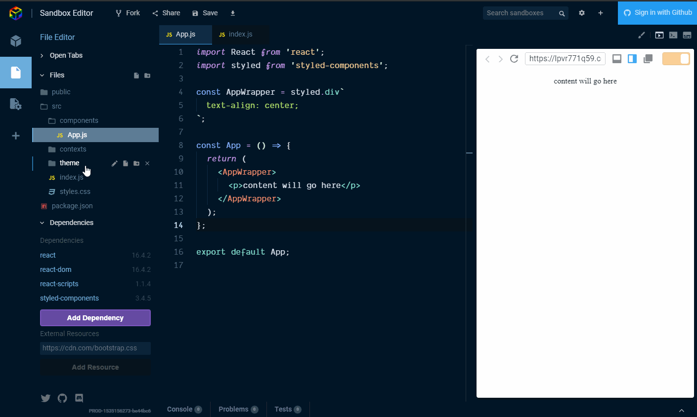
AppWrapper is the top level wrapper which in a larger component could be used for layout with CSS Grid or Flexbox, in our case we're going to align the text center.

Straightforward enough, right? Now the majority of the rest of the components will use the styled-components ThemeProvider which is what we're going to pass our theme to from the Context API.
Add themes to switch between with the React Context API
Ok, we need to define some themes to pass to the ThemeProvider, we're going to define several theme aspects we want to change, these are going to be:
primary; // colour
secondary; // colour
danger; // colour
fontHeader; // font
fontBody; // font
Create a file to contain the theme object in the theme directory and call it globalStyle.js and add in the following:
import { injectGlobal } from 'styled-components';

export const themes = {
  theme1: {
    primary: '#ff0198',
    secondary: '#01c1d6',
    danger: '#e50000',
    fontHeader: 'Old Standard TT, sans, sans-serif',
    fontBody: 'Nunito, sans-serif',
  },

  theme2: {
    primary: '#6e27c5',
    secondary: '#ffb617',
    danger: '#ff1919',
    fontHeader: 'Enriqueta, sans-serif',
    fontBody: 'Exo 2, sans, sans-serif',
  },

  theme3: {
    primary: '#f16623',
    secondary: '#2e2e86',
    danger: '#cc0000',
    fontHeader: 'Kaushan Script, sans, sans-serif',
    fontBody: 'Headland One, sans-serif',
  },
};

injectGlobal`
  @import url('
    https://fonts.googleapis.com/css?family=
    Old+Standard+TT:400,700|
    Nunito:400,700'|
    Enriqueta:400,700|
    Exo+2:400,700|
    Kaushan+Script:400,700|
    Headland+One:400,700|
  ');

  body {
    padding: 0;
    margin: 0;
  }
`;
Ok, so nothing really happening there apart from setting up the styles for use later.
You will notice that injectGlobal is being used here, this is where we're setting the fonts for use throughout the app, injectGlobal should be used once in an app to set global styles like this.
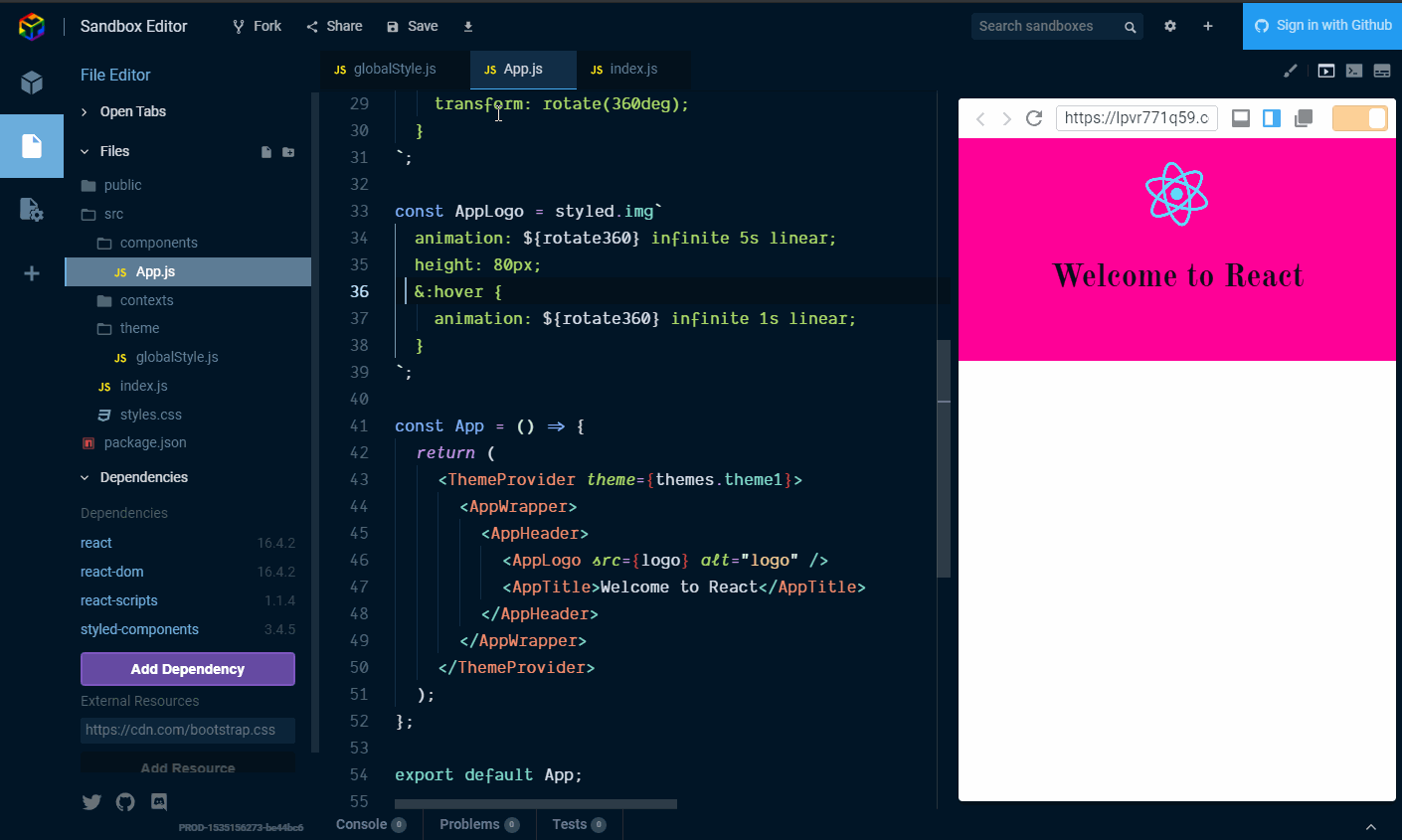
Onwards! Let us now focus on getting the basic app styles into the App.js component. We can now start using the ThemeProvider in App.js. To do this, for now, to get some visual feedback we're going to apply one of the themes from the themes object in globalStyle.js this is so, as we are adding in components we can see the theme being applied.
We can do this now with the AppHeader which is a styled div:
const AppHeader = styled.div`
  height: 12rem;
  padding: 1rem;
  color: ${({ theme }) => theme.dark};
  background-color: ${({ theme }) => theme.primary};
`;
You will notice here that we're beginning to use the styled-components, theme props but, if we paste this code in now there won't be any change until the ThemeProvider is passed the theme object so we're going to wrap App.js with the ThemeProvider component so that any component encapsulated by the ThemeProvider is able to receive theme props.

AppTitle is going to be a h1 so:
const AppTitle = styled.h1`
  font-family: ${({ theme }) => theme.fontHeader};
`;
For the spinning React logo we can use the asset used previously in the styled-components getting started example
We can add it in with the imports at the top of the App.js component and add it into the AppLogo styled component as an img tag:
const logo = `https://user-images.githubusercontent.com/
    234708/37256552-32635a02-2554-11e8-8fe3-8ab5bd969d8e.png`;
The keyframes helper will need to be imported alongside the ThemeProvider for the animation on the react logo.
const rotate360 = keyframes`
  from {
    transform: rotate(0deg);
  }
  to {
    transform: rotate(360deg);
  }
`;

const AppLogo = styled.img`
  animation: ${rotate360} infinite 5s linear;
  height: 80px;
  &:hover {
    animation: ${rotate360} infinite 1s linear;
  }
`;

Shared components
Shared components are covered in the styled-components getting started guide if you need more information, for this example we're going to bring in the final couple of components as shared ones for the StyledHyperLink and Button in src/Shared.js add the following:
src/Shared.js
import styled, { css } from 'styled-components';

export const Button = styled.button`
  padding: 0.5rem 1rem;
  margin: 0.5rem 1rem;
  color: ${({ theme }) => theme.primary};
  font-size: 1rem;
  box-shadow: 0 3px 5px rgba(0, 0, 0, 0.1);
  cursor: pointer;
  border: 2px solid ${props => props.border};
  background-color: Transparent;
  text-transform: uppercase;
  border-radius: 4px;
  transition: all 0.1s;
  &:hover {
    transform: translateY(1px);
    box-shadow: 0 2px 3px rgba(0, 0, 0, 0.15);
  }
  ${props =>
    props.primary &&
    css`
      background: ${({ theme }) => theme.primary};
      border: 2px solid ${({ theme }) => theme.primary};
      color: white;
    `};
  ${props =>
    props.danger &&
    css`
      background: ${({ theme }) => theme.danger};
      border: 2px solid ${({ theme }) => theme.danger};
      color: white;
    `};
  &:hover {
    transform: translateY(2px);
    box-shadow: 0 2px 3px rgba(0, 0, 0, 0.15);
  }
`;

export const StyledHyperLink = styled.a`
  cursor: pointer;
  &:visited,
  &:active {
    color: ${({ theme }) => theme.primary};
  }
  &:hover {
    color: ${({ theme }) => theme.secondary};
  }
  color: ${({ theme }) => theme.primary};
`;
Then import the components like any other:
The last three components for now, AppIntro, Underline and StyledHyperLink:
const AppIntro = styled.p`
  color: ${({ theme }) => theme.dark};
  font-size: large;
  code {
    font-size: 1.3rem;
  }
  font-family: ${({ theme }) => theme.fontBody};
`;

const Underline = styled.span`
  border-bottom: 4px solid ${({ theme }) => theme.secondary};
`;

const StyledHyperLink = SHL.extend`
  text-decoration: none;
  font-family: ${({ theme }) => theme.fontBody};
  color: ${({ theme }) => theme.fontDark};
`;

Add them in under the AppLogo styled component and then we can add the rest of the components into the App function return, so, ready for another copy pasta? Here:
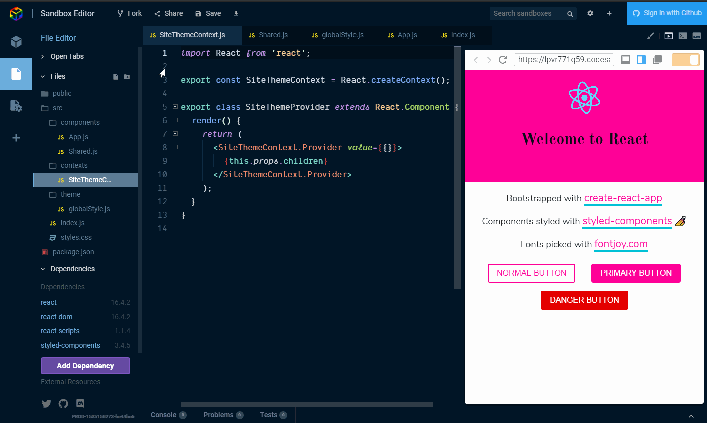
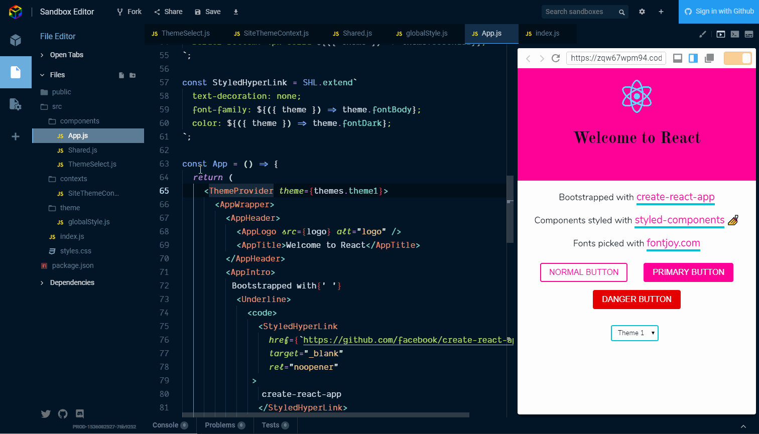
<AppIntro>
  Bootstrapped with{' '}
  <Underline>
    <code>
      <StyledHyperLink
        href={`https://github.com/facebook/create-react-app`}
        target="_blank"
        rel="noopener"
      >
        create-react-app
      </StyledHyperLink>
    </code>
  </Underline>.
</AppIntro>
<AppIntro>
  Components styled with{' '}
  <Underline>
    <code>
      <StyledHyperLink
        href={`https://www.styled-components.com`}
        target="_blank"
        rel="noopener"
      >
        styled-components
      </StyledHyperLink>
    </code>
  </Underline>{' '}
  <span role="img" aria-label="nail polish">
    ?
  </span>
</AppIntro>
<AppIntro>
  Fonts picked with{' '}
  <Underline>
    <code>
      <StyledHyperLink
        href={`https://fontjoy.com/`}
        target="_blank"
        rel="noopener"
      >
        fontjoy.com
      </StyledHyperLink>
    </code>
  </Underline>
</AppIntro>
<Button>Normal Button</Button>
<Button primary>Primary Button</Button>
<Button danger>Danger Button</Button>
Sorry for the code wall! Right paste that in under the closing </AppHeader> tag and we should have the base of what we're going to theme!

Ok? How's it looking?
Now we have a basic React app that uses styled-components!
Use the React Context API
Now for the main event! Here we're going to cover:
Making the theme context.
Using the context API with a component.
Consuming the Context API in multiple components.
So, passing state needlessly through components is what we can use the Context API to avoid. If we take a look at the styled-components getting started example we can see the state being managed in the App.js component and the handleThemeChange function has to be passed to the ThemeSelect component much the same way as any props would need to be passed down. That is a simplified example but it's quite easy to imagine if that component lived on a footer component or a menu item there would be several other components that would need to have the state passed through them that would not actually need that state or props. Make sense?
example
<App>               {/* state begins here */}
  <Header>          {/* through here */}
    <Navigation>    {/* and here */}
      <ThemeSelect> {/* to be used here */}
    </Navigation>
  </Header>
  <Footer/>
</App>
Add the site theme context
In our src/contexts/ directory we're going to make our SiteThemeContext.js, import React and define and export our context:
import React from 'react';

export const SiteThemeContext = React.createContext();
So what is a context?
A context is made up of two things, a provider and a consumer, you have a single provider which will sit up as high as possible in the component tree so that multiple consumers can get the state and props from the provider.
Hopefully you recall the point at which we abstracted the function App component out of the src/index.js file, this is so we could add in the context provider at the highest level of the app, in the src/index.js file. This means that any consumer within the app, no matter how deep into the component tree it is, it can get the state and props from that top level.
Now to create a provider, the provider is a regular React component, so:
import React from 'react'
export const SiteThemeContext = React.createContext()
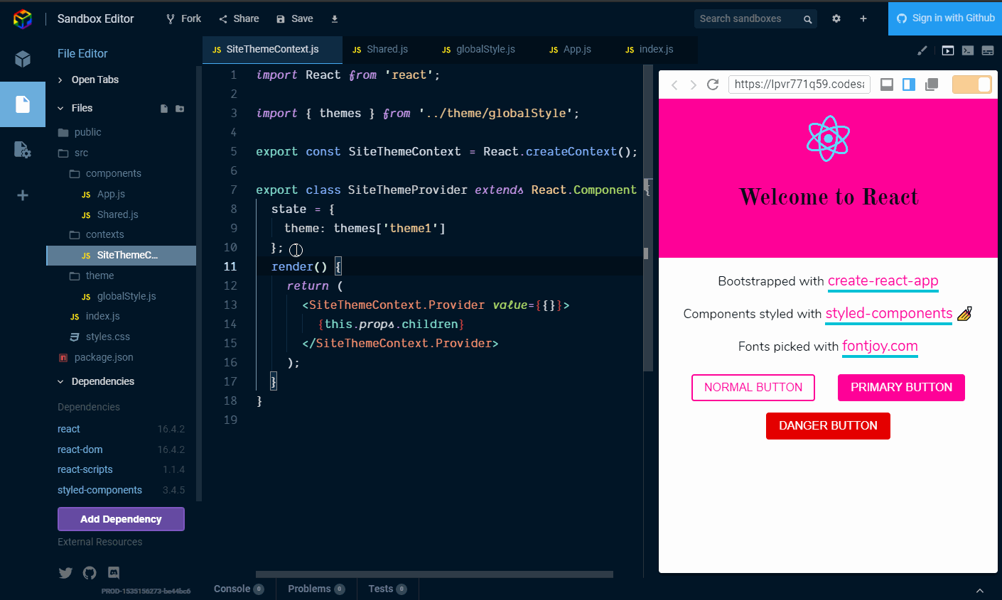
export class SiteThemeProvider extends React.Component {
render() {
return (
<SiteThemeContext.Provider value={}>
{this.props.children}
</SiteThemeContext.Provider>
)
}
}
What is being returned by <SiteThemeProvider> is the <SiteThemeContext.Provider> and the children of that component, the one prop you have to provide the the provider is a value prop. This is the variable that the consumer has access to. The consumer being <SiteThemeContext.Consumer> (more on this shortly).
So what we can do now is have what is passed into value be an object value={{}} so it can store multiple properties of the state and the functions that are defined in SiteThemeContext.
The state for the context needs to be the theme so we need to import the theme from src/theme/globalStyle and add that to the state, we're going to default the theme (and state) to theme1 and add a copy of that into the value prop by spreading into state ...❤️, it should look like this:
import React from 'react';
import PropTypes from 'prop-types';

import { themes } from '../theme/globalStyle';

export const SiteThemeContext = React.createContext();

export class SiteThemeProvider extends React.Component {
  state = {
    theme: themes['theme1'],
  };

  render() {
    return (
      <SiteThemeContext.Provider
        value={{
          ...this.state,
        }}>
        {this.props.children}
      </SiteThemeContext.Provider>
    );
  }
}
Ok, it's been a while since I've added a gif, time for another one!

And bring in the themes and add state:
Now we can add in a function to the provider to change the theme state based on what has been selected via the handleThemeChange event value:
handleThemeChange = e => {
  const key = e.target.value;
  const theme = themes[key];
  this.setState({ theme });
};
This can then be consumed by any provider that wants to use it, we're going to need to add it into the value prop, like this:
import React from 'react';
import PropTypes from 'prop-types';

import { themes } from '../theme/globalStyle';

export const SiteThemeContext = React.createContext();

export class SiteThemeProvider extends React.Component {
  state = {
    theme: themes['theme1'],
  };

  handleThemeChange = e => {
    const key = e.target.value;
    const theme = themes[key];
    this.setState({ theme });
  };

  render() {
    return (
      <SiteThemeContext.Provider
        value={{
          ...this.state,
          handleThemeChange: this.handleThemeChange,
        }}>
        {this.props.children}
      </SiteThemeContext.Provider>
    );
  }
}
Ok, that is the site theme context component covered, pretty straight forward, right?
What I should mention is that the e in the handleThemeChange function is going to be the event from the theme select box that we're about to make.
Let's go through adding in the function and adding that to the state:
And now we can add the theme provider to src/index.js so anything lower in the dependency tree can access it via a consumer.

Add the theme select
Now we want a want to call the handleThemeChange function that is part of the SiteThemeProvider via the SiteThemeContext! I'm sure this all making perfect sense right now (?) so let's get right in there and define the component that we're going to use to consume the SiteThemeContext.Provider with a ThemeSelect component!
In the src/components directory add a new ThemeSelect.js component, this is where we are going to consume the site theme context with a consumer.
The child of a consumer isn't a component it's a function, so what we're going to need to do is have the theme select inside the return of that function.
Let's first set up the styled-components that will make up the select, which is a select box, some options and a wrapper.
First we'll do it without the consumer then we'll add it in.
ThemeSelect.js
import React from 'react';
import styled from 'styled-components';

import { themes } from '../theme/globalStyle';

const SelectWrapper = styled.div`
  margin: 0rem 0.5rem 0rem 0.25rem;
  padding: 0rem 0.5rem 0rem 0.25rem;
`;

const Select = styled.select`
  margin: 1.5rem 0.5rem;
  padding: 0.25rem 0.5rem;
  font-family: ${({ theme }) => theme.fontBody};
  border: 2px solid ${({ theme }) => theme.secondary};
  box-shadow: 0px 0px 0px 1px rgba(0, 0, 0, 0.1);
  background: ${({ theme }) => theme.foreground};
  border-radius: 4px;
`;

export const SelectOpt = styled.option`
  font-family: ${({ theme }) => theme.fontBody};
`;

const ThemeSelect = props => {
  return (
    <SelectWrapper>
      <Select>
        {Object.keys(themes).map((theme, index) => {
          return (
            <SelectOpt key={index} value={theme}>
              Theme {index + 1}
            </SelectOpt>
          );
        })}
      </Select>
    </SelectWrapper>
  );
};

export default ThemeSelect;

So from this we can list the this themes available to us in the themes object. But that's it, the function to handle the theme change lives on the SiteThemeProvider.
Back to the SiteThemeContext.Consumer as I mentioned earlier the child of a consumer is a function () => () the first section is the value from the provider (<SiteThemeContext.Provider>) so let's take a quick look at what we've previously defined in the provider:
value={{
  ...this.state,
  handleThemeChange: this.handleThemeChange
}}
Available from SiteThemeContext.Provider is the state and a function so any of those items we can extract and pass to the provider, or to put it another way the consumer can access those values.
Here we can use destructuring to pull the handleThemeChange function we need to change the theme.
import React from 'react'

import { SiteThemeContext } from '../contexts/SiteThemeContext'

const ThemeSelect = props => {
  return (
    <SiteThemeContext.Consumer>
      {({ handleThemeChange }) => ()}
    </SiteThemeContext.Consumer>
  )
}

export default ThemeSelect
Currently this isn't going to change the theme because we have that hardcoded into the styled-components ThemeProvider, what we want to do is use a consumer for the currently selected theme in the SiteThemeContext.
Before that we'll also need to add in the onChange event we want to use to pass the event (e) to the handleThemeChange function on SiteThemeContext.
Then in the App component we can import our <SiteThemeContext.Consumer> to consume the theme on the SiteThemeContext state and pass that to the styled-components ThemeProvider.
Want to know more?
As mentioned at the start of this article a great resource is @leighchalliday and his YouTube channel where you can find his great usecase for the React Context API.
There's also the React community on spectrum and styled-components on spectrum.
Example code of the walkthrough is available on CodeSandbox.
Thanks for reading
If there is anything I have missed, or if there is a better way to do something then please let me know.
Follow me on Twitter or Ask Me Anything on GitHub.
You can read other articles like this on my blog.