
By Gilad Dayagi
Styled-components is a library for styling React components that took the React world by storm when it was introduced at the end of 2016. The library is powerful and flexible. And solves most of the problems that classic CSS has in the so-called Component Age.
In this post, I’ll look into one aspect of styling components:
How to implement a component that can have multiple visual variants.
And I’ll show you three different ways to achieve this using styled-components, which I call:
1: The Classic Approach
2: The Component Approach
3: The Extending Approach
I’ll assume some knowledge of React and styled-components. But in case you need a reference, both have excellent documentation. You can find React’s docs here and styled-component’s here.
You can see a live demo of each approach here.
Visual variants
In React, a component translates state and props into a visual representation. This usually means into a DOM element.
And sometimes you need a component to switch between several visual states, depending on certain conditions. Meaning you need the component to change, perhaps, color to convey different information. For example:
- A button can be normal, primary, secondary, disabled, etc.
- A list item can be selected or not selected.
- A form element can be required, with error or normal.
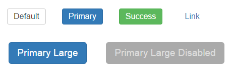
A good example of this visual variant pattern is Bootstrap’s button styles. You style the button independent of its content and choose among a host of variants. And each variant of the button serves its own semantic purpose (like success or disabled) as opposed to appearance (like blue, round, etc.).
So how do you implement visual variants with styled-components? You can do so using the Classic Approach, Component Approach, or Extending Approach.
#1: The Classic Approach
Styled-components fully supports CSS. Which includes the ability to apply style rules to “subclasses” of elements. That means you can create visual variants using CSS classes not so different from how it’s done with plain CSS.
To select a variant of a component you modify the className prop. You can also pass a number of classes this way and combine several variants, say, ‘primary’ and ‘large’.
Example
// ButtonClassic.jsximport styled from 'styled-components'
const ButtonClassic = styled.button` background: #fff; color: #333; font-size: 1em; margin: 1em; padding: 6px 12px; border: 1px solid #ccc; border-radius: 4px; cursor: pointer;
/* Style sub-classes */ &.primary { color: #fff; background: #337ab7; border-color: #2e6da4; } &.success { color: #fff; background-color: #5cb85c; border-color: #4cae4c; } &.link { color: #337ab7; background-color: transparent; border: none; border-radius: 0; font-weight: 400; } &.large { font-size: 1.2em; padding: 10px 16px; border-radius: 6px; } &.disabled { color: #ddd; background-color: #aaa; border: 1px solid #aaa; }`;
export default ButtonClassic
Usage
// ... <ButtonClassic>Default</ButtonClassic><ButtonClassic className="primary">Primary</ButtonClassic><ButtonClassic className="success">Success</ButtonClassic><ButtonClassic className="link">Link</ButtonClassic>
// With Combos<ButtonClassic className="primary large"> Primary Large</ButtonClassic>
<ButtonClassic className="disabled primary large"> Primary Large Disabled</ButtonClassic>
Pros
- Easy to support several variants.
- Easy to combine a list of variants (for example, primary + large + disabled)
- Code is readable and compact
- Easy to port styles from plain CSS
Cons
- Doesn’t use standard component facilities (props)
- When combining classes, results depend on the declaration order of the style rule. Like in classic CSS. This may lead to unexpected behavior.
#2: The Component Approach
Styled components, like their name suggest are simply normal components. Which means they can receive props. Props that can be accessed in the style declaration and used to determine values for style rules.
I call this the Component Approach because it works like how usual React components work. Where prop values are used to calculate the visual representation of the component. In this case, the concept is limited to styling, rather than content.
Example
// ButtonComponent.jsx import styled from 'styled-components'
const ButtonComponent = styled.button` background: ${props => props.primary ? '#337ab7' : '#fff'}; color: ${props => props.primary ? '#fff' : '#333'}; font-size: 1em; margin: 1em; padding: 6px 12px; border: ${props => props.primary ? '1px solid #2e6da4' : '1px solid #ccc'}; border-radius: 4px; cursor: pointer;`
export default ButtonComponent
Usage
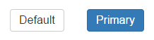
// ...<ButtonComponent>Default</ButtonComponent><ButtonComponent primary={true}>Primary</ButtonComponent>
Pros
- Standard React component behavior, deriving visual representation from props
Cons
- If more than two states are needed, the code can become unreadable
- There is some code repetition, especially if many rules differ between variants.
#3: The Extending Approach

Besides primitive elements, styled-components allows us to also style custom components. So you can re-style a base or default component. And override relevant style rules to create a visual variant.
Example
// ButtonExtend.jsximport styled from 'styled-components'
const ButtonExtend = styled.button` background: #fff; color: #333; font-size: 1em; margin: 1em; padding: 6px 12px; border: 1px solid #ccc; border-radius: 4px; cursor: pointer;`
export default ButtonExtend
export const ButtonExtendPrimary = styled(ButtonExtend)` color: #fff; background: #337ab7; border-color: #2e6da4;`
export const ButtonExtendSuccess = styled(ButtonExtend)` color: #fff; background-color: #5cb85c; border-color: #4cae4c;`
export const ButtonExtendLink = styled(ButtonExtend)` color: #337ab7; background-color: transparent; border: none; border-radius: 0; font-weight: 400;`
Usage
// ...<ButtonExtend>Default</ButtonExtend><ButtonExtendPrimary>Primary<;/ButtonExtendPrimary><ButtonExtendSuccess>Success</ButtonExtendSuccess><ButtonExtendLink>Link</ButtonExtendLink>
Pros
- Each variant is a separate component
- Easy to have many variants
- Code is very readable
Cons
- To get a different variant, a different component needs to be rendered vs changing a property on the same component which might be more cumbersome.
- Can’t easily support combining multiple variants.
Summary
I have listed all the ways for doing visual variants that I had a chance to try, but there might be others. Which approach is best depends on your specific needs and preferences.
If you missed the link above, a live demo of the code examples is available in this webpack bin.
If you know of other approaches using styled-components, let me know in the comments below.
Update (Jun 9 2017)
Styled-components V2 was released a few days ago with a slightly better way to use the Extending Approach.
There is now a specific function for this approach named [extend](https://www.styled-components.com/docs/basics#extending-styles). The function is like the original method, but under the hood creates a new stylesheet by extending the old one. And thus doesn’t generate two classes.
So the original example for the Extending Approach, would look something like this:
// ButtonExtendV2.jsximport styled from 'styled-components'
const ButtonExtendV2 = styled.button` background: #fff; color: #333; font-size: 1em; margin: 1em; padding: 6px 12px; border: 1px solid #ccc; border-radius: 4px; cursor: pointer;`
export default ButtonExtendV2
export const ButtonExtendV2Primary = ButtonExtendV2.extend` color: #fff; background: #337ab7; border-color: #2e6da4;`
export const ButtonExtendV2Success = ButtonExtendV2.extend` color: #fff; background-color: #5cb85c; border-color: #4cae4c;`// ...