
By Chris Lee
Picture Jon. Jon is a first adopter for a startup that’s trying to design a better way to roast salmon using a toaster oven. He’s smart, 35, and a working professional. He spends his evenings answering work emails and watching Dora the Explorer with his two young daughters.
Now, as the designer working for that startup, your task is simple: make his salmon roasting experience out-of-this-world-amazing. What do you do?
Two approaches to design
The first answer for designers is usually to jump right in and do research. That’s not the wrong answer! Interview Jon. Ask him about his salmon preferences. Does he like it overcooked or undercooked? How big of a filet does he like to roast for dinner? How often does his family eat salmon? Do his daughters ever complain that the salmon is too thick, thin, salty or bland?
All good questions, all good insight. But there comes a critical junction in the decision making process of the designer. Once he or she is armed with the knowledge and context of the Job to be Done, the question is:
Do I know enough about the user to prescribe what I believe will be an ideal experience?
1. The prescriptive approach
Many times the designer will answer yes. What results is a toaster oven that is so perfectly tailored to one specific use case that any deviance in the user’s needs or wants results in a catastrophic failure. Jon said he wanted slightly overcooked salmon because his daughters were afraid of raw meat!
Then he had a date night alone with his wife. He found that chewing salmon-rubber for two hours didn’t make for a splendid evening. Even when paired with a nice Chardonnay.
Sure, any designer in their right mind would have realized that the user has different preferences for different situations. Designers would never design a toaster oven that tries to prescribe “the best” process.
And yet, that’s what they did — cue the $1500 toaster oven. There were many technical problems with the product as well. But I would argue that the largest issue was simple: designers assumed they knew exactly what users wanted.
“Automated yet distracting. Boastful yet mediocre. Confident yet wrong.” — Mark Wilson, Fast Company
It’s the user’s fault!
You could say that it’s almost the user’s fault. Jon said he wanted it slightly overcooked, so that’s what he got. And yet, Jon found that he’d said something that he later realized he didn’t mean. Users aren’t omniscient. They can and will emphatically declare things that simply aren’t true, even about their own habits.
Not only that, but as you talk to more and more people, there are many cases where their Jobs to be Done vary a little. Make the definitive claim that a prescriptive approach is best. But you had better be damn sure that you really do have enough insight into their needs and wants.

The problem is, if a user can’t use it they won’t. If you ask your users to read a 500 page manual to use a toaster, they might choose not to purchase it because it’s too difficult to understand. So who’s loss is it?
Sometimes we all need a bit of a reality check. Designers need to acknowledge what they don’t know (which is a lot) and flag that as a risk to be mitigated.
Once you peg an assumption as risky, you can design around it. The danger lies in being “pretty sure” and filling in the gaps. But sometimes there’s nothing to suggest you should actually fill them.
That’s why Eric Ries (The Lean Startup) favors testing & measuring user behaviors to see if they want something, rather than asking.
When use cases are clear, we can tailor a specific flow that’s optimized for those folks. We are confident that we know what those cases are and what percent of the population they represent. Otherwise, there’s another approach.
2. The platform approach
In economics 101 there’s a concept known as price discrimination. It sounds complicated, but it’s not. All it really means is that companies can make the most money if they charge customers exactly the maximum they’d be willing to pay. There are various ways of going about doing this, of course. Car salesman use first degree price discrimination. They haggle with you until both of you agree on a price and are red in the face. In this case, the salesman figured out exactly the most you were willing to pay. Then he gave you a great offer to match.
There’s a problem with first degree price discrimination. It relies on the company’s knowledge of exactly what their customers are willing to pay. What happens if they don’t know? Here’s where 2nd and 3rd degree discrimination comes in.
Companies can set the price too high and lose you as a customer (and receive a total of $0). Or, they can put out different kinds of offers to let the user determine what they want. For example, airlines had a hunch that there were a group of users who had more money and were willing to spend more for nicer seats. Hence, they offered business class.
All of a sudden, customers can self-select into what’s ideal for them. Take the sale of toilet paper as an example. Does Charmin know exactly how much toilet paper different people need? Nope. But they have a 6-pack, 12-pack, and sometimes even a 48-pack (my favorite). Whichever category their customer fits into, they’ve got something for them.
Don’t know what users want? No problem.
Sound familiar? The key is for the designers to admit what they don’t know. Because once you do that, you can then design around it.
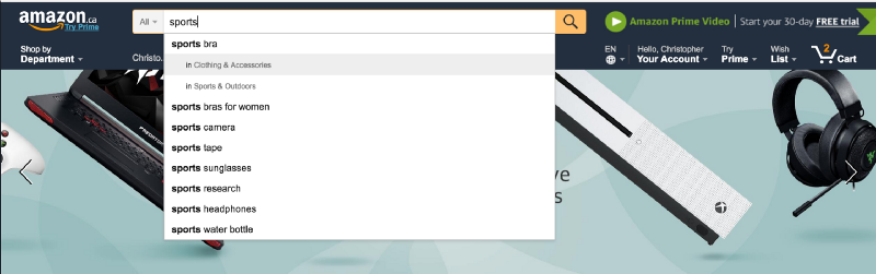
Case in point: search results. This design pattern is really prevalent if you think about it. The inherent nature of search is that we have a general idea of what the user wants, but nothing specific. So the smart designer should use the platform approach. Provide a bed of utility that the users can self-select into. Go to any e-commerce site and test out their search.
Remember the story about the pitfalls of interviewing users? Actions speak louder than words. What better way to know if Jon really wants his salmon overcooked than by giving him multiple options? Push him to self-select into the option he wants as early as possible in his salmon-roasting journey. Then, once he has categorized himself, prescribe the solution.
A note of caution
The toaster oven example is a very obvious one. A regular toaster oven gives us all the cooking options we could ever want. Designers realize they have no idea which one we would need and when.
We laugh and dismiss it as an amateur mistake, but I can’t stress enough how often this point of judgement surfaces.
A few years ago I designed an app that helped grocery shoppers figure out what to buy. All the user had to do was select preferences like how many meals they wanted and what cuisines they liked. Then the app would spit out a set of recipes that all shared similar ingredients, telling you how much of each to buy. It sounded great on paper. You could even swipe to replace recipes on that list, and the new recipe would still share the same ingredients for efficient shopping.
But again, the app was too prescriptive. I kept tunneling in on designing the ideal experience for the ideal user. But I lost sight of the degree of variance that came with all the user interviews I was conducting.

As a result, I designed an inflexible system. Users would have a great time until some small deviation in their plan happened. This would render the app too difficult to use.
For example, after a user had found the 5 recipes they wanted to cook this week, a friend might call and ask them out to dinner on Wednesday. The user would then have to start the process from scratch. That just wasn’t something I discovered during the preliminary user interview.
Designers, beware the age of automation
If you read the headlines of technology today, you’re likely to come across buzz terms like “machine learning”, “AI”, and “bots.” Technology is incredibly powerful. Everyone is giddy with excitement considering all the value that can be added to people’s lives.
While engineers and business people fawn over the amazing ways to automate life, designers need to be the voice of caution. Do we really know exactly what users want to the point where we can automate it? Or is a platform approach better, letting the user self-select the value they want, and we take it from there? It’s easy to fall into the trap of throwing around a powerful weapon like machine learning without knowing where to point it. In a likely scenario, we’ll end up wasting time, money, and human effort on something that should be left to the user.
I always preferred my salmon pan fried anyway.
If you enjoyed the post, I’d really appreciate it if you clicked clap button below. Follow me for more thoughts on design, life, and startups. And remember, the 48-pack toilet paper rolls are always the best deal.
If I haven’t exhausted your design-reading quota for today, check out “3 principles that all fields of design have in common”.