
By Andrej Kovacevic
If you're a beginner developer, it can be difficult to find ways to use your limited knowledge to support yourself. And at the same time, you won't be able to hone your skills if you aren't using them full time.
It's a precarious spot that I remember being in when I was starting out (much longer ago than I care to admit).
And if you're anything like me, you'll probably end up taking on freelance web development work to make ends meet. This is especially useful if you're focused on expanding your knowledge of languages like Python and Java.
But if you're inexperienced, there's a good chance you're going to need to start with web designs for individuals or small companies – at least until you have a decent portfolio that can lure in bigger clients.
The trouble is, smaller clients often will want you to do things that – for lack of better terms – are unusual at best and simply wrong at worst. And while you will earn some money doing it, you won't end up with anything you'd really want to show to other potential clients.
So, even if it costs you some work early on, you should take the time to set some standards for yourself.
And the best place to start is by understanding what the current best practices are in web design in 2021. If you commit to only taking on work that conforms to them, you'll always end up with something worth showing off that will land you bigger clients.
Here are some of the most important of those best practices.
Create Responsive Designs
If there's only one best practice that you stick to when beginning your coding journey, let it be this one: go for jobs that call for responsive designs. There are so many reasons for this – but I'll try to pick out the most relevant among them.
First, every major web design client you'll want to impress later in your career is going to want a responsive site. In today's multi-screen, multi-device world, responsive sites just work better in most cases than static sites.
If a client asks you to build a static web page, they're really looking for an electronic billboard. And in terms of your portfolio, you'd get the same benefit from mocking up a page design in Photoshop as you would from building that static page.
These days, businesses can design a responsive website by using simple WYSIWYG editors, which tells you how much of a standard they've become. And there's a very good reason for that.
The name of the game in web design today is user experience. A high-quality website delivers a similar user experience on all platforms. It's good for branding, it's good for usability, and it's good for retention.
Plus, it's a great way to show off your understanding of how to create a cohesive structure and look. Consider Dropbox's homepage design from a few years ago:
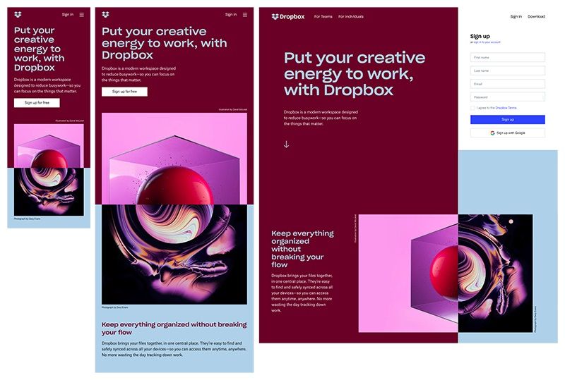
It makes great use of the space it has on each screen type. And if you have designs like this one in your portfolio, it will communicate to potential clients that you know what you're doing and can be trusted to take care of their brand.
Use Intuitive Navigation
Inexperienced web designers often want to reinvent the wheel. And the first place that impulse usually finds expression is in page navigation.
That's because it's the one area of website design that seems like it offers some room for creativity. And in truth, that's not untrue.
Really – just take a look at this compilation of award-winning websites with unusual navigation structures. I'll be the first one to admit that some of the sites featured there are beautiful. Even captivating. And I've worked on my fair share of sites like that in the past.
But do you know how many of them I can still show off to potential clients? None of them.
That's because sites like those will make a nice big splash on launch day and then have to be replaced once real people start using them.
There are good reasons why big, well-known sites like Amazon use such simple – and dare I say, boring – navigation elements. They get the job done and they're easy to comprehend at a glance.
For example, check out this screenshot of the website for The University of Advancing Technology circa 2014:
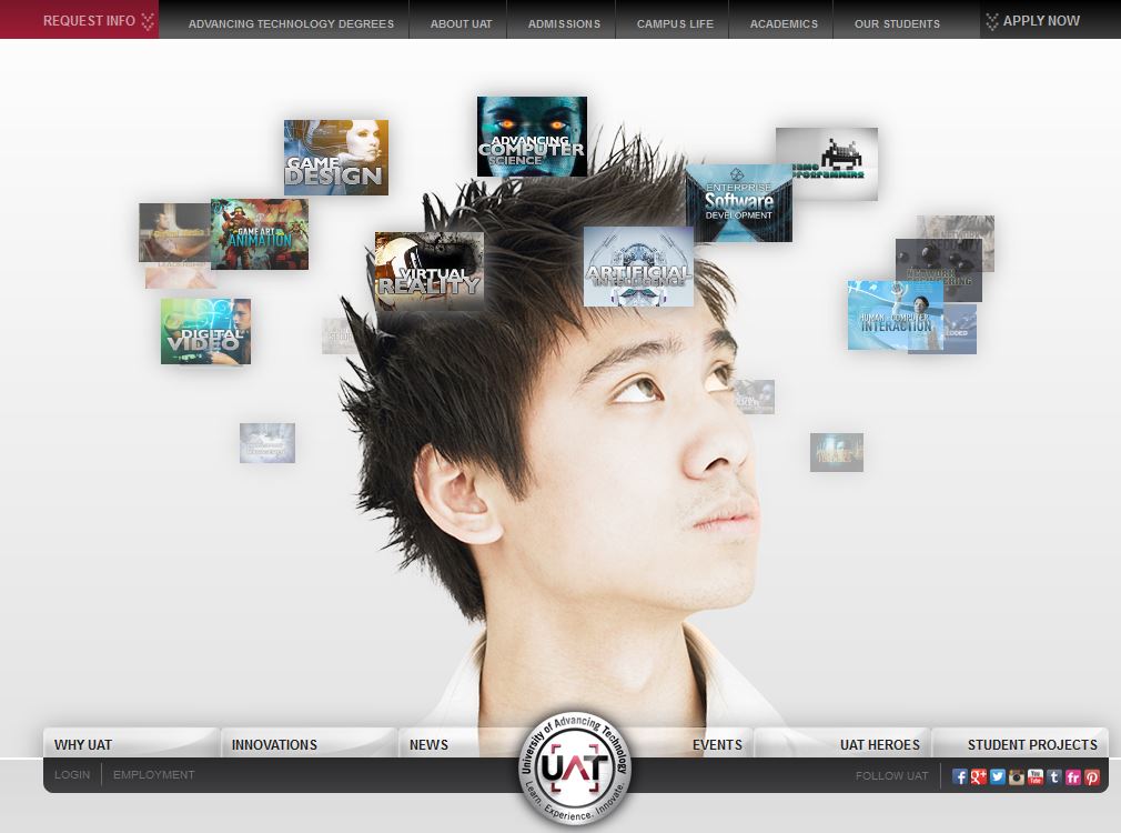
At first glance, it looks like a clever use of imagery to depict the ways that the school might develop its students' minds.
But those floating images over the head of the student are links – and that's a major problem. They're irritatingly hard to read, and the average visitor wouldn't even think to click on them.
Then, you'll also notice two competing top and bottom menus that don't seem to follow any clear information structure.
Fortunately, the school learned its lesson and updated its design. If you visit the school's website today, you'll notice they've made significant navigational changes.
For one, they've condensed the menu into a single, easy-to-spot hamburger in the lower-left corner. It's immediately visible when you reach the page, and clicking it opens up a hierarchical menu that follows a perfect logical structure.
It's an excellent example of a navigational structure that will feel familiar to anyone that visits.
And if you want to replicate it in your own work, consider using a tool like Optimal Sort that will let you test out your navigation logic before you commit to anything. They even offer a free tier that will let you create up to twenty navigation cards, which is perfect for small web projects.
Find a Balance Between High-Tech and Human
This next best practice is one that's bound to sound a bit confusing. It's that you should only build websites that strike an appropriate balance between technology and humanity.
To understand what I'm talking about, check out the website of the average SEO or marketing firm. You'll notice that you're being assaulted with pop-overs, calls-to-action, and interruptions aplenty.
And while modern analytics says those are great ways to get visitors to convert, they're also a recipe for cookie-cutter, robotic pages (development-wise) that won't stand out in your portfolio. Plus, they're pretty annoying to visitors.
So even if you do manage to create the world's most impressive version of a page like that, you wouldn't want to send a potential client through such a gauntlet to check out your work.
What you'll want to focus on is learning how to naturally integrate things like AI-powered chatbots into your designs because that's what big clients will look for when evaluating your work.
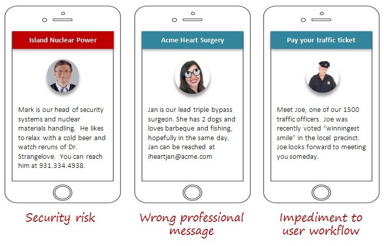
But to counter-balance the technology, you should also aim to weave humanizing elements into the pages you create.
An excellent way to do that is to try and include as many real photo and video elements as you can – and avoid stock photography if possible.
You'll also want to make the text elements of your pages as conversational as possible. The idea is to communicate to the visitor that the site represents real people looking to connect with them on an individual level.
But make sure you think through your efforts at humanizing your pages before you implement them. There's a time and a place for everything, and if you go too far, you can do more harm than good.
Pay careful attention to how the messages you send will sound to visitors. That way you can avoid conveying anything counterproductive.
If you can prove that you know how to seamlessly blend automation and assistive technologies into your designs while still putting humanizing elements first, you'll soon have new clients beating a path to your digital door.
Integrate Accessibility Features into Your Design
Although they're treated like an afterthought, accessibility features have become a major issue on the modern internet. By that, I mean that they're mostly nonexistent.
But it's not going to stay that way much longer. Decades of legal challenges finally resulted in a Department of Justice ruling that most business websites have to comply with the Americans With Disabilities Act. So there's about to be an accessibility reckoning online.
And you should prepare for that by insisting on including accessibility features in all your work.
First, this will make you stand out from the competition because not too many developers specialize in accessible designs. Plus, you'll be doing your part to make the internet a more inclusive place.
And you'll even get a leg up when the innumerable businesses that need to get into compliance go looking for help.
A great place to get started learning about this is by going through the W3C's tutorials on the subject. They include integration solutions for a variety of accessibility features, advice on building compliant pages, and reference materials containing relevant global standards (for when you land your first international customers).
And once you know how to include accessibility features, make it a point to include a testing process for the ones you deploy. It's something too many sites fail to do.
For example, try to use tab navigation on the Brit+Co website. You'll see that it appears to work – until the focus suddenly vanishes at random points in your navigation journey. There seems to be no way to access the search function or the more menu item. And that would make it impossible to use a keyboard to access the whole site.
Stick to Your Principles
The bottom line here is simple. When you're first getting started as a coder, your priority has to be building up an impressive resume as fast as possible. And if you insist on taking work that conforms to the above best practices, it won't take you that long to do it.
There will be temptations, though. And I'm not telling you to sacrifice putting food on the table for the sake of your principles. If a client comes along offering to pay you way more than their project is worth – go ahead and take the money even if you won't end up with a portfolio-worthy website.
But if you make a habit of seeking out high-quality work you will soon find that more lucrative clients will start finding their way to you.
In the end, that's going to let you build your coding skills faster and give you the freedom to take on bigger challenges because you won't be as worried about how you're going to pay your next rent bill. And that's not a bad place to be for any beginner.