
Microsoft Fabric is a data analytics tool that can help you streamline all your data needs and workflows, from data integration to analytics and engineering.
In this guide, I'll explain what Microsoft Fabric is in more detail, how it works, and walk you through building a project with it. If you already have an understanding of the platform, you can skip to the Microsoft Fabric project.
Here's what you'll learn about in this guide:
- What is Microsoft Fabric?
- Why you should learn about Microsoft Fabric
- Microsoft Fabric architecture and components
- How to get started by building a simple project
- How to create a workspace in Microsoft Fabric
- How to create a Lakehouse in Microsoft Fabric
- How to use Kaggle API data in Microsoft Fabric
- How to use the Data Wrangler in Microsoft Fabric
- How to perform customer segmentation in Microsoft Fabric
- How to visualize your lakehouse data in Power BI
Prerequisites
To follow along, you will need to have a Power BI license. You can get one for free to practice with using the Microsoft 365 Developer Program.
It would be also be helpful if you have knowledge of Microsoft Power BI and Python.
What is Microsoft Fabric?
Microsoft Fabric is an all-in-one analytics software-as-a-service (SaaS) platform for managing all your data analytics needs and workflows. Microsoft built this end-to-end platform to handle data-related data, from your data storage and migration to your real-time data analytics, data science projects, and data engineering workflow.
But how does it work?
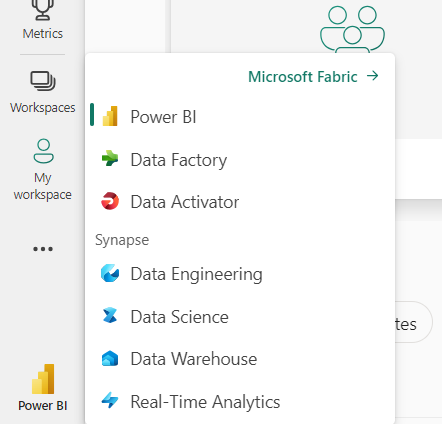
This tool brings together various new and preexisting data tools and technologies—Power BI, OneLake, Azure Data Factory, Data Activator, Power Query, Apache Spark, Synapse Data Warehouse, Synapse Data Engineering, Synapse Data Science, Synapse Real-Time Analytics, Azure Machine Learning, and various connectors.
Why You Should Learn About Microsoft Fabric
The best part of Microsoft Fabric is its simplicity in terms of functionality. Using various technologies together, you can do everything all in one place and focus more on what you can do with it and less on licensing, supporting systems, dependencies, and how to integrate with all these different platforms.
Another benefit of the platform is how it handles your data. This provides and allows you to maintain a single reliable source of information. With Microsoft Fabric’s OneLake, you can have a single, unified data storage.
Microsoft Fabric also has Azure’s OpenAI service integrated into its layer. This way, you can use AI (Co-pilot) to help you discover insights quickly.
Lastly, since it is an all-in-one platform, there is a cost-saving edge since there is no need to subscribe to multiple vendors.
Microsoft Fabric Architecture
Think of Microsoft Fabric as your data estate.
Just like every piece of real estate, Microsoft Fabric has various components in its architecture.
Let’s start by looking at the terminology you'll encounter and need to understand when using Microsoft Fabric's architecture:
Experiences and Workloads:
These refer to the various capabilities of the platform. Every experience on the platform is tailored with a specific user in mind.
Below are some examples of the various experiences/workloads available. You'll notice that each of them are built for a specific purpose, task, and user.
- Data factory: This application gives users over 150 connectors to Lakehouses, warehouses, cloud, and on-premise data sources and orchestrates data pipelines for data transformation. A Lakehouse here refers to a data platform for storing structured and unstructured data. You can also copy your on-prem data to the cloud and load it into OneLake through the Data Factory.
- Synapse data engineering is part of the data engineering experience on the platform. It has some cool features like Lakehouses, built data pipelines, and a Spark engine.
- Synapse data warehouse provides you with a unified and serverless SQL engine. Like your “traditional” data warehouse, you have the full capabilities of your transactional T-SQL features.
- Synapse real-time analytics allows you to stream data from Internet of Things (IoT) devices, telemetry, and logs. You can also use the workload here to analyze semi-structured data using its Kusto Query Language (KQL) capabilities, just like Azure Data Explorer.
- Synapse data science allows you to build, collaborate, train, and deploy fully scalable end-to-end Machine learning (ML) and AI models. You can also carry out your ML experiments in your notebooks and log your models using the Fabric Auto Logging feature. A must-mention tool in this experience is the Data Wrangler, a Fabric graphical user interface for data transformation. With this tool, you can clean your data by simplifying by clicking buttons while the tool automatically generates the Python code for you. It is similar to Power Query.
- Business Intelligence with Power BI helps you quickly turn your business data into insightful analytic reports and dashboards.
- Data Activator allows you to take care of your data observability and monitor workloads in a non-code/low-code way. This tells you when specific data points hit a threshold or match a pattern. You can also automate particular actions and kickoff Power Automates flows when specific conditions occur.
- Copilot in Fabric provides you with an Azure OpenAI Service. This means you can build reports, describe how you want to ingest your data, summarize, explore, and transform your data using the natural language capability of Azure OpenAI.
Workspaces
Workspaces are similar to Power BI’s workspace. Here, you can share and collaborate with others and create reports, Warehouses, Lakehouses, dashboards, and notebooks.
Capacity Unit (CU)
A CU is the ability of your resource to perform or produce an output.
Now we'll look at the various components of Microsoft Fabric's architecture.
OneLake
OneLake is the central data repository for Microsoft Fabric that stores the data in Delta Lake format. Think of it as OneDrive for your data. This repository allows you to explore and find data assets in your organization.
One exciting thing is Shortcuts, which allows you to share or point to data in other locations in OneLake without moving or duplicating the data. This removes any case of data redundancy.
Lakehouses vs Warehouses
While both "houses" hold data, some differences exist between Lakehouses and Warehouses in Microsoft Fabric.
For starters, a Lakehouse can store any data type, whether structured or unstructured. It is, however, stored in the Delta format by default. The Delta format is a storage layer that offers ACID (Atomicity, Consistency, Isolation, Durability) transactions. A Warehouse, on the other hand, is more suited for structured data.
Lakehouses also support Notebooks. So you can work with various languages from PySpark to SQL and R. Warehouses, on the other hand, only use SQL.
Keep in mind, though, that Fabric provides you with two types of Warehouses: SQL Endpoint and Synapse Data Warehouse.
- SQL Endpoint is auto-generated when a Lakehouse is created. This mean you can have a SQL-based experience and can query Lakehouse data using T-SQL language.
- Synapse Data Warehouse is more of your traditional SQL engine. So you can use it to create and query data out of OneLake.
How to Get Started With Microsoft Fabric – An End-to-End Project Example
To get a glimpse of how the Fabric platform works, we will build a little project.
We'll create a Lakehouse to store a mall dataset from Kaggle using the Kaggle API. We will also transform our data using Data Wrangler. Then, we will perform customer segmentation on our data based on the customer's annual income and spending score using the KMeans clustering algorithm. This will allow us to group the customers into various categories like low income earners that don't spend, average income earning customers, and high income customers who do not spend much.
Let's get started.
How to Enable Fabric
The first thing we need to do is to log into Microsoft Power BI. Here, we will activate Microsoft Fabric's capabilities for our workspace.
To do this, follow these steps:
First, navigate to the capacity settings in the admin portal. The admin portal is where administrators control and manage the various Power BI features.
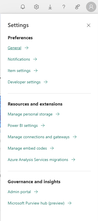
Then under the Tenant setting tab, look for Microsoft fabric tab.
Under that tab, enable the Users can create fabric items toggle to on. Once you've done that, select Apply.
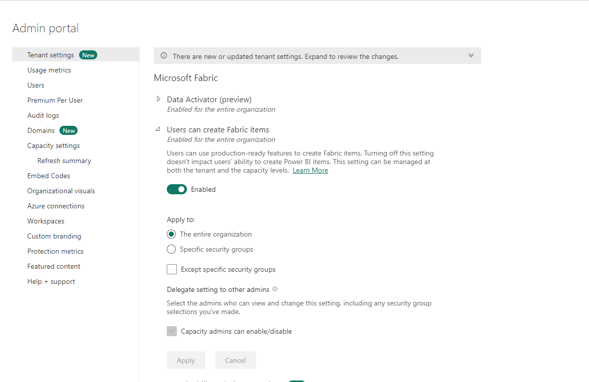
Now your environment will be set up and the various services should appear at the bottom left of your screen.
How to Create a Workspace in Microsoft Fabric
We'll use a mall customer segmentation dataset from Kaggle for this demo. This data, as mentioned in Kaggle, was created for the purpose of learning customer segmentation concepts.
Let's talk a little bit about the dataset. Imagine you have a supermarket mall and each customer has a membership card. You also have a data catalog of each customer with basic information like their customer ID, age, gender, annual income and spending score.
Now we want to segment these customer into various groups so we can improve customer loyalty, understand the customers better, and more effectively target our marketing strategy.
To achieve this, we will use the spending score assigned to each customer to define their purchasing power.
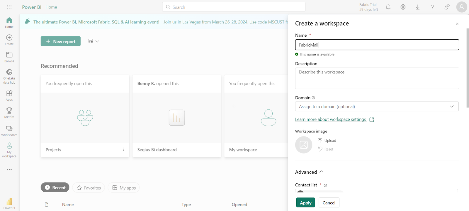
To get started, you'll need to create a new workspace. You can do that by following these steps:
- Head to your Microsoft Fabric home page.
- Select workspaces and click on New Workspace.
- Give your workspace a name – I'm calling mine FabricMall.
- Click on Advanced to view the dropdown options and select Trial if you are making use of your Fabric trial.
- Click Apply.
The next thing you want to do is to create a Lakehouse for your data.
How to Create a Lakehouse in Microsoft Fabric
To create a Lakehouse, first click on New within your workspace. This will display a list of various tasks you can do within your workspace.
Then select More options and select Lakehouse.
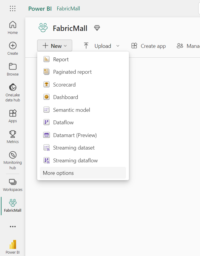
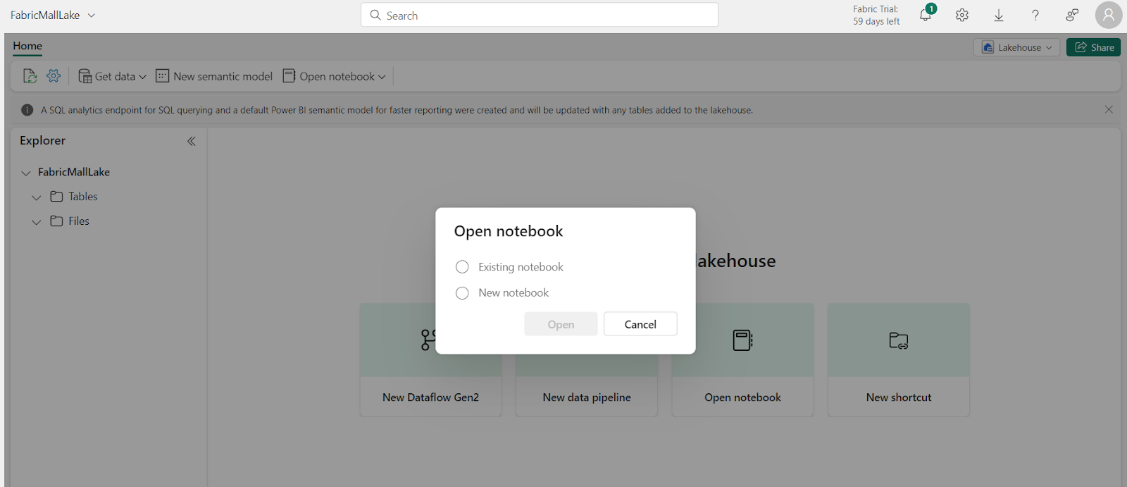
Then give it a name, like FabricMallLake, and click on Open notebook.
Click on New notebook and Open. You can rename your notebook at the top left corner of your notebook. The notebook is similar to the Jupyter notebook experience.
How to Use Kaggle API Data in Microsoft Fabric
Notebooks allow us to write, visualize, and execute code. Within the Notebook, we will use Python to perform a customer segmentation on our data in Microsoft Fabric.
First, import Kaggle using the command below:
!pip install Kaggle
Next, you'll need to import your operating system and connect to the Kaggle API.
import os
os.chdir('/lakehouse/default/Files')
os.environ['KAGGLE_USERNAME'] = 'bennyifeanyi'
os.environ['KAGGLE_KEY'] = '050019167fbe0027359cdb4b5eea50fe'
from kaggle.api.kaggle_api_extended import KaggleApi
api = KaggleApi()
api.authenticate()
api.dataset_download_file('vjchoudhary7/customer-segmentation-tutorial-in-python', 'Mall_Customers.csv')
In the code above, os.chdir('/lakehouse/default/Files') represents our File API path. Also remember to replace the username and API Key with your own.
Now import Pandas. This will allow you to read your file.
import pandas as pd
df = pd.read_csv("/lakehouse/default/" + "Files/Mall_Customers.csv")
df.head()
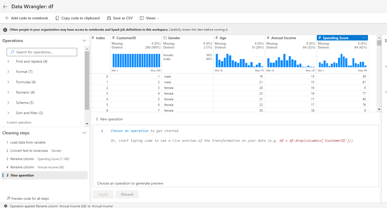
But before we start segmenting our customers, let's transform our data by exploring the data wrangler.
How to Use the Data Wrangler in Microsoft Fabric
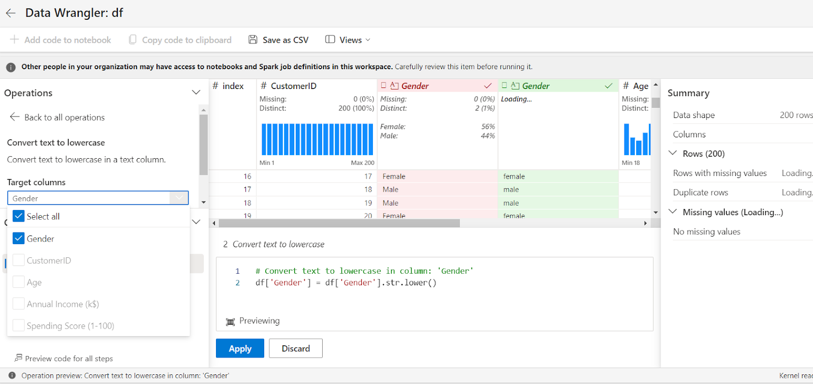
One of the most exciting things about this notebook is that you can perform data cleaning tasks without writing code using the Data Wrangler.
To do that, click on Data on the ribbon and select Transform DataFrame in Data Wrangler.
We will perform the following transformations:
- We will convert the gender column to lowercase.
- We will also rename the columns with special characters like the dollar sign, brackets, and a dash. This is because I noticed Fabric finds it hard to handle these characters at the moment.
To do these transformations, follow these steps:
Under the Operation tab, select Convert text to lowercase.
Pick the column – Gender in this example – and select Apply. This will convert your Gender column to lowercase and automatically generate the codes.
Similarly, under the schema tab, select rename columns.
Rename Annual Income (k$) to AnnualIncome, and Spending Score (1-100) to SpendingScore.
Once you’re done with the transformation, click Add code to notebook.
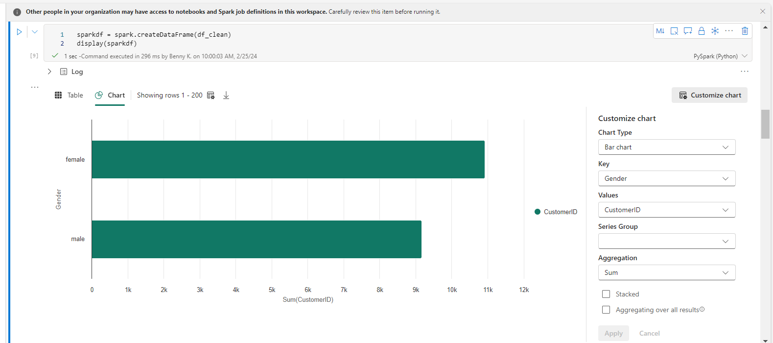
Back in the notebook, we can visualize our data using the code below:
sparkdf = spark.createDataFrame(df_clean)
display(sparkdf)
Within the chart element created, select Customize chart. Pick the columns you want and select Apply.
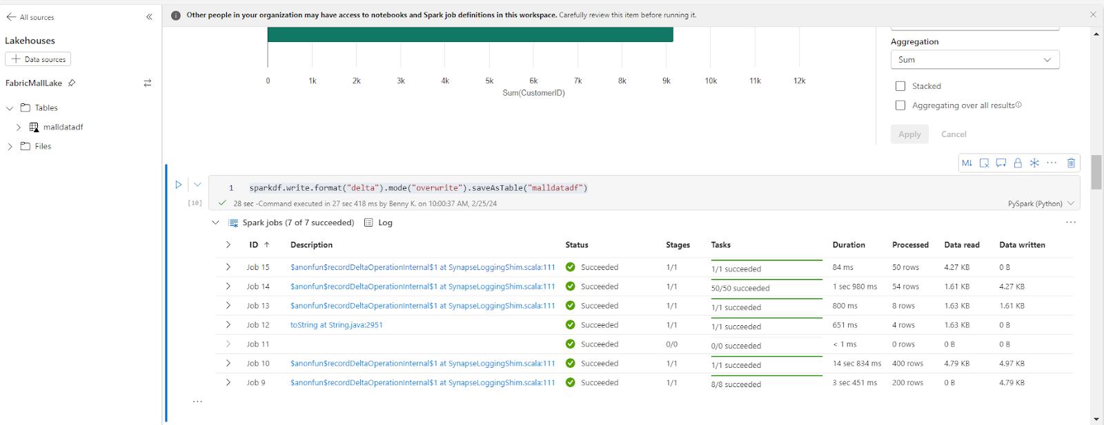
Once that's done, we can save the data in the Lakehouse using this code below:
sparkdf.write.format("delta").mode("overwrite").saveAsTable("malldatadf")
How to Perform Customer Segmentation in Microsoft Fabric
For our customer segmentation, we will use the KMeans clustering algorithm to segment the customers based on their annual income and spending score.
K-means clustering is an unsupervised machine learning algorithm. It groups similar data points in your data based on underlying observations, similarities, and input vectors.
We will do this by importing our libraries, applying our K-means by training the K-Means clustering model, and visualizing the clusters of customers based on their annual income and spending score.
We will also include and show the centroids of each cluster, providing insights into the distribution of customers in the dataset.
The centroids here refers to the center points of the clusters found by our algorithm. This is calculated as the average of all the data points in that cluster. When we visualize the clusters, the centroid will be represented with a distinct symbol or color.
Run this code to achieve this:
import numpy as np
import seaborn as sns
import matplotlib.pyplot as plt
from sklearn.cluster import KMeans
from sklearn.preprocessing import StandardScaler
from sklearn.preprocessing import MinMaxScaler
X = df_clean[['AnnualIncome', 'SpendingScore']]
# Feature normalization
scaler = MinMaxScaler()
X_scaled = scaler.fit_transform(X)
kmeans = KMeans(n_clusters=5, init='k-means++', random_state=42)
kmeans.fit(X_scaled)
plt.figure(figsize=(10, 8))
for cluster_label in range(5):  # Loop through each cluster label
cluster_points = X[kmeans.labels_ == cluster_label]
centroid = cluster_points.mean(axis=0)  # Calculate the centroid as the mean position of the data points
plt.scatter(cluster_points['AnnualIncome'], cluster_points['SpendingScore'],
s=50, label=f'Cluster {cluster_label + 1}')  # Plot points for the current cluster
plt.scatter(centroid[0], centroid[1], s=300, c='black', marker='*', label=f'Centroid {cluster_label + 1}')  # Plot the centroid
plt.title('Clusters of Customers')
plt.xlabel('Annual Income (k$)')
plt.ylabel('Spending Score (1-100)')
plt.legend()
plt.show()
Here's the output:
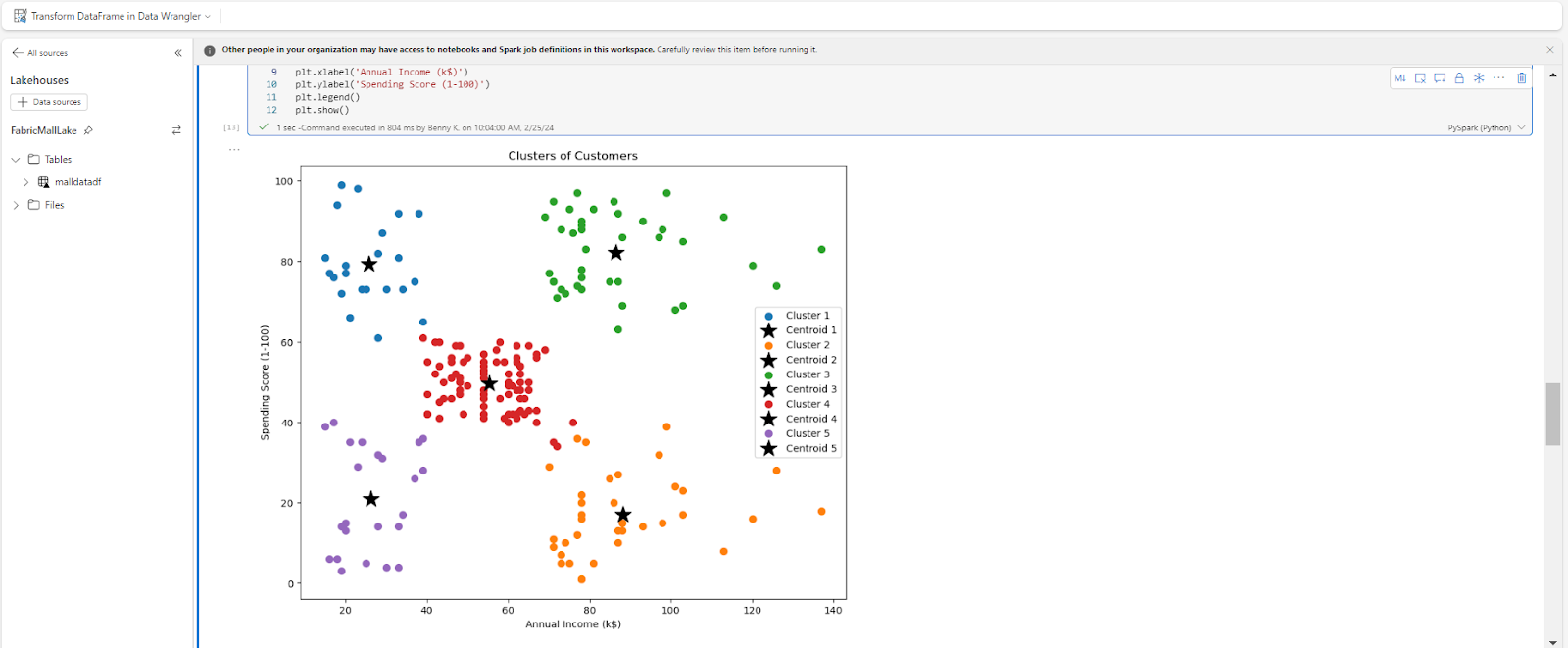
The result of our analysis shows that our customers can be grouped into 5 clusters:
- Cluster 1 (Purple) are low income earners with a low spending score.
- Cluster 2 (Blue) are low income earners with a high spending score.
- Cluster 3 (Red) are average income earning customers with significant spending scores.
- Cluster 4 (Orange) are high income customers who do not spend much at the mall. They’re probably not satisfied with the services rendered.
- Cluster 5 (Green) are high income customers with a high spending score.
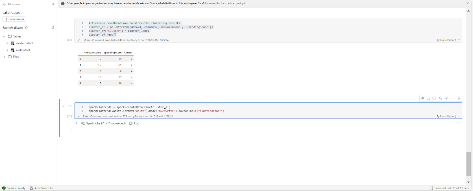
We can also save our prediction as a new dataset using this code:
# Create a new DataFrame to store the clustering results
cluster_df = pd.DataFrame(data=X, columns=['AnnualIncome', 'SpendingScore'])
cluster_df['Cluster'] = cluster_label
sparkclusterdf = spark.createDataFrame(cluster_df)
sparkclusterdf.write.format("delta").mode("overwrite").saveAsTable("clusterdatadf")
Want to take a look at the notebook? You can download it from my GitHub.
How to Visualize Lakehouse Data in Power BI
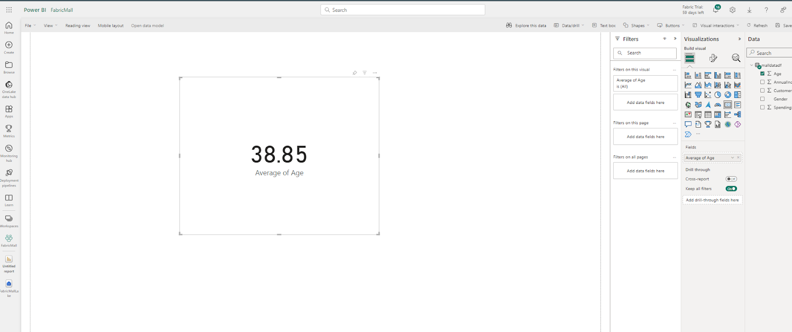
Now we can decide to visualize our data on a dashboard within Fabric.
Head back to the FabricMall workspace and select the semantic model type of the FabricMallLake Lakehouse.
Then select Manage default semantic model.
Pick your dataset, click Confirm, and then select New Report.
Let's visualize the average age in our data. To do this, click on the card visual and drag the age into this card. This will automatically create a visual showing the average age in your dataset.
Just like in Power BI Desktop, you can create your measure, build your report, and publish your dashboard. You can learn more about how to create visuals in Power BI using this free freeCodeCamp YouTube data analysis video.
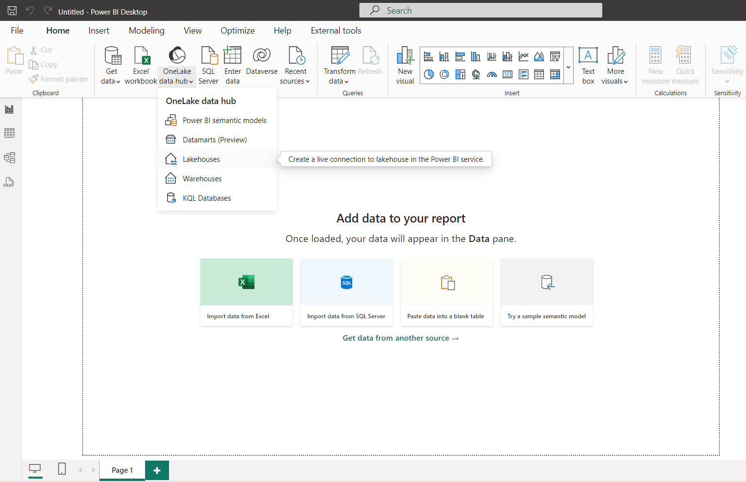
Alternatively, you can open Power BI Desktop, and connect to your Lakehouses from Onelake data hub.
Where Can I Learn More about Microsoft Fabric?
Though Microsoft Fabric is a pretty new data platform, I hope you can tell that this tool will help you ease the way you and your team consume, analyze, and get insight from your data.
To learn more you can start with the fabric official documentation or any helpful YouTube tutorial like Francis’s Fabric course. I would also advise you to start with freeCodeCamp's Fabric publication tags if you want a compilation of resources.
Lastly, if you’re new to data analysis, start your journey today with freeCodeCamp’s Data Analyst Bootcamp for Beginners on YouTube. It covers everything from SQL, Tableau, Power BI, and Python to Excel, Pandas, and real-life projects building.
If you enjoyed reading this article and/or have any questions and want to connect, you can find me on LinkedIn, Twitter and do check out my articles on freeCodeCamp.