

CSS is a technology that can be your best or worst friend. While it's incredibly flexible and can produce what seems like magic, without the proper care and attention, it can become hard to manage like any other code.
How can Tailwind CSS help us to take control of our styles?
- What is Tailwind?
- So what makes Tailwind great?
- Part 1: Adding Tailwind CSS to a static HTML page
- Part 2: Adding Tailwind CSS to a React app
What is Tailwind?
Tailwind CSS is a "utility-first" CSS framework that provides a deep catalog of CSS classes and tools that lets you easily get started styling your website or application.
The underlying goal is that as you're building your project, you don't need to deal with cascading styles and worrying about how to override that 10-selector pileup that's been haunting your app for the last 2 years.
So what makes Tailwind great?
Taildwind's solution is to provide a wide variety of CSS classes that each have their own focused use. Instead of a class called .btn that is created with a bunch of CSS attributes directly, in Tailwind, you would either apply a bunch of classes like bg-blue-500 py-2 px-4 rounded to the button element or build a .btn class by applying those utility class to that selector.
While Tailwind has a lot more going for it, we're going to focus on these basics for this tutorial, so let's dig in!
Part 1: Adding Tailwind CSS to a static HTML page
We're going to start off by applying Tailwind CSS straight to a static HTML page. The hope is that by focusing on Tailwind and not the app, we can get a better understanding of what's actually happening with the framework.
Step 1: Creating a new page
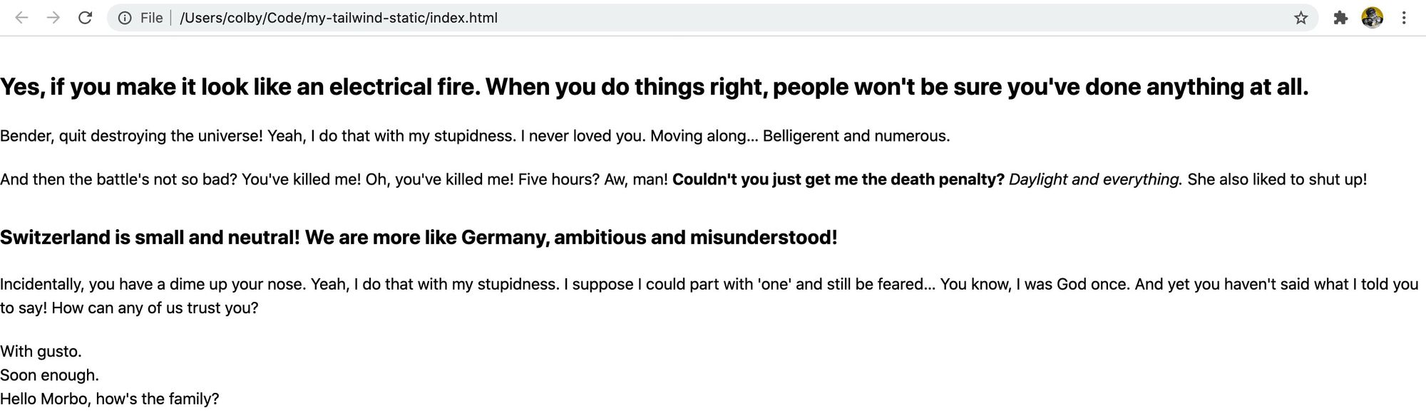
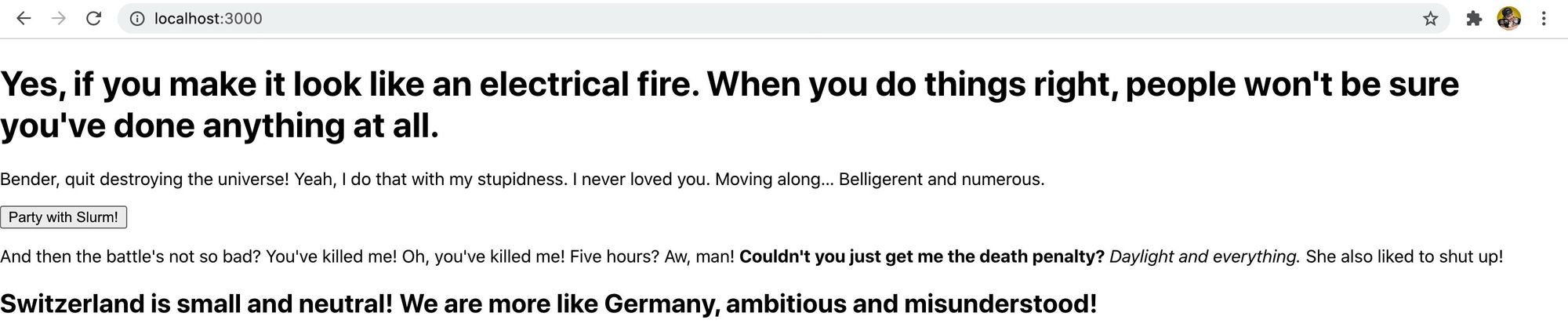
You can get started by simply creating a new HTML file. For the content, you can use whatever you want, but I'm going to use fillerama.io so the filler content is a bit more fun.
 New HTML page with content
If you want to simplify this step, you can just copy the file I created to get started.
Step 2: Adding Tailwind CSS via CDN
Tailwind typically recommends that you install through npm to get the full functionality, but again, we're just trying to understand how this works first.
So let's add a link to the CDN file in the <head> of our document:
<link href="https://unpkg.com/tailwindcss@^1.0/dist/tailwind.min.css" rel="stylesheet">
Once you save and reload the page, the first thing you'll notice is that all of the styles were stripped!
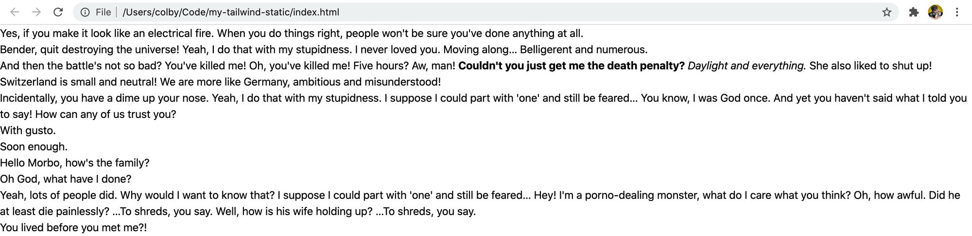 HTML page with the Tailwind CSS base
This is expected. Tailwind includes a set of preflight styles to fix cross-browser inconsistencies. For one, they include the popular normalize.css which they build upon with their own styles.
But we're going to learn how to use Tailwind to add back our styles and set things up how we want!
Step 3: Using Tailwind CSS to add styles to your page
Now that we have Tailwind installed, we've added the ability to make use of their huge library of utility classes that we'll now use to add styles back to our page.
Let's start off by adding some margin to all of our paragraphs (<p>) and our list elements (<ol>, <ul>). We can do this by adding the .my-5 class to each element like so:
<p class="my-5">
  Bender, quit destroying the universe! Yeah, I do that with my stupidness. I never loved you. Moving along…
  Belligerent and numerous.
</p>
The class name follows a pattern that you'll notice with the rest of the utility classes – .my-5 stands for margin (m) applied to the y-axis (y) with a value of 5 which in Tailwind's case, it uses rem, so the value is 5rem.
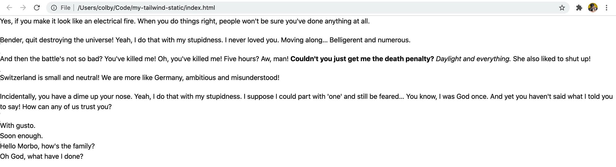 HTML page with basic paragraph styles
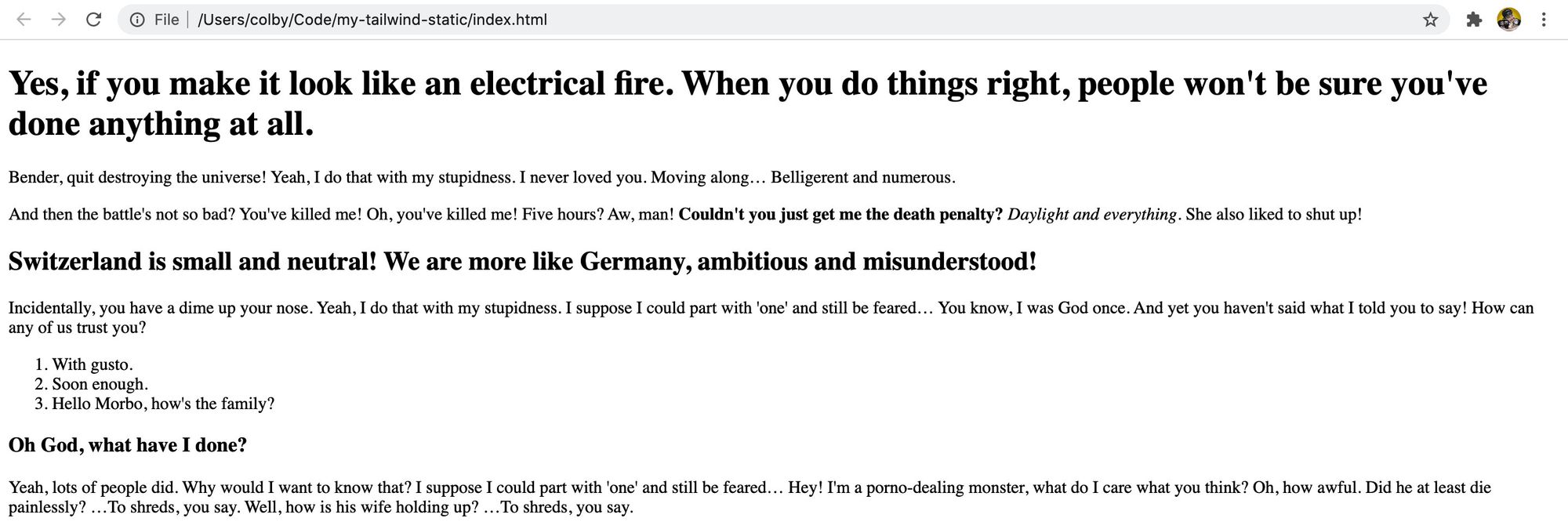
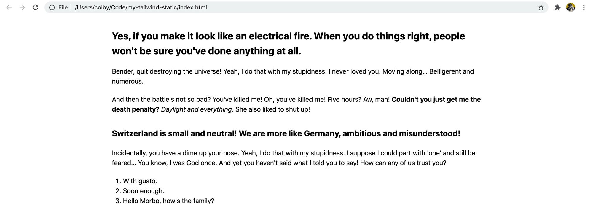
Next, let's make our headers look like actual headers. Starting with our h1 tag, let's add:
<h1 class="text-2xl font-bold mt-8 mb-5">
Here's what's happening:
text-2xl: set the text size (font-size) to 2xl. In Tailwind, that 2xl will equate to 1.5remfont-bold: set the weight of the text (font-weight) to boldmt-8: Similar tomy-5, this will set the margin top (t) to 8remmb-5: And this will set the margin bottom (b) to 5rem
 HTML page with styled H1
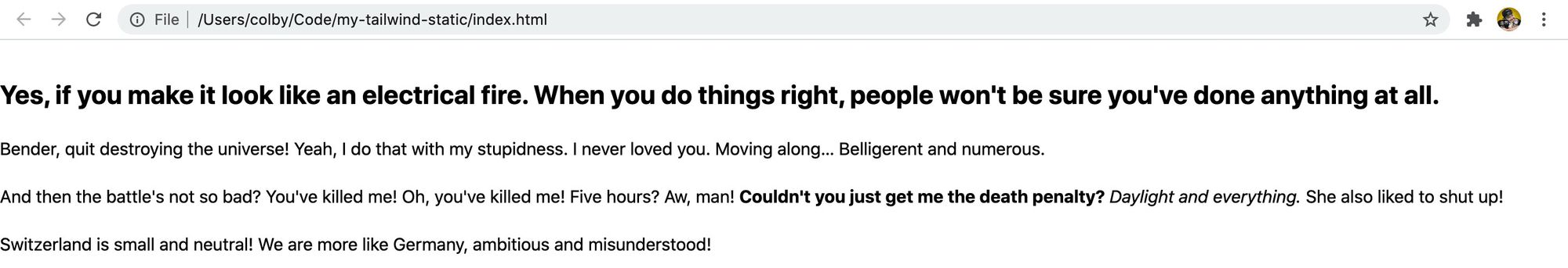
With those classes added to the h1, let's apply those same exact classes to the rest of our header elements, but as we go down the list, reduce the size of the font size, so it will look like:
- h2:
text-xl - h3:
text-lg
 HTML page with all headers styled
Now let's make our list elements look like lists. Starting with our unordered list (<ul>), let's add these classes:
<ul class="list-disc list-inside my-5 pl-2">
Here's what we're adding:
list-disc: set the list-style-stype to disc (the markers on each line item)list-inside: sets the position of the list markers using relative to the list items and the list itself with list-style-position to insidemy-5: set the margin of the y axis to 5rempl-2: set the left padding to 2rem
Then we can apply the exact same classes to our ordered list (<ol>), except instead of list-disc, we want to change our style type to list-decimal, so that we can see numbers given it's an ordered list.
<ol class="list-decimal list-inside my-5 pl-2">
And we have our lists!
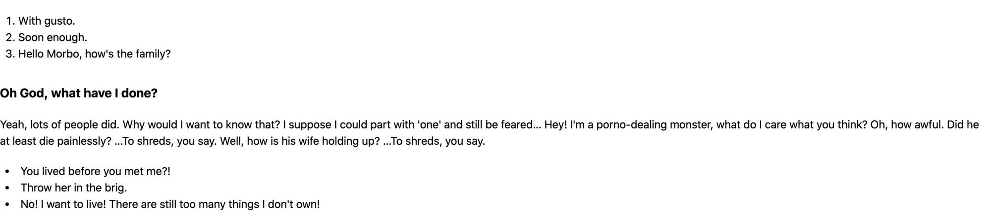 HTML page with styled lists
Finally, let's make our content a little easier to read by setting a max width and centering the content. On the <body> tag, add the following:
<body class="max-w-4xl mx-auto">
/Note: Typically you wouldn't want to apply these classes to the <body> itself, rather, you can wrap all of your content with a <main> tag, but since we're just trying to get an idea of how this works, we'll roll with this. Feel free to add the <main> tag with those classes instead if you prefer!/
And with that, we have our page!
 HTML page with centered content
Step 4: Adding a button and other components
For the last part of our static example, let's add a button.
The trick with Tailwind, is they intentionally don't provide pre-baked component classes with the idea being that likely people would need to override these components anyways to make them look how they wanted.
So that means, we're going to have to create our own using the utility classes!
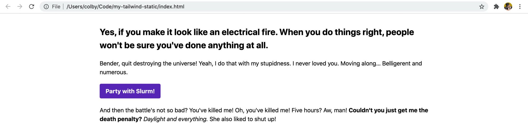
First, let's add a new button. Somewhere on the page, add the following snippet. I'm going to add it right below the first paragraph (<p>) tag:
<button>Party with Slurm!</button>
 HTML page with unstyled button
You'll notice just like all of the other elements, that it's unstyled, however, if you try clicking it, you'll notice it still has the click actions. So let's make it look like a button.
Let's add the following classes:
<button class="text-white font-bold bg-purple-700 hover:bg-purple-800 py-2 px-4 rounded">
  Party with Slurm!
</button>
Here's a breakdown of what's happening:
text-white: we're setting our text color to whitefont-bold: set the weight of the text to bold (font-weight)bg-purple-700: set the background color of the button to purple with a shade of 700. The 700 is relative to the other colors defined as purple, you can find these values on their palette documentation pagehover:bg-purple-800: when someone hovers over the button, set the background color to purple shade 800. Tailwind provides these helper classes that allow us to easily define interactive stiles with things like hover, focus, and active modifierspy-2: set the padding of the y-axis to 2rempx-4: set the padding of the x-axis to 4remrounded: round the corners of the element by setting the border radius. With tailwind, it sets the border-radius value to .25rem
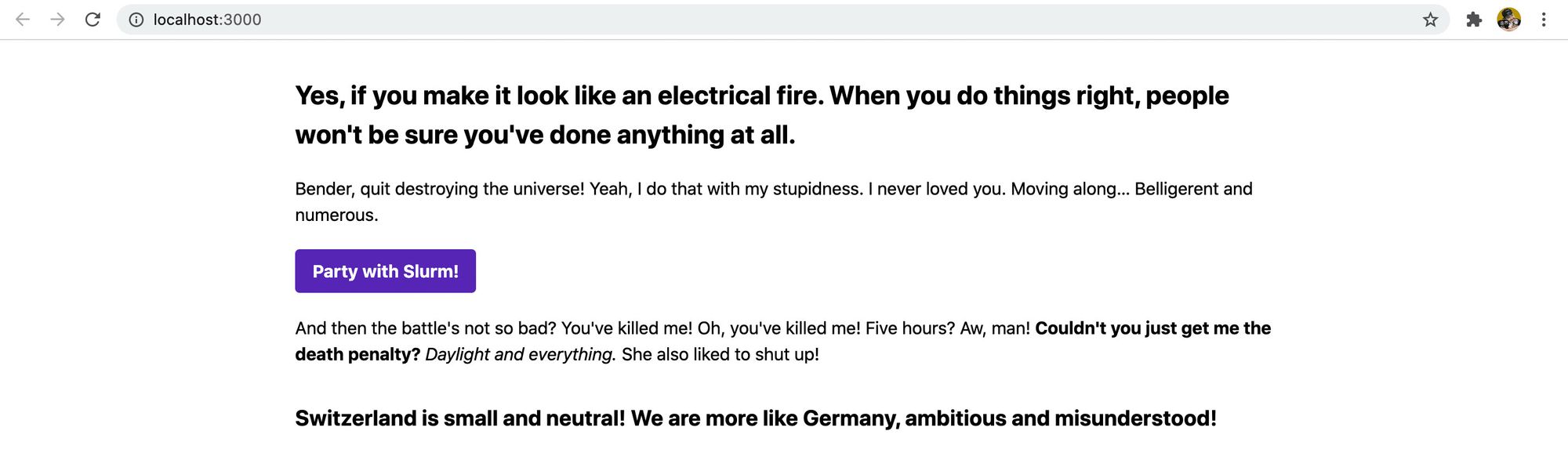
And with all of that, we have our button!
 HTML page with a styled button
You can apply this methodology to any other component that you'd like to build. Though it's a manual process, we'll find out how we can make this process easier when building in more dynamic projects like those based on React.
Part 2: Adding Tailwind CSS to a React app
For more of a real-world use case, we're going to add Tailwind CSS to an app created with Create React App.
First, we'll walk through the steps you need to take to add tailwind to your project using a fresh install of Create React App, then we'll use our content from our last example to recreate it in React.
Step 1: Spinning up a new React app
I'm not going to detail this step out too much. The gist is we'll bootstrap a new React app using Create React App.
To get started, you can follow along with the directions from the official React documentation:
https://reactjs.org/docs/create-a-new-react-app.html
And once you start your development server, you should now see an app!
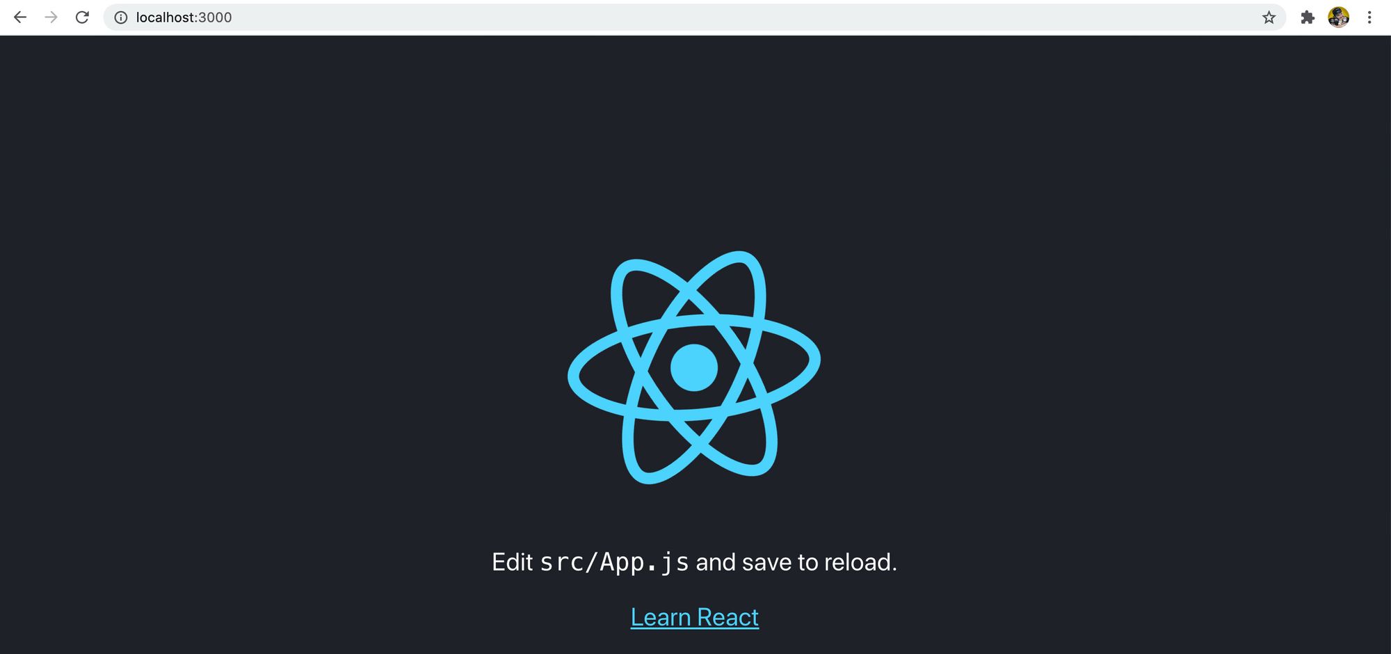 Create React App starting page
Finally, let's migrate all of our old content to our app. To do this, copy everything inside of the <body> tag of our static example and paste it inside of the wrapper <div className="App"> in the new React project.
 Migrating code to React app
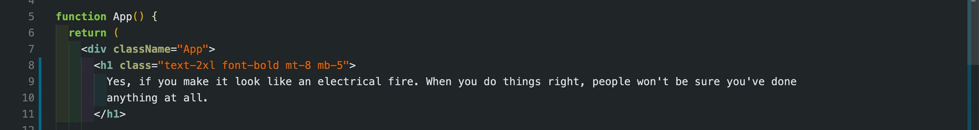
Next, change all class=" attributes from the content we pasted in to className=" so that it's using proper React attributes:
 Fixing class attribute in content
And lastly, replace the className App on our wrapper <div> to the classes we used on our static <body>.
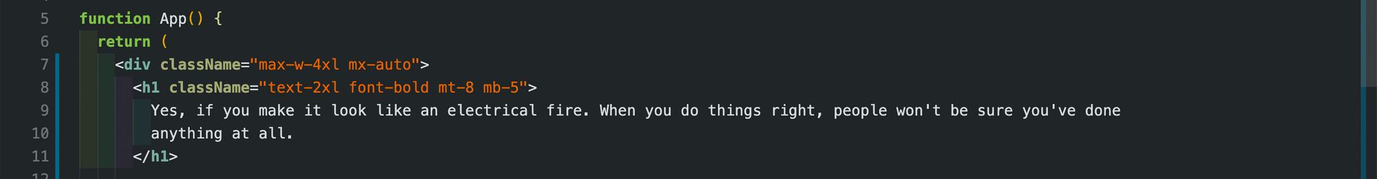 Adding wrapper styles to the app
Once you save your changes and spin back up your server, it will look deceivingly okay.
 React app with basic content
React includes some basic styles itself, so while it looks okay, we're not actually using Tailwind yet. So let's get started by installing it!
Step 2: Installing Tailwind in your React app
There are a few steps we'll need to go through in order to get Tailwind up and running on our app. Make sure you follow these steps carefully to ensure it's properly configured.
First, let's add our dependencies:
yarn add tailwindcss postcss-cli autoprefixer
# or
npm install tailwindcss postcss-cli autoprefixer
Per Tailwind's documentation, we need to be able to process our styles so that they can be properly added to our pipeline. So in the above, we're adding:
- tailwindcss: the core Tailwind package
- postcss-cli: Create React App already uses postcss, but we need to configure Tailwind to be part of that build process and run it's own processing
- autoprefixer: Tailwind doesn't include vendor prefixes, so we want to add autoprefixer to handle this for us. This runs as part of our postcss configuration
We're also going to add two dev dependencies that make it easier to work with our code:
yarn add concurrently chokidar-cli -D
# or
npm install concurrently chokidar-cli --save-dev
- concurrently: a package that lets us set up the ability to run multiple commands at once. This is helpful since we'll need to watch both the styles and React app itself.
- chokidar-cli: let's us watch files and run a command when changed. We'll use this to watch our CSS file and run the build process of the CSS on cahnge
Next, let's configure postcss, so create a new file in the root of your project called postcss.config.js and include the following:
// Inside postcss.config.js
module.exports = {
    plugins: [
        require('tailwindcss'),
        require('autoprefixer')
    ],
};
This will add the Tailwindcss and Autoprefixer plugins to our postcss config.
With our configuration, we need to include it as part of the build and watch processes. Inside package.json, add the following to definitions to your scripts property:
"build:css": "tailwind build src/App.css -o src/index.css",
"watch:css": "chokidar 'src/App.css' -c 'npm run build:css'",
Additionally, modify the start and build scripts to now include those commands:
"start": "concurrently -n Tailwind,React 'npm run watch:css' 'react-scripts start'",
"build": "npm run build:css && react-scripts build",
With our configuration ready to go, let's try our styles back to where they were when we left off from the static example.
Inside the App.css file, replace the entire content with:
@tailwind base;
@tailwind components;
@tailwind utilities;
This is going to import Tailwind's base styles, components, and utility classes that allow Tailwind to work as you would expect it to.
We can also remove the App.css import from our App.js file because it's now getting injected directly into our index.css file. So remove this line:
import './App.css';
Once you're done, you can start back up your development server! If it was already started, make sure to restart it so all of the configuration changes take effect.
And now the page should look exactly like it did in our static example!
 React app with content styled
Step 3: Creating a new button component class with Tailwind
Tailwind doesn't ship with prebaked component classes, but it does make it easy to create them!
We're going to use our button that we already created as an example of creating a new component. We'll create a new class btn as well as a color modifier btn-purple to accomplish this.
The first thing we'll want to do is open up our App.css file where we'll create our new class. Inside that file, let's add:
.btn {
  @apply font-bold py-2 px-4 rounded;
}
If you remember from our HTML, we're already including those same classes to our <button> element. Tailwind let's us "apply" or include the styles that make up these utility classes to another class, in this case, the .btn class.
And now that we're creating that class, let's apply it to our button:
<button className="btn text-white bg-purple-700 hover:bg-purple-800">
  Party with Slurm!
</button>
And if we open up our page, we can see our button still looks the same. If we inspect the element, we can see our new .btn class generated with those styles.
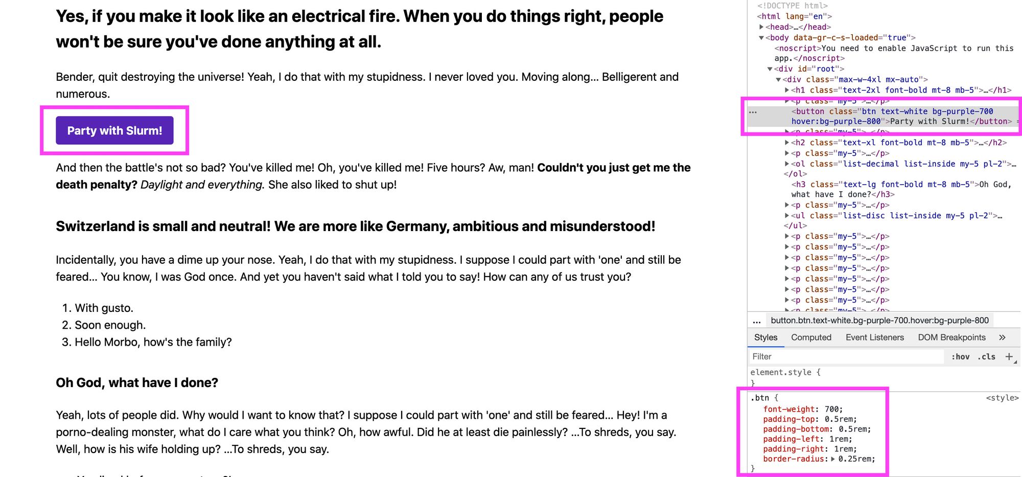 .btn class in a React app with Tailwind
Next, let's create a color modifier. Similar to what we just did, we're going to add the following rules:
.btn-purple {
  @apply bg-purple-700 text-white;
}

.btn-purple:hover {
  @apply bg-purple-800;
}
Here, we're adding our background color and our text color to our button class. We're also applying a darker button color when someone hovers over the button.
We'll also want to update our HTML button to include our new class and remove the ones we just applied:
<button className="btn btn-purple">
  Party with Slurm!
</button>
And with that change, we can still see that nothing has changed and we have our new button class!
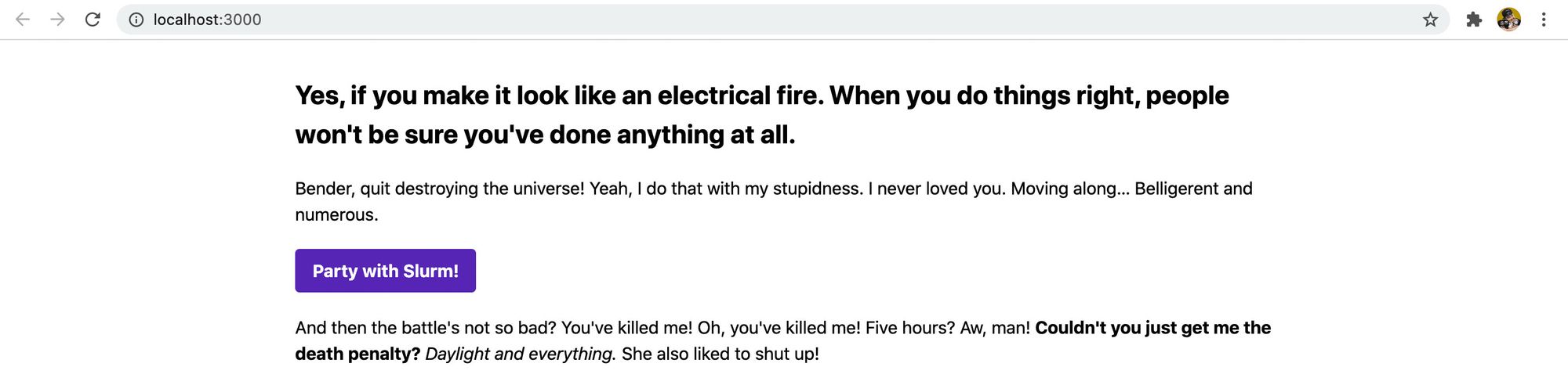 Styled button in React with Tailwind
Applying these concepts to more components
Through this walkthrough, we learned how to create a new component class using the Tailwind apply directive. This allowed us to create reusable classes that represent a component like a button.
We can apply this to any number of components in our design system. For instance, if we wanted to always show our lists the way we set them up here, we could create a .list-ul class that represented an unordered list with the Tailwind utilities list-disc list-inside my-5 pl-2 applied.
What tips and tricks do you like to use with Tailwind?
Share with me on Twitter!