By Girish Rawat
A case study on big name redesign fails and what you can learn from them

A product manager walks into a design department and orders a website redesign. “Our website looks so old! All our competitors have flashier websites. Let’s redesign it. Buttons with colorful shadows are the future!”
Designer: “Ok, let’s start by conducting a usability test — ”
PM: “You have 3 weeks and I want all colors to be changed to hot pink, edgy blue or millennial orange.”
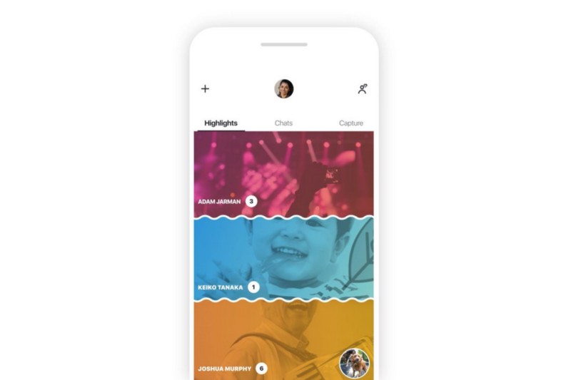 Skype Redesign 2018
This is how you murder your conversion rate. While the above scenario might be a wild exaggeration, the number of companies radically redesigning their brand every year is certainly not. Just look at Facebook, which seems like a new website almost every time I open it. There’s an entire group on Facebook consisting of 3k members who track every minute detail the company changes.
Any user facing product must inevitably stay current and fresh in the ever-changing market. Redesigns are vital for websites, apps or any product that interacts with any kind of users or stakeholders. If done correctly with a data-driven process and clearly defined design KPIs, a redesigned product can increase conversions, get more sales and make your users happy.
But more often than not, redesigns feel pretty unwelcome with dip in conversions, angry users and negative app reviews. Be it small players like Snapchat or bigwigs like Microsoft with Windows 8 and Skype — it seems that no one is safe from a redesign failure.
Why does a redesign fail?
A redesign, be it visual or functional, is a change in how a user remembers your product. People don’t like changes. When you change how a user accesses the settings page on your app, you are asking them to break a habit. Users who were previously able to navigate to the settings page on your app without thinking about it twice are now fumbling to find it. This results in a microaggression. Your job as a designer is to minimize these microaggressions and motivate them to build new habits.
Snapchat’s Navigation Redesign
Let’s analyze how snapchat redesigned one of their core user stories — viewing stories from friends.
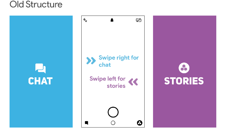
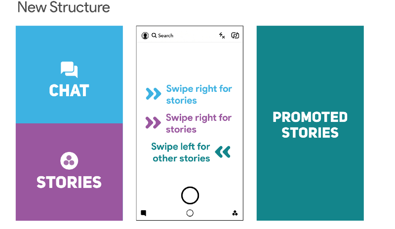
The older version of snapchat had set up the following structure for navigation: swipe left to view stories and swipe right to chat with friends. To view stories from your friends you had to swipe left from the main camera screen and then click on your friend’s story.
Promoted stories from celebrities and media outlets were a part of the stories page. They appeared alongside your friends’ stories.
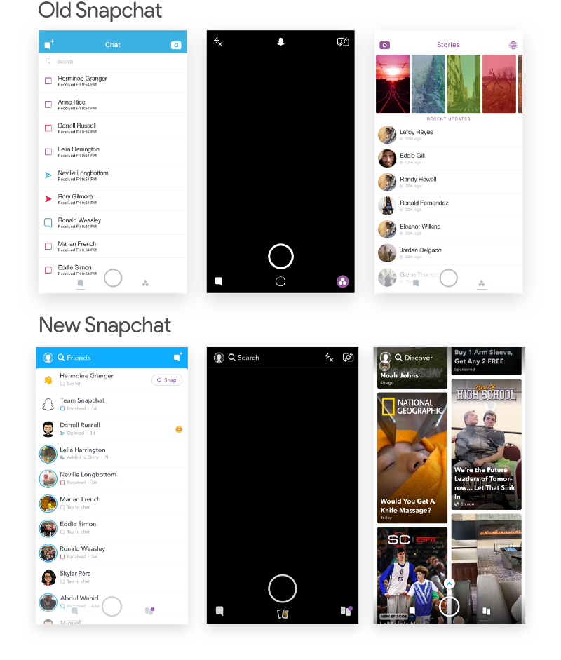
When Snapchat decided to redesign, friends’ stories were moved to the left and combined with chat. Promoted stories got their own page. This redesign saw Snapchat move away from its previous split between “chat” and “stories”. It focused on the division between friends and publishers making it easy for publishers to promote paid content while grouping everything from friends in one place.
The primary area to click for viewing the story was also shrunk in the redesign. Previously, users had a rectangle bar which they could click to view their friend’s story. After the redesign, it was shrunk down to a much smaller circle which was shoved all the way to the left to the screen.
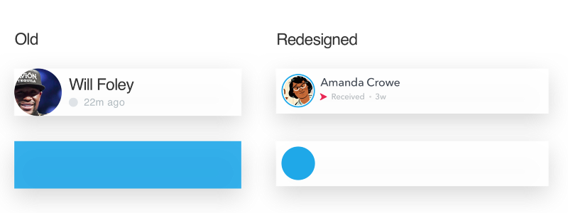 Area to click to view story
At least two rules-of-thumb were changed: the navigation structure and the area to tap to view a story. Needless to say, users didn’t like these changes very much. Within a week Snapchat’s average rating dropped from 3.1 stars to 2.4.
I did a sentiment analysis of user reviews using Appbot. We can clearly see the spike in negative reviews after the redesign was rolled out to users.

 Histogram Legend
Snapchat’s redesign was a disaster. It dropped its daily users by 2% to 188 million users from 193 million. Ad views and revenue went down by 36%. Many publishers switched platforms and started calling Instagram their new home.
6 months after the redesign rollout, Snapchat made amends and announced a reversal. Friend’s stories would be moved back to the right page alongside publisher stories. In a direct quote:
We learned that combining watching Stories and communicating with friends into the same place made it harder to optimize for both competing behaviors. We are currently rolling out an update to address this by moving Stories from friends to the right side of the application.- Evan Spiegel, CEO Snapchat
Windows 8 Start Menu Redesign
Now let’s look at how Microsoft redesigned their start menu in Windows 8. Let’s try to open the control panel in Windows 7 and 8.
To open control panel in Windows 7, you need to click on the Start button to list all the applications. And then you click on the control panel.
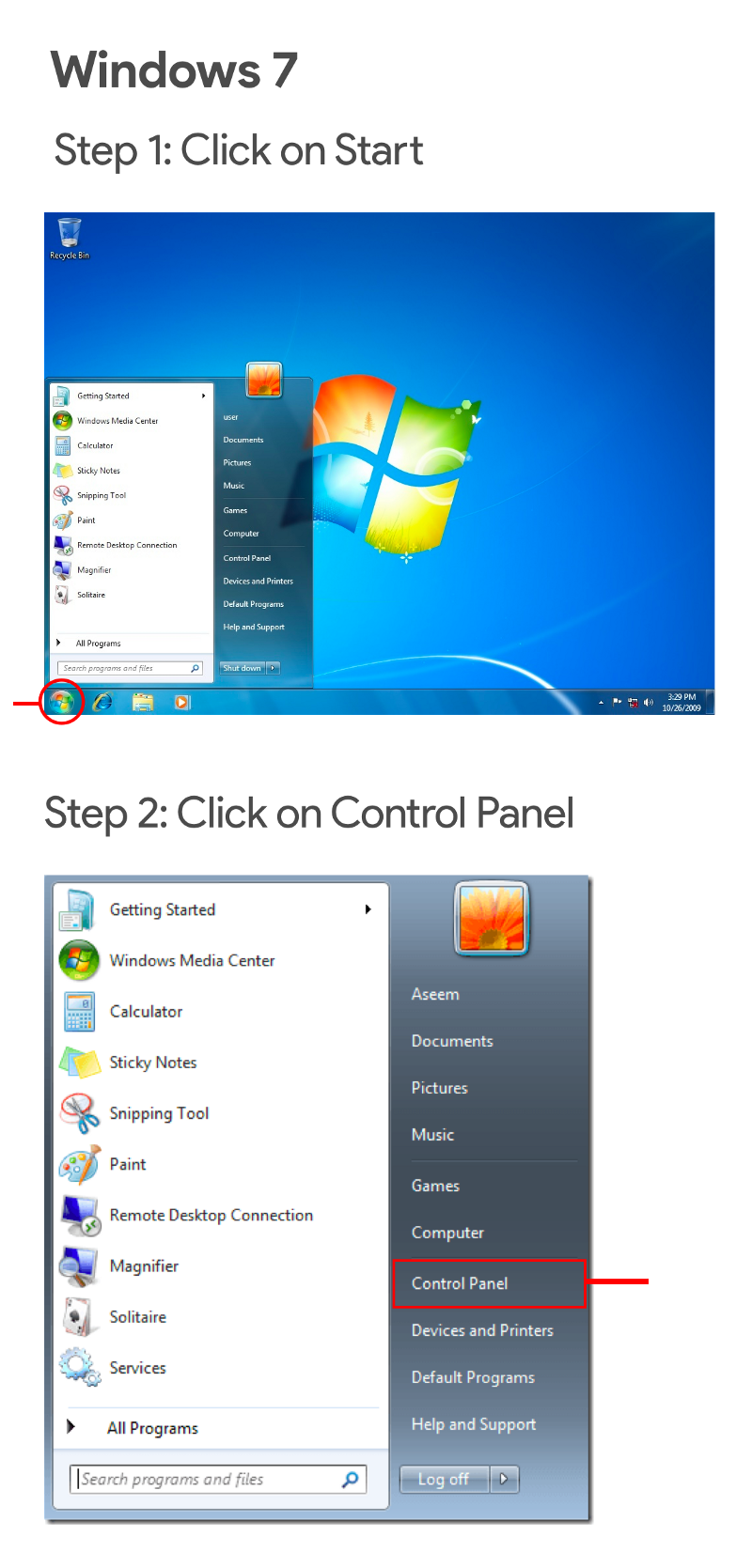
In Windows 8, you already start at the Start menu. A good head start, right? Wrong. There is no control panel to be found in the apps listed. Nor is any option to list all programs.
To get to the panel, you need to open the Charms menu. The menu can be opened by hovering your mouse on the top-right or the bottom-right portion of the screen. After you have managed to open the Charms menu, you click on Settings and then on Control panel.
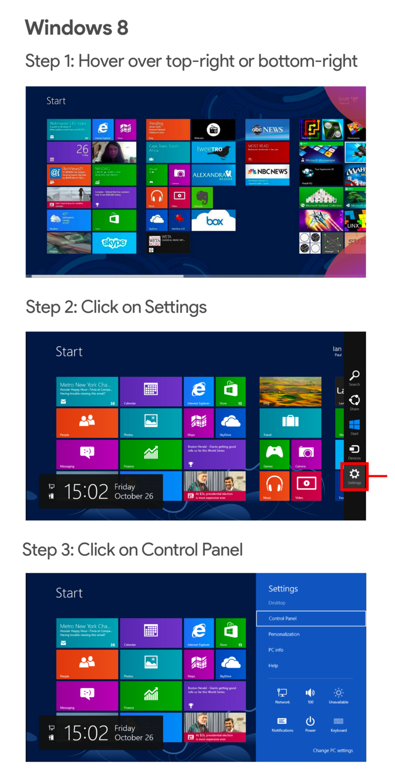
This gesture-based process to access panels was completely alien to users when Windows 8 launched. Windows didn’t provide any onboarding to help users discover the charms menu. Even after users discovered the charms menu by googling or from their friends, they were still not comfortable with it. Gestures and hovering both were new concepts to the OS.
Are all redesigns bad?
Redesigns are changes and people don’t like changes. It’s easy to think from the above examples that putting time in a redesign to change how a product works might not be a good investment for your product. But products that don’t evolve and keep the same design to ‘play it safe’ are inevitably phased out by faster moving competitors.
Lightweight and progressive changes that users are able to pick up easily makes a redesign bearable. Sometimes that might translate to skipping flashy animations, gestures or navigation structures to using simpler alternatives that the user is already comfortable with.
Facebook’s Navigation Redesign
In 2012, Facebook was gearing up for a major redesign on how people navigated its mobile app. Up until now the way to navigate to your friend requests, messages and notifications was through the iconic blue action bar on the top. This action bar was meant to emulate how users navigated on the website. It was made to look and feel like what the website header looked like.

Both the Android and the iOS implemented navigation in similar fashion with identical action bars.
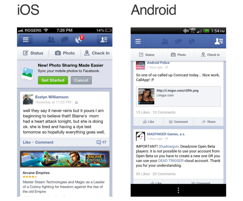
But the mobile user base was catching up and mobile-first users were about to shadow desktop-first users. Mobile only social networks like Instagram, Snapchat and Vine (rip) were gaining popularity. It was pretty evident that people were going to be spending more time on their phones than on their computers in the coming future.
So when Facebook decided to simplify their navigation structure for mobile, they decided to ditch consistency and treat Android and iOS as two different products. Facebook introduced two different navigation structures for respective apps. The Android app got the slidable tab bar that stuck to the top while iOS got the static tab bar that stuck to the bottom.
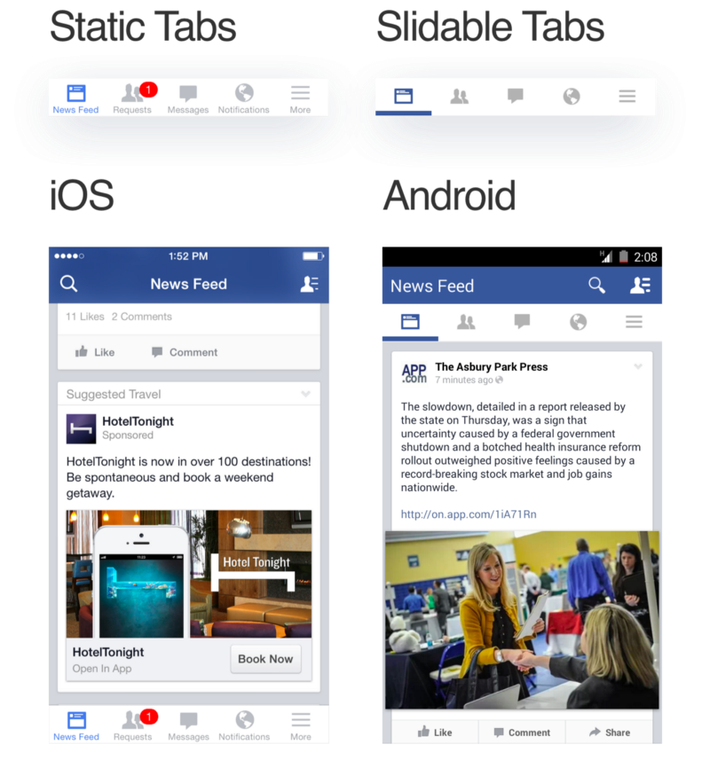
These changes were new to the app but not to the users. While the redesign did require users to break their habit of heading to the blue action bar to navigate, users were already familiar with their platform specific tab bars. Slidable tab bars had been in the Android ecosystem for a couple of years. It didn’t take a lot of time for users to switch from the action bar to the tab bar. Similarly, the iOS tab bar had been present since the platform’s inception, and didn’t feel alien to their users.
Facebook’s separation of tabs in Android and iOS played out really well for them. They became an industry standard shortly after and most mobile platforms with Android and iOS apps implement navigation similarly to this day.
Learnings
The most effective redesigns are usually not the prettiest
Redesign is not a process of beautifying things. The visual aspect is a part of the redesign but it’s not the redesign. If you are redesigning your product just for the sake of better-looking visuals, drawing inspiration from retina-ready mockups from Dribbble, and implementing design trends without any research to back it, your redesign is bound to fail.
Sometimes the problem might be that your outdated design language is diluting your brand’s value. Your customers are moving to a competitor with a better-looking design system. And it’s perfectly fine to redesign your design system to look better. But blindly following design trends without any strategy or research to back it up will lead to unfavorable results.
Redesigns are meant to solve problems with specific business constraints and requirements.
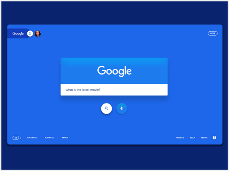
This Google redesign concept from Dribbble uses bold colors and heavy shadows to draw your attention. While it does look fly, this redesign has some major flaws and would not ever see the light of the day at Google. First off, Google’s iconic colorful branding that the brand has stuck to since the last 20 years is missing. Secondly, all Google websites have the profile avatar to the right while here it is on the left. I could go on but hopefully, you get the gist of what I’m trying to convey.
Redesign is a process, not a destination
Product design is a cyclic process of prototyping, testing, analyzing, and refining a product or process. A redesign doesn’t mean that the product is completed. It just means that it’s “completed enough” to satisfy any current requirements. No product or user interface is ever “finished”.
Focus on micro conversions
It is important to read between the lines to help you paint a better picture of your users and their activities. Typically, when we talk about conversions in the tech vertical, we focus on the number of app installs, users signed up or sales generated.
Micro conversions are often forgotten and sometimes not tracked. Micro conversions are the low-hanging fruits, precisely, actions that lead users to the end goal, that is, macro conversions. Examples of micro conversions could be number of users using the search feature, number of users updating their profile pictures or number of users confirming their phone number. Micro conversion acts as a process milestone in the conversion funnel and impacts the ultimate step, or macro conversion.
How are these micro conversions doing? Do you see a dip in a particular micro conversion metric? Are users not able to add their buddies because the new search bar is hard to find? Did your call-to-action to sign up for the free trial got buried behind a new layout and users are not able to find it anymore? Defining precise micro conversion goals and tracking them will help you assess points of friction in your redesigned platform’s user journey.
Conclusion
Thanks for reading! This analysis was part of my internship application which I didn’t end up applying to. Hopefully, this post helped you better understand some redesigns and what we could learn from them. Feel free to provide any feedback or ask any questions that you have in the comments below.