
By Gert Svaiko
While CSS isn’t as widely used as JavaScript, it’s still in the top 10 coding languages, according to Redmonk. Since CSS is quite robust, reasonably easy to learn, and universal across different browsers, it’s popular among website developers.
As it is with every coding language, there are several shortcuts or hacks with CSS that allow you to write cleaner code, improve design elements, and save valuable time. Furthermore, you can directly insert these snippets to your site using a code editor.
It is also important to know that you don’t have to be a senior web developer to use CSS. Data from W3Techs show that CSS is used by 96 percent of all websites, and being able to use CSS to enhance the layout and appearance of a website is integral to the functioning of major open source CMSs like WordPress.
In fact, most of the biggest website builder tools (generally known for promoting a “What You See Is What You Get” or WYSIWYG approach) now allow users to insert custom CSS code.
If you’re new to CSS, freeCodeCamp has an excellent tutorial video on Youtube where you can learn the basics. If you already know the fundamental aspects, then let’s get started with these ten CSS hacks.
1. How to position content in the center with CSS
Placing content in the middle of the screen might be tricky. However, you can use position: absolute to override the dynamic placement and always position the content in the center.
It also works with every resolution across devices. However, always double-check if everything is positioned as you want it and the element looks natural even on smaller screens.
Example snippet:
section {
  position: absolute;
  left: 50%;
  top: 50%;
  transform: translate(-50%, -50%);
  padding: 30px;
}
2. How to fix an element’s position in CSS
Despite websites being dynamic, you might have some elements that you want to fix in certain positions. You can do so by using the position:absolute script.
However, use this method carefully and test it beforehand on every screen size and resolution so that it doesn’t break your site’s design.
Following this script with a specific position node assures that the element remains in the same position for all users.
Example snippet:
/* suppose you want to fix your sidebar’s position and size */
.sidebar {
  position: absolute;
  top: 15px;
  right: 15px;
  width: 300px;
  height: 150px;
}
3. How to fit images to the page in CSS
There are few things worse than your images spilling over your site visitor's screen. It can absolutely break your site’s design and discourage users.
However, with this simple hack, you can make sure that your images always fit the visitor’s screen regardless of the device they’re using.
Example snippet:
img {
  max-width: 100%;
  height: auto;
}
4. How to edit styles on a single page in CSS
If you have a CMS and want some of your posts to look different than others, you can use a custom class to override the site's CSS styles. This ensures that you only tweak a single post page and leave the others as the default.
When you create a post on a WordPress blog it includes the post's id as a class in the body, for example:
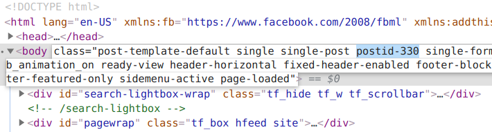
Then you could do something like this to change the styling for just that post's page:
.postid-330 {
  font-size: 24px;
  font-weight: 750;
  color: red;
}
Other popular CMSs allow you to add custom classes to individual posts. For example, Ghost lets you mark a post as a featured post and adds a .featured class.
However, if you find yourself using this method a lot, it's best to modify the main CSS style sheet to avoid writing unnecessary code.
And this doesn't just apply to CMSs – if you have a simple website with multiple HTML files, you could apply custom styling to elements throughout your project, and adjust them through the same CSS file.
For example, if you have page with the class .landing:
<!DOCTYPE html>
<html lang="en">
  <meta charset="UTF-8" />
  <title>Landing Page</title>
  <meta name="viewport" content="width=device-width,initial-scale=1" />
  <link href="css/style.css" rel="stylesheet" />
  <body class="landing">
    <h1>Landing Page</h1>
    <p>My landing page.</p>
  </body>
</html>
And another with the class .about:
<!DOCTYPE html>
<html lang="en">
  <meta charset="UTF-8" />
  <title>About Page</title>
  <meta name="viewport" content="width=device-width,initial-scale=1" />
  <link href="css/style.css" rel="stylesheet" />
  <body class="landing">
    <h1>About Page</h1>
    <p>My about page.</p>
  </body>
</html>
You could add this to your main style sheet to only adjust the styling on the about page:
.about {
  font-size: 24px;
  font-weight: 750;
  color: red;
}
5. How to consolidate styling in CSS
If you know that you want to add CSS styling to multiple items, then writing these pieces of code out one by one takes time. However, when you separate items with commas and write the CSS style inside, then the style is added to all of them.
This helps you save time and lower your code’s weight because you don’t have to write a similar line of code multiple times.
Example snippet:
/* suppose you want to add a solid border around your caption element, image, and paragraph element */
.caption, img, p {
  border: 2px solid #000000;
}

/* you can also limit the selection using selectors */
p.white-text, div > p.unique {
  color: white;
  font-size: 24px;
}
6. Visited link styling in CSS
The default style of visited links that users have clicked on might not work great with your current site’s style. You can use CSS code to tweak how the links look before and after visitors have clicked on them.
You can then match these with your site’s overall style to create a unique experience.
Example snippet:
a:link {
  color: #ff0000; /* the unvisited link is red */
}
a:visited {
  color: #ee82ee; /* the visited link turns violet */
}
7. Hovering effect delays in CSS
The :hover selector is a CSS pseudo-class which allows you to create a hovering effect. However, you can further stylise this by adding a transition element to delay the hovering effect.
While it looks neat, it also creates a sense of movement in the users’ eyes, further drawing attention to the element.
Example snippet:
.entry h2 {
  font-size: 48px;
  color: #000000;
  font-weight: 750;
}

/* Next, add a delay to the hover effect */
.entry h2:hover{
  color: #f00;
  transition: all 0.5s ease;
}
8. How to disable text wrapping and add ellipsis in CSS
If you’re tight on space for your text, you might need to cut it short to fit other elements. Sure, you can manually tweak each of the text elements, but that takes time and some trial and error.
What you can do instead is combine overflow, white-space, and text-overflow to create a natural break in the text that’s easy on the eyes.
The following example sets the limit on the text width, hides the overflowing part, disables the text wrapping, and adds an ellipsis (...) to indicate there’s more text for the users.
Example snippet:
.product-description {
max-width: 150px;
  overflow: hidden;
  white-space: nowrap;
  text-overflow: ellipsis;
}
9. Initial letter stylizing in CSS
The stylized initial letter or drop caps have been used in book and magazine design for a long time. It works by grabbing the readers’ attention and getting them interested in reading the first line.
While you may think that this style has aged, you can also design it to look modern and still capitalize on the psychological effect it creates for your visitors. Furthermore, drop caps option is also written into the CSS language, so you can effortlessly use it and give your paragraphs a new look.
Example snippet:
p:first-letter {
  display: block;
  float: left;
  margin: 5px;
  color: #000000;
  font-size: 60px;
}
10. How to reset CSS styles
Last but not least, you might need to override all the default styling attributes across different browsers for your design to work flawlessly.
Each browser has its own style sheet, with built-in default styles, and this can sometimes be a problem when you’re trying to make your website look consistent on all browsers.
You can use a comprehensive CSS reset from Eric Meyer which covers almost all bases. However, you can also achieve a minimal reset result, which you can borrow from Jeff Starr:
* {
  vertical-align: baseline;
  font-weight: inherit;
  font-family: inherit;
  font-style: inherit;
  font-size: 100%;
  border: 0;
  outline: 0;
  padding: 0;
  margin: 0;
}
And there you have it, ten hacks to make your CSS code look neater, decrease your coding time, and add visitor-friendly elements.
Thanks for reading!
I’m a writer passionate about digital marketing, web development, and cybersecurity. You can reach me on LinkedIn here.
You might also enjoy some other articles I have written: