By Siena Duplan
Update | May 13, 2016: Videos of all talks are officially live!
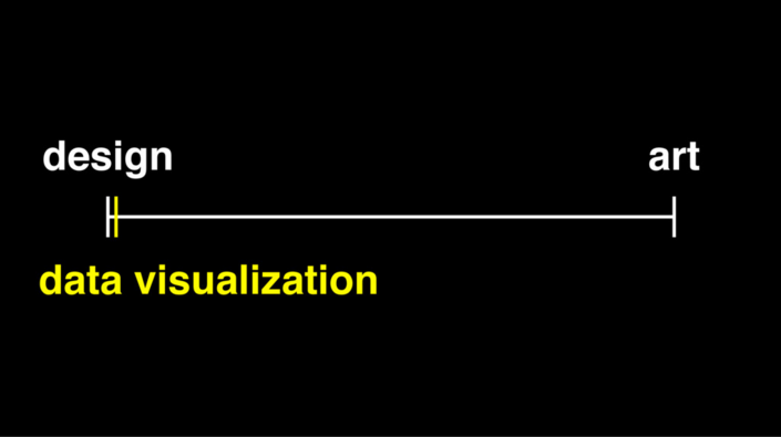
1. “Data visualization is not your creative outlet; data visualization is making data understandable.”
rachel binx from NASA’s Jet Propulsion Laboratory eloquently described every data viz practitioner’s struggle: compromising between art and utility.
Visualization literacy and data literacy take time. In fact, Tony Chu taught us how data visualization is the use of space to control time (spacetime pun?).
Intuitive data exposition is constrained by attention — what Daniel Kahneman, author of Thinking, Fast and Slow, would call our System 2 thinking.
Tony advocates using techniques like animation and pacing (think scrollytelling) to feed bite-size bits of information (pun intended) to those digesting our visualizations, while Rachel focuses on using data viz to render tools instead of to tell stories or paint a picture.
2. Yet, so much creativity is involved in finding solutions to visualizing complex data problems.
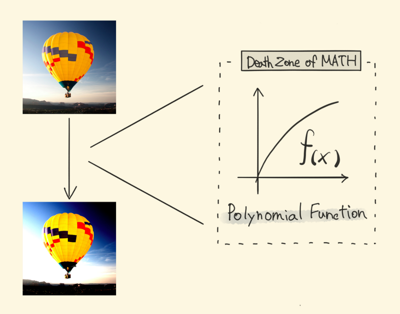
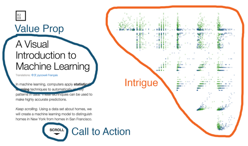
Every speaker probed the realms of creativity in their mesmerizing visuals and approaches to technical rigor. Mariko Kosaka transformed polynomial functions into “pixel playgrounds” and brought kernel convolution to life with a “pixel social graph.”
Shirley Wu abused the force (d3’s force-directed graph layout) in a number of ways to simplify Illumio’s Illumination product (Shirley’s slides distill this complex idea into beautiful, understandable simplicity).
Amelia McNamara sneakily taught us some statistics — particularly, a creative solution to distinguishing real patterns in data from randomly generated data.
Nicky Case cleverly applied systems thinking to real-world phenomena like disease proliferation, ecosystem regeneration, and racial segregation. Nicky employed emojis in simulations to show that the world is not linear; it’s loopy. (Side note: emojis made a record-breaking number of appearances in this year’s talks.)
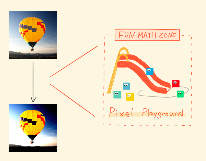

And Nadieh Bremer meticulously decoded SVG properties like gradient, animation, the glow filter, motion blur, the gooey filter, and color blending. These eye candy features spruce up even the most basic data visualizations.

3. The future of data visualization is virtual, physical, and sonic.
“Data visualization” is quickly becoming an understatement for the field. The OpenVis Conference exploited much more than just our visual cortexes. Our ears sampled the building blocks of music in Kyle McDonald’s talk and we experienced a physics lesson in Ana Asnes Becker’s 3D ride along the Nasdaq.
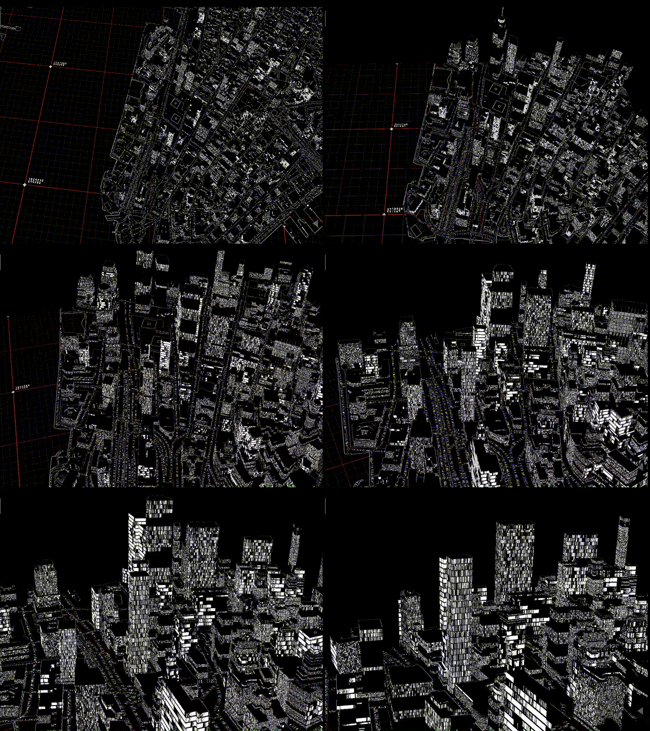
Virtual reality is building a new playground for data visualization — side effects may include nausea. Patricio Gonzalez Vivo showcased the future of 2D and 3D mapmaking using shaders (check out Mapzen’s Tangram).
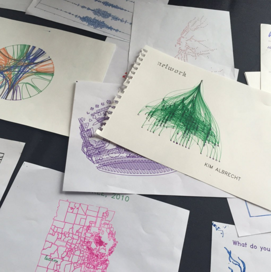
We also witnessed robots produce physical data visualizations and data art during breaks at the conference.
4. Feature engineering is major ?.
At the foundation of every well-fit model, successful predictive algorithm, and effective data visualization is hours of feature engineering and data scrubbing.
Oftentimes, the visualization is just the tip of the iceberg. Sometimes, a single line of code is just the tip of the iceberg (cough, cough rachel binx)! Data visualizers are all under-the-hood engineers as well as designers and artists.
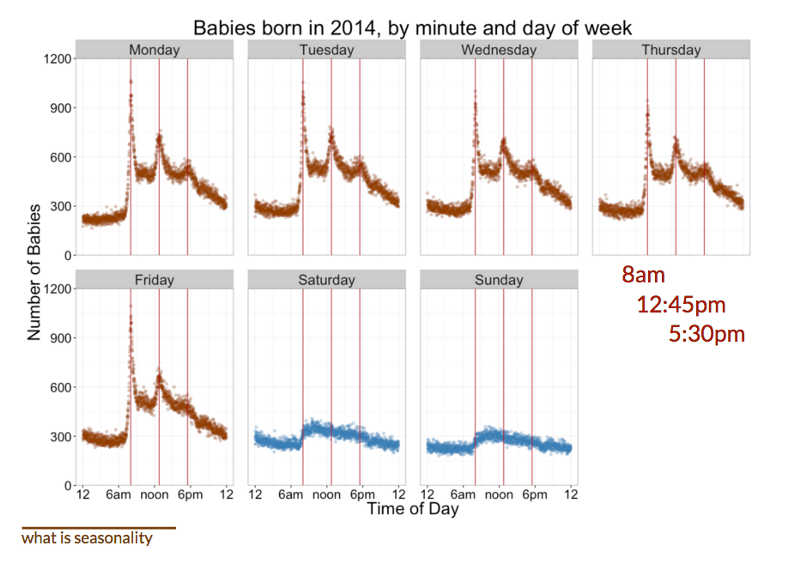
Zan Armstrong taught us how to explore time series data to select the appropriate seasonality before modeling. Fernanda Viégas and Martin Wattenberg heavily reinforced the importance of wise feature selection and engineering prior to building a successful machine learning algorithm.
5. Neural networks are 2016’s sexiest algorithm and they are part math, part magic ✨.
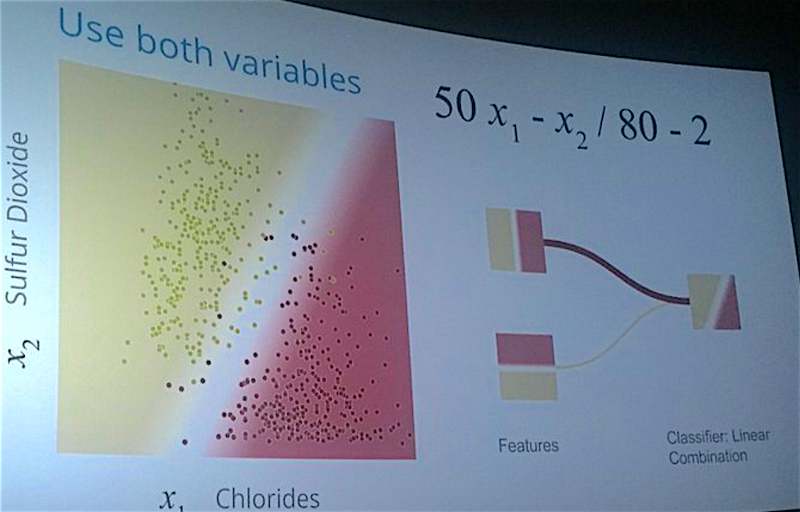
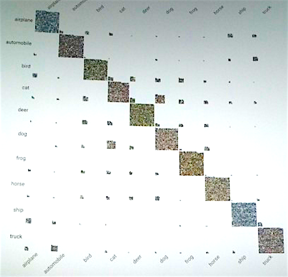
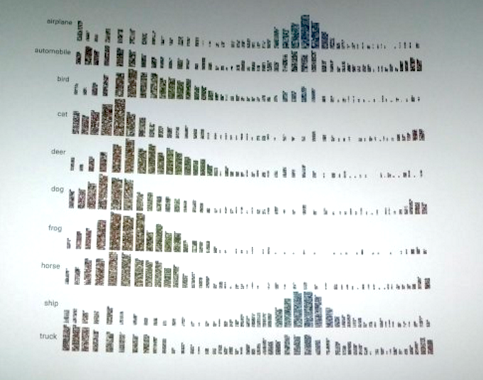
Fernanda Viégas and Martin Wattenberg from Google’s data visualization group demystified neural nets by demo-ing their recently released TensorFlow playground.
With the right amount of hidden layers, nodes, and training data, a neural net can classify just about anything… well, except for images of mugs (again, feature engineering is key).
6. Text analysis is about to blow up beyond word clouds.
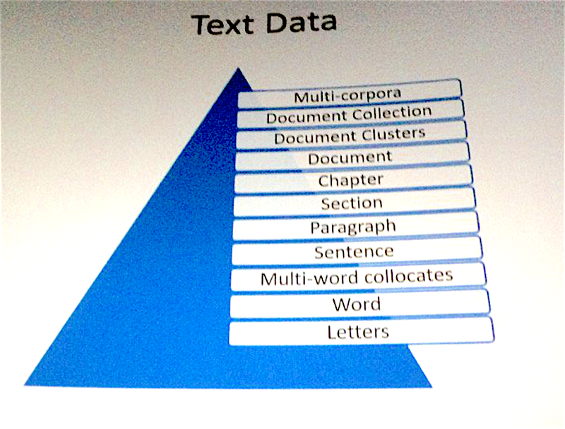
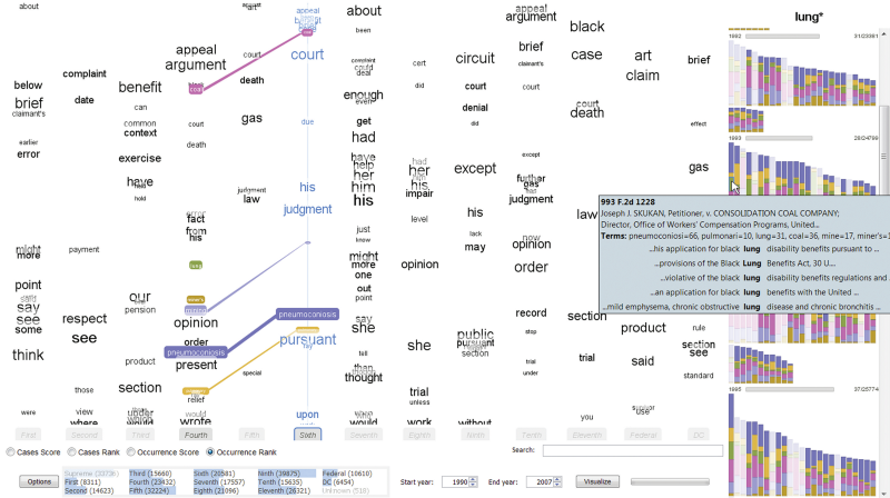
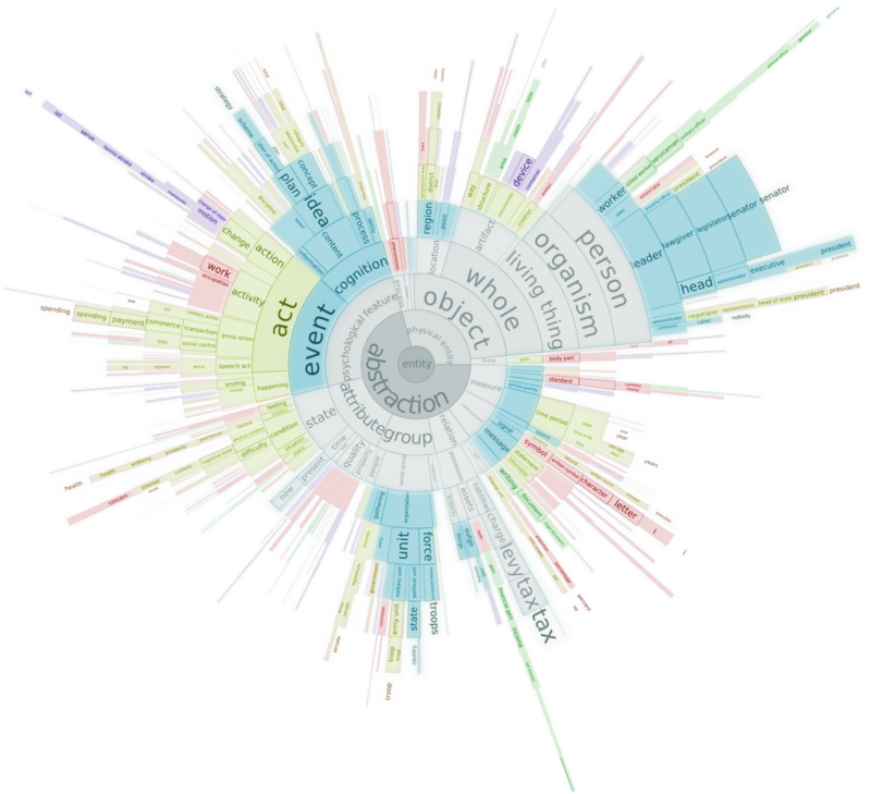
Christopher Collins led us through a text analysis and visualization spree. In the limited time he had, Christopher whisked us through parallel tag clouds of our country’s legal cases, sunburst diagrams of barbie’s lexicon, and how anomalous information spreads across the web. Christopher’s techniques are novel and mark the launch of a new era of text analysis.
7. Automation is inevitable.
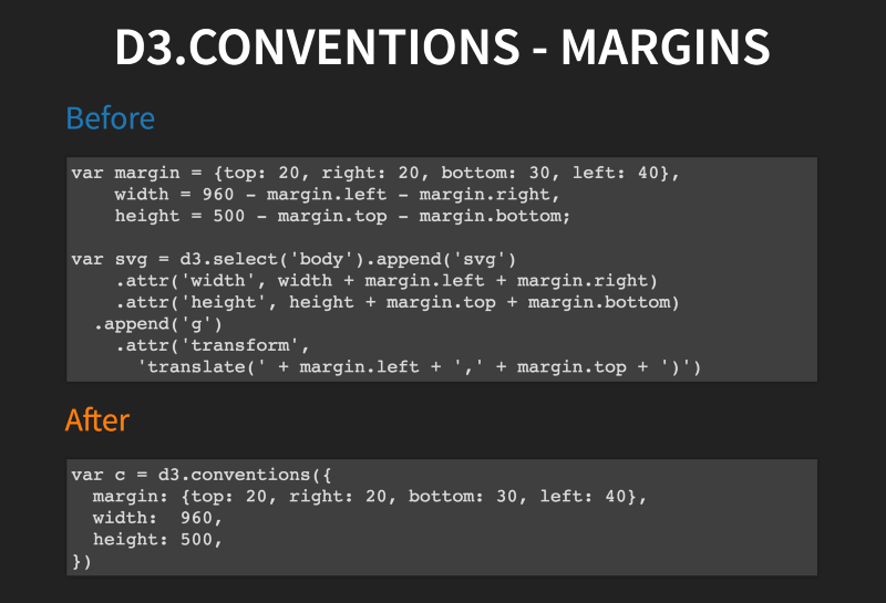
One seventh of the 21 talks focused on components of automation in data visualization. Adam Pearce’s tiny tools developed at Bloomberg Graphics drastically reduce the time spent in iterative tasks like writing redundant lines of code.
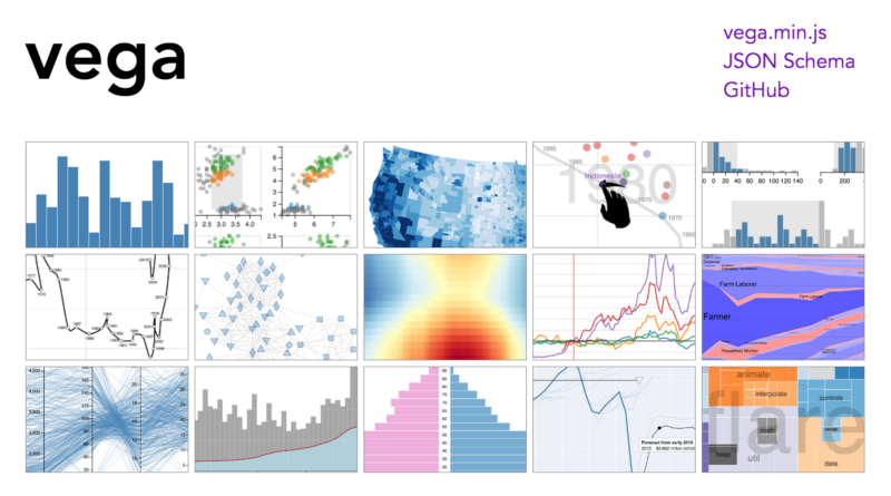
David Yanofsky’s charting platform uses d3.js and react.js to create brutally simple point-and-click dashboards and charts. Arvind Satyanarayan demo’ed Vega, the reactive programming tool that allows users to declaratively define interactivity and describe features of a visualization directly in a JSON.
8. Data visualization leaves no stone left unturned.
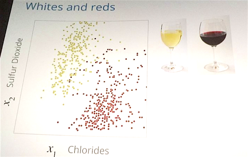
By stone, I mean field of study. We saw disruptive data visualization techniques in a breadth of fields from wine and song to outer space and tennis. We, as data visualization experts, get to play in everyone’s backyard.
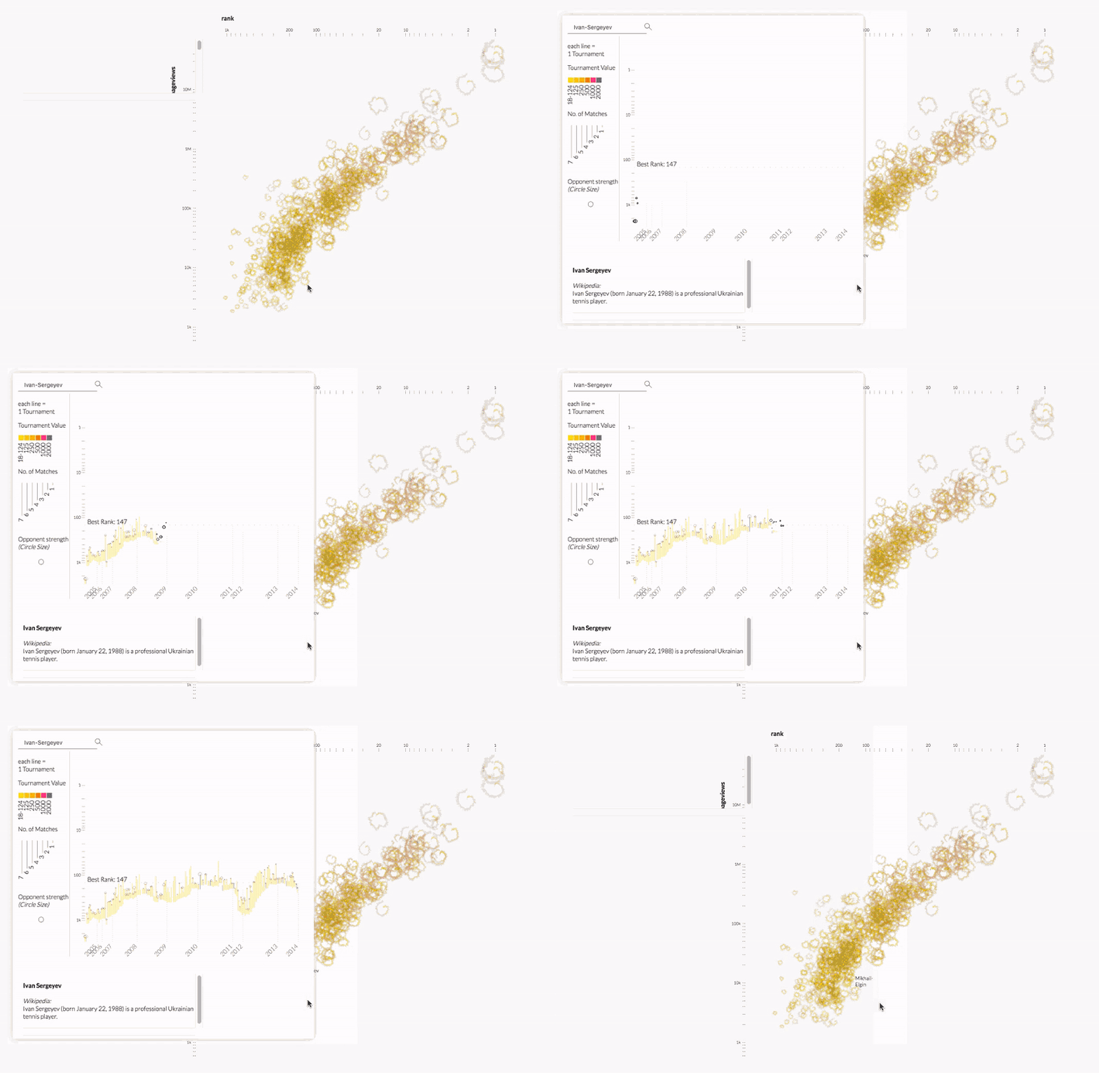
Kim Albrecht deconstructed the relationship between performance and popularity in professional tennis. Kim explained the intersection between data science and data visualization and how visualization unites scientists and sparks public dialogues.
Christine Waigl launched us into orbit around the planet and probed into regions of the world affected by climate change and natural disaster. We voyaged through her visualization trajectory from retrieving satellite data to generating quality raster images.
9. Good data visualization nods to principles from psychology, neuroscience, and philosophy about how our visual cortex communicates with the rest of our brain and about how we ethically communicate uncertainty.
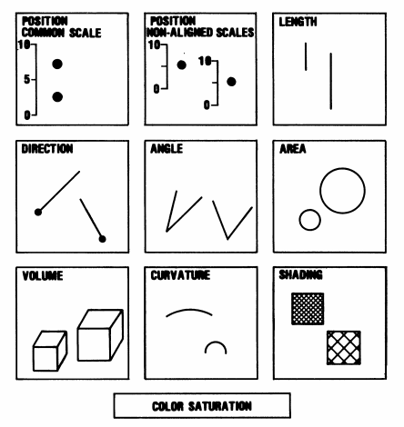
kennedy elliott showed us how pre-attentive processing of image attributes like color, shape, angles, position, curvature, volume, shading, area, length, and direction deeply impacts how humans interpret graphics.
As designers and data experts, our job requires us to be aware of the inherent biases in graphics to produce accurate and useful tools.
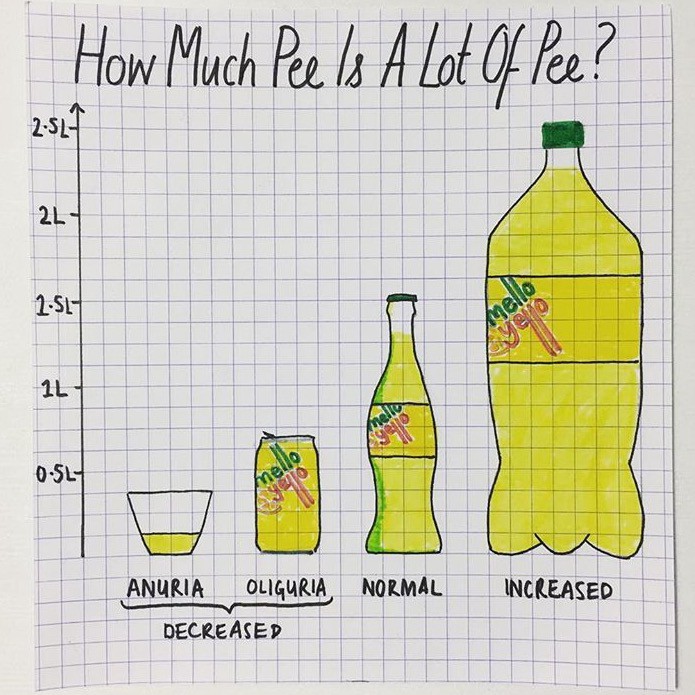
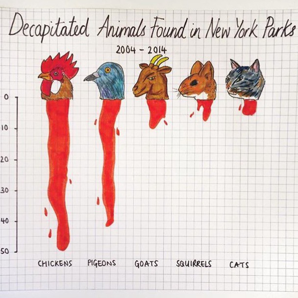
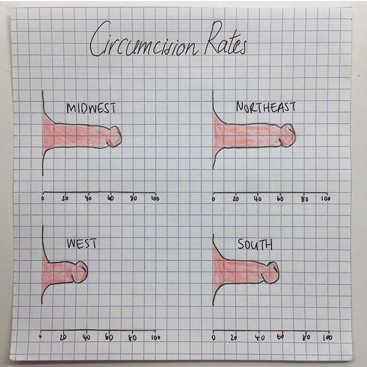
Mona Chalabi reminded us to humanize our data and to be receptive to channels of critique like comment sections. Mona would agree that the medium is both the message and the messenger.
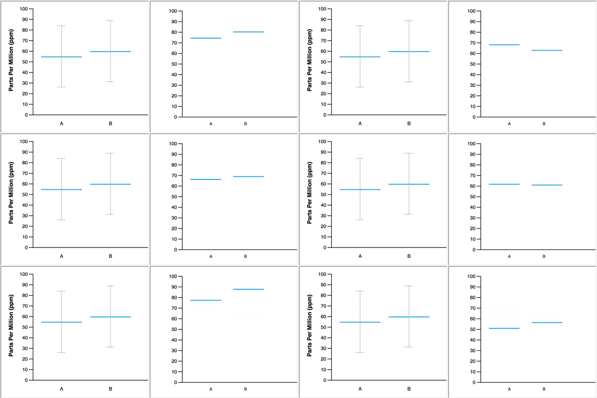
In real life, we learn to navigate uncertainty from repeated experiences. Jessica Hullman used hypothetical outcome plots to place us in the midst of uncertainty. According to Jessica, “HOPs enable a user to experience uncertainty in terms of countable events, just like we experience probability in our day to day lives.”
10. Data nerds are my people!
The handsdown most valuable part of the conference was meeting the wildly accomplished and equally curious data visualization and data science explorers.
I am so grateful to Irene Ros, the rest of the team at Bocoup, and the sponsors for putting together an outstandingly organized conference. Post-conference depression is a real thing, I learned. Thank you for the knowledge, friends, skills, and ideas. Also, huge thank you to Salesforce for sponsoring me and my awesome manager Ernest for supporting my attendance!
One of my favorite stories from the conference happened at the party. I was standing near Mariko who prefaced her talk by sharing how she married her love for knitting sweaters with her love for coding. A data viz engineer at Apple turned to me and asked if I was a knitter myself. Being the R queen that I am, I assumed he was wondering if I was a knitr user — as in R’s report-generating package ‘knitr’ — to which I responded positively, “Yes! I am a big knitr slash sweave fan.”
At any other party, I probably would have received a strange look and spent the rest of the night wondering why no one would talk to me. But a data nerd party is different. He understood me immediately, laughed at my misunderstanding, and followed up with more questions about knitr ?.
