
By Emmanuel Ohans
June 11, 2017, I decided to read the CSS Grid spec.
The Spec was a little bit technical, but it was by far the most enjoyed specification I had ever read. If you’re a more advanced developer, bookmark it for future references.
So, will this be helpful?
I believe the difference between good and great engineers, is that the latter take their time to understand what really goes on under the hood. They learn how things work, instead of learning by “copy and paste.”
So, do you want to be a great developer?
Hell, yeah. Or, you wouldn’t be reading this article.
What you’ll learn
While reading the spec, I learned some very subtle, but profound details.
In this article, I will share them with you.
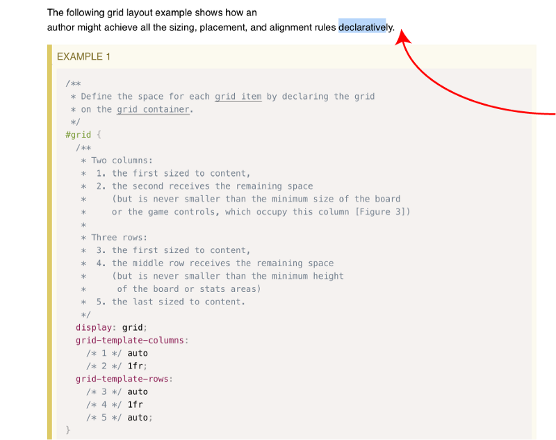
1. The CSS Grid is declarative
Declarative APIs are so sweet to work with. Think ReactJS?
As websites evolved from simple documents into complex, interactive applications, web layouts became difficult to compose. So difficult, they were my nightmare.
This is exactly the problem CSS Grid has come to solve today.
 From the spec.
The CSS Grid takes away the painful process of crafting intelligent layouts and replaces it with a beautiful set of declarative rules that make the process near effortless.
These are good times in the history of CSS.
2. The fractional unit does not always produce equally spaced rows and columns
One of the first things everyone learns and gets to love about the CSS Grid is the fractional unit. Even a duck can get away with it.
The fractional unit takes away the pain of calculating percentages. It is a delight to work with.
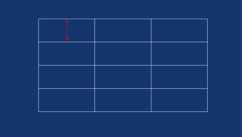
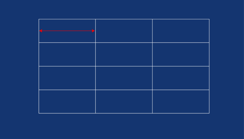
Most people teach that the fractional unit (fr) yields equally spaced columns or rows.
For example, a declaration like 1fr 1fr 1fr is expected to give you columns or rows of equal spacing. See the illustration below:
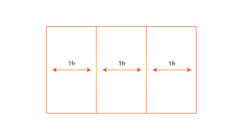 Equally spaced columns created by the fractional unit.
Sadly, this is NOT always true. Poor duck.
The following is from the spec:
The
frunit fills up the available space BUT it is NEVER smaller than the minimum size of the grid container or the content of the row or column.
Essentially, If you have an image, img or any grid item, with a min-width or min-height declaration, you can have unexpected results with the fractional unit.
After quacking around like a wet scared duck, I spent a lot of time experimenting with the fractional unit. I wrote an article on my findings.
3. You don’t really know how Grids are sized. Or, do you?
A CSS grid definition always begins in the lines of this:
display: grid
Often times, it is followed by the row and column definitions. Something like this:
grid-template-rows: 10px 1fr 3fr
grid-template-columns: 1fr
And finally, you are likely to place the grid items with whatever technique suits you.
Since there are lots of ways to place grid items, I’ll skip the required code for brevity.
So, here’s the problem.
Under the hood, you must assume that the size of the grid rows and columns are first computed before the items are placed. Right?
Well, it appears that the truth is the complete opposite.
How weird.
The following is from the spec:
2.3. Sizing the Grid
Once the grid items have been placed, the sizes of the grid tracks (rows and columns) are calculated, accounting for the sizes of their contents and/or available space as specified in the grid definition.
Note the progression.
- The grid items are placed.
- The sizes of the grid tracks are calculated
You’re likely to have questions around this. So, I’ll try to resolve those concerns of yours.
Firstly, note that every grid item is assigned a grid-area . The grid items are then sized within this area. So, how exactly are the grid items placed without already calculating the size of the tracks?
If you take a look at the Placing Grid items section of the spec, you’ll find a clue.
A lot is taken into consideration when sizing grids, and that largely includes the size of the grid items.
Sizing grids may be based on the following:
- A fixed sizing function (
[length](https://www.w3.org/TR/css3-values/#length-value)or resolveable[percentage](https://www.w3.org/TR/css3-values/#percentage-value)). - An intrinsic sizing function (
[min-content](https://www.w3.org/TR/css-grid-1/#valdef-grid-template-columns-min-content),[max-content](https://www.w3.org/TR/css-grid-1/#valdef-grid-template-columns-max-content),[auto](https://www.w3.org/TR/css-grid-1/#valdef-grid-template-columns-auto),[fit-content()](https://www.w3.org/TR/css-grid-1/#valdef-grid-template-columns-fit-content)), or - A flexible sizing function (
[flex](https://www.w3.org/TR/css-grid-1/#typedef-flex)).
What I believe happens under the hood is, the grid items are placed.
That is, the containing block for the item is determined, the sizing function for the item is then determined. This in turn influences the size of the grid tracks.
You see?
Not what you initially thought.
4. By default, grid items are stretched to fit their grid area — except in certain cases
Without your intervention, grid items will always stretch to fit their grid area.
So, if you had a declaration like so:
grid-template-areas: 'header header header'
                     'sidebar main  main'
                     'sidebar footer footer'
And you had divs assigned to the specific grid areas, like so:
.div1 {
   grid-area: header
}
.div2 {
   grid-area: sidebar
}
.div3 {
   grid-area: main
}
.div4 {
   grid-area: footer
}
You don’t need to declare the width and height of the divs above to 100%
They will automatically stretch to fill their respective areas.
Now, here’s the catch.
This behavior is inconsistent with Images.
As pointed out by Rachel Andrew, the spec goes on to say this behavior is different for grid items with an intrinsic aspect ratio.
Don’t let the big words scare you. It ain’t no demogorgon.
An image is by default an inline-block element, but they also have specific dimensions. They have dimensions naturally associated with them. An image could be 400px by 600px wide, or any given dimensions at all.
But, regular block elements such as divs , have no intrinsic dimensions. That is, they do not have dimensions that naturally belong to them.
So, while grid items with NO intrinsic dimensions will stretch to fit their grid area, this is not true for grid items having an intrinsic dimension e.g images.
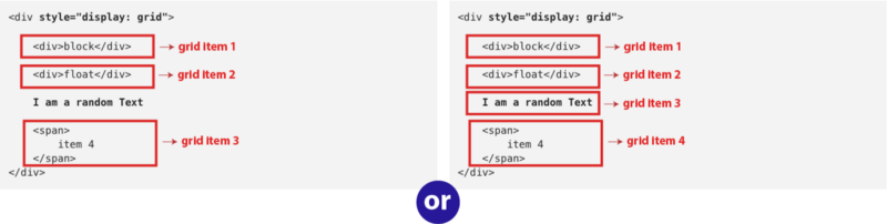
5. Do you really know what a Grid Item is?
Consider the code block below:
<div style="display: grid">
    <div>block</div>

    <div>float</div>

    I am a random Text

    <span>
        item 4
    </span>
</div>
In the code block above, can you spot the grid items?
How many grid items are in the code block, 3 or 4?
I failed this question blatantly.
Note that the text I am a random text isn’t wrapped by any html tags.
 which is it?
So, what’s your answer?
Well, if you answered 3, you’re wrong. Haha, got ya!
According to the spec, an anonymous grid item is wrapped around each run of text within a grid.
Yes, that means I am a random text is also a grid item.
<div style="display: grid">

<div>block</div>

    <div>float</div>
    <!-- the text below is a grid item -->
    I am a random Text

    <span>
        item 4
    </span>
</div>
Yeah, the answer is 4. We’ve got 3 explicit grid items and 1 anonymous grid item!
Got that?
6. The margins of adjacent grid items do not collapse.
There are big differences between block elements and grid containers.
What I mean is, an element with display: block and another with display: grid have a lot of fundamental differences.
The difference I am choosing to discuss here is got to do with collapsible margins.
One of first things you learn with CSS is the concept of collapsible margins. I don’t want to spend a lot of time explaining what collapsible margins mean. If you bring it up in the comments, I will.
So, back to grids.
With every grid item, the margins are never collapsed.
Well, this is understandable. Let me show you why.
Adjacent grid items are independently contained within the containing block formed by their grid areas.
What that complex paragraph above means is this. Each grid item lives and breathes within a grid-area
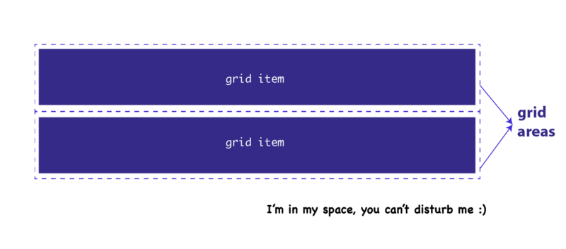 Grid items are placed within their respective grid areas. They stay in their own undisturbed territories. They are unaffected by collapsible margins. How cool.
So, technically, you may say the grid item isn’t an immediate neighbor of the other grid items. But is contained within an uninterrupted closed territory — the grid area.
If you’re curious what other differences exist between block elements and grid elements, I wrote an interesting article on the subject.
7. auto-fill and auto-fit. What's the difference?
While auto-fill and auto-fit look like the same functions they are different in a way.
They are similar in the sense that they allow for automatically creating grid tracks that fill up the grid container in some way.
For example, the following code will create as many 200px columns as will fit into the window width. If there is any remaining space, it will be distributed among the 200px columns.
body {
  display: grid;
  grid-template-columns: repeat(auto-fill, minmax(200px, 1fr));
}
What’s the difference?
auto-fill will create tracks even if there's no grid item to fill it up. auto-fit will not do this. It will deflate empty tracks to zero.
That's all.
8. In the grid-template-areas definition, the number of words in a string MUST be equal.
You remember the weird looking grid-template-areas values that look like a map?
Well, it appears it can mess things up real quick.
In a grid-template-areas declaration, all strings must have the same number of columns, or else the declaration is invalid.
For example:
/* this is valid */

grid-template-areas: "header header header sidebar"
                     "main   main   main   sidebar"
                     "main   main   main   sidebar"

/* this is WRONG */

grid-template-areas: "header header header sidebar"
                     "main   main   main   sidebar"
                     "main   main     sidebar"
The number of word in the strings, must be equal.
9. Avoid using percentages in paddings or margins on grid items entirely
 _[From the CSS Grid Spec](https://www.w3.org/TR/css-grid-1/#item-margins" rel="noopener" target="blank" title=")
The reason behind this is simple. At the time of this writing, you will get different behavior in different browsers.
According to the spec, the percentage may be resolved either against the width of the element alone, or left/right margins against the width while top/bottom are resolved against the height
In order to have a consistent rendering across most browsers, avoid using percentages in paddings or margins of grid items.
More importantly, there are already a few confusing bits with the CSS Grid. Don’t shoot yourself in the foot with percentages paddings or margins in grid items.
10. How’s the size of the explicit grid resolved when there’s a conflict?
Assume that you have a grid declaration like so:
grid-template-areas: "header header header sidebar"
                     "main   main   main   sidebar"
                     "main   main   main   sidebar"
In the code block above, you have 4 columns and 3 rows.
What if you also did this:
grid-template-columns: repeat(5, 1fr)
grid-template-rows: repeat(4, 1fr)
Now you have more columns and rows. 5 columns, and 4 rows.
You got that?
There’s now a conflict in the declarations. So, how is this resolved?
According to the spec, the size of the explicit grid is determined by the larger of the number of rows/columns defined by grid-template-areas and the number of rows/columns sized by grid-template-rows/grid-template-columns.
The spec may seem like it complicated a simple thing. In plain language, what that means is, the declaration with the larger number of rows or columns wins.
In the example above, the grid will take up 5 columns, and 4 rows NOT 4 columns and 3 rows.
*EDIT: The grid-template-areas property is used to place grid items on a grid. So, why should we have a conflict in grid definition? Aren’t grids supposed to be defined with just the grid-template-columns and grid-template-rows properties? I answer this in the comment section. Check it out.
11. The size of the grid is not purely the sum of the track sizes
 Grid tracks refer to the distance between grid lines.
While this is simple, it is worth mentioning incase you have a fixed width grid set up.
The size of the grid may be influenced by the grid-row-gap, grid-column-gap and justify-content, align-content . Which sadly, can add additional space between tracks too.
So, be careful while computing fixed widths within the grid.
BONUS: We can all contribute to making the DOCS better
Because I’m a kind soul, I’ve added one more tip here ?
The Spec was written by humans. And it so happens that humans can make mistakes.
While reading the spec, I spotted a tiny typo.
At the time, I wasn’t particularly sure what to do. So, I asked around on Twitter.
The kind Jen Simmons helped file an issue on github, and it got fixed.
So, what’s the moral?
You can help make the docs better by contributing in whatever way possible.
Yes, you!
Let’s make the web better, together.
Want to become Pro?
Download my free CSS Grid guide, and also get two quality interactive Flexbox courses for free!
 How to Master the CSS Grid, and what to build along the way (Free PDF Guide)