
By Kyle Prinsloo
So you're thinking of building your portfolio site as a freelance web developer.
Or maybe you're looking to create an online space where potential employers can get a feel for who you are and what you've done in the past.
Either way, your portfolio site is the perfect place to show your past work and provide a convenient way for potential clients or employers to contact you. Even if you don’t have past work, a great portfolio can help you get that first client.
We're going to take a look at the standard features your portfolio site should include to bring across a clear message. After we've gone over the basics, we're going to delve into some inspirational, beautiful, and a few simply amazing portfolios of freelancers out there.
Include an “About Me” Page on Your Portfolio Site
A portfolio website, and business-website landing pages in general, are the modern-day business card.
Bringing across the information that will make potential clients and employers stick around to find out more about you, in the hope of working with you, is crucial.
That being said, it's considered good practice to include an "About" section on your site. In this section, give a well-revised version of the most important (relevant) information about yourself, your experience, and maybe your approach as well.
Of course, there can be variation, but the most important thing is to try to identify your unique selling points and validators (past work and/or skills) and point them out as clearly as possible.
We'll see in some of the inspirational portfolios below that you can get creative with this while remaining clear in the main message.
Show Proof of Past Work in Your Portfolio
Your portfolio site serves one main purpose: to show credibility and build trust in the minds of your visitors.
There is one sure way of doing so and that is through the clear display of previous projects or work.
This becomes even more relevant and important if your ideal visitor is not technically-savvy and just wants to see proof and quality of previous work.
This is a good place to show a range of work illustrating what you're capable of and that you're able to adapt to the needs of different project scopes.
Keep in mind that clarity is important here. Showing a screenshot of a sample project is not enough, especially if you do not have a huge amount of experience.
What you could do is describe the process for each project: use this space as a way to communicate your thinking and explain certain design or technical choices you made.
If done well, a potential client or employer can understand how and why you do the things you do which will give them a much more informed impression of you and the way you work.
Add Testimonials to Your Portfolio Site
Adding testimonials, if you have them, is probably the best way to provide social proof about your work. These can be quotes from past clients and colleagues. If you've worked with brands, include their names and logos.
Demonstrating how past clients and employers feel about their experience with you can settle the nerves of an anxious visitor and solidify the trustworthy impression you're trying to make with your portfolio site.
Include Your Contact Information
This may seem like an obvious one, but many portfolio sites make it more difficult than it should be to find the most important contact info.
Leave your email address, social media links, or a contact form in an easy-to-find spot on your site.
You need to make the whole experience of visitors interacting with your site as easy as possible, including the process to follow when they've decided they want to get in touch.
10 Awesome Freelancing Portfolios to Inspire You
Stef Ivanov
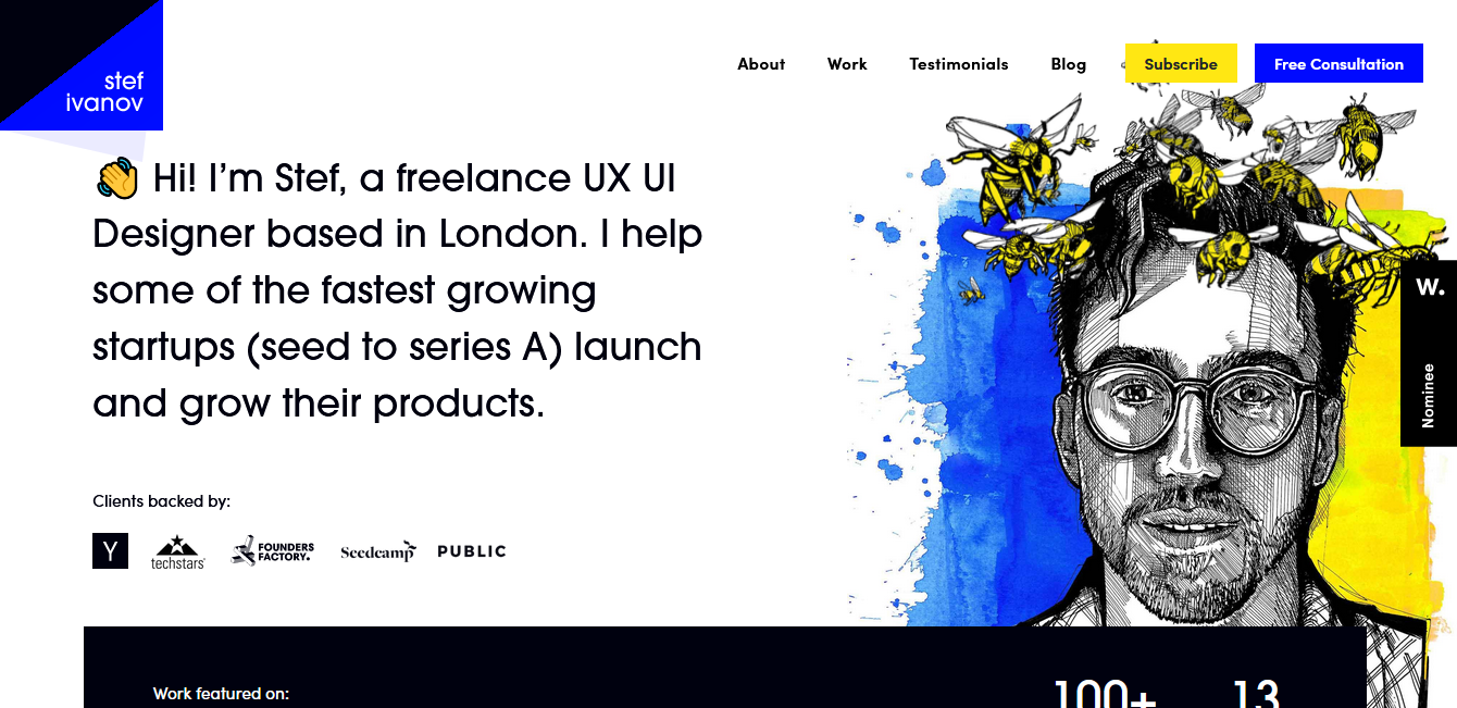
Freelance UX and UI designer, Stef Ivanov, has worked for more than 100 companies throughout a 13-year career, and there's a great selection of his work on show in his portfolio.
However, that's not why I included him on this list. It wouldn't make sense to include only the most experienced freelancers here. Where's the inspiration in that? Rather, he's been included for the attention-grabbing landing page.
It features a simple block of introductory text which is pretty standard for sites in general.
How the landing page shines is with a beautifully cross-hatched pen-and-ink portrait of Stef with an animated halo of bees buzzing around his head.
Not only does he nail the basics we mentioned above but he's added a little extra touch that shows off a bit of his creative personality and piques visitors' interest.
Erika Senft Miller
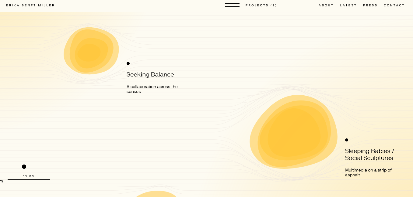
When you visit Erika's site, you're met with a very minimalist loading screen.
Something most unusual happens once the page is fully-loaded. You'd have to visit Erika's site to get a real feel for it but let's give a wordy description a go, shall we?
Her website is presented as a lined page that you can move around by dragging with the mouse. As you move the on-screen pointer, you'll notice that the lines making up the page move and bend around the pointer.
When you come to a portfolio item – represented as a slowly morphing, multi-layered 2D orb which itself expands as you mouse over it – the lines around the item also warp.
Once you click on one of these morphing, moving orbs, the project info expands outwards. And the intriguing concept continues. Instead of scrolling down or across, you sort of follows= a meandering path as you see fit.
The way this is presented is highly creative but where it shines is in its ability to draw a visitor in with its unique interaction style.
Erika has presented a fascinating way of exploring her work.
Jessica Haines
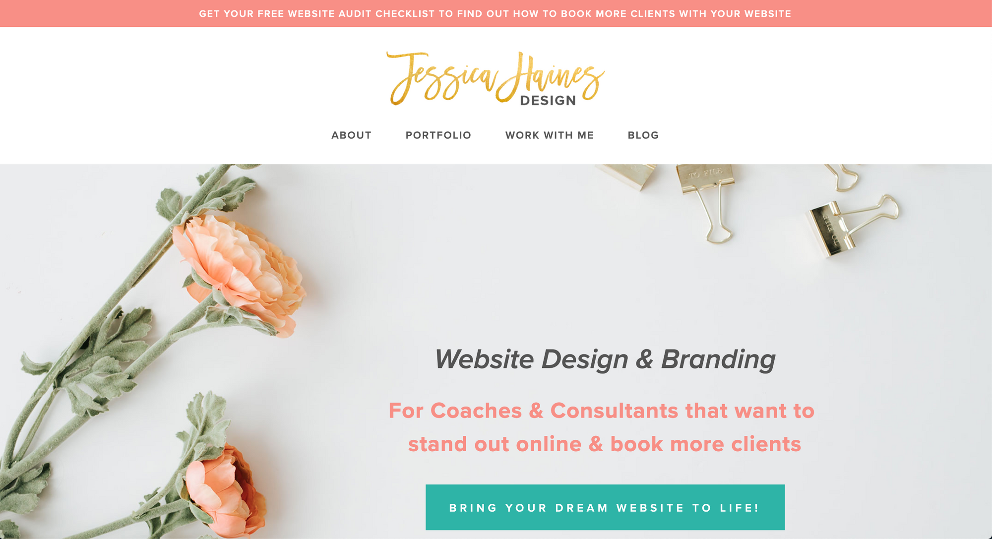
Jessica has a great portfolio website!
It's designed with conversions in mind, it is well thought out, the colors are great, it's niched down - it's just superb.
The cool thing about her website that stands out to me is that she clearly showcases her expertise.
Take notes for your portfolio site. I always use her example when chatting to freelance students.
Rey van den Berg
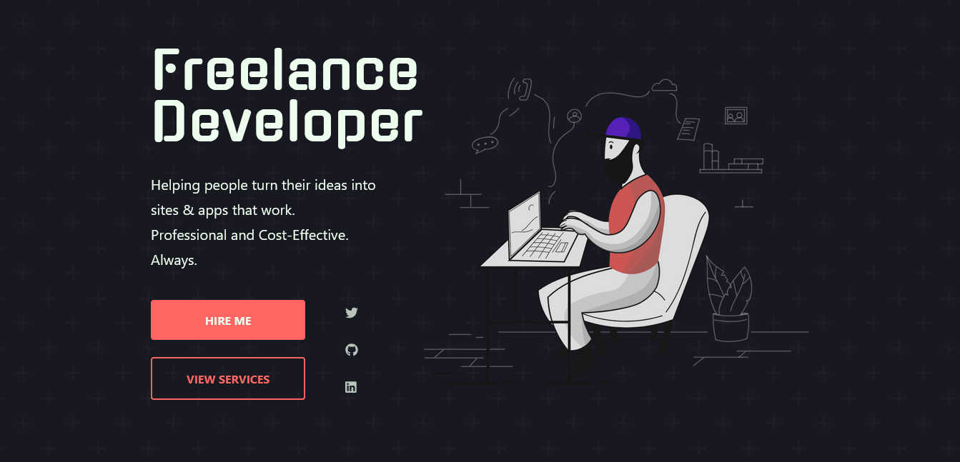
Clarity is key in Rey's portfolio.
Rey seems to have chosen a less creative approach in favour of really nailing the fundamentals of a good-quality portfolio site.
On the landing page, you see some intro text and an illustration of a developer sitting at a laptop. What this landing page does so well is provide a clear description of exactly what he does and provides the crucial information we were talking about earlier.
You do not need to scroll any further if you're looking to contact him via a form or social media and he directs visitors to a section where they can see an elaboration on the services he provides.
Rey has clearly designed his website copy to build trust with the site visitors in a more personal way. There is little technical jargon which is inviting to less tech-savvy visitors while he still includes his tech skills for would-be employers
This site nails the fundamentals by being clear and providing proof-of-work. Rey goes a step further by being personal yet professional in drawing potential clients and employers into his communication approach with "Promises", "Ways You'll Benefit", and "FAQs".
Adam Brooks
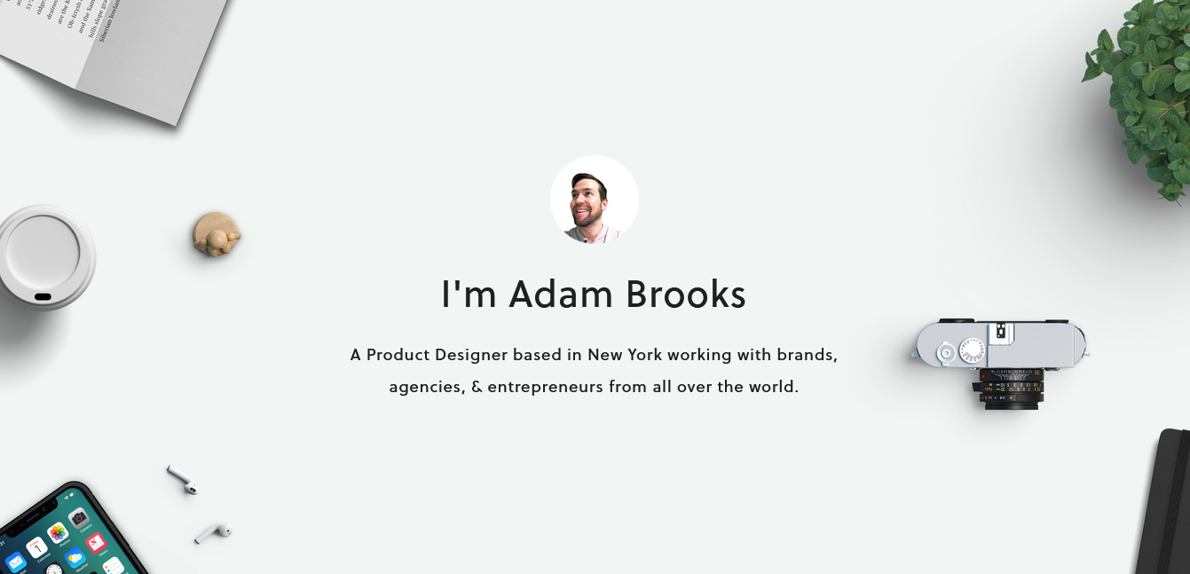
A clean design and generous use of whitespace give Adam's site a modern feel that will appeal to most.
The landing page includes a smiling picture of Adam which immediately adds some personality to the site. He is clear with what he does and includes some credibility right off the bat by stating that he has worked with brands all over the world.
After a gentle introduction to what he does, a scroll down the page reveals a two-sentence pitch of his services with contact links. This might be all that some visitors are looking for, especially if they have been referred from elsewhere about Adam's services. He has done well to include a way of contacting him so early in his site.
For those that don't quite grasp that two-sentence pitch, he expands on that a little by explaining his services a bit more – especially useful for more lay visitors.
Following that section, we're met by some sample work as device mockups presented in a manner that is easy-breathing, thanks to the generous whitespace, and minimal which gives off a professional feel.
This site is fantastic at coming across as credible, professional, and, thanks to the sign off at the bottom of the site, approachable.
Geoff House
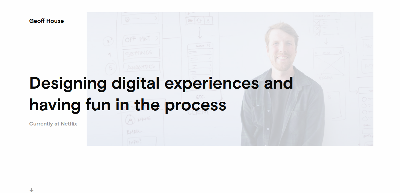
Geoff wastes absolutely no time in reassuring would-be clients and employers that he can get a job done – he shows past work almost immediately!
You're met with a clear one-liner of what he does and where he is currently working.
Scrolling down reveals several projects that Geoff has worked on in the past.
Clicking on one of these projects is where this portfolio site excels. You'll find a case study of the project where he provides a brief description of it and expands on his role and team within the project.
This manner of presenting past work does wonders in the minds of visitors.
It provides information about the project's rationale, a deeper dive into the project's purpose, and a chance to get an idea for his communication style.
Jennie Lakenan
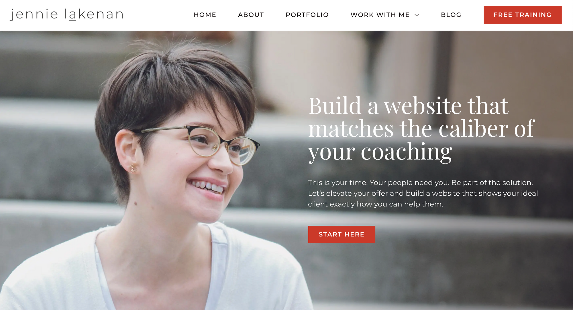
I love Jennie's website, because it's simple but effective.
She has a great headline, great images, testimonials, clear call-to-actions, and she's niched down.
Way too many freelancers go overboard with animations and fluff - Jennie's portfolio is a good example of keeping it simple and not losing sight of the core focus: getting more clients.
Adhemas Batista
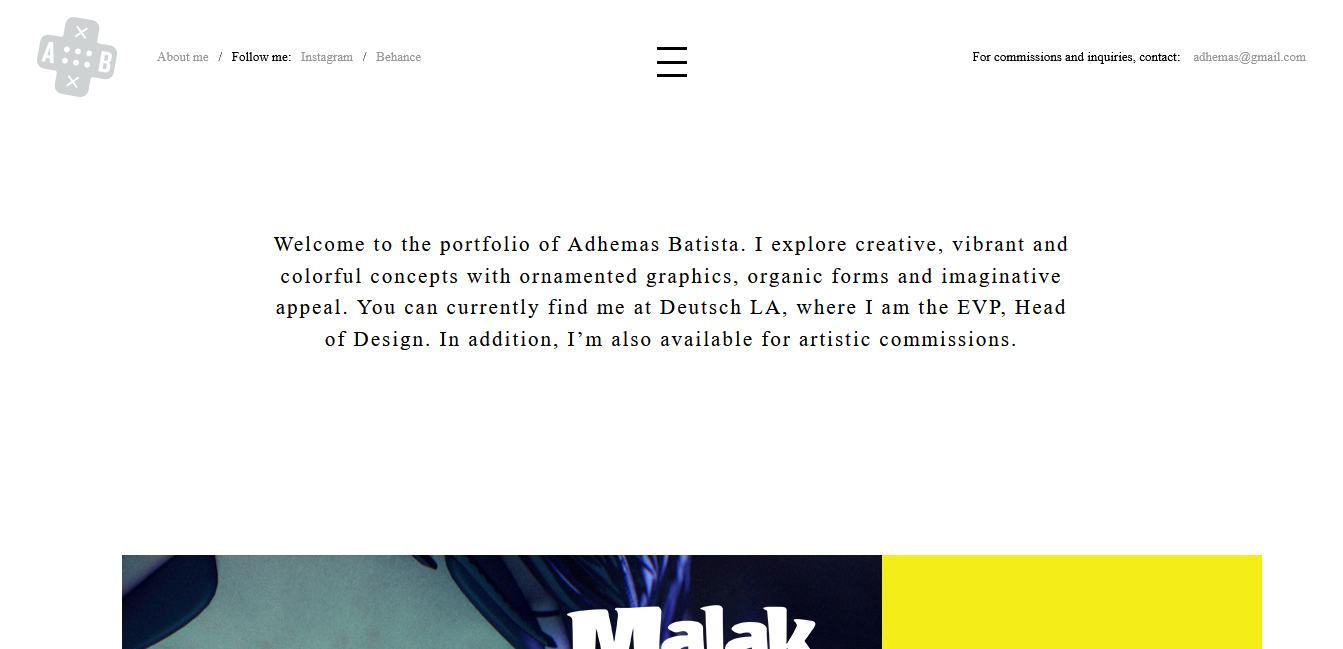
Adhemas has worked on a huge amount of very impression projects but that is not what I like the most about his portfolio site.
He has managed to include all of the fundamentals of a great portfolio on a single view with a ton of whitespace.
His design is minimal but very clever. At the top, you can find social media contact info and an email address. In the top-center, you can read about what Adhemas does, his current work and location, and his availability.
A little lower on the landing page, his display of previous work begins with large, multi-coloured images that have an animated hover effect.
Clicking on one of these past projects takes you to a long case study page which is media-heavy with a ton of whitespace. He has detailed these project "case studies" extensively allowing you to get a real feel for the project and its purpose.
Adhemas' portfolio site is a fantastic example of how lots of whitespace can be used while still packing a ton of useful information on one view.
Flamy
A full-screen loading splash screen gives way to Flamy's unconventional yet eye-catching portfolio design.
Clean minimalism is not the name of the game here with a strong cartoon theme being preferred. Flamy's site goes to show that you can be quirky and fun without forgoing a professional appeal.
When you reach the landing page, you'll see what can only be described as a man with a flame for a head and cards describing the services Flamy offers.
The rest of the site sees clever parallax effects being used to add an interactive element to the site.
This site is undoubtedly fun, although not for everyone. This being said, they do get the fundamentals right and all the quirkiness is executed in a manner that doesn't sacrifice UX or clarity in the offering.
If nothing else, this site will leave a lasting impression in visitors' minds, and sometimes that's all you need to do to get visitors returning to your site and contacting you.
Ivo Mynttinen

Ivo's site is one of almost-Scandinavian minimalism.
It's clean, uses a lot of whitespace with large, clear headings, and gets all the other design fundamentals right such as beautiful visual hierarchy and well-matched text opacity.
His landing page includes a clear path to see past projects, which include lengthy project descriptions, and an intuitive contact button.
Smooth page transitions complement a flawless portfolio site.
Ivo has thought of everything potential clients and employers may be interested in seeing or finding out.
If you want to see what a perfect portfolio site looks like, without unnecessary bells and whistles, this is it.
Sara Michelazzo
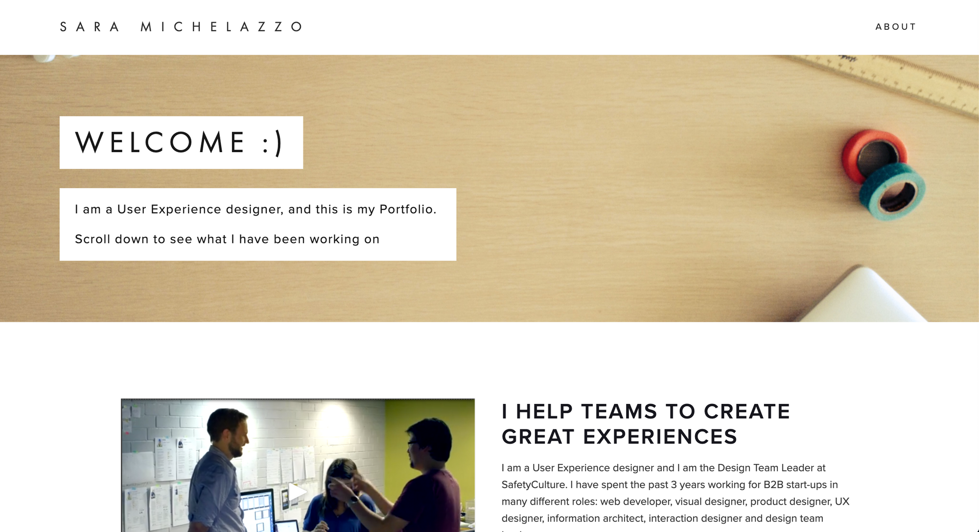
If you're into minimalist websites, Sara's portfolio is a good example.
She answers what she does and who she is within a quick glance of viewing her website.
My only critique is there's no contact form, but other than that, it's a clean minimalist example to be inspired from.
Jordan Flaig

Here is a minimal description one of the most minimal site's you'll see.
It answers all the important site visitor questions except for one missing, crucial question - "How do I contact you, Jordan?"
Add a contact section to your unique spin off of this site and you'll have the perfect minimalist modern-day business card on your hands.
Ruben Kuipers
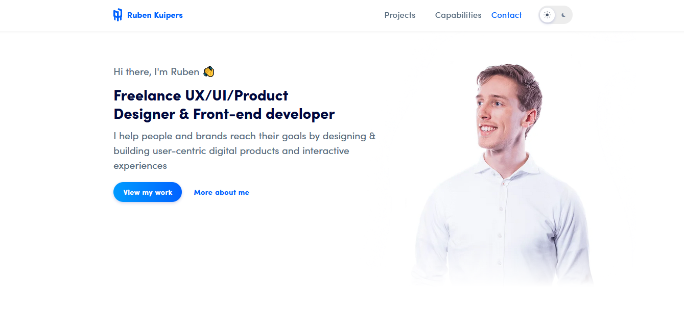
The style of Ruben's portfolio site is one that many developers will probably recognize. It even starts with a "Hi there, I'm Ruben"!
As a developer, you would be able to appreciate the little extras that make us happy like a toggle switch for dark-mode (and corresponding dark-mode profile image), subtle animations, and a section on "Skills & Tools".
What you may not notice is how these extras complement an already brilliant site.
As you land on Ruben's page, you immediately know what he looks like (which increases familiarity), know what he does, know that he is credible (a list of past clients), and have a way to contact him.
He has cleverly included testimonials interlaced with project cards which, together, make a convincing case for "Let's hire this guy!"
Ultimately, this site is a great example of a single page that alleviates all of the visitor's concerns without the page feeling too long or bloated. He manages to show his credibility, technical expertise, and testimonials in a seamless package.
This is a top portfolio and could serve as some real inspiration for your next portfolio build.
Summary
We've had a look at 10 fantastic freelancing portfolio sites that were designed in a multitude of styles and personalities.
If you were to take away one thing from this article, it should be this:
Nail those fundamentals that all portfolio sites should have.
Once you've figured out how you want to present the most important information for the visitors of your site, you can start becoming fancy.
Don't do it the other way or you run the risk of losing potential clients or jobs.
Hopefully, you've found some inspiration to improve upon or build your freelance portfolio site!
I'll leave you with one last portfolio site to play with by Robby Leonardi.
That's it!
Hope you found this article helpful.
See you on Twitter
Kyle