By Oluwaseyi Bello
Charts and graphs are a great way to display information/data to your app's users. In this article I will show you exactly how to do that with vue-apexcharts.
Getting Started
Using the Vue CLI we can easily create a starter application. First, we need to install the Vue CLI with the command below. You can skip this if you have it installed already.
Note: In order to use the CLI, you’ll need to have Node.js version 8 or above installed (8.10.0+ is recommended).
To install the CLI, run this command in your terminal:
npm install @vue/cli
Now we can use it to create our project. We will create the project using this command:
vue create vue-apexcharts-demo
We’ll then be prompted with the option to pick a default preset or to manually select features. Select **default**.
A new project directory will be created, and you can navigate into it using this command:
cd vue-apexcharts-demo
Installing Apexcharts
Before we continue, you might be wondering…
What is apexcharts?!
ApexCharts is a modern charting library that helps developers create beautiful and interactive visualizations for web pages. You can view their demo here.
We can easily use ApexCharts with our Vue application by integrating its wrapper component for Vue called vue-apexcharts.
To install the vue-apexcharts component in our application, use this command:
npm install --save apexcharts
npm install --save vue-apexcharts
Configuring vue-apexcharts
Now that we have vue-apexcharts installed we need to install it in our application. Open up the src directory and create a new directory called plugins. Inside the new plugins directory create a file called apexcharts.js.
Next, we will create a Vue component for apexcharts in our apexcharts.js. This will make the component globally available in our application.
To do this, we'll be importing both Vue and vue-apexcharts. Next, we will create a global component called apexchart. Here is what your apexcharts.js file should look like:
import Vue from 'vue'
import VueApexCharts from 'vue-apexcharts'

Vue.component('apexchart', VueApexCharts)
Importing our plugin file
We have to make Vue aware of the file we just created. To do that, we import it in the main.js file. Open up the main.js file and add the following line after the last import statement:
import '@/plugins/apexcharts'
Now we are ready to create our first chart.
Creating our First Chart
We will be creating our charts in the HelloWorld component. This component was created automatically when we used the Vue CLI to create our application.
Open up the file HelloWorld.vue and delete all the demo code there.
Your file should look like this:
<template>
</template>
<script>
export default {
 name: 'HelloWorld'
}
</script>
<style scoped>
</style>
Remember in our plugin, we called our component apexchart.
Vue-Apexcharts builds charts by using the data you pass into it using props, as seen in the code below. We will use that to create the HTML for our first chart. In the first example, we will start with a very basic bar chart.
<template>
  <div>
   <apexchart
     width="500" type="bar"
     :options="options" :series="series">
   </apexchart>
  </div>
</template>
As you can see in the above template, the apexchart component holds 4 props. Now, let’s jump to the script part.
<script>
export default {
  name: 'HelloWorld',
  data: () => ({
    options: {
      chart: {
        id: 'vuechart-example'
      },
      xaxis: {
        categories: [
         "Jan",
         "Feb",
         "Mar",
         "Apr",
         "May",
         "Jun",
         "Jul",
         "Aug",
         "Sep",
         "Oct",
         "Nov",
         "Dec"
        ]
      }
    },
    series: [{
      name: 'series-1',
      data: [55, 62, 89, 66, 98, 72, 101, 75, 94, 120, 117, 139]
    }]
  })
}
</script>
Explaining Chart Data
Our bar chart contains monthly stock pricing for a fictional organization. We have 12 data points in our bar chart. Each month will be displayed on the x-axis of the chart. Their pricing is displayed on the y-axis of the chart.
To provide the data that will be displayed in our bar chart, we will add a series array. A series is an array of objects. Each object defines the type of chart to be created and will have a data array of values to be plotted on the graph.
You can start your server with the command:
npm run serve
Now, open your browser to localhost:8080 and you should see your chart:
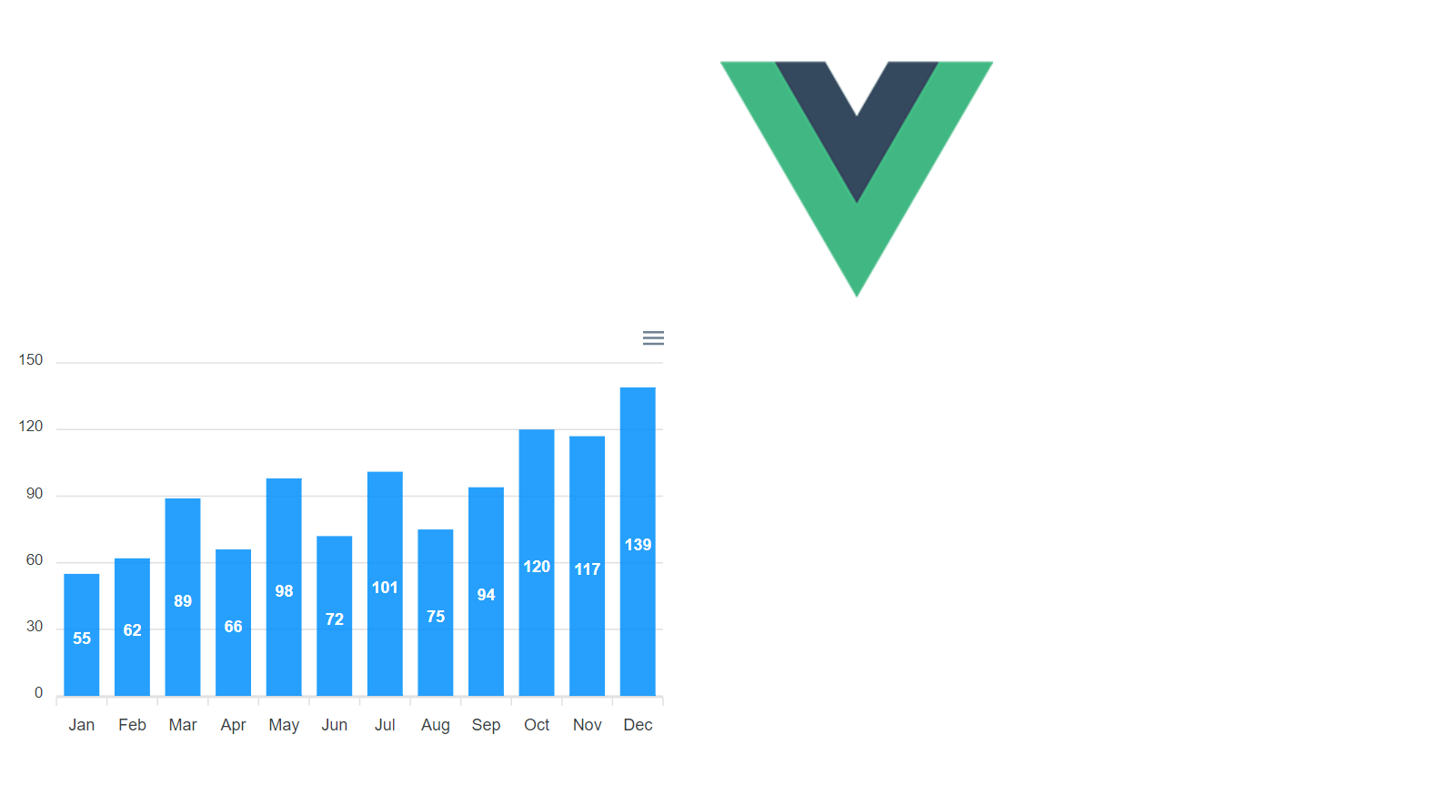
Styling our charts
We can place our chart in the center of the page. To do this I am going to add a class chart-wrapper inside our div. I also want to increase the width of the chart to 800px. My template now looks like this:
<template>
  <div class="chart-wrapper">
    <apexchart
      width="800" type="bar"
      :options="options" :series="series">
    </apexchart>
</div>
</template>
Next, let’s add some styling to the new chart-wrapper class that will place our chart in the center of the page. Here is the style I have added:
<style scoped>
div.chart-wrapper {
  display: flex;
  align-items: center;
  justify-content: center
}
</style>
While we are adding styles I want to replace the Vue logo with a title. Open up the App.vue file. Delete the tag and replace it with:
<h1>Vue Apexcharts Demo</h1>
Our charts now looks like this:
Adding a Title and Changing Chart Color
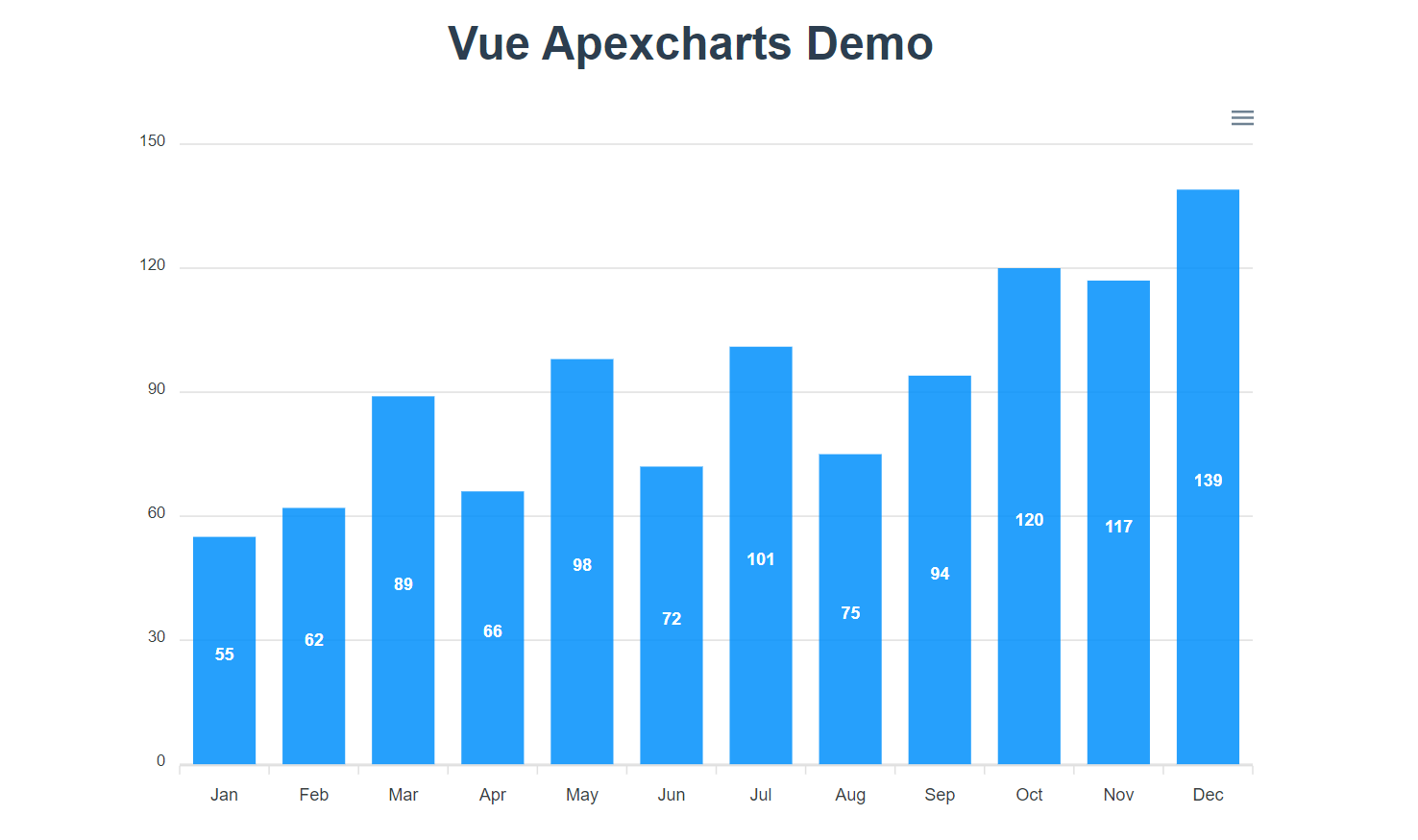
We can add a title to our bar chart to add further context and an explanation of what the chart is all about.
To add a title to our bar chart, go back to your HelloWorld.vue component and add a title to the options object.
options: {
      chart: {
        id: 'vuechart-example'
      },
      xaxis: {
        categories: [
         "Jan",
         "Feb",
         "Mar",
         "Apr",
         "May",
         "Jun",
         "Jul",
         "Aug",
         "Sep",
         "Oct",
         "Nov",
         "Dec"
        ]
      },
      title: {
        text: 'Monthly Stock Pricing'
      }
 },
 series: [{
   name: 'series-1',
   data: [55, 62, 89, 66, 98, 72, 101, 75, 94, 120, 117, 139]
 }]
By default, the title is placed on the left side of the bar chart. Here is what our chart looks like now:
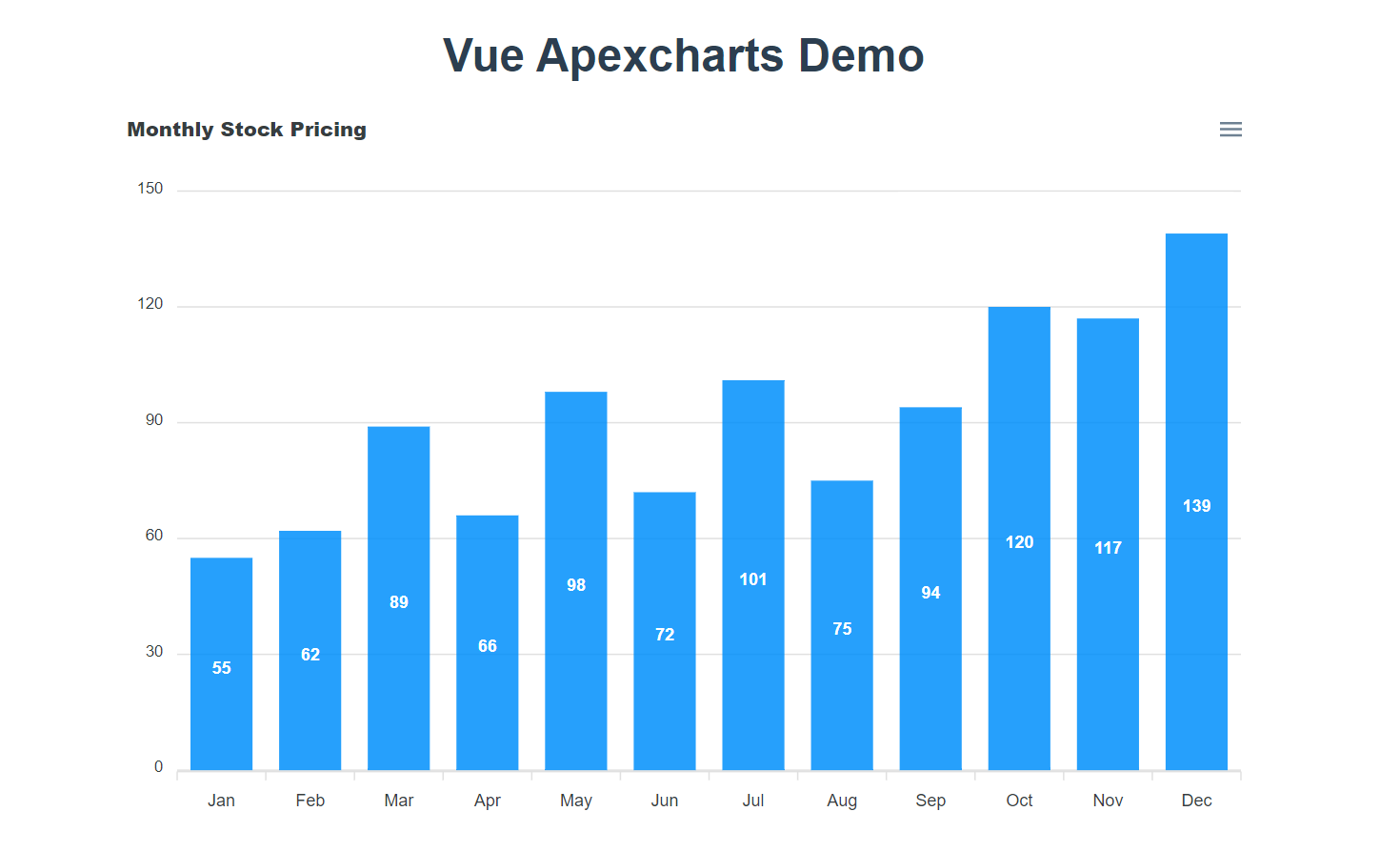
Let’s change the default behaviour by adding our own custom style. I want the title to have a bigger font size and to be centered. The title object has a property called align which represents the horizontal plane. I want the title centered on this. To make the title have a bigger font size we need to add a style option.
Also, we can set the bar chart to have a different color. Here is what options look like now:
options: {
      chart: {
        id: 'vuechart-example'
      },
      xaxis: {
        categories: [
         "Jan",
         "Feb",
         "Mar",
         "Apr",
         "May",
         "Jun",
         "Jul",
         "Aug",
         "Sep",
         "Oct",
         "Nov",
         "Dec"
        ]
      },
      title: {
        text: 'Monthly Stock Pricing',
        align: 'center',
        style: {
          fontSize:  '20px',
        },
      },
      colors: ['#00897b']
 },
 series: [{
   name: 'series-1',
   data: [55, 62, 89, 66, 98, 72, 101, 75, 94, 120, 117, 139]
 }]
This is what the bar chart looks like now:
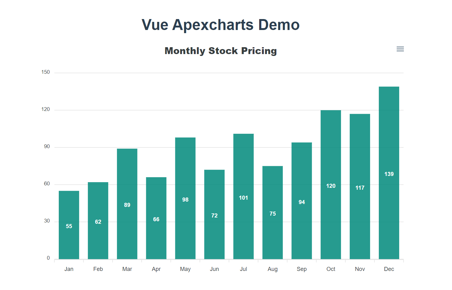 Final version of our bar chart
Creating a Line Chart
First, we need to create a new chart-wrapper div and a new apexchart element. The new apexchart element will hold props like the previous example. But the interesting thing here is all you need to do is to change the prop type in the template to line.
Here is what my HTML code looks like now:
<template>
  <div>
    <div class="chart-wrapper">
      <apexchart
        width="800" type="bar"
        :options="options" :series="series">
      </apexchart>
    </div>
    <hr>
    <div class="chart-wrapper">
      <apexchart
        width="800" type="line"
        :options="options" :series="series">
      </apexchart>
    </div>
  </div>
</template>
We now have this line graph:
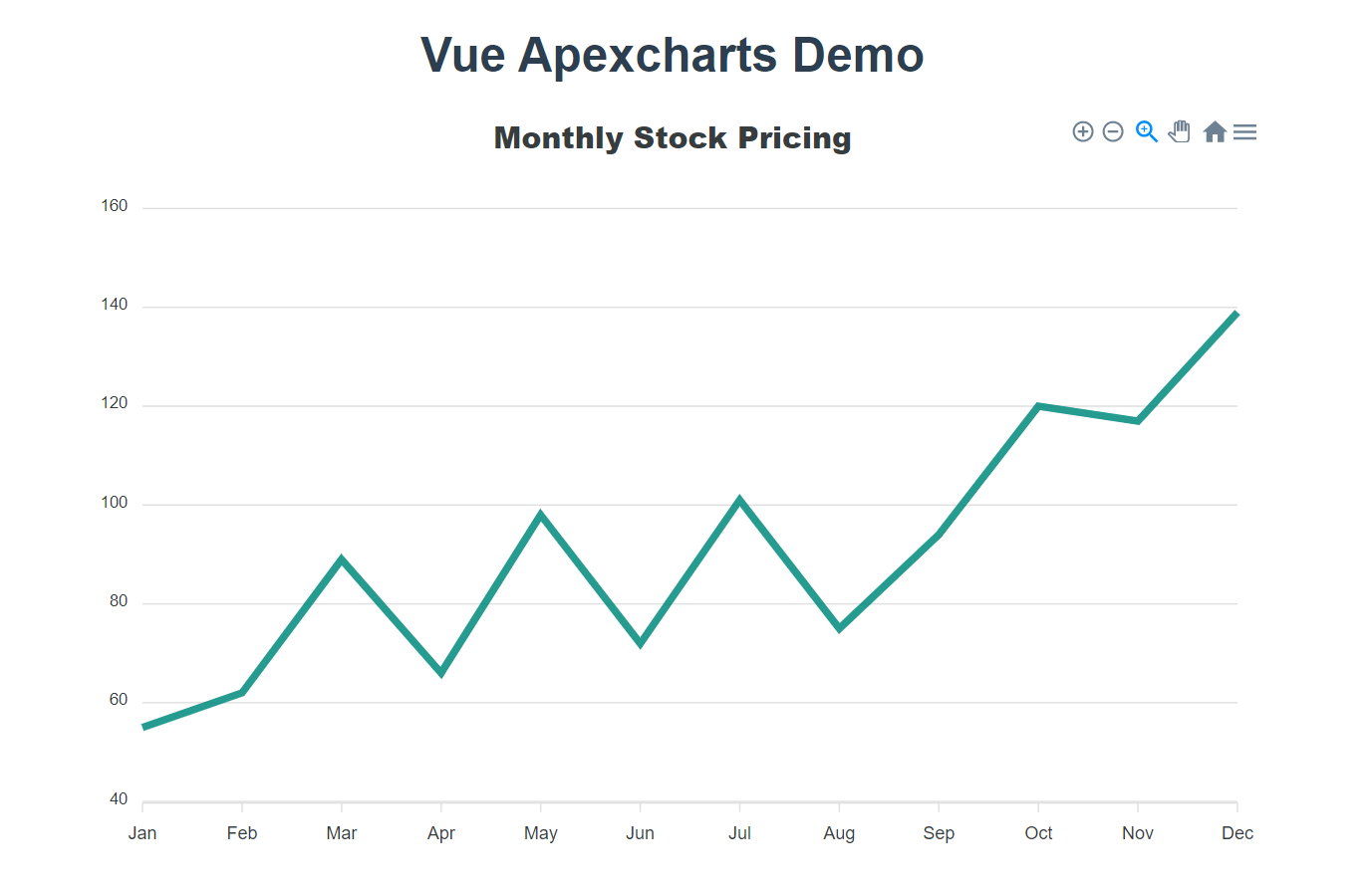 Line chart
Apexcharts Documentation
Apexcharts have different charts type you can choose from apart from bar and line. They also have various options that you can add to your chart. You can add legends or markers, and tooltips for example.
If you want to find out about the other chart types and options that are available you can read their documentation here
Repo
You can find the code for this article in my github account.
Conclusion
Charts helps us visualize data and help users view and interact with it. Integrating ApexCharts to your Vue application is just as easy as you have seen above.
Feedback is welcome! And please share this article if you found it helpful.
Thanks for reading!