
By Jeff M Lowery
Heat maps are a great way of visualizing correlations among two data sets. With colors and gradients, it is possible to see patterns in the data almost instantly.
I went searching for a heat map implementation in npm, but was unable to find one that I liked, so I wrote my own. It is still a work in progress, but does provide basic functionality.
There are actually two parts to the implementation: jsheatmap takes headings and row data to produce a JSON object where the raw input is scaled from 0.0 to 1.0 and then RGB colors are mapped to those scaled values. I will confess that most of this was already worked out by Andrew Noske, who provided a partial C++ implementation in his blog. Transliterating C++ to TypeScript was relatively easy.
The second part is an HTML presentation of the JSON data returned by jsheatmap. This would typically be the responsibility of the user of jsheatmap module, but I did build a general-purpose React application that demonstrates how HTML table cells can be used as a heat map representation.
The basics
First, install jsheatmap:
npm i -S jsheatmap
As mentioned, jsheatmap was written in TypeScript, but npm will install the generated JavaScript version of the TypeScript program, which is what your application will use.
Next, import the jsheatmap components.
import HeatMap, { Style } from "jsheatmap"
The Style component is not strictly required. As of this writing, there are only two Styles: SIMPLE and FANCY. FANCY is the default, which uses a 5-color gradient for the heat map RGB data. SIMPLE uses a three-color gradient, which you might prefer for smaller data sets. The style is passed to the getData() method, as will be shown later.
Instantiate a HeatMap with headings (column names) and row data:const heatMap = new HeatMap(headings, rows)
where headings is an array of strings (column headings) and rows is an array of labels and cell data. For example:
// Days of rain in summer summer months, by year
const headings = ["June", "July", "August", "September"]  // the months
const rows = [["2015", [9, 5, 6, 8]],   // the years and rainy days by month
   ["2016", [7, 5, 10, 7]],
   ["2017", [7, 4, 3, 9]],
   ["2018", [10, 5, 6, 8]],
   ["2019", [8, 9, 3, 1]],]
Converting to RGB
Now is time to get the heat map data:
// const data = heatMap.getData({ style: Style.SIMPLE });
const data = heatMap.getData();
The default style is FANCY (five color gradient) whereas SIMPLE would use a three-color gradient for the RGB mapping.
Cell values are then scaled, relative to each other, with scale values determined by the high and low values of the input. Once all the inputs have been scaled from 0.0 to 1.0, they can be mapped to RGB color values. All of this data is returned by getData():
{
  "headings": [
    "Jun",
    "Jul",
    "Aug",
    "Sep"
  ],
  "high": 9,
  "low": 4,
  "rows": [
    {
      "label": "2015",
      "cells": {
        "values": [
          7,
          5,
          6,
          8
        ],
        "colors": [
          {
            "red": 0.6249999999999998,
            "green": 1,
            "blue": 0
          },
          {
            "red": 0,
            "green": 0.588235294117647,
            "blue": 1
          },
          {
            "red": 0,
            "green": 1,
            "blue": 0.625
          },
          {
            "red": 1,
            "green": 0.588235294117647,
            "blue": 0
          }
        ],
        "scales": [
          0.6,
          0.2,
          0.4,
          0.8
        ]
      }
    },
    {
      "label": "2016",
      "cells": {
        "values": [
          7,
          5,
          5,
          7
        ],
        "colors": [
          {
            "red": 0.6249999999999998,
            "green": 1,
            "blue": 0
          },
          {
            "red": 0,
            "green": 0.588235294117647,
            "blue": 1
          },
          {
            "red": 0,
            "green": 0.588235294117647,
            "blue": 1
          },
          {
            "red": 0.6249999999999998,
            "green": 1,
            "blue": 0
          }
        ],
        "scales": [
          0.6,
          0.2,
          0.2,
          0.6
        ]
      }
    },
    {
      "label": "2017",
      "cells": {
        "values": [
          7,
          4,
          5,
          9
        ],
        "colors": [
          {
            "red": 0.6249999999999998,
            "green": 1,
            "blue": 0
          },
          {
            "red": 0,
            "green": 0,
            "blue": 1
          },
          {
            "red": 0,
            "green": 0.588235294117647,
            "blue": 1
          },
          {
            "red": 1,
            "green": 0,
            "blue": 0
          }
        ],
        "scales": [
          0.6,
          0,
          0.2,
          1
        ]
      }
    },
    {
      "label": "2018",
      "cells": {
        "values": [
          6,
          5,
          7,
          8
        ],
        "colors": [
          {
            "red": 0,
            "green": 1,
            "blue": 0.625
          },
          {
            "red": 0,
            "green": 0.588235294117647,
            "blue": 1
          },
          {
            "red": 0.6249999999999998,
            "green": 1,
            "blue": 0
          },
          {
            "red": 1,
            "green": 0.588235294117647,
            "blue": 0
          }
        ],
        "scales": [
          0.4,
          0.2,
          0.6,
          0.8
        ]
      }
    },
    {
      "label": "2019",
      "cells": {
        "values": [
          8,
          6,
          6,
          8
        ],
        "colors": [
          {
            "red": 1,
            "green": 0.588235294117647,
            "blue": 0
          },
          {
            "red": 0,
            "green": 1,
            "blue": 0.625
          },
          {
            "red": 0,
            "green": 1,
            "blue": 0.625
          },
          {
            "red": 1,
            "green": 0.588235294117647,
            "blue": 0
          }
        ],
        "scales": [
          0.8,
          0.4,
          0.4,
          0.8
        ]
      }
    }
  ]
}
For the demonstration application, I use React to generate a table with each element's background styled as follows:
const background = (rgb) => {
    return `rgb(${rgb.red * 100}%, ${rgb.green * 100}%, ${rgb.blue * 100}%)`;
}
Where rgb() is the built-in CSS function for RGB colors, and the passed-in rgb parameter comes from the cell colors of the row generated by getData(). To run the implementation, first clone the repository:
git clone [https://github.com/JeffML/sternomap.git](https://github.com/JeffML/sternomap.git)
then go to the sternomap folder and run:
npm install
finally:
npm run start
As an aside: the application was originally generated using Create React App, and the README.md file explains all that in detail.
The output
Once the script has finished, it will load a page in your browser (I use Chrome). Here's a snapshot:
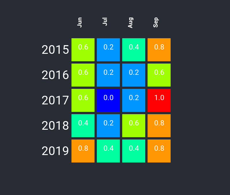
This shows rainy days per month in each cell, by year. From this you can see that the driest months are July and August, with the wettest being September. The number inside each cell is the scaled value of the raw input (rainy days), so the least rainy days were in July of 2017, and the most in September of that year.
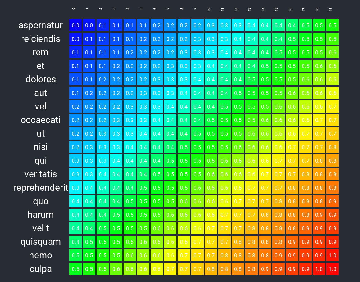
A rainbow of colors
I can generate a data set where the value of each cell is the sum of it's x + y coordinates. For row labels, I use the npm module casual to create them.
The wrap up
I have some plans to use this heat map implementation in other projects, which I am sure will require changes to the API, but the basics should remain the same. If you decide to try this and find it useful, let me know.