
Making your mobile apps accessible makes sure that everyone, including people with visual, auditory, motor, or cognitive disabilities, can interact with and navigate the app effectively.
Historically, accessibility has often been treated as an afterthought. Something to consider only if time permitted before a release.
Today, that perspective has fundamentally changed. With regulations like the European Accessibility Act (EAA) taking effect across European Union markets, building accessible software is increasingly a legal and business requirement.
More importantly, building accessible applications is just good engineering. Accessible apps improve usability for all users and help make sure that you're not excluding a substantial portion of your potential audience.
Jetpack Compose simplifies accessibility compared to the traditional Android View system. Because Compose is declarative and state-driven, it manages semantic metadata alongside your visual user interface.
In this comprehensive guide, you will learn how accessibility works in Jetpack Compose, how to use the Semantics tree, how to apply essential and advanced accessibility patterns, and how to thoroughly test your apps using automated tests, Google's Accessibility Scanner, Android Studio's Layout Inspector, and TalkBack.
Prerequisites
To follow along with this guide, you'll need:
Basic familiarity with Kotlin and Jetpack Compose (such as Composables, Modifiers, and State).
Android Studio (Hedgehog, Iguana, Jellyfish, Koala, Ladybug, or newer).
An Android device or emulator running Android 9.0 (API 28) or higher with access to the Google Play Store (to install and run the current version of Google Accessibility Scanner).
Table of Contents
Why Accessibility Matters in Modern Android Development
According to the World Health Organization (WHO), more than 1.3 billion people (representing roughly 16% of the global population) live with a significant disability. This includes people with permanent visual impairments, hearing loss, physical motor limitations, and cognitive or neurological differences.
In addition to permanent disabilities, users can often experience temporary or situational limitations. A person holding a baby with one hand has temporary motor constraints. Someone using their phone in harsh midday sunlight experiences situational visual impairment. And someone in a loud airport terminal experiences situational hearing limitations.
Designing an accessible app ensures that your interface remains resilient and usable across all of these scenarios and more.
Beyond empathy and inclusive design, accessibility is increasingly governed by international law.
In the European Union, the European Accessibility Act (EAA) mandates accessibility for a defined list of products and services, including smartphones and computers, e-commerce, consumer banking services, e-books, and passenger transport services. In practice, conformity is typically demonstrated against EN 301 549, the European accessibility standard for digital products and services.
In the United States, the Americans with Disabilities Act (ADA) applies to state and local governments (Title II, which, since 2024, has an explicit web and mobile app rule requiring compliance with WCAG 2.1 Level AA) and to public accommodations (Title III). Separately, Section 508 of the Rehabilitation Act requires federal agencies' information and communications technology to be accessible.
Failing to meet these standards can result in legal penalties and brand damage. Conversely, prioritizing accessibility expands your total addressable market and boosts user retention.
Quality also affects distribution: Google's Android vitals documentation notes that a high user-perceived crash rate hurts your app's discoverability on Google Play.
Core Concepts of Android Accessibility
To design accessible applications in Jetpack Compose, you must understand how the underlying Android operating system communicates with assistive technologies.
Understanding Android Accessibility Services
Android includes several built-in accessibility services that run as background processes. These services intercept the app's user interface and translate it into alternative sensory feedback or alternative input mechanisms:
TalkBack (Screen Reader): TalkBack is Android's built-in screen reader designed for blind and low-vision users. It inspects your interface elements, converts visual content and semantic descriptions into synthesized speech and haptic vibrations, and enables non-visual navigation using linear swipe gestures.
Switch Access: Designed for users with severe motor impairments who can't use a physical touch screen, Switch Access allows users to control their device using one or more physical switches (such as foot pedals, sip-and-puff devices, or single buttons) or a connected keyboard. It scans through focusable screen elements sequentially, allowing the user to select items when highlighted.
Voice Access: Allows users to control their entire phone using spoken commands (such as "Tap Open," "Scroll down," or "Type hello"). It assigns numeric badges to interactive elements based on their accessibility labels so users can trigger actions by number.
Select to Speak: Allows users to highlight specific paragraphs, buttons, or icons on the screen to hear them spoken aloud without turning on full TalkBack navigation.
All of these accessibility services share one common requirement: they don't interact directly with visual pixels. Instead, they read the Semantics Tree generated by your application.
How the Compose Semantics Tree Works
When you build a user interface in Jetpack Compose, Compose generates two separate but linked internal tree structures:
The Layout (UI) Tree: This tree contains the visual rendering nodes that measure, place, and draw pixels on the screen (such as Canvas, Box, Row, Column, Text, and Image).
The Semantics Tree: This tree runs in parallel with the Layout tree. It contains metadata that describes the meaning, purpose, state, and interactive capabilities of each element.
| Layer | Visual Layout Tree (UI & Pixels) | Semantics Tree (Accessibility & TalkBack) |
|---|---|---|
| Container | Row(modifier = Modifier.clickable { ... }) |
Single Merged Accessibility Node |
| Child 1 | Image(Icons.Default.Star) |
Merged into parent description |
| Child 2 | Text("4.5") |
Merged into parent description |
| Child 3 | Text("Rating") |
Merged into parent description |
| Result | Renders separate visual pixels on screen | TalkBack announces: "Rating: 4.5 stars, button" |
Standard Material Compose components (such as Button, Checkbox, Slider, Switch, and Text) automatically populate appropriate semantic properties into the Semantics tree. For example, a Button composable automatically sets its role to Role.Button and attaches a click action.
But when you build custom layouts, canvas drawings, or non-standard interactive widgets, Compose can't automatically infer your design intent. In those cases, you must use Compose's semantic modifiers to enrich the Semantics tree manually.
The WCAG 2.1 POUR Principles
The international benchmark for digital accessibility is the Web Content Accessibility Guidelines (WCAG) 2.1, published by the World Wide Web Consortium (W3C). These guidelines are organized around four core principles known by the acronym POUR:
Perceivable: Information and UI components must be presentable to users in ways they can perceive. Content can't be invisible to all of a user's senses. In Android apps, this means providing descriptive text alternatives for all visual media, supporting dynamic font scaling, and maintaining high color contrast.
Operable: User interface components and navigation must be operable. Users must be able to perform all interactions regardless of whether they use a touchscreen, a hardware keyboard, voice commands, or a switch device. This requires adequate touch targets (Android's guideline is at least 48dp × 48dp) and logical navigation orders.
Understandable: Users must be able to understand both the information and the interface's operation. This means writing clear labels, providing meaningful validation error messages, avoiding sudden unexpected layout shifts, and structuring forms predictably.
Robust: Content must be sufficiently robust to be reliably interpreted by a wide variety of user agents and assistive technologies. In Compose, this means avoiding hacky workarounds, using standard semantic roles, and honoring system-level user preferences.
Semantics in Jetpack Compose
In this section, we'll examine how Compose exposes and manipulates semantic metadata.
What Are Semantics?
Semantics in Jetpack Compose are key-value properties attached to layout nodes using the Modifier.semantics modifier. They convey information such as:
What an element is called (
contentDescription)What kind of UI control it represents (
role = Role.Checkbox,Role.Button,Role.Tab)What state it currently holds (
stateDescription = "Checked",progressBarRangeInfo)What actions the user can perform (
onClick,onLongClick,customActions)
Basic Semantic Properties and Content Descriptions
The most widely used semantic property is contentDescription. It provides a localized textual representation of non-textual UI elements, such as icons, photographs, and vector graphics.
Here's how you provide content descriptions for visual components:
// A functional icon button that performs an action
IconButton(onClick = { /* Open camera */ }) {
    Icon(
        painter = painterResource(id = R.drawable.ic_camera),
        contentDescription = "Open camera"
    )
}

// A decorative background illustration
Image(
    painter = painterResource(id = R.drawable.decorative_pattern),
    contentDescription = null, // Informs TalkBack to skip this node completely
    modifier = Modifier.fillMaxWidth()
)
How It Works Under the Hood
When TalkBack navigates to the Icon, it reads the contentDescription aloud (something like "Open camera, button, double tap to activate"). TalkBack automatically appends the word "button" because IconButton exposes Role.Button. (Exact TalkBack phrasing varies by version and locale. The spoken examples throughout this guide are illustrative.)
For decorative elements (such as subtle background shapes, divider lines, or visual illustrations that accompany adjacent descriptive text), you should explicitly set contentDescription = null. Setting contentDescription = null instructs Compose to omit that element from the Semantics tree, preventing screen readers from stopping on meaningless visual noise.
Custom Semantics and State Descriptions
When an element changes its state dynamically (such as toggling between playing and paused, or expanded and collapsed), screen reader users need to be notified of the current state before they interact with it.
You can set stateDescription and role inside the Modifier.semantics block:
var isPlaying by remember { mutableStateOf(false) }

IconButton(
    onClick = { isPlaying = !isPlaying },
    modifier = Modifier.semantics {
        // Explicitly declare what state the media player is in
        stateDescription = if (isPlaying) "Playing audio" else "Audio paused"
        role = Role.Button
    }
) {
    Icon(
        imageVector = if (isPlaying) Icons.Default.Pause else Icons.Default.PlayArrow,
        contentDescription = if (isPlaying) "Pause" else "Play"
    )
}
How It Works Under the Hood
Without stateDescription, TalkBack only reads the action ("Play, button"). The user has to guess whether the audio is currently playing or stopped.
By adding stateDescription, TalkBack announces: "Playing audio, Pause, button, double-tap to toggle." This gives the user immediate confirmation of the current state followed by the action that activating the control will perform.
How to Merge Semantics with mergeDescendants
In complex layouts, multiple individual composables often combine to represent a single logical entity. For instance, a user profile row might contain an avatar image, a username, an online badge, and a timestamp.
By default, TalkBack will treat every child Text and Image node as an independent stop, forcing the user to swipe four or five times just to move past a single list item.
You can use Modifier.semantics(mergeDescendants = true) to combine all descendant nodes into a single, cohesive accessibility node:
// Bad: TalkBack focuses three separate times: "Star icon", "4.5", "Customer rating"
Row(modifier = Modifier.clickable { /* Navigate to reviews */ }) {
    Icon(
        imageVector = Icons.Default.Star,
        contentDescription = "Star icon"
    )
    Text(text = "4.5")
    Text(text = "Customer rating")
}

// Good: Merged into one single stop: "Customer rating: 4.5 out of 5 stars, button"
Row(
    modifier = Modifier
        .clickable(onClickLabel = "View all reviews") { /* Navigate to reviews */ }
        .semantics(mergeDescendants = true) {
            contentDescription = "Customer rating: 4.5 out of 5 stars"
        }
) {
    Icon(
        imageVector = Icons.Default.Star,
        contentDescription = null // Suppressed because parent provides full description
    )
    Text(text = "4.5")
    Text(text = "Customer rating")
}
How It Works Under the Hood
When mergeDescendants = true is set, Compose collapses the accessibility boundaries of all child composables. Instead of generating multiple stops in the Semantics tree, Compose exposes a single node to the accessibility framework. TalkBack focuses the entire Row as a single bounding box and reads the parent's contentDescription.
How to Clear Semantics with clearAndSetSemantics
In certain situations, a standard composable may include default semantic behaviors that interfere with your intended accessibility experience.
The Modifier.clearAndSetSemantics modifier clears all semantic properties that would otherwise be inherited from child composables or default implementations, allowing you to define a clean, custom semantic definition:
// A composite badge displaying notification count
Box(
    modifier = Modifier.clearAndSetSemantics {
        contentDescription = "3 unread messages"
        role = Role.Button
    }
) {
    Icon(
        imageVector = Icons.Default.Email,
        contentDescription = "Email icon" // Cleared and ignored
    )
    Text(text = "3") // Cleared and ignored
}
How It Works Under the Hood
Unlike Modifier.semantics, which adds or overrides specific keys, clearAndSetSemantics discards all existing keys generated by the composable subtree. In the example above, the separate "Email icon" and "3" text nodes are completely erased from the Semantics tree and replaced with the single announcement: "3 unread messages, button."
Essential Accessibility Practices
Now we'll cover the core accessibility practices you should implement in your applications, along with explanations of why each practice matters.
How to Write Meaningful Content Descriptions
A content description should concisely explain the purpose or action of an element rather than its visual appearance.
What to Do (Recommended Practice)
// Descriptive, action-oriented label
IconButton(onClick = { deleteDraft() }) {
    Icon(
        imageVector = Icons.Default.Delete,
        contentDescription = "Delete draft message"
    )
}

// Contextual weather information
Image(
    painter = painterResource(R.drawable.weather_sunny),
    contentDescription = "Current weather: Sunny, 75 degrees Fahrenheit"
)
The icon description tells the user exactly what will happen when they tap the button ("Delete draft message"). The weather image communicates the actual underlying data rather than describing the art style.
What Not to Do (Antipattern)
// Avoid generic or redundant descriptions
IconButton(onClick = { deleteDraft() }) {
    Icon(
        imageVector = Icons.Default.Delete,
        contentDescription = "Trash can icon button" // Bad: includes visual style and element type
    )
}

// Avoid empty strings on interactive elements
IconButton(onClick = { openSettings() }) {
    Icon(
        imageVector = Icons.Default.Settings,
        contentDescription = "" // Bad: leaves the button with no accessible label
    )
}
Including words like "icon" or "button" is redundant because TalkBack already announces the component's role. Using an empty string ("") on an interactive element leaves TalkBack with nothing meaningful to announce (typically read out as an unlabeled button), giving screen reader users zero context about what the button does. Compose's accessibility checks treat an empty content description the same as a missing one.
How to Ensure Minimum Touch Target Sizes
Google's Material Design and Android accessibility guidelines require all interactive elements to have a minimum touch target size of at least 48dp × 48dp, which corresponds to a physical size of about 9mm. This is squarely within the 7–10mm range Google recommends for touchscreen targets.
For comparison, WCAG itself sets lower web-oriented baselines: WCAG 2.1 Success Criterion 2.5.5 requires 44×44 CSS pixels at Level AAA, and WCAG 2.2 Success Criterion 2.5.8 requires 24×24 CSS pixels at Level AA. The 48dp rule is Android's stricter platform standard.
What to Do (Recommended Practice)
// Method A: Using minimumInteractiveComponentSize()
Box(
    modifier = Modifier
        .minimumInteractiveComponentSize() // Expands touch area to 48dp x 48dp
        .clickable { /* Toggle bookmark */ }
) {
    Icon(
        imageVector = Icons.Default.Bookmark,
        contentDescription = "Bookmark article",
        modifier = Modifier.size(24.dp) // Visual size is 24dp, touch target is 48dp
    )
}

// Method B: Standard IconButton (built-in 48dp target)
IconButton(onClick = { /* Toggle bookmark */ }) {
    Icon(
        imageVector = Icons.Default.Bookmark,
        contentDescription = "Bookmark article"
    )
}
Modifier.minimumInteractiveComponentSize() allows your visual design to remain compact (for instance, a 24dp icon) while ensuring that the invisible, clickable hit box expands to 48dp × 48dp. This prevents touch misses for users with motor tremors or limited fine motor control.
What Not to Do (Antipattern)
// Bad: Tightly constrained 20dp clickable area
Icon(
    imageVector = Icons.Default.Close,
    contentDescription = "Close dialog",
    modifier = Modifier
        .size(20.dp)
        .clickable { dismissDialog() } // Touch target is strictly 20dp x 20dp!
)
A 20dp touch target is nearly impossible to tap reliably, especially on high-density displays or while walking. Google's Accessibility Scanner will flag it as a touch target issue.
How to Maintain Accessible Color Contrast Ratios
Color contrast measures the difference in luminance between foreground text and its background. If the contrast ratio is too low, people with low vision, color blindness, or older eyes will likely not be able to read your text.
WCAG 2.1 defines the following minimum contrast ratios (Android's accessibility documentation maps WCAG's point sizes to sp):
Normal text (smaller than 18sp, or smaller than 14sp bold): Minimum 4.5:1
Large text (18sp or larger, or 14sp bold or larger): Minimum 3.0:1
UI components and graphical objects: Minimum 3.0:1
What to Do (Recommended Practice)
// Using Material 3 color tokens (paired roles maintain usable contrast)
Text(
    text = "Account Overview",
    color = MaterialTheme.colorScheme.onPrimaryContainer,
    modifier = Modifier.background(MaterialTheme.colorScheme.primaryContainer)
)

// Explicit high-contrast colors (for example, Black on White = 21:1 ratio)
Text(
    text = "Order Confirmed",
    color = Color(0xFF1B5E20), // Dark green
    modifier = Modifier.background(Color(0xFFE8F5E9)) // Light green tint
)
Material 3 color tokens (such as onPrimaryContainer paired with primaryContainer) are generated by the Material color system so that "on" colors maintain usable contrast against their paired container colors across both light and dark themes. You should still verify contrast for any custom brand colors you override.
What Not to Do (Antipattern)
// Bad: Light gray on pure white (Contrast ratio ~ 1.6:1 - Fails WCAG)
Text(
    text = "Terms and Conditions apply",
    color = Color(0xFFB0B0B0),
    modifier = Modifier.background(Color.White)
)
Light gray text on a white background is one of the most common accessibility violations on the mobile web and in native apps. Sighted users in bright ambient light and users with low vision can't read this text.
How to Provide Custom Clickable Labels
When a user navigates to a clickable element using TalkBack, the screen reader appends default instructions such as "Double-tap to activate."
You can customize this instruction using the onClickLabel parameter in Modifier.clickable to describe the precise outcome of the interaction.
What to Do (Recommended Practice)
ListItem(
    headlineContent = { Text("Wi-Fi Networks") },
    supportingContent = { Text("Connected to Office_5G") },
    modifier = Modifier.clickable(
        onClickLabel = "Open Wi-Fi network settings"
    ) {
        navigateToWifiSettings()
    }
)
TalkBack will announce: "Wi-Fi Networks, Connected to Office_5G, double-tap to open Wi-Fi network settings." The user knows exactly what will happen before committing to the action.
What Not to Do (Antipattern)
// Bad: Generic clickable element without context
Card(
    modifier = Modifier.clickable { openInvoiceDetails() }
) {
    Text("Invoice #4092")
}
TalkBack announces: "Invoice #4092, double-tap to activate." The user is left uncertain whether tapping will pay the invoice, download a PDF, or open an edit screen.
How to Establish Heading Hierarchies
Visual readers scan large, bold text headings to understand a screen's layout and hierarchy. Screen reader users need the exact same structural overview.
By applying the heading() semantic modifier, you designate a text node as an accessibility heading. TalkBack users can change their navigation mode to "Headings" and quickly swipe up or down to jump between sections.
What to Do (Recommended Practice)
Column(modifier = Modifier.padding(16.dp)) {
    // Screen title heading
    Text(
        text = "Security Settings",
        style = MaterialTheme.typography.headlineMedium,
        modifier = Modifier.semantics { heading() }
    )

    Spacer(modifier = Modifier.height(16.dp))

    // Section 1 heading
    Text(
        text = "Two-Factor Authentication",
        style = MaterialTheme.typography.titleMedium,
        modifier = Modifier.semantics { heading() }
    )

    // Section 1 content...

    Spacer(modifier = Modifier.height(16.dp))

    // Section 2 heading
    Text(
        text = "Connected Devices",
        style = MaterialTheme.typography.titleMedium,
        modifier = Modifier.semantics { heading() }
    )

    // Section 2 content...
}
TalkBack users can bypass dozens of individual switches and descriptions to jump directly to "Connected Devices" in seconds.
What Not to Do (Antipattern)
// Bad: Visual heading without semantic markup
Text(
    text = "Two-Factor Authentication",
    style = MaterialTheme.typography.titleLarge // Visually large, but invisible as a heading to TalkBack
)
Without semantics { heading() }, TalkBack treats the text as regular body copy, preventing users from navigating by headings.
How to Announce Dynamic Updates with Live Regions
When content on the screen updates asynchronously (such as a timer countdown, a file upload completion message, or a real-time validation banner), sighted users see the change immediately.
But screen reader users won't know that anything changed unless you mark the changing container as a live region.
Compose provides liveRegion = LiveRegionMode.Polite and liveRegion = LiveRegionMode.Assertive:
LiveRegionMode.Polite: TalkBack waits until the current audio announcement is finished before reading the update. Use this for almost all status updates.LiveRegionMode.Assertive: TalkBack announces the change immediately, ahead of other feedback. Reserve this strictly for time-sensitive, high-urgency alerts (such as emergency warnings).
What to Do (Recommended Practice)
var uploadStatus by remember { mutableStateOf("Ready to upload") }

Text(
    text = uploadStatus,
    modifier = Modifier.semantics {
        liveRegion = LiveRegionMode.Polite
    }
)

// Later, when upload finishes:
LaunchedEffect(Unit) {
    performUpload()
    uploadStatus = "Upload complete! 12 files saved."
}
As soon as uploadStatus changes, TalkBack automatically speaks: "Upload complete! 12 files saved," keeping non-sighted users fully informed without requiring them to search the screen.
How to Support Dynamic Text Scaling
Users with low vision often increase their system font size in Android Settings (under Display or the accessibility settings, depending on the device). Android 14 and newer support non-linear font scaling up to 200%.
To respect this user preference, you must define all text sizes in sp (scale-independent pixels), never in dp or raw pixels.
What to Do (Recommended Practice)
// Good: Using Material Typography (uses sp automatically)
Text(
    text = "Dashboard Summary",
    style = MaterialTheme.typography.titleMedium
)

// Good: Explicit sp sizing
Text(
    text = "Custom Label",
    fontSize = 18.sp
)
When a user sets their font scale to 1.5×, an 18sp font cleanly renders at 27sp, ensuring readable text.
What Not to Do (Antipattern)
// Bad: Fixed dp size converted to sp (does not scale with system settings)
Text(
    text = "Fixed Size Warning",
    fontSize = with(LocalDensity.current) { 16.dp.toSp() } // Will not scale!
)
Sizing text with fixed dp measurements prevents the text from enlarging when users increase their system font size, directly violating accessibility standards.
Advanced Accessibility Techniques
For complex, production-grade applications, you can apply advanced accessibility techniques to handle non-trivial user interactions.
How to Control Traversal and Focus Order
By default, accessibility services traverse screen elements based on their visual and structural coordinates (top-to-bottom, start-to-end). In multi-column layouts, financial ledgers, or custom grids, this default order can create confusing announcements.
You can customize the navigation sequence using traversalIndex and isTraversalGroup:
Column(
    modifier = Modifier.semantics { isTraversalGroup = true }
) {
    Text(
        text = "Step 1: Account Info",
        modifier = Modifier.semantics { traversalIndex = 1f }
    )

    Text(
        text = "Step 3: Confirmation",
        modifier = Modifier.semantics { traversalIndex = 3f }
    )

    Text(
        text = "Step 2: Payment Details",
        modifier = Modifier.semantics { traversalIndex = 2f }
    )
}
How the code works under the hood:
Setting
isTraversalGroup = truecreates a self-contained accessibility boundary, ensuring TalkBack reads all elements inside this container before moving to other screen elements.The
traversalIndexfloating-point value establishes the exact relative order (lowest index first). TalkBack will read Step 1, then Step 2, and finally Step 3, regardless of their visual placement in the layout.
How to Create Custom Accessibility Actions
Consider an e-commerce product card that contains "Quick View," "Add to Wishlist," and "Add to Cart" buttons. For a screen reader user, tabbing through three separate buttons on twenty consecutive cards is tedious.
With customActions, you can attach secondary actions directly to the parent card node. When the card gains focus, TalkBack tells the user that actions are available, and the user opens the TalkBack menu to pick one.
var isBookmarked by remember { mutableStateOf(false) }

Card(
    modifier = Modifier
        .fillMaxWidth()
        .semantics {
            customActions = listOf(
                CustomAccessibilityAction(
                    label = if (isBookmarked) "Remove from bookmarks" else "Add to bookmarks",
                    action = {
                        isBookmarked = !isBookmarked
                        true // Return true to indicate the action was handled
                    }
                ),
                CustomAccessibilityAction(
                    label = "Share article link",
                    action = {
                        shareArticle()
                        true
                    }
                )
            )
        }
) {
    // Visual card content...
}
When a TalkBack user focuses on the card, TalkBack informs them that custom actions are available. The user opens the TalkBack menu (or uses accessibility gestures) to see a clean list containing "Add to bookmarks" and "Share article link." This keeps your visual design streamlined while providing direct, high-efficiency navigation for power users.
How to Design Accessible Form Inputs and Text Fields
Accessible form inputs require more than just a visual placeholder. They need explicit labels, clear input type hints, and logical keyboard navigation actions:
var emailValue by remember { mutableStateOf("") }

OutlinedTextField(
    value = emailValue,
    onValueChange = { emailValue = it },
    label = { Text("Work Email") },
    placeholder = { Text("alex@example.com") },
    singleLine = true,
    keyboardOptions = KeyboardOptions(
        keyboardType = KeyboardType.Email,
        imeAction = ImeAction.Next
    ),
    keyboardActions = KeyboardActions(
        onNext = { /* Move focus to password field */ }
    ),
    modifier = Modifier
        .fillMaxWidth()
        .semantics {
            contentDescription = "Work email address input field"
        }
)
How it works under the hood:
The
labelcomposable provides persistent context that remains visible even after the user types.keyboardType = KeyboardType.Emailinstructs Android to display an email-optimized keyboard (including@and.comshortcuts) and hints to accessibility services that standard email syntax is expected.imeAction = ImeAction.Nextensures hardware keyboard users and switch device users can smoothly advance through form fields using the keyboard Enter key.
How to Communicate Dynamic Error States
When client-side validation fails, setting the visual border to red isn't enough. You must attach semantic error metadata so screen readers announce the validation failure immediately.
var password by remember { mutableStateOf("") }
val isPasswordInvalid = password.isNotEmpty() && password.length < 8

OutlinedTextField(
    value = password,
    onValueChange = { password = it },
    label = { Text("Password") },
    isError = isPasswordInvalid,
    supportingText = {
        if (isPasswordInvalid) {
            Text(
                text = "Password must be at least 8 characters long",
                color = MaterialTheme.colorScheme.error
            )
        }
    },
    modifier = Modifier
        .fillMaxWidth()
        .semantics {
            if (isPasswordInvalid) {
                error("Password must be at least 8 characters long")
            }
        }
)
How it works under the hood:
The isError = isPasswordInvalid parameter handles the visual styling (red outline and error icons).
- The
error("...")semantic property tells TalkBack to treat this element as invalid and announce the specific validation error message as soon as the user focuses the text field.
How to Manage Progress Indicators and Asynchronous Loading
Loading states must clearly convey whether a task is indeterminate (in progress with unknown duration) or determinate (progressing toward 100%).
// Indeterminate Progress (such as initial network fetch)
CircularProgressIndicator(
    modifier = Modifier.semantics {
        contentDescription = "Syncing messages, please wait"
    }
)

// Determinate Progress (such as file download)
val downloadProgress = 0.65f // 65%

LinearProgressIndicator(
    progress = { downloadProgress },
    modifier = Modifier.semantics {
        progressBarRangeInfo = ProgressBarRangeInfo(
            current = downloadProgress,
            range = 0f..1f
        )
        contentDescription = "Downloading update: ${(downloadProgress * 100).toInt()}% completed"
    }
)
For determinate progress indicators, ProgressBarRangeInfo tells assistive technologies the minimum, maximum, and current values. TalkBack interprets this information and provides periodic spoken and haptic updates as progress increases.
How to Handle Expandable and Collapsible Content
Accordion menus and expandable FAQ cards must clearly indicate whether they're open or closed, and what action tapping them will trigger.
var isExpanded by remember { mutableStateOf(false) }

Column(modifier = Modifier.fillMaxWidth()) {
    Row(
        verticalAlignment = Alignment.CenterVertically,
        modifier = Modifier
            .fillMaxWidth()
            .clickable(
                onClickLabel = if (isExpanded) "Collapse section" else "Expand section"
            ) {
                isExpanded = !isExpanded
            }
            .semantics {
                stateDescription = if (isExpanded) "Expanded" else "Collapsed"
            }
            .padding(16.dp)
    ) {
        Text(
            text = "Frequently Asked Questions",
            style = MaterialTheme.typography.titleMedium,
            modifier = Modifier.weight(1f)
        )
        Icon(
            imageVector = if (isExpanded) Icons.Default.ExpandLess else Icons.Default.ExpandMore,
            contentDescription = null // Decorative: parent Row communicates full state
        )
    }

    AnimatedVisibility(visible = isExpanded) {
        Text(
            text = "Our refund policy allows returns within 30 days of purchase...",
            modifier = Modifier.padding(16.dp)
        )
    }
}
The stateDescription announces whether the section is currently open or closed ("Expanded" or "Collapsed"). Simultaneously, onClickLabel clarifies the upcoming action ("Collapse section" or "Expand section"). The icon has contentDescription = null to avoid redundant announcements.
How to Enhance Lazy Lists and Large Collections
When users navigate a long feed or list, they need context regarding where they are and how many items exist.
val messages = remember { listOf("Order Shipped", "Delivery Delayed", "Payment Received") }

LazyColumn(
    modifier = Modifier.semantics {
        contentDescription = "Notifications list, ${messages.size} total alerts"
    }
) {
    itemsIndexed(messages) { index, messageText ->
        Card(
            modifier = Modifier
                .fillMaxWidth()
                .padding(vertical = 4.dp)
                .semantics {
                    contentDescription = "Notification ${index + 1} of ${messages.size}: $messageText"
                }
        ) {
            Text(
                text = messageText,
                modifier = Modifier.padding(16.dp)
            )
        }
    }
}
TalkBack announces positional indexes ("Notification 1 of 3: Order Shipped"), allowing screen reader users to track their progress through lists without losing their place.
How to Test and Debug Accessibility
Building accessible software requires a multi-layered testing strategy: automated regression checks, on-device diagnostic tools, semantics tree inspection, and manual verification with TalkBack.
| Testing Level | Primary Tool | What It Validates | When to Run |
|---|---|---|---|
| Manual Verification | TalkBack Screen Reader | Real non-visual user experience and gesture navigation | Before major feature releases |
| Visual Auditing | Google Accessibility Scanner | Automated on-screen contrast and touch target violations | During feature QA testing |
| Tree Inspection | Android Studio Layout Inspector | Real-time semantics tree merging and node properties | During active development |
| Automated Checks | Compose UI Test (ui-test-junit4) |
Regressions on touch targets and content descriptions | In continuous integration (CI) |
How to Test Manually with TalkBack
Nothing replaces manually navigating your application using TalkBack.
How to Enable and Use TalkBack
Open your device's Settings app and navigate to Accessibility and then TalkBack.
Toggle the switch to On and accept the system permissions. (You can also use the volume key shortcut, if enabled: hold both volume keys for a few seconds to toggle TalkBack).
Core TalkBack gestures:
Swipe Right: Move accessibility focus to the next element.
Swipe Left: Move accessibility focus to the previous element.
Double Tap: Activate the currently focused element.
Two-Finger Swipe: Scroll lists or pages.
Three-Finger Tap (or swipe down then right in one motion): Open the TalkBack menu.
What to check during your TalkBack walkthrough:
Can you complete critical user journeys (such as registration, login, searching, and checkout) with your eyes closed?
Are all buttons and interactive controls clearly announced with meaningful names?
Does focus move in a logical, expected reading order?
Are error messages and dynamic state changes announced automatically?
How to Write Automated Compose Accessibility Tests
You can integrate automated accessibility assertions into your JUnit instrumented tests to catch missing descriptions and undersized touch targets on continuous integration (CI) servers.
Add Dependencies to build.gradle.kts:
androidTestImplementation("androidx.compose.ui:ui-test-junit4")
androidTestImplementation("androidx.compose.ui:ui-test-manifest")
Writing Compose Accessibility Tests:
@RunWith(AndroidJUnit4::class)
class AccessibilityTest {

    @get:Rule
    val composeTestRule = createAndroidComposeRule<ComponentActivity>()

    @Test
    fun testLoginButton_hasProperTouchTargetAndLabel() {
        composeTestRule.setContent {
            MaterialTheme {
                Button(
                    onClick = { /* Submit login */ },
                    modifier = Modifier.minimumInteractiveComponentSize()
                ) {
                    Text("Sign In")
                }
            }
        }

        // Verify the node exists with correct text and semantics
        composeTestRule
            .onNodeWithText("Sign In")
            .assertExists()
            .assertHasClickAction()
            .assertHeightIsAtLeast(48.dp)
            .assertWidthIsAtLeast(48.dp)
    }

    @Test
    fun testIconButton_containsContentDescription() {
        composeTestRule.setContent {
            MaterialTheme {
                IconButton(onClick = {}) {
                    Icon(
                        imageVector = Icons.Default.Favorite,
                        contentDescription = "Add to favorites"
                    )
                }
            }
        }

        // Verify content description is accurately exposed in semantics tree
        composeTestRule
            .onNode(hasContentDescription("Add to favorites"))
            .assertExists()
            .assertHasClickAction()
    }
}
Step-by-Step Guide to Google Accessibility Scanner
Google Accessibility Scanner is an Android diagnostic tool that inspects your app's rendered UI and flags accessibility violations.
How to Install and Set Up Accessibility Scanner
Install from Google Play: Open the Google Play Store on your test device and install Accessibility Scanner (published by Google LLC).
Enable in Accessibility Settings:
Go to Settings then Accessibility and then Accessibility Scanner.
Toggle the switch to On and grant the required screen-reading permissions.
Locate the Floating Button: A blue floating action button with a checkmark icon
(✓)will appear overlaid on your screen.
Running a Scan and Interpreting Results
Open your Android application and navigate to the screen you want to audit. Tap the floating blue Scanner button.
Then tap the Snapshot (camera) icon to analyze the static screen, or tap Record to audit a multi-step user flow.
The Scanner outlines each flagged UI component with an orange rectangle. Typical findings include interactive touch targets smaller than 48dp, missing labels on buttons and images, insufficient text or image contrast, and duplicate or redundant descriptions.
Tap any highlighted result to view a detailed breakdown explaining the problem, a link to the relevant accessibility guidance, and suggested remediation steps. Keep in mind that Scanner is a diagnostic aid. A clean scan doesn't guarantee that your app is fully accessible.
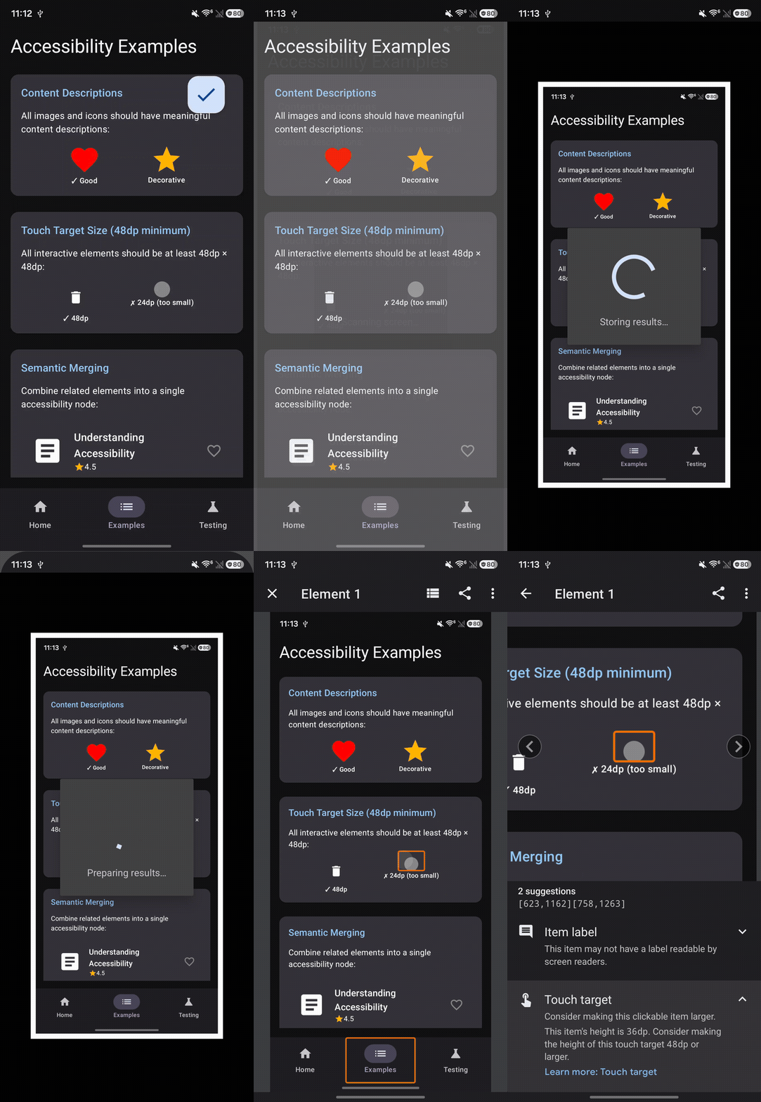
Figure: Google Accessibility Scanner auditing the AccessibilityDemo app, flagging an undersized 24dp touch target and displaying remediation guidance.
How to Inspect Semantics with Android Studio Layout Inspector
Android Studio's Layout Inspector allows you to inspect your running Compose hierarchy in real time and view the exact Semantics Tree exposed to the operating system.
How to Inspect Semantics Step-by-Step
Run your Compose application on an emulator or physical device connected via USB debugging.
In Android Studio, open View then Tool Windows and then Layout Inspector.
In the process selector dropdown, select your application's process (such as
com.example.accessibilitydemo).In the Layout Inspector component tree panel on the left, navigate to the composable you want to inspect (such as the
Cardunder Semantic Merging).Look at the Attributes panel on the right. You'll see dedicated sections for:
Merged Semantics: Displays the collapsed semantic metadata exposed to accessibility services when
mergeDescendants = trueis used (including mergedContentDescription,Textlists,OnClickactions, and container flags).Declared Semantics: Shows the explicit semantic properties directly attached to that specific composable node.
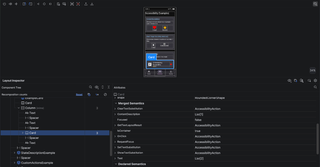
Figure: Android Studio Layout Inspector inspecting the AccessibilityDemo app, displaying the Component Tree on the left, visual wireframes in the center, and the Merged Semantics attributes panel on the right.
Using Layout Inspector provides visual confirmation that:
semantics(mergeDescendants = true)is properly grouping disparate children into a single node.Decorative icons are successfully excluded from the accessibility tree.
Click actions (
OnClick: AccessibilityAction) and custom actions are correctly wired to the composable.
Real-World Accessible UI Patterns
Here are complete, production-ready implementations of common UI patterns:
Fully Accessible Login Form
Forms are critical entry points. This implementation combines heading semantics, email input validation, dynamic error announcements, and proper touch target sizing:
@Composable
fun AccessibleLoginForm(
    onLoginSubmitted: (String, String) -> Unit
) {
    var email by remember { mutableStateOf("") }
    var password by remember { mutableStateOf("") }
    var isSubmitted by remember { mutableStateOf(false) }

    val isEmailInvalid = isSubmitted && !android.util.Patterns.EMAIL_ADDRESS.matcher(email).matches()
    val isPasswordInvalid = isSubmitted && password.length < 8

    Column(
        modifier = Modifier
            .fillMaxSize()
            .padding(24.dp)
    ) {
        // 1. Designated Screen Title Heading
        Text(
            text = "Welcome Back",
            style = MaterialTheme.typography.headlineLarge,
            modifier = Modifier.semantics { heading() }
        )

        Text(
            text = "Sign in to access your account",
            style = MaterialTheme.typography.bodyMedium,
            color = MaterialTheme.colorScheme.onSurfaceVariant
        )

        Spacer(modifier = Modifier.height(24.dp))

        // 2. Accessible Email Input
        OutlinedTextField(
            value = email,
            onValueChange = { email = it },
            label = { Text("Email Address") },
            isError = isEmailInvalid,
            singleLine = true,
            keyboardOptions = KeyboardOptions(
                keyboardType = KeyboardType.Email,
                imeAction = ImeAction.Next
            ),
            supportingText = {
                if (isEmailInvalid) {
                    Text(
                        text = "Please enter a valid email address",
                        color = MaterialTheme.colorScheme.error
                    )
                }
            },
            modifier = Modifier
                .fillMaxWidth()
                .semantics {
                    if (isEmailInvalid) {
                        error("Please enter a valid email address")
                    }
                }
        )

        Spacer(modifier = Modifier.height(16.dp))

        // 3. Accessible Password Input
        OutlinedTextField(
            value = password,
            onValueChange = { password = it },
            label = { Text("Password") },
            isError = isPasswordInvalid,
            singleLine = true,
            visualTransformation = PasswordVisualTransformation(),
            keyboardOptions = KeyboardOptions(
                keyboardType = KeyboardType.Password,
                imeAction = ImeAction.Done
            ),
            supportingText = {
                if (isPasswordInvalid) {
                    Text(
                        text = "Password must be at least 8 characters long",
                        color = MaterialTheme.colorScheme.error
                    )
                }
            },
            modifier = Modifier
                .fillMaxWidth()
                .semantics {
                    if (isPasswordInvalid) {
                        error("Password must be at least 8 characters long")
                    }
                }
        )

        Spacer(modifier = Modifier.height(24.dp))

        // 4. Accessible Submit Button
        Button(
            onClick = {
                isSubmitted = true
                if (!isEmailInvalid && !isPasswordInvalid) {
                    onLoginSubmitted(email, password)
                }
            },
            modifier = Modifier
                .fillMaxWidth()
                .minimumInteractiveComponentSize()
                .semantics {
                    contentDescription = "Sign in to your account"
                }
        ) {
            Text("Sign In")
        }
    }
}
Why this pattern works:
Screen Heading: TalkBack users can instantly jump to "Welcome Back" when entering the screen.
Error Semantics: If validation fails,
error("...")ensures TalkBack immediately speaks the validation requirement when the text field receives focus.Keyboard Routing:
ImeAction.NextandImeAction.Doneguide keyboard and switch users smoothly between input fields.
E-Commerce Product Card with Custom Actions
This pattern demonstrates how to combine mergeDescendants = true with customActions to create a concise, power-user-friendly card:
data class Product(
    val id: String,
    val title: String,
    val priceFormatted: String,
    val rating: Float,
    val imageRes: Int
)

@Composable
fun AccessibleProductCard(
    product: Product,
    onCardClick: () -> Unit,
    onToggleFavorite: () -> Unit,
    onAddToCart: () -> Unit
) {
    Card(
        modifier = Modifier
            .fillMaxWidth()
            .clickable(onClickLabel = "View product details") { onCardClick() }
            .semantics(mergeDescendants = true) {
                // Group all descriptive properties into one coherent announcement
                contentDescription = "${product.title}, Price: ${product.priceFormatted}, Rated ${product.rating} out of 5 stars"

                // Expose secondary operations as custom accessibility actions
                customActions = listOf(
                    CustomAccessibilityAction("Add to shopping cart") {
                        onAddToCart()
                        true
                    },
                    CustomAccessibilityAction("Save to favorites") {
                        onToggleFavorite()
                        true
                    }
                )
            }
    ) {
        Row(
            modifier = Modifier.padding(16.dp),
            verticalAlignment = Alignment.CenterVertically
        ) {
            Image(
                painter = painterResource(product.imageRes),
                contentDescription = null, // Decorative: covered by merged description
                modifier = Modifier
                    .size(80.dp)
                    .clip(RoundedCornerShape(8.dp))
            )

            Spacer(modifier = Modifier.width(16.dp))

            Column(modifier = Modifier.weight(1f)) {
                Text(
                    text = product.title,
                    style = MaterialTheme.typography.titleMedium
                )
                Text(
                    text = product.priceFormatted,
                    style = MaterialTheme.typography.bodyLarge,
                    fontWeight = FontWeight.Bold
                )
                Text(
                    text = "★ ${product.rating}",
                    style = MaterialTheme.typography.bodySmall,
                    color = MaterialTheme.colorScheme.onSurfaceVariant
                )
            }
        }
    }
}
Why this pattern works:
Single Semantic Stop: Instead of swiping four times through separate image and text views, TalkBack reads the entire card in one unified statement.
Action Shortcuts: Users can add items to their cart or favorites directly from the TalkBack actions menu without navigating into the details page.
Tab Navigation with Selection State
This pattern demonstrates accessible tab bar navigation using stateDescription and custom tab announcements:
@Composable
fun AccessibleTabNavigation(
    tabs: List<String>,
    selectedTabIndex: Int,
    onTabSelected: (Int) -> Unit
) {
    TabRow(
        selectedTabIndex = selectedTabIndex,
        modifier = Modifier.semantics {
            contentDescription = "Navigation tabs, ${tabs[selectedTabIndex]} selected"
        }
    ) {
        tabs.forEachIndexed { index, title ->
            val isSelected = selectedTabIndex == index
            Tab(
                selected = isSelected,
                onClick = { onTabSelected(index) },
                modifier = Modifier.semantics {
                    role = Role.Tab
                    stateDescription = if (isSelected) "Selected" else "Not selected"
                    contentDescription = "$title tab"
                }
            ) {
                Text(
                    text = title,
                    modifier = Modifier.padding(vertical = 16.dp)
                )
            }
        }
    }
}
Why this pattern works:
Explicit Role: Marking each item with
Role.Tabinforms accessibility services that this is a selectable tab container.Selection Feedback: The
stateDescriptiontells the user whether a tab is currently active before they tap it.
Confirmation Dialog with Action Descriptions
This pattern shows how to structure an accessible confirmation dialog:
@Composable
fun AccessibleDeleteConfirmationDialog(
    itemName: String,
    onDismissRequest: () -> Unit,
    onConfirmDelete: () -> Unit
) {
    AlertDialog(
        onDismissRequest = onDismissRequest,
        title = {
            Text(
                text = "Delete Item?",
                style = MaterialTheme.typography.headlineSmall,
                modifier = Modifier.semantics { heading() }
            )
        },
        text = {
            Text("Are you sure you want to permanently delete \"$itemName\"? This action cannot be undone.")
        },
        confirmButton = {
            TextButton(
                onClick = onConfirmDelete,
                modifier = Modifier.semantics {
                    contentDescription = "Confirm deletion of $itemName"
                }
            ) {
                Text("Delete", color = MaterialTheme.colorScheme.error)
            }
        },
        dismissButton = {
            TextButton(
                onClick = onDismissRequest,
                modifier = Modifier.semantics {
                    contentDescription = "Cancel deletion and close dialog"
                }
            ) {
                Text("Cancel")
            }
        },
        modifier = Modifier.semantics {
            contentDescription = "Delete item confirmation dialog"
        }
    )
}
Why this pattern works:
Clear Focus: When the dialog appears, TalkBack automatically traps focus within the dialog bounds so users can't accidentally click background elements.
Context-Rich Buttons: Button descriptions explain the exact consequence of clicking ("Confirm deletion of Shopping List" rather than just "Delete").
Accessibility Audit Checklist
Before releasing your app to production or submitting it to app stores, run through this accessibility audit checklist:
Visual and Typography
Scalable Text: Define all font sizes in
sp(never fixeddp) so text scales cleanly up to 200%.Color Contrast: Maintain at least a 4.5:1 contrast ratio for normal text and 3.0:1 for large text and essential UI components against their backgrounds.
Color Independence: Never convey information through color alone. Always pair color cues with text labels or distinct icons.
Interactive Elements and Touch Targets
Touch Target Sizing: Ensure every clickable or interactive component has a minimum hit target of 48dp × 48dp using
Modifier.minimumInteractiveComponentSize().Actionable Descriptions: Provide descriptive, action-oriented
contentDescriptionstrings on all functional icon buttons and interactive images.Decorative Elements: Set
contentDescription = nullon purely decorative icons and illustrations to keep TalkBack feedback concise.Click Context: Provide custom
onClickLabelparameters on cards, list items, and custom buttons to clarify the outcome before activation.
Screen Structure and Navigation
Accessibility Headings: Mark major section titles and screen headers with
Modifier.semantics { heading() }for rapid heading navigation.Semantic Merging: Group related visual sub-elements (such as ratings or multi-text card headers) using
Modifier.semantics(mergeDescendants = true).Live Announcements: Designate asynchronous UI updates with
liveRegion = LiveRegionMode.Politeso TalkBack announces background changes.Form Optimization: Specify appropriate
keyboardTypeandimeActionconfigurations on all text inputs.Validation Feedback: Declare active input error states using
Modifier.semantics { error("...") }.
Testing and Verification
Automated Unit Tests: Add Compose accessibility assertions in continuous integration to catch touch target and missing label regressions.
On-Device Diagnostic Audit: Run Google Accessibility Scanner across all key app screens to catch contrast or sizing defects.
Semantics Tree Inspection: Use Android Studio Layout Inspector to verify merged semantics and declared accessibility actions.
Manual Screen Reader Walkthrough: Complete end-to-end user journeys (login, checkout, navigation) with TalkBack enabled.
Conclusion and Next Steps
Building accessible applications in Jetpack Compose doesn't mean just retrofitting code at the end of a project. You need to understand Compose's dual-tree architecture and design your user interface so that both visual pixels and semantic metadata accurately represent your application's intent.
By applying semantic properties, ensuring 48dp touch targets, maintaining WCAG contrast ratios, and verifying your work with TalkBack and Google Accessibility Scanner, you ensure that your Android applications are welcoming, compliant, and intuitive for all users worldwide.
Essential Resources
To deepen your understanding of Android accessibility, consult these essential references:


