
By Satyam Singh Chauhan
Data Visualization is not just about colors and graphs. It’s about exploring the data and visualizing the right thing.

While playing with the data, the most powerful tool that comes handy is Aggregates. Aggregates is just the type of transformation that we apply to any given data.
We have 11 aggregate function available to us:
- avg
Average of all numeric values is calculated and returned. - count
Function count returns total number of items in each group. - first
The first value of each group is returned by the function first. - last
The last value of each group is returned by the function last. - max
The max value of each group is returned by the function max.
It is very helpful to identify outliers as well. - median
The median of all numeric values for the mentioned group is returned by the function median. - min
The min value of each group is returned by the function min.
It is very helpful to identify outliers as well. - mode
The mode of all numeric values for the mentioned group is returned by the function mode. - rms
Root Mean Square, rms value for all numeric values in the group is returned by the fucntion rms. - sttdev
Standard Deviation of all Numeric values given in the group is returned by the function stddev. - sum
Sum of all the numeric values is returned by the function sum.
Basic Examples
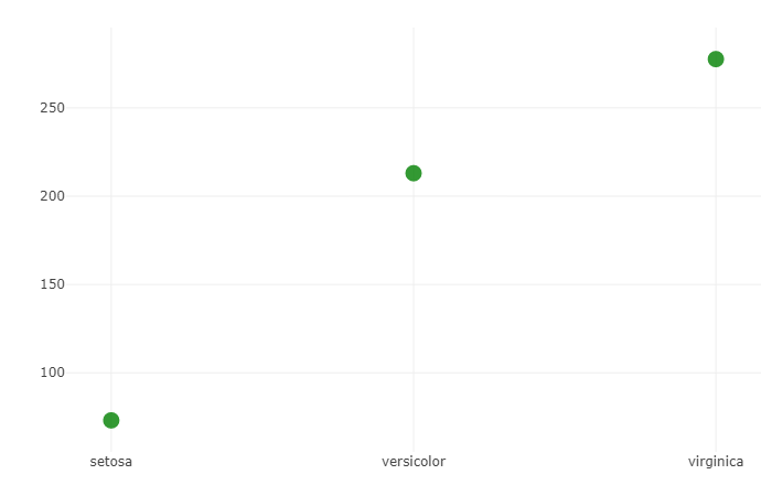
Basic Visual Scatter plot using aggregate function — sum
#Include the Librarylibrary(plotly)
#Store the graph in one variable to make it easier to manipulate.p <- plot_ly( type = 'scatter', y = iris$Petal.Length/iris$Petal.Width, x = iris$Species, mode = 'markers', marker = list( size = 15, color = 'green', opacity = 0.8 ), transforms = list( list( type = 'aggregate', groups = iris$Species, aggregations = list( list( target = 'y', func = 'sum', enabled = T ) ) ) ))
#Display the graphp
What does this mean?
Function sum, as mentioned above, calculates the sum of each group.
Thus, here the groups are categorized as species. This code uses the Iris Data Set which consist three different species, setosa, veriscolor, and virginica. For each species there are 50 observations in the data set. This data set is available in R (built-in) and can be loaded directly.
There are “iris” and “iris3” - two data sets are available. You can choose any one of them to run this code. The Data-Set used in this article is “iris”.
What does this code do exactly?
This code uses the function sum and calculates the sum of all the Petal.Length of each group respectively. Then, the calculated sum is plotted on the x-y axis. Where the x-axis is Species, the y-axis shows the Summation.
From this graph, we can get an idea that the petal size of setosa is smallest as the sum is the smallest, but it’s not conclusive evidence. To get conclusive evidence we can use the function avg.
The function sum is very suitable for almost the whole data set. For example, one of the best places where this can be used is in Population Data Set. In the world population data set, we can aggregate countries according to continents and find the sum of all the population of the countries in it.
Most used function — avg
#Include the Librarylibrary(plotly)
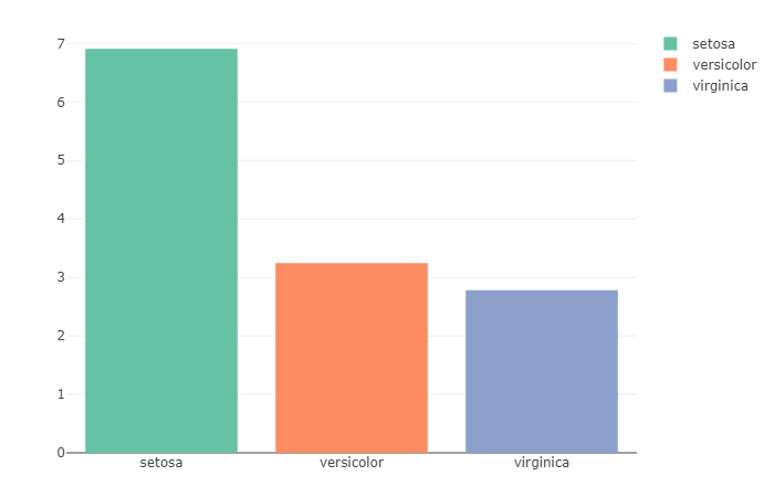
#Store the graph in one variable to make it easier to manipulate.q <- plot_ly( type = 'bar', y = iris$Petal.Length/iris$Petal.Width, x = iris$Species, color = iris$Species, transforms = list( list( type = 'aggregate', groups = iris$Species, aggregations = list( list( target = 'y', func = 'avg', enabled = T ) ) ) ))
#Display the graphq
What does this mean?
The iris data-set contains two columns for Petals, Petal.Width and Petal.Length. Further, it can be used to calculate the average of the ratio of Petal.Length & Petal.Width.
What does this code do exactly?
For each observation, the ratio of Petal.Length to Petal.Width is calculated before the average of all the gained values is plotted. As we can observe from this Bar Plot, Setosa has the max ratio with a near-ratio of 7, which shows that the petal length in Setosa is 7 times longer than its width. While on the other hand, virginica has the smallest ratio with nearly 3 times the width.
This function is very flexible and especially when it’s used very wisely to get the best result. For example, if we consider some other data-set like Population, then we can calculate the average birth to death ratio for each country.
Let’s use all the functions in one graph. Now we’re going to plot a scatter plot for each category and we’re going to use all the functions. To this graph we will add a button from which we can select the desired function to make our work easier and get the results quicker.
Aggregation of all functions — all functions in one-graph
#Include the Librarylibrary(plotly)
#Store the graph in one variable to make it easier to manipulate.s <- schema()agg <- s$transforms$aggregate$attributes$aggregations$items$aggregation$func$valuesl = list()
for (i in 1:length(agg)) { ll = list(method = "restyle", args = list('transforms[0].aggregations[0].func', agg[i]), label = agg[i]) l[[i]] = ll }
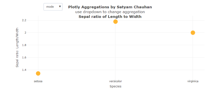
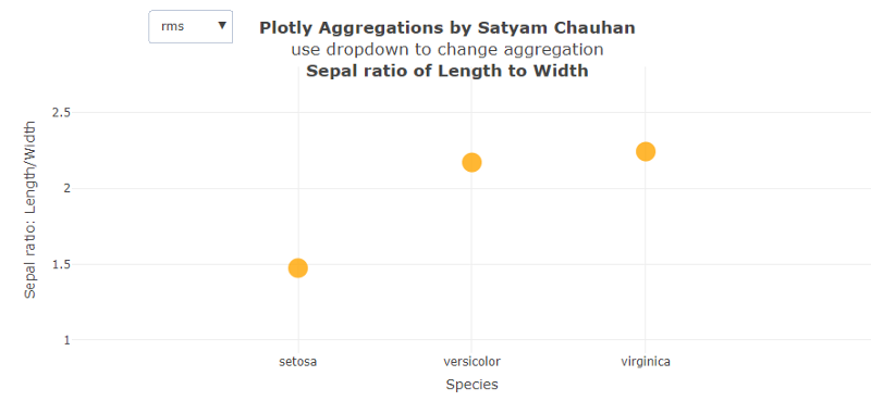
p <- plot_ly( type = 'scatter', x = iris$Species, y = iris$Sepal.Length / iris$Sepal.Width, mode = 'markers', marker = list( size = 20, color = 'orange', opacity = 0.8 ), transforms = list( list( type = 'aggregate', groups = iris$Species, aggregations = list( list( target = 'y', func = 'avg', enabled = T ) ) ) )) %>%layout( title = '<b>Plotly Aggregations by Satyam Chauhan</b><br>use dropdown to change aggregation<br><b>Sepal ratio of Length to Width</b>', xaxis = list(title = 'Species'), yaxis = list(title = 'Sepal ratio: Length/Width'), updatemenus = list( list( x = 0.2, y = 1.2, xref = 'paper', yref = 'paper', yanchor = 'top', buttons = l ) ))
#Display the graphs
What does this mean?
We make a list where all the function attributes of aggregation are stored. We use this function to experiment with all the functions of Aggregations in R.
A few of the graphs with different examples are shown below.
What does this code do exactly?
First, a list is created as mentioned earlier, in which all the functions are stored. After the list is made, the y-axis is set to the ratio of Sepal.Length to Sepal.Width and x-axis is set to Species.
After calculating the ratio, the function transform is called in which the func = ‘avg’ is mentioned for just the starting phase. When we run this code and select the function ‘mode’, we get Fig. 3 (above), which shows that the mode of setosa is the least among the three at around 1.4. Mode tells that the ratio 1.4 is repeated the most times or that value is most likely to be sampled. The different pattern we saw here is that the highest value most likely to be sampled is from the category veriscolor having a mode near to 2.2.
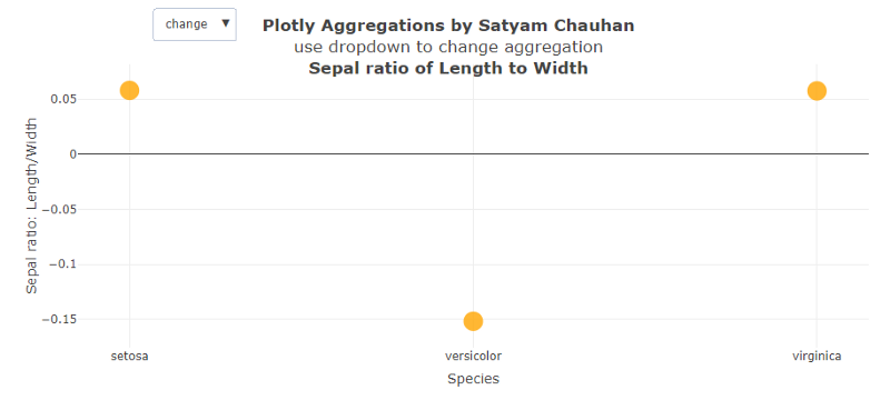
In Fig. 4 above, the change of ratio of Sepal Length to Sepal Width is plotted and we get very different results compared to the rest of the graphs. We observe the change of Setosa and Virginica to be the same and positive, while in the change of ratio by species, veriscolor is almost negative and is three times the change of the setosa and virginica.
On the other hand, the right figure shows the rms values of each species. We can easily see that the species veriscolor and virginica have almost same value which is significantly greater than the rms value of setosa.
Conclusion
Aggregation functions are one of the most powerful tools developers can ask for. They can provide you the patterns and results that you wouldn’t expect. To analyse the data visually, you have to play with the data, and to do that we need to manipulate and transform it. Aggregation functions do that for you, and they’re one of the most widely used functions in transform. This article is just a start. You can certainly explore more and apply more. That’s what explorers do.