
By Sarah Dayan
Test-driven development (TDD) is a process where you write tests before you write the associated code. You first write a test that describes an expected behavior, and you run it, ensuring it fails. Then, you write the dumbest, most straightforward code you can to make the test pass. Finally, you refactor the code to make it right. And you repeat all the steps for each test until you’re done.
This approach has many advantages. First, it forces you to think before you code. It’s commonplace to rush into writing code before establishing what it should do. This practice leads to wasting time and writing complicated code. With TDD, any new piece of code requires a test first, so you have no choice but take the time to define what this code should do before you write it.
Secondly, it ensures you write unit tests. Starting with the code often leads to writing incomplete tests, or even no tests at all. Such a practice usually happens as a result of not having precise and exhaustive specs, which leads to spending more time coding than you should. Writing tests becomes a costly effort, which is easy to undermine once the production code is ready.
Unit tests are critical to building robust code. Overlooking or rushing them increases chances of your code breaking in production at some point.
Why do TDD for components?
Testing a component can be counter-intuitive. As we saw in Unit Test Your First Vue.js Component, it requires a mental shift to wrap your head around testing components versus testing plain scripts, knowing what to test, and understanding the line between unit tests and end-to-end.
TDD makes all this easier. Instead of writing tests by examining all bits and pieces of a finished project and trying to guess what you should cover, you’re doing the opposite. You’re starting from actual specs, a list of things that the component should do, without caring about how it does it. This way, you’re ensuring that all you test is the public API, but you’re also guaranteeing you don’t forget anything.
In this tutorial, we’ll build a color picker. For every swatch, users can access the matching color code, either in hexadecimal, RGB, or HSL.
Despite its apparent simplicity, there are a bunch of small pieces of logic to test. They require some thinking before jumping into code.
In this article, we’ll deep dive into TDD. We’ll put some specs together before we write a single line of code. Then, we’ll test every public feature in a test-driven fashion. Finally, we’ll reflect on what we did and see what we can learn from it.
Before we start
This tutorial assumes you’ve already built something with Vue.js before, and written unit tests for it using Vue Test Utils and Jest (or a similar test runner). It won’t go deeper into the fundamentals, so make sure you get up to speed first. If you’re not there yet, I recommend you go over Build Your First Vue.js Component and Unit Test Your First Vue.js Component.
TL;DR: this post goes in-depth in the how and why. It’s designed to help you understand every decision behind testing a real-world Vue.js component with TDD and teach you how to make design decisions for your future projects. If you want to understand the whole thought process, read on. Otherwise, you can go directly to the afterthoughts at the end, or look at the final code on GitHub.
Write down your specs
Before you even write your first test, you should write down an overview of what the component should do. Having specs makes testing much more straightforward since you’re mostly rewriting each spec in the form of tests.
Let’s think about the different parts that compose our component, and what they should do.
First, we have a collection of color swatches. We want to be able to pass a list of custom colors and display as swatches in the component. The first one should be selected by default, and the end user can select a new one by clicking it.
Secondly, we have the color mode toggler. The end user should be able to switch between three modes: hexadecimal (default), RGB and HSL.
Finally, we have the color code output, where the end user can get the code for the currently selected color swatch. This code is a combination of the selected swatch and color mode. Thus, by default, it should display the first swatch as a hexadecimal value. When changing any of these, the code should update accordingly.
As you can see, we don’t go too deep into details; we don’t specify what the color mode labels should be, or what the active state looks like for the color swatches. We can make most of the small decisions on the fly, even when doing TDD. Yet, we’ve come from a simple definition of what the component should be, to a comprehensive set of specs to start from.
Write test-driven code
First, you need to create a new Vue project with Vue CLI. You can check Build Your First Vue.js Component if you need a step by step guide.
During the scaffolding process, manually select features and make sure you check Unit testing. Pick Jest as your testing solution, and proceed until the project is created, dependencies are installed, and you’re ready to go.
We’ll need to use SVG files as components, so you also need to install the right loader for them. Install vue-svg-loader as a dev dependency, and add a rule for it in your vue.config.js file.
// vue.config.js

module.exports = {
  chainWebpack: config => {
    const svgRule = config.module.rule('svg')
    svgRule.uses.clear()
    svgRule.use('vue-svg-loader').loader('vue-svg-loader')
  }
}
This loader doesn’t play well with Jest by default, which causes tests to throw. To fix it, create a svgTransform.js file as documented on the website, and edit your jest.config.js as follows:
// svgTransform.js

const vueJest = require('vue-jest/lib/template-compiler')

module.exports = {
  process(content) {
    const { render } = vueJest({
      content,
      attrs: {
        functional: false
      }
    })

    return `module.exports = { render: ${render} }`
  }
}

// jest.config.js

module.exports = {
  // ...
  transform: {
    // ...
    '.+\\.(css|styl|less|sass|scss|png|jpg|ttf|woff|woff2)$': 'jest-transform-stub',
    '^.+\\.svg$': '<rootDir>/svgTransform.js'
  },
  // ...
}
Note that we’ve removed “svg” from the first regular expression (the one that gets transformed with jest-transform-stub). This way, we ensure SVGs get picked up by svgTransform.js.
Additionally, you need to install color-convert as a dependency. We’ll need it both in our code and in our tests later on.
Don’t serve the project yet. We’re going to write tests and rely on them passing or not to move on. We don’t want to control whether what we build works by testing it visually in the browser, nor being distracted by how it looks.
Instead, open your project and create a new ColorPicker.vue single-file component in the src/components/ directory. In tests/unit/, create its associated spec file.
<!-- ColorPicker.vue -->

<template>
  <div></div>
</template>

<script>
export default {}
</script>

<style>
</style>

// ColorPicker.spec.js

import { shallowMount } from '@vue/test-utils'
import ColorPicker from '@/components/ColorPicker'

describe('ColorPicker', () => {
  // let's do this!
})
In your terminal, execute the following command to run tests:
npm run test:unit --watchAll
For now, you should get an error because you don’t yet have tests. Don’t worry though; we’ll fix this shortly ? Note the usage of the --watchAll flag in the command: Jest is now watching your files. This way, you won’t have to re-run test by hand.
TDD goes in 3 stages:
- Red: you write a test that describes an expected behavior, then you run it, ensuring it fails.
- Green: you write the dumbest, most straightforward code you can to make the test pass.
- Refactor: you refactor the code to make it right.
Step 1: Red
Time to write our first test! We’ll start with the color swatches. For clarity, we’ll wrap all tests for each distinct element in their own suite, using a describe block.
First, we want to make sure that the component displays each color that we provide as an individual swatch. We would pass those as props, in the form of an array of hexadecimal strings. In the component, we would display the list as an unordered list, and assign the background color via a style attribute.
import { shallowMount } from '@vue/test-utils'
import ColorPicker from '@/components/ColorPicker'
import convert from 'color-convert'

let wrapper = null

const propsData = {
  swatches: ['e3342f', '3490dc', 'f6993f', '38c172', 'fff']
}

beforeEach(() => (wrapper = shallowMount(ColorPicker, { propsData })))
afterEach(() => wrapper.destroy())

describe('ColorPicker', () => {
  describe('Swatches', () => {
    test('displays each color as an individual swatch', () => {
      const swatches = wrapper.findAll('.swatch')
      propsData.swatches.forEach((swatch, index) => {
        expect(swatches.at(index).attributes().style).toBe(
          `background: rgb(${convert.hex.rgb(swatch).join(', ')})`
        )
      })
    })
  })
})
We mounted our ColorPicker component and wrote a test that expects to find items with a background color matching the colors passed as props. This test is bound to fail: we currently have nothing in ColorPicker.vue. If you look at your terminal, you should have an error saying that no item exists at 0. This is great! We just passed the first step of TDD with flying colors.
Step 2: Green
Our test is failing; we’re on the right track. Now, time to make it pass. We’re not much interested in writing working or smart code at this point, all we want is to make Jest happy. Right now, Vue Test Utils complains about the fact that we don’t event have no item at index 0.
[vue-test-utils]: no item exists at 0
The simplest thing we can do to make that error go away is to add an unordered list with a swatch class on the list item.
<template>
  <div class="color-picker">
    <ul class="swatches">
      <li class="swatch"></li>
    </ul>
  </div>
</template>
Jest still complains but the error has changed:
Expected value to equal:
  "background: rgb(227, 52, 47);"
Received:
  undefined
This makes sense; the list item doesn’t have a style attribute. The simplest thing we can do about it is to hardcode the style attribute. This isn’t what we want in the end, but, we aren’t concerned about it yet. What we want is for our test to go green.
We can therefore hardcode five list items with the expected style attributes:
<ul class="swatches">
  <li class="swatch" style="background: rgb(227, 52, 47);"></li>
  <li class="swatch" style="background: rgb(52, 144, 220);"></li>
  <li class="swatch" style="background: rgb(246, 153, 63);"></li>
  <li class="swatch" style="background: rgb(56, 193, 114);"></li>
  <li class="swatch" style="background: rgb(255, 255, 255);"></li>
</ul>
The test should now pass.
Step 3: Refactor
At this stage, we want to rearrange our code to make it right, without breaking tests. In our case, we don’t want to keep the list items and their style attributes hardcoded. Instead, it would be better to receive swatches as a prop, iterate over them to generate the list items, and assign the colors as their background.
<template>
  <div class="color-picker">
    <ul class="swatches">
      <li
        :key="index"
        v-for="(swatch, index) in swatches"
        :style="{ background: `#${swatch}` }"
        class="swatch"
      ></li>
    </ul>
  </div>
</template>

<script>
export default {
  props: {
    swatches: {
      type: Array,
      default() {
        return []
      }
    }
  }
}
</script>
When tests re-run, they should still pass ? This means we’ve successfully refactored the code without affecting the output. Congratulations, you’ve just completed your first TDD cycle!
Now, before we go to the next test, let’s reflect a bit. You may be wondering:
“Isn’t this a bit dumb? I knew the test would fail. Am I not wasting time by running it anyway, then hardcoding the right value, see the test pass, then make the code right? Can’t I go to the refactor step directly?”
It’s understandable that you’re feeling confused by the process. Yet, try to look at things from a different angle: the point here isn’t to prove that the test doesn’t pass. We know it won’t. What we want to look at is what our test expects, make them happy in the simplest possible way, and finally write smarter code without breaking anything.
That’s the whole idea of test-driven development: we don’t write code to make things work, we write code to make tests pass. By reversing the relationship, we’re ensuring robust tests with a focus on the outcome.
What are we testing?
Another question that may come to mind is how we’re deciding what to test. In Unit Test Your First Vue.js Component, we saw that we should only be testing the public API of our component, not the internal implementation. Strictly speaking, this means we should cover user interactions and props changes.
But is that all? For example, is it okay for the output HTML to break? Or for CSS class names to change? Are we sure nobody is relying on them? That you aren’t yourself?
Tests should give you confidence that you aren’t shipping broken software. What people can do with your program shouldn’t stop working the way they expect it to work. It can mean different things depending on the project and use case.
For example, if you’re building this color panel as an open source component, your users are other developers who use it in their own projects. They’re likely relying on the class names you provide to style the component to their liking. The class names become a part of your public API because your users rely on them.
In our case, we may not necessarily be making an open source component, but we have view logic that depends on specific class names. For instance, it’s important for active swatches to have an active class name, because we’ll rely on it to display a checkmark, in CSS. If someone changes this by accident, we want to know about it.
Testing scenarios for UI components highly depend on the use case and expectations. Whichever the case, what you need to ask yourself is do I care about this if it changes?
Next tests
Testing the swatches
Let’s move on to the next test. We expect the first swatch of the list to be the one that’s selected by default. From the outside, this is something that we want to ensure keeps on working the same way. Users could, for instance, rely on the active class name to style the component.
test('sets the first swatch as the selected one by default', () => {
  const firstSwatch = wrapper.find('.swatch')
  expect(firstSwatch.classes()).toContain('active')
})
This test, too, should fail, as list items currently don’t have any classes. We can easily make this pass by adding the class on the first list item.
<li
  :key="index"
  v-for="(swatch, index) in swatches"
  :style="{ background: `#${swatch}` }"
  class="swatch"
  :class="{ 'active': index === 0 }"
></li>
The test now passes; however, we’ve hardcoded the logic into the template. We can refactor that by externalizing the index onto which the class applies. This way, we can change it later.
<template>
  <!-- ... -->
  <li
    :key="index"
    v-for="(swatch, index) in swatches"
    :style="{ background: `#${swatch}` }"
    class="swatch"
    :class="{ active: index === activeSwatch }"
  ></li>
  <!-- ... -->
</template>

export default {
  // ...
  data() {
    return {
      activeSwatch: 0
    }
  }
}
This naturally leads us to our third test. We want to change the active swatch whenever the end user clicks it.
test('makes the swatch active when clicked', () => {
  const targetSwatch = wrapper.findAll('.swatch').at(2)
  targetSwatch.trigger('click')
  expect(targetSwatch.classes()).toContain('active')
})
For now, nothing happens when we click a swatch. However, thanks to our previous refactor, we can make this test go green and even skip the refactor step.
<li
  :key="index"
  v-for="(swatch, index) in swatches"
  :style="{ background: `#${swatch}` }"
  class="swatch"
  :class="{ active: index === activeSwatch }"
  @click="activeSwatch = index"
></li>
This code makes the test pass and doesn’t even need a refactor. This is a fortunate side-effect of doing TDD: sometimes, the process leads to either writing new tests that either don’t need refactors, or even that pass right away.
Active swatches should show a checkmark. We’ll add it now without writing a test: instead, we’ll control their visibility via CSS later. This is alright since we’ve already tested how the active class applies.
First, create a checkmark.svg file in src/assets/.
<svg viewBox="0 0 448.8 448.8">
  <polygon points="142.8 323.9 35.7 216.8 0 252.5 142.8 395.3 448.8 89.3 413.1 53.6"/>
</svg>
Then, import it in the component.
import CheckIcon from '@/assets/check.svg'

export default {
  // ...
  components: { CheckIcon }
}
Finally, add it inside the list items.
<li ... >
  <check-icon />
</li>
Good! We can now move on to the next element of our component: the color mode.
Testing the color mode
Let’s now implement the color mode toggler. The end user should be able to switch between hexadecimal, RGB and HSL. We’re defining these modes internally, but we want to ensure they render correctly.
Instead of testing button labels, we’ll rely on class names. It makes our test more robust, as we can easily define a class name as part of our component’s contract. However, button labels should be able to change.
Now you may be tempted to check for these three specific modes, but that would make the test brittle. What if we change them? What if we add one, or remove one? That would still be the same logic, yet the test would fail, forcing us to go and edit it.
One solution could be to access the component’s data to iterate on the modes dynamically. Vue Test Utils lets us do that through the vm property, but again, this tightly couples our test with the internal implementation of the modes. If tomorrow, we decided to change the way we define modes, the test would break.
Another solution is to keep going with black box testing and only expect the class name to match a given pattern. We don’t care that it’s color-mode-hex, color-mode-hsl or color-mode-xyz, as long as it looks like what we expect from the outside. Jest lets us do that with regular expression matchers.
// ...
describe('Color model', () => {
  test('displays each mode as an individual button', () => {
    const buttons = wrapper.findAll('.color-mode')
    buttons.wrappers.forEach(button => {
      expect(button.classes()).toEqual(
        expect.arrayContaining([expect.stringMatching(/color-mode-\w{1,}/)])
      )
    })
  })
})
Here, we’re expecting elements with a class that follows the pattern “color-mode-“ + any word character (in ECMAScript, any character within [a-zA-Z_0-9]). We could add or remove any mode we want, and the test would still be valid.
Naturally, right now, the test should fail, as there are no buttons with class color-mode yet. We can make it pass by hardcoding them in the component.
<div class="color-modes">
  <button class="color-mode color-mode-hex"></button>
  <button class="color-mode color-mode-rgb"></button>
  <button class="color-mode color-mode-hsl"></button>
</div>
We can now refactor this code by adding the modes as private data in our component and iterate over them.
<template>
  <!-- ... -->
  <div class="color-modes">
    <button
      :key="index"
      v-for="(mode, index) in colorModes"
      class="color-mode"
      :class="`color-mode-${mode}`"
    >{{ mode }}</button>
  </div>
  <!-- ... -->
</template>

export default {
  // ...
  data() {
    return {
      activeSwatch: 0,
      colorModes: ['hex', 'rgb', 'hsl']
    }
  }
}
Good! Let’s move on.
As with the swatches, we want the first mode to be set as active. We can copy the test we wrote and adapt it to this new use case.
test('sets the first mode as the selected one by default', () => {
  const firstButton = wrapper.find('.color-mode')
  expect(firstButton.classes()).toContain('active')
})
We can make this test pass by manually adding the class on the first list item.
<button
  :key="index"
  v-for="(mode, index) in colorModes"
  class="color-mode"
  :class="[{ active: index === 0 }, `color-mode-${mode}`]"
>{{ mode }}</button>
Finally, we can refactor by externalizing the index onto which the class applies.
<template>
  <!-- ... -->
  <button
    :key="index"
    v-for="(mode, index) in colorModes"
    class="color-mode"
    :class="[{ active: index === activeMode }, `color-mode-${mode}`]"
  >{{ mode }}</button>
  <!-- ... -->
</template>

export default {
  // ...
  data() {
    return {
      activeSwatch: 0,
      activeMode: 0,
      colorModes: ['hex', 'rgb', 'hsl']
    }
  }
}
We need to change the active mode whenever the end user clicks the associated button, as with the swatches.
test('sets the color mode button as active when clicked', () => {
  const targetButton = wrapper.findAll('.color-mode').at(2)
  targetButton.trigger('click')
  expect(targetButton.classes()).toContain('active')
})
We can now add a @click directive as we did with the swatches, and make the test go green without having to refactor.
<button
  :key="index"
  v-for="(mode, index) in colorModes"
  class="color-mode"
  :class="[{ active: index === activeMode }, `color-mode-${mode}`]"
  @click="activeMode = index"
>{{ mode }}</button>
Testing the color code
Now that we’re done testing the swatches and color code, we can move on to the third and final element of our color picker: the color code. What we display in there is a combination of the other two: the selected swatch defines the color we should display, and the selected mode determines how to display it.
First, we want to make sure we initially display the default swatch in the default mode. We have the information to build this since we’ve implemented the swatches and the color mode.
Let’s start with a (failing) test.
describe('Color code', () => {
  test('displays the default swatch in the default mode', () => {
    expect(wrapper.find('.color-code').text()).toEqual('#e3342f')
  })
})
Now, let’s make this pass by hardcoding the expected result in the component.
<div class="color-code">#e3342f</div>
Good! Time to refactor. We have a raw color in hexadecimal mode, and we’re willing to output it in hexadecimal format. The only difference between our input and output values is that we want to prepend the latter with a hash character. The easiest way of doing so with Vue is via a computed property.
<template>
  <!-- ... -->
  <div class="color-code">{{ activeCode }}</div>
  <!-- ... -->
</template>

export default {
  // ...
  computed: {
    activeCode() {
      return `#${this.swatches[this.activeSwatch]}`
    }
  }
}
This should keep the test green. However, there’s an issue with this computed property: it only works for hexadecimal values. It should keep on working when we change the color, but not when we change the mode. We can verify this with another test.
test('displays the code in the right mode when changing mode', () => {
  wrapper.find('.color-mode-hsl').trigger('click')
  expect(wrapper.find('.color-code').text()).toEqual('2°, 76%, 54%')
})
Here, we’ve changed to HSL mode, but we’re still getting the hexadecimal output. We need to refactor our code so that our activeCode computed property is not only aware of the current color, but also the current color mode. One way we can achieve this is to create computed properties for each mode and proxy them through activeCode based on the selected mode.
First, we should simplify access to the current color and mode. Right now, we need to do an array lookup, which is repetitive and makes the code hard to read. We can use computed properties to wrap that logic.
export default {
  // ...
  computed: {
    // ...
    activeColorValue() {
      return this.swatches[this.activeSwatch]
    },
    activeModeValue() {
      return this.colorModes[this.activeMode]
    }
  }
}
As you can see, we’re not writing tests for these computed properties, as they aren’t part of our public API. We’ll use them later in our dedicated color mode computed properties, which themselves will be proxied in activeCode, which we’re testing in our “Color code” suite. All we care about is that the color code renders as expected so that the user can rely on them. How we get there are implementation details that we need to be able to change if need be.
We can now write our dedicated computed properties for each mode. We’ll map their name onto the ones in colorModes, so we can do an array lookup later in activeCode to return the right one.
For the hexadecimal output, we can externalize what we currently have in activeCode and refactor it using activeColorValue.
export default {
  // ...
  computed: {
    // ...
    hex() {
      return `#${this.activeColorValue}`
    }
  }
}
Now, let’s modify activeCode so it proxies the right computed property depending on the active mode.
export default {
  // ...
  computed: {
    // ...
    activeCode() {
      return this[this.activeModeValue]
    }
  }
}
This still shouldn’t make our latest test pass, since we haven’t written a computed property for it. However, our test that checks if the default mode renders correctly is still passing, which is a good sign we’re on the right track.
We now want to write a computed property that returns the color output in HSL mode. For this, we’ll use color-convert, an npm package that lets us convert colors in many different modes. We’ve already been using it in our tests, so we don’t have to reinstall it.
import convert from 'color-convert'

export default {
  // ...
  computed: {
    // ...
    hsl() {
      const hslColor = convert.hex.hsl(this.activeColorValue)
      return `${hslColor[0]}°, ${hslColor[1]}%, ${hslColor[2]}%`
    }
  }
}
Great, our test passes! We can now finish this up adding the missing RGB mode.
Yet, as you can see, we’re currently not testing the output of our color computed properties in isolation, but through other tests. To make things cleaner, we could decouple that logic from the component, import it as a dependency, and test it separately. This has several benefits:
- it keeps the component from growing every time we want to add a color mode,
- it keeps domains separated: the component focuses on its own view logic, and the color modes utility takes care of testing each mode exhaustively.
First, create a new color.js file in the src/utils/ directory, and a matching spec file in tests/unit/.
// color.spec.js

import { rgb, hex, hsl } from '@/utils/color'

// color.js

import convert from 'color-convert'

export const rgb = () => {}

export const hex = () => {}

export const hsl = () => {}
We can use TDD to test those three functions and make sure they always return the expected value. We can extract the logic we had in our Vue component for the last two, and write the RGB function from scratch.
For the sake of brevity, we’ll cover all three tests at once, but the process remains the same.
import { rgb, hex, hsl } from '@/utils/color'

const color = 'e3342f'

describe('color', () => {
  test('returns the color into RGB notation', () => {
    expect(rgb(color)).toBe('227, 52, 47')
  })
  test('returns the color into hexadecimal notation', () => {
    expect(hex(color)).toBe('#e3342f')
  })
  test('returns the color into HSL notation', () => {
    expect(hsl(color)).toBe('2°, 76%, 54%')
  })
})
We now have three failing tests. The first thing we can do is to return hardcoded values to go green.
export const rgb = () => '227, 52, 47'

export const hex = () => '#e3342f'

export const hsl = () => '2°, 76%, 54%'
Now, we can start refactoring by migrating the code from our Vue component.
export const hex = () => `#${color}`

export const hsl = color => {
  const hslColor = convert.hex.hsl(color)
  return `${hslColor[0]}°, ${hslColor[1]}%, ${hslColor[2]}%`
}
Finally, we can implement our rgb function.
export const rgb = color => convert.hex.rgb(color).join(', ')
All tests should stay green!
We can now use the color utilities in our Vue component and refactor it a bit. We no longer need to import color-convert in the component, nor do we need dedicated computed properties for each mode, or even for getting the active color and mode values. All we need to keep is activeCode, where we can store all the necessary logic.
This is a good example where doing black box testing helps us: we’ve been focusing on testing the public API; thus we can refactor the internals of our component without breaking the tests. Removing properties like activeColorValue or hex doesn’t matter, because we were never testing them directly.
// ...
import { rgb, hex, hsl } from '@/utils/color'

const modes = { rgb, hex, hsl }

export default {
  // ...
  computed: {
    activeCode() {
      const activeColor = this.swatches[this.activeSwatch]
      const activeMode = this.colorModes[this.activeMode]
      return modes[activeMode](activeColor)
    }
  }
}
We now have much terser code in our component, and better domain separation, while still respecting the component’s contract.
Finally, we can implement a missing test: the one that ensures the color code changes whenever we click a new swatch. This should already go green, but it’s still essential for us to write it, so we can know about it if it breaks.
test('displays the code in the right color when changing color', () => {
  wrapper
    .findAll('.swatch')
    .at(2)
    .trigger('click')
  expect(wrapper.find('.color-code').text()).toEqual('#f6993f')
})
And we’re done! We just built a fully functional Vue component using TDD, without relying on browser output, and our tests are ready.
Visual control
Now that our component is ready, we can see how it looks and play with it in the browser. This allows us to add the CSS and ensure we didn’t miss out on anything.
First, mount the component into the main App.vue file.
<!-- App.vue -->

<template>
  <div id="app">
    <color-picker :swatches="['e3342f', '3490dc', 'f6993f', '38c172', 'fff']"/>
  </div>
</template>

<script>
import ColorPicker from '@/components/ColorPicker'

export default {
  name: 'app',
  components: {
    ColorPicker
  }
}
</script>
Then, run the app by executing the following script, and open it in your browser at [http://localhost:8080/](http://localhost:8080/).
npm run serve
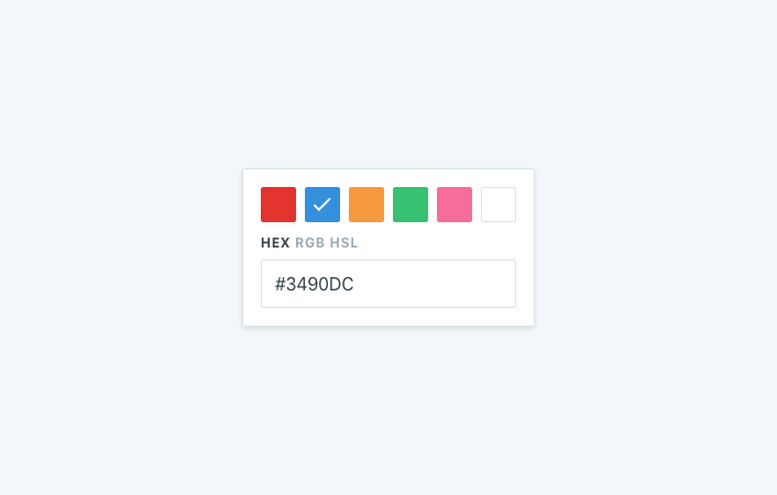
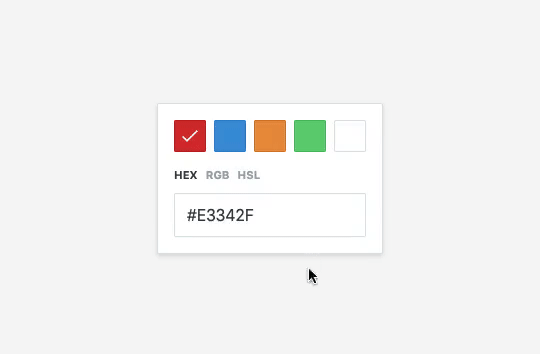
You should see your color picker! It doesn’t look like much for now, but it works. Try clicking colors and change the color mode; you should see the color code change.
To see the component with proper styling, add the following CSS between the style tags:
.color-picker {
  background-color: #fff;
  border: 1px solid #dae4e9;
  border-radius: 0.125rem;
  box-shadow: 0 2px 4px 0 rgba(0, 0, 0, 0.1);
  color: #596a73;
  font-family: BlinkMacSystemFont, Helvetica Neue, sans-serif;
  padding: 1rem;
}

.swatches {
  color: #fff;
  display: flex;
  flex-wrap: wrap;
  list-style: none;
  margin: -0.25rem -0.25rem 0.75rem;
  padding: 0;
}

.swatch {
  border-radius: 0.125rem;
  cursor: pointer;
  height: 2rem;
  margin: 0.25rem;
  position: relative;
  width: 2rem;
}

.swatch::after {
  border-radius: 0.125rem;
  bottom: 0;
  box-shadow: inset 0 0 0 1px #dae4e9;
  content: '';
  display: block;
  left: 0;
  mix-blend-mode: multiply;
  position: absolute;
  right: 0;
  top: 0;
}

.swatch svg {
  display: none;
  color: #fff;
  fill: currentColor;
  margin: 0.5rem;
}

.swatch.active svg {
  display: block;
}

.color-modes {
  display: flex;
  font-size: 1rem;
  letter-spacing: 0.05rem;
  margin: 0 -0.25rem 0.75rem;
}

.color-mode {
  background: none;
  border: none;
  color: #9babb4;
  cursor: pointer;
  display: block;
  font-weight: 700;
  margin: 0 0.25rem;
  padding: 0;
  text-transform: uppercase;
}

.color-mode.active {
  color: #364349;
}

.color-code {
  border: 1px solid #dae4e9;
  border-radius: 0.125rem;
  color: #364349;
  text-transform: uppercase;
  padding: 0.75rem;
}
You should see something like this:
And we’re done!
Afterthoughts
How can we improve this?
For now, we have a robust test suite. Even though we don’t have 100% coverage, we can feel confident with our component going out in the wild, and evolving over time. There are still a couple of things we could improve though, depending on the use case.
First, you may notice that when clicking the white swatch, the checkmark doesn’t show up. That’s not a bug, rather a visual issue: the checkmark is there, but we can’t see it because it’s white on white. You could add a bit of logic to fix this: when a color is lighter than a certain threshold (let’s say 90%), you could add a light class on the swatch. This would then let you apply some specific CSS and make the checkmark dark.
Fortunately, you already have all you need: the color-converter package can help you determine whether a color is light (with the HSL utilities), and you already have a color utility module to store that logic and test it in isolation. To see what the finished code could look like, check out the project’s repository on GitHub.
We could also reinforce the suite by adding a few tests to make sure some expected classes are there. This doesn’t test actual logic, but would still be particularly useful if someone was relying on those class names to style the component from the outside. Again, everything depends on your use case: test what shouldn’t change without you knowing, don’t only add tests for the sake of it.
What did we learn?
There are several lessons to learn from this TDD experiment. It brings a lot to the table but also highlights a few challenges that we should be aware of.
First, TDD is a fantastic way to write robust tests, not too many and not too few. Have you ever finished a component, moved on to tests and thought “where do I even start?”? Looking at finished code and figuring out what to test is hard. It’s tempting to get it done quickly, overlook some critical parts and end up with an incomplete test suite. Or you can adopt a defensive approach and test everything, risking to focus on implementation details and writing brittle tests.
Adopting TDD for developing UI components helps us focus on exactly what to test by defining, before writing any line of code, if this is part of the contract or not.
Secondly, TDD encourages refactors, leading to better software design. When you’re writing tests after coding, you’re usually no longer in a refactoring dynamic. You can fix your code if you find issues while testing, but at this stage, you’re most likely done with the implementation. This separation between writing code and writing test is where lies the issue.
With TDD, you’re creating a deeper connection between code and tests, with a strong focus on making the public API reliable. Implementation comes right after you’ve guaranteed the outcome. This is why the green step is critical: you first need your test to pass, then ensure it never breaks. Instead of implementing your way to a working solution, you’re reversing the relationship, focusing on the contract first, and allowing the implementation to remain disposable. Because refactoring comes last, and you’ve established the contract, you now have mental space to make things right, clean some code, adopt a better design, or focus on performance.
It’s worth noting that TDD is much easier to follow with specs. When you already have a clear overview of everything the component should do, you can translate those specifications into tests. Some teams use frameworks like ATDD (acceptance test–driven development), where the involved parties develop specifications from a business perspective. The final specs, or acceptance tests, are a perfect base to write tests following TDD.
On the other hand, going with TDD to test UI components can be difficult at first, and require some prior knowledge before diving into it. For starters, you need to have good knowledge of your testing libraries so that you can write reliable assertions. Look at the test we wrote with a regular expression: the syntax is not the most straightforward. If you don’t know the library well, it’s easy to write a test that fails for the wrong reasons, which would end up hindering the whole TDD process.
Similarly, you need to be aware of some details regarding the values you expect; otherwise, you could end up battling with your tests and doing some annoying back-and-forths. On that matter, UI components are more challenging than renderless libraries, because of the various ways the DOM specifications can be implemented.
Take the first test of our suite for example: we’re testing background colors. However, even though we’re passing hexadecimal colors, we’re expecting RGB return values. That’s because Jest uses jsdom, a Node.js implementation of the DOM and HTML standards. If we were running our tests in a specific browser, we might have a different return value. This can be tricky when you’re testing different engines. You may have to seek some more advanced conversion utilities or use environment variables to handle the various implementations.
Is it worth it?
If you made it this far, you’ve probably realized that TDD demands time. This article itself is over 6,000 words! This can be a bit scary if you’re used to faster development cycles, and probably looks impossible if you’re often working under pressure. However, it’s important to bust the myth that TDD would somehow double development time for little return on investment, because this is entirely false.
TDD requires some practice, and you’ll get faster over time. What feels clumsy today can become a second nature tomorrow, if you do it regularly. I encourage you not to discard something because it’s new and feels awkward: give it some time to assess it fairly, then take a decision.
Secondly, time spent on writing test-driven code is time you won’t spend fixing bugs.
Fixing bugs is far more costly than preventing them. If you’ve ever had to fix critical production bugs, you know this feels close to holding an open wound on a surgical patient with one hand, while trying to operate with the other one. In the desert. At night. With a Swiss Army knife. It’s messy, stressful, suboptimal, and bears high chances of screwing up something else in the process. If you want to preserve your sanity and the trust your end users have in your software, you want to avoid those situations at all costs.

Tests help you catch bugs before they make it to production, and TDD helps you write better tests. If you think you should test your software, then you should care about making these tests useful in the first place. Otherwise, the whole thing is only a waste of time.
As with anything, I encourage you to try TDD before discarding the idea. If you’re consistently encountering production issues, or you think you could improve your development process, then it’s worth giving it a shot. Try it for a limited amount of time, measure the impact, and compare the results. You may discover a method that helps you ship better software, and feel more confident about hitting the “Deploy” button.