By Michael Frederick
Applying borders to non-rectangular shapes in CSS can be challenging. In this article, we will explore ways to apply different border types to trapezoidal shapes in CSS.
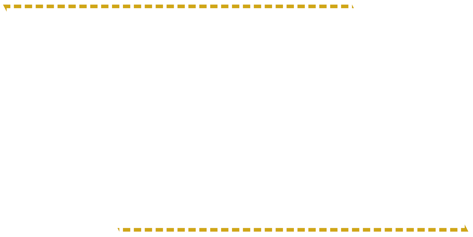
The final shape we aim to achieve is a golden dashed parallelogram border, as you can see in the screenshot below:

Parallelogram with Dashed Border using CSS
Step 1: How to Create a Parallelogram
Let's create some basic HTML and CSS to work off of. In this article, we will use a parallelogram as our base shape, but the approach here would work for other trapezoids as well.
To create a parallelogram, you can use an online clip path generator. Here is the code we will be working with for our parallelogram:
HTML
<div class="parallelogram"></div>
CSS
.parallelogram {
  background: blue;
  height: 500px;
  clip-path: polygon(0% 0%, 75% 0%, 100% 100%, 25% 100%);
}
Result

Blue Parallelogram
Step 2: How to Add a Solid Border to the Parallelogram
Now that we have a parallelogram that roughly follows the shape we are looking for, we need to apply a border to it.
Attempt 1: Using the CSS Border Property (fail!)
This is where the implementation starts to get tricky. If you're like me, the first thing you will try is to apply the CSS border property to the parallelogram. See the code and result below for what this looks like.
HTML
<div class="parallelogram"></div>
CSS
.parallelogram {
  background: transparent;
  height: 200px;
  clip-path: polygon(0% 0%, 75% 0%, 100% 100%, 25% 100%);
  border: dashed 5px gold; // attempt to add a border
}
Result
Dashed Borders on Top and Bottom
The problem in the example above is that the CSS clip-path property does not change the actual shape of a block element – it just changes the portion of an element that is rendered on the screen.
This means that the CSS border property that is being applied to the parallelogram is being drawn as a rectangle border around the container of the parallelogram. When the clip-path is applied, the left and right borders disappear because they are not within the clipped area. The top and bottom borders are within the clipped area, so they still appear.
Attempt 2: Simulating a Border (success!)
Since the built-in CSS border property is not enough, we can instead simulate a border by layering two parallelograms on top of each other, one slightly smaller than the other.
To do this, we will use a relatively positioned container with an absolutely positioned parallelogram inside.
In the code below, the "small-parallelogram" has a 1% inset from the top and bottom of the outer parallelogram. This effect is created with the clip-path property of the small-parallelogram.
HTML
<div class="parallelogram-container">
  <div class="parallelogram"></div>
  <div class="small-parallelogram"></div>
</div>
CSS
.parallelogram-container {
  position: relative;
  height: 300px;
}

.parallelogram {
  height: 300px;
  clip-path: polygon(0% 0%, 75% 0%, 100% 100%, 25% 100%);
  background: rgb(208, 166, 23);
}

.small-parallelogram {
  position: absolute;
  background: white;
  width: 100%;
  height: 100%;
  top: 0;
  left: 0;
  clip-path: polygon(1% 1%, 74% 1%, 99% 99%, 26% 99%);
}
Result

Fully Outlined Parallelogram
In the above example, there are two parallelograms: a gold one that is overlapped by a white one. Because the white one has the same background color as the document and it slightly smaller than the gold one, the arrangement gives the appearance of one single parallelogram with a gold border.
Step 3: How to Create a Dashed Border Effect
To take this design one step further, we want to make the gold “border” appear dashed. Thus, we need to simulate a dashed border effect.
Implementing the Left and Right Borders
To make the left and right borders dashed, we will use a repeating-linear-gradient background. The gradient will alternate between gold and white, giving the parallelogram the look of a dashed border on its left and right-hand sides.
Update the CSS of the parallelogram div using the code below:
CSS
.parallelogram {
  height: 300px;
  clip-path: polygon(0% 0%, 75% 0%, 100% 100%, 25% 100%);
  background: repeating-linear-gradient(rgb(208, 166, 23) 0px, rgb(208, 166, 23) 8px, white 8px, white 16px);
}
Result

Implementing the Top and Bottom Borders
The top and bottom borders need a separate approach. Here, we will generate a border using an SVG, allowing us to control dash spacing and sizing.
This will require the introduction of yet another absolutely positioned parallelogram for effect. See the background-image property of the parallelogram-vertical-borders div below to see how the SVG is applied to create top and bottom borders.
Note that in this example I have cut the border width in half. I've done this by modifying the "stroke-width" property of the SVG background on the parallelogram-vertical-borders div, and cutting the repeating linear gradient size in half on the parallelogram div.
HTML
<div class="parallelogram-container">
  <div class="parallelogram"></div>
  <div class="parallelogram-vertical-borders"></div>
  <div class="small-parallelogram"></div>
</div>
CSS
.parallelogram-container {
  position: relative;
  height: 300px;
}

.parallelogram {
  height: 300px;
  clip-path: polygon(0% 1%, 75% 1%, 100% 100%, 25% 100%);
  background: repeating-linear-gradient(rgb(208, 166, 23) 0px, rgb(208, 166, 23) 8px, white 8px, white 16px);
  z-index: 1;
}

.parallelogram-vertical-borders {
  height: 300px;
  clip-path: polygon(0% 0%, 75% 0%, 100% 100%, 25% 100%);
  z-index: 1;
  position: absolute;
  width: 100%;
  height: 100%;
  top: 0;
  left: 0;
  z-index: 5;
  background-image: url("data:image/svg+xml,%3csvg width='100%25' height='100%25' xmlns='http://www.w3.org/2000/svg'%3e%3crect width='100%25' height='100%25' fill='none' stroke='rgb(208, 166, 23)' stroke-width='4' stroke-dasharray='6%2c 14' stroke-dashoffset='0' stroke-linecap='square'/%3e%3c/svg%3e");
}

.small-parallelogram {
  position: absolute;
  background: white;
  width: 100%;
  height: 100%;
  top: 0;
  left: 0;
  clip-path: polygon(0.3% 1%, 74.5% 1%, 99.5% 99%, 25.2% 99%);
  z-index: 3;
}
Final Result

Final Dashed Outline Parallelogram
Conclusion
Adding borders to non-rectangular shapes in CSS can be challenging, but in this tutorial you've seen a way to do it.
You can see a live working example of the implementation from this article on the Swovo homepage.