

I believe we may have all noticed the trend of meticulously organized web layouts reminiscent of Japanese bento boxes. These 'Bento Grids' have swiftly gained traction, offering a visually appealing and structurally cohesive way to present content online.
In this article, we'll delve into the origins, rise, and practical implementation of the bento grid trend, exploring how it intersects aesthetics with functionality in modern web design.
Prerequisites
- Fundamentals of HTML and CSS (CSS Grid)
- Basics of Web Design
The Philosophy Behind Bento Grids
The concept of bento grids traces back to the Japanese tradition of serving a variety of dishes in a single, segmented container known as a bento box. This method of presentation not only ensures a balanced meal but also pleases the eye with its organization and simplicity.
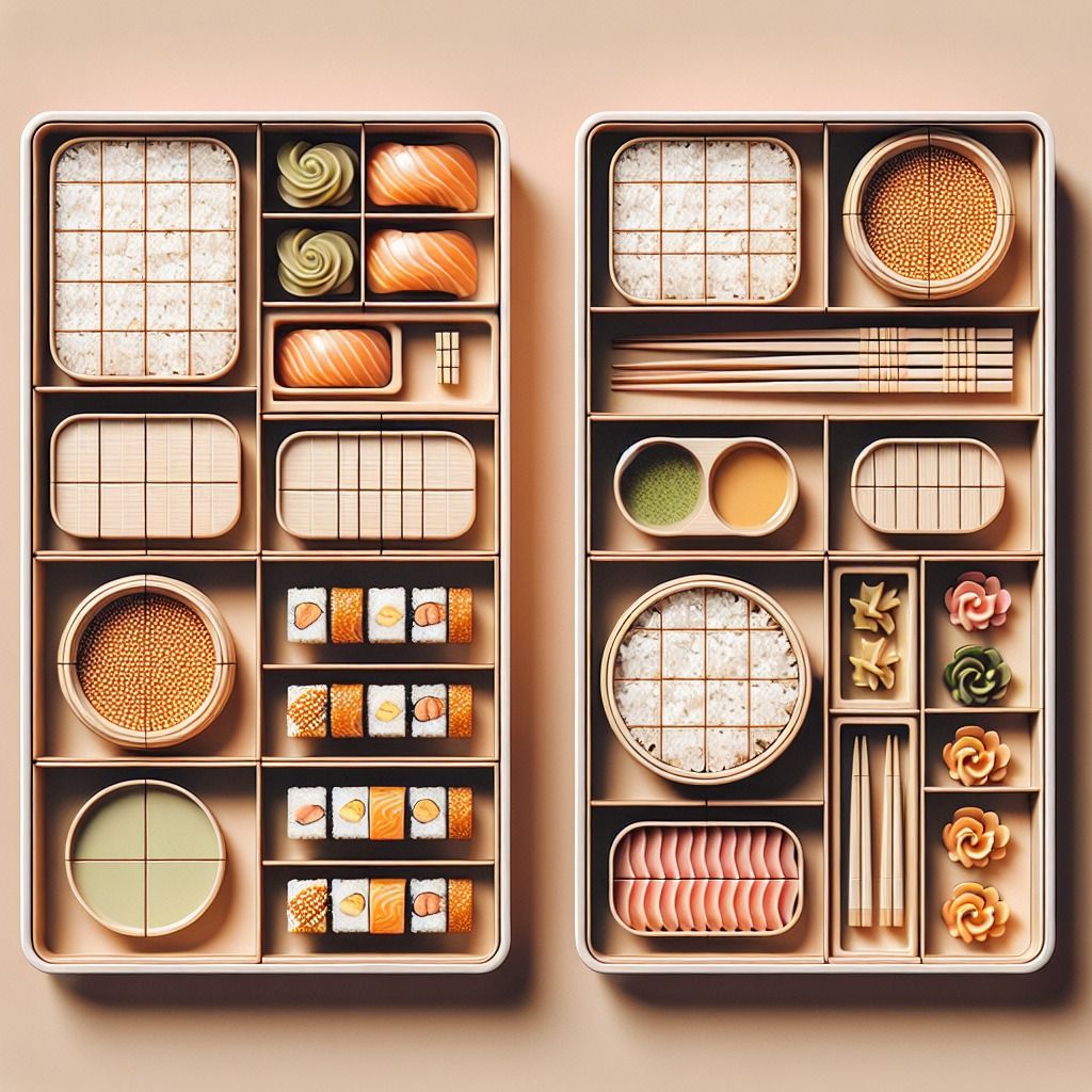 Bento Japanese Box
Translated into web design, bento grids offer a similar experience: diverse content segmented into distinct areas, making it both accessible and aesthetically balanced.
The bento grid philosophy hinges on compartmentalization and organization. It creates a predictable rhythm that users can follow, reducing cognitive load and enhancing the overall user experience. The design's symmetry and order offers a sense of calm and control, appealing to users' desire for simplicity and structure amidst the chaos of the internet.
The Rise of Bento Grids
While the use of grids in design is not new, the specific trend of bento grids began to gain traction as designers sought to create more organized and mobile-responsive layouts.
Powerhouses like Apple use this design pattern in promotional videos for their products as well.
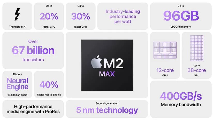 Apple mac promotional infographic
The trend also saw a surge in popularity with the advent of CSS Grid Layout and the growing focus on minimalist design that doesn't sacrifice functionality for form.
Platforms that emphasize content, such as online magazines, educational sites, and portfolios, were among the early adopters of bento grids. Their adoption highlighted the grid's ability to present diverse content types in a harmonious layout, thereby improving navigation and readability.
Examining the Trend
Clean lines, geometric shapes, and a clear space division often characterize modern bento grids. They usually consist of:
- The title of a feature
- A short description of the feature
- Some infographic or interactive content.
This trend has been propelled by its positive impact on user experience. A well-implemented bento grid guides users through the website with ease, allowing quick access to information without overwhelming them with choices.
Pros of Using Bento Grids
- Enhanced Organization and Cohesion: Bento grids bring a high level of organization to web design, allowing for a cohesive presentation of varied content. This segmentation makes it easier for users to digest information in a structured manner.
- Aesthetic Appeal: The symmetry and clean lines inherent in bento grids are visually appealing, providing a neat and professional look that can enhance the visual identity of a website.
- Reduced Scroll Fatigue: By efficiently utilizing space within a single viewport, bento grids can display a significant amount of content, which can reduce the need for excessive scrolling.
- Metaphorical Clarity: The bento box metaphor effectively communicates the concept of a complete and balanced experience, which can be particularly useful for showcasing product features or a portfolio of work.
- Improved Navigation: The predictability and order of bento grids aid in straightforward navigation, as users can easily move from one compartmentalized section to another.
- Compatibility with Responsive Design: Bento grids seamlessly integrate with responsive design principles, facilitating effortless adjustment of a website's layout to accommodate diverse screen sizes and devices.
- Focus on Content: The grid layout emphasizes content without unnecessary distractions, which can be crucial for sites where content is important, such as online galleries or information-driven platforms.
- Facilitates Comprehensive Product Capture: In the context of showcasing products, bento grids offer users the convenience of capturing all essential information at once. With content neatly organized within distinct compartments, users can easily screenshot or save a single view of the grid, ensuring they capture all relevant details without the need for multiple interactions or navigating through various pages.
Cons of Bento Grids
- Potential Information Overload: While bento grids can reduce cognitive load through organization, there's a risk of cramming too much information into a single screen, potentially overwhelming users.
- Limited Visual Hierarchy: The uniform structure of bento grids can sometimes lead to a lack of visual hierarchy, making it harder for users to determine the importance of certain content over others.
- Considerations Regarding Hick's Law: A densely packed grid presents users with a multitude of options, potentially prolonging their decision-making process. This abundance of choices can result in the paradox of choice, where users experience indecision or slower navigation due to the overwhelming array of options available.
- Design Rigidity: The structured nature of bento grids can sometimes restrict creative design elements and lead to a monotonous user experience if not implemented with variation and dynamic content.
- SEO Challenges: Search engines may have difficulty parsing the relevance of content when it's distributed across numerous grid compartments, potentially impacting SEO if not structured properly.
- Accessibility Concerns: The compartmentalized nature of bento grids might present accessibility challenges, particularly for users who rely on screen readers or keyboard navigation, if not designed with accessibility standards in mind.
Bento Grids in Practice
Creating bento grids typically involves CSS grid layout and flexbox, which offer robust solutions for creating complex layouts with ease. Bento grids are favored for their flexibility and responsiveness, allowing content to reflow seamlessly across different screen sizes.
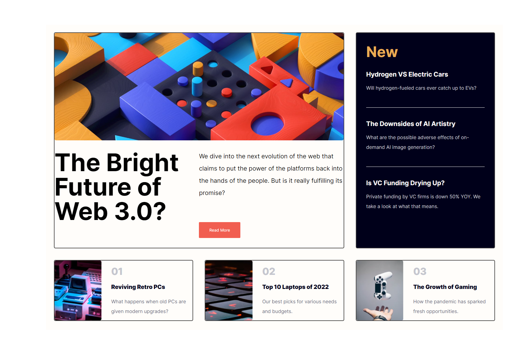
For this article, here’s the design we’re going to create the interface below:
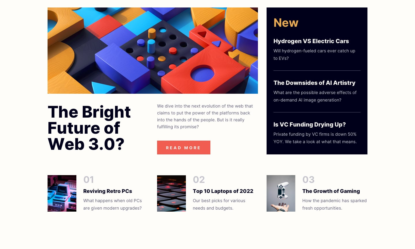 desktop design to recreate
To begin, create a couple of divs in your markup.
<body>
    <div class="grid">
      <div class="item"></div>
      <div class="item"></div>
      <div class="item"></div>
      <div class="item"></div>
      <div class="item"></div>
    </div>
  </body>
Then utilize the grid property, grid-template-columns, and grid-template-rows to define the number of rows and columns you desire.
.grid {
  background: hsl(36, 100%, 99%);
  width: 100%;
  max-width: 1500px;
  height: 1000px;
  display: grid;
  gap: 1.5vw;
  padding: 1vw;
  grid-template-columns: repeat(6, 1fr);
  grid-template-rows: auto;
}
The final ingredient to achieving a bento-style grid lies in the use of the grid-template-areas property which is used to name grid areas according to the position you want them to occupy on the page.
.grid {
  background: hsl(36, 100%, 99%);
  width: 100%;
  max-width: 1500px;
  height: 1000px;
  display: grid;
  gap: 1.5vw;
  padding: 1vw;
  grid-template-columns: repeat(6, 1fr);
  grid-template-rows: auto;
  grid-template-areas:
    "hero hero hero hero aside2 aside2"
    "hero hero hero hero aside2 aside2"
    "hero hero hero hero aside2 aside2"
    "hero hero hero hero aside2 aside2"
    "aside3 aside3 aside4 aside4 aside5 aside5 ";
}
Finally, assign those names to the exact element you want to take up that space.
.item {
  border: 2px solid #464545;
  border-radius: 5px;
}

.grid .item:nth-child(1) {
  grid-area: hero;
}
.grid .item:nth-child(2) {
  grid-area: aside2;
}

.grid .item:nth-child(3) {
  grid-area: aside3;
}
.grid .item:nth-child(4) {
  grid-area: aside4;
}

.grid .item:nth-child(5) {
  grid-area: aside5;
}
You should have this result:
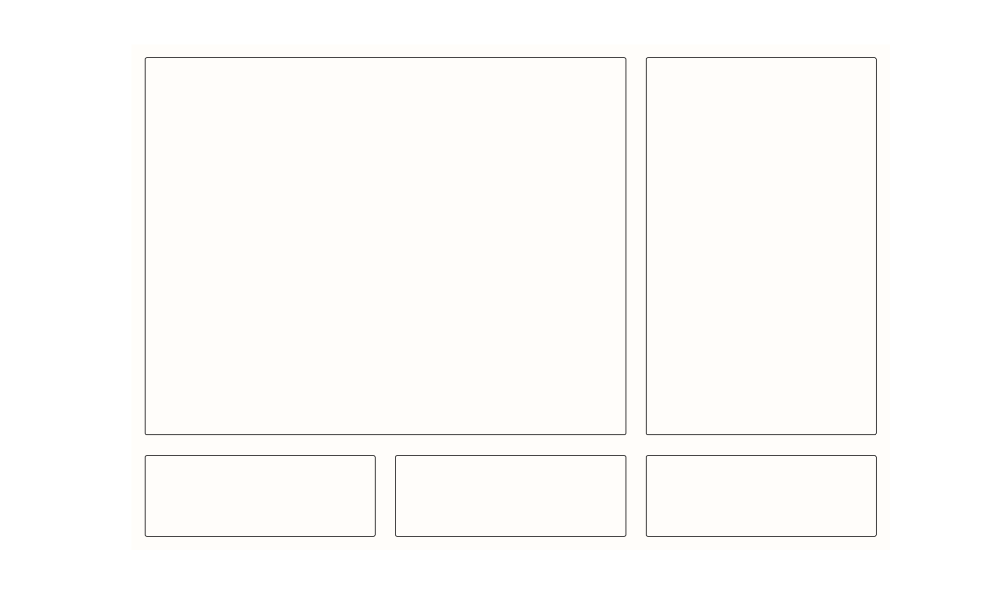 Bento structure achieved
All that’s left is to fill the boxes with their appropriate content and assets. You can some assets/content in this repo.
 Bento Grid with its content filled
Another usefulness of the grid-template-areas property is the ease by which you can achieve responsiveness with it. In our example, to make the page responsive, you pass in a new string pair on your preferred threshold.
On tablet screens:
@media screen and (max-width: 1000px) {
  .grid {
    grid-template-columns: repeat(4, 1fr);
    grid-template-areas:
      "hero   hero   hero   hero"
      "hero   hero   hero   hero"
      "aside2 aside2 aside2 aside3"
      "aside4 aside4 aside5 aside5";
  }
}
 Tablet Screens
And on smaller screens:
@media screen and (max-width: 750px) {
  .grid {
    grid-template-columns: repeat(3, 1fr);
    grid-template-areas:
      "hero   hero   hero"
      "hero   hero   hero"
      "aside2 aside2 aside2"
      "aside3 aside3 aside3"
      "aside4 aside4 aside4"
      "aside5 aside5 aside5";
  }
}
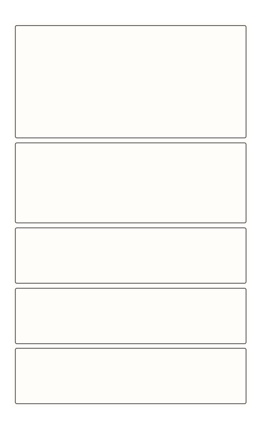 Smaller screens
Common Rules of Bento Grids
Here are some good rules of thumb when building bento grids:
- Group Related Content: One of the fundamental principles of bento grids is to group related content together within each segment. This enhances the user's ability to quickly locate and understand the information they're seeking. By organizing content logically, designers can improve user engagement and satisfaction.
- Vary Box Sizes: Avoid using the same size for every box within the grid. Varying box sizes can create visual interest and hierarchy, drawing attention to key elements while maintaining overall balance. This variation can help guide users through the content and highlight important information effectively.
- Establish Visual Hiererchy: Although varying box sizes contribute to visual hierarchy, establishing visual hierarchy encompasses a broader range of design elements. In addition to box sizes, designers should consider factors such as colour, typography, and placement to prioritize certain elements over others.
- Prioritize Center Square: In traditional bento grids, the center square often holds a special significance and acts as a focal point. Designers can use this central square to showcase critical information or highlight key features, effectively punctuating the grid and drawing users' attention to its core elements.
- Limit the Number of Boxes: To maintain clarity and avoid overwhelming users, it's recommended to use nine or fewer boxes within the bento grid. Limiting the number of boxes ensures that the layout remains manageable and facilitates easier navigation and comprehension for users.
- Consider Swirl Pattern: While not a strict rule, considering a swirl pattern can add an extra layer of visual interest to the bento grid design. This involves arranging content in a curved or swirling pattern within the grid, creating a dynamic and engaging layout that encourages exploration.
Additional Information
I’d like to point out a couple of things in the article not highlighted.
- First and foremost, the article was inspired by Tom Geoco’s video on bento grids.
- BentoGrids is an excellent resource for finding design inspiration if you’re interested. If you’re interested in the full code, here’s the repo, GitHub, and the Live version. Demo.
- The design inspiration for the grid we built was gotten from FrontEnd Mentor.
Conclusion
Bento grids stand out as a significant trend in the modern web design landscape, offering a blend of aesthetic appeal and functional clarity. They represent a design ethos that values order, beauty, and user-centricity.
As web technologies evolve, the principles underlying bento grids will continue to inform best practices, encouraging designers to create experiences that are not only visually compelling but also intuitively navigable.
Contact Information
Want to connect or contact me? Feel free to hit me up on the following:
- Twitter / X: @jajadavid8
- LinkedIn: David Jaja
- Email: Jajadavidjid@gmail.com