By Victor Ikechukwu
CSS has come a long way over the past few years. In the past, you'd use CSS to create simple-looking web applications that rely on HTML tables and CSS floats as their layout systems. And now you can architect complex interactive user interfaces that are appealing with elegant designs.
But as advanced as CSS has become, writing out CSS styles from scratch for extensive web applications can be time-consuming. It can also lead to the repetition of styles, longer CSS files, cross-browser compatibility errors, and generally a more complex codebase.
To solve this challenge, CSS frameworks emerged as a solution. CSS frameworks introduced a means for developers to adopt a set of pre-defined and standardized CSS styles and components to create consistent, appealing, and responsive user interfaces.
But with so many CSS frameworks to choose from, deciding on the right framework for your application can be difficult. You'll want to conduct a proper comparison that accounts for the overall features of each CSS framework, so you can choose the most suitable option that fits your needs.
In this article, we’ll explore what CSS frameworks are, their benefits and limitations, and how you can get started using them. We’ll also look at the most prominent and used CSS frameworks you should know.
In the end, you'll have a good sense of how CSS frameworks work and which to use to meet your project's needs. Let's get started.
Table of Contents
What are CSS Frameworks?
CSS frameworks are a set of pre-written and ready-to-use CSS styles and stylesheets that provide a set of styles and components for styling markup. They streamline the development process by offering a foundation of reusable CSS styles for common design elements and layouts.
CSS frameworks are used to create familiar and consistent user interfaces, simplify responsive design, and enhance collaboration among development teams.
Why Should You Use CSS Frameworks?
CSS frameworks offer numerous benefits that make them indispensable tools for web development. Here are some advantages that CSS frameworks provide:
Faster development time: CSS frameworks come with pre-built components and styles, eliminating the need to write everything from scratch. This speeds up the development process and allows developers to focus on customizing and fine-tuning specific aspects of their projects rather than building from scratch.
Consistent style and design: CSS frameworks help provide a cohesive and consistent look across different components and pages. They ensure that all styles, UI elements, buttons, and typography maintain a unified design language, saving developers from spending excessive time on styling and ensuring a better user experience.
Improve collaboration and maintainability: CSS frameworks usually offer well-documented libraries and established conventions, making it easier for developers to collaborate and maintain codebases. With a common codebase and extensive documentation, developers can easily understand and work with each other's code.
Types of CSS Frameworks
CSS frameworks aren’t a one-size-fits-all. They come in different forms, and each category has its own focus and advantages. Knowing the categories CSS frameworks can fit into will be helpful in letting you know what to expect from each framework.
Let's look at the main types of CSS frameworks now.
Component-Based Frameworks
This is the origin of CSS frameworks. Component-based frameworks offer a set of pre-built UI components that developers can plug into their applications to assemble interfaces quickly. The goal is to provide a modular and reusable design system that can help you create consistent and visually appealing web apps without starting from scratch every time.
Utility-First Frameworks
The idea behind utility-first frameworks is that CSS should not be descriptive and should not heavily rely on your markup (for example, a “.header” class that signifies a navigation bar or website's header), but instead should be based on functionality (for example, “.text-align-center”).
Rather than confining your application’s design to only what is provided by the framework, utility-first frameworks offer CSS styles and classes that only do one thing (or a small set of things) as building blocks to extend and customize the design of your application beyond the limitations of a component-based framework.
CSS-in-JS
With the rise of JavaScript libraries like React, CSS-in-JS frameworks were created to let developers manipulate styles directly in JavaScript by including CSS in their JavaScript markup.
CSS-in-JS utilizes the dynamic nature of JavaScript to provide a way of writing interactive CSS styles that are performant and based on user data and interactions.
There are more types of CSS frameworks available, but these three categories cover the most notable groups.
Note that there isn’t a fine line that separates these concerns. Most CSS frameworks can overlap into multiple categories – for example, a component-based framework can give you utilities, and a utility-based framework can give you components as well
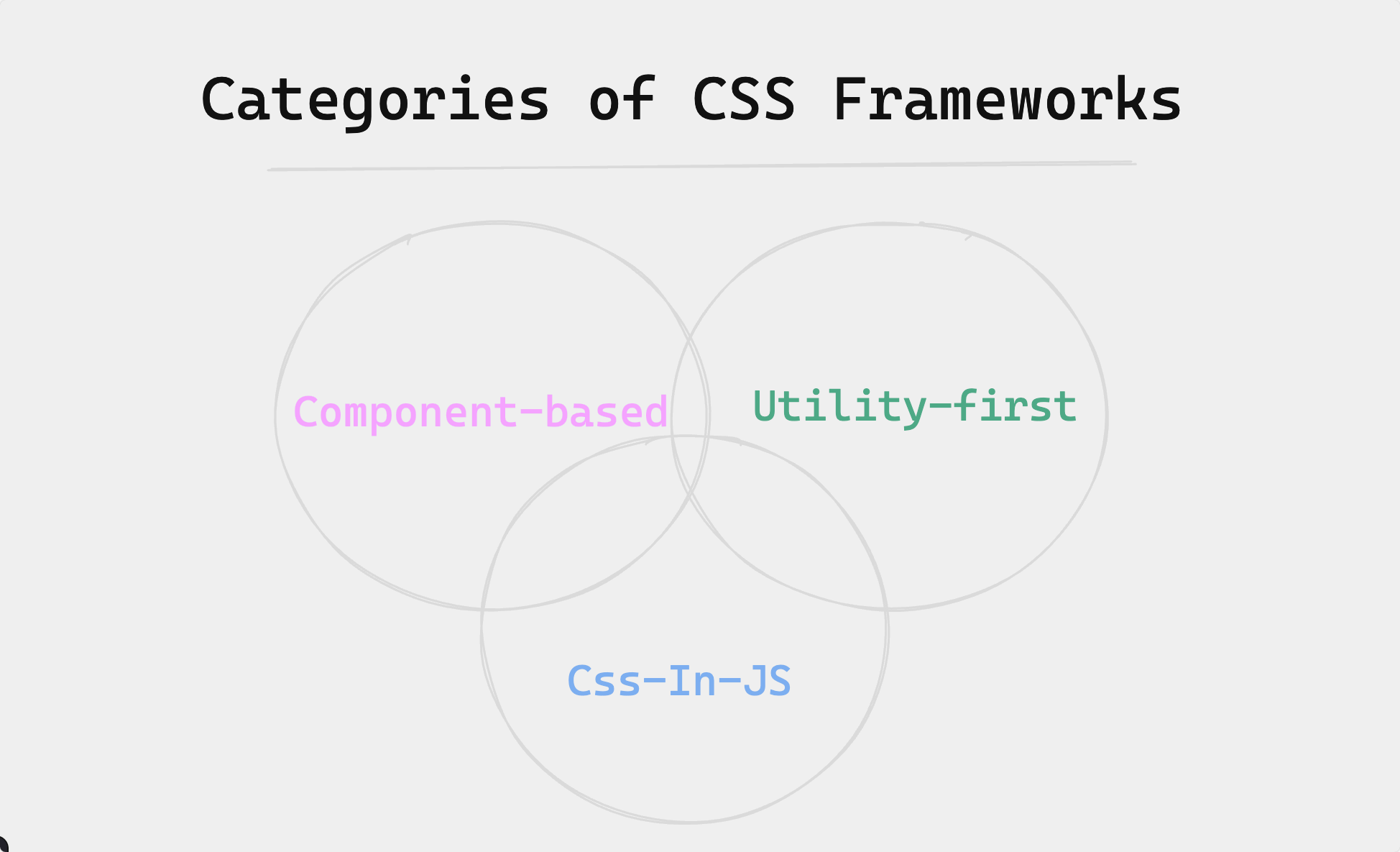
A diagram showing some categories of CSS frameworks and how the intertwine with each other
For example, consider the diagram above that shows how the three categories of CSS frameworks can intertwine.
9 CSS Frameworks You Should Know
Now that you have a clear understanding of what CSS frameworks are and their different types, let's have a look at some of the most prominent and most-used CSS frameworks you should know.
Bootstrap
Bootstrap began as an internal tool at X (formerly, Twitter) to maintain a consistent look across the platform. Then it was open-sourced in 2011 for the wider web development community to use. Bootstrap is one of the most widely used CSS frameworks, with a focus on responsive, mobile-first web design.
Bootstrap offers a robust collection of CSS and JavaScript components, such as its grid system and responsive UI components like buttons, navigation menus, and forms, that streamline the process of building clean and consistent web layouts.
Bootstrap has large community support and over a hundred thousand GitHub stars. And though it may seem bulky when compared to modern options, it's still one of the most used CSS frameworks you can use to build good-looking and thematically coherent web applications without needing to be an expert in CSS and web design.
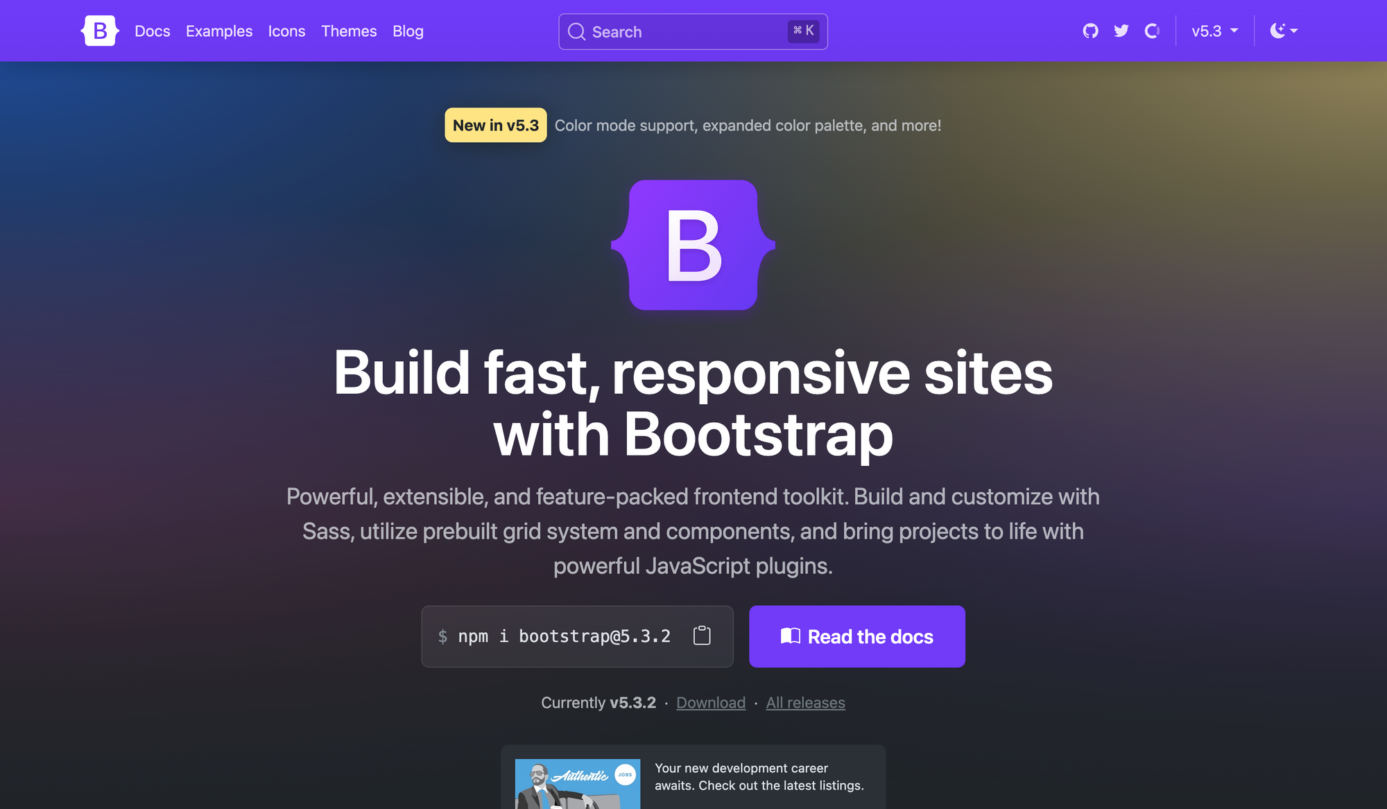
An image of the Bootstrap framework official website
How to use Bootstrap
To get started with Bootstrap, you need to pull its source files into your project. In a JavaScript framework like React, you can install Bootstrap into your project using a package manager like npm.
npm install bootstrap
Next, import Bootstrap’s CSS at the top of your application's main entry file, typically src/index.js:
import 'bootstrap/dist/css/bootstrap.min.css';
This will import Bootstrap CSS and make it available for use throughout your application. Now you can use Bootstrap components in your application like this:
import React from 'react';

function App() {

  return (

    <div className="container">

      <h1>Hello, Bootstrap in React!</h1>

      <button className="btn btn-primary">Click Me</button>

    </div>

  );

}

export default App;
To learn more about Bootstrap, refer to the official Bootstrap documentation for detailed guidance, examples, and additional resources.
Tailwind CSS
Tailwind CSS is a utility-first CSS framework that allows you to rapidly build custom user interfaces directly in markup files.
As a utility-first framework, Tailwind abstracts from the constraints of a component-based framework, for example, Bootstrap.
Though component-based frameworks like Bootstrap excel at streamlining the process of building web layouts by providing pre-defined UI components, they’re opinionated in that you’re confined to the current design system and ecosystem of the framework. Trying to extend or customize your application’s layout beyond what the framework provides can prove to be a workaround.
Tailwind offers a robust system of utility and helper classes as building blocks that can be composed to build any design directly in your markup. With Tailwind ranking as the second most used framework in the State of CSS 2023 survey at about 76%, it's the best choice to rapidly prototype and speed up the development process in line with modern web standards.
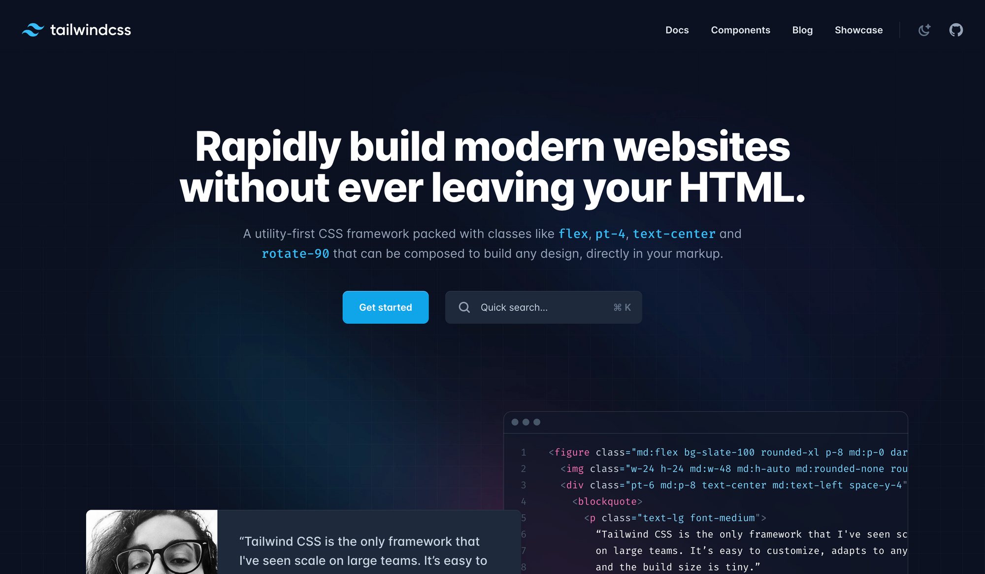
An image of the Tailwind CSS framework official website
How to use Tailwind CSS
Install tailwindcss via a package manager, and create your tailwind.config.js file to configure and customize Tailwind CSS for your application.
npm install -D tailwindcss

npx tailwindcss init
Add the paths to all your template and markup files in your tailwind.config.js file as well as other configurations.
/** @type {import('tailwindcss').Config} */

module.exports = {

  content: ["./src/**/*.{html,js,jsx,ts,tsx}"],

  theme: {

    extend: {},

  },

  plugins: [],

}
Add the@tailwind directives for each of Tailwind’s layers to your main CSS file and ensure the CSS file is imported into the main entry file of your application.
@tailwind base;

@tailwind components;

@tailwind utilities;
Now you can apply utility classes directly in your HTML markup to style your components.
function Button({children}) {

  return (

      <button className="bg-green-500 hover:bg-green-700 text-white font-bold py-2 px-4 rounded">

        {children}

      </button>

  );

}

export default Button;
You can learn more about setting up and using Tailwind CSS based on your project environment and advanced usage by going through the official Tailwind CSS documentation.
Material UI
Material UI is a component-based CSS framework for building user interfaces in React applications. It is based on Google's open-source design system, Material Design, and provides a rich collection of pre-built components and styles.
As one of the largest UI communities in the React ecosystem, Material UI offers a modern and visually appealing design system. It features a suite of customization options that make it easy for developers to implement custom design systems on top of the library, making it a popular choice for creating consistent UIs in React applications.
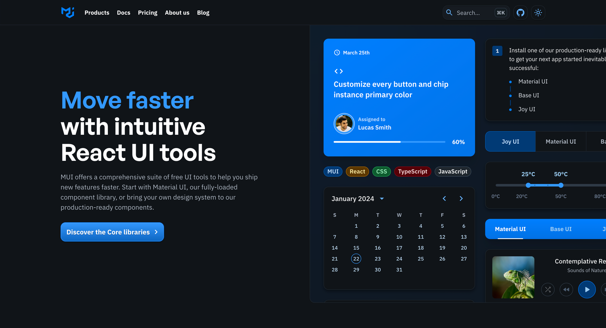
An image of the MUI kit official website
How to use Material UI
Install Material UI's core package and any additional dependencies you need.
npm install @mui/material @emotion/react @emotion/styled
Now you can Import any Material UI component into your React components and use them in your JSX code.
import Button from '@mui/material/Button';

export default function ButtonUsage() {

  return <Button variant="contained">Hello world</Button>;

}
Checkout Material UI documentation for detailed usage guidelines, API references, and examples
styled-components
styled-components is one of the most prominent CSS-in-JS libraries. It provides a seamless way to create and manage CSS styles within JavaScript files and components.
While it was originally designed specifically for the React ecosystem, styled-components have advanced so that you can now use it with vanilla JavaScript or other JavaScript frameworks like Vue.
As the most popular CSS-in-JS library by GitHub stars and weekly NPM downloads, styled-components offers a highly flexible and intuitive approach to styling, making it easier to build reusable and self-contained UI components.
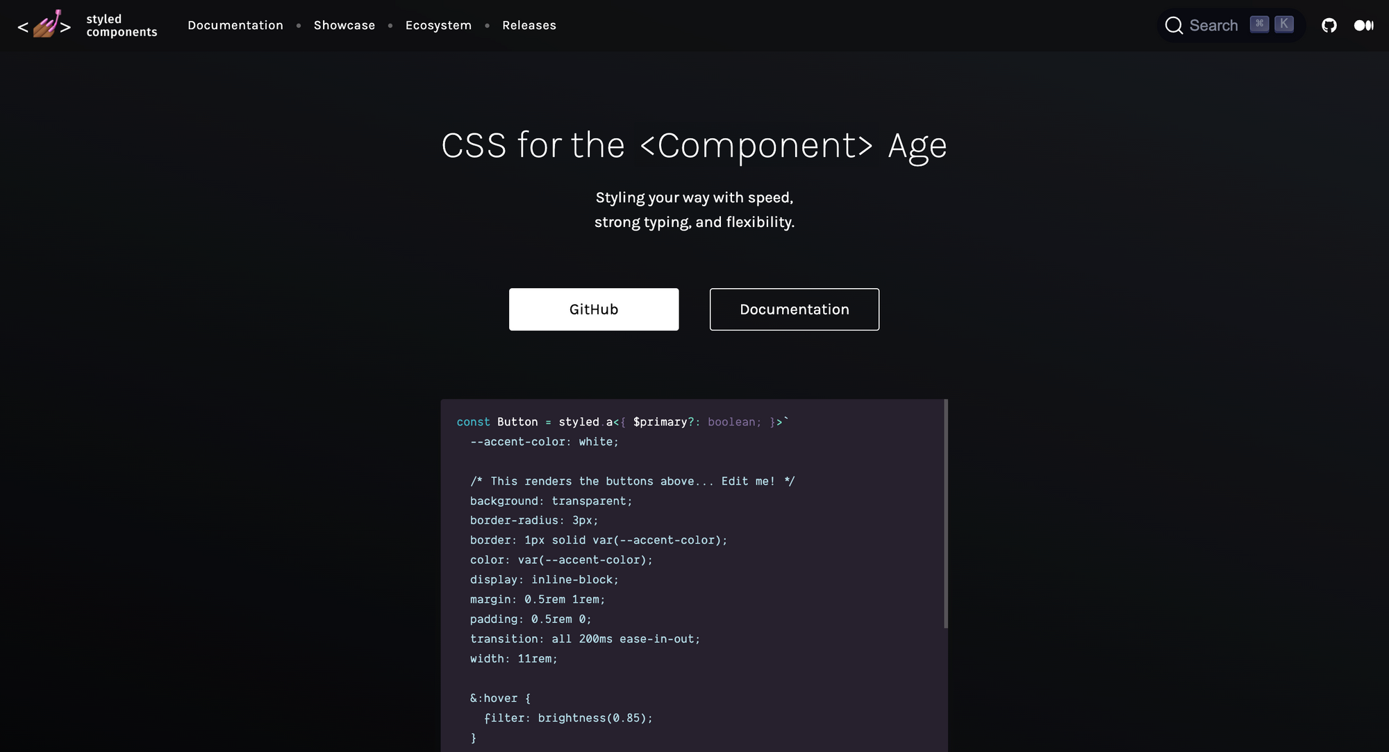
An image of the Styled-components official website
How to use styled-components
Install the styled-components package via npm or yarn.
npm install styled-component
Now, you can define your styled components by importing the styled function and using it to create styled versions of HTML elements or custom components.
import styled, { css } from 'styled-components'

const Title = styled.h1`

  font-size: 1.5em;

  text-align: center;

  color: #BF4F74;

`;

render(

  <div>

    Title>

      Hello World!

    </Title>

  </div>

);
Refer to the official styled-components documentation for comprehensive guides, examples, and advanced features.
Foundation
Foundation is the closest alternative to Bootstrap. It's not just a CSS framework, but a comprehensive toolkit for styling web applications, architecting email templates, which are known to be notoriously hard, and integrating with ZURB’s Motion UI to create advanced CSS animations.
It includes common UI components like Bootstrap but is more utility-focused and gives developers more options for customizing components. With almost too many features, it can be considerably more complex and harder to fully understand how everything works compared to other frameworks.
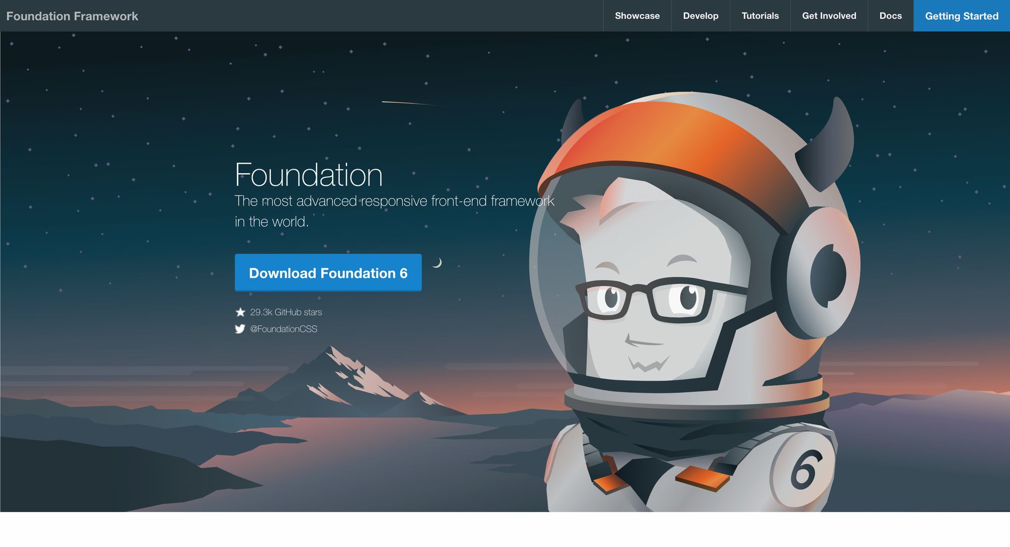
An image of the Foundation framework official website
How to use Foundation
You can install Foundation in your project with a package manager.
npm install foundation-sites
Now you can use its styles and components in your application.
<div class="card" style="width: 300px;">

  <div class="card-divider">

    This is a header

  </div>

  <img src="assets/img/generic/rectangle-1.jpg">

  <div class="card-section">

    <h4>This is a card.</h4>

    <p>It has an easy to override visual style.</p>

  </div>

</div>
Consult Foundation’s official documentation for detailed instructions, examples, and additional resources.
Chakra UI
The brainchild of Nigerian developer Segun Adebayo, Chakra UI falls into the same category as MUI as a component library and CSS framework for React applications. It emphasizes accessibility, developer ergonomics, and a customizable design system.
Chakra UI provides a collection of well-designed and accessible components that can be easily customized to match your project's branding and style.
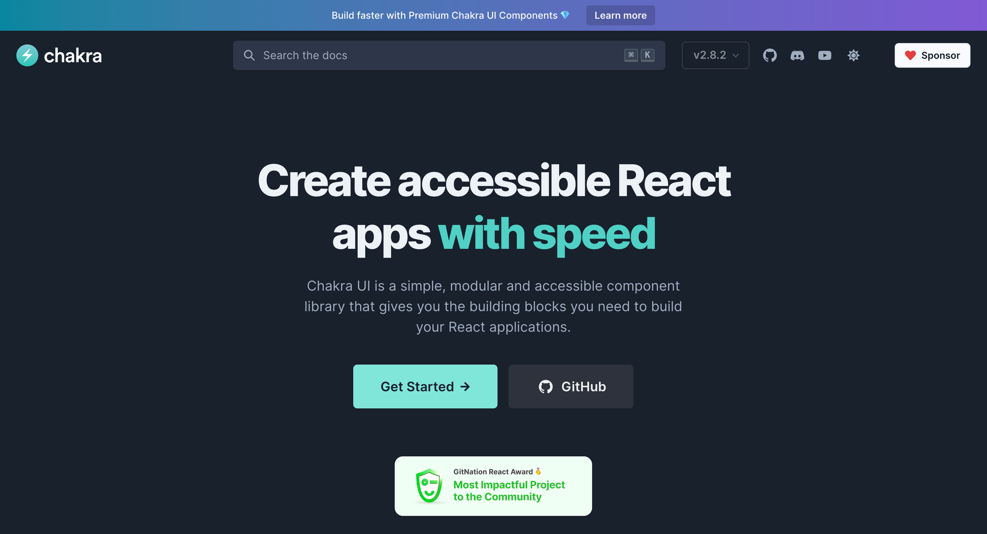
An image of the Chakra CSS framework official website
How to use Chakra UI
To get started, install the Chakra UI package via a package manager.
npm i @chakra-ui/react @emotion/react @emotion/styled framer-motion
After installing Chakra UI, you need to wrap your application or specific components with the ChakraProvider to make the Chakra UI components available.
import * as React from 'react'

// 1. import `ChakraProvider` component

import { ChakraProvider } from '@chakra-ui/react'

function App() {

  // 2. Wrap ChakraProvider at the root of your app

  return (

    <ChakraProvider>

      <TheRestOfYourApplication />

    </ChakraProvider>

  )

}
Now you can use Chakra UI's components in your JSX code to build your user interface.
import { Button} from '@chakra-ui/react'

export default function ButtonUsage() {

  return <Button colorScheme='blue'>Hello world</Button>;

}
To learn more, you can check out the Chakra UI documentation for detailed usage guidelines, component examples, and theming options
Emotion
Emotion is built off the concepts of styled-components to be a more performant, lightweight, and feature-rich CSS-in-JS library. It does this by utilizing features such as source maps, labels, and testing utilities.
Emotion is framework-agnostic and has a syntax that is as close to CSS as possible, making it easier to adopt.
Image of the Emotion homepage
How to use Emotion
The @emotion/css package is framework-agnostic and it's the simplest way to use Emotion. To get started, install the package via a package manager.
npm i @emotion/css
Now you can use Emotion's CSS API to generate and compose CSS styles.
import { css } from '@emotion/css'

const color = 'white'

render(

  <div

    className={css`

      padding: 32px;

      background-color: hotpink;

      font-size: 24px;

      border-radius: 4px;

      &:hover {

        color: ${color};

      }

    `}

  >

    Hover to change color.

  </div>

)
Refer to the official Emotion documentation for detailed instructions, usage examples, and advanced features.
Bulma
Bulma is a modern and lightweight CSS framework that offers a flexible grid system and a variety of CSS styles and components. It focuses on simplicity, modularity, and ease of use.
Bulma emphasizes that it is "environment agnostic," meaning that it is just the style layer on top of the logic, so it integrates capably with any JS environment.
Bulma is more of a collection of CSS classes than UI components. It has a clean and intuitive syntax and is less complex and easier to understand compared to other component-based frameworks like Foundation and Bootstrap. This makes it an ideal choice for beginners or developers who value simplicity and want to quickly build responsive websites.
An image of the Bulma CSS framework official website
How to use Bulma
To get started, you need to download Bulma for your project.
npm install bulma
Next, import Bulma CSS styles into your project's main stylesheet.
@import 'bulma/css/bulma.css';
Now, you're ready to start styling your project using Bulma's classes and components.
You can learn more about customizing Bulma's styles, overriding CSS variables, or modifying the Sass source files from the official documentation.
Pure CSS
Pure CSS is a minimalistic and lightweight CSS framework that aims to provide a set of small, responsive CSS modules and styles as a starting point for styling web applications without imposing any design decisions. It has one of the smallest bundle sizes of 3.5KB (compressed) when all modules are used.
Pure CSS is suitable for projects where a minimal design approach is desired or when you prefer to write your styles from scratch.
An image of the Pure.CSS official website
How to use Pure CSS
You can add Pure CSS to your page via the free jsDelivr CDN. Add the following <link> element to your page's <head>, before your project's stylesheets.
<link rel="stylesheet" href="https://cdn.jsdelivr.net/npm/purecss@3.0.0/build/pure-min.css" integrity="sha384-X38yfunGUhNzHpBaEBsWLO+A0HDYOQi8ufWDkZ0k9e0eXz/tH3II7uKZ9msv++Ls" crossorigin="anonymous">
Refer to the official Pure CSS documentation for detailed usage guidelines, examples, and additional resources.
How to Choose the Right CSS Framework for Your Project
As your applications grow and become bigger, adopting a CSS framework is an invaluable option when it comes to speeding up your workflow.
CSS frameworks help you build good-looking and professional web pages while maintaining consistency in design. But not all frameworks compare equally, as some provide more benefits and advantages.
When choosing the ideal CSS framework for your project, it is crucial to keep in mind various factors that can greatly impact how successful and efficient working with the framework will be for your project.
Some key aspects to consider are:
Customizability: The level of customization the framework offers. Does the framework let you customize and extend your styles beyond the framework’s design system to suit your specific needs and preferences? Or is it opinionated and vendor-locked so that you become confined to the framework’s design-system and ecosystem?
Learning curve: Another factor to consider is the learning curve associated with implementing the framework. How user-friendly is the framework for new learners? What’s the developer experience like? Are there enough documentation and resources available for you to learn and utilize the frameworks effectively?
Community support: The availability of a supportive and active community is also an important consideration. Dedicated communities of developers who actively contribute to the frameworks' growth and provide assistance to fellow developers (and you!) are a great resource.
How it fits your project: Lastly, ensuring that the CSS framework you choose is compatible with your project goals and matches its branding and design requirements is essential.
A comparison table that compares different factors across the CSS frameworks mentioned in this article | |||||||||
Framework | Approach | Type | Customization | Community | |||||
|---|---|---|---|---|---|---|---|---|---|
Bootstrap | Component-based, uses pre-styled components | CSS framework | Moderate, offers variables for customization | Large and established community | |||||
Tailwind CSS | Utility-first, uses utility classes to build designs | Utility framework | Highly customizable, based on utility classes | Growing community | |||||
Material UI | Component-based, uses pre-styled components | React UI framework | Moderate, offers variables for customization | Strong React community | |||||
styled-components | CSS-in-JS, allows writing CSS within JavaScript | Styling library | Highly customizable, CSS-in-JS approach | Growing adoption | |||||
Foundation | Modular, customizable grid system and components | CSS framework | High, modular components allow extensive customization | Smaller compared to Bootstrap | |||||
Chakra UI | Component-based, focused on accessibility | React UI framework | Moderate, offers variables for customization | Growing community | |||||
Emotion | CSS-in-JS, lightweight and high-performance | Styling library | Highly customizable with CSS-in-JS | Increasing adoption | |||||
Bulma | Modular, based on Flexbox, simple and flexible | CSS framework | Moderate, offers variables for customization | Decent user community | |||||
Pure CSS | Minimalistic, small, and responsive | CSS framework | Limited, encourages using own styles | Smaller community |
The table above gives an overview of the CSS frameworks we covered across different aspects, such as their approach, customization, learning curve, community support, available components, and styles.
Final Thoughts
In the coming years, we can expect the emergence of new CSS frameworks and improvements to existing ones. The CSS frameworks discussed in this article are some of the most notable to use for your next project.
It all comes down to which fits with your goals and project requirements. By carefully evaluating and weighing these factors, you can make an informed decision and select the CSS framework that perfectly aligns with your needs and objectives.
Whether you opt for the versatility and flexibility of Tailwind CSS or the simplicity of Pure.CSS, all frameworks offer valuable solutions that can significantly streamline your development time, ensure brand consistency, and improve code maintenance.
So, go ahead and choose the framework that best suits your project, and embark on a journey towards creating visually stunning and highly functional web applications!
If you found this article helpful, you can follow me on Twitter or connect with me on LinkedIn. Happy coding!