

I don’t use Tableau for my data science work, but I have done a couple of mini-projects to help me review the interface and learn what the hype is all about.
So yesterday, I decided to create a complete dashboard using Tableau.
I wanted to compare the ease of building, time it took to complete the project, and quality of the dashboard. So I chose to base it on the number of Novel Coronavirus cases in the world, since I'd built a similar dashboard displaying COVID cases using Python, Jupyter Notebook, and Voila.
Pre-requisites for this quick tutorial
There's nothing major – just make sure you have Tableau public installed.
To better understand the stark difference between the two approaches – that is, building a dashboard using programming versus building it with Tableau – just skim through my article on Building a COVID-19 interactive dashboard from Jupyter Notebooks or watch the video here.
You can view my Python-based dashboard here.
Let’s start building…
How to Find a Good Data Source
The first step is to find a credible data source given the seriousness of the topic we’ve picked up.
For this, we are going to leverage the COVID-19 Data Repository by the Center for Systems Science and Engineering (CSSE) at Johns Hopkins University¹.
This is maintained by a number of contributors from the University and is updated on a regular basis.
There are many different types of datasets, but to keep things simple for now, we are going to use the country-specific data giving us the latest number of different types of cases (active, confirmed, deaths, recovered) for different countries/regions in the world.
Here is the raw link to the file:
https://raw.githubusercontent.com/CSSEGISandData/COVID-19/web-data/data/cases_country.csv
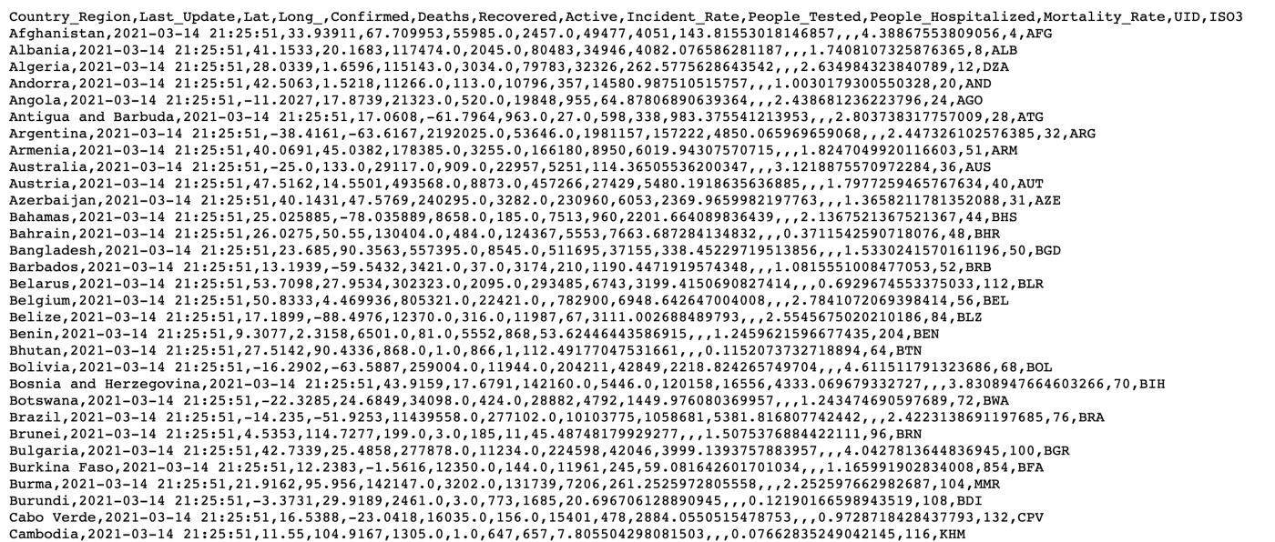
It is a CSV file that looks like this:
How to Load the Data into Tableau
There are several ways of loading data into Tableau, including:
Uploading files from your local machine — Excel, CSV, text, JSON, PDF, Spatial, and so on.
Connecting to data stored on a server — you can directly load data from Tableau Server, Google Cloud Storage/Analytics, MS SQL server, and others.
You can use already available data connectors for these.You can also connect to sources you’ve connected to before.
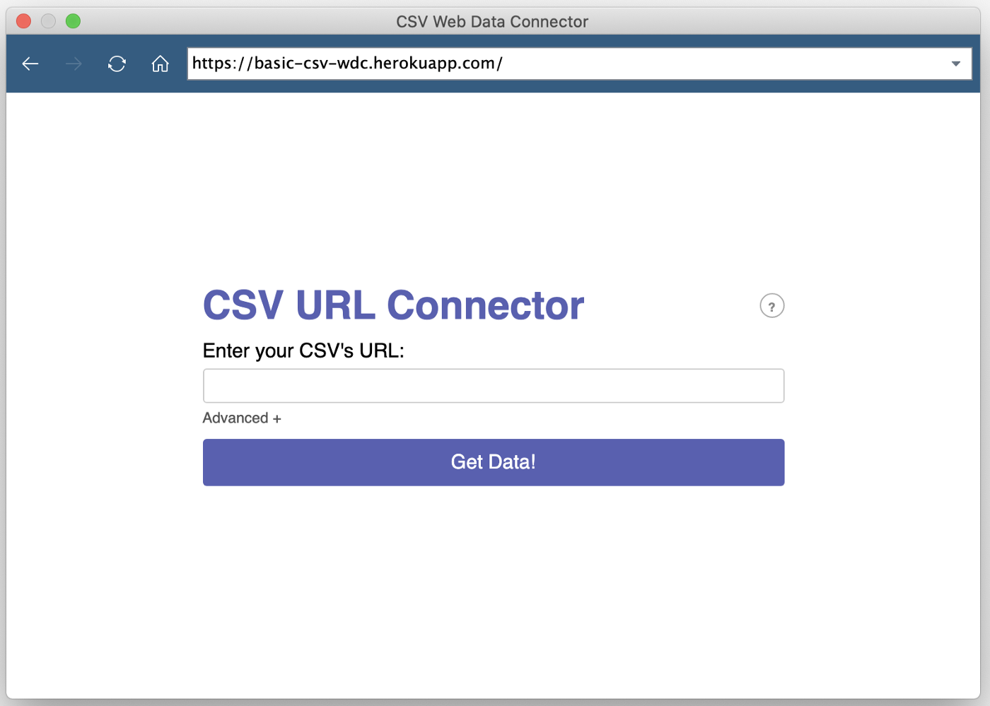
In our case, we want to load the raw CSV file available on GitHub directly to Tableau. For this purpose, we can use a CSV web data connector developed by Keshia Rose.

Here's the link to the connector: https://basic-csv-wdc.herokuapp.com/
And these are the steps to load the data:
Under the Connect pane, click on
**Web Data Connector**.Add the connector URL in the field that pops up and hit
Enter.
- Now, add the link to the raw CSV file in the search field and click on
**Get Data!**.
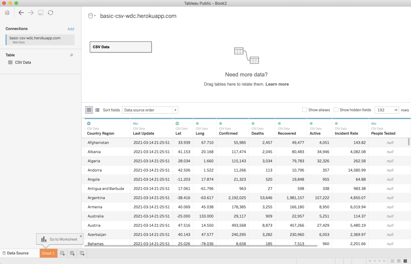
It will take a few seconds to load the data and then you can click on Update now to finally peek at the data available in the file:
How to Explore the Data in Tableau
Tableau presents the data in a very intuitive manner. We can learn about the basic attributes of the data and their types right from the preview and metadata.
From the preview, we can find out about the features we have in the dataset that further define the questions we are interested in answering about the problem at hand.
From the metadata view, we can find out about the data types (categorical/quantitative/DateTime, and so on) of those features that tell us how we can analyze those features in combination with others.
Clicking on the metadata view displays the columns along with their names and types:
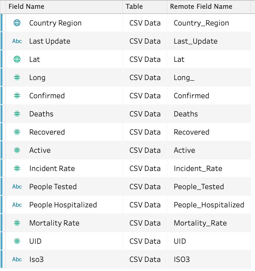
It’s important to learn about the meaning of the features and their data types:
How to find the data type of a variable — represented by the notations.**#** — denotes numerical data type.**Abc** — denotes categorical/string data type.🌐 — denotes geographical values.
Apart from these, we also have DateTime, clusters, and boolean notations.
This should help us understand what we can do with this dataset.
Since the data is already clean and formatted, we can skip the wrangling part and move on to define what we want from this analysis.
So, let’s move on to the next step.
How to Define Questions Based on the Columns
Based on the features we have and their data types, we can look to answer the following straightforward questions:
What is the current number of COVID cases in the world (total active, confirmed, deaths)?
What is the current state of countries — if we can visualize this in one frame?
Which are the most affected countries in terms of the number of cases and mortality rate?
You can add and define more or different questions, but I am going to walk you through these for now.
It’s time to get down to answering these questions.
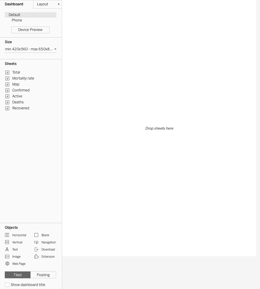
How the Tableau Interface Works
Here’s a quick tour of the Tableau interface.
→ At the bottom, you’ll see there are a number of icons, these are to:

check the connected data source
add new sheets
add new dashboards
add new stories.
→ Click on Sheet 1 which is created for us by default.
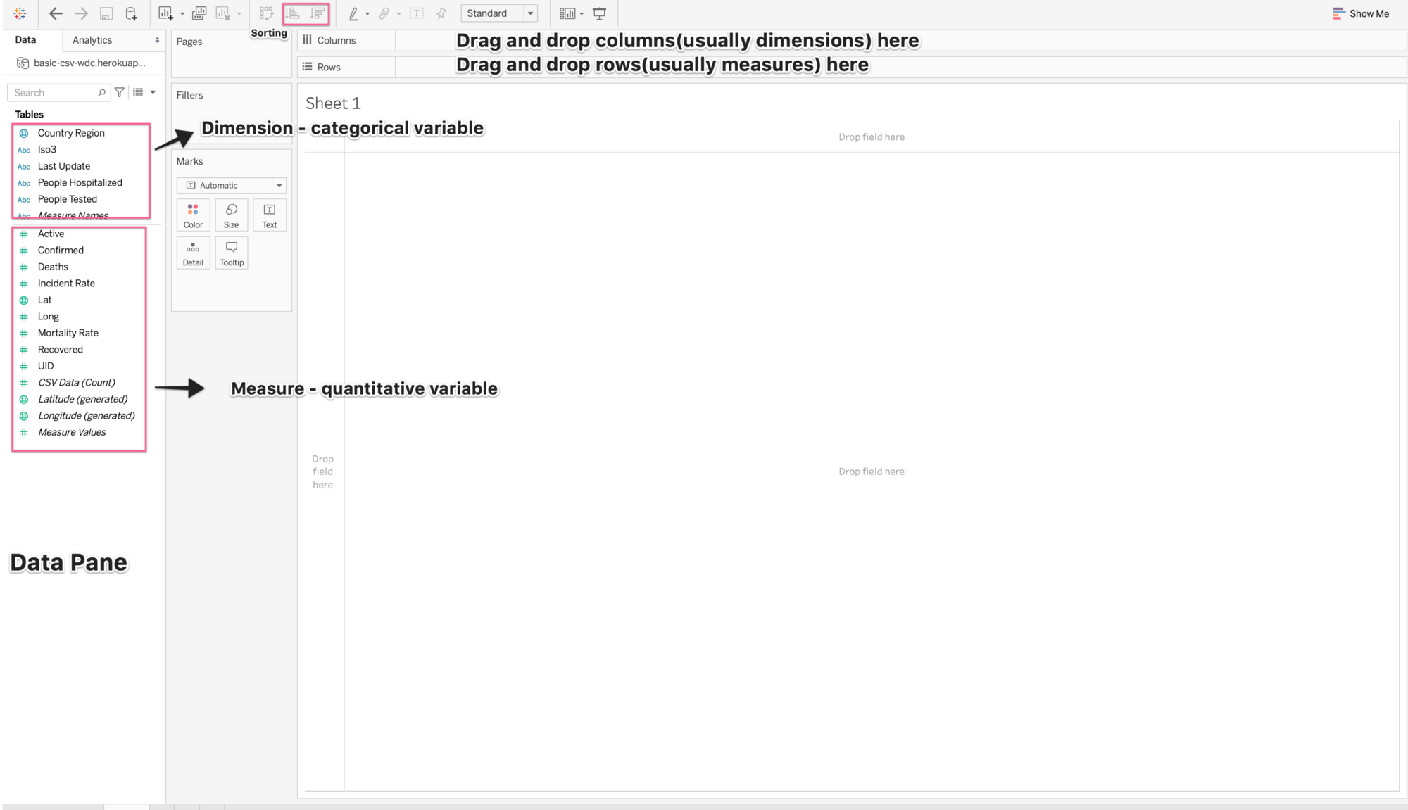
In the picture above, I’ve annotated only the important parts of the interface. We can do most of the analysis by dragging and dropping features into columns and rows.
How to Create Visualizations in Tableau
We’ll now iterate over each question and create a dedicated sheet to analyze the data in order to answer that question.
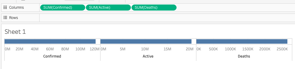
#1 Total Number of cases
To answer this, we are going to make use of the following columns:
Confirmed
Deaths
Active
Now, Tableau knows that these are quantitative measures and adds a default aggregator (SUM in this case) as soon as you try to drag and drop any one of these. You can change the aggregator at any point using the Marks.
To visualize the total (SUM) number of cases, simply drag each of the above features and put them in the columns field at the top.
At any point, if anything goes wrong, you can use
_Cmd/Ctrl + z_to undo it.
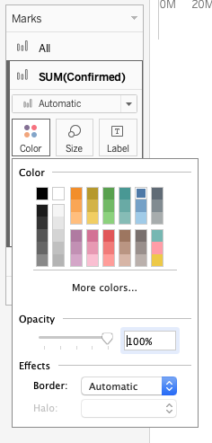
Furthermore, you can change the color of each of the bars using Marks in the left pane.
You can also play around with the font, text color, shadow, and more by right-clicking on the data visualization you want to format.
Here’s what my formatted visualization looks like after a few changes (color and width).
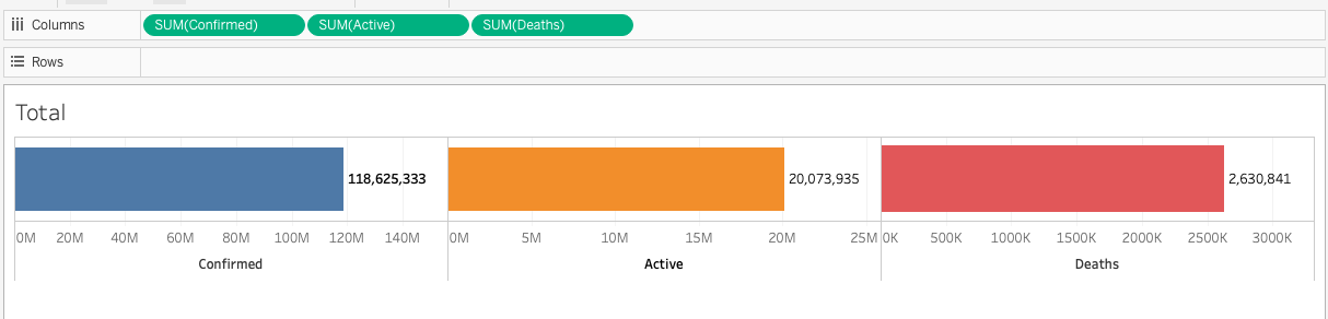
→ Decent enough for the amount of effort we’ve put in. It would have taken a lot more time and effort to code this.
Awesome, let’s move on to the next part.
#2 World Map that Displays the COVID Cases in Each Country/Region
Since we have geospatial dimensions in the data, we can look to plot the numbers on a world map to visualize the situation in each country with reference to our variable of choice.
I am going to plot the number of cases (confirmed, active, and deaths) on the world map using Latitude and Longitude columns. These are generated by Tableau from the Lat/Long variables, and are italicized in the Tables pane.
How to do that:
The first step is to add a new sheet by clicking the icon adjacent to
Sheet 1Drag the Longitude (generated) and drop it in Columns
Drag Latitude (generated) and drop it in Rows. After doing this, you’ll have a blank world map in the main view.
To add the names of countries, drop the
Country Regioncolumn on the details box in the Marks pane. Doing this will produce the symbols map with country names showing in the tooltip.Now, we have a
Show Mepane on the right top that shows us all the visualizations that you can use. The charts that are greyed out are not applicable and when you hover over them, it will tell you what all types of columns you need to make that chart applicable. Do it for the world map and you’ll learn that we need at least 1 geospatial dimension, 0 or more dimensions, and 0 or 1 measure.It’s time to add the measure, that is the variable that we want to visualize. I am choosing the number of confirmed cases. Drag and drop the Confirmed column on the Label box in the Marks pane.
You can also add other variables to the details box if you want to add them to the insights.
Here’s what my symbols map looks like:
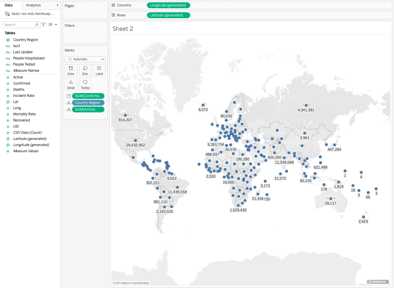
Feel free to play around with the other map, add colors, or format what you want to see on the map.
#3 Most Affected Countries
The total numbers and world map can only give you a brief overview of the pandemic.
So, let’s dive a little deeper to see which countries are most affected in terms of confirmed cases, deaths, and mortality rate, and which countries have high recovery rates.
These data are very simple to plot. Here are the steps:
Add a new sheet.
Drag and drop the
Country Regionfeature into Columns.Drag and drop the
SUM(Confirmed)into Rows. You’ll have a bar chart ready for you in the main view with countries on the X-axis and the number of Confirmed cases on the Y-axis.Since we are supposed to look at the most affected countries, we need to sort the data, and Tableau makes it very easy for us. All we need to do is click on the
Sort descendingicon in the taskbar at the top.With all the bars aligned in descending order, we now simply want to pick a few that are above a certain threshold – let’s say top 10. Hold your cursor in a clicked state and drag it over the number of bars you want to shortlist.
Hover over the shortlisted bars and click on Keep Only in the pop-up that appears. This will give you an uncluttered chart.
You can turn on the labels from the taskbar or drop SUM (Confirmed) onto the Label box.
And again, you can add colors, format as you like, annotate, and do more with these data.
Here are the charts that I created using the above steps:
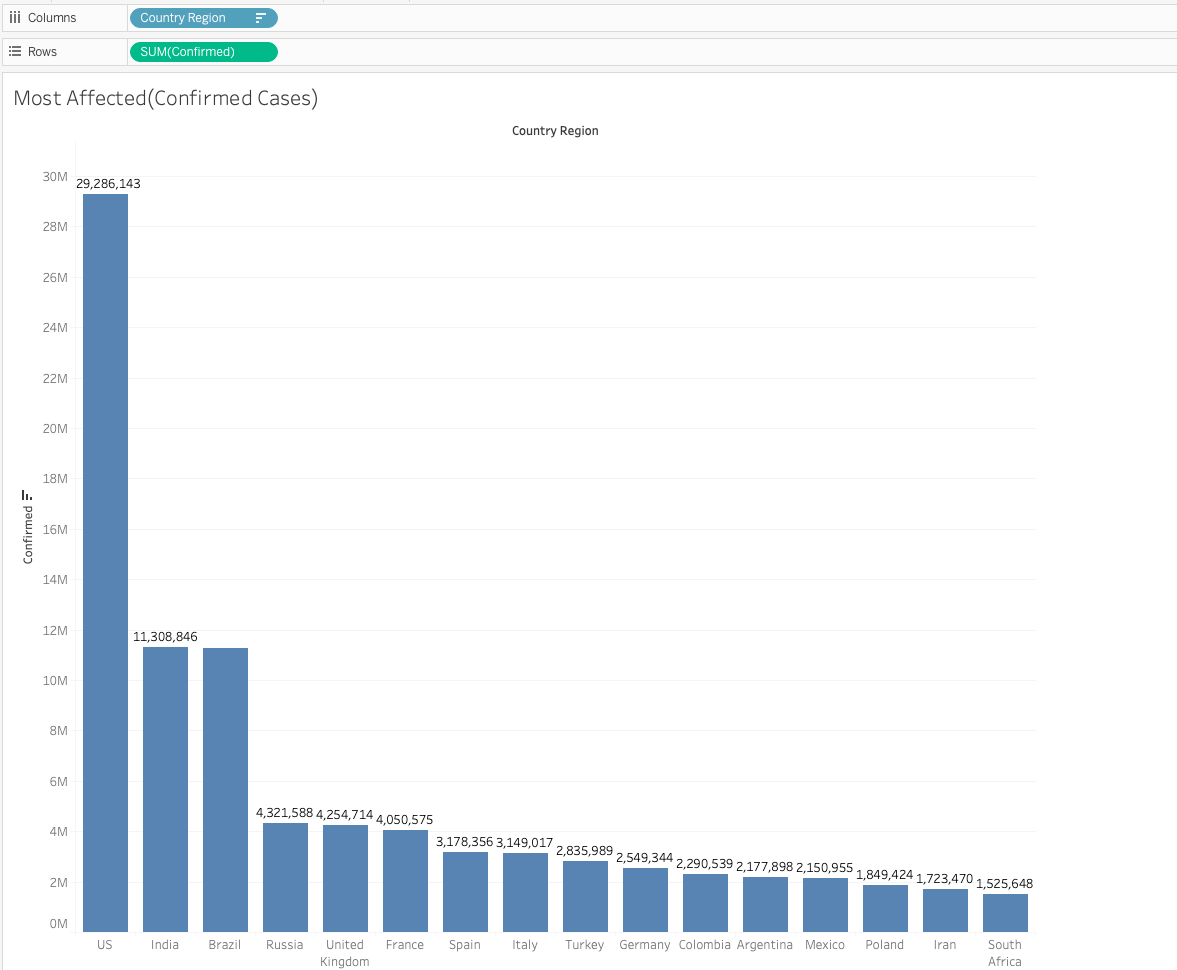
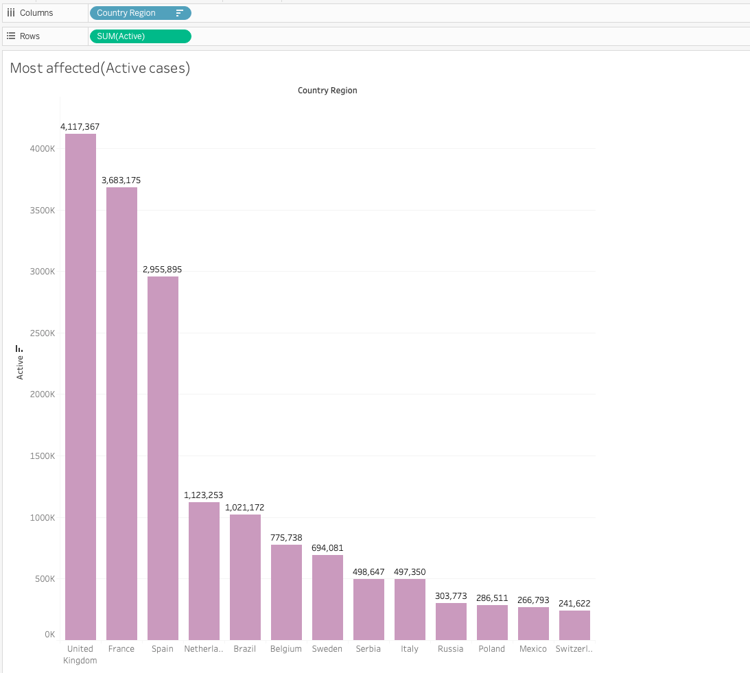
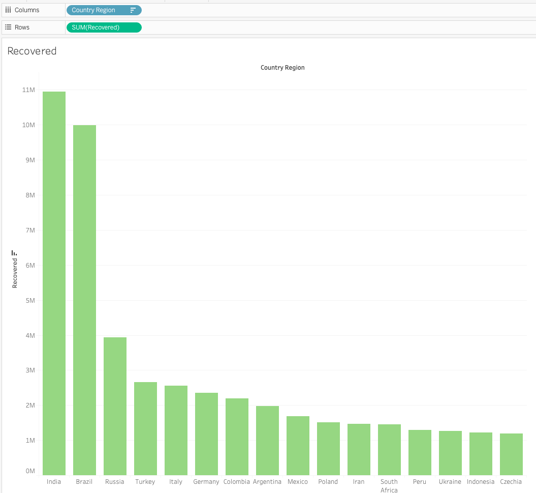
Don’t forget to rename your sheets as per their use case.
How to Create a Dashboard out of These Sheets
With enough visualizations and numbers, we can now dump them all on one screen to create a quick interactive dashboard out of it.
This final step is very simple – all you need to do is click on the New Dashboard icon at the bottom.
This will create an empty dashboard view, prompting you to drop the sheets you want to appear in your dashboard from the left pane.
You can drag and drop the sheets to the dashboard and then position them to make your dashboard look insightful and appealing.
Here’s my final dashboard:
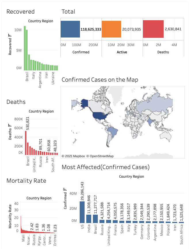
If you want to make changes to any of the visualizations, you can go back to that sheet and the changes will be reflected automatically in the dashboard.
How to Share your Dashboard
You can save all of your changes to your notebooks/dashboard on Tableau’s public server by creating your own personal account.
Saving the dashboard will create a public link that you can share with your fellow analysts, collaborators, or friends.
You can look at my dashboard here:
https://public.tableau.com/profile/harshit.tyagi#!/vizhome/covid_book/Dashboard.
Conclusion
After building this dashboard using Tableau, I compared it with the amount of effort it took me to create the same using Python and Jupyter Notebook. I tried to score the two methodologies on different metrics on a scale of 1 - 5, where 5 is the best and 1 is the worst:
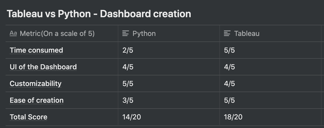
Tableau turns out to be a clear winner here!
I can say that Tableau seems to be a wise and time-efficient choice at least for these kinds of scenarios.
Disclaimer: It may be incorrect to compare a programming language with a Data Analysis software. This is a fun comparison which is only applicable in this type of dashboard building task. This is my personal opinion as per my experiences and you should find the best choice of tool for yourself.
Live Project
If you want to work on something similar yet advanced, you should check out my live project on Manning.
Video version of this blog!
If this tutorial was helpful, you should check out my data science and machine learning courses on Wiplane Academy. They are comprehensive yet compact and helps you build a solid foundation of work to showcase.
Citation(s):
[1]: Dong E, Du H, Gardner L. An interactive web-based dashboard to track COVID-19 in real time. Lancet Inf Dis. 20(5):533–534. doi: 10.1016/S1473–3099(20)30120–1