
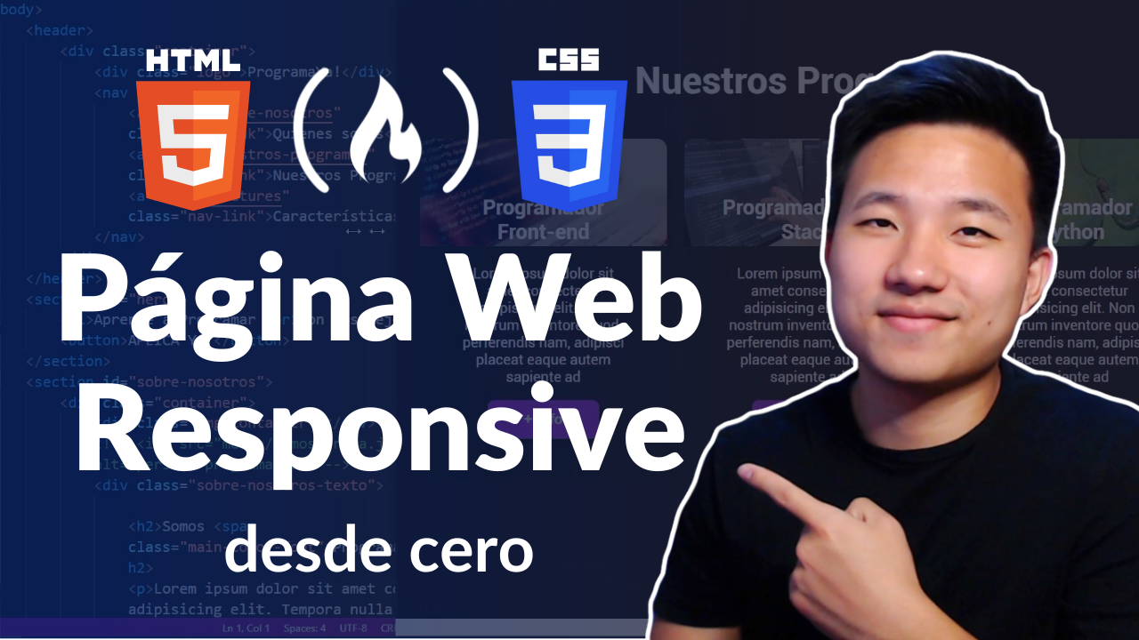
Building websites that look great on any device – like a phone, tablet, or computer screen – is what responsive web development is all about. In this course, you will learn how to build a responsive website step by step in Spanish using HTML and CSS.
We just published a course on the freeCodeCamp.org Spanish YouTube channel that will teach you Responsive Web Development by building a website step by step. You will use the core concepts that you need to understand in order to master responsive web development. By the end of the course, you will be able to design and implement responsive websites using HTML and CSS.
If you have Spanish-speaking friends, you are welcome to share the Spanish version of this article with them.
This course was created by David Choi. David is a Software Developer who loves coding and sharing his knowledge with everyone who wants to dive into the world of programming and computer science.
David will teach you how to create and implement modern and responsive web designs step by step with HTML and CSS (without frameworks or libraries).
If your goal is to design and create modern websites, you definitely need to learn how to make them responsive. Before you start learning responsive web development with David's course, let's have a quick introduction.
What is Responsive Web Development?
A responsive website is a website that adapts its layout and content to fit the size of the screen. It should look and work correctly on desktops, laptops, tablets, smartphones, and other devices.
Responsive web development is the approach used by developers to create these websites that adapt to devices of different sizes. This results in a much better user experience because the user will have access to the content in a layout that has been specifically adapted to their device. Search engines also reward sites that offer a good user experience for all devices.
You can develop responsive websites with HTML and CSS. This is where CSS Flexbox comes to the rescue. You will practice your CSS Flexbox skills during the course. Let's see what it is all about.
What is Flexbox?
Flexbox is a CSS layout model for arranging elements in a single dimension. With Flexbox, you can place elements horizontally or vertically, distribute space evenly to resize the layout based on screen size, and even control the order of the elements.
💡 Tip: If you need to refresh your HTML, CSS, and Flexbox skills, you can take courses on these topics on our Spanish YouTube channel before diving into the project.
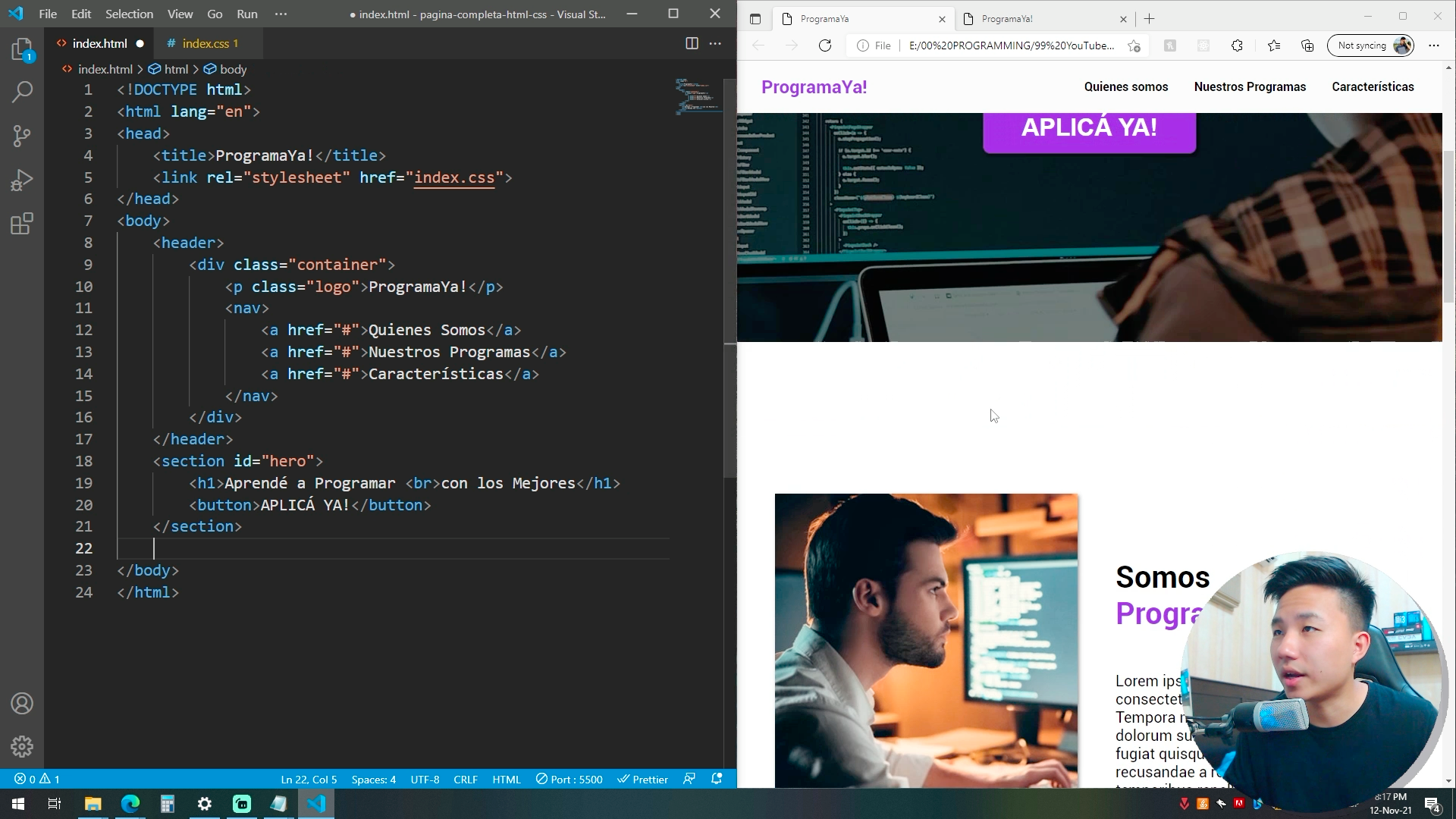
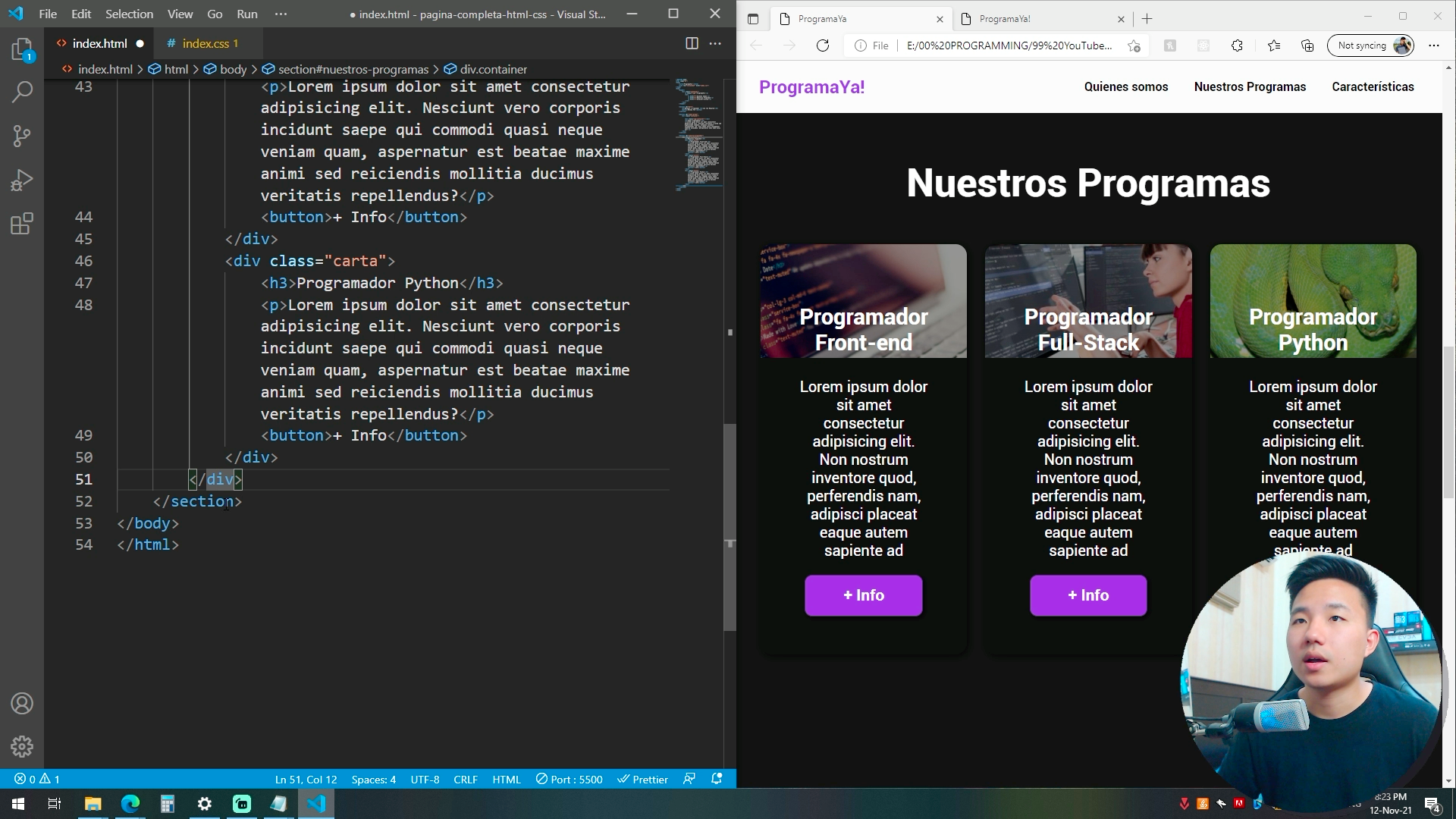
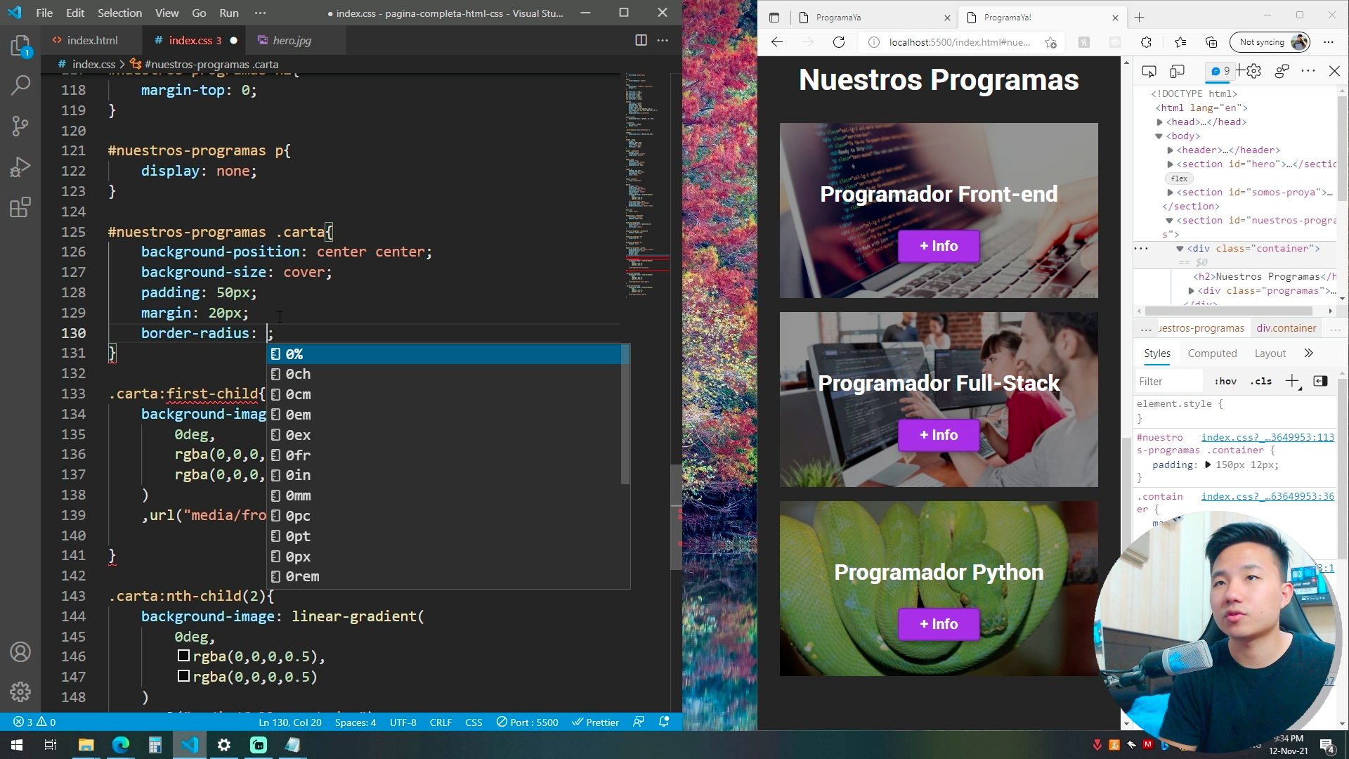
Responsive Website Project in Spanish
During the course, you will:
Analyze the website design and translate it into HTML.
Prepare your development environment.
Install Visual Studio Code.
Create the structure of the website in HTML.
Define and assign CSS styles for the mobile version.
Define and assign CSS styles for the desktop version.
You will combine basic CSS with Flexbox to assign styles that adapt to the current size of the screen.
Here we have some course screenshots to give you an idea of the awesome project that you will be building with David:
If you are ready to start building this project, check out the course in Spanish on the freeCodeCamp.org Spanish YouTube channel:
✍️ Course created by David Choi.
YouTube: @deivchoi
GitHub: @choidavid4