
By Krissanawat
###
As the Flutter mobile app development framework grows more and more popular, many business are choosing to use it for their projects.
Many devs appreciate its ability to develop apps with pixel perfect UIs using a simple structure of widgets. I think Flutter is the future of mobile app development because of its simplicity in developing UIs and its ability to power feature logic using the Dart programming language.
This tutorial mainly focuses on teaching you the basics of the Flutter framework by building a simple Tip Calculator app. We will cover the standard coding patterns including Stateful and Stateless widget classes and some of the widgets you'll use the most during Flutter app development.
The idea here is to start by setting up a starter Flutter project. Then, we'll move on to implementing the overall UI and basic functionality.
So, let's get started!
How to Set Up Your Flutter Project
In order to create a new Flutter project, you must have the Flutter SDK installed on your system. For a simple and quick installation process, you can follow the official flutter documentation.
Remember that it also requires Android Studio and Android SDK if you are developing an app for the Android platform.
After everything is set up successfully following the documentation, you can go ahead and run the following Flutter command in the terminal:
flutter create tipCalculator
This command will automatically download and set up your starter Flutter project for you. Now you can open the project in the Visual Studio Code IDE.
If you have a device simulator or actual smartphone device connected, then you can simply run the following command to launch the app:
flutter run
Alternatively, you can press 'F5' on your keyboard which will trigger a menu option in VSCode. From that menu, you can select the device in which you want to launch the app.
Note that, you must be inside the file with extension .dart to successfully run this command.
Build and run using it using the above command or F5 to get the following starter template in your emulator/actual device:
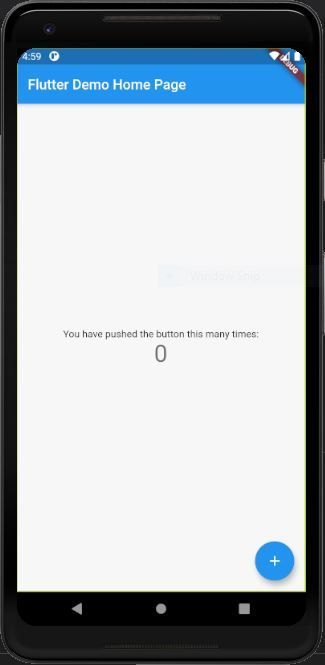
Now you should have your Flutter app up and running.
Let's go into a bit more detail about what's going on in the main project file, main.dart.
In the main.dart file, we have two class objects. One extends to Stateful widgets and the other to Stateless widgets. So what does that mean?
- Stateful widget: the class that houses the states of the app. The states can change and trigger the render of the widgets in this stateful widget class. It contributes to dynamic state changes.
- Stateless widget: this class does not house any state. It represents the widget view that does not change. It does not contribute to any dynamic state changes.
The main.dart file also houses the main() function that calls the MyApp class inside the runApp method in order to trigger the launch of the Flutter app in the device.
How to Build the Tip Calculator's UI
In order to start implementing our UI, we need to clear out everything that is present inside the MyHomePageState class by default.
After clearing it out, we are going to return a simple Scaffold widget from inside the build function.
The Scaffold widget provides the properties to add the appBar as well as the body. For now, we are going to add a simple app bar. You can see the overall implementation in the code snippet below:
class _MyHomePageState extends State<MyHomePage> {

  @override
  Widget build(BuildContext context) {
    return Scaffold(
      appBar: AppBar(
        title:Text('Tip Calculator', style: TextStyle(color: Colors.black87),),
      ),
      body: Container()
    );
  }
}
Build and run it after adding the appBar using the AppBar widget with title property. You'll get the following result in your emulator screen:
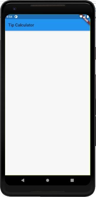
Note that Flutter has hot reloading while saving the Dart file. So whenever you save any changes in your project's Dart file, the changes are automatically reflected in the emulator.
Step 1: Design the App Bar
Here, we are going to modify the AppBar widget using various properties it offers. You can see the modified code in the snippet below:
appBar: AppBar(
  title: Text('Tip Calculator', style: TextStyle(color: Colors.black87),),
  centerTitle: true,
  elevation: 0.0,
  backgroundColor: Colors.white70,
),
Build and run it, and you will get the following result in the emulator screen:
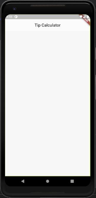
Here, we have used some of the basic AppBar widget properties such as
elevation, which enables us to control the shadow effect in the App bar similar to z-index,centerTitleto centralize the title,- and we've also changed the background color to white.
Step 2: Design the Scaffold Body
Up to this point, we've only had an empty Container widget in the body property. Now, we are going to add some properties and child widgets to the Container widget as directed in the code snippet below:
body: Container(
  color: Colors.white70,
  padding: const EdgeInsets.all(16.0),
  child: Center(
    child: Form(
      child: Column(
        mainAxisAlignment: MainAxisAlignment.center,
        children: <Widget>[
        ],
      ),
    ),
  ),
Build and run it, and you will get the following result in the emulator screen:
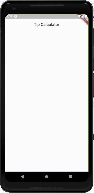
As you can see in the screenshot above, we have changed the body background color to white. Also, we've added some padding along with the Center widget as a child widget which will centralize the entire UI in the body.
The Center widget has a Form widget (one of its children) for which we are going to create a simple form with text fields.
And most importantly, we have the Column widget as a child widget of Form. The Column widget provides us with the children widget array property in which we can integrate any number of widgets which will appear vertically on the screen.
Step 3: Define Constants and Variables
Before implementing the form elements (including text fields), we need to define some constants in order to handle the inputs from the input fields.
You can see the required constants and variables in the code snippet below:
// This is the default bill amount
  static const defaultBillAmount = 0.0;

  // This is the default tip percentage
  static const defaultTipPercentage = 15;

  // This is the TextEditingController which is used to keep track of the change in bill amount
  final _billAmountController =
      TextEditingController(text: defaultBillAmount.toString());

  // This is the TextEditingController which is used to keep track of the change in tip percentage
  final _tipPercentageController =
      TextEditingController(text: defaultTipPercentage.toString());

  // This stores the latest value of bill amount calculated
  double _billAmount = defaultBillAmount;

  // This stores the latest value of tip percentage calculated
  int _tipPercentage = defaultTipPercentage;
In the code snippet above, you can see that we're using the TextEditingController method. This controller method allows us to handle the text inputs in the TextFormField widget later which is initialized to default values.
Step 4: Add Input Form Fields
Now, we are going to add two Input form fields using the TextFormField widget.
While using this widget, we need to compulsorily assign the controller property with our controller variables that we defined before. You can see the overall coding implementation of the widget in the code snippet below:
body: Container(
        color: Colors.white70,
        padding: const EdgeInsets.all(16.0),
        child: Center(
          child: Form(
            child: Column(
              mainAxisAlignment: MainAxisAlignment.center,
              children: <Widget>[
                TextFormField(
                  key: Key("billAmount"),
                  controller: _billAmountController,
                  keyboardType: TextInputType.numberWithOptions(decimal: true),
                  decoration: InputDecoration(
                      hintText: 'Enter the Bill Amount',
                      labelText: 'Bill Amount',
                      labelStyle: TextStyle(
                        fontSize: 25,
                        letterSpacing: 1,
                        fontWeight: FontWeight.bold
                      ),
                      fillColor: Colors.white,
                      border: new OutlineInputBorder(
                        borderRadius: new BorderRadius.circular(20.0),
                      ),
                    ),
                ),
                SizedBox(height: 25,),
                TextFormField(
                  key: Key("tipPercentage"),
                  controller: _tipPercentageController,
                  keyboardType: TextInputType.number,
                  decoration: InputDecoration(
                    hintText: 'Enter the Tip Percentage',
                    labelText: 'Tip Percentage',
                    labelStyle: TextStyle(
                      fontSize: 25,
                      letterSpacing: 1,
                      fontWeight: FontWeight.bold
                    ),
                    fillColor: Colors.white,
                    border: new OutlineInputBorder(
                      borderRadius: new BorderRadius.circular(20.0),
                    ),
                  ),
                ),
              ],
            ),
          ),
        ),
      ),
Here, we have assigned the keyboardType property which enables us to show the required type of keyboard when the user taps on the input field.
We also have decoration properties with which we can style our input fields using the InputDecoration widget.
In the InputDecoration widget, we have several properties that help us show the placeholder text as well as the label above the input. We have also applied the border property to show a curved outline border.
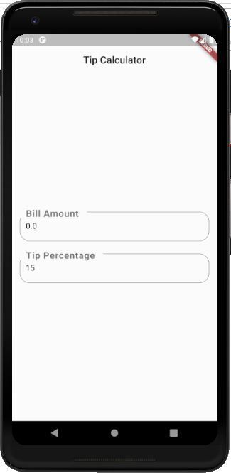
Build and run it, and you will get the following result in your emulator screen:
Step 5: Add Event Listeners and Functions
Since we are going to calculate the tip amount as soon as the user inputs the bill amount or percentage, we need to listen to the changes in the text input fields.
For that, we need to add the event listeners to the controllers using the addListener method.
Now as soon as any changes occur in the input field, we also want to trigger a certain function to update the bill amount and tip percentage.
For that, we are going to use the required functions with the setState method which help us render the entire UI as soon as some changes occur.
Note that the
setStatemethod triggers the re-run of thebuildmethod.
You can see the overall coding implementation in the code snippet below:
@override
void initState() {
  super.initState();
  _billAmountController.addListener(_onBillAmountChanged);
  _tipPercentageController.addListener(_onTipAmountChanged);
}

_onBillAmountChanged() {
  setState(() {
    _billAmount = double.tryParse(_billAmountController.text) ?? 0.0;
  });
}

_onTipAmountChanged() {
  setState(() {
    _tipPercentage = int.tryParse(_tipPercentageController.text) ?? 0;
  });
}
Here, we have the initState method as well. This method runs as soon as we enter this screen of the app. So we add the event listeners as soon as we enter the screen.
Step 6: Add the Amounts Section
Now back to our UI widgets. We are going to add the Amounts section just below the input fields inside the Column widget.
Here, we will also use the SizedBox widget which enables us to provide some required spacing between the widgets. You can see the coding implementation of the Amounts section in the code snippet below:
),
SizedBox(height: 20,),
Container(
  margin: EdgeInsets.all(15),
  padding: EdgeInsets.all(15),
  decoration: BoxDecoration(
    color: Colors.white,
    borderRadius: BorderRadius.all(
      Radius.circular(15),
    ),
    border: Border.all(color: Colors.white),
    boxShadow: [
      BoxShadow(
        color: Colors.black12,
        offset: Offset(2, 2),
        spreadRadius: 2,
        blurRadius: 1,
      ),
    ],
  ),
  child: Column(
    children: [
      Text("Tip Amount"),
      Text("Total Amount")
    ],
  ),
),
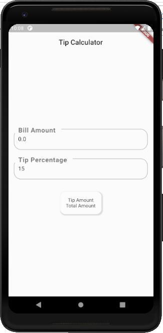
Here, we have a Container with some required style decorations. The child property houses another Column widget with two Text widgets arranged vertically.
Build and run it, and you will get the following result in your emulator screen:
Step 7: Make a Separate Stateless Widget to Show the Amounts
Since we want to show the Tip Amount and Total Amount with a bit of styling. It will not contain any states but will depend on the value passed from the Stateful widget.
You can see the overall coding implementation of the AmountText stateless widget class in the code snippet below:
class AmountText extends StatelessWidget {
  final String text;

  const AmountText(
    this.text, {
    Key key,
  }) : super(key: key);

  @override
  Widget build(BuildContext context) {
    return Container(
      padding: EdgeInsets.all(8),
      child: Text(text.toUpperCase(),
          style: TextStyle(fontWeight: FontWeight.bold, color: Colors.blueAccent, fontSize: 20)),
    );
  }
}
Here, we have used the constructor class to get the value of the actual text to be displayed. The build method of this class returns the Container widget with simple padding and the Text widget as a child widget.
Since our AmountText widget is ready, now we can call the widget in the Stateful widget.
We are going to add the widget inside the Column widget that we defined earlier with simple Text widgets. We just need to replace the Text widget with the AmountText widget and pass the required text values.
You can see see the coding implementation in the code snippet below:
Container(
  margin: EdgeInsets.all(15),
  padding: EdgeInsets.all(15),
  decoration: BoxDecoration(
    color: Colors.white,
    borderRadius: BorderRadius.all(
      Radius.circular(15),
    ),
    border: Border.all(color: Colors.white),
    boxShadow: [
      BoxShadow(
        color: Colors.black12,
        offset: Offset(2, 2),
        spreadRadius: 2,
        blurRadius: 1,
      ),
    ],
  ),
  child: Column(
    children: [
      AmountText(
        'Tip Amount: ${_getTipAmount()}',
        key: Key('tipAmount'),
      ),
      AmountText(
        'Total Amount: ${_getTotalAmount()}',
        key: Key('totalAmount'),
      ),
    ],
  ),
),
Here, we have passed the function inside the AmountText widget. The function returns the respective Tip amount and Total amount values, as you can see in the code snippet below:
  _getTipAmount() => _billAmount * _tipPercentage / 100;

  _getTotalAmount() => _billAmount + _getTipAmount();
Finally, we need to terminate the controllers when exiting the view. For that, we need to use the built-in dispose function. This function runs while we are exiting the current screen.
Inside this method, we need to call the controllers with dispose methods in order to terminate the input text controllers. This will cause the controller to stop listening to the changes in the input fields.
You can see the dispose function in the code snippet below:
@override
void dispose() {
  // To make sure we are not leaking anything, dispose any used TextEditingController
  // when this widget is cleared from memory.
  _billAmountController.dispose();
  _tipPercentageController.dispose();
  super.dispose();
}
Build and run it to get the final result of our implementation of Tip Calculator, which you can see in the demo below:
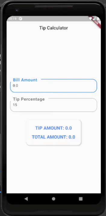
You'll notice that the value of both amounts changes as we change the inputs in the input fields.
We have now come to the end of this tutorial. You successfully implemented a simple Tip calculator using the Flutter framework and Dart.
Where to Go From Here?
The major aim of this tutorial was to teach you basic programming patterns in the Flutter app development framework by building a simple Tip Calculator.
There are many more interesting widgets and additions that you can explore. You can change up your app's UI while keeping the functional components the same.
As a whole, Flutter makes complex UI design simpler with the widget pattern. You can simply create a great UI just by stacking the Widgets together using their child properties.
A next step could be to use Flutter's navigation mechanisms to navigate to different screens. Flutter also simplifies the addition of custom drawer menus and bottom tabs.
This is just the starting point of Flutter development. There is more to it than meets the eye. We just need to keep on exploring and coding.
The demo of the entire project is available in Codepen.
You can get inspiration for your Flutter app from others that are already out there.
Happy Coding!