

You've probably come across carousels in many modern-day applications. Known by various names such as sliders or rotators, these versatile web elements showcase content in a visually appealing, sliding, or rotating manner.
Carousels can help you save space as well as enhance your User Interface and provide a great user experience.
Carousels have become a staple in UI design, often used to display images, testimonials, and more. They are indispensable when creating an engaging and dynamic interface.
In this article, we'll dive into the process of building an image carousel using React and Framer Motion, guiding you through every step to create a stunning and interactive visual component for your application.
What is Framer Motion?
This is an open-source animation library for React applications that you can use to create dynamic and responsive animations for our web application.
Framer motion has several helpful features, including:
- Animation: This allows you to do seamless transitions for your components.
- Gesture: It supports touch and mouse motions, which allows you to account for certain events.
- Variants: Framer motion enables you to declare components declaratively, keeping your code organized and reusable.
All these features are very useful and we will see them in action soon.
To gain a deeper understanding of Framer Motion, you can explore its documentation and resources. But for this article, we'll focus on the fundamentals. As I guide you through the basics of utilizing Framer Motion, my primary goal is to build an impressive and engaging image carousel.
How to Set Up Your Development Environment
The first thing we are gonna do is to set up your development Environment. This involves installing the necessary packages to successfully build your application. This includes installing Node.js and npm
If you already have Node.js and npm installed, you don't need to download and install them again.
Create a React application
At this point, I will assume you have Node and npm installed. To create a React application, simply go to your terminal and visit the directory you want your application to be in. Then run this command:
npx create-react-app react-image-carousel
You can name your application whatever you want – but for the purpose of this article I will be calling it react-image-carousel.
When your React application is successfully created, open up your directory in your code editor. You should get some default files and styles and it should look something like this:

We won't need most of these files and styles for this project so you can clear up files like the: app.test.js, and logo.svg, and reportWebVitals.js,setupTest.js. You can also delete all the default styles in the App.css sheet.

Now that your React application is created and set up, the last step in setting up your development environment for this project is installing Framer motion.
To do this, simply go to your terminal make sure you are in the project directory and run this command:
npm install framer-motion
and this should install the latest version of Framer Motion. Now you should be good to go. Simply use npm run start to fire the development server on your browser.
How to Design the Image Carousel Component
To kick off the design we will first create a Carousel.js component. In the carousel component, we will import the useState hook from React and then the motion and AnimatePresence properties from Framer Motion.
import { useState } from "react";
import { motion, AnimatePresence } from "framer-motion";
We then create our carousel function which takes in the images prop which will be an array of image URLs:
const Carousel = ({ images }) => {};
In our carousel function, we initialize a state variable with useState to keep track of the current image index we use setCurrentIndex as the corresponding function to update the index.
Next, we create 3 helper functions to handle user interactions which include:
- handleNext: this updates the currentIndex to the next index in order to change the image and if it reaches the end of the array it cycles back.
- handlePrevious: this does the same as the handleNext function, but this time in reverse order. This allows us to go back to images.
- handleDotClick: this takes an index as a parameter and updates the currentIndex. With this, we can jump forward and backward to images just by clicking the dots.
const Carousel = ({ images }) => {
  const [currentIndex, setCurrentIndex] = useState(0);

  const handleNext = () => {
    setCurrentIndex((prevIndex) =>
      prevIndex + 1 === images.length ? 0 : prevIndex + 1
    );
  };
  const handlePrevious = () => {
    setCurrentIndex((prevIndex) =>
      prevIndex - 1 < 0 ? images.length - 1 : prevIndex - 1
    );
  };
  const handleDotClick = (index) => {
    setCurrentIndex(index);
  };
These are the helper functions we will need for our component
How to Create our Template
Our template is a pretty simple one and is made up of our image, our slider direction, and the dots (indicator).
  return (
    <div className="carousel">
        <img
          key={currentIndex}
          src={images[currentIndex]}
        /><div className="slide_direction">
        <div className="left" onClick={handlePrevious}>
          <svg
            xmlns="http://www.w3.org/2000/svg"
            height="20"
            viewBox="0 96 960 960"
            width="20"
          >
            <path d="M400 976 0 576l400-400 56 57-343 343 343 343-56 57Z" />
          </svg>
        </div>
        <div className="right" onClick={handleNext}>
          <svg
            xmlns="http://www.w3.org/2000/svg"
            height="20"
            viewBox="0 96 960 960"
            width="20"
          >
            <path d="m304 974-56-57 343-343-343-343 56-57 400 400-400 400Z" />
          </svg>
        </div>
      </div>
      <div className="indicator">
        {images.map((_, index) => (
          <div
            key={index}
            className={`dot ${currentIndex === index ? "active" : ""}`}
            onClick={() => handleDotClick(index)}
          ></div>
        ))}
      </div>
    </div>
  );
As you can see in the template, we display the image at the current index. Then we have a div of slider_direction which holds two divs with class names left and right. We created these as navigation buttons for the carousel. They use inline SVGs to display arrow icons, and their onClick handlers are set to handlePrevious and handleNext, respectively.
We also have an indicator div which we created to display a series of dots that represent each image in the carousel. It maps over the images array and creates a dot for each image, setting the active class for the dot corresponding to the currentIndex.
We then attached an onClick handler for each dot which is set to call handleDotClick with the index of the dot.
And that should be our template, for now. All that is left is to export the carousel component, import it into the App.js component, and add some CSS. Then we will be ready to start animating.
So we simply export our carousel function from our Carousel.js component.
export default Carousel;
How to Use the Carousel Component
We have created our carousel component. But to use it we have to import it into our App.js component:
import Carousel from "./Carousel";
After that, we can create our images array, which will hold our image URLs.
const images = [
  "https://images.pexels.com/photos/169647/pexels-photo-169647.jpeg?auto=compress&cs=tinysrgb&w=600",
  "https://images.pexels.com/photos/313782/pexels-photo-313782.jpeg?auto=compress&cs=tinysrgb&w=1260&h=750&dpr=1",
  "https://images.pexels.com/photos/773471/pexels-photo-773471.jpeg?auto=compress&cs=tinysrgb&w=1260&h=750&dpr=1",
  "https://images.pexels.com/photos/672532/pexels-photo-672532.jpeg?auto=compress&cs=tinysrgb&w=1260&h=750&dpr=1",
  "https://images.pexels.com/photos/632522/pexels-photo-632522.jpeg?auto=compress&cs=tinysrgb&w=1260&h=750&dpr=1",
  "https://images.pexels.com/photos/777059/pexels-photo-777059.jpeg?auto=compress&cs=tinysrgb&w=1260&h=750&dpr=1",
];
These are just images I got from pexels – that's what we are gonna use for this project.
Next, we add our App function which will hold our application template.
function App() {
  return (
    <div className="App">
      <header className="App-header">
        <h1>Image Carousel using React and Framer Motion</h1>
      </header>
      <main>
        <Carousel images={images} />
      </main>
    </div>
  );
}
export default App;
As you can see, we have our header that just displays a header showing what our application is about.
Then we have the main section which has our carousel component added and takes in a prop of the images array. If you recall, this was the prop we used in our carousel component to display images.
Lastly, we export the App component so we can use it in the index.js file.
To see all this together with no styling, run the npm run start command. The application should look like this:

Ugly right? Yes, I agree with you. But with just a few lines of CSS, this will be transformed. So let's dive in.
How to Add the CSS
I don't want to create a separate style sheet for the carousel component, so we will do all our CSS in the App.css file. Don't forget to import your style sheet.
import "./App.css"
This is our CSS:
@import url("https://fonts.googleapis.com/css2?family=Oswald:wght@600&display=swap");
.App-header {
  font-size: 1rem;
  text-align: center;
  font-family: "Oswald", sans-serif;
  padding-bottom: 2rem;
}
.carousel-images {
  position: relative;
  border-radius: 10px;
  height: 400px;
  max-width: 650px;
  margin: auto;
  overflow: hidden;
}
.carousel-images img {
  width: 99%;
  height: 99%;
  border-radius: 8px;
  border: #ff00008e solid 2px;
}
.slide_direction {
  display: flex;
  justify-content: space-between;
}
.left,
.right {
  background-color: #fb666675;
  color: #fff;
  padding: 10px 8px 8px 13px;
  margin: 0 20px;
  border-radius: 50%;
  position: absolute;
  top: 0;
  bottom: 0;
  margin: auto 10px;
  height: 25px;
  width: 25px;
}
.left {
  left: 0;
}
.right {
  right: 0;
}
.carousel-indicator {
  margin-top: 20px;
  display: flex;
  justify-content: center;
  gap: 20px;
}
.dot {
  background-color: #333;
  width: 15px;
  height: 15px;
  border-radius: 50%;
}
.active {
  background-color: #fa2020;
}
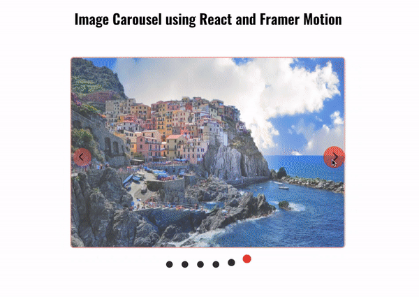
And here is the result with our CSS:

You'll probably agree that this looks a whole lot better and is already fully functional.
Now let's move on to adding our animation using Framer Motion to give it a nice sliding look.
How to Add Animation to the Carousel Component
To start animating with Framer Motion there are a few concepts you must be familiar with because we will be using them often in this section. These concepts include:
- Variants: Think of a variant as a named group of properties. Its job is to define how an element should appear or animate. You can create different variants to represent different visual states or animations for an element, like
open,closed,hover, and so on. - Initial: This is simply the state your object will posses before the animation kicks in.
- Animate: This is simply the state your object will animate to, it's as simple as that.
Back to the project, we'll add our animations to our carousel component. We have already imported the two properties which we will be needing – the motion and AnimatePresence properties.
I will be breaking this section into three parts because we will be adding animation to three parts of our code, including the image, the slider directions, and the indicator dot.
Image Animation
To animate the exit and entrance of an image, we need to wrap our img element with an AnimationPresence component. This enables us to add animation whenever an image leaves or enters. Then we attach a motion. to our tag just like this.
 <AnimatePresence>
  <motion.img key={currentIndex} src={images[currentIndex]} />
</AnimatePresence>;
Next, we go outside our template and declare our variants.
  const slideVariants = {
    hiddenRight: {
      x: "100%",
      opacity: 0,
    },
    hiddenLeft: {
      x: "-100%",
      opacity: 0,
    },
    visible: {
      x: "0",
      opacity: 1,
      transition: {
        duration: 1,
      },
    },
    exit: {
      opacity: 0,
      scale: 0.8,
      transition: {
        duration: 0.5,
      },
    },
  };
As you can see, the sliderVariants has four properties:
- hiddenRight: this sets the opacity of the image to 0 and places it at the right side of the container.
- hiddenLeft: this does the same as the hiddenRight but this time it's set on the left side.
- visible: this is the property that will be called for the slide animation to happen from whichever position the image is to the center of the container.
- exit: this animation controls the removal of the image from the screen as another image slides in.
Now our variants are set. How do we tell where the image should slide in from? We need to set a direction state and update the state based on which of the slide_directions was clicked.
const [direction, setDirection] = useState('left');
So we set the direction to start at the left. This is only logical since the first image to be displayed will be the first image. Then we go over to our helper function and set the direction depending on which direction was clicked.
  const handleNext = () => {
    setDirection("right");
    setCurrentIndex((prevIndex) =>
      prevIndex + 1 === images.length ? 0 : prevIndex + 1
    );
  };

  const handlePrevious = () => {
    setDirection("left");

    setCurrentIndex((prevIndex) =>
      prevIndex - 1 < 0 ? images.length - 1 : prevIndex - 1
    );
  };

  const handleDotClick = (index) => {
    setDirection(index > currentIndex ? "right" : "left");
    setCurrentIndex(index);
  };
You may have noticed that we didn't just set the state for the handleNext and handlePrevious. We also did for the handleDotClick. So whenever a previous or next dot is clicked the direction will be set accordingly.
Just a reminder – the purpose of direction is to set the initial state of the image so the slider can work as it ought to.
Now that our direction is set, let's use our variants in our img element.
<AnimatePresence>
          <motion.img
            key={currentIndex}
            src={images[currentIndex]}
            variants={slideVariants}
            initial={direction === "right" ? "hiddenRight" : "hiddenLeft"}
            animate="visible"
            exit="exit"
          />
        </AnimatePresence>
So we add the variants prop and set it equal to the slideVariants we created. Then we added the initial prop and set it equal to a ternary operator. This sets the initial state of the image to either be hiddenRight or hiddenLeft depending on which of the slider_direction or dot was clicked.
Next, we add the animate property, which animates the image from the initial position to the position we set in the visible property.
Lastly, we add our exit property and set it to exit. This animates the image out of the screen when a new image enters.
There are lots of props you can use when working with Framer Motion. You can check the documentation to learn more about them.
And with that in place, our image carousel should be working perfectly.

Sliders and Dots Animation
We could stop here, but I just want to add a few animations to my slide directions and dots.
  const slidersVariants = {
    hover: {
      scale: 1.2,
      backgroundColor: "#ff00008e",
    },
  };
const dotsVariants = {
    initial: {
      y: 0,
    },
    animate: {
      y: -10,
      scale: 1.3,
      transition: { type: "spring", stiffness: 1000, damping: "10" },
    },
    hover: {
      scale: 1.1,
      transition: { duration: 0.2 },
    },
  };
As usual, first we create our variants. For the slidersVariants we just add a hover property. For the dotsVariants we have three properties: initial, animate, and hover.
Just like we did with the img element, we will add motion. as a prefix to the element name in order to use Framer Motion.
<div className="slide_direction">
  <motion.div
    variants={slidersVariants}
    whileHover="hover"
    className="left"
    onClick={handlePrevious}
  >
    <svg
      xmlns="http://www.w3.org/2000/svg"
      height="20"
      viewBox="0 96 960 960"
      width="20"
    >
      <path d="M400 976 0 576l400-400 56 57-343 343 343 343-56 57Z" />
    </svg>
  </motion.div>
  <motion.div
    variants={slidersVariants}
    whileHover="hover"
    className="right"
    onClick={handleNext}
  >
    <svg
      xmlns="http://www.w3.org/2000/svg"
      height="20"
      viewBox="0 96 960 960"
      width="20"
    >
      <path d="m304 974-56-57 343-343-343-343 56-57 400 400-400 400Z" />
    </svg>
  </motion.div>
</div>;
As you can see, we added our variants and set it equal to slidersVariants. Then we used a new property whileHover and set it equal to the over property we specified in our slidersVariants object.
<motion.div
  key={index}
  className={`dot ${currentIndex === index ? "active" : ""}`}
  onClick={() => handleDotClick(index)}
  initial="initial"
  animate={currentIndex === index ? "animate" : ""}
  whileHover="hover"
  variants={dotsVariants}
></motion.div>;
Here we didn't just add a whileHover prop. We also added an initial prop and an animate prop that animates the current image dot so it stands out.
In our slidersVariants object, we specified a transition type of spring which gives it the bouncy nature when the animation transition takes place.
Add all this together and our sleek Image Carousel is ready. Here is the final result:
Just for reference, this is the full code of the carousel component:
import { useState } from "react";
import { motion, AnimatePresence } from "framer-motion";

const Carousel = ({ images }) => {
  const [currentIndex, setCurrentIndex] = useState(0);
  const [direction, setDirection] = useState(null);

  const slideVariants = {
    hiddenRight: {
      x: "100%",
      opacity: 0,
    },
    hiddenLeft: {
      x: "-100%",
      opacity: 0,
    },
    visible: {
      x: "0",
      opacity: 1,
      transition: {
        duration: 1,
      },
    },
    exit: {
      opacity: 0,
      scale: 0.8,
      transition: {
        duration: 0.5,
      },
    },
  };
  const slidersVariants = {
    hover: {
      scale: 1.2,
      backgroundColor: "#ff00008e",
    },
  };
  const dotsVariants = {
    initial: {
      y: 0,
    },
    animate: {
      y: -10,
      scale: 1.2,
      transition: { type: "spring", stiffness: 1000, damping: "10" },
    },
    hover: {
      scale: 1.1,
      transition: { duration: 0.2 },
    },
  };

  const handleNext = () => {
    setDirection("right");
    setCurrentIndex((prevIndex) =>
      prevIndex + 1 === images.length ? 0 : prevIndex + 1
    );
  };

  const handlePrevious = () => {
    setDirection("left");

    setCurrentIndex((prevIndex) =>
      prevIndex - 1 < 0 ? images.length - 1 : prevIndex - 1
    );
  };

  const handleDotClick = (index) => {
    setDirection(index > currentIndex ? "right" : "left");
    setCurrentIndex(index);
  };

  return (
    <div className="carousel">
        <div className="carousel-images">
        <AnimatePresence>
          <motion.img
            key={currentIndex}
            src={images[currentIndex]}
            initial={direction === "right" ? "hiddenRight" : "hiddenLeft"}
            animate="visible"
            exit="exit"
            variants={slideVariants}
          />
        </AnimatePresence>
        <div className="slide_direction">
          <motion.div
            variants={slidersVariants}
            whileHover="hover"
            className="left"
            onClick={handlePrevious}
          >
            <svg
              xmlns="http://www.w3.org/2000/svg"
              height="20"
              viewBox="0 96 960 960"
              width="20"
            >
              <path d="M400 976 0 576l400-400 56 57-343 343 343 343-56 57Z" />
            </svg>
          </motion.div>
          <motion.div
            variants={slidersVariants}
            whileHover="hover"
            className="right"
            onClick={handleNext}
          >
            <svg
              xmlns="http://www.w3.org/2000/svg"
              height="20"
              viewBox="0 96 960 960"
              width="20"
            >
              <path d="m304 974-56-57 343-343-343-343 56-57 400 400-400 400Z" />
            </svg>
          </motion.div>
        </div>
      </div>
      <div className="carousel-indicator">
        {images.map((_, index) => (
          <motion.div
            key={index}
            className={`dot ${currentIndex === index ? "active" : ""}`}
            onClick={() => handleDotClick(index)}
            initial="initial"
            animate={currentIndex === index ? "animate" : ""}
            whileHover="hover"
            variants={dotsVariants}
          ></motion.div>
        ))}
      </div>
    </div>
  );
};
export default Carousel;
Check out the Git Repository on GitHub.
Here is the site on Netlify.
Just a note that there are accessibility issues with this code, and so it shouldn't be used in a production environment.
Resources
I understand that there might be some terms or syntax that might be unclear, especially if you are new to React or new to using Framer Motion. Here are some resources I would recommend if you want to learn more:
Conclusion
In this article, we explored the process of designing an engaging and responsive image carousel using the powerful combination of React and Framer Motion, an animation and gesture library.
By incorporating components like motion and AnimationPresence, we wear able to walk through the steps to build a visually appealing carousel. This carousel showcases our images and delivers smooth transitions between images with captivating animations for an enhanced user experience.