
By Stephen McLean
Recently, I decided to build a web application to allow designers and developers to generate variants for colors and to check color accessibility. In this post, I would like to give you a walkthrough of how I built some of the components I would use in that app.
Full source code for the application can be found at the end of this article, along with a link to a Storybook instance with all of the described components.
Dependencies
To help me build these components I used Tinycolor, a library with a range of color utility functions which you can use to manipulate, transform, and represent colors.
I have also used React Spring, which is a spring physics based library that allows you to add animations to your project really easily.
Color Tile
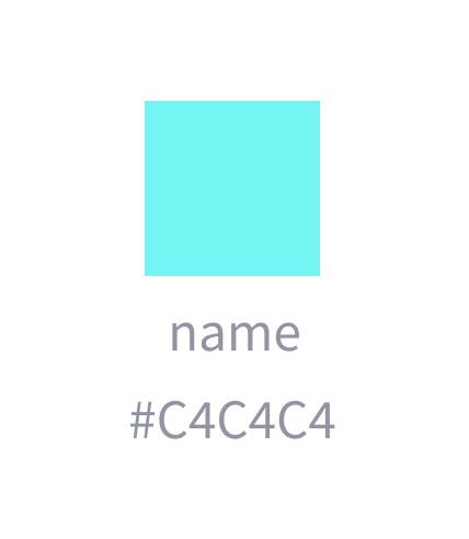 Color Tile Designs
The simplest component out of our list, the color tile will serve as a building block for other components. The responsibility of this component is to display a color, along with its name and HEX value.
const TILE_SIZES = {
  sm: "2.5rem",
  md: "4rem",
  lg: "6rem"
};

const ColorTile = ({
  color,
  name,
  hideName,
  hideHex,
  size,
  className,
  customTileStyle,
  ...otherProps
}) => {
  const containerClass = cx(styles.container, className);

  const tileClass = cx(styles.tile, {
    "margin-bottom--xxs": !hideName || !hideHex
  });
  const dimension = TILE_SIZES[size];
  const tileStyle = {
    "--color-tile-width": dimension,
    "--color-tile-height": dimension,
    "--color-tile-bg": color,
    "--color-tile-border-color": "transparent",
    ...customTileStyle
  };
  const tile = <div style={tileStyle} className={tileClass} />;

  const nameClass = cx("text--colors-grey-lighten-30", {
    "margin-bottom--xxs": !hideHex
  });

  const hex = useMemo(() => tinycolor(color).toHexString(), [color]);
  return (
    <div className={containerClass} {...otherProps}>
      {tile}
      {!hideName && <small className={nameClass}>{name}</small>}
      {!hideHex && (
        <small className="text--colors-grey-lighten-30">{hex}</small>
      )}
    </div>
  );
};

ColorTile.propTypes = {
  /**
   * Color to display
   */
  color: PropTypes.string.isRequired,
  /**
   * Name of the color
   */
  name: PropTypes.string,
  /**
   * Hide the name text if true
   */
  hideName: PropTypes.bool,
  /**
   * Hide the hex color value display if true
   */
  hideHex: PropTypes.bool,
  /**
   * Size of the tile
   */
  size: PropTypes.oneOf(["sm", "md", "lg"]),
  /**
   * Custom styles to apply to the tile element
   */
  customTileStyle: PropTypes.object
};

ColorTile.defaultProps = {
  size: "md",
  hideName: true,
  hideHex: true,
  customTileStyle: {}
};
Notes on the implementation
- Line 17, and line 19 might look slightly strange if you’re not familiar with the excellent classnames library. Basically, the classnames library allows you to concatenate and conditionally apply CSS classes to your elements.
- On line 36 you can see that we calculate the HEX string of the color passed in. Since we’re using the color prop passed in directly in the CSS, it can be in any acceptable CSS color format, not just HEX. It could be an rgba string for example. This is where Tinycolor comes in. We can give it any of those formats and it returns a nicely formatted HEX string we can display along with our tile.
- Sticking with line 36, you might also have noticed that the function to calculate the HEX string is wrapped in
useMemo. This is because we only want to compute this value if the color changes. We can avoid recalculating if any of the other props change which might cause a rerender. I’m still learning the new Hooks API, so this might not be the most appropriate usage ofuseMemosince it’s probably not a particularly expensive operation, but I think it was a nice way to handle it regardless. You can learn more about theuseMemofunction or Hooks in general here.
.tile {
  width: var(--color-tile-width);
  height: var(--color-tile-height);
  background-color: var(--color-tile-bg);
  border: 3px solid var(--color-tile-border-color);
  cursor: pointer;
}

.container {
  display: inline-flex;
  flex-direction: column;
  align-items: center;
}
Notes on the styling
The styling of our tile is really simple. We have the tile itself which takes its dimensions and color from the variables we pass in.
Then, we have the container which holds the tile, the color name, and the HEX value. It’s a simple flex container that keeps our elements aligned.
Color Picker
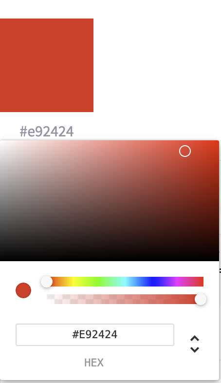 Color Picker Designs
For our Color Picker, we are going to reuse the Color Tile component, along with a picker from the react-color package.
import React, { useState } from "react";
import PropTypes from "prop-types";
import { ChromePicker } from "react-color";

import ColorTile from "../ColorTile/ColorTile";

import styles from "./ColorPicker.module.scss";

const ColorPicker = ({ color, onChange, className, tileClassName }) => {
  const [isPickerOpen, setPickerOpen] = useState(false);

  const onSwatchClick = () => {
    setPickerOpen(!isPickerOpen);
  };

  const onColorChange = color => {
    onChange(color.hex);
  };

  return (
    <div className={className}>
      <ColorTile
        color={color}
        onClick={onSwatchClick}
        hideHex={false}
        size="lg"
        className={tileClassName}
      />

      {isPickerOpen && (
        <div className={styles.popover}>
          <div className={styles.cover} onClick={onSwatchClick} />
          <ChromePicker color={color} onChangeComplete={onColorChange} />
        </div>
      )}
    </div>
  );
};

ColorPicker.propTypes = {
  /**
   * Currently selected color value
   */
  color: PropTypes.string,
  /**
   * Callback fn for when the color changes
   */
  onChange: PropTypes.func,
  /**
   * Custom classes to apply to the color tile
   */
  tileClassName: PropTypes.string
};

ColorPicker.defaultProps = {
  onChange: () => {}
};

export default ColorPicker;
Notes on the implementation
Our color picker is composed of a ColorTile which shows the currently selected color, along with its HEX value, and a ChromePicker from the react-color library which actually allows us to select a color.
We have some state which controls whether the ChromePicker is visible or not, and a callback function to let whatever component is using our picker know when the color changes. react-color provides lots of information when the color changes, but the hex value was enough for my purposes as you can see on line 17.
Color List
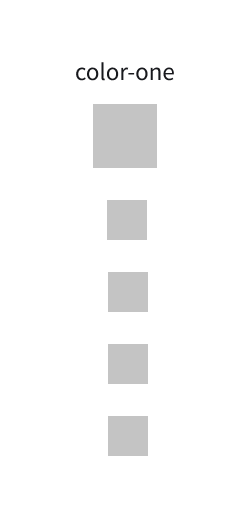 Color List Designs
Our Color List component takes a list of colors and renders them as a list containing color tiles. Our Color List is intended to show a base color as a slightly larger tile, with the remaining tiles representing the variants of the base shown as smaller tiles. We also allow naming our list, and this will be used to display the name of the base color.
Our Color List also brings the “springy” part of this walkthrough. The tiles will be animated on entry using React Spring ?
const ROW_DIRECTION = "row";
const COL_DIRECTION = "col";
const ALL_DIRECTIONS = [ROW_DIRECTION, COL_DIRECTION];

/**
 * Renders a list of colors
 */
const ColorPaletteList = ({
  name,
  colors,
  direction,
  onColorClick,
  onColorDoubleClick,
  animationRef,
  getCustomTileStyle,
  renderTileBy,
  ...otherProps
}) => {
  const headingClass = cx("margin-bottom--xs", {
    "text--align-left": direction === ROW_DIRECTION,
    "text--align-center": direction === COL_DIRECTION
  });

  const containerClass = cx({
    [styles.containerCol]: direction === COL_DIRECTION,
    [styles.containerRow]: direction === ROW_DIRECTION
  });

  const tileClass = cx({
    "margin-bottom--xs": direction === COL_DIRECTION,
    "margin-right--xs": direction === ROW_DIRECTION
  });

  const trailMargin =
    direction === COL_DIRECTION ? "marginBottom" : "marginRight";
  const trails = useTrail(colors.length, {
    from: { [trailMargin]: 20, opacity: 0 },
    to: { [trailMargin]: 0, opacity: 1 },
    ref: animationRef
  });

  return (
    <div {...otherProps}>
      <h4 className={headingClass}>{name || ""}</h4>
      <div className={containerClass}>
        {trails.map((trailProps, idx) => {
          const color = colors[idx];
          const onClick = () => onColorClick(color);
          return (
            <animated.div
              key={`animated-tile-${color.name}-${idx}`}
              style={trailProps}
            >
              {renderTileBy(color, tileClass, onClick, false, false)}
            </animated.div>
          );
        })}
      </div>
    </div>
  );
};

ColorPaletteList.propTypes = {
  /**
   * Name of the list
   */
  name: PropTypes.string,
  /**
   * The list of colors to display
   */
  colors: PropTypes.arrayOf(
    PropTypes.shape({
      color: PropTypes.string,
      name: PropTypes.string,
      isMain: PropTypes.bool
    })
  ).isRequired,
  /**
   * Determines the layout of the tiles
   */
  direction: PropTypes.oneOf(ALL_DIRECTIONS),
  /**
   * Callback for when a color in the list is clicked
   */
  onColorClick: PropTypes.func,
  /**
   * Ref used to hook into the animation
   */
  animationRef: PropTypes.object,
  /**
   * Pass custom styles for a particular color tile
   */
  getCustomTileStyle: PropTypes.func,
  /**
   * Render prop to render the color tile
   */
  renderTileBy: PropTypes.func
};

ColorPaletteList.defaultProps = {
  direction: COL_DIRECTION,
  onColorClick: () => {},
  onColorDoubleClick: () => {},
  getCustomTileStyle: () => ({}),
  renderTileBy: (color, className, onClick, hideName, hideHex) => (
    <ColorTile
      key={color.name}
      color={color.color}
      name={color.name}
      size={color.isMain ? "lg" : "md"}
      className={className}
      onClick={onClick}
      hideName={hideName}
      hideHex={hideHex}
    />
  )
};
Notes on the implementation
- On line 34–40 you can see our implementation of React Spring using
useTrail. You can read more about trails here. We animate the margin on the Color Tile container and depending on whether the list is column aligned or row aligned this could be the margin on the right or bottom. - On line 39 you can see that we pass a ref to our animation. This is so that we can pass a ref to our Color List to delay the animation. This would be useful is we wanted to trigger a specific sequence of animations from a parent component.
.containerCol {
  display: flex;
  flex-direction: column;
  justify-content: center;
  align-items: center;
}

.containerRow {
  display: flex;
  flex-direction: row;
  align-items: center;
  flex-wrap: wrap;
}
Color Pair
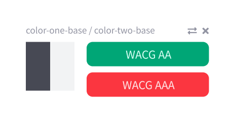 Color Pair Designs
The Color Pair component takes two colors and displays them side by side along with some accessibility information. The idea is that a developer or designer would pair colors to ensure they work together when used as a background/foreground combination.
const AccessiblePair = ({
  background,
  foreground,
  hideCloseBtn,
  onCloseBtnClick,
  closeBtnIcon,
  ...otherProps
}) => {
  const title = `${background.name}/${foreground.name}`;

  const bgTileStyle = {
    "--tile-color": background.color
  };

  const fgTileStyle = {
    "--tile-color": foreground.color
  };

  const tileContainerClass = cx(styles.tileContainer, "margin-right--sm");
  const titleContainerClass = cx(
    styles.titleContainer,
    "margin-bottom--xxs",
    "text--colors-grey-lighten-30"
  );

  const isAAPass = tinycolor.isReadable(background.color, foreground.color, {
    level: "AA",
    size: "small"
  });
  const isAAAPass = tinycolor.isReadable(background.color, foreground.color, {
    level: "AAA",
    size: "small"
  });

  const aaDisplayText = "WCAG AA";
  const aaaDisplayText = "WCAG AAA";
  const aaPillType = isAAPass ? "success" : "error";
  const aaaPillType = isAAAPass ? "success" : "error";

  const examplePillStyle = {
    "--pill-background": background.color,
    "--pill-color": foreground.color
  };

  return (
    <div {...otherProps}>
      <div className={titleContainerClass}>
        <small className={styles.title}>{title}</small>
        {!hideCloseBtn && (
          <FontAwesomeIcon icon={closeBtnIcon} onClick={onCloseBtnClick} />
        )}
      </div>
      <div className={styles.mainContent}>
        <div className={tileContainerClass}>
          <div style={bgTileStyle} className={styles.tile} />
          <div style={fgTileStyle} className={styles.tile} />
        </div>

        <div className={styles.pillContainer}>
          <Pill type={aaPillType} className="margin-bottom--xxs">
            {aaDisplayText}
          </Pill>
          <Pill type={aaaPillType} className="margin-bottom--xxs">
            {aaaDisplayText}
          </Pill>
          <Pill style={examplePillStyle}>This is how text will look</Pill>
        </div>
      </div>
    </div>
  );
};

AccessiblePair.propTypes = {
  /**
   * The background color
   */
  background: colorShape.isRequired,
  /**
   * The foreground color
   */
  foreground: colorShape.isRequired,
  /**
   * Set to true to hide the close button
   */
  hideCloseBtn: PropTypes.bool,
  /**
   * Callback for when the close button is clicked
   */
  onCloseBtnClick: PropTypes.func,
  /**
   * FontAwesome icon to use for the close button
   */
  closeBtnIcon: PropTypes.string
};

AccessiblePair.defaultProps = {
  hideCloseBtn: false,
  onCloseBtnClick: () => {},
  closeBtnIcon: "times"
};
Notes on the implementation
As mentioned, our Color Pair component takes a background and foreground color, and on line 26–33 you can see where we use Tinycolor to determine the accessibility of the color pair.
We use a simple Pill component to display the result with the type of the Pill being determined by the result. I haven’t shown the source for the Pill here, but it’s a pretty standard component that you would find in any component library (Bootstrap, Material, etc).
You can learn more about accessibility and WCAG here.
Conclusion and source code
I hope you have learned something from this walkthrough. I highly recommend looking into the libraries I have mentioned here in your next project. In particular, my application would have taken much longer to create without the excellent Tinycolor package.
Source code for the full application can be found here.
A Storybook instance with all of the components can be found here.
If you have any feedback on the designs, code, or in general, I would love to hear it.
Thank you very much for reading my article!
Originally published here.