
By Tina Feijóo
There is a lot of material about color to be found online. But none of us has the time to search and read lengthy series of articles to cover the topic. That’s why I wanted to create this comprehensive guide for applying color in web design. In this post we’ll cover:
- Color psychology
- Color terminology
- Color rules
- How to build and apply a color palette in web design
- Useful tools and resources
Getting started
So, you have a web design project on your hands. One of the first steps you’ll probably have to take in order to kickstart the process is choosing a color palette. If you’re working for an existing brand, then probably your color scope will be limited, especially if this company has a brand guideline. However, if so far you only have a black and white sketch of a brand, waiting for definitions such as color, then keep reading.
The first thing I recommend doing is performing a small exercise with your client or the project’s stakeholders. The exercise consists in having these stakeholders write a short list of attributes that they believe their new brand should have. If you can be on-site for the exercise (I personally work remotely from Argentina for clients in Europe and the US), then have them write each attribute on a sticky note. Then gather all sticky notes and put them on a whiteboard. Soon, you’ll start noticing patterns. Pick up and reorganize the sticky notes so as to cluster the notes that relate to one another. Then, you can name each cluster. In this case, since this is a small exercise, the name would probably be a single word that comprises all those related attributes. In other words, a consensual attribute.
Color psychology
When you finish with this mini-workshop you should have in your hands a list of consensual attributes. Your aim is to get the brand to evoke these attributes. For that, a very strong tool is color psychology. You shouldn’t define a brand’s color just because you (or someone else) likes it. Whichever color you use will surely have an impact on your audience. There is a lot to be said about audiences, enough to cover it in a separate post. For now, let’s just say that your audience matters and that you should design specifically for it.
Back to color psychology. To summarize, color affects people and evokes certain ideas/attributes. The way we relate ideas to colors depends on our culture. Different cultures have different color interpretations (see, I told you the audience matters). There is material to be found on color psychology for many countries/areas of the world. Here is a resource I found.
In this post, we’ll cover western color interpretations:
- Red: Love, danger, anger, war. A darker red could be related to elegance.
- Orange: Energy, vitality, autumn.
- Yellow: Warning, happiness, cowardice, or wealth, in a golden shade.
- Pink: Femininity, romance, sensitivity. Could also convey energy and innovation.
- Purple: Royalty, luxury, creativity, spirituality.
- Blue: Sadness, calm, reliability, trust, corporate.
- Green: Nature, luck, cleanliness (depending on the shade).
- Grey: Conservative, modernity, luxury.
- Black: Elegance, power, strength.
- White: Purity, cleanliness, elegance.
It is important to note that the shade of the color will also affect its interpretations. But then again, not only the “shade”.
Color terminology
Let’s speak properly. If we are going to work with color, we should know how to speak about it, and because of that, how to manipulate it to fit our design needs. Let’s get acquainted with a couple of terms:
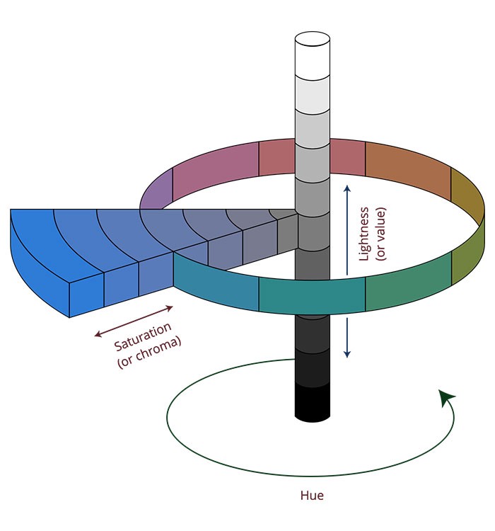
- Hue: This is the color.
- Saturation/Chroma: This refers to the purity of a color. A color is most pure when it lacks gray.
- Value: Refers to the lightness or darkness of a color.
With these three parameters, we can create many “versions” of a color. To better explain it, let’s look at the Munsell Sphere:
The “versions” I was referring to earlier actually have names. Yes, more color terminology to learn!
- Tone: When you add gray (desaturate) a color or hue.
- Shade: When you add black (lower the value) of a color or hue.
- Tint: When you add white (increase the value) of a color or hue.
Creating a color palette
So, a quick recap. Until now you have:
- Defined a list of attributes for your brand.
- Selected a color to reflect these attributes, through the use of color psychology.
- Determined a more specific “version” (tone, shade or tint) of your color, through your knowledge of the Munsell Sphere.
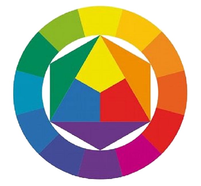
Great! Now, it’s time to build a color palette for your website. To do that, we’ll take your brand’s new color as the central color to base your palette on. The next step is to choose some colors to accompany your main color, and therefore, create your palette. In order to do it, there are several color rules that you can choose from and apply. These rules are built upon the Chromatic Circle or Color Wheel, a very useful tool to create color combinations.
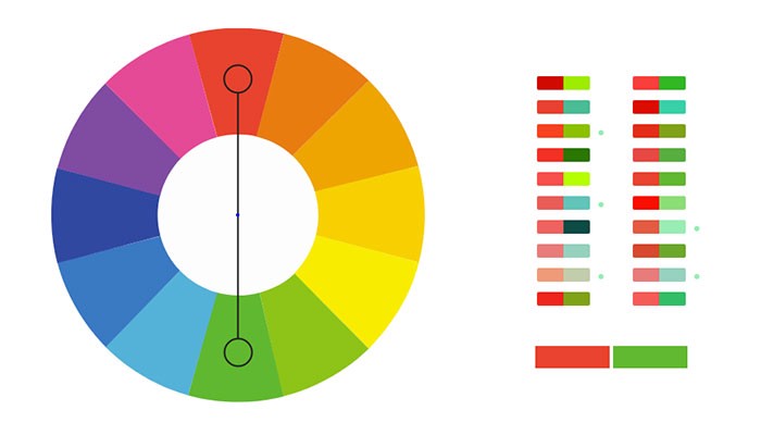
Complementary colors
These are colors that are located at opposing sides of the Chromatic Circle.
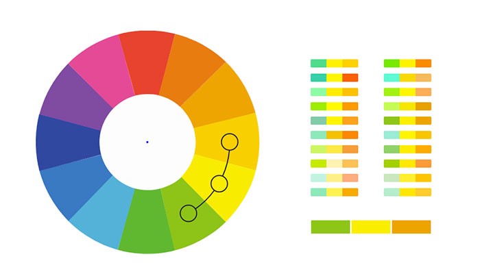
Analogous colors
These are colors that are next to each other on the Chromatic Circle.
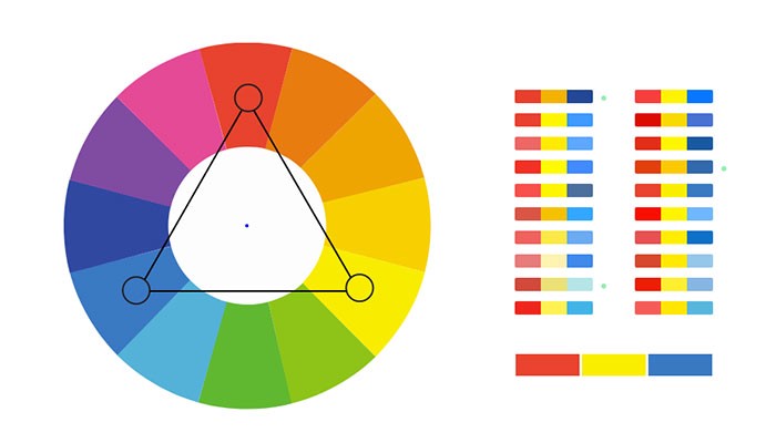
Triadic colors
These are colors obtained by overlapping an equilateral triangle to the Chromatic Circle.
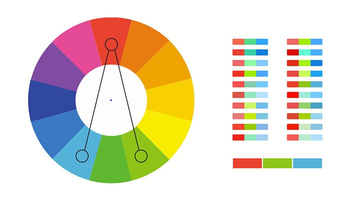
Split-complementary colors
This combination is obtained by matching the main color to the two colors adjacent to its complementary.
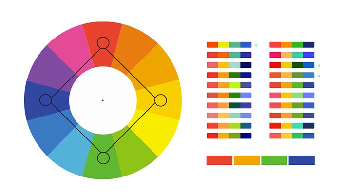
Square colors
These are colors obtained by overlapping a square to the Chromatic Circle.
More combinations
The same as with the triadic and square color combinations, you can create even larger palettes by using other geometrical figures such as pentagon, or a hexagon.
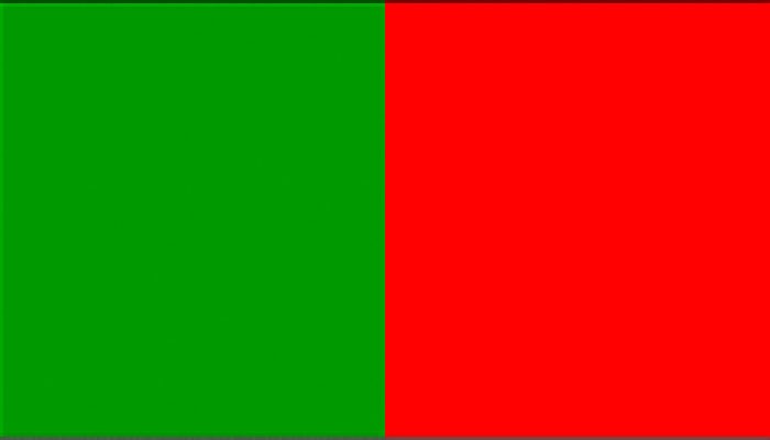
Tip: Beware of color vibration
When you create a palette, especially a complementary palette, it’s not only necessary to define the hues. You also need to take into account the saturation/chroma and the value of your colors, in order to get a harmonious palette. Otherwise, you risk your colors vibrating. Literally.
There are some colors, that when placed next to each other, produce a disturbing effect on our eyes. They seem to vibrate. This happens especially with colors that at opposite in the Chromatic Circle, and that have the same level of saturation.

Applying colors in web design
Now that we have one central color and some notions about color rules, we can choose a strategy and define our color palette for our website design. Let’s start from the beginning.
How many colors?
The truth is you can have as many colors as you like, but you should keep in mind that larger color palettes are harder to implement effectively. It may also affect the ability to have a consistent design system in place. However, it’s your choice. I would personally recommend having a simple color palette, especially if you’re just starting.
Which colors should my palette include?
To start, your palette should include a very light color and a very dark color. The idea is that these two colors have a great contrast (I will leave tools to measure contrast at the end of the article). For example, black and white (yes, white counts as a color). Why? Because you will need a color for backgrounds and a color for text. Just that simple. Personally, I prefer choosing neutral colors for this. Neutral colors are versatile and elegant and can compliment any given color palette.
Bottom line, your color palette shouldn’t only include very live and interesting colors. You need base colors too.
The finished color palette
Let’s say that in total we’re going to have 5 colors in our palette. We already know that one color should be really light (e.g. white) and another color should be very dark (e.g. black). That leaves us three open spots for some interesting colors. We also know that we have the main color and that the other two colors will relate to this main color through the use of color rules.
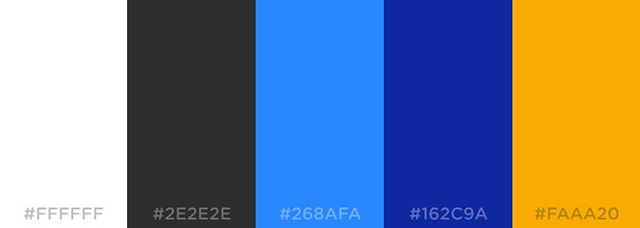
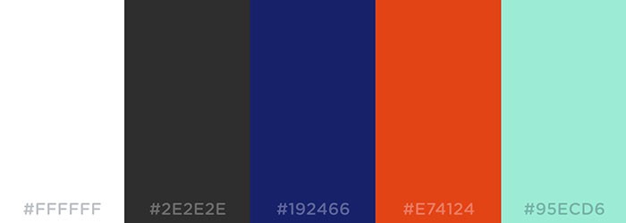
Let’s pretend our main color is blue. Here are some possible palettes with blue as the main color.
Complementary palette
Analogous palette
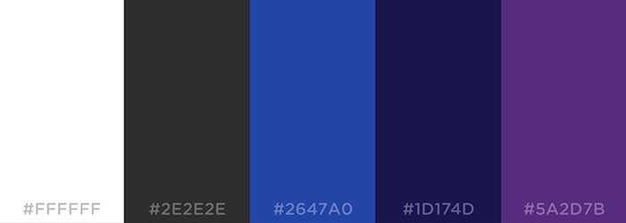
Triadic palette
How should I apply these colors to my design?
Of course, there are no set rules, and different designers might obtain very different results using the same colors, fonts and so on. This is only meant as a guide for getting started. In other words, if you have no clue whatsoever on what to do with your new color palette.
Let’s continue with our made up palette. Suppose we chose to use the complementary palette.
How can we apply it?
- White: can be used as a base/background color. Of course, you can use other light neutrals (like gray) for some backgrounds, or even a bright color from your palette, but in general, for legibility sake, you should probably have more white real estate in place.
- Black: Can be used for text. Again, you can have quotes or highlighted text in another color.
- Light blue: Pick a color that is very different from the text color but has a good contrast with the main background color. In this case, that color would be the light blue. This color will be perfect for hyperlinks. You want links to be distinguishable from your text, but readable.
- Blue: This is your main color, so it will probably set the tone for your design. You will probably use it for some backgrounds, buttons, graphs and so on.
- Orange: This would be your accent color. You could use it to add a touch of color to your design. Could be used on some buttons, miscellanea, icons, and graphs.
Ok, but what about consistency?
I like rules. Rules for me are what separate designing with a rationale/objective/justification from designing just what you feel like. So, when I was starting I would look for rules to use color. For example:
- Should all (primary) buttons have the same color?
- Should all clickable elements look the same?
- Should all clickable elements have the same color?
And so on. The truth is there is no rule (in this case). You could have (primary) buttons of different colors, and you could use the same color for clickable and non-clickable elements. Not all clickable elements need to look like links or buttons. Something that is necessary is that you clearly show which elements are clickable and which are not. You can achieve this by defining hover states.
Also, however you decide to design your UI elements, you need to make sure that you will keep the design consistent throughout the platform. To do this, you could create:
- A kitchen sink (if you manage HTML/CSS)
- A style guide
- Symbols in your design software (e.g. Sketch symbols). So whenever you need an element, you don’t create it from scratch, you just use an existing symbol. If you make a change on a symbol, this change will reflect on all instances of the symbol.
Practical uses of color
Color is not only meant to make your design attractive. It is also used to convey meaning. For example:
- You can use Red/yellow on warnings/notices.
- You can implement color coding (e.g. all content of X topic will have X color).
- You can show status (green could mean active, red inactive and so on).
This is great and it helps users understand and decode the information you’re showing them. However, you shouldn’t rely solely on color. Why? Because you need to consider color-blind users, who represent an 8% of the world’s population. For their sake, always try to include clear labels and/or icons to convey meaning, and use color to support this meaning.
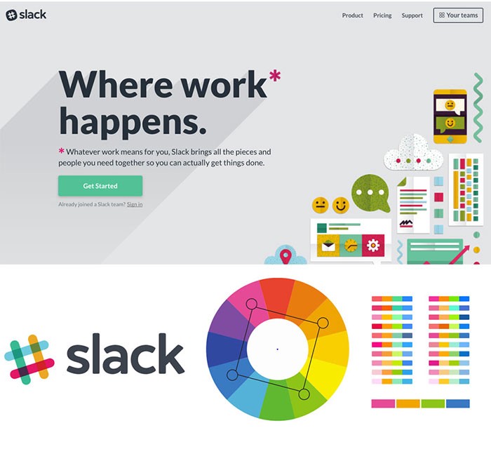
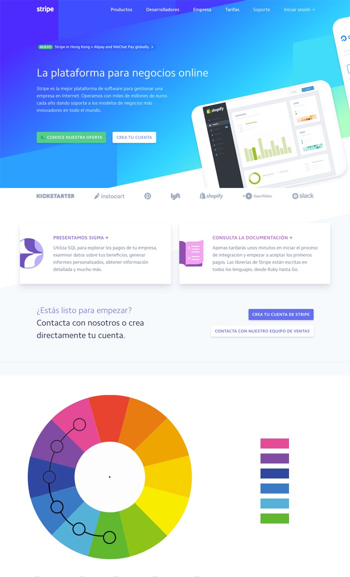
More complex palettes
Like we said before, you can have more complex palettes, with more colors. For example a square palette, or an analogous palette with a higher number of colors. It can work out perfectly, but as always, the decision to use more colors should be based on things like the objective of your website and its target audience. Let’s look at a couple of examples:
Slack
Stripe
Tools and resources
You’ve reached the end of this article, congratulations! (and thank you for reading). I hope you found this article helpful. We’ve covered a lot of ground, but in a summarized way (yes, it could have been longer).
Please find some tools and resources to work with color in web design below:
Choosing colors
Check contrast
- ContrastChecker
- ContrastFinder
- Color contrast tips and tools for accessibility with this contrast checker
Color-blindness
- ColorOracle: With one click see what people with common color vision impairments will see.
You can read more of my blog posts at uxagustina.com.