
Before now, making your website responsive was limited to resizing HTML elements with media queries. This was, and still is, a brilliant innovation for web development in general.
But web development has evolved with the advent of JavaScript frameworks—particularly with the use of components as building blocks in developing User Interfaces.
In the component-driven world we are living in, we can see the benefits of container queries in Responsive Web Design. In fact, in some cases, we can achieve a fully-responsive webpage without using media queries.
In this article, we will explore responsive design beyond the viewport with Container Queries and analyze an example of a fully responsive site using just container queries.
So, What are Container Queries?
Container queries allow you to style HTML elements based on the size of their containers. It is similar in execution to media queries, except elements are styled based on the size of a viewport with media queries.
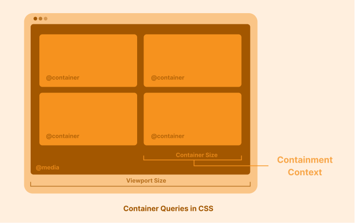 Image illustrating Container Queries in CSS
How to Use Container Queries
The containment context
To use container queries, you need to tell the browser which HTML element you wish to use as a container. We do this by declaring a “containment context”.
A containment context instructs the browser to start paying attention to the size of a container (or an element). This way, the browser knows when to apply the styles specified in your container query.
To declare a containment context, we use the container-type property with a value of size, inline-size, or normal. See the container-type API reference to understand what each of these values means.
Consider the following example of a soft drink card component below:
<div class="drink-card-container">
  <div class="drink-card">
    <img src="images/coke.png" alt="" />
    <div class="info">. . .</div>
   </div>
 </div>
We can then add a containment context to the container:
.drink-card-container {
  container-type: inline-size;
}
And now, the browser pays attention to the size of .drink-card-container. Although, we still need to apply specific styles based on this container size, so we need the @container at-rule.
The @container at-rule
The @container at-rule allows you to style elements based on the size of their container. The container condition is evaluated when the container changes in size. Also, the @container at-rule is what primarily defines a container query. It takes this form:
@container <container-condition> {
  <stylesheet>
}
It has a similar syntax to the @media at-rule in media queries.
Recall our soft drink card example. We can now add a @container at-rule that modifies the flex-direction of our .drink-card when the container’s size is less than or equal to 450px.
@container (max-width: 450px) {
  .drink-card-container .drink-card {
    flex-direction: column;
  }
}
And that’s it! That’s all you need to know to start using container queries.
The container-name property
Now that you know how container queries work, let's think about it at scale—what happens when we have multiple containers or containment contexts to work with?
This introduces the need for specificity when writing container queries, which is why the container-name property exists.
Let’s reconsider the example from our soft drink card component.
<div class="drink-card-container">
  <div class="drink-card">
    . . .
    <div class="info">
          <h3>Coke</h3>
      <p>On May 8, 1886, the first glass of Coke was sold.</p>
      <h5>₦ 150 <sup>estimated RRP</sup></h5>
      <a href="<https://www.coca-cola.com/>">See Official Website</a>
        </div>
   </div>
 </div>
We can then add a containment context to the .info element by giving it a container-type property, as we did earlier. But this time, we include a container-name property to give the container a specific identity.
.info {
  container-type: inline-size;
  container-name: drink-info;
}
Our container query will then take this shape:
@container drink-info (max-width: 200px) {
  .info p {
    display: none;
  }
}
The code above tracks the size of the .info container (named drink-info) and hides the paragraph element when the container’s size is less than or equal to 200px.
Source Code for a Responsive Site Using Only Container Queries
To access the complete source code where all of the snippets in this article were extracted, you can visit this GitHub repository.
Live Preview
You can see a live preview of the GitHub code here. To see the responsiveness in action, resize the browser window. Alternatively, you can interact with the codepen below.
Browser Compatibility for Container Queries
Container queries are available on all the major browser engines and are stable in all modern browsers. This means you can use it today for personal and work projects.
I hope this article helped you learn the basics of container queries. Now, you’re won't be confined to just using media queries—container queries are also a valid way to make your websites responsive.
I hope you found this article helpful. If you did, feel free to connect with me on LinkedIn and check out favourfelix.com to see what else I'm writing and up to.