

We are surrounded by gorgeous web applications. Sometimes I catch myself admiring visual effects on some website and wondering how they were made.
Well today I'll show you how you can create awesome CSS animations in React 18.
As always, we'll work on the real world example but we'll just focus on the animations only to avoid confusion. If you want to see the final results applied to a proper application, then don't worry. I've attached the source code of a pet project so feel free to play with it.
Before we start, I need to give you some context – I designed those animations for my 2048 Game in React. This game is a part of my online course on Udemy but I will tell you more about it at the end of this article.
You can find the source code on GitHub. Here's the final result of what we'll be creating:
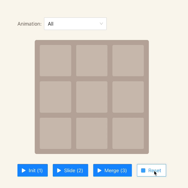 All animations of 2048-in-react
🛠️ Prerequisites**
Before we start, make sure you know some basics of React and CSS. It would be great if you are familiar CSS transitions but it isn't necessary. Actually I'm hoping this article will encourage you to go down that rabbit hole on your own. Believe me – nothing is more rewarding than users admiring your work.
Also, you don't need any tools, but if you want to run the example project on your computer, then you will need to install Node.js first.
🕹️ Quick Introduction
If you aren't familiar with the 2048 game, here's the gist: the player must combine tiles containing the same numbers until they reach the number 2048. The tiles can contain only numbers that represent a power of two starting from 2 – this means 2, 4, 8, 16, 32, and so on. The board has dimension of 4 x 4 tiles, so that it can fit up to 16 tiles.
Let me briefly show you what animations I prepared for the game's users:
The first animation is supposed to visualize the tile movement.
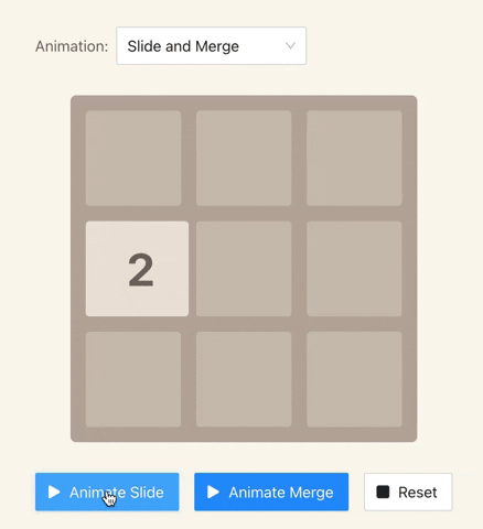 The "tile sliding" animation
The game would look janky if tiles disappeared and popped up in different places. CSS transitions help make the movement smooth for users.
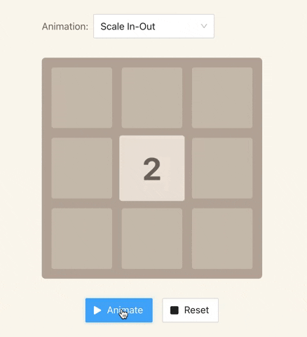
The second animation highlights tile creation and their merges.
 The "tile highlighting" animation
This animation helps users spot tiles that are changed after the movement.
I think that's all I need to tell you about the project. Let's get our hands dirty!
🌟 How to Create the Highlighting Animation
We'll start with the animation responsible for highlighting changes. I must admit I had a hard time to find a "beautiful" way to visualize it. The main objective was to bring the user's focus to tiles that changed their values or were created. I decided to rescale those tiles because it didn't want the animation to be too "intrusive".
So how is this going to work? First, we'll increase the size of the tile to 110%. Once the tile reaches 110% of its original size, we will downscale it back to 100%. The entire animation will last 0.2s (0.1s upscale, 0.1s downscale). I think that's enough to show the user's updated elements.
We can accomplish this animation using the following CSS transitions:
.tile {
  // ...
  transition-property: transform;
  transition-duration: 100ms;
  transform: scale(1);
}
Brief explanation of those CSS properties:
transition-property– defines the property on which the transition will be applied. In our case, we want to animate the transformation – the change of the element's size.transition-duration– defines transition duration. In our case – 0.1s.transform– this property allows us to rotate, scale, skew, or translate an element. Side note: thescale(1)means 100%, and we will use it as a default value.
The CSS transition is ready. Now we need to implement rescaling in React.
export default function Tile({ value }) {
  const [scale, setScale] = useState(1);

  const previousValue = usePreviousProps(value);
  const hasChanged = previousValue !== value;

  useEffect(() => {
    if (hasChanged) {
      setScale(1.1);
      setTimeout(
          () => setScale(1),
          100 /* 100ms == 0.1s */
      );
    }
  }, [hasChanged, setScale]);

  const style = {
    transform: `scale(${scale})`
  };

  return (
    <div className="tile" style={style}>
      {value}
    </div>
  );
};
Let me briefly explain this code:
- It sets the initial scale using the
useStatehook. By default, it's1to reflect 100% of the tile size. - We take advantage of the
usePreviousPropshook to retrieve the previous value of the tile. If the tile is freshly created, the previous value will beundefined. - The
useEffecthook plays a key role in our animation – it's checking if the tile's value has changed. If yes, it will scale it up to 110% and after 0.1s it will set it back to 100%. - The
styleconstant is used to inject inline CSS attributes into thedivelement.
And the result is the following:
 Tile creation (aka "hightlighting")
🛝 How to Create the Sliding Animation
The second animation is responsible for tile movements. I hope you agree with me that users might feel confused if they can't trace tiles moving across the board. After every move they would need to analyze the entire board again. It'd be a poor user-experience.
Let's think about how we can fix it. We could definitely take advantage of CSS properties responsible for positioning, such as left and top. If we follow this approach, we need to add a few additional CSS transitions. Let's do it.
.tile {
  position: absolute;
  // ...
  transition-property: left, top, transform;  // added: left, top
  transition-duration: 250ms, 250ms, 100ms; // added: 250ms, 250ms
  transform: scale(1);
}
Once we've declared the transitions, we can implement the logic responsible for tile movement.
export default function Tile({ value, position }) {
  // ...
  const boardWidthInPixels = 464;
  const tileCount = 4;

  const positionToPixels = (position) => {
    return (position / tileCount) * boardWidthInPixels;
  };

  const style = {
    top: positionToPixels(position[0]),
    left: positionToPixels(position[1]),
    transform: `scale(${scale})`
  };

  // ...
};
As you can see, the equation in the positionToPixels function needs to know the position of the tile, the total number of tiles per row and column, and the total board length in pixels (width or height – same, it is a square). The calculated value is passed down to the style constant which we passed down to the div element in the previous step.
The result is the following:
 Animation for tile movement
🏁 Summary
Adding CSS transitions into your React project may seem intimidating at first but it really isn't. As you can see, just a few lines of code significantly improved the user-experience of my game.
Keep in mind that while animations can indeed improve user experience, they can also ruin it. Always aim to find the right balance when you are applying them. It takes some practice, and that's why I hope this article encouraged you to experiment on your own.
The best way to learn is by practicing and learning from others. That's why you should check the source code on my 2048 Game on Github. Don't forget to give it a star 🌟 . It's the easiest way to bookmark it in your profile so you never lose it.
If this article helped you, please share it on your social media or give me a shout-out on Twitter. Thank you!
🏫 Would You Like to Build Your Own 2048 Game?
As I told you at the beginning, I created an online course on Udemy where I teach how to create a fully-functional 2048 Game in React 18. I'm giving 50% discount for freeCodeCamp readers. Just use the code 50DISCOUNT to enroll.
🧑🎓 Join my React 18 course on Udemy
What you'll learn:
- How to build 2048 game with React 18 and Next.js.
- Essential React hooks such as useState, useRef, useCallback, useEffect, and many more.
- Managing state using Reducer and React Context.
- How to create responsive mobile apps that support touch events (like mobile swiping).
- Integrate TypeScript into your React projects.
- Testing React apps.
I created this course because I believe programming should be fun and unleash creativity. Rather than build yet another TODO list or a shopping cart, let's create something that you can show to your friends or maybe even a hiring manager!