
By Paul Akinyemi
OTP inputs are one of the most fun components you can use in your app. They make the dry process of filling in yet another form a little more engaging.
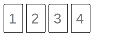
In this article, you’ll learn how to build an OTP input from scratch in Vue 3. By the end of the tutorial, you'll have built an OTP input that looks like this:

Here’s an overview of the steps the tutorial will follow:
- Project setup
- Building the Basics
- Adding functionality
- Finishing touches
- Conclusion
Prerequisites
To easily follow along with this tutorial, you should have the following:
- A basic understanding of Vue 3 and vanilla JavaScript
- Node.js 16+ installed on your machine
- A basic knowledge of CSS
What's an OTP Input?
In case you aren't familiar with the term, an OTP input is a form component for strings. Each character in the string is typed into a separate box, and the component switches between boxes as you type (as opposed to you needing to click into each box).
It's called an OTP input because they're usually used to let users type in an OTP (One Time Password) that they've received via some other channel, usually email or SMS.
Project Setup
This project won't use any external libraries, so all the setup you need is to create a Vue application with Vite.
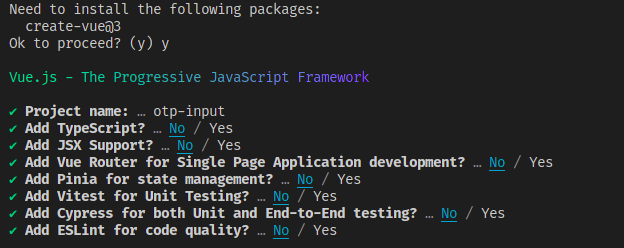
Create the Vue project by running the following in a terminal window:
npm init vue@3
If you haven’t installed create-vue on your device, this command will install it. Next, it will present a series of options to you. The options let you specify the project name and select which add-ons you want to include.
Call the project otp-input and don't select any add-ons, as shown below:
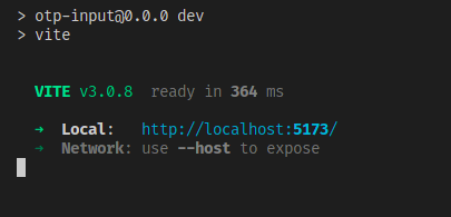
After you’ve done that, run:
cd otp-input
npm install
npm run dev
After the dev server starts up, you should see something like this in your terminal:
Open the URL Vite gives you in your browser, and let’s get to the fun stuff.
How to Build the Basics
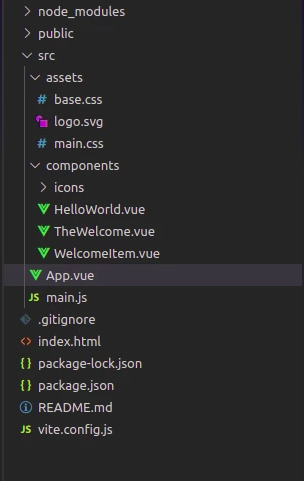
If you open the otp-input folder in your editor, it should have a file structure like this:
You’re going to adjust this setup to something more suitable. Start by opening src/App.vue and replacing its contents with this:
<template>
</template>

<script setup>

</script>

<style>

</style>
Next, select all the files inside src/components and delete them, and create a file inside components called OTP.vue. On Linux/Mac devices, you can do that by running the following in a new terminal window:
rm -rfv src/components
mkdir src/components
touch src/components/OTP.vue
Then, delete the src/assets folder, and remove the following line from src/main.js:
import './assets/main.css'
Next, open components/OTP.vue, and put the starting template for your OTP into it:
<template>
  <div ref="otpCont">
    <input
      type="text"
      class="digit-box"
      v-for="(el, ind) in digits"
      :key="el+ind"
      v-model="digits[ind]"
      :autofocus="ind === 0"
      :placeholder="ind+1"
      maxlength="1"
    >
  </div>
</template>
Let’s explain this.
The template starts with a container div that you've attached a ref to called otpCont. Inside the container, you have a text input with a v-for on it. The v-for will render one input for each element of a collection we called digits, and attach a two-way binding with the element of digits that shares its index.
The first rendered input will have the autofocus attribute, the placeholder for each input is its index plus one, and each input has a maximum length of one character.
Next is the script for the component. Place the following code into OTP.vue:
<script setup>
  import { ref, reactive } from 'vue';

  const props = defineProps({
    default: String,

    digitCount: {
      type: Number,
      required: true
    }
  });

  const digits = reactive([])

  if (props.default && props.default.length === props.digitCount) {
    for (let i =0; i < props.digitCount; i++) {
      digits[i] = props.default.charAt(i)
    }
  } else {
    for (let i =0; i < props.digitCount; i++) {
      digits[i] = null;
    }
  }

  const otpCont = ref(null)

</script>
After the import, this code defines two props: a required number digitCount that controls the number of inputs, and an optional string default.
Then, it creates the reactive digits array the template needs. If the default prop was provided and its length matches the digitCount prop, digits is initialized using the characters in default. If not the elements of digits are filled with null.
Finally, the code creates the otpCont reference from the template.
The last task for this section is to give the inputs a bit of styling. Put the following at the end of OTP.vue:
<style scoped>
.digit-box {
    height: 4rem;
    width: 2rem;
    border: 2px solid black;
    display: inline-block;
    border-radius: 5px;
    margin: 5px;
    padding: 15px;
    font-size: 3rem;
}

.digit-box:focus {
  outline: 3px solid black;
}

</style>
And that creates the basic form of your OTP.
Next, you’re going to edit the home page of your app to render the input. Replace the contents of src/App.vue with the following:
<template>
  <otp
    :digit-count="4"
  ></otp>

</template>

<script setup>
import otp from "./components/OTP.vue";
</script>
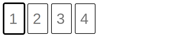
If you open the app in the browser, you should see the separate inputs rendered like this:
How to Add Functionality
Right now, you don’t really have an OTP input yet. You need to manually switch focus between fields, and there’s no validation. Next, you’ll write the logic to fix that.
Open components/OTP.vue, and add a keydown event handler to the input tag:
@keydown="handleKeyDown($event, ind)"
Now, create the handleKeyDown function at the end of the script setup section like so:
const handleKeyDown = function (event, index) {
    if (event.key !== "Tab" &&
        event.key !== "ArrowRight" &&
        event.key !== "ArrowLeft"
    ) {
      event.preventDefault();
    }

    if (event.key === "Backspace") {
      digits[index] = null;

      if (index != 0) {
        (otpCont.value.children)[index-1].focus();
      }

      return;
    }

    if ((new RegExp('^([0-9])$')).test(event.key)) {
      digits[index] = event.key;

      if (index != props.digitCount - 1) {
        (otpCont.value.children)[index+1].focus();
      }
    }
  }
Let’s break down this function. The event handler is called every time a key is pressed while one of the input fields is in focus.
If the pressed key isn’t tab or one of the horizontal arrow keys, the function will call preventDefault(), and move to the next if block.
If the pressed key was Backspace, the value of the digit array at the index of the target input will be set to null. Then if the target input wasn’t the first input, the code shifts focus to its previous sibling.
The last if block uses a regular expression to test if the pressed key was one of the digits 0 to 9. If it was, digits is updated appropriately, and focus is shifted to the next input.
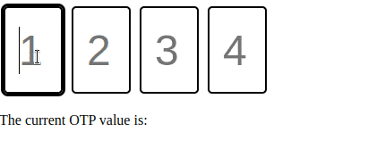
If you open the app in your browser now, you should see that the OTP input automatically shifts focus between the boxes. Also, it only accepts numbers as input, and you can use the tab key to navigate between boxes:
Add the Finishing Touches
The OTP input is now mostly complete, but it feels a little plain. Let’s add a last set of features:
- The input should emit the OTP value once all fields are filled.
- A small bounce animation should trigger when the user enters a value.
We’ll start with the logic for emitting the OTP value. First, you'll modify App.vue so it can display the emitted value. Replace the contents of App.vue with the following:
<template>
  <otp
    :digit-count="4"
    @update:otp="otpValue = $event"
  ></otp>

  <p>The current OTP value is: {{ otpValue }} </p>
</template>

<script setup>
import otp from "./components/OTP.vue";
import { ref } from "vue";

otpValue = ref('')
</script>
Not much has changed: you just created a reactive variable called otpValue, told the template to render it, and added an event listener to the OTP component to update otpValue.
Next, open components/OTP.vue and add the following code just before the handleKeyDown function:
const emit = defineEmits(['update:otp']);

const isDigitsFull = function () {
  for (const elem of digits) {
    if (elem == null || elem == undefined) {
      return false;
    }
  }

  return true;
}
This code defines the custom event update:otp, as well as a function isDigitsFull . isDigitsFull returns false if there’s any null value inside digits and true otherwise.
Add the following to handleKeyDown at the end of the last if block:
if (isDigitsFull()) {
  emit('update:otp', digits.join(''))
}
Each time a digit is pressed in an input box, this code calls the helper function isDigitsFull to determine if all the input boxes are filled.
If they are, it emits the update:otp event, combines the value of all input boxes to a single string, and sends it as the value of the event.
Your rendered page in the browser should now display the most recent (complete) OTP value:
Finally, you’ll add animation to your OTP input. Paste the following CSS at the end of the style tag in components/OTP.vue:
.bounce {
  animation: pulse .3s ease-in-out alternate;
}

@keyframes pulse {
  0% {
    transform: scale(1);
  }

  100% {
    transform: scale(1.1);
  }
}
And then add the following class binding to the input in the template:
:class="{bounce: digits[ind] !== null}"
And that’s the code for the animation! Here’s how it works:
- The bounce class for each input is tied to
digits[index] - If the value of
digits[index]changes, the expression is evaluated again - If the new value isn’t null, the bounce class gets applied
- If it’s null, the bounce class is removed
- If the value doesn’t change, the expression isn’t re-evaluated, so the animation doesn’t trigger.
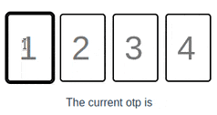
Here’s the final look of your OTP:
And you’re done!
Conclusion
In this tutorial, you learned how to build an OTP input from scratch in Vue 3. You can find the source code for this component here. I hope you enjoyed the read!
If you'd like to see more of my writing, you can follow me on Twitter.