By Manu Arora
Scroll-based animations are triggered when a user scrolls on a webpage. Recently, I built a Scroll Animation with Framer Motion that moves grids in uneven directions. This project prompted me to write a tutorial about how I did that here on freeCodeCamp.
The Framer Motion library makes it super easy to integrate animations into your React applications. With a few lines of code, you can achieve what might seem like a difficult task.
Today, we are going to build a scroll-triggered animation that rotates, translates, and scales a card (or a container) when the user scrolls.
What We're Building:
Here, as the user scrolls, three things are going to happen:
- The text
Unleash the power of Scroll Animationsmoves up a little bit. - The Frame (the black container which is holding the cards) rotates and aligns perfectly with the page.
- The cards inside the frame translate up a bit – providing a parallax effect.
All of these actions are achieved with the help of the scrollYProgress value from the useScroll() function from Framer Motion. The scrollYProgress value (more on this later) gives you the progress between 0 to 1, determining where the user currently is on the page.
Let's jump into the code and see how to implement this animation from scratch.
Prerequisites
For this demo, we are going to use:
- Next.js for writing our component
- Tailwind CSS for styling and CSS
- Framer Motion for animations
How to Setup the Project
Setting up the project is pretty simple. Here are the steps you should follow:
First, you'll need to install Next.js if you don't already have it.
Open your terminal and type the following command:
npx create-next-app@latest scroll-animation --typescript --eslint
This will initialize a Next.js application where you can go to the app directly for routes and the components folder to create your components.
We are going to keep it really simple for this demo and add the component in the components folder.
Next you'll need to install Tailwind CSS, which you can do like this:
npm install -D tailwindcss postcss autoprefixer
npx tailwindcss init -p
Now add Tailwind to your project by copying the following file contents into the tailwind.config.ts file which gets created after you run the above step:
tailwind.config.js

/** @type {import('tailwindcss').Config} */
module.exports = {
  content: [
    "./app/**/*.{js,ts,jsx,tsx,mdx}",
    "./pages/**/*.{js,ts,jsx,tsx,mdx}",
    "./components/**/*.{js,ts,jsx,tsx,mdx}",

    // Or if using `src` directory:
    "./src/**/*.{js,ts,jsx,tsx,mdx}",
  ],
  theme: {
    extend: {},
  },
  plugins: [],
}
Now add the following global styles in the globals.css file:
@tailwind base;
@tailwind components;
@tailwind utilities;
With these steps completed, you should be able to write the component and add it to your project seamlessly.
Now that we are done with the setup, let's deep dive into the component code that we are going to build.
How to Build the Scroll Component
There's essentially only one main component that we are going to work with. We are calling it Scroll, because why not? Here's the code:
export const Scroll = () => {
  return (
    <div className="flex flex-col bg-white h-screen w-screen">
      <ScrollCore />
    </div>
  );
};
export const ScrollCore = () => {
  return (
    <div className="h-[120vh] p-10 flex items-center justify-center relative ">
      <div
        className="py-40 w-full relative"
      >
        <Header />
        <Card />
      </div>
    </div>
  );
};

export const Header = () => {
  return (
    <div
      className="div max-w-5xl mx-auto text-center"
    >
      <h1 className="text-4xl font-semibold">
        Unleash the power of <br />{' '}
        <span className="text-5xl lg:text-6xl  font-bold mt-1 leading-none">
          Scroll Animations
        </span>
      </h1>
    </div>
  );
};

export const Card = () => {
    // Going to implement later in the blog
};
The Scroll components is the container which contains a ScrollCore component.
The ScrollCore component holds the Header and the Card components:
- The
Headeris the text component that translates to the top (as we saw in the preview - The
Cardcomponent is theFramethat we talked about earlier.
Both of these components are styles with Tailwind CSS. We give a class of h-screen and w-screen to the container, and we want the container to take the entire height and width of the screen.
How to Build the Card Component
The Card component is pretty basic (without the animation) since we are going to render multiple cards inside a container with grids from Tailwind CSS. Here's the code:
import {users} from './users';

export const Card = () => {
  return (
    <div
      style={{
        boxShadow:
          '0 0 #0000004d, 0 9px 20px #0000004a, 0 37px 37px #00000042, 0 84px 50px #00000026, 0 149px 60px #0000000a, 0 233px 65px #00000003',
      }}
      className="max-w-5xl -mt-12 mx-auto h-[30rem] md:h-[40rem] w-full border-4 border-[#6C6C6C] p-6 bg-[#222222] rounded-[30px] shadow-2xl"
    >
      <div className="bg-gray-100 h-full w-full rounded-2xl grid grid-cols-2 md:grid-cols-4 gap-4 overflow-hidden p-4">
        {users.map((user, idx) => (
          <div
            key={`user-${idx}`}
            className="bg-white rounded-md cursor-pointer relative"
          >
            <div className="absolute top-2 right-2 rounded-full text-xs font-bold bg-white px-2 py-1">
              {user.badge}
            </div>
            <img
              src={user.image}
              className="rounded-tr-md rounded-tl-md text-sm "
            />
            <div className="p-4">
              <h1 className="font-semibold text-sm ">{user.name}</h1>
              <h2 className=" text-gray-500 text-xs ">{user.designation}</h2>
            </div>
          </div>
        ))}
      </div>
    </div>
  );
};
Here, we are giving a box shadow which I have taken from Box shadows for Tailwind CSS. Also we are giving it a background of #22222. In tailwind, we can use arbitrary values using the [] notation. For example, we have given the class bg-[#22222] for the background.
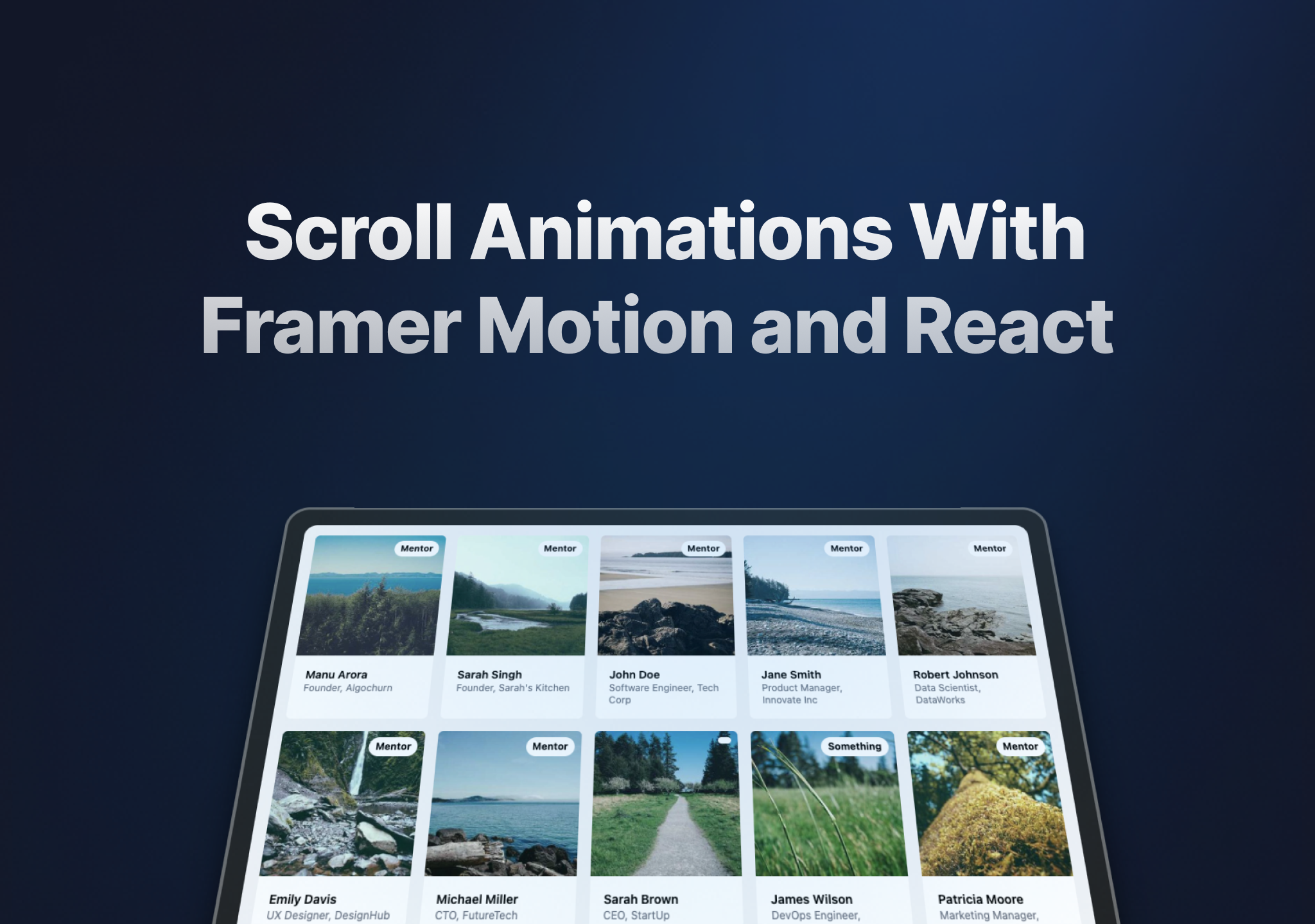
We are also using a users array to render out a list of users. The user array looks something like this:
export const users = [
  {
    name: 'Manu Arora',
    designation: 'Founder, Algochurn',
    image: 'https://picsum.photos/id/10/300/300',
    badge: 'Mentor',
  },
  {
    name: 'Sarah Singh',
    designation: "Founder, Sarah's Kitchen",
    image: 'https://picsum.photos/id/11/300/300',
    badge: 'Mentor',
  },
  // Rest of the users...
];
Here, we are rendering out the user's name, designation, image, and badge.
Now we're done with the basic cards and header design, so we can move on to animating these using Framer Motion.
How to Add the Animation Functions
Framer Motion provides helpful functions that you can use to animate anything on a webpage. Some of the use cases of these animations might be:
- Animate when the user drags and drops
- Animate when the user scrolls
- Animate when the user clicks or hovers
- Animate on page load
In this demo, we want to animate on scroll. For that, we can use the useScroll() function provided by Framer Motion.
To animate using scroll, we are going to:
- Get
scrollYProgressfromuseScroll()method - Use the
useTransformhook to transformscrollYProgressvalues - Use the transformed values to animate our cards.
Let's take a look at the code snippet for the same:
import { useScroll, useTransform, motion } from 'framer-motion';

import { users } from './users';

export const Scroll = () => {
  return (
    <div className="flex flex-col bg-white h-screen w-screen">
      <ScrollCore />
    </div>
  );
};
export const ScrollCore = () => {
  const { scrollYProgress } = useScroll();

  const rotate = useTransform(scrollYProgress, [0, 1], [20, 0]);
  const scale = useTransform(scrollYProgress, [0, 1], [1.05, 1]);
  const translate = useTransform(scrollYProgress, [0, 1], [0, -100]);

  return (
    <div className="h-[120vh] transform scale-[0.8] p-10 flex items-center justify-center relative ">
      <div
        className="py-40 w-full relative"
        style={{
          perspective: '1000px',
        }}
      >
        <Header />
        <Card />
      </div>
    </div>
  );
};
// rest of the code
Let's break down what's happening in the code:
We are using the scrollYProgress value from the useScroll() function. This scrollYProgress is a motion value which we can use with motion.div from Framer Motion to animate various CSS properties. The CSS properties we are going to animate are rotate, scale and translate.
We combine these scrollYProgress values with another hook from framer-motion which is useTransform.
The useTransform hook is responsible from converting one value to another. For example, if we want to rotate the card from 45 degrees to 90 degrees when the user scrolls from the top of the page to bottom of the page, we could use something like this:
const rotate = useTransform(scrollYProgress, [0, 1], [45, 90]);
This rotate value can now be passed to the style tag of a motion.div element. Remember that a regular a div cannot be used here since rotate is a MOTION VALUE and should be used with a motion.div element.
Similarly, we are going to add all the values for rotate, scale and translate like this:
const rotate = useTransform(scrollYProgress, [0, 1], [20, 0]);
const scale = useTransform(scrollYProgress, [0, 1], [1.05, 1]);
const translate = useTransform(scrollYProgress, [0, 1], [0, -100]);
Here:
- When a user scrolls from top to bottom (0 is starting, 1 is ending, meaning the user has scrolled from top to bottom), we want to rotate the card from 20 degrees to 0 degrees. But here's a catch: we also specify the
perspectiveproperty and set it to800pxso that it gives a 3D effect. - We want the scale to go from
1.05to1when the user scrolls. - And finally we want to translate the cards from 0 to -100 px in the Y direction (later on how we are going to animate the Y direction).
Now that we have all the animations setup, we just need to pass these values to the components' style tags and get the animations working.
How to Add the Animations
We saw earlier how we use the useScroll() hook to get scroll progress and get the rotate, scale and translate values (these values are called motion values, because they can only be used with a motion.div block). Now it's time to actually use these values within our component.
We can do this by passing down the rotate, scale and translate values to the Header and Card component and using them in their respective style tags.
Let's have a look at the code snippet to understand it better:
import { useScroll, useTransform, motion } from 'framer-motion';

import { users } from './users';

export const Scroll = () => {
  return (
    <div className="flex flex-col bg-white h-screen w-screen">
      <ScrollCore />
    </div>
  );
};
export const ScrollCore = () => {
  const { scrollYProgress } = useScroll();

  const rotate = useTransform(scrollYProgress, [0, 1], [20, 0]);
  const scale = useTransform(scrollYProgress, [0, 1], [1.05, 1]);
  const translate = useTransform(scrollYProgress, [0, 1], [0, -100]);

  return (
    <div className="h-[120vh] transform scale-[0.8] p-10 flex items-center justify-center relative ">
      <div
        className="py-40 w-full relative"
        style={{
          perspective: '1000px',
        }}
      >
        <Header translate={translate} />
        <Card rotate={rotate} translate={translate} scale={scale} />
      </div>
    </div>
  );
};
// rest of the code
Here, we are passing down the translate, rotate, and scale values inside the components:
<Header translate={translate} />
<Card rotate={rotate} translate={translate} scale={scale} />
- For
Header, we only want to translate the text from bottom to top a bit (sort of giving a parallax effect) - For
Card, we want to do a bit more with rotation and translation.
Here's the code for the Header component:
export const Header = ({ translate }: any) => {
  return (
    <motion.div
      style={{
        translateY: translate,
      }}
      className="div max-w-5xl mx-auto text-center"
    >
      <h1 className="text-4xl font-semibold">
        Unleash the power of <br />{' '}
        <span className="text-5xl lg:text-6xl  font-bold mt-1 leading-none">
          Scroll Animations
        </span>
      </h1>
    </motion.div>
  );
};
Here, we converted the div to motion.div so that it can accept motion values.
We also animated the translateY property given by Framer Motion and added the translate value. Remember, translate goes from 0 to -100.
And that is it to animate the text. Essentially for the Header component, we have written just three lines of code to animate it. Pretty cool, huh?
Here's the code for the Card component:
export const Card = ({
  rotate,
  scale,
  translate,
}: {
  rotate: any;
  scale: any;
  translate: any;
}) => {
  return (
    <motion.div
      style={{
        rotateX: rotate, // rotate in X-axis
        scale,
        boxShadow:
          '0 0 #0000004d, 0 9px 20px #0000004a, 0 37px 37px #00000042, 0 84px 50px #00000026, 0 149px 60px #0000000a, 0 233px 65px #00000003',
      }}
      className="max-w-5xl -mt-12 mx-auto h-[30rem] md:h-[40rem] w-full border-4 border-[#6C6C6C] p-6 bg-[#222222] rounded-[30px] shadow-2xl"
    >
      <div className="bg-gray-100 h-full w-full rounded-2xl grid grid-cols-2 md:grid-cols-4 gap-4 overflow-hidden p-4">
        {users.map((user, idx) => (
          <motion.div
            key={`user-${idx}`}
            className="bg-white rounded-md cursor-pointer relative"
            style={{ translateY: translate }}
            whileHover={{
              boxShadow:
                '0 20px 25px -5px rgb(0 0 0 / 0.1), 0 8px 10px -6px rgb(0 0 0 / 0.1)',
            }}
          >
            <div className="absolute top-2 right-2 rounded-full text-xs font-bold bg-white px-2 py-1">
              {user.badge}
            </div>
            <img
              src={user.image}
              className="rounded-tr-md rounded-tl-md text-sm "
            />
            <div className="p-4">
              <h1 className="font-semibold text-sm ">{user.name}</h1>
              <h2 className=" text-gray-500 text-xs ">{user.designation}</h2>
            </div>
          </motion.div>
        ))}
      </div>
    </motion.div>
  );
};
This is the same code as before with just one difference: the div is now converted to a motion.div to accept values wherever required. Here, we want the cards inside of the container to translate, and the entire card itself to rotate.
From the code above, let's look at this part closely:
<motion.div
      style={{
        rotateX: rotate, // rotate in X-axis
        scale,
        boxShadow:
          '0 0 #0000004d, 0 9px 20px #0000004a, 0 37px 37px #00000042, 0 84px 50px #00000026, 0 149px 60px #0000000a, 0 233px 65px #00000003',
      }}
      className="max-w-5xl -mt-12 mx-auto h-[30rem] md:h-[40rem] w-full border-4 border-[#6C6C6C] p-6 bg-[#222222] rounded-[30px] shadow-2xl"
    >
    // rest of the code...
</motion.div>
Here, we want to:
rotateXso that it goes from giving an illusion of lying flat on the screen to standing straight. (Remember, as the user scrolls, the value goes from20degto0deg.)- The
scaleof the container (or the frame) is also animated to go from1.05to1.
Let's look at the cards inside this frame now:
{users.map((user, idx) => (
          <motion.div
            key={`user-${idx}`}
            className="bg-white rounded-md cursor-pointer relative"
            style={{ translateY: translate }}
            whileHover={{
              boxShadow:
                '0 20px 25px -5px rgb(0 0 0 / 0.1), 0 8px 10px -6px rgb(0 0 0 / 0.1)',
            }}
          >
            <div className="absolute top-2 right-2 rounded-full text-xs font-bold bg-white px-2 py-1">
              {user.badge}
            </div>
            <img
              src={user.image}
              className="rounded-tr-md rounded-tl-md text-sm "
            />
            <div className="p-4">
              <h1 className="font-semibold text-sm ">{user.name}</h1>
              <h2 className=" text-gray-500 text-xs ">{user.designation}</h2>
            </div>
          </motion.div>
        ))}
Here, the translateY property is animated and the div is converted to a motion.div.
And that's it. That's all it takes to animate on scroll using Framer Motion.
Conclusion
In this tutorial, you learned how to animate using Framer Motion. Essentially, we looked at two core functions:
useScroll()useTransform()
There are other functions you can use which can help you achieve your animation goals. But I believe Framer Motion is a really simple animation API to work with, given its intuitive functions and ease of use.
Here's the complete source code for the demo.
I've created various other demos like this Parallax Effect Using Tailwind CSS and Framer Motion which essentially uses the same pattern that we discussed in this guide.
If you liked this demo and want me to create more of these cool Tailwind CSS and Framer motion components, let me know on Twitter and I'd be more than happy to work on it. :)
Happy coding ✨