By Krist Wongsuphasawat
In the past year, the grid map style visualization has gained a lot of popularity in the US [2,4]. It has a quite a few nice properties, which inspired me to create one for Thailand.
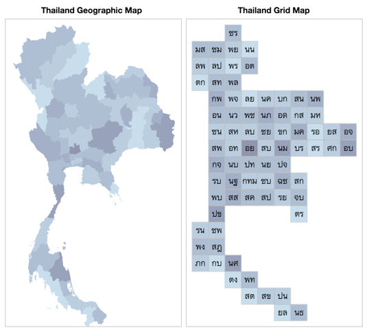
The rest of this article will explain grid maps, and how I created the grid map for Thailand map you see above.
But if you are interested in using the map already without reading the details of how to create one yourself, jump straight to my gridmap-layout-thailand github repository.
What is a Grid Map, and what are its properties?
In a grid map, each region is represented as a tile of the equal shape and size. The tiles are placed to fit within a grid at positions that approximate real geographic position. If the tile is a square, the grid is rectangular. If the tile is a hexagon, then the grid is like a honeycomb. See the US maps below:
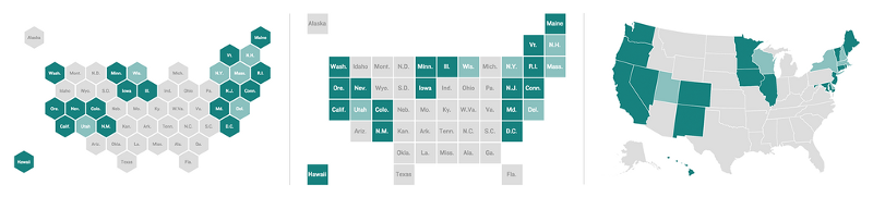 _Maps of the US: (left) Hexagon Tile Grid Map (center) Square Tile Grid Map (right) Geographic Map. Source: [NPR Blog](http://blog.apps.npr.org/2015/05/11/hex-tile-maps.html" rel="noopener" target="blank" title=")
Most of grid map visualizations are choropleth maps that use colors to encode values, such as amount of rainfall, average population age, or political alignment. Creating choropleth maps from geographic maps has some disadvantages, because the different sizes of each region introduce biases while interpreting the results. Also, many small regions are often too small to be notice on a map.
Pros: grid maps do not introduce biases due to different sizes of the regions, making it an interesting choice when creating a choropleth map. Small regions are now guaranteed to be big enough to be seen. It’s also easier to implement and faster to load than a geographic map.
Cons: The positions of the regions are only approximations, and could be inaccurate. For example, some adjacent regions may not appear adjacent on the grid map. It also distorts the distance between regions.
Creating Grid Map for Thailand
Here are the requirements:
- The overall map still looks similar to the geographical shape of Thailand. The neighboring regions should appear adjacent or close by.
- Use square tiles for ease of curation and application. For example, this map can be drawn in Excel [3] or Google Sheets easily.
- The map does not have any holes in the middle to avoid confusion.
Of course, the most straightforward approach to create this map is to draw the map manually from scratch. However, I would like to save some energy with a semi-automatic approach:
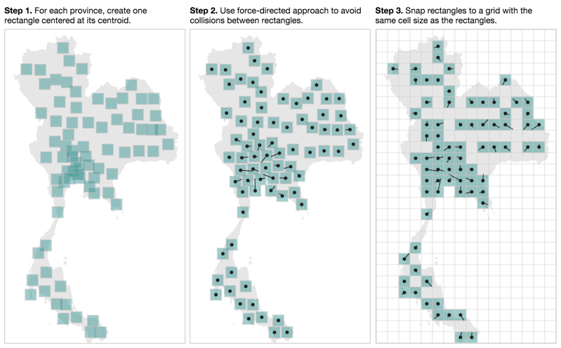
- For each province, create one rectangle centered at its centroid.
- Use a force-directed simulation to detect collisions between rectangles and remove overlaps. Each rectangle has its own center of gravity at the centroid of its province (multi-foci force-directed layout). The solid lines in the figure below show displacements of the rectangles from their ideal positions.
- Snap the rectangles to a rectangular grid.
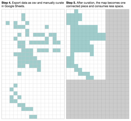
- Export results from Step 3 as CSV file and manually curate in Google Sheets or Excel. The goal of this step is to remove unnecessary gaps, connect the map into one contiguous piece, and adjust the positions of some provinces.
- Done! The new map only requires 40% of the original space.
Usage
The output from this process can be used as JS, CSV or JSON files. Please see gridmap-layout-thailand on GitHub for instructions. The code I used for steps 1–5 above are also in that repo.
Lastly, this method still depends a lot on manual curation at the end, which may not produce the best optimization. If you have any suggestions or would like to recommend a better approach, the comment box below is yours. :)
References
[1] Mike Bostock. “Multi-Foci Force Layout” bl.ocks.org Published 11 February 2012
[2] Danny DeBelius. “Let’s Tesselate: Hexagons For Tile Grid Maps” NPR Blog. Published 11 May 2015
[3] Caitlin Dempsey Morais. “How to Make a Tile Grid Map Using Excel” GIS Lounge. Published 10 November 2015
[4] Nathan Yau. “The Great Grid Map Debate of 2015” Flowing Data. Published 12 May 2015