
What a user sees on a website will impact how good their user experience is. It will also affect how easily they can use the whole site in general.
Adding images to the background of certain parts of a website is often more visually appealing and interesting than just changing the background-color.
Modern browsers support a variety of image file types like .jpg, .png, .gif, and .svg.
This article explains how to add images to your HTML code and how to then fine-tune them to look better.
Background Image Syntax
The first step is to make sure you create an assets directory (folder) to hold the images you want to use in your project.
For example we can create an images folder in the project we are working on and add an image called sunset.png that we want to use.
The background-image CSS property allows you to then place the image behind any HTML element you wish.
This could either be the whole page (by using the body selector in CSS which targets the <body> element in our HTML), or just a standalone specific part of the page such as a section element like in the example below.
To add a background-image to a section tag in your .css file, write the following code:
section {
     background-image: url("images/sunset.png");
        }
Let's discuss what's going on here in detail:
sectionspecifies the tag you want to add the image to.url()is used to tell CSS where our image is located.- Inside the parentheses,
"images/sunset.png"is the path to the image. This lets the browser know what URL to pull. - The path in this example is called a
relativepath which means it is a local file, relative to our project and to our current working directory and is not a web address. To add images we can also use anabsolutepath, which is a full web address and starts with a domain URL (http://www.). - Using quotes is a good habit but we can omit them, so
background-image: url(images/sunset.png)works the same. - Don't forget the semicolon!
How to Stop Background Repeat
When you apply a background image to an element, by default it will repeat itself.
If the image is smaller than the tag of which it's the background, it will repeat in order to fill in the tag.
How do we stop this from happening?
The background-repeat property takes in 4 values and we are able to change the direction in which the image repeats, or stop the image from repeating itself all together.
section {
    background-repeat: repeat;
        }
This is the default value if we don't give the background-repeat property a value. In this case the image is repeated both horizontally and vertically so in both x-direction and y-direction respectively until it fills the space.
section {
    background-repeat: no-repeat;
        }

The no-repeat value stops the image from repeating itself from all directions. The image is only shown once.
section {
    background-repeat: repeat-y;
        }
This value repeats the image only horizontally on the page. The image is repeated across the page, in the x-direction. The x-direction in math is from the left to the right.
section {
    background-repeat: repeat-y;
        }
This value repeats the image only vertically on the page. The image is repeated down the page ,in the y-direction. The y-direction in math is from top to bottom.
How to Set Background Position
After adding a background image and stopping it from repeating, we are able to further control how it looks within the background of the tag by improving its position.
We'll use the background-position property to do this.
The selector takes in two values. The first one is for the horizontal position, or x-direction (how far across the tag). The second one is for the vertical position, or y-direction (how far down the tag).
The values can be units, like a pair of pixels:
section {
    background-position: 20px 30px;
        }
This will move the image 20px across and 30px down the containing tag.
Instead of pixels we can use a set of keywords like right, left, top, down, or center to place the image at the right, left, top, down, or center of the tag.
section {
    background-position: right center;
        }
This places the image at the right hand side of the center of the tag.
If we wanted to center it both horizontally and vertically, we would do the following:
section {
    background-position: center center;
        }
To position an image with finer detail, it is worth mentioning that we can use percentages.
section {
    background-position: 20% 40%;
        }
This positions the image 20% across the tag and 40% down the tag.
So far we have seen values used in combination, but we can also just specify one value like background-position: 20px; or background-position: center; or background-position: 20%;, which applies it to both directions.
How to Resize a Background Image
To control the size of the background image we can use the background-size property.
Again, like the previous properties mentioned, it takes in two values. One for the horizontal (x) size and one for the vertical (y) size.
We can use pixels, like so:
section {
    background-size: 20px 40px;
    /* sizes the image 20px across and 40px down the page */
        }
If we do not know the exact width of the container we are storing the image in, there is a set of specific values we can give the property.
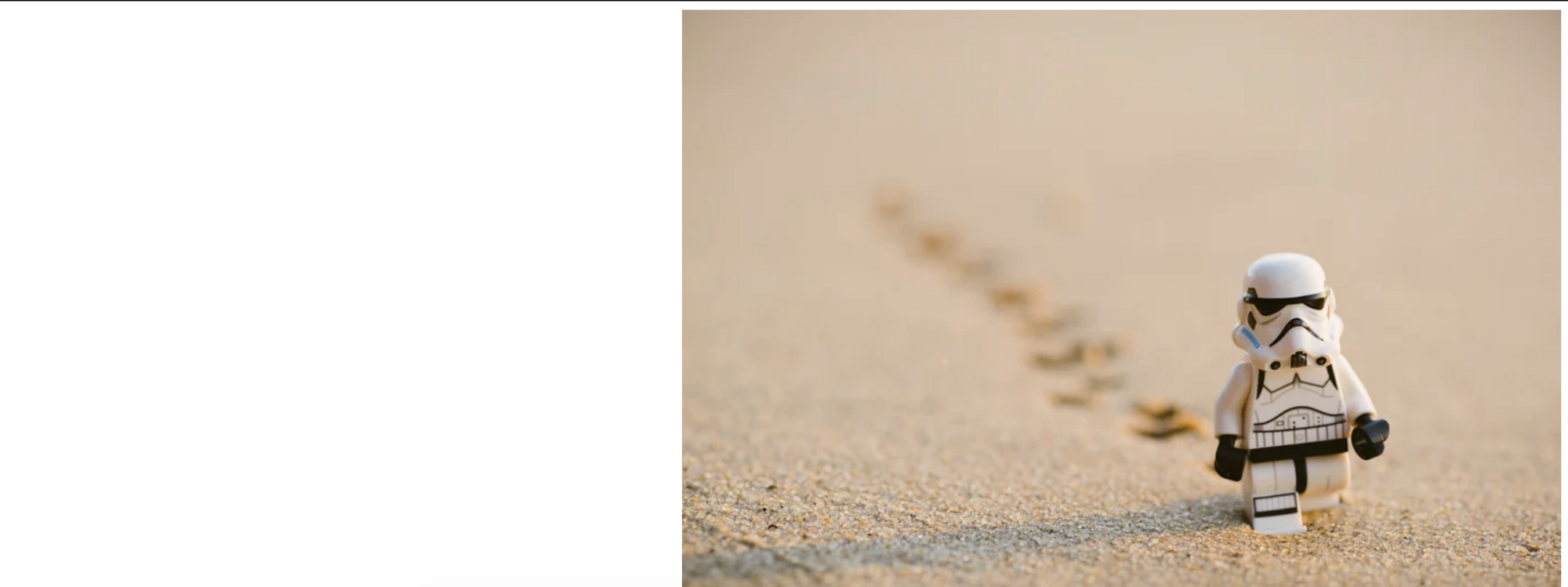
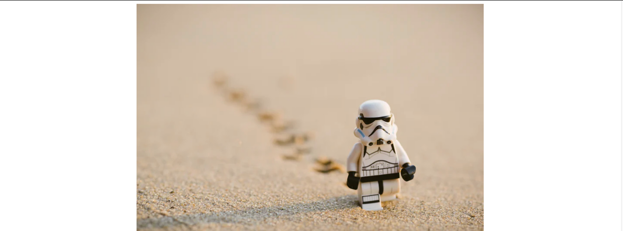
background-size: cover;resizes the background image so it covers up the whole tag's background space no matter the width of the tag. If the image is too big and has a larger ratio to the tag it is in, this means the image will get stretched and therefore cropped at its edges.background-size: contain;contains the image, as the name suggests. It will make sure the whole image is shown in the background without cropping out any of it. If the image is much smaller than the tag there will be space left empty which will make it repeat to fill it up, so we can use thebackground-repeat: no-repeat;rule we mentioned earlier.
The rule background-size:cover; in this case will crop of parts of the image
When we change it to background-size:contain; we see that the image shrinks to fit the section tag.
How to Use the Background Attachment Property
With the background-attachment property we can control where the background image is attached, meaning if the image is fixed or not to the browser.
The default value is background-attachment: scroll;, where the background image stays with its tag and follows the natural flow of the page by scrolling up and down as we scroll up and down.
The second value the property can have is background-attachement: fixed;.
This makes the background image stay in the same postion, fixed to the page and fixed on the browser's viewport. This creates a parallax effect which you can see an example of here:
See the Pen by Dionysia Lemonaki (@deniselemonaki) on CodePen.
Background Gradients
A different use case for the background-image property is for telling the browser to create a gradient.
The background-image in this case does not have a URL, but a linear-gradient instead.
The simplest way to do this is to specify the angle. This controls the direction of the gradient and how to colors will blend. Lastly add two colors that you want blended together in a gradient for the tag's background.
A gradient that goes from top to bottom and from black to white is:
 section {
     background-image: linear-gradient(black,white);
         }
The most common degrees used for gradients are:
0degfrom top to bottom90degfrom left to right180degfrom bottom to top270degfrom right to left
The above degrees each correspond with to top, to right, to bottom and to left, respectively.
section{
  background-image: linear-gradient(to left,pink,orange);
        }
See the Pen by Dionysia Lemonaki (@deniselemonaki) on CodePen.
Instead of keyword colors we can use hex colors to be more particular and have a wider range of options:
section{
  background-image: linear-gradient(to left,#42275a, #734b6d)
      }
See the Pen by Dionysia Lemonaki (@deniselemonaki) on CodePen.
We can also include more than two colors in a gradient, creating different affects and color schemes.
Conclusion
This marks the end of our introduction to the basic syntax of the background-image property.
From here the possibilities are endless and leave room for a lot of creative expression. These effects help the user have a pleasant experience when visiting your website.
I hope this was helpful, and thank you for reading.
Have fun with your designs and happy coding!