

In CSS, everything is a box. And each box – whether it's text, an image, a div, a span, or any other element – has a border that separates its edges from other boxes around it.
The CSS border property allows us to do several things with the border of individual boxes. Getting familiar with this property can really help you debug more effectively and design your web pages more beautifully.
In this tutorial, we will look at CSS's border property in detail. This will help you get comfortable with it and start using it in your next coding project.
What is the CSS border property?
border is not all the border property entails – though it is important to note that it’s a very useful shorthand, which we will get to later in this tutorial.
So, in addition there are the border-width, border-style, border-color, and border-radius sub-properties. Let's take a look at each of them one by one.
CSS border-width property
You use the border-width property to specify the width of a border. The value is commonly expressed in pixels (px), but it can be expressed in rem, em, and percentage (%).
And it doesn’t end there – this property also takes thin, medium, and thick as values.
The border-width property is a shorthand for border-top-width, border-right-width, border-bottom-width and border-left-width, moving in a clockwise direction. So, if you want, you can apply different width values to the border-top, border-right, border-bottom, and border-right.
CSS border-style property
With the border-style property, you get access to different styles you can apply to the border of a box. It takes none (the default), solid, dashed, dotted, double, groove, ridge, inset, and outset.
Just like border-width, border-style is a shorthand for border-top-style, border-right-style, border-bottom-style and border-left-style. So again, you can specify different values for the properties if you don’t want to use the shorthand.
CSS border-color property
The border-color property lets you specify different colors for your border. You can specify this color with named, RGB, and HSL colors – there are no limits.
Black is the default color for this property. So if you don’t specify a value for it, black is automatically set as long as you have the border-width and border-style set to some values.
As it goes with border-width and border-style, you can also specify different colors on all the sides of the border. So, border-color is a shorthand for border-top-color, border-right-color, border-bottom-color, and border-left-color.
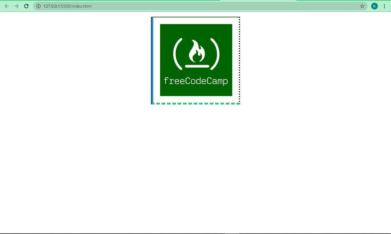
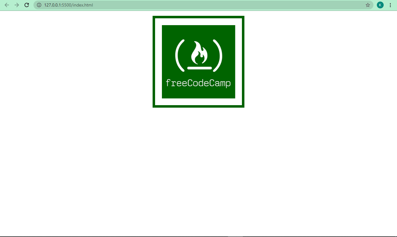
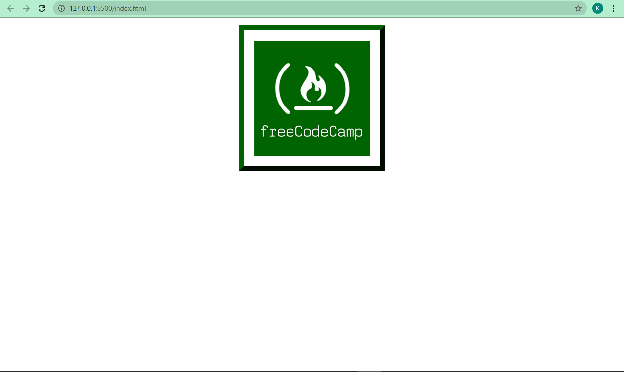
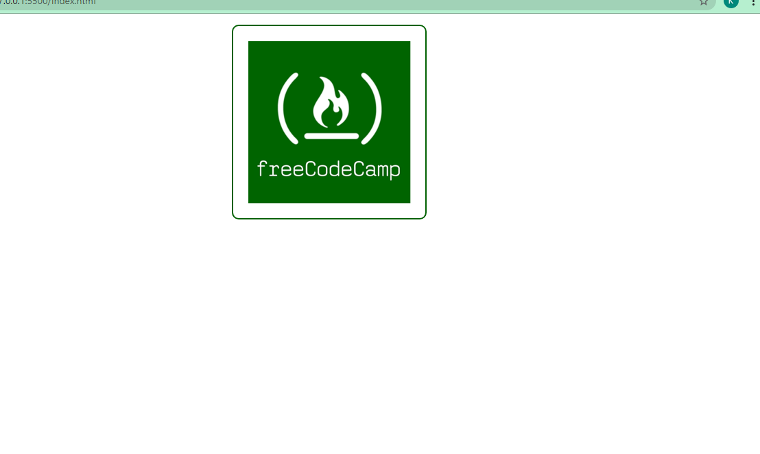
Below are snippets of code and their respective screenshots showing the three sub-properties of border in action:
<img src="freecodecamp.png" alt="freecodecamp-img" />
img {
      display: block;
      margin: 0 auto;
      margin-top: 1rem;
    }

    img {
      border-top-width: 2px;
      border-right-width: 4px;
      border-bottom-width: 6px;
      border-left-width: 8px;
      border-top-style: solid;
      border-right-style: dotted;
      border-bottom-style: dashed;
      border-left-style: groove;
      border-top-color: #006100;
      border-right-color: #050116;
      border-bottom-color: #2ecc71;
      border-left-color: #3498db;
    }
img {
      display: block;
      margin: 0 auto;
      margin-top: 1rem;
    }

img {
      border-width: 8px;
      border-style: solid;
      border-color: #006100;
    }
 img {
      border-width: 10px;
      border-style: outset;
      border-color: #006100;
    }
You can play around with the sub-properties to get a better understanding of how they work.
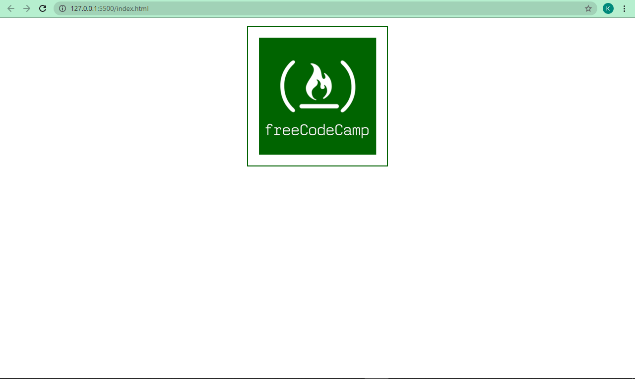
The border shorthand
We’ve applied the border sub-properties (border-width, border-style, and border-color) one by one, but they can be applied together with the border shorthand.
This shorthand is useful especially when you want all four sides to be the same like I have done below:
img {
      border: 2px solid #006100;
    }
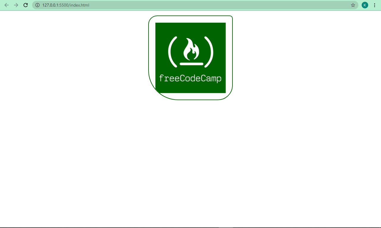
CSS border-radius property
With border-radius, you can remove sharp edges from the borders in order to make them into rounded corners. I think this makes them more beautiful, too.
The value is specified in pixels (px), and percentage (%) too, depending on how you prefer it.
img {
      border: 2px solid #006100;
      border-radius: 10px;
    }
If you want to, you can also specify a different radius for the top, left, bottom and right edges of the border with border-top-right-radius, border-top-left-radius, border-bottom-right-radius and border-bottom-left-radius. This is because border-radius is also a shorthand for those four sub-properties.
We can apply some radii to our borders too:
img {
      border: 2px solid #006100;
      border-top-right-radius: 10px;
      border-top-left-radius: 30px;
      border-bottom-right-radius: 50px;
      border-bottom-left-radius: 100px;
    }
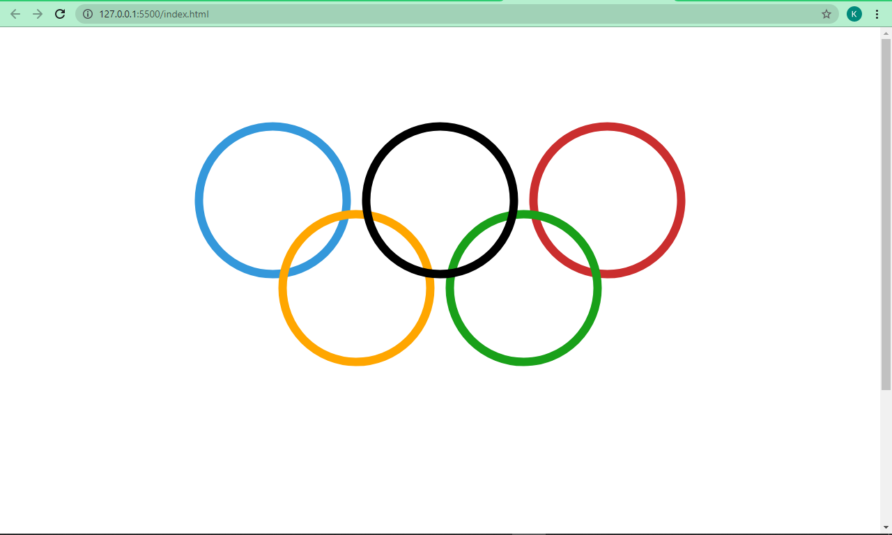
A small project: How to Use the CSS border Property to Make the Olympic Rings
We can take what we’ve learned about the border property and combine it with CSS Positioning and Flexbox to make the Olympic Rings.
    <section class="container">
      <section class="top">
        <div class="red"></div>
        <div class="black"></div>
        <div class="blue"></div>
      </section>

      <section class="bottom">
        <div class="green"></div>
        <div class="yellow"></div>
      </section>
    </section>
div {
      height: 12.5rem;
      width: 12.5rem;
      border: 12px solid;
      border-radius: 50%;
      margin: 1rem;
    }

    .blue {
      color: #3498db;
    }

    .black {
      color: black;
      position: relative;
      z-index: 1000;
    }

    .red {
      color: #ca2e2e;
    }

    .yellow {
      color: #ffa600;
    }

    .green {
      color: #19a019;
    }

    .container {
      display: flex;
      align-items: center;
      justify-content: center;
      transform: rotate(90deg);
    }

    .bottom {
      position: relative;
      right: 8.125rem;
    }

    @media screen and (max-width: 750px) {
      div {
        width: 130px;
        height: 130px;
      }

      .bottom {
        right: 7rem;
      }
    }
So what's going on in this code?
The Olympic Rings have 5 circles – 3 at the top and 2 at the bottom – with colors blue, black, red, yellow, and green, respectively.
To make a circle with the border-radius property, we set the width and height to 12.5rem each, then the border-radius itself to 50%. This is how you make a circle with CSS.
We placed the top and bottom rings in a parent container, so we're able to place them one on top of each other with CSS Flexbox. But that didn’t complete the job, so we used the transform property of CSS animation to get it done.
Finally, we made some little tweaks with CSS Positioning to get the rings interlocked.
In the end, we get the result below:
Conclusion
I hope this tutorial helps you get up and running with the CSS border property so you can make effective use of it in your projects.
Thanks a lot for reading and have a good time.