

Today we're gonna learn how to use the CSS box model with examples. This will help you make pixel perfect websites and will teach you to use the box-sizing, margin, padding, and border properties more accurately.
We're also going to see some practical use cases for these properties. Let's get started 💖
Table of Contents
- Why learn CSS Box Model?
- CSS Box-Model Diagram
- The Padding Property
- The Border Property
- The Margin Property
- The box-sizing Property.
- Content-box VS Border-box
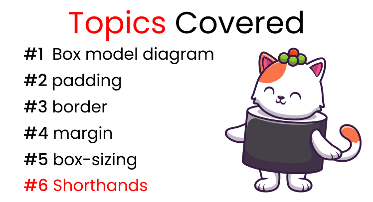 Topics covered
You can watch this tutorial on YouTube as well if you like:
Why learn CSS Box Model?
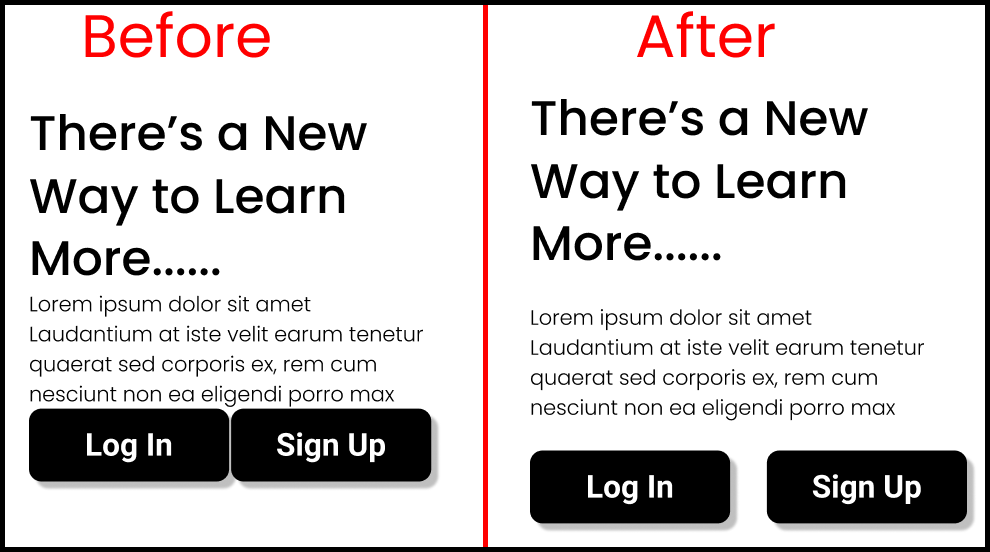
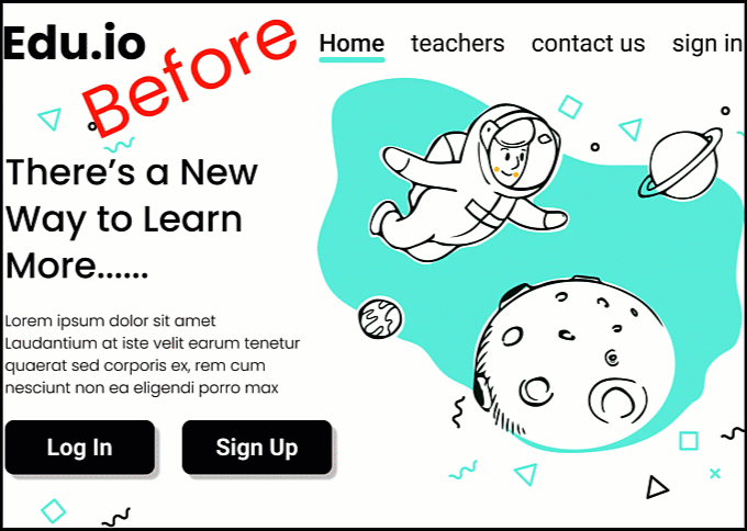
The CSS box model comprises the box-sizing, padding and margin properties. If you don't use them, your website will look like this 👇
 A website with no margin or padding
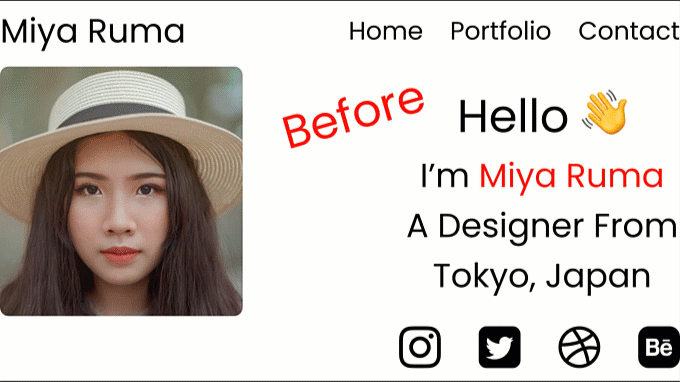
But if you use the box model properties correctly, your website will look like this 👇
 A website using box model properties
Much more visually appealing, right? If you want to make your website with accurate calculations, like the one above 👆 then this topic is for you. Learning about the CSS box model is one of many ways that will help you make pixel perfect websites.
This article will talk about how to use these properties:
- Padding
- Margin
- Border
- box-sizing
How to Use CSS box-model Properties
Let's look at some examples of where we can use the properties of the CSS box-model. We're gonna dissect the website shown above. 👆
Let's have a closer look at the navbar. You can notice the difference between the example that uses the padding property and the one that doesn't:
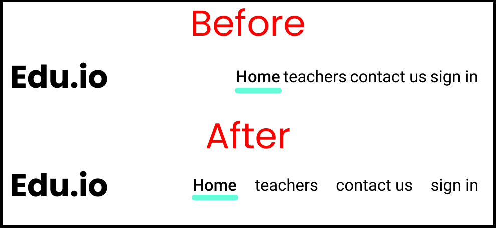 Navbar items using the padding property
Now let's have a closer look to the content section along with the buttons. Again, you'll notice the difference – the right one is also using the padding property.
 A content section using the padding property
CSS Box-Model Diagram
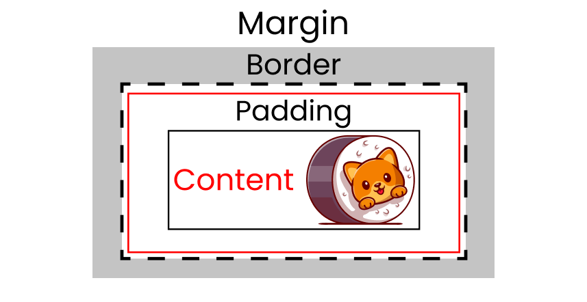
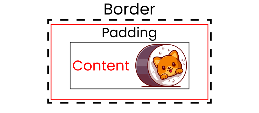
Think of the CSS box-model like an onion. It has 4 Layers:
- 1st layer: Content
- 2nd layer: Padding
- 3rd layer: Border
- 4th layer: Margin
1st box-model layer: Content
In HTML, everything behaves like a box. Let's insert some content with a kitty image. 👇
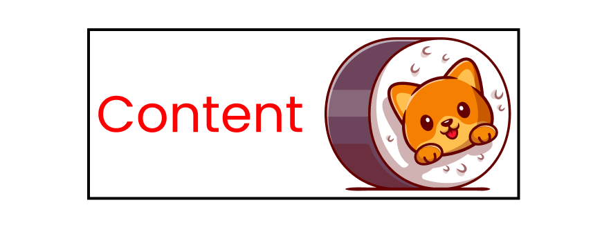 1st layer of the box model: content
2nd box-model layer: Padding
The next layer of the CSS box model is the padding layer. It wraps our content like this 👇
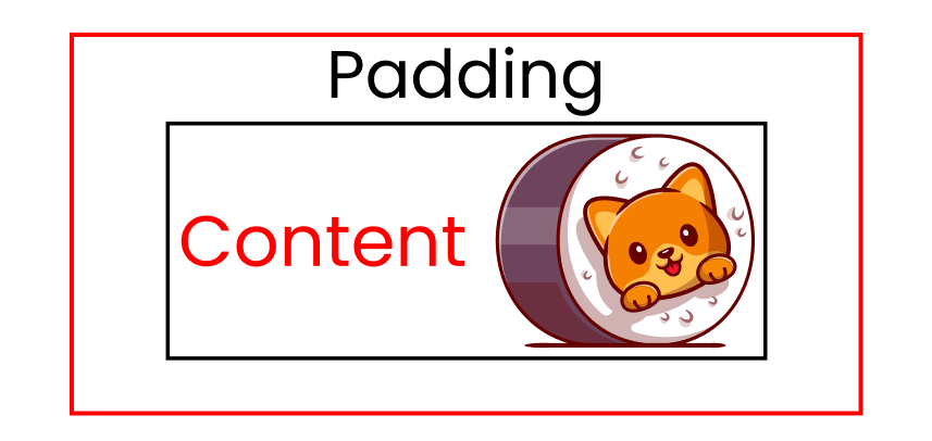 2nd layer of the box model: padding
3rd box-model layer: Border
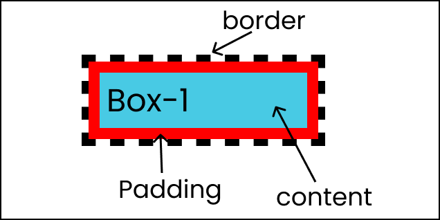
The next layer of the CSS box model is the border layer. It wraps our content + padding like this 👇
 The black dashed line is the border
4th box-model layer: Margin
The next and final layer of the CSS box model is the margin layer. It wraps our content + padding + border like this 👇
 Grey Region is The Margin
Alright, let's see how these properties work in a project.
How to Setup the Project

This tutorial is good for everyone including beginners. If you want to code along, then follow these steps.
HTML
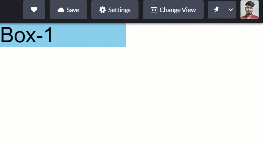
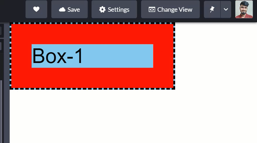
Open VS Code or Codepen.io and write this code 👇 inside the body tag:
<div class="box-1"> Box-1 </div>
CSS
Clear the default styles of our browser 👇
* {
  margin: 0px;
  padding: 0px;
  font-family: sans-serif;
}
Now, let's style our box 👇
.box-1 {
  width: 300px;
  background-color: skyblue;
  font-size: 50px;
}
We're all set, let's start coding! ✨

The Padding Property
But first, let's discuss the practical uses of the padding property. Then, we'll see how to use this property.
Generally, I use padding to put some space between contents. Look at this navbar 👇
 Navbar items using padding property
Here's another example for you – look at the below content, with two buttons👇
 content section using padding property
How to use the padding property in CSS
This is the shorthand of the four padding properties:
- padding-top
- padding-right
- padding-bottom
- padding-left
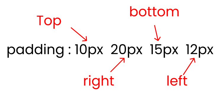 Shorthand of padding property
And remember, padding is the space you add on top of your main content:
 2nd Layer of Box-Model : Padding
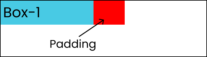
Let's add some padding to our content. The red colored area is the padding 👇
 The red colored area is padding
In order to recreate the results above, ☝ write this code in your CSS: 👇
// Padding added on top, right, left, bottom of .box-1

.box-1{
   padding : 100px;
}
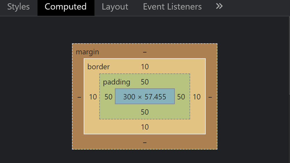
Let's open our developer console and go to the computed section:
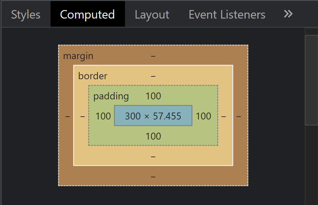 Computed CSS Box model
At the very middle is our content which is 300px in width. Look around our content, we have added 100px padding all around it.
Let's try adding padding to just 1 side of our content (only the right side):
 padding-right property
In order to recreate the results above, ☝ write this code in your CSS: 👇
.box-1{
   padding: 0 100px 0 0;
}

// Or you can use 👇

.box-1{
   padding-right: 100px;
}
Now, open the computed section on your developer console 👇
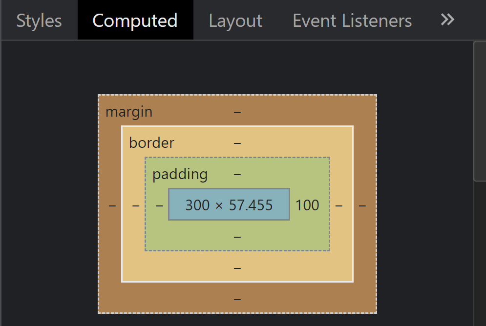 Computed CSS Box model
Look – the padding of 100px has only been added on the right side of our content as we specified.
The Border Property
You'll commonly use the border property while making buttons. Here's a GIF demo 👇
 Buttons using the border property
Notice how a white colored border shows around the button when I hover the mouse over the button.
How to use the border property in CSS
And remember, the border is the space added on top of our main content + padding: 👇
 The black dashed line is the border
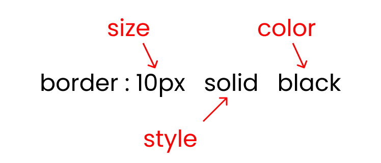
There are three crucial inputs of the border property:
- border size
- border style : solid / dotted/ dashed
- border color
 Border property syntax
There are three styles of border property as I listed above. In this example, we'll use the dashed style:
To recreate the results above, write this code in your CSS: 👇
.box-1 {
  width: 300px;
  font-size: 50px;
  padding: 50px;
  border: 10px dashed black;
}
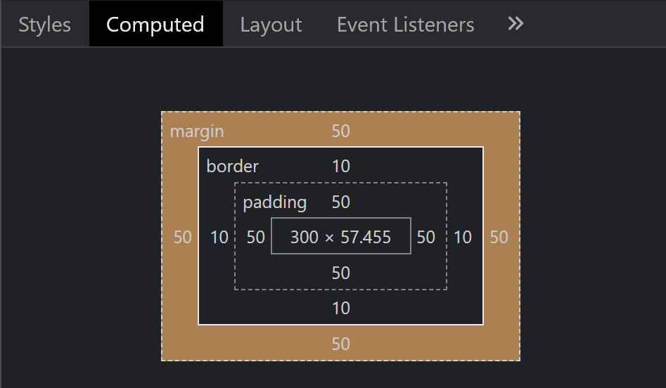
Let's open our console and see the box model calculations:
 Computed CSS box model
Now look at the above image☝ – a 10px border is added all around our content + padding.
The Margin Property
Generally, I use the margin property to put some whitespace between my content and the main screen on the desktop layout (large screens). Look at this GIF: 👇
 Adding margin to a website
Notice that I'm adding the margin to the left and right edges of my website above 👆
Here's another sample GIF of a use case of the margin property: 👇
 Adding margin to a website
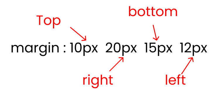
How to use margin property in CSS
This is the shorthand for the four properties of the margin property:
- margin-top
- margin-right
- margin-bottom
- margin-left
 Shorthand of the margin property
And remember, margin is the space added on top of our main content + padding + border:
 The grey region is the margin
Let's add a margin to our content. The content is getting pushed due to the Margin in this GIF:👇
 Content getting pushed due to margin
To recreate the results above, write this code in your CSS: 👇
.box-1 {
  padding: 50px;
  border: 10px dashed black;

  margin: 50px;
}
We can check the calculations again: 👇
 Computed CSS box model
Look, a 50px margin has been added all around our content + padding + border.
Let's try adding a margin to just 1 side of our content (only the left side):
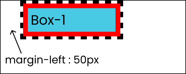 The margin-left property
To recreate the results above, write this code in your CSS 👇
.box-1 {
  padding: 50px;
  border: 10px dashed black;

  margin-left: 50px;
}
On the console, we can see that a 50px margin got applied only on the left side 👇
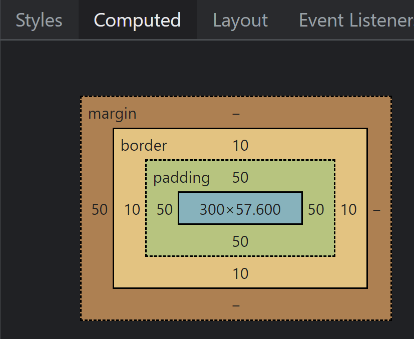 Computed CSS Box Model
Take a Break!
So far so good – take a break! You deserve it 💖

The Box-sizing Property
This property defines how our margin, padding, and borders will be calculated. There are three types of calculations (you can call them values):
- border-box
- padding-box
- content box
Note:
We're not gonna discus box-sizing: padding-box, as only Firefox supports it and it isn't used very often.
What is the difference between content-box and border-box in CSS?
Both border-box and content-box work in the same way. Look at these images:👇
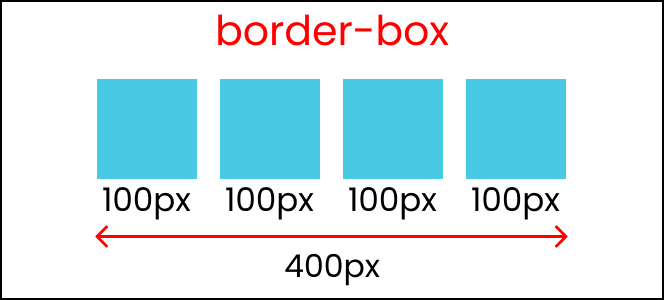 Boxes using the border-box value
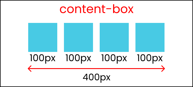 Boxes using the content-box value
So, what's the main difference here? The difference is noticeable when we are adding margin, border, or padding to our boxes.
When we are using the box-sizing: content-box, which is the default value, it will add a margin, padding, and borders outside the box, like this: 👇
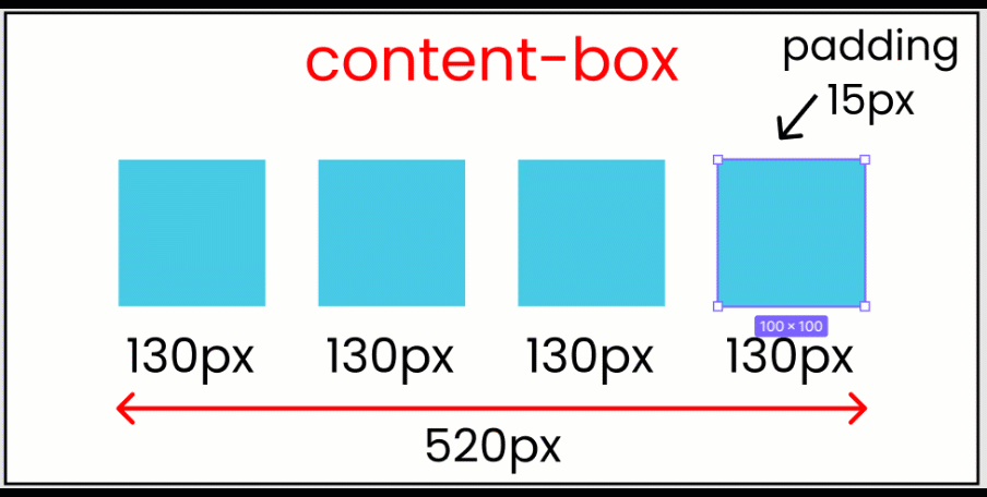 Padding getting applied outside the box
You can see the calculations here as well: 👇
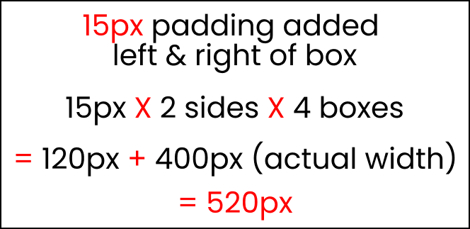 Calculations with content-box
Which means that things can get out of control and you'll see unexpected calculations. This means that it's hard to make responsive websites. Always use the box-sizing: border-box property instead.
But when we are using the box-sizing: border-box property, it will add a margin, padding, and borders inside the box, like this:👇
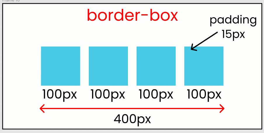 Padding getting applied inside the box
The box-sizing: border-box property shows us the EXACT calculations of our HTML elements, which means that this value is ideal for making responsive websites.
You can experiment with the values as well – just follow along with this code: 👇
* {
  box-sizing: border-box;
}

/* Or, Write 👇 */

* {
  box-sizing: content-box;
}
Conclusion
Congratulations! You can now make pixel perfect websites. Not only that, but when you're coding, you can figure out why your content is behaving strangely.
Here's your medal for reading till the end ❤️
Suggestions & Criticisms Are Highly Appreciated ❤️
YouTube / Joy Shaheb
LinkedIn / JoyShaheb
Twitter / JoyShaheb
Instagram / JoyShaheb