CSS provides the style of a website.
The background property lets you use images and colors to create backgrounds for your web pages.
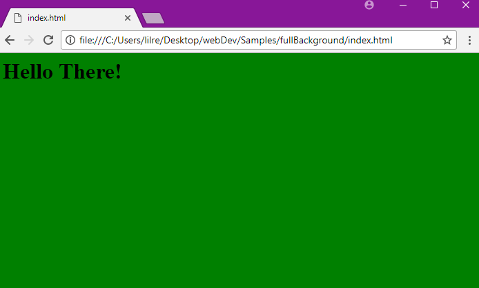
Background Color Example
The background color property allows you to choose the color of your element. This can be the background for the entire page or the background of one section of your page.
- An element is a piece of HTML such as a header or paragraph on a web page.
Here is an example of setting the background color for a web page to green.
  body {
    background-color: green;
  }
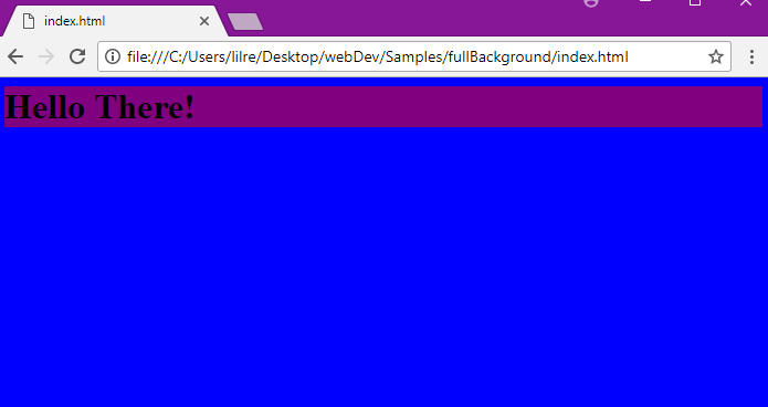
Here is an example of setting the colors for two elements. This will set the background of the header to purple and the rest of the page to blue.
  body {
    background-color: blue;
  }
  h1 {
    background–color: purple;
  }
In CSS, color can be defined in three ways:
- A valid color name such as
blue - A HEX value such as
#FFFFF(This is the hex value for white.) - An RGB value such as
rgb(76,175,80)(This is the RGB value for light green.)
Background Images
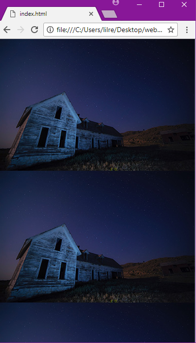
You can use the background image property to set an image as a background for an element. The image is repeated by default so that it covers the entire element.
body {
  background-image: url("barn.jpg");
}
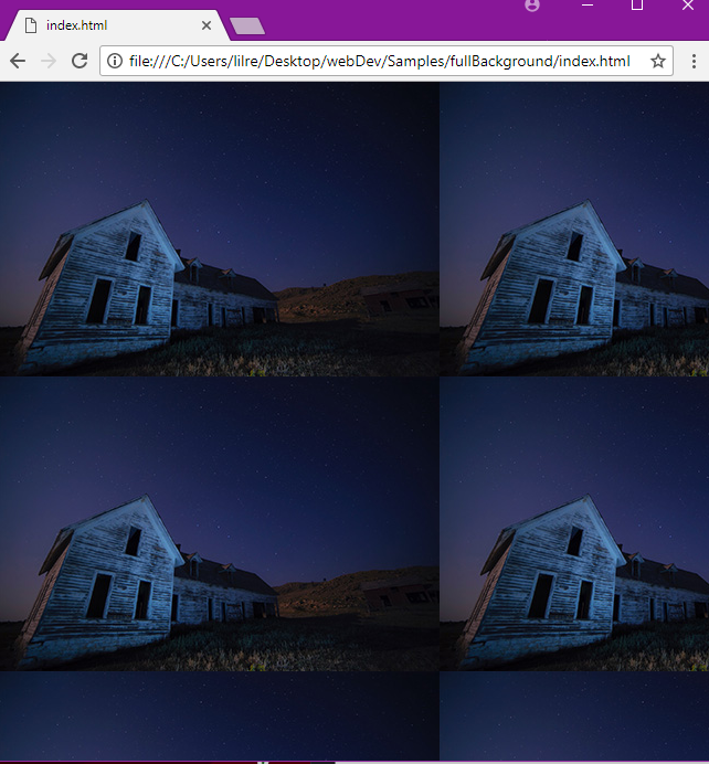
You can also link pictures or gifs that you find online by using their link (for example, from a Google Images search).
body {
  background-image: url("https://mdn.mozillademos.org/files/11983/starsolid.gif");
}
Background Image - The Repeat Property
The background image is repeated both vertically (up and down) and horizontally (across the web page) by default. You can use the background-repeat property to repeat the image vertically or horizontally.
Here is an example that repeats the image vertically:
body {
  background-image: url("barn.jpg");
  background-repeat: repeat-y;
}
You can repeat the image horizontally by setting the background-repeat property to “repeat-x”.
body {
  background-image: url("barn.jpg");
  background-repeat: repeat-x;
}
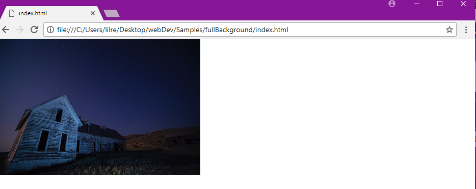
You can also use the background-repeat property to set an image to not repeat.
body {
  background-image: url("barn.jpg");
  background-repeat: no-repeat;
}
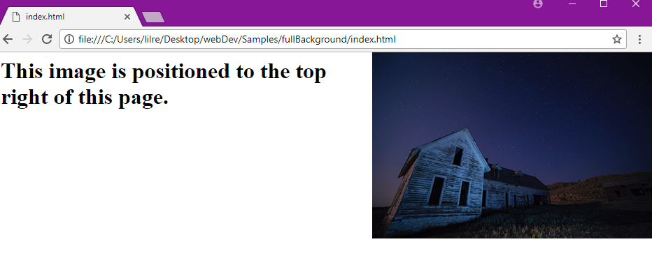
Background Image – The Position Property
You can use the position property to specify where your image will be located on a web page.
body {
  background-image: url("barn.jpg");
  background-repeat: no-repeat;
  background-position: right top;
}
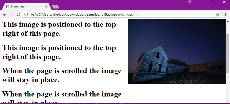
Background Image – The Fixed Position
You can use the background-attachment property to set an image to a fixed position. A fixed position makes it so an image does not scroll with the rest of the page.
body {
  background-image: url("barn.jpg");
  background-repeat: no-repeat;
  background-position: right top;
  background-attachment: fixed;
}
Background Gradients
A gradient is a transition between two or more colors and can be used via CSS similar to a background image.
The syntax of a gradient background can be quite complex and is often still used with vendor prefixes due to inconsistencies between supported browsers.
The Colorzilla Gradient Editor is a great online tool for generating custom gradients and the associated CSS markup.
Background – The Shorthand Property
You can write the background properties on a single line. This is called the shorthand property.
body {
  background: url("barn.jpg") no-repeat right top;
}
You can leave out properties you don’t need when using the shorthand property, but the properties must be used in a certain order. The order is:
- color
- image
- repeat
- attachment
- position
Multiple Background Images
You can specify multiple background images in a single background property.
body {
  background: url("barn.jpg"), url("stars.jpg"), linear-gradient(rgba(0, 0, 255, 0.5), rgba(255, 255, 0, 0.5));
}
The first image (or gradient) specified is the uppermost, the second comes after, and so on. If one of the elements is not correct due to its URL or its syntax, the whole line will be ignored by the browser.
Some Basic Background Properties of CSS
The CSS background properties are used to define the background effects for elements.
CSS background properties: background-color, background-image, background-repeat, background-attachment, background-position
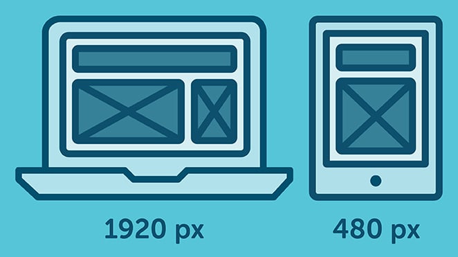
CSS Breakpoint Example
A CSS Breakpoint is a specific point in which a website’s layout changes, based on a Media Query becoming active.
Generally, you specify a breakpoint when you want to re-adapt the website’s layout to the browser viewport’s size; mostly, to the viewport’s width.
For example, if your website content looks great on a narrow viewport (like on a smart-phone browser), but it starts to look bad on bigger screens (e.g. maybe the fonts’ size are too small and difficult to read), then you might want to introduce a new breakpoint for bigger screens that makes the fonts bigger:
CSS Breakpoints can be considered to be the heart of responsive web design, because they define how the content behaves or is arranged at a different device width/scale. This allows you to show the best possible layout to the user.
Setting Break Points
Breakpoints are broadly set on the basis of either of the following:
- Breakpoints based on device width
- Breakpoints based on content
Breakpoints based on device width
It’s quite apparent that all of our devices don't have same screen widths/sizes. It is now a design decision to include a set of particular devices and code the CSS rules accordingly.
We already have enough devices to worry about, and when a new one comes out with a different width, going back to your CSS and adding a new breakpoint all over again is time-consuming.
Here’s an example:
/* ----------- iPhone 6, 6S, 7 and 8 ----------- */

/* Portrait */

@media only screen

and (min-device-width: 375px)

and (max-device-width: 667px)

and (-webkit-min-device-pixel-ratio: 2)

and (orientation: portrait) {

}

/* Landscape */

@media only screen

and (min-device-width: 375px)

and (max-device-width: 667px)

and (-webkit-min-device-pixel-ratio: 2)

and (orientation: landscape) {

}

/* ----------- Google Pixel ----------- */

/* Portrait */

@media screen

and (device-width: 360px)

and (device-height: 640px)

and (-webkit-device-pixel-ratio: 3)

and (orientation: portrait) {

}

/* Landscape */

@media screen

and (device-width: 360px)

and (device-height: 640px)

and (-webkit-device-pixel-ratio: 3)

and (orientation: landscape) {

}
With this approach, you will end up having a huge list of media queries.
Breakpoints based on Content
This is the preferred choice while making or writing the breakpoint rules. Because it is easier to adjust your content according a particular layout only when it requires a change.
@media only screen (min-width: 768px){
...
}
This breakpoint means the CSS will apply when the device width is 768px and above.
You can also set a range with breakpoints, so the CSS will only apply within those limits.
@media only screen and (min-width: 768px) and (max-width: 959px){

...

}
Note Always try to create breakpoints based on your own content, not devices. Break them to a logical width rather than a random width and keep them to a manageable number, so modifying remains simple and clear.
CSS breakpoints are useful when you want to update styles based on the screen size. For example, from a device measuring 1200px width and above, use the font-size: 20px;, or else use the font-size: 16px;.
What we have started with is from devices greater than 1200px, a common laptop screen’s width. You may also have noticed that we mentioned ‘greater than’, meaning that we are in a way using something like an ’if-then’ statement.
Let’s turn it into CSS code:
.text1 {
    font-size: 16px;
}
@media (min-width: 1200px) {
    .text1 {
        font-size: 20px;
    }
}
For our convenience, we write down the .text1 basic styling first… then afterwards we will specify the @media rules.
Tip: you may see on a common CSS Framework called ‘Bootstrap’, that they have adopted ‘min-width’ and up in their Bootstrap v4.0, as compared to their old Bootstrap v3.0 using ‘max-width’ and down. This is only a preference, and there is nothing wrong with saying ’this size and less than’ versus ’this size and greater than’.
It is perfectly fine to use @media (max-width) {} . Here is an example:
.text1 {
    font-size: 20px;
}
@media (max-width: 1199px) {
    font-size: 16px;
}
// Normal, basic styles
// that look great on small screens
// but not on bigger screens
body {
  font-size: 16px;
}

// Define a new breakpoint, with a media query.
// In this case, for when the viewport's width
// is at least 512px wide.
@media (min-width: 512px) {
    body {
        font-size: 20px;
    }
}
Breakpoints that are based on content as opposed to device are less complicated. Here’s a simple snippet that triggers when the device’s width is upward of code 700px, roughly smart-phone screen sized
@media only screen and (min-width: 700px) {
  something {
    something: something;
  }
}
You can also set a minimum and maximum width, which lets you experiment with different ranges. This one roughly triggers between smart-phone and larger desktop and monitor sizes:
@media only screen and (min-width: 700px) and (max-width: 1500px) {
  something {
    something: something;
  }
}
CSS Color Example
Colors
CSS Colors is a CSS module that deals with colors, color types, color blending, and opacity. Not all CSS properties that take a as a value are part of this module, but they do depend upon it.
In CSS, you can change the color of almost any element in your HTML page. Properties like background-color, color, and border-color set the color of those elements.
CSS supports color names, hexadecimal, and RGB colors. In addition to the introduction of the opacity declaration, colors in CSS3 can now be specified using color names, or RGB, HEX, HSL, RGBA, HSLA values.
HTML supports 140 standard color names.
RGB(A)
RGB stands for “Red, Green, Blue”. An RGB value is a combination of intensity values for red, green, and blue. Each is between 0 (black) and 255 (full intensity). RGBA color values are an extension of RGB color values with an alpha channel - which specifies the opacity for a color. The alpha parameter is a number between 0.0 (fully transparent) and 1.0 (fully opaque).
An RGB color value is specified with: rgb(red, green, blue). An RGBA color value is similar, with the alpha value in last position: rgba(red, green, blue, alpha).
HSL(A)
HSL stands for “Hue, Saturation and Lightness”. Hue is a degree on the color wheel (from 0 to 360): 0 (or 360) is red, 120 is green, 240 is blue. Saturation is a percentage value: 100% is the full color. Lightness is also a percentage; 0% is dark (black) and 100% is white.
HSLA color values are an extension of HSL color values with an alpha channel - which specifies the opacity for a color.
An HSL color value is specified with: hsl(hue, saturation, lightness). An HSLA color value is similar, with the alpha value in last position: hsla(hue, saturation, lightness, alpha).
CMYK
CMYK colors are a combination of CYAN, MAGENTA, YELLOW , and BLACK. Computer screens display colors using RGB color values. Printers often present colors using CMYK color values. CMYK is not supported in HTML, but it is suggested as a new standard in CSS4.
Example colors: CMYK Red: cmyk(0%, 100%, 100%, 0%), CMYK Green: cmyk(100%, 0%, 100%, 0%), or CMYK Blue: cmyk(100%, 100%, 0%, 0%).
Hexcodes
Hexcode, short for hexadecimal code, is a way to express a color value to your computer. It is named this way because 16 unique symbols can be used as values. In this case, the numbers 0 to 9 and letters a to f are used.
Hex codes are expressed in this format: #000000, which would be the color black in this instance. Six characters are used in each hexcode, using any of the 16 characters mentioned previously. These six characters are divided into three pairs of two.
These three pairs each express a value for the amount of red, green and blue in a particular color. Taking the hexcode color #AA11BB, AA is the amount of red, 11 the amount of green, and BB the amount of blue. 0 is the lowest value of a color while f is the highest value.
Hex codes are case insensitive, meaning that #FFFFFF and #ffffff would be the same color: white.
Additionally, there are 16,777,216 possible color combinations using hexcode.
Opacity
The CSS3 opacity property sets the opacity for the whole element (both background color and text will be opaque/transparent). Unlike alpha values specified with rgba and hsla, opacity is inherited by child elements.
The opacity property value must be a number between 0.0 (fully transparent) and 1.0 (fully opaque).
Examples
<html>
  <body>
    <p>Hello Moto</p>
  </body>
</html>
body {
  background-color: green;
  color: white;
}
In the above example, the background-color: green turns the <body> element green. This turns the whole web page green. The <p> elements are all white after color: white too. You can use named colors, like green, blue, yellow, red, purple, and many others. But for custom colors, you can use hex codes (#147ACC), RGB values (rgb(20, 122, 204)), and even HSL values (hsl(145, 59%, 30%)).
p {
  color: rgba(244, 145, 14, 0.80); // bright orange
}

h2 {
 color: #FA8072; //salmon
}
You can also add an alpha value, or transparency to colors. Transparency allows text to be overlaid on an image and still have the image partially viewable through the text, or can be used to change the shade of the colour if no other elements are in front or behind the text. Use rgba() or hsla() and fill in your color values. The alpha value goes last and is a percent converted to a decimal. (For example, 20% is 0.2, 75% is 0.75, etc.)
body {
  background-color: hsl(184, 87%, 94%); // bright blue
}
Above shows paragraphs styled bright orange and 20% transparent, h2 elements a salmon pink, and the body’s background bright blue.
To get custom colors to use in CSS, you might find a color picker helpful. Some text editors have built-in color pickers, like Visual Studio Code. If you search “color picker” on Google or DuckDuckGo, you will get a color picker that you can use. Google Chrome and Firefox also have color picker add-ons that you can install. Adobe Color CC not only helps you pick a color, but will also help you pick out a color scheme for your web page!
It’s a good idea to check that you have enough contrast between your text and background colors by using a tool like WebAIM’s Color Contrast Checker.
Colors in CSS Example
Colors in CSS are used to colorize elements in our web-pages. There are many ways to assign colors to elements. You can use the actual names for the colors, their RGB values or the Hexadecimal values. In CSS3 the hsl (hue-saturation-lightness) has been added to the specification.
Color Names
Currently there are 140 color names supported in HTML, which can be assigned in CSS rules by just typing their name. For example:
Syntax
p {
  color: green;
}
This rule changes all the font color for all
elements to green.
For the full 140 color list see here: https://www.w3schools.com/colors/colors_names.asp
RGB values
RGB stands for “Red”, “Green” and “Blue” and we can also assign colors by typing their RGB values in our rules. An RGB value would look like this: rgb(255,0,0), where each number defines how much of each color will be in the final mix.
The values range from 0 to 255, and in our example we see that only the first value is 255 while the other two are set to 0. That means that there is only red in our value and the respective element will be colored red. An RGB value of (0, 0, 0) would give black and a value of (255, 255, 255) would give white.
It is impossible to try to memorize each color code, and for that reason there are numerous tools online for picking the colors you want for your projects. For example: https://www.w3schools.com/colors/colors_picker.asp or http://htmlcolorcodes.com/color-picker/.
p {
  color: rgb(0, 255, 0);
}
This rule changes the font color of all p elements to green, just like above.
Hexadecimal Values
Hexadecimal values are yet another way to define colors in CSS and they work quite similarly to RGB values.
A random hex code would like this: #29432b, where the first two characters after the hash stand for the amount of RED in the mix, the second two stand for the amount of Green, and the last two stand for the amount of Blue.
The values of #000000 and #ffffff stand for black and white respectively.
You can find the specific Hexadecimal colors you require by using the same tools mentioned for the RGB values.
Syntax
p {
  color: #00fe00;
}
This rule again changes the font color of all p elements to green.
HSL
HSL has three values. The first one is Hue, which is measured in degrees. So 0 (or 360) represents the color red, at 120 it is green, and 240 is blue.
The second one is Saturation which has a percentage value with a range from 0 to 100%.
And the third one is Lightness which also has a percentage value with a range from 0 to 100%. 0% is dark black, 50% average, 100% is white.
Syntax
p {
  color: hsl(0, 100%, 50%);
}
Output
Why use RGB or HEX values?
Color names take only 140 values, while RGB and HEX values have 16,777,216 possible combinations. So if you want your projects to look exactly how you have envisioned them, you should use the two latter options and keep the color names' values for mock-ups and testing purposes.
The currentColor Keyword
The currentColor keyword, as the name suggests, is a valid color value in CSS. This represents the value of the specific element’s color property. This lets you use the color property’s value for properties that do not receive it by default.
For example, if we declare each div to have a 3px border of color currentColor, which means that each div’s border will be colored with the same value of its color property:
div{
  /* The currentColor keyword for the color value, which means that the border will have the value of the respective div's color property */
  border: 3px solid currentColor;
}

/* This div will have green borders, because its color value is green. */
#div1{
  color: green;
}

/* This div will have blue borders, because its color value is blue. */
#div2{
  color: blue;
}
Practical Application with an SVG
Here’s a very common example on the web – a button with an SVG icon and text in it. The color of the border, text and icons change on hovering over the button. The below image depicts the initial and the hovered states of the button in order.
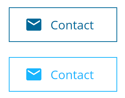
Icon fonts could also be used for this purpose, but there are various advantages of inline SVG over icon fonts, and this may make SVGs the choice for many developers. Quoting CSS-Tricks,
It can be frustrating to position a font icon. The icons are inserted via pseudo element, and it depends on
line-height,vertical-align,letter-spacing,word-spacing, how the font glyph is designed (does it naturally have space around it? does it have kerning information?). Then the pseudo elementsdisplaytype affects if those properties have an effect or not. SVG just is the size that it is.To sum it up, it can at times be frustrating to use font icons with text.
We could use this code of ours to achieve the desired behavior:
button {
  color: #016898;
}

.emailIcon {
  fill: #016898;
}

button:hover {
  color: #19B5FE;
}

button:hover .emailIcon {
  fill: #19B5FE;
}
Now, instead of changing the SVG’s fill color on hover explicitly, we can set the fill to currentColor. This automatically changes the color of the SVG to the value of the color property of the button. We now just need to change the color property of the button. This makes the CSS code shorter and smarter:
.emailIcon {
  fill: currentColor;
}

button {
  color: #016898;
}

button:hover {
  color: #19B5FE;
}
Check out the live example at https://repl.it/NNt9/2.
CSS3 Media Queries Example
Media Queries allow you to have different styles for different devices/screen sizes. Their introduction in CSS3 has greatly eased the building of responsive webpages.
The best approach when designing a responsive website is to think mobile first; meaning that you create your page starting with the design and content of the mobile version.
You may think that with some scalable sizes ( %, vw or vh ), your page will adapt perfectly to any device. But it will not. Maybe for some very basic design, but certainly not for more common or complex pages!
When designing your page for smaller devices, you will focus on the main content. On a bigger screen, you will have to readapt some font-sizes, margins, paddings and so on in order to keep your site comfortable and readable. But you will also want/need to add more content, the bits you did not judge fundamental, and fill in the space created by the screen size.
The thought process should be:
- Which content to show?
- How to layout?
- Size?
The basic syntax
    @media only screen and (min-width: 768px) {
      p {padding: 30px;}
    }
The p tag will have a padding of 30px as soon as the screen reaches min 768px width.
The AND syntax
  @media only screen and (min-height: 768px) and (orientation: landscape) {
    p {padding: 30px;}
  }
The p tag will have a padding of 30px as soon as the screen reaches min 768px height and its orientation is landscape.
The OR syntax
    @media only screen and (min-width: 768px), (min-resolution: 150dpi) {
      p {padding: 30px;}
    }
The p tag will have a padding of 30px as soon as the screen reaches min 768px width or its resolution reaches min 150dpi.
CSS Fonts Example
The different CSS font properties define the size, weight, style, line height, and font family / typeface of text on the page.
Font family
The font family or typeface of text is set by using the font-family property.
This property works will a fallback system – if your browser doesn't support the first font, it will try each of the following fonts until it finds one that it supports. If the name of the font is longer than one word, it must be surrounded by quotes. For example:
p {
    font-family: "Times New Roman", Times, serif;
}
Times New Roman is made up of three words and must be surrounded by quotes. Meanwhile, serif is just one word, so it doesn't need quotation marks.
The last item in the list should always be a generic font family name such as serif, sans-serif, monospace, cursive, fantasy, system-ui.
Font style
The font-style property can be used to make text italic or oblique.
There are three possible values for this property:
- normal - Text is shown normally
- italic - Text is shown in italic
- oblique - Text is shown leaning
.normal {
    font-style: normal;
}

.italic {
    font-style: italic;
}

.oblique {
    font-style: oblique;
}
Font size
Use the font-size property to adjust the size of the text. The default size of text is 16px in most browsers.
Here are the most commonly used font size values:
px(pixels)em-1em– the font size of the parentrem– the font size of the root element%- percentages
.with-pixels {
    font-size: 14px;
}

.with-ems {
    font-size: 0.875em;
}

.with-absolute {
    font-size: large;
}

.with-percentage {
    font-size: 80%;
}
Font weight
The font-weight property adjusts the weight of text. This property accepts keyword values like bold or normal, and numeric keyword values such as 400 and 700.
Here are some common keyword and numeric keyword values:
| Keyword Values | Numeric Keyword Values |
| 100 | thin |
| 300 | light |
| 400 | normal |
| 500 | medium |
| 700 | bold |
| 900 | black |
The default font weight is 400 or normal.
p {
   font-weight: bold
}
Note: Not all keyword or numeric keyword values are available for every font family. For example, if you are loading a font family from Google Fonts, you need to select all the font weights you want to use.
CSS Text Align Example
This CSS property describes the horizontal alignment of inline content in its parent block element. text-align does not control the alignment of block elements, it affects only their inline content.
Values:
The text-align property is specified as a single keyword chosen from the list of values below:
text-align: left; aligns the text to the left
text-align: right; aligns the text to the right
text-align: center; aligns the text to the center
text-align: justify; makes the lines the same width
text-align: justify-all; makes the lines the same width, including the last one
text-align: start; aligns the last line at the beginning of the line
text-align: end; aligns the last line at the end of the line
text-align: match-parent; calculates the value's start and end to the parent’s direction and replaced by the appropriate left or right value.
Block Alignment Values (non-standard syntax):
text-align: -moz-center;
text-align: -webkit-center;
Global Values:
text-align: inherit; inherits from its parent element
text-align: initial; default value
text-align: unset; applies either the inherit or the initial value, depending on the default properties of the element
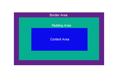
CSS Box Model Example
Understanding the CSS Box Model is crucial to being able to correctly layout a web page.
When a browser renders (draws) a web page each element, for example, a piece of text or an image is drawn as a rectangular box following the rules of the CSS Box Model.
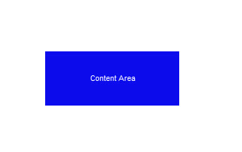
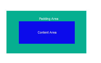
At the center of the box is the content itself, which takes up a certain height and width. This region is known as the Content Area. The size of the content area can be automatically determined, or you can explicitly set the size of height and width (see note below regarding box-sizing).
Around the Content Area, this is a region known as Padding Area. The size of the padding can be the same all around (set with padding), or you can set individually for the top, right, bottom and left paddings (with padding-top, padding-right, padding-bottom and padding-left).
Next, there is a Border Area. This creates a border around the element and its padding. You can set thickness (border-width), color (border-color), and style (border-style) of the border. Style options include none (no border), solid, dashed, dotted and several others.
Additionally, you can set the borders on the 4 sides individually; for example, the top border with border-top-width, border-top-color and border-top-style for its thickness, color and style. (See note below regarding box-sizing.)
Finally, there is the Margin Area. This creates clear space around the element, padding, and border. Again you can individually set the top, right, bottom and left margins (with margin-top, margin-right, margin-bottom and margin-left). Under certain circumstances, margin collapsing occurs and the margins between adjacent elements may be shared.
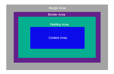
box-sizing Property: The default for this property is content-box. If you use the default, then the box model will allow the author to specify the size of the content area. However, it is possible to use these to instead specify the size of the border area. This is done by changing box-sizing property to border-box. This can sometimes make layouts easier. You can set the box-sizing property per element as desired.
CSS Cursors
The cursor property specifies the type of cursor to be displayed when you hover over an element. It has 36 possible values:
    .auto            { cursor: auto; }
    .default         { cursor: default; }
    .none            { cursor: none; }
    .context-menu    { cursor: context-menu; }
    .help            { cursor: help; }
    .pointer         { cursor: pointer; }
    .progress        { cursor: progress; }
    .wait            { cursor: wait; }
    .cell            { cursor: cell; }
    .crosshair       { cursor: crosshair; }
    .text            { cursor: text; }
    .vertical-text   { cursor: vertical-text; }
    .alias           { cursor: alias; }
    .copy            { cursor: copy; }
    .move            { cursor: move; }
    .no-drop         { cursor: no-drop; }
    .not-allowed     { cursor: not-allowed; }
    .all-scroll      { cursor: all-scroll; }
    .col-resize      { cursor: col-resize; }
    .row-resize      { cursor: row-resize; }
    .n-resize        { cursor: n-resize; }
    .e-resize        { cursor: e-resize; }
    .s-resize        { cursor: s-resize; }
    .w-resize        { cursor: w-resize; }
    .ns-resize       { cursor: ns-resize; }
    .ew-resize       { cursor: ew-resize; }
    .ne-resize       { cursor: ne-resize; }
    .nw-resize       { cursor: nw-resize; }
    .se-resize       { cursor: se-resize; }
    .sw-resize       { cursor: sw-resize; }
    .nesw-resize     { cursor: nesw-resize; }
    .nwse-resize     { cursor: nwse-resize; }
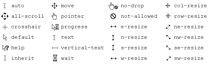
You can also set an image as the cursor.
.custom-cursor {
  cursor: url(cursor-image.png);
}