
In this tutorial, we are going to build a simple landing page for an online education platform called Skilllz.
This tutorial will teach you how to use and implement CSS Flexbox and CSS Grid alignment. We'll also cover many other CSS concepts. And finally, we'll learn how to make the page responsive so that it works on all screen sizes.
The tutorial is divided into five parts:
How to Build the Navigation Bar
How to Build the Showcase Section
How to Build the Lower Section
How to Build the Footer Section
How to Make the Page Responsive
Each of these sections will teach you some new CSS and web development skills and tools. So let's jump right in.
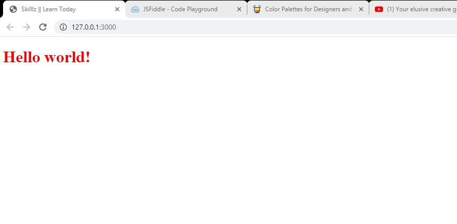
How to Create the HTML Boilerplate
If you have emmet installed in your IDE, you can generate an HTML boilerplate for your project by typing ! and clicking the enter or tab key on your keyboard.
If not, you can copy this boilerplate code and paste it into your code editor:
<!DOCTYPE html>
<html lang="en">
<head>
  <meta charset="UTF-8">
  <meta name="viewport" content="width=device-width, initial-scale=1.0">
  <meta http-equiv="X-UA-Compatible" content="ie=edge">
  <title>Document</title>
  <link rel="stylesheet" href="styles.css">
  <link rel="stylesheet" href="https://cdnjs.cloudflare.com/ajax/libs/font-awesome/5.15.4/css/all.min.css" integrity="sha512-1ycn6IcaQQ40/MKBW2W4Rhis/DbILU74C1vSrLJxCq57o941Ym01SwNsOMqvEBFlcgUa6xLiPY/NS5R+E6ztJQ=="
  crossorigin="anonymous" referrerpolicy="no-referrer" />
</head>
<body>

</body>
</html>
How to Use Font Awesome Icons
As you can see in one of the shots, we will be using some font icons to give better swap to our service section.
For this, we will be using font awesome from the CDN. If you created an HTML biolerplate by yourself, copy the following link tag and paste it into your head tag:
<link rel="stylesheet" href="https://cdnjs.cloudflare.com/ajax/libs/font-awesome/5.15.4/css/all.min.css" integrity="sha512-1ycn6IcaQQ40/MKBW2W4Rhis/DbILU74C1vSrLJxCq57o941Ym01SwNsOMqvEBFlcgUa6xLiPY/NS5R+E6ztJQ=="
  crossorigin="anonymous" referrerpolicy="no-referrer" />
Let's Get Started
First, make sure that your stylesheet file (.css) is properly linked to your HTML page.
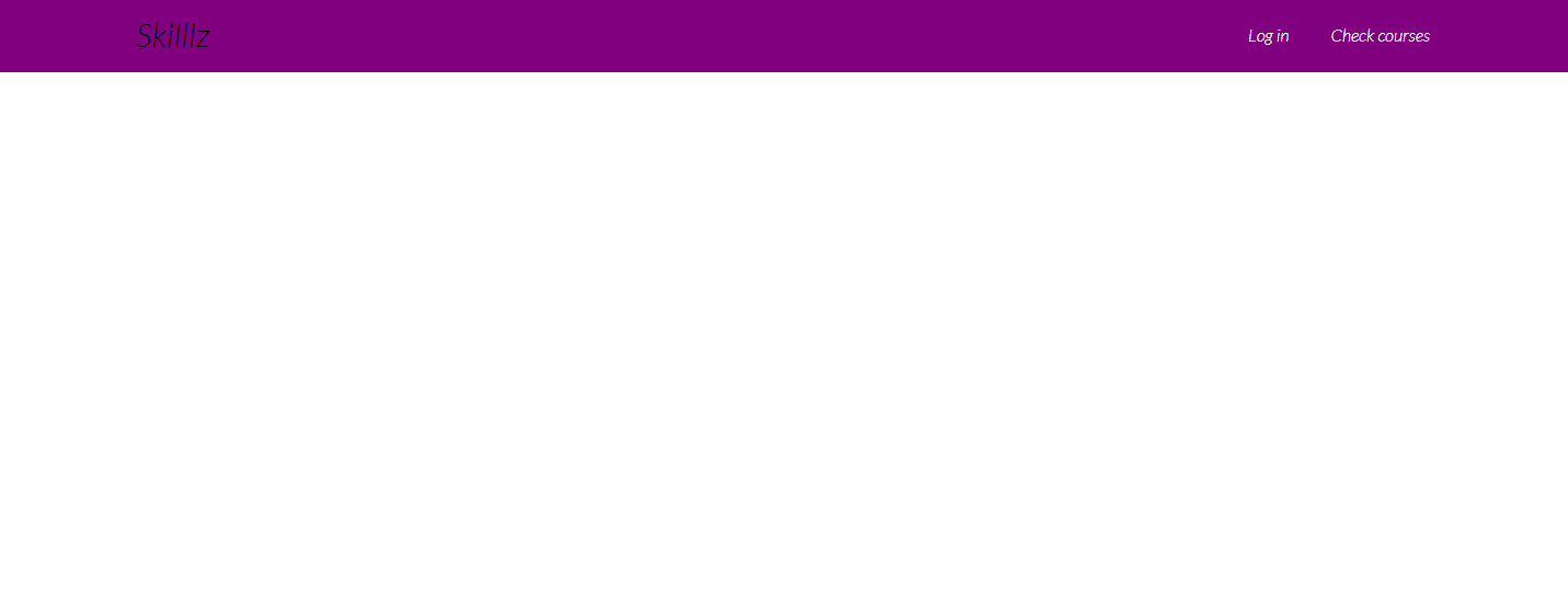
How to Build the Navigation Bar
The Navigation Bar section is going to be comprised of our site's name as well as two navigation links: Log in and check courses.
Here is the markup for our navbar:
<div class="navbar">
        <div class="container flex">
          <h1 class="logo">Skilllz</h1>
            <nav>
              <ul>
                <li class="nav"><a class="outline" href="">Log in</a></li>
                <li class="nav"><a href="" class="outline">Check courses</a                 </li>
              </ul>
            </nav>
        </div>
      </div>
On the div wrapping the elements inside this section (the navbar), we register the container and flex class.
.container: we will use this utility class in every section to make sure that the inner elements do not exceed a certain width which we'll specify in CSS.flex: we will use this utility class to display children elements in a horizontally aligned manner (side-by-side) using CSS Flexbox.
Inside the div we have an h1 with class of logo and two navigation links li>a with the outline classes, respectively.
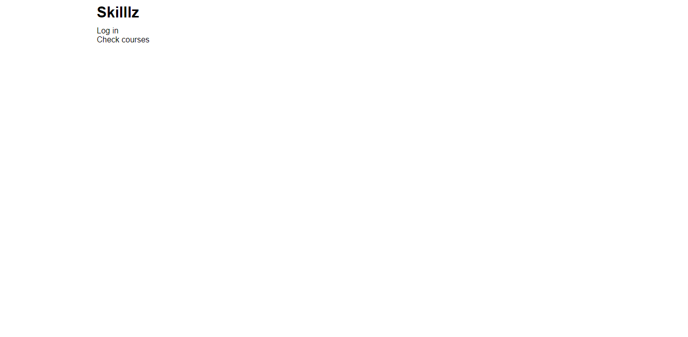
At this point, our page will look all plain and bare like this:
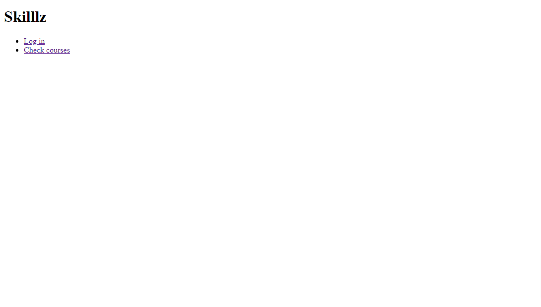
No CSS yet
How to Apply CSS Styling to our Page
We now have to apply some CSS rules to style our nav section the way we want. What we want to do first is set the base styling for our web page with the following code:
/* Override default style and set padding and margin to nothing */

* {
  box-sizing: border-box;
  padding: 0;
  margin: 0
}

/* White text throughout */

body {
  font-family: "lato", sans-serif;
  color: white;
}

/* Make all link text black with no text decoration */
a {
  color: black;
  text-decoration: none;
}


h1 {
  font-size: 30px;
  font-weight: 600;
  margin: 10px 0;
  line-height: 1.2;
}


h2 {
  font-size: 25px;
  font-weight: 300;
  margin: 10px 0;
  line-height: 1.2;
}

p {
  font-size: 30px;
}

/* All images must not be larger than parent container */
img {
  width: 100%;
}

/* No styling on list items */
li {
  list-style-type: none;
}


p {
  font-size: 20px;
  margin: 10px 0;
}
With the default styles applied, our page will now look like this:

Next, we need to define the styling for our container class:
/* Centers it, sets a maximum width and makes sure elements can flow past it*/

.container {
  margin: 0 auto;
  max-width: 1200px;
  overflow: visible;
}
Now, our content will not exceed the maximum width specified.
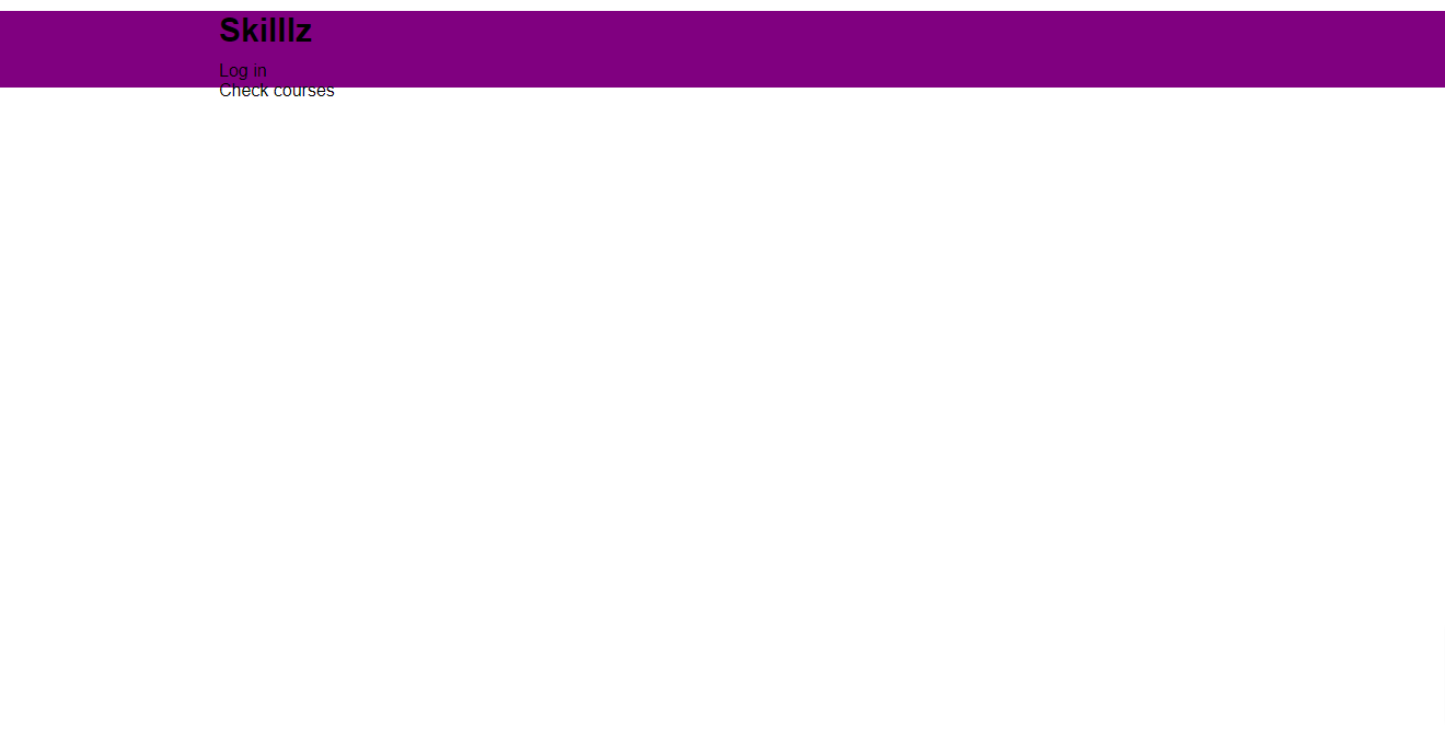
After that, we need to set the background color of our navbar section to purple:
/* Sets background color, height and padding*/

.navbar {
  background-color: purple;
  height: 70px;
  padding: 0 30px;
}
Then we target only the h1 element inside the navbar and specify the following styles:
/* Sets font size, reduces font-weight, adds margin and line height */

.navbar h1 {
  font-size: 30px;
  font-weight: 300;
  margin: 10px 0;
  line-height: 1.2;
}
With that style applied, our h1 heading will look like this:
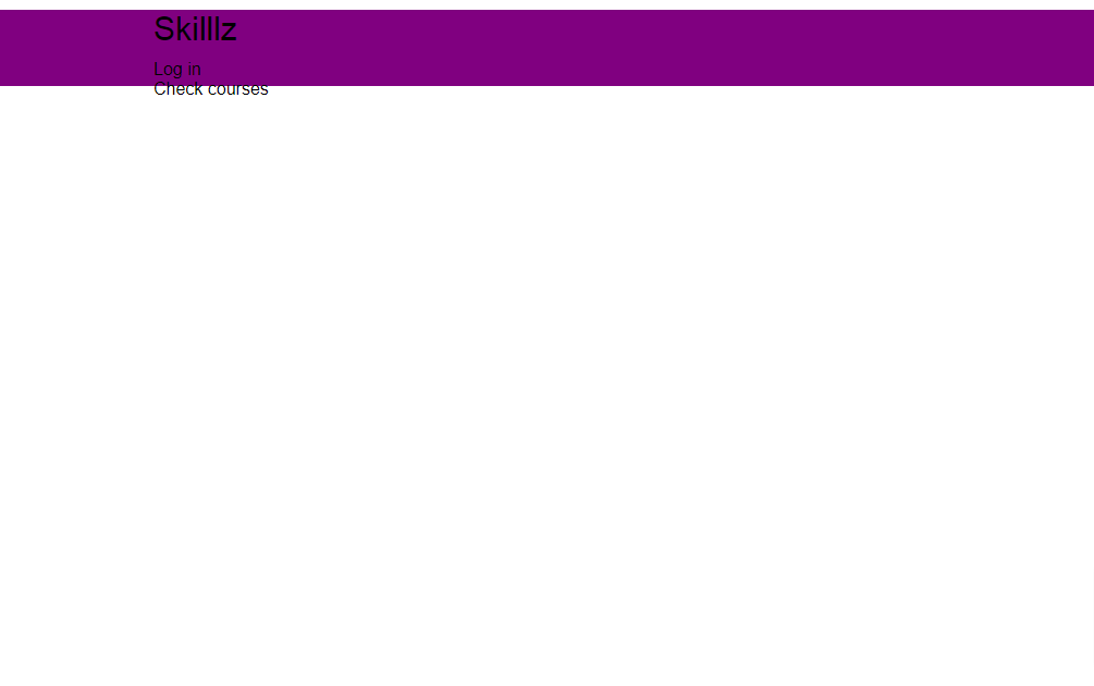
Now we need to display both child elements inside the container h1 and nav side-by-side using Flexbox.
.navbar .flex {
  display: flex;
  justify-content: space-between;
  align-items: center;
  height: 100%;
}
First, we set the display mode to flex. This will align the elements side by side by default.
We then justify the content, adding a considerable space between each item using the space-between value. We align the items to appear at the center (middle) of the container and set its height to take up the entire container.
This is what our page should now look like:
Cool right?
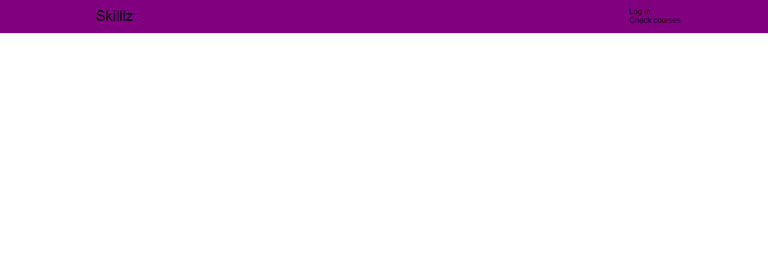
However, we also do not want both of our navigation link stacked on top of each other. Instead, we want them to be displayed side-by-side. Guess how we do that? With Flexbox!
.navbar ul {
  display: flex;
}

/* Changes the color of both links to white, adds padding between them and margin as well */

.navbar a {
  color: white;
  padding: 9px;
  margin: 0 10px;
}
Our page will now look like this:
The power of CSS flexbox
If you watched the brief intro video, you will notice that whenever I hover over any of the links, the text color changes to a lighter shade of purple and a solid border appears below it.
We can implement this transition using the CSS :hover pseudo-element:
.navbar a:hover {
  color: #9867C5;
  border-bottom: 3px solid #9867C5;
}
Now watch this:
Hover effect on the links
And with that, we have come to the end of the navbar section.
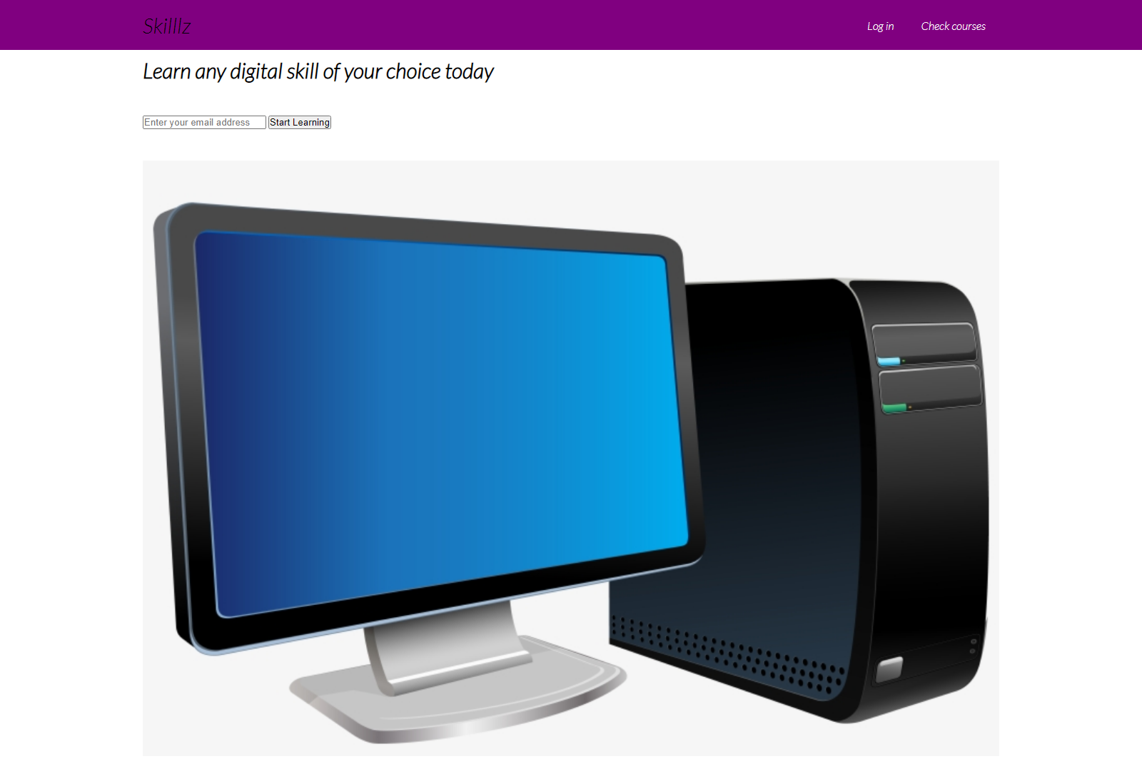
How to Build the Showcase Area
The showcase area is going to house the headline text, supporting text, a form for signing up new users, as well as a headline image.
This section is going to be divided in two: the left side and the right side. In other words, it will be displayed as a grid of two units.
Here is the markup for this section:
<section class="showcase">
        <div class="container">
            <div class="grid">
              <div class="grid-item-1">
                <div class="showcase-text">
                  <h1>Learn any digital skill of your choice today</h1>
                  <p class="supporting-text"> Over 30,000 students currently learn with us</p>
                </div>
                <div class="showcase-form">
                  <form action="">
                    <input type="email" placeholder="Enter your email address">
                    <input type="submit" class="btn" value="Start Learning">
                  </form>
                  <p class="little-info">Try out our free courses today. No risk, no credit card required</p>
                </div>
              </div>

              <div class="grid-item-2">
                <div class="image">
                  <img src="./images/transparent.png" alt="">
                </div>
              </div>
           </div>

        </div>
      </section>
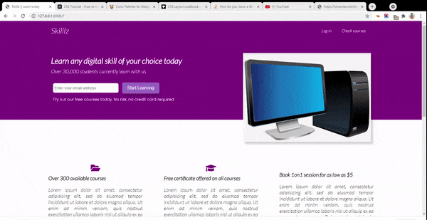
Currently, our app is going to look a bit messy:
How to Apply CSS Styling to our Showcase Area
First, we set the height of the showcase section as well as a background color:
.showcase {
  height: 300px;
  background-color: purple;
}
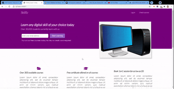
Our app will now look like this:
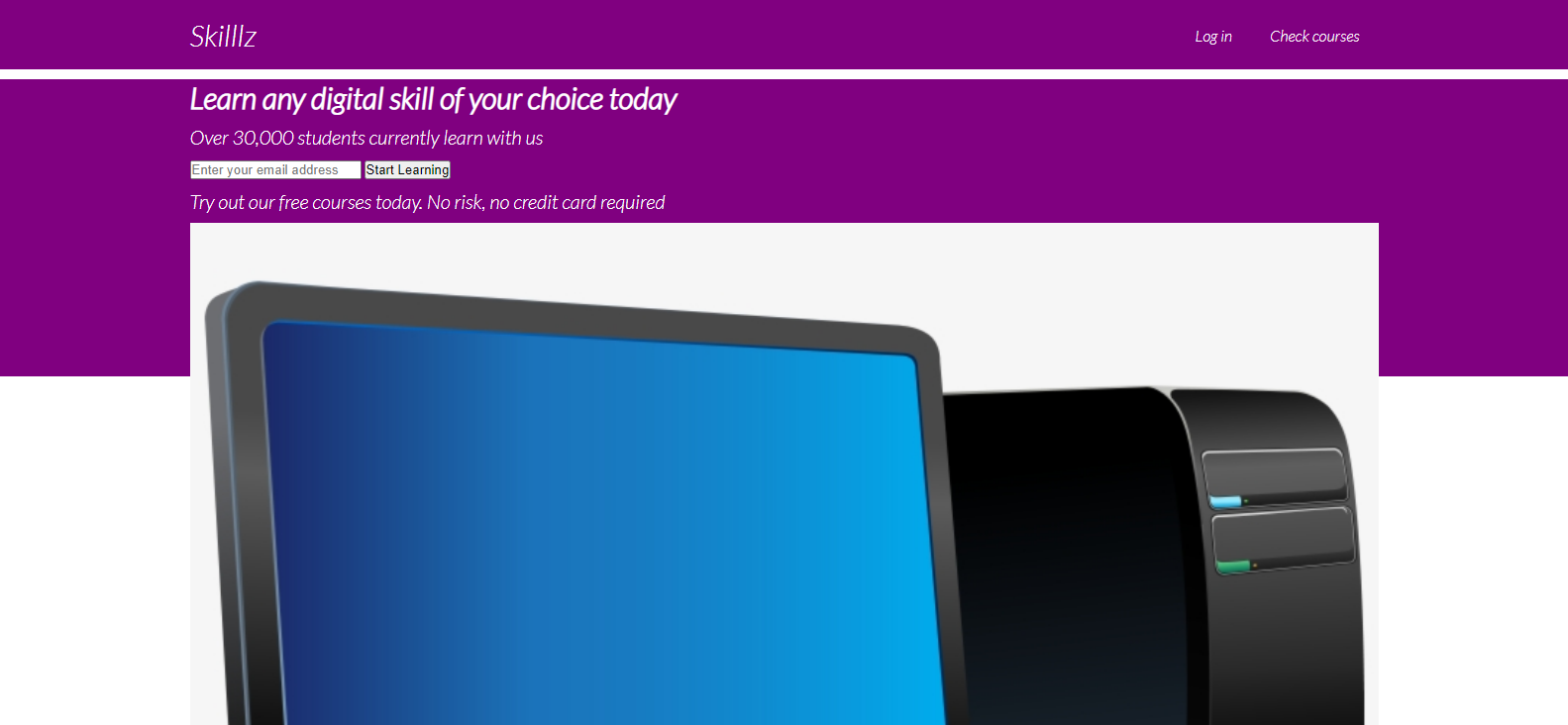
Still messy
NOTE: I changed the color of
h1to white
Next, we apply the following styles:
/* Adds margin below the text */
.showcase p {
  margin-bottom: 30px;
}

/* Adds a shadow below the image */
.showcase img {
  box-shadow: 7px 7px 7px rgba(0, 0, 0, 0.2);
}

/* Adds some padding on the form content */
.showcase-form {
  padding-left: 7px;
}
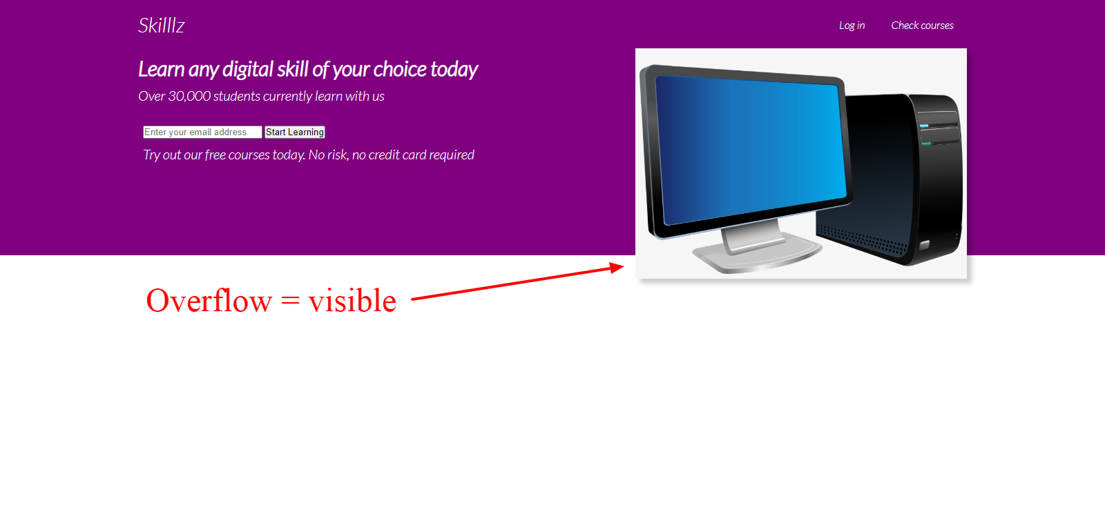
This brings us to the main activity. If you remember, I said that we were going to be creating two sections (grids) inside the showcase container. With the grid class registered on that container, we can align its content using CSS grid display like this:
.grid {
  overflow: visible;
  display: grid;
  grid-template-columns: 60% 40%;
}
This will create two columns inside of our showcase container. The first part will take up 60 percent of the container, and the second part will take up the remaining 40 percent of the container.
The overflow visible will ensure that the image (if bigger than the container) will flow beyond the container.
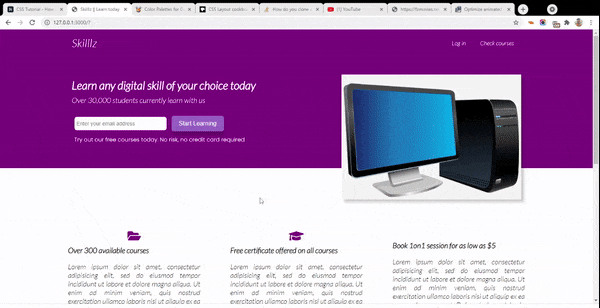
Our app will now look like this
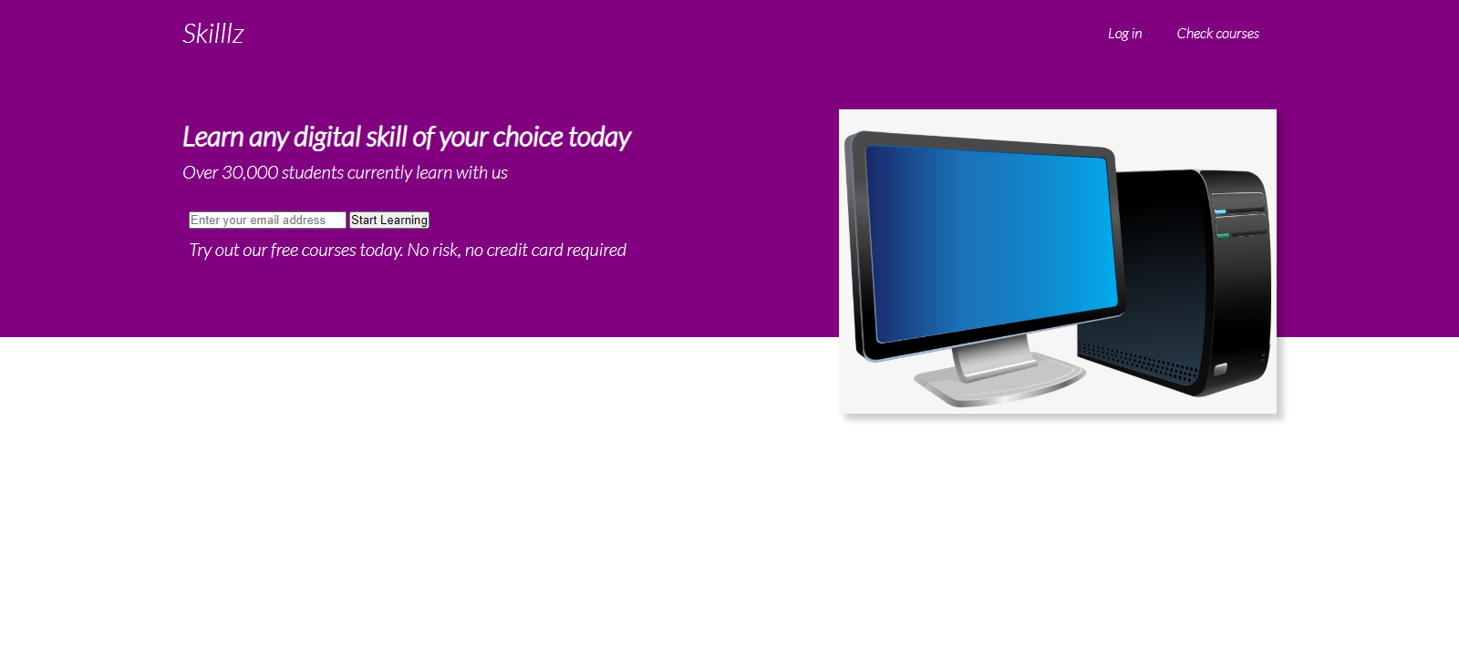
Next, we need to set some space between the navigation area and the showcase area.
.grid-item-1,
.grid-item-2 {
  position: relative;
  top: 50px;
}
As a result, it is now spaced out a bit:
Now, we need to style both of our form inputs because they don't look so nice. We select the first input by its type (email) and select the second by its class name, btn.
.showcase input[type='email'] {
  padding: 10px 70px 10px 0;
  font-size: 14px;
  border: none;
  border-radius: 6px;
  padding-left: 6px;
}

.btn {
  border-radius: 6px;
  padding: 12px 20px;
  background: #9867C5;
  border: none;
  margin-left: 10px;
  color: white;
  font-size: 16px;
  cursor: pointer;
  box-shadow: 0 10px 10px rgba(0, 0, 0, 0.2);
}
This style will transform both our form inputs to this:
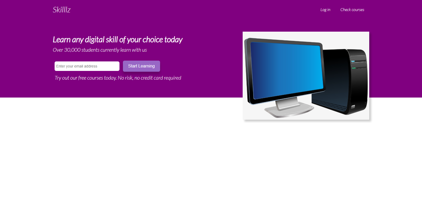
Form input styled better
Also maybe change the font of the supporting text:
.showcase-form {
  margin: auto;
}

/* Change typeface and its size */
.little-info {
  font-size: 15px;
  font-family: "poppins", sans-serif;

}
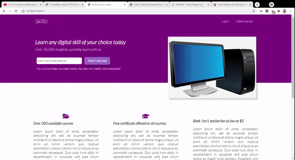
This is the final look of our showcase section:
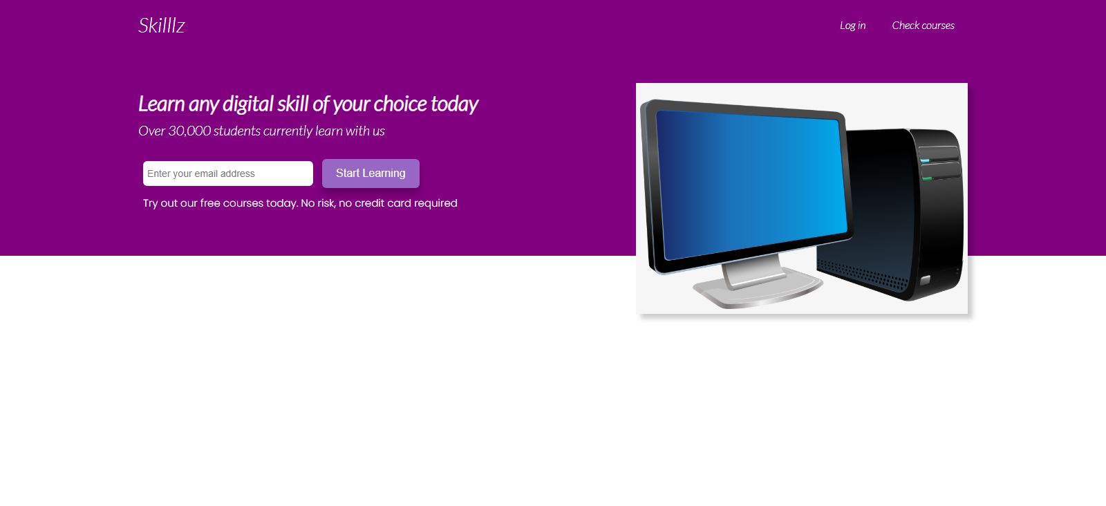
Final look of showcase section
That's it for this section!
How to Build the Lower Part of the Page
The lower part of the page is going to contain two sections, the stats section and the testimonials section.
The stats container which displays the services offered by Skilllz will be made up of three divs, each of which houses a font awesome icon, an h3 of class title, and a paragraph p of class text.
The testimonial container will hold the testimonials of three random people who learned using Skillz. I grabbed the pictures from unsplash.
How to Build the Stats Section
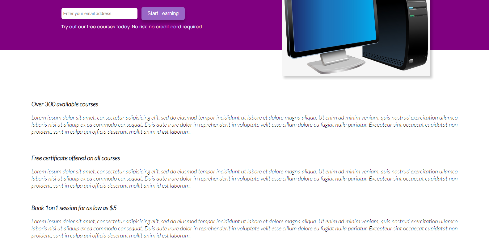
First, we are going to work on the stats section. The text is just a dummy 'lorem50' text to act as a filler for this demo.
Here is the markup for it:
<div class="lower-container container">
      <section class="stats">
        <div class="flex">
          <div class="stat">
            <i class="fa fa-folder-open fa-2x" aria-hidden="true"></i>
            <h3 class="title">Over 300 available courses</h3>
            <p class="text">Lorem ipsum dolor sit amet, consectetur adipisicing elit, sed do eiusmod tempor incididunt ut labore et dolore magna aliqua. Ut enim ad minim veniam, quis nostrud exercitation ullamco laboris nisi ut aliquip ex ea commodo consequat. Duis aute irure dolor in reprehenderit in voluptate velit esse cillum dolore eu fugiat nulla pariatur.
              Excepteur sint occaecat cupidatat non proident, sunt in culpa qui officia deserunt mollit anim id est laborum.</p>
          </div>
          <div class="stat">
            <i class="fa fa-graduation-cap fa-2x" aria-hidden="true"></i>
            <h3 class="title">Free certificate offered on all courses</h3>
            <p class="text">Lorem ipsum dolor sit amet, consectetur adipisicing elit, sed do eiusmod tempor incididunt ut labore et dolore magna aliqua. Ut enim ad minim veniam, quis nostrud exercitation ullamco laboris nisi ut aliquip ex ea commodo consequat. Duis aute irure dolor in reprehenderit in voluptate velit esse cillum dolore eu fugiat nulla pariatur.
              Excepteur sint occaecat cupidatat non proident, sunt in culpa qui officia deserunt mollit anim id est laborum.</p>
          </div>
          <div class="stat">
            <i class="fa fa-credit-card-alt fa-2x" aria-hidden="true"></i>
            <h3 class="title">Book 1on1 session for as low as $5</h3>
            <p class="text">Lorem ipsum dolor sit amet, consectetur adipisicing elit, sed do eiusmod tempor incididunt ut labore et dolore magna aliqua. Ut enim ad minim veniam, quis nostrud exercitation ullamco laboris nisi ut aliquip ex ea commodo consequat. Duis aute irure dolor in reprehenderit in voluptate velit esse cillum dolore eu fugiat nulla pariatur.
              Excepteur sint occaecat cupidatat non proident, sunt in culpa qui officia deserunt mollit anim id est laborum.</p>
          </div>
        </div>
      </section>
This section will be displayed as a blank page. This is because we had set the color of our text in the whole body to white. So we have to add some styling.
How to Apply CSS Styling to the Stats Section
First we need to apply the following styles:
/* Centers the container, sets a maximum width
.lower-container {
  margin: 120px auto;
  padding: 0;
  max-width: 1400px;
}


/* Targets all h3 with class of title */
.title {
  color: black;
  font-size: 20px;
  text-align: left;
  padding-left: 10px;
  padding-top: 10px;
}

/* Targets the paragraphs with class name of text */
.text {
  color: black;
  font-size: 19px;
  width: 100%;
  padding: 10px;
  margin: 0, 20px;
  text-align: justify;
}
This will now make our text visible:
Notice that the font icons from Font Awesome are not visible. We will be working on that pretty soon.
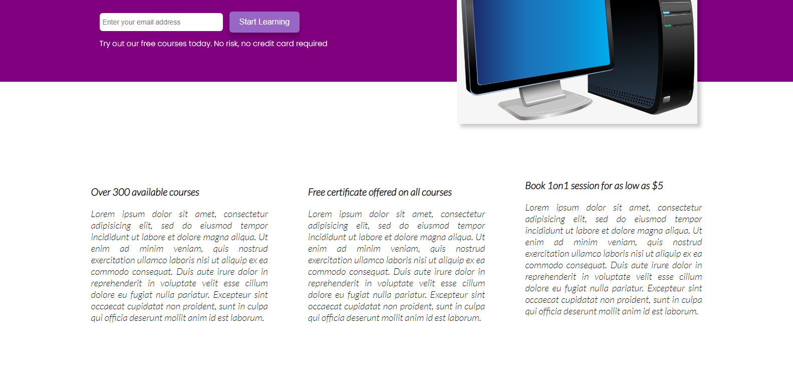
But before then, we will need to do something important. We do intend for all of the three stat divs to be aligned horizontally (side-by-side). To achieve that, we will once again be using CSS Flexbox:
/* Display horizontally, put a little space around them */
.flex {
  display: flex;
  justify-content: space-around;
}

/* Add some padding around the container. Align text centrally */
.stats {
  padding: 45px 50px;
  text-align: center;
}

/* Set margin and width */
.stat {
  margin: 0 30px;
  text-align: center;
  width: 800px;
}
This is how our app will now look:
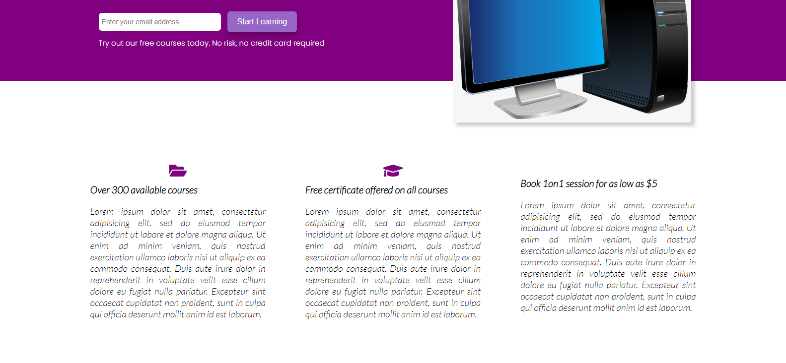
Still no icons? Time to fix that!
.stats .fa {
  color: purple;
}
and voilà!
How to Build the Testimonials Section
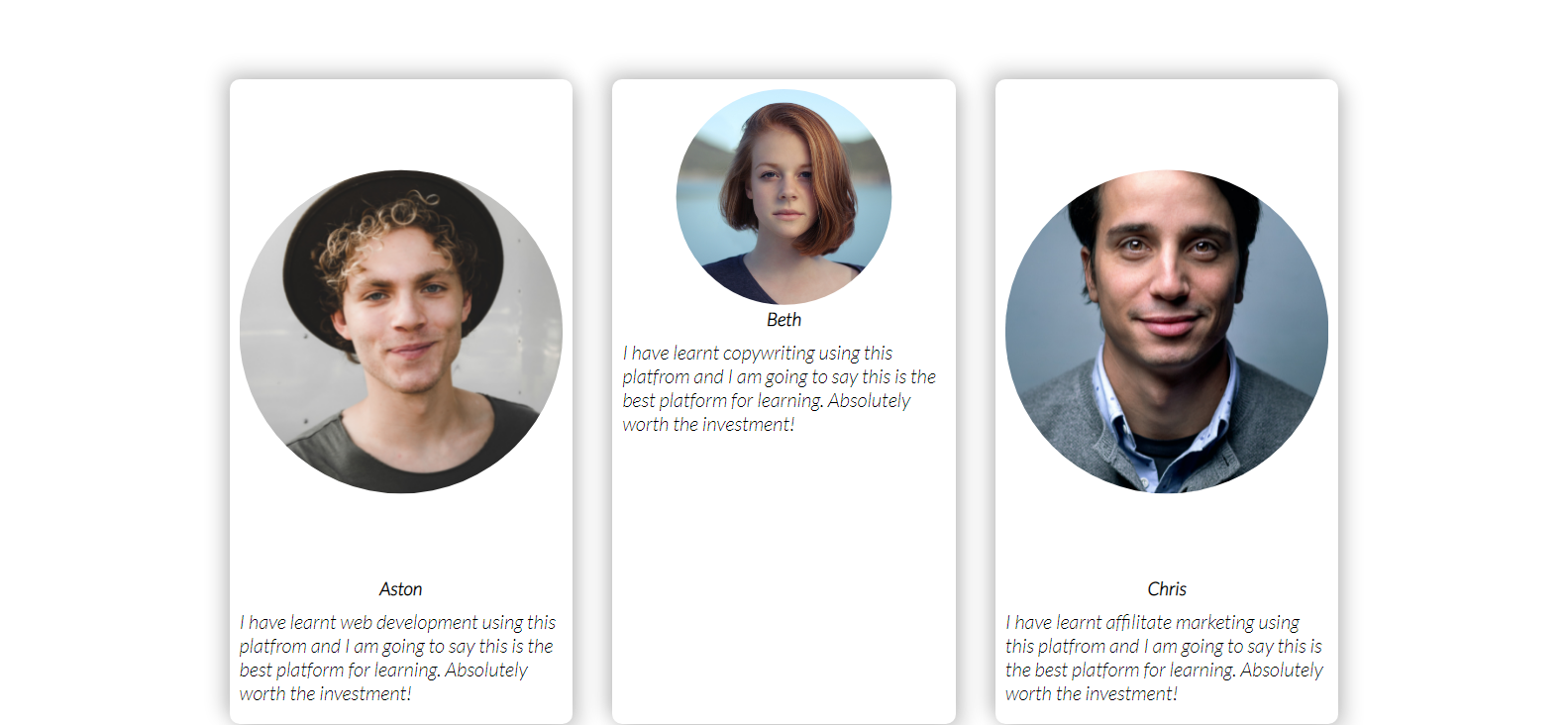
The second section inside of the lower container div of the page is the testimonials section. This section is going to be made up of three cards, each of which contains the image of the person (clipped inside a circle), their name, and the person's testimonial.
Here is the markup for that:
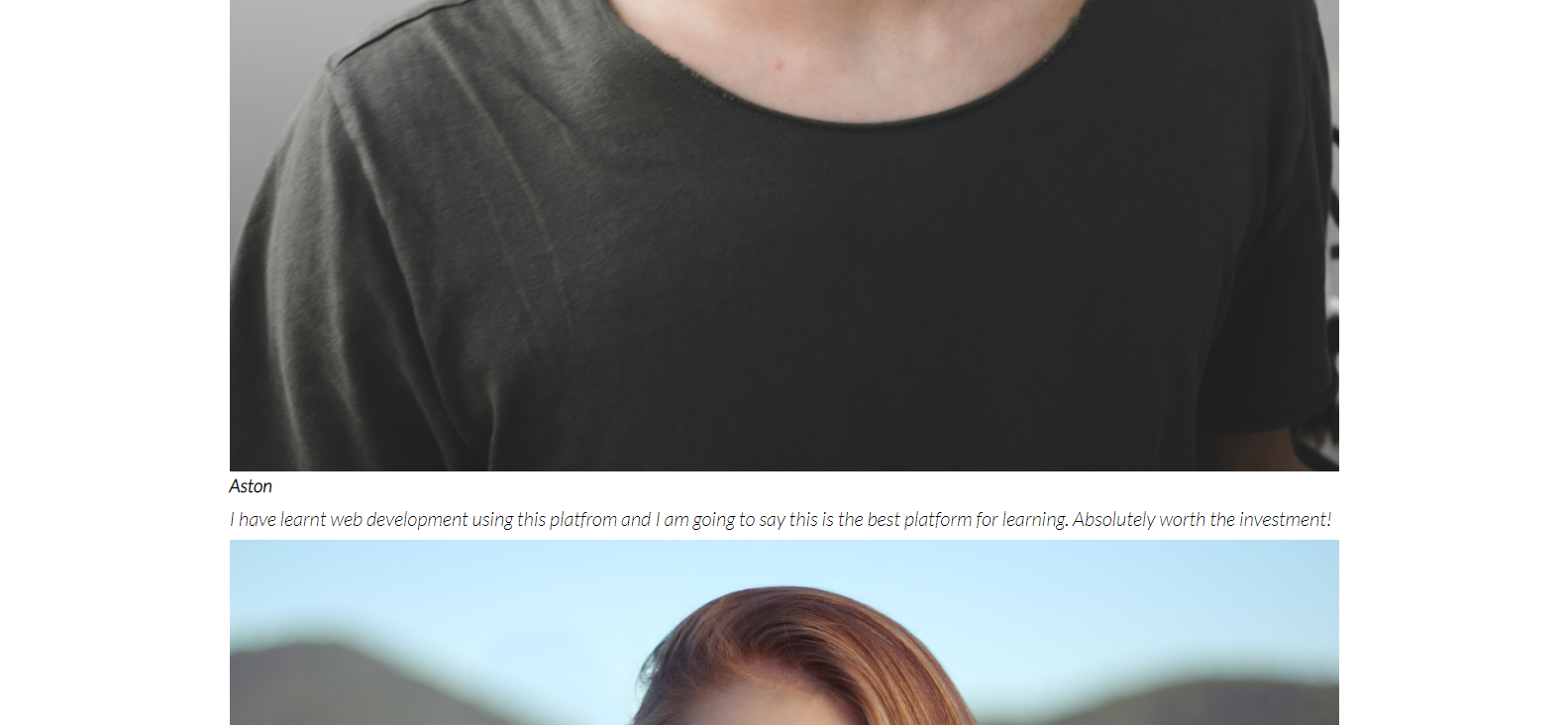
<section class="testimonials">
      <div class="container">
        <div class="testimonial grid-3">
          <div class="card">
            <div class="circle">
              <img src="./images/4.jpg" alt="">
            </div>
            <h3>Aston</h3>
            <p>I have learnt web development using this platfrom and I am going to say this is the best platform for learning. Absolutely
            worth the investment!</p>
          </div>
          <div class="card">
            <div class="circle">
              <img src="./images/5.jpg" alt="">
            </div>
            <h3>Beth</h3>
            <p>I have learnt copywriting using this platfrom and I am going to say this is the best platform for learning. Absolutely
            worth the investment!</p>
          </div>
          <div class="card">
            <div class="circle">
              <img src="./images/6.jpg" alt="">
            </div>
            <h3>Chris</h3>
            <p>I have learnt affilitate marketing using this platfrom and I am going to say this is the best platform for learning. Absolutely
            worth the investment!</p>
          </div>
        </div>
      </div>
    </section>
How to Apply CSS Styling to it
First, we set the text color to black so we can see it:
.testimonial {
  color: black;
  padding: 40px;
}
When applied, it should make the text visible and add some padding to the section:
Next, we set the image to take up the height of its parent container:
/* Wrap the image inside a cirle shape and set height to take up all of parent element */

.testimonial img {
    height: 100%;
    clip-path: circle();
}

/* Align text centrally */

.testimonial h3{
  text-align: center;
}
If you check the final layout in the gif, you will notice that all three testimonial cards are aligned side-by-side on the same line.
So we will need to create a div of three equal columns using the CSS grid arrangement.
/* Create a grid of three equal columns. Set a gap of 40 px between them */

.grid-3 {
  display: grid;
  grid-template-columns: repeat(3, 1fr);
  gap: 40px;
}


/* Create a white card with some shadow around it */
.card {
  padding: 10px;
  background-color: white;
  border-radius: 10px;
  box-shadow: -7px -7px 20px rgba(0, 0, 0, 0.2),
               7px  7px 20px rgba(0, 0, 0, 0.2)
}
With all of these styles applied, the testimonials section will now look like this:
Finally, we style the circle div and position it relative to the top border of the card using CSS:
.circle {
    background-color: transparent;
    border:3px solid purple;
    height:90px;
    position: relative;
    top: -30px;
    left: 120px;
    border-radius:50%;
    -moz-border-radius:50%;
    -webkit-border-radius:50%;
    width:90px;
}
And here is how everything will look in our browser:

Final look
Alright, now we're ready to move on to the footer section. Then we'll learn how to make the site responsive.
How to build the Footer Section
The final part of our landing page building process is to create the footer section. The footer section will comprise some copyright text, three extra navigation links, and a group of social media icons from Font Awesome.
Here is the HTML Markup for the footer section of our landing page:
<footer>
<div class="container grid-3">
<div class="copyright">
<h1>Skilllz</h1>
<p>Copyright © 2021</p>
</div>
<nav class="links">
<ul>
<li><a href="" class="outline">Home</a></li>
<li><a href="" class="outline">Tutors</a></li>
<li><a href="" class="outline">Categories</a></li>
</ul>
</nav>
<div class="profiles">
<a href=""><em class="fab fa-twitter fa-2x"></em></a>
<a href=""><em class="fab fa-instagram fa-2x"></em></a>
<a href=""><em class="fab fa-facebook fa-2x"></em></a>
<a href=""><em class="fab fa-whatsapp fa-2x"></em></a>
</div>
</div>
</footer>
The footer section will look unattractive without any styling:

No CSS yet
So let's change that.
How to Style the Footer
First, we need to set the background colour for the footer section (as well as the color for all links) to white, like this:
/* Add padding around the footer as well */

footer {
  background-color: purple;
  padding: 20px 10px;
}

/* Sets all link texts to white and puts margin to the left and right */

footer a {
  color: white;
  margin: 0 10px;
}
Now the footer will look like this:

Footer
If you check the first gif, you will notice that when I hover over any of the links inside of the footer, their color changes to a lighter shade of purple and a border also appears below them.
We can make this happen using a :hover selector:
footer a:hover {
  color: #9867C5;
  border-bottom: 2px solid #9867C5;
}
That's all for the footer!
How to Set Media Queries to Make the Page Responsive
It's now time to make our landing page more responsive. When building a website, it is important to have in mind that users will be viewing the site from different devices. So it is imperative to make the site layout responsive to improve the user experience across multiple devices.
In our CSS, we will define media queries which set breakpoints for the various screen widths of different devices and map a set of CSS rules for each screen size.
How to Design for Tablets and Smaller Screens
First, we will optimize our site's layout for users viewing from a tablet. In our CSS, we define the following style:
/* Tablets and Under */

@media(max-width: 768px) {
  .grid,
  .grid-3 {
    grid-template-columns: 1fr;
  }
Initially we had set two columns for the .grid class and 3 columns for the grid-3 class. Now, we want to make sure that all grid items take up just a single line.
As a result, our form and image which was formerly displayed side-by-side (horizontally) will now be displayed one after the other (vertically), like this:

Next, we'll apply the following styles:
/* Align all text to the center. This will move all text, including form centrally */

.showcase {
    height: auto;
    text-align: center;
  }

/* This resets the width of the image container and adds margin space to the left */

.image {
    width: 600px;
    margin-left: 80px;
  }

/* Changes the service sections from side-by-side orientation to each taking its own line. Aligns text to the center */

.stats .flex {
    flex-direction: column;
  }

  .stats {
    text-align: center;
  }

/* Makes sure each stat section does not exceed the width of parent */

.stat {
    width: 100%;
    padding-right: 80px;
  }

/* (re)Moves the cirle to the center of the card */

.circle {
      background-color: transparent;
      border:3px solid purple;
      height:90px;
      position: relative;
      top: -30px;
      left: 270px;
      border-radius:50%;
      -moz-border-radius:50%;
      -webkit-border-radius:50%;
      width:90px;
  }
And voilà! Our site now works on tablets and smaller screens.
The result
How to Design for Mobile Devices
Many people may view the site from a mobile device which typically has the smallest screen size out of all devices. Because of this, creating a layout for mobile-sized screens is very important.
/* Mobile devices */
@media(max-width: 500px) {
  .navbar {
    height: 100px;
  }
First, we increase the height of our navigation area. Since it will be viewed from a smaller screen, we want the area more accentuated for the user.
Then, we define the following styles:
/* Changes the alignment. The logo title stays at the top, the nav links will be below it */

.navbar .flex {
    flex-direction: column;
  }


/* When hovered on, retain white color and change border to black */

  .navbar a:hover {
    color: white;
    border-bottom: 2px solid black;
  }


/* Set light purple background on nav links, make it a bit round and add some spacing */

  .navbar ul {
    background: #9867C5;
    border-radius: 5px;
    padding: 10px 0;
  }


/* Align text to center */

  .showcase {
    height: auto;
    text-align: center;
  }


/* Reduce font size */

.little-info {
    font-size: 13px;
  }


/* Reduce image width */

  .image {
    width: 350px;
    margin-left: 70px;
  }

  .stat {
    margin-bottom: 40px;
  }


/* Move circle once again */

.circle {
      background-color: transparent;
      border:3px solid purple;
      height:90px;
      position: relative;
      top: -30px;
      left: 150px;
      border-radius:50%;
      -moz-border-radius:50%;
      -webkit-border-radius:50%;
      width:90px;
  }
}
And voilà!
Wrapping Up
FlexBox and Grid alignment are very powerful tools for laying out a web page however you want it to look.
Responsive web design is arguably one of the most important design principles in web development. We have to consider the fact that our site will be viewed from various kinds of devices with different screen resolutions. Optimizing our site's layout for different screens will improve the user experience.
In this tutorial, we have designed a simple landing page using CSS Flexbox, Grid, and many other CSS properties. We have also made the page look good on Tablets and Mobile Screens.
The full code for this project can be gotten from this GitHub repository.
I hope you learned something useful from this tutorial. If you have any suggestions, reach out to me on Twitter. You can also visit my blog for posts like this.
Thanks for following along and see you soon.