By Kevin Powell
CSS gets a bad rap for not behaving the way people expect. One of the things that throws people off the most are margins. They seem so simple, yet they have the potential to cause some really strange issues.
For people just getting into CSS, it's easily one of those things that can get you thinking "this is a stupid language that makes no sense!"
I see it everyday – both in the classroom as people try to figure out their spacing issues and in my YouTube comments sections as well.
In a way, margins are bit of a microcosm of CSS in general. CSS seems so simple with its property: value pairs, but as you progress with it, you realize that there is a lot going on.
Margins also seem so simple. Add some margin, and you add some empty space around that element. But then suddenly they behave a little differently in one situation than another, or you add some margin-top to a child element, and instead it's the parent that moves down.
Frustration ensues.
In this article, I hope to shed a little light on how margins work. We'll look at some of the common problems that happen, as well as simple solutions to those issues.
To go over all this, I'll be using examples from my Responsive Web Design Bootcamp over on Scrimba, which I pulled this simple layout from:

What are margins anyway?
Before we really jump into the deep-end here, I want to make sure we all know what margins actually are!
I'm going to assume that we all know that margins are part of the box model, with margin being all the way on the outside, coming after the content itself, the padding and the border.
The MDN explains them really well (emphasis mine):
The margin is the outermost layer, wrapping the content, padding and border as whitespace between this box and other elements. Its size can be controlled using margin and related properties.
In other words, it's effectively empty space that we can use to create space between one box and another in our layout.
Dealing with user-agent stylesheets
Browsers come with a surprising amount of CSS by default, which we call user-agent stylesheets. These styles are the reason that, without any CSS on our part, an <h1> is bigger than an <h2>, and why the <body> has a margin on it that we tend to always remove.
These styles are important, but they also lead to one of the biggest issues that people run into with margins! Margins don't default to 0 on all of our elements, and this can cause all sorts of strange issues which we'll be exploring shortly.
Lists, blockquotes, paragraphs, and headings all have margin on them (among other elements). While sometimes they're only a slight inconvenience, the default margin on paragraphs and headings seems to be the one which causes most issues out of the box.
By default, the left and right margins of a text element are set to 0, but they all come with a margin-top and margin-bottom.
I often tell people that those top and bottom defaults are roughly the same as the font-size of that element, since it's true for <p> as well as <h3> through <h6>. For <h1> it's actually 0.67em and for <h2> it's 0.83em.
This means that space exists between the elements on our page even if we have not explicitly set a margin.
We'll come back to these defaults in a second.
Collapsing margins
Collapsing margins are where the headaches often start.
When two elements have vertical margins which touch each other, they effectively merge into one another.
It's already a strange behavior, and then add it to the fact that it's only for vertical margins (top and bottom), I get why people get confused and annoyed by them.
We can see this in action with the following example:
p {
  font-size: 18px;
  margin-bottom: 40px;
}

.links {
  margin-top: 40px;
}
To help illustrate what's happening here, the .links class is on the last paragraph (<p class="links">) , which contains the two links inside it.
When people do something like this, they expect the margin between the middle paragraph and the links below it to be 80px (40px + 40px), but in reality, it's 40px. The two margins are touching each other, so they merge into one another.

To push it even more, let's give our <p>s' a margin-bottom to 100px:
p {
  font-size: 18px;
  margin-bottom: 100px;
}

.links {
  margin-top: 40px;
}
Again, the two margins don't add together, they collapse into one another, so the total space here is 100px.

This is a good thing
In cases like this, it's actually a good thing, though. If there are several elements with different margins, there is no need to add the margins together to see how large the gap between the elements is because we can rely on the fact that the larger margin always wins.
We often don't even think about it, it just works the way we expect it to work.
When it's not a good thing
That said, one instance where margin collapse causes all sorts of confusion is when the first child within an element has a margin-top that merges with the parent's margin-top.
Let's look at that same screenshot again:
There is a white space between the top of the viewport and the black box. That's not from the body (it's much bigger than the 8px margin the body would have).
Care to guess where it's coming from?
It's actually coming from the <h1> at the top of that black box.
Remember when I mentioned that the user-agent stylehsheets can do some odd things?
To help explain exactly what's happening here, let's add a much bigger margin-top to the h1.
.card {
  background: #000;
  color: white;
  width: 560px;
  margin: 0 auto;
}

h1 {
  font-size: 24px;
  margin-top: 100px;
}

p {
  font-size: 18px;
  margin-bottom: 100px;
}

.links {
  margin-top: 10px;
}
I see people do this all the time, trying to push the title down within its parent. However, rather than working as expected, we get a giant space on top of the entire card!

This is because the margin-top on the <h1> merges with the margin-top on the parent element.
There is nothing separating the top of the child and the parent in this case. So when we add margin-top to the child, it touches the parent's margin-top. And, as we saw above, when two margins touch one another, they merge into a single margin.
So while we are giving the margin to the child, it's being applied to the parent.
This is why people hate CSS.
Similarly, in the code above we gave all paragraphs a margin-bottom. That margin on the p.link elements touches the margin-bottom of the .card element, which means that the two merge together and the margin affects the .card element instead of the links.

Although this isn't causing an issue for the site we are currently creating, it could cause problems if we later decided to add further elements to the page.
The problem is, we're using margin for the wrong purpose
If I want space between the top of the .card element and the children inside it, I shouldn't be using margin anyway.
Beginners often get mixed up between margin and padding. My general rule of thumb is if you want empty space, use margin. If you want more background, use padding.
In this case, we want our .card to have more background, so we shouldn't be adding a margin to its children. Instead we should add padding to that element itself.

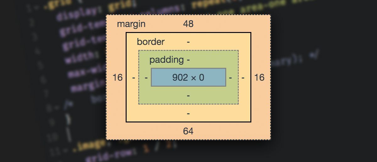
In the image above, we can see the padding and the margin. The <h1> on top still has a margin, but it's no longer merging with the .card because the padding has added in a buffer. This prevents the .card's and h1 margin from touching one another.
As the padding adds sufficient space between the <p>s and the <h1>s, we can now remove the margins we previously added to them.

Margins don't always collapse
There are some exceptions to collapsing margins. The direct descendants of grid and flex parents do not have collapsing margins.
Cue the ?.
But there is a bit of a workaround for this as well, which brings us full circle back to those user agent-stylesheets we talked about at the start.
There is an easy way to avoid even thinking about collapsing margins
First off, there is my general rule of thumb that I talked about above:
- If you need empty space, use
margin - If you need more background, use
padding
That will get you out of trouble most of the time. But let's add an extra rule to this that will help even more:
- Try to avoid
margin-topexcept when you really need it
This rule is in a bit of conflict with the user-agent-styles, which set a margin-top and margin-bottom to a bunch of elements, which is one reason I often will do something like this:
h1,
h2,
h3,
h4,
h5,
h6,
p,
ul,
ol {
 margin: 0 0 1em 0;
}
It eliminates a lot of the issues that come from collapsing margins on their own, as well as differences in your layout when some places are using flex or grid and others are not.
(Note: if you inspect the code here on freeCodeCamp, you'll see they do something similar as well!)
It's not a perfect solution, and I often do use a little margin-top on certain subtitles or in specific situations where it's called for. But I'm doing it very intentionally instead of letting the user-agent-styles potentially get in the way in some unforeseen way.
These lessons are just a snippet of my much larger course on responsive web design. To continue this coding journey, take a look at the course.
In the course I cover an introduction to responsive web design, and dive into both flexbox and grid, all the while trying to show people how much fun CSS really is once you start to understand how it works.
Happy coding :)