
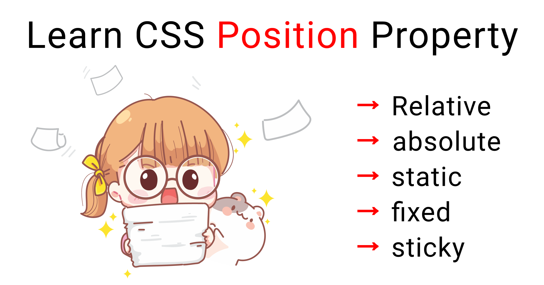
Today we're gonna learn everything you need to know about the CSS position property along with examples. Let's get started 🎖️
Table of contents
- What is CSS Position Property?
- What is the Static Position in CSS?
- What are the Relative and Absolute Positions in CSS?
- What is the Fixed Position in CSS?
- What is the Sticky Position in CSS?
You can watch this tutorial on YouTube as well if you like:
What is the position property in CSS?
If you want to make stunning websites that looks artistic, unique, and beautiful, then you should definitely learn how to use the CSS position property. Let's see how it works.
Using Flexbox or Grid, you can make a symmetrical website like this: 👇
 Website made w/ Flexbox
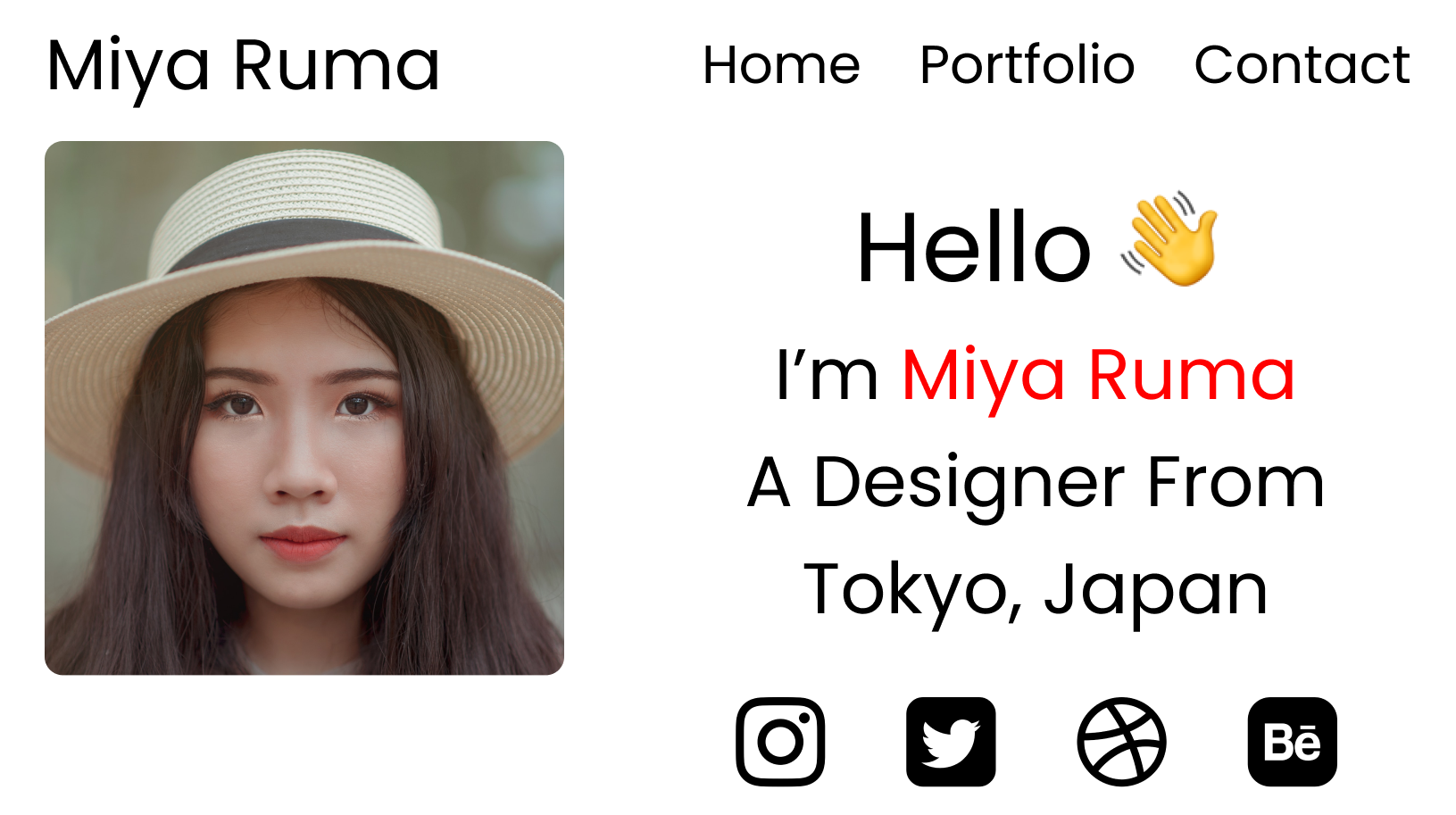
With the position property, you can make an asymmetrical website like this:👇
 Website made w/ Grid & position properties
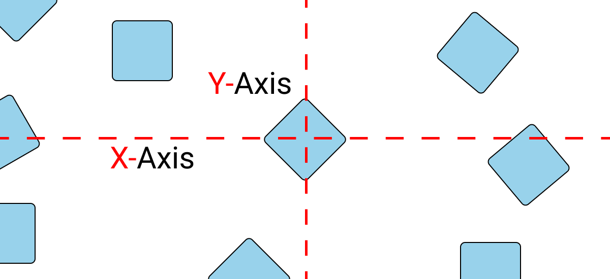
You can't place your content anywhere you wish using Flexbox and Grid. You're limited around the X and Y Axis. Look at this drawing to see what I mean: 👇
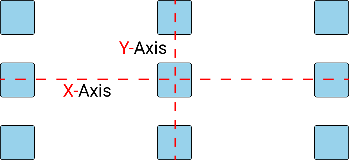 Symmetrical content layout showing elements placed respective to the x and y axis
Your boxes will follow these exact measurements. 👆
But, using the position property, you can place your content anywhere you wish by detaching each element from the other elements.
 Asymmetrical content layout showing elements placed irrespective of x and y axis.
You can place your boxes anywhere you wish with this sort of layout. 👆 In other words, you will have free movement around your screen.
Here's another example of what you can make using the position property:
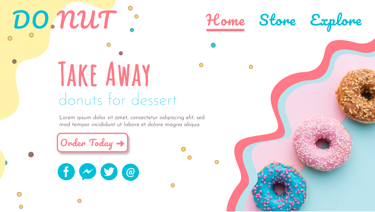 An Asymmetrical Website
You can place or move those little dots and waves patterns and donut image all around the page ☝ anywhere you wish using the position property.
Project Setup
For this project, you can use any code editor that has the emmet plugin installed. I'm gonna use CodePen.io.
HTML
Inside the body tag, write this code: 👇
<div class="box-1"> </div>
CSS
Clear your default browser settings and add this CSS:👇
*{
   margin: 0px;
   padding: 0px;
   box-sizing: border-box;
}
Style the box-1 class like this:👇
.box-1{
   width: 120px;
   height: 120px;
   background-color: skyblue;
   border: 2px solid black;
}
Our position property has 5 values:
- relative
- absolute
- static
- fixed
- sticky
To move our box, we'll use 4 properties:
- Top, Bottom
- Left, Right
What is the Static Position in CSS?
This has no use cases. This is the default value of every element.
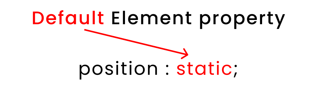 Default position of every element
What are the Relative and Absolute Positions in CSS?
Both the relative position and absolute position work in the same way except in one field. We use relative to identify the parent class. And we use absolute to identify the children classes.
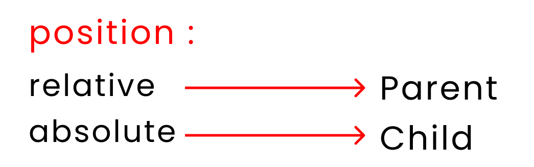 Position VS relative position
Let's look at 2 examples 👇
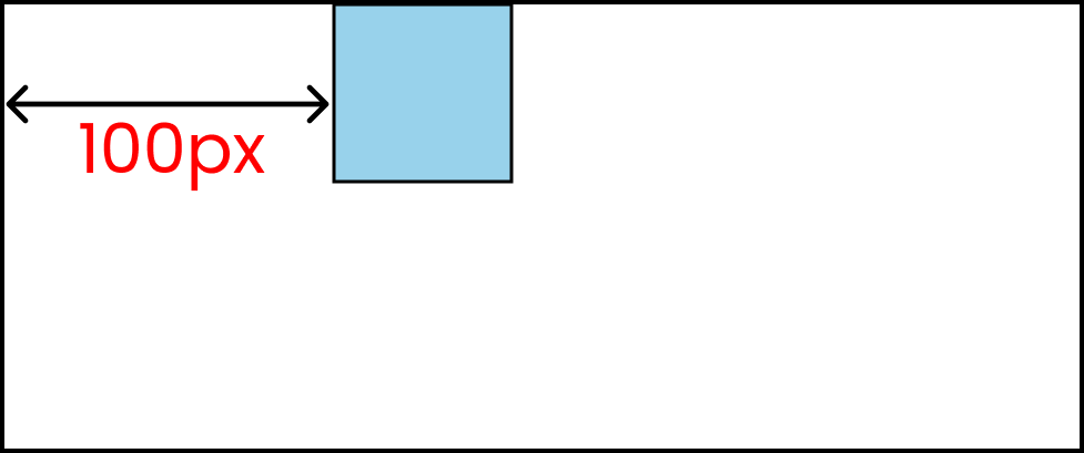
First, let's experiment with the relative value. Try out this code:
.box-1{
/* Other codes are here*/

   position: relative;
   left: 100px;
}
This is the result you'll get:👇
We can duplicate the same result using the absolute value like this: 👇
.box-1{
/* Other codes are here*/

   position: absolute;
   left: 100px;
}
Let's investigate the main difference between relative and absolute positions.
Relative vs Absolute Position in CSS
HTML
Write this code inside your HTML: 👇
<body>
   <div class="box-1">

       <div class="box-2"> </div>

   </div>
</body>
CSS
Style the boxes with the following CSS:👇
.box-1{
    width: 300px;
    height: 300px;
    background-color: skyblue;
    border: 2px solid black;
    margin: auto;
}

.box-2{
    width: 100px;
    height:100px;
    background-color: pink;
    border: 2px solid black;
}
It should look like this:👇
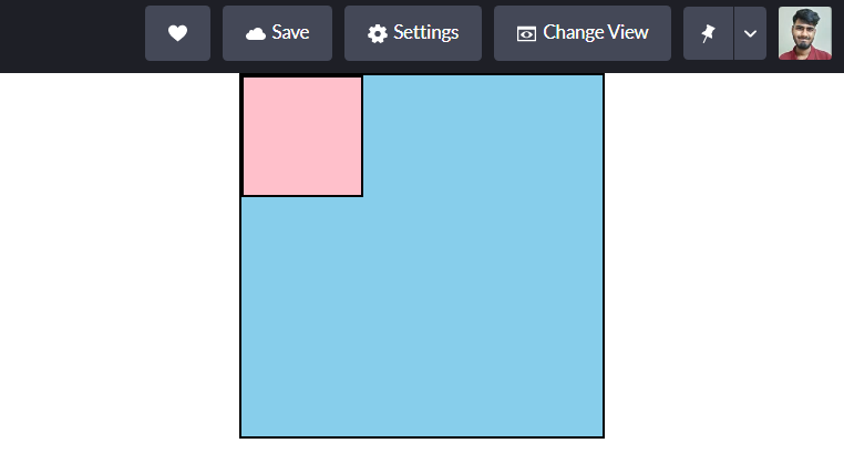 The result is a blue box with a smaller pink box in the upper left
Now, we'll select our classes like this: 👇
body{ }

.box-1{ }

.box-2{ }
Now, write this code in your CSS: 👇
body{

}

.box-1{
/* This is the  👇 parent */
    position: relative;
}
.box-2{
/* This is the  👇 child */
    position: absolute;
    left: 100px;
}
Here's the result: 👇
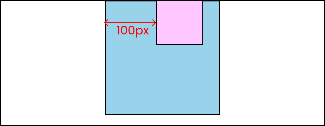 The result is that the pink box has moved right 100px
Notice that .box-2 has moved 100px from .box-1.
This is because .box-1 is the parent and .box-2 is the child.
Let's change it again. Write this code in your CSS:
body{
/* This is the  👇 parent */
   position: relative;
}

.box-1{

}
.box-2{
/* This is the  👇 child */
   position: absolute;
    left: 100px;
}
Now here's the result: 👇
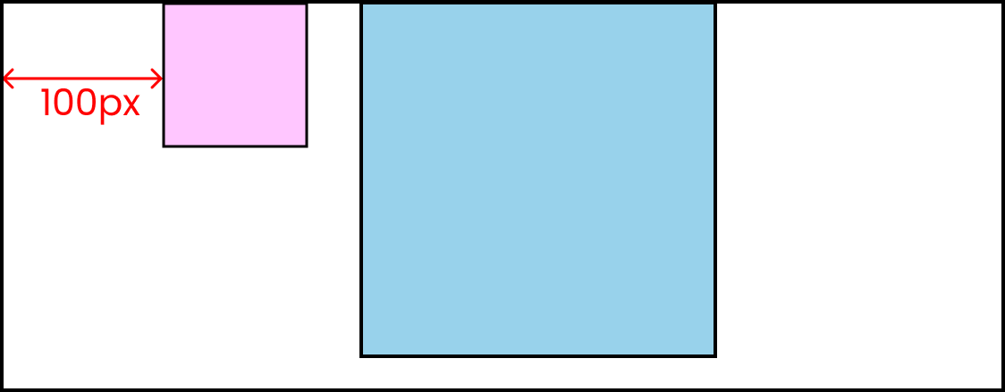 The result is that the pink box has moved 100px from the body
Notice that .box-2 has moved 100px from the body element.
This is because the body is the parent and .box-2 is the child.
What is the Fixed Position in CSS?
This value will fix the position of your element on the screen even when you scroll in the browser. Let's look at some examples to see how it works.
Fixed position example
Write this code in your HTML. 👇 Once you write lorem200, make sure to hit the Tab key on your keyboard:
<div class="container">

    <p>lorem200</p>

    <div class="box-1"> fixed </div>

    <p>lorem200</p>

</div>
And here's the CSS:
.container{
    height: 3000px;
}

.box-1{
    height: 120px;
    width: 120px;
    background-color: skyblue;
    border: 2px solid black;

    display: grid;
    place-content: center;
}
Then add this CSS at the bottom:
.box-1{

    position: fixed;
    top: 100px;
    left: 200px;
}
Here's the result:👇
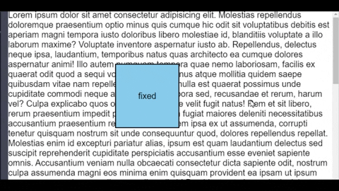
You can see that the element remains fixed even when we scroll our browser.
What is the Sticky Position in CSS?
After scrolling to a certain point on our screen, this value will fix the position of our element on the screen so it doesn't move.
Sticky position example
Don't change anything in your current HTML and CSS except this one value:
.box-1{
/*  Play with  👇 this value */
   position: sticky;
   top: 30px;
   left: 200px;
}
Here's the result: 👇
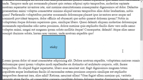
You can see that after a certain scroll point, the element remains fixed at the exact top of our browser screen.
You can check out these websites to see how the sticky position works on actual websites.
Conclusion
Now, you can confidently make beautiful websites and solve simple layout problems using the position property.
Here's your medal for reading till the end. ❤️
Suggestions and Criticisms Are Highly Appreciated ❤️
YouTube / Joy Shaheb
LinkedIn / JoyShaheb
Twitter / JoyShaheb
Instagram / JoyShaheb
Credits
#