By Nishant Kumar
If you have ever used CSS, then you know how hard it is to position elements. But by the end of this tutorial you'll know much more about CSS positioning and Flexbox, and you'll be able to position elements in your dream project like a boss.
First, let's understand some basics about CSS positioning.
CSS Position Property
You can use the CSS position property to position elements, divs, and containers in CSS according to your needs. The great thing about the position property is that you can use it to arrange elements of your app anywhere you want, and it's easy to learn and implement.
There are five types of positioning in CSS:
- Static positioning
- Relative positioning
- Absolute positioning
- Fixed positioning
- Sticky positioning
Let's learn about them one by one.
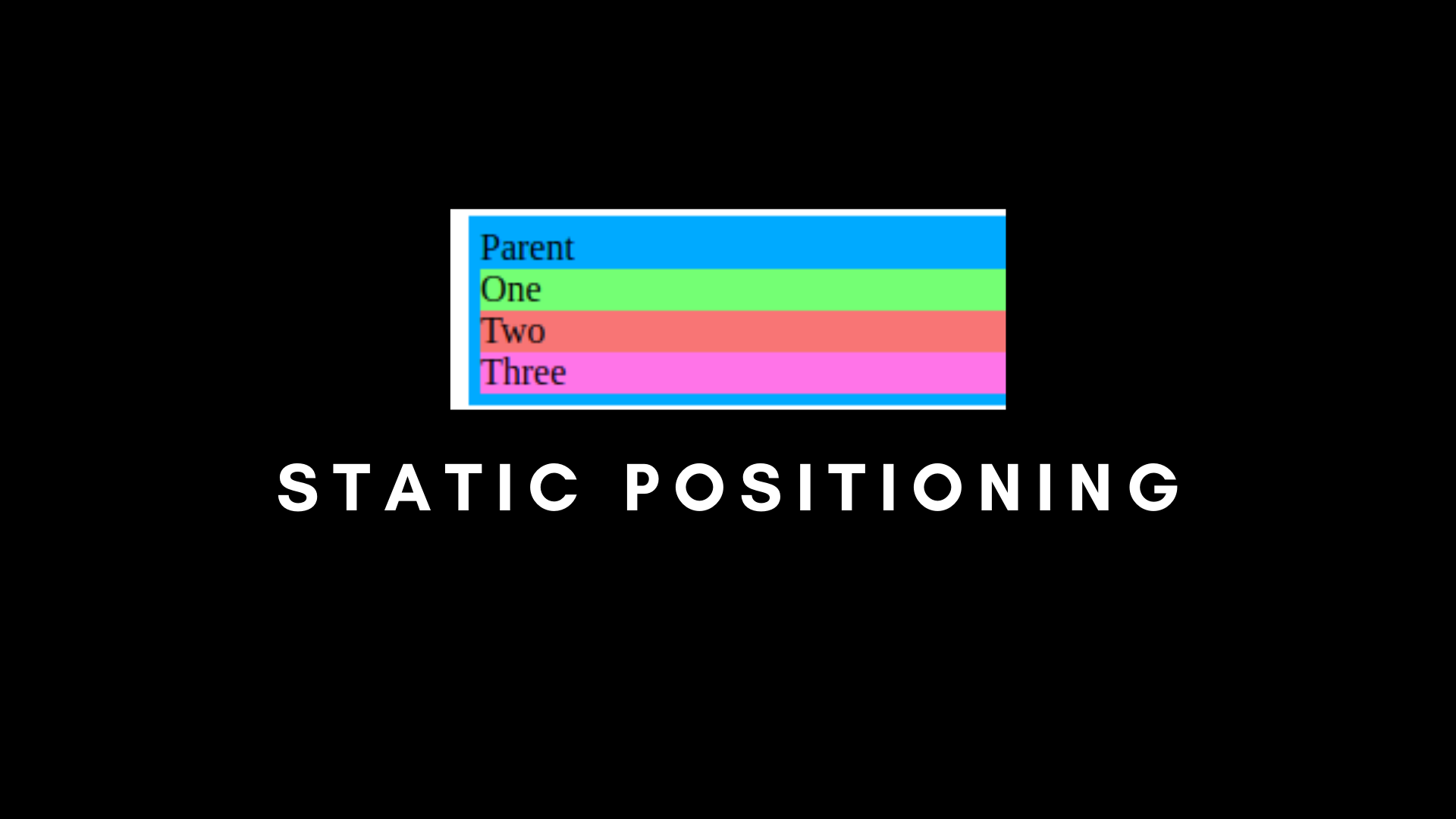
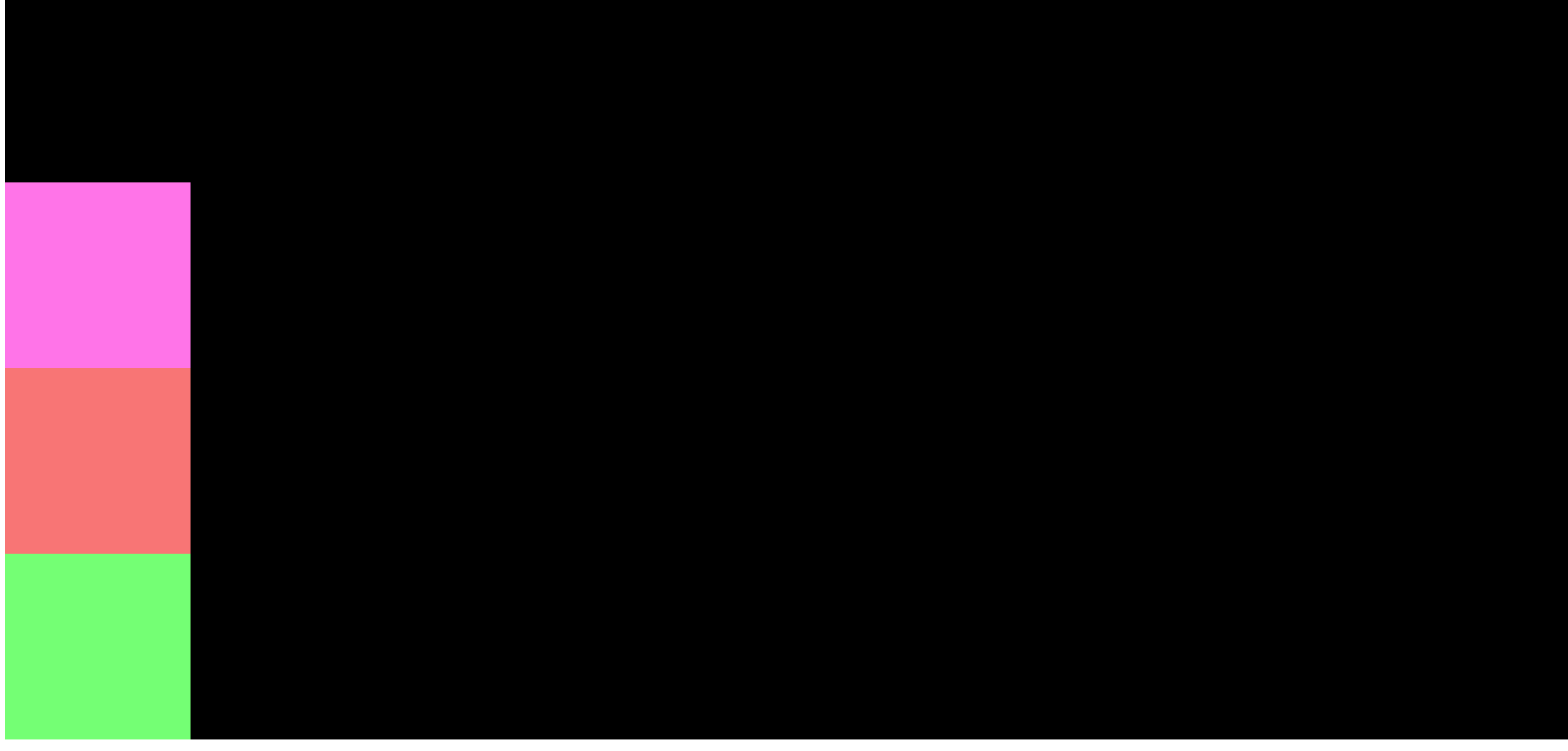
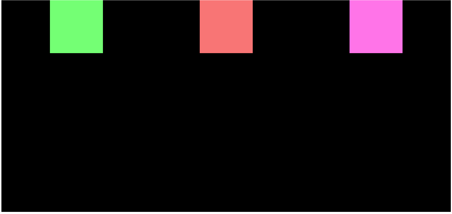
Static Positioning in CSS
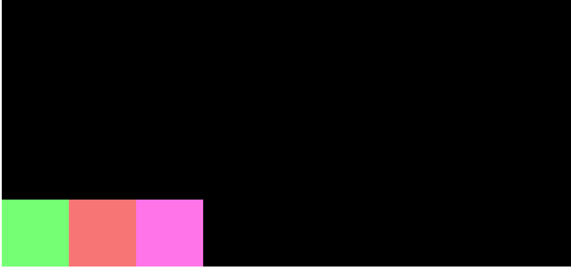
Static Positioning is the default positioning property used in CSS. It always goes according to the normal flow of the page. Whatever element comes in your document first, will be displayed first.
 Output
Here's what the code would look like:
/* Static Positioning */
.parent {
    padding: 5px;
    position: static;
    background-color: #00AAFF;
    width: 40%;
  }

  .child-one {
      position: static;
    background-color: rgb(116, 255, 116);
  }

  .child-two {
      position: static;
    background-color: rgb(248, 117, 117);
  }

  .child-three {
      position: static;
    background-color: rgb(255, 116, 232);
  }
<!DOCTYPE html>
<html lang="en">
<head>
    <meta charset="UTF-8">
    <meta name="viewport" content="width=device-width, initial-scale=1.0">
    <title>CSS Position and Flexbox</title>
    <link rel="stylesheet" href="./index.css">
</head>
<body>
    <div class="parent">Parent
        <div class="child-one">One</div>
        <div class="child-two">Two</div>
        <div class="child-three">Three</div>
    </div>
</body>
</html>
In the above example, we have our parent, then child one, then child two, and lastly child three. They all are arranged according to Static Positioning, that is according to the normal flow of the page.
Relative Positioning in CSS
Relative Positioning works exactly like static positioning, but there is a catch.
There are four things that we can do in relative positioning that we cannot do with static: we can shift our elements to left, right, bottom, and top.
Let's understand what I mean with an example.
/* Relative Positioning */
.parent {
    padding: 5px;
    background-color: #00AAFF;
    width: 40%;
  }

  .child-one {
    position: relative;
    background-color: rgb(116, 255, 116);
  }

  .child-two {
    background-color: rgb(248, 117, 117);
  }

  .child-three {
    background-color: rgb(255, 116, 232);
  }
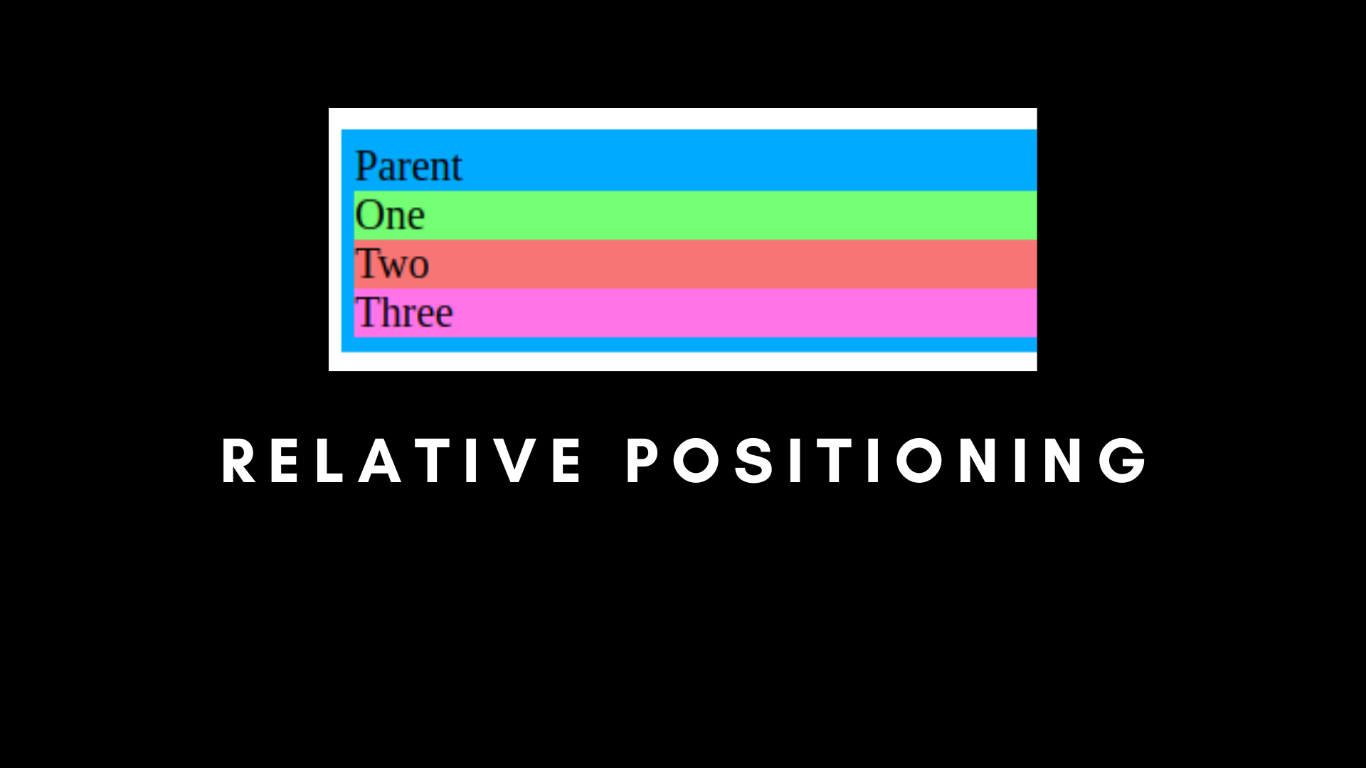
If we run our app, we will see that there is no difference in the output. In other words, static and relative positioning are the same, unless we are using top, bottom, left, and right with relative.
Let's try using top, bottom, left and right.
/* Relative Positioning with Top, Bottom, Left and Right */
.parent {
    padding: 5px;
    background-color: #00AAFF;
    width: 40%;
  }

  .child-one {
    position: relative;
    top: 10px;
    background-color: rgb(116, 255, 116);
  }

  .child-two {
    background-color: rgb(248, 117, 117);
  }

  .child-three {
    background-color: rgb(255, 116, 232);
  }
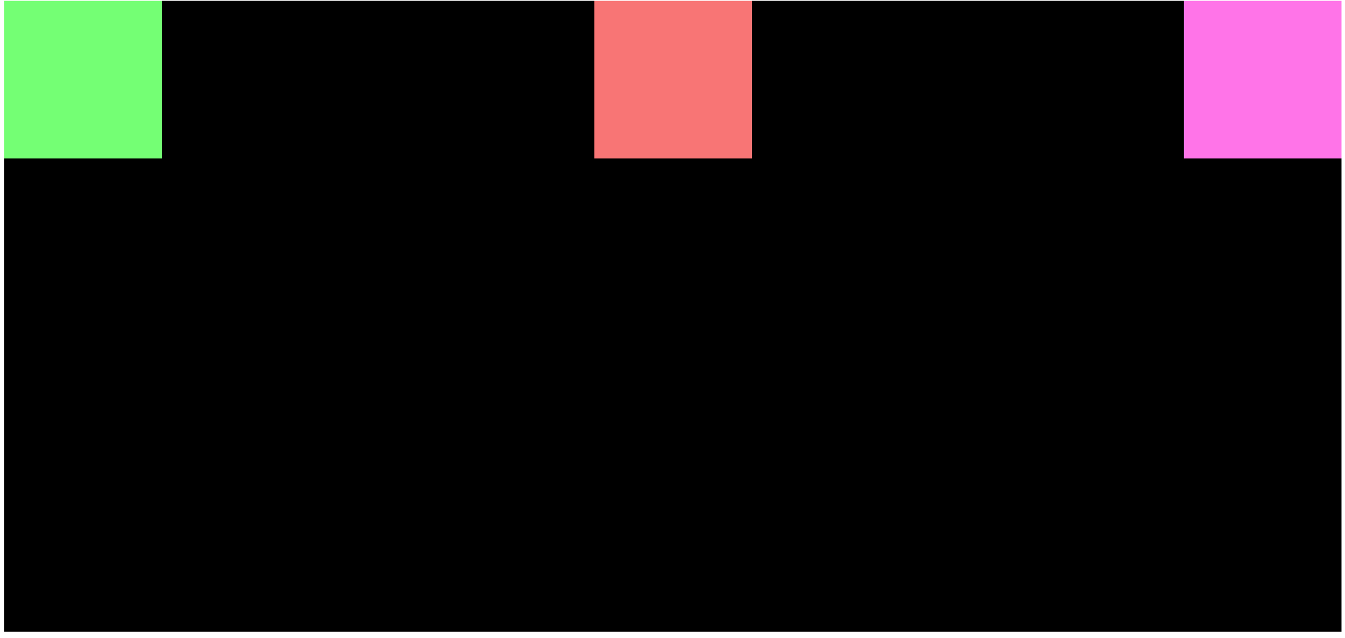
We are using Top with Relative in child-one.
This throws child-one out of the document flow, and it will shift from the top to the bottom by 10px.
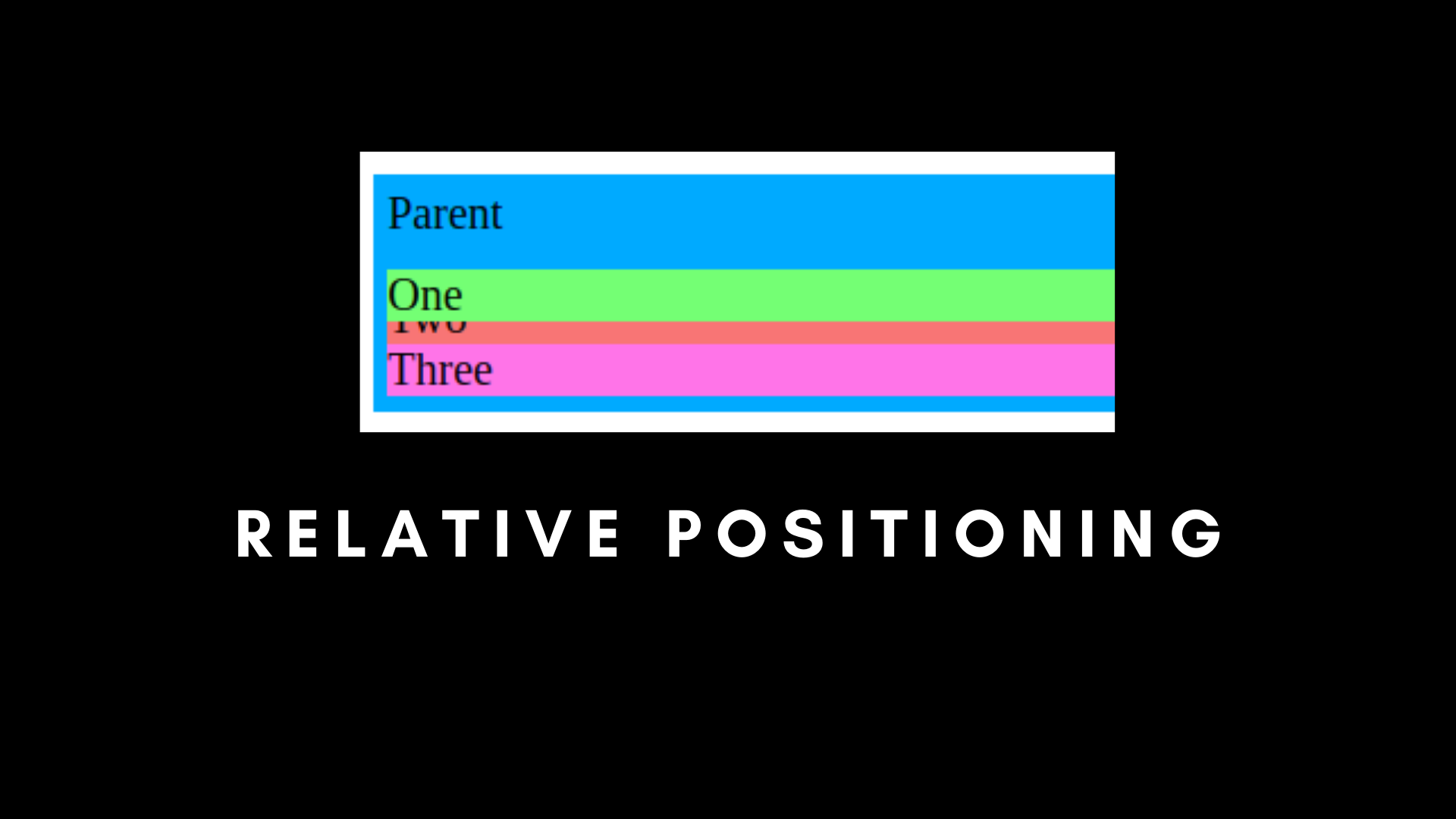 Relative positioning with Top
You can see it covering the child-two element. And it will be similar if you use left, right, or bottom, according to the property.
The main reason why child-one is covering child-two is that child-one is no longer part of the normal document flow, but child-two and child-three are.
Absolute Positioning in CSS
The next way you can position elements is with absolute positioning. This positioning completely removes the element from the flow of the document. All other elements will ignore the element which has the absolute property.
And if we use Top, Bottom, Left, or Right with Absolute, it will arrange the element according to the parent container, with the condition that the parent container must also be absolute-positioned.
/* Absolute Positioning */
.parent {
    padding: 5px;
    background-color: #00AAFF;
    width: 40%;
    position: static;
  }

  .child-one {
    position: absolute;
    top: 0px;
    background-color: rgb(116, 255, 116);
  }

  .child-two {
    background-color: rgb(248, 117, 117);
  }

  .child-three {
    background-color: rgb(255, 116, 232);
  }
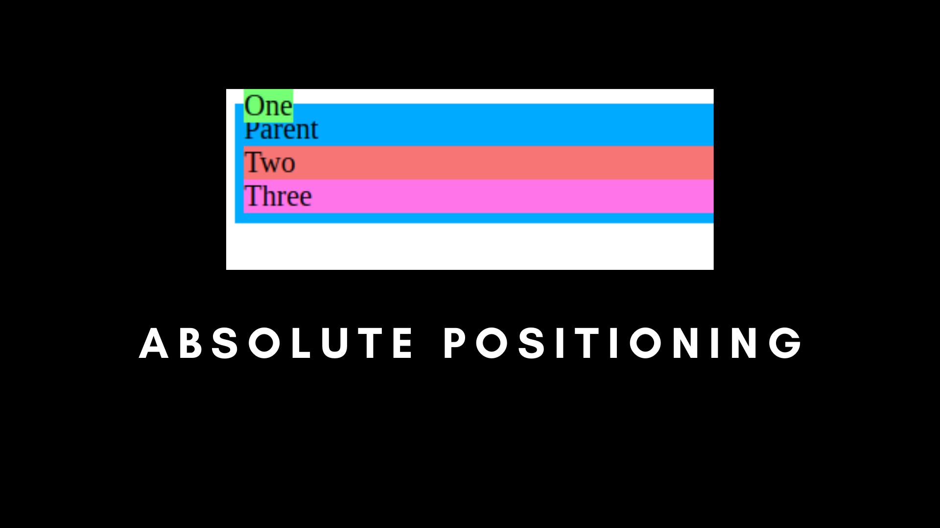
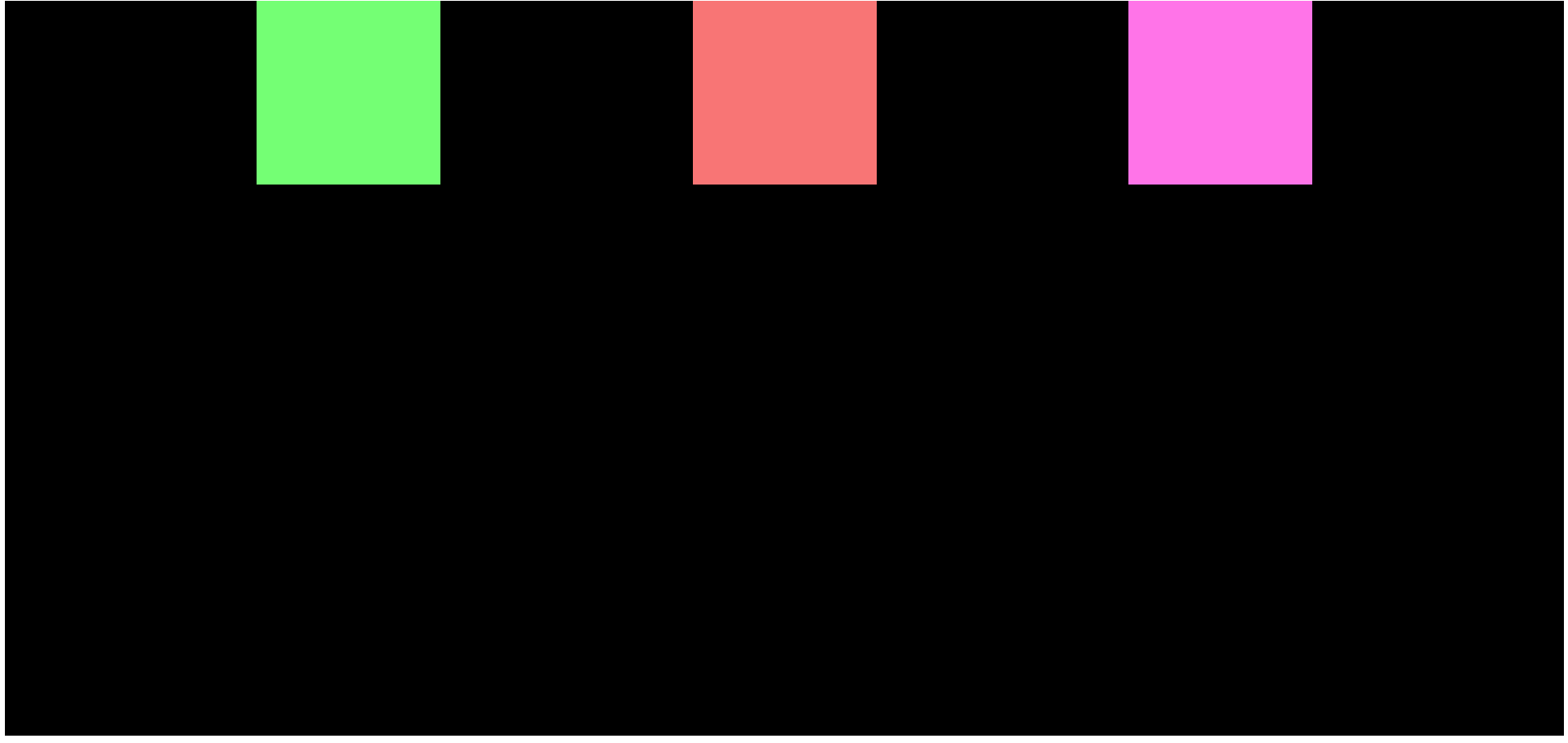
Here, child one is outside the normal flow of the document, if we set Top as 0px.
That is because child-one is absolute, and the parent is static.
But what if we set the parent to absolute with top at 0px?
/* Absolute Positioning */
.parent {
    padding: 5px;
    background-color: #00AAFF;
    width: 40%;
    position: absolute;
    top: 0px;
  }

  .child-one {
    position: absolute;
    top: 0px;
    background-color: rgb(116, 255, 116);
  }

  .child-two {
    background-color: rgb(248, 117, 117);
  }

  .child-three {
    background-color: rgb(255, 116, 232);
  }
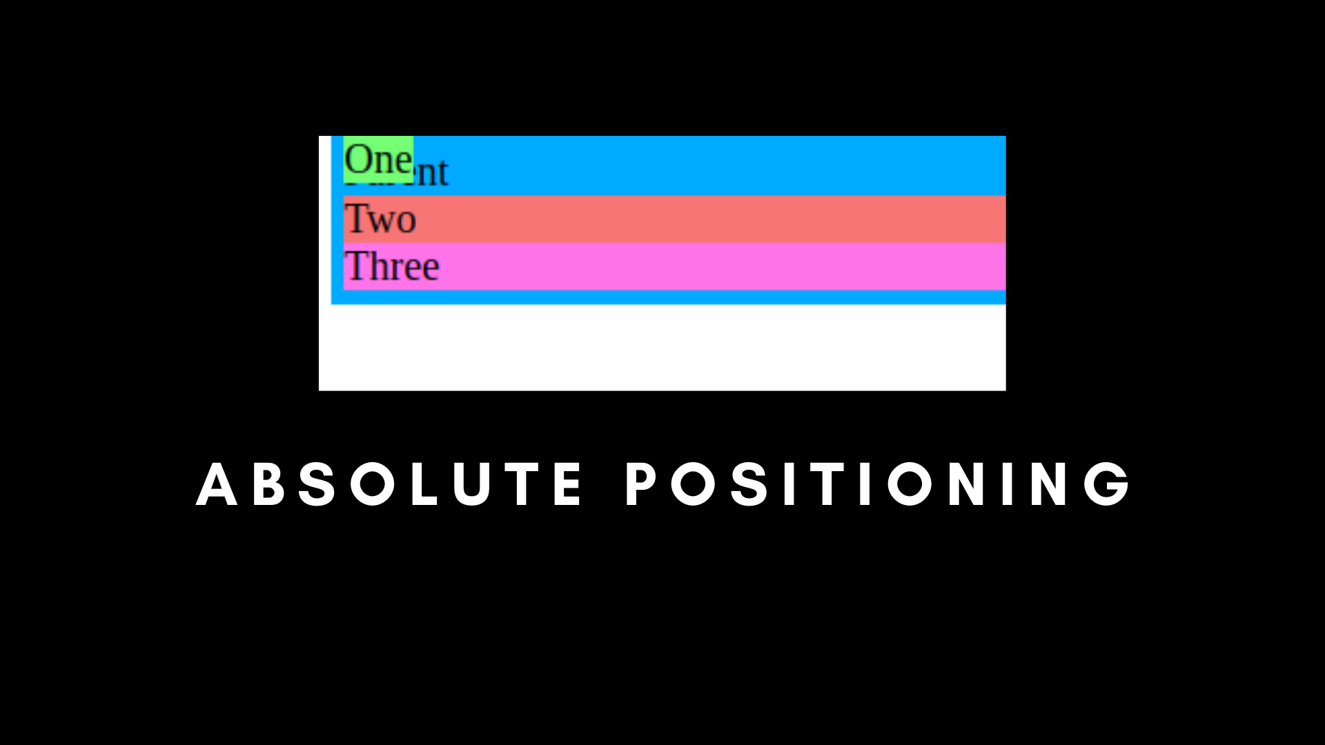
Here, you can see that the first-child overlaps the parent element, and both of them are at the top with 0px.
There is a third use case, where we can set the Parent as relative and the first-child as absolute.
/* Absolute Positioning */
.parent {
    padding: 5px;
    background-color: #00AAFF;
    width: 40%;
    position: relative;
    top: 0px;
  }

  .child-one {
    position: absolute;
    top: 0px;
    background-color: rgb(116, 255, 116);
  }

  .child-two {
    background-color: rgb(248, 117, 117);
  }

  .child-three {
    background-color: rgb(255, 116, 232);
  }
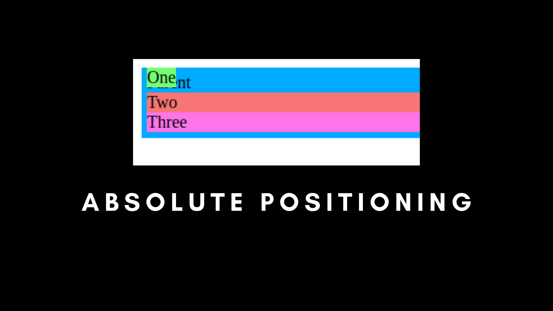
This is the most useful use case when we are using relative with absolute. Now, you can see that our child-one is relative to the parent element, not the entire document.
In simpler words, if you fix the parent as relative, and the child as absolute, the child will follow the parent as its container.
Fixed Positioning in CSS
Remember absolute with relative positioning? There is a position that completely ignores the parent element, and that is fixed positioning.
Fixed positioning is fixed according to the entire HTML document. It won't follow any other parent, even if it's set as relative.
Another thing is that if we set something as fixed, it will stay in the same position even if we scroll.
The fixed positioning is mainly used for floating items and buttons.
/* Fixed Positioning */
.parent {
    padding: 5px;
    background-color: #00AAFF;
    width: 40%;
    position: relative;
    top: 0px;
    height: 1000px;
  }

  .child-one {
    position: fixed;
    top: 0px;
    background-color: rgb(116, 255, 116);
  }

  .child-two {
    background-color: rgb(248, 117, 117);
  }

  .child-three {
    background-color: rgb(255, 116, 232);
  }
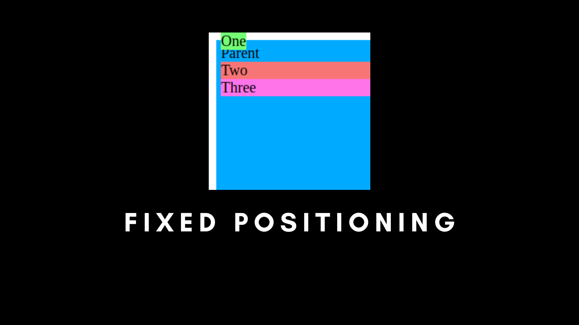
You can see that the first element is completely out of its parent component, even if the parent is set as relative.
And if we scroll, the rest of the children will flow according to the document, but the fixed will stay the same.
Sticky Positioning in CSS
Sticky position is the combination of relative and fixed.
/* Sticky Positioning */
.parent {
    padding: 5px;
    background-color: #00AAFF;
    width: 40%;
    position: relative;
    top: 0px;
    height: 1000px;
  }

  .child-one {
    position: sticky;
    top: 0px;
    background-color: rgb(116, 255, 116);
  }

  .child-two {
    background-color: rgb(248, 117, 117);
  }

  .child-three {
    background-color: rgb(255, 116, 232);
  }
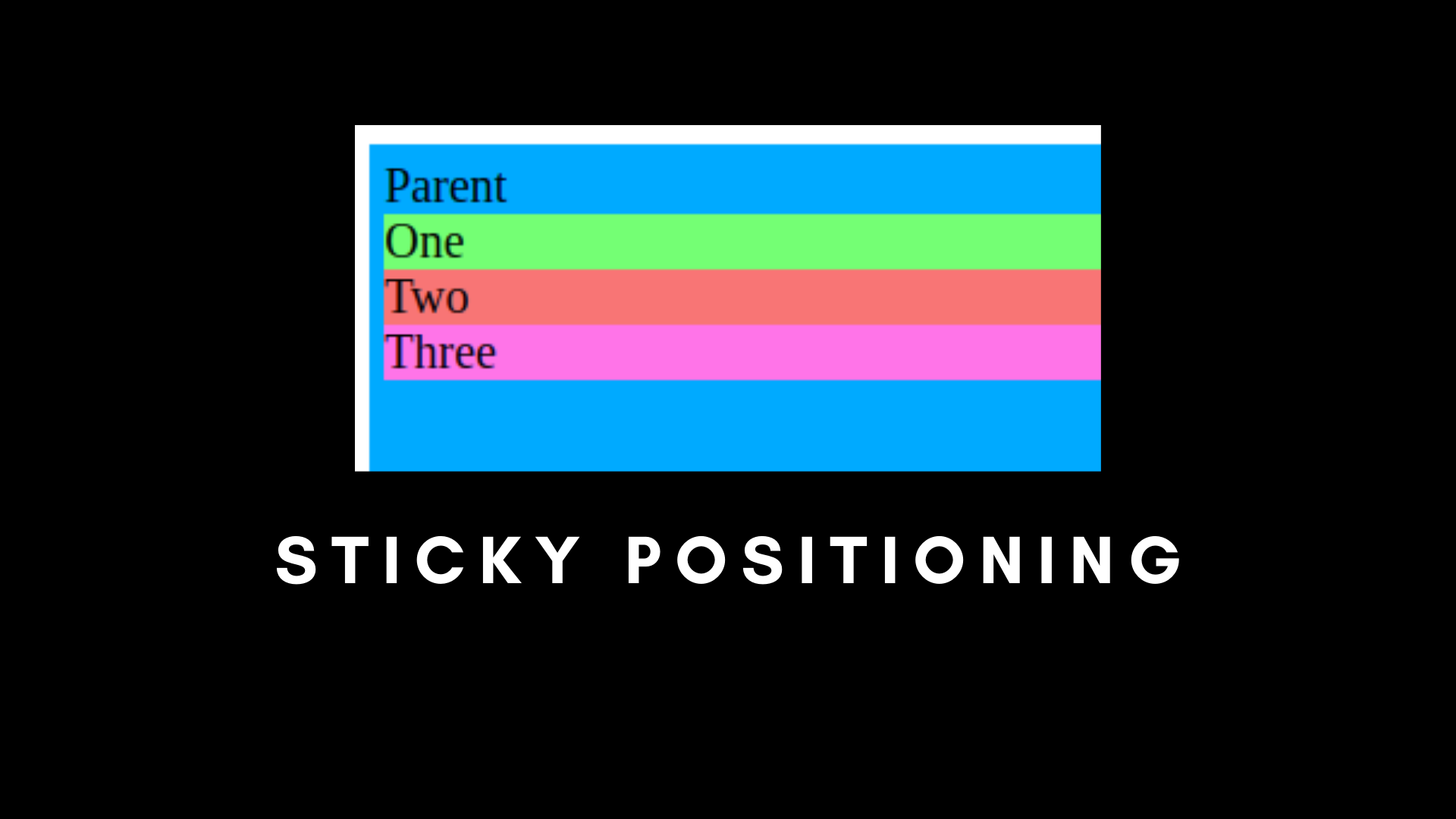
If we set a child to sticky positioning, it will look normal, like relative. But as soon as we start scrolling, the sticky child element will stick to the top. It will become a fixed position.
The sticky position is mainly used to create navigation bars.
Now that we have CSS positions out of the way, let's focus on Flexbox.
How to Use Flexbox
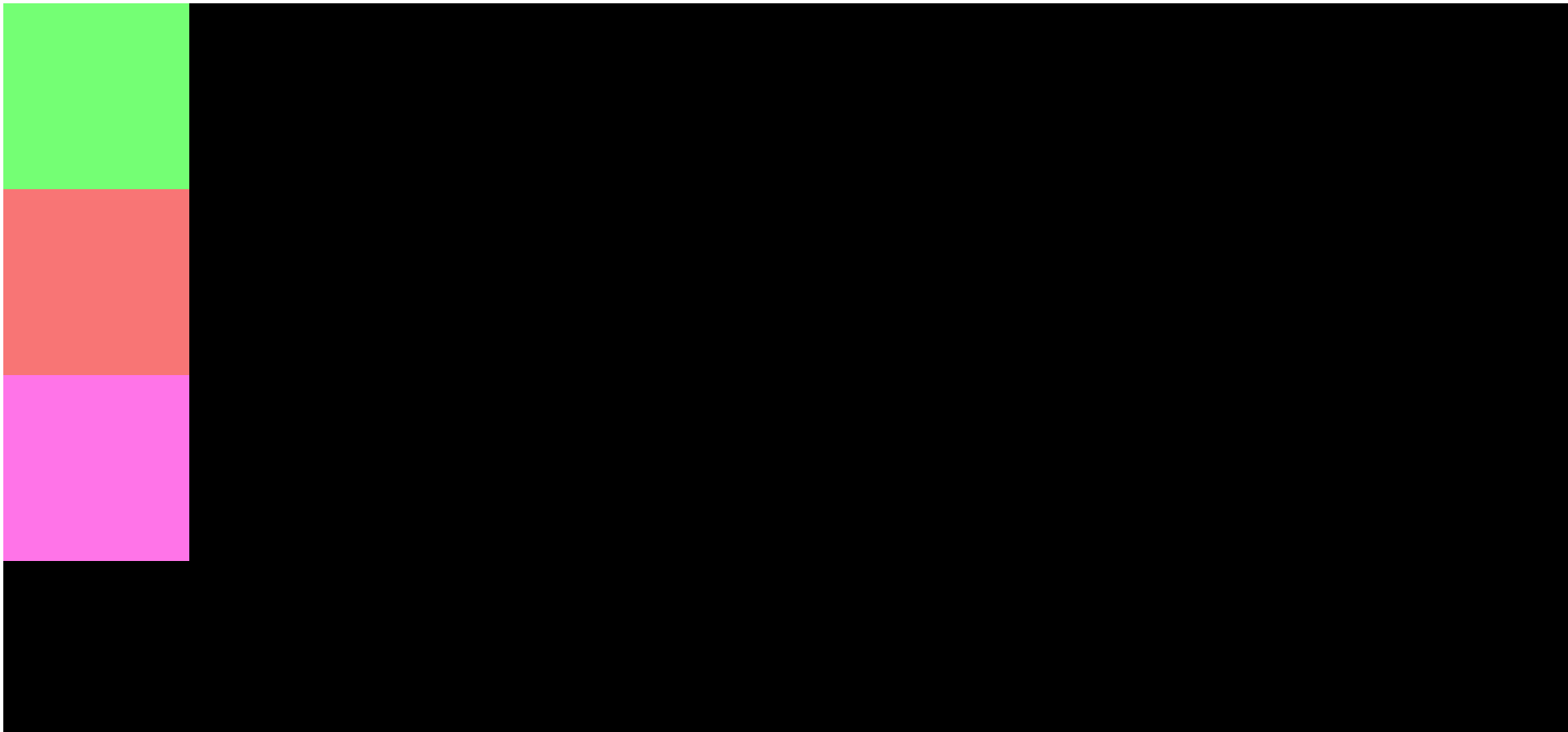
You can use the CSS Flexbox property to arrange items without using float. This makes arranging items in the document much easier. You can use it to replace Grids in CSS.
Without Flexbox, our output will flow with the document, that is child-one, then child-two, and then child-three.
But what if we wanted them side by side horizontally, like in the image below?

The solution is Flexbox. We need to position them evenly with respect to rows or columns, with spaces between them or spaces around them.
To get started, let's create a parent div with three children in it.
<!DOCTYPE html>
<html lang="en">
<head>
    <meta charset="UTF-8">
    <meta name="viewport" content="width=device-width, initial-scale=1.0">
    <title>CSS Position and Flexbox</title>
    <link rel="stylesheet" href="./index.css">
</head>
<body>
    <div class="parent">
        <div class="child-one"></div>
        <div class="child-two"></div>
        <div class="child-three"></div>
    </div>
</body>
</html>
Something like this:
/* Flexbox container */
.parent {
    background-color: #00AAFF;
    width: 300px;
    height: 300px;
    display: flex;
  }

  .child-one {
    background-color: rgb(116, 255, 116);
    width: 300px;
    height: 300px;
  }

  .child-two {
    background-color: rgb(248, 117, 117);
    width: 300px;
    height: 300px;
  }

  .child-three {
    background-color: rgb(255, 116, 232);
    width: 300px;
    height: 300px;
  }
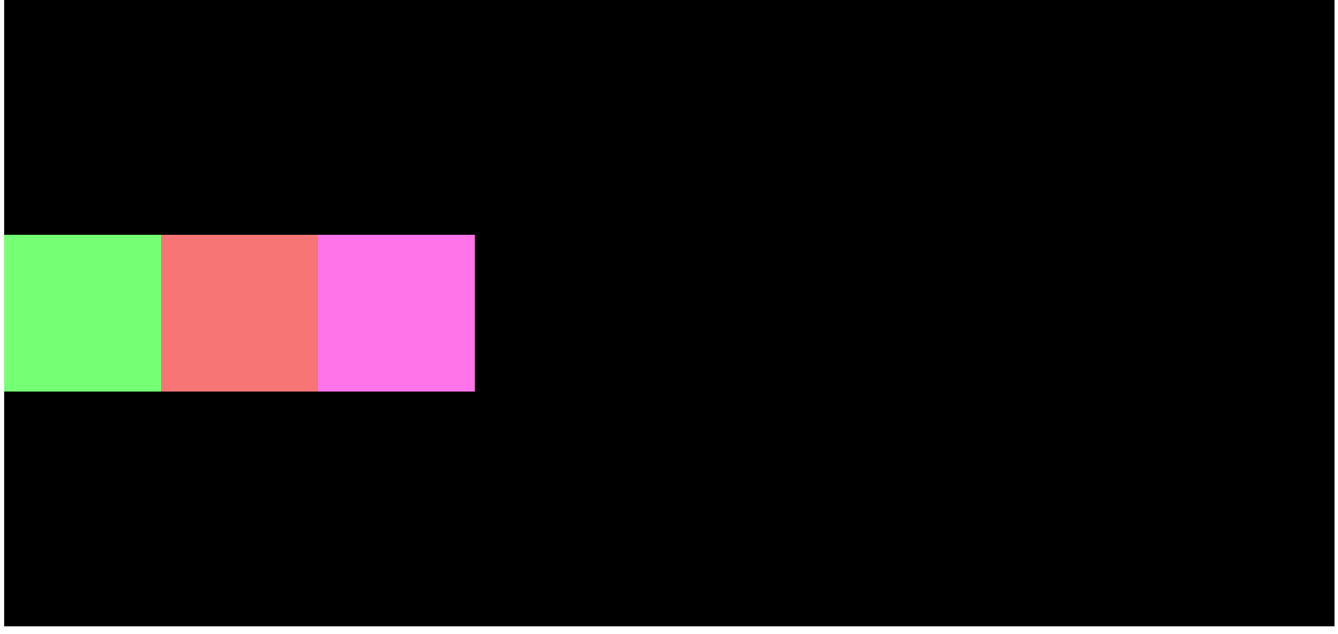
We can see that the parent has been declared as flex.

Here, we have three div boxes, each with different colors. This is the default Flexbox arrangement.
Let's see the different types of arrangements in Flexbox.
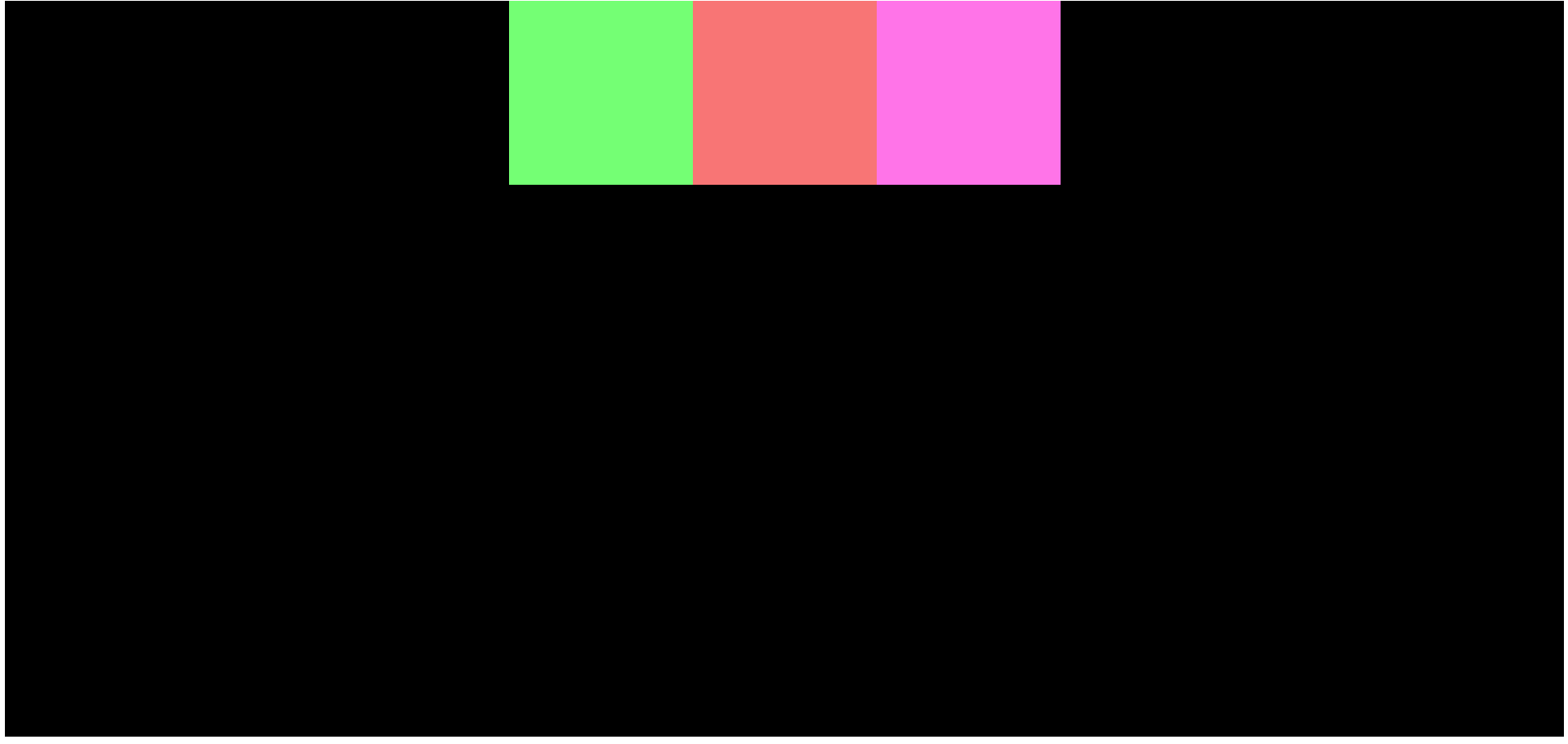
How to Arrange Elements with Flexbox
Flex Direction
This property defines how your elements will appear on the screen, that is vertically or horizontally.
Row is used to arrange items horizontally.
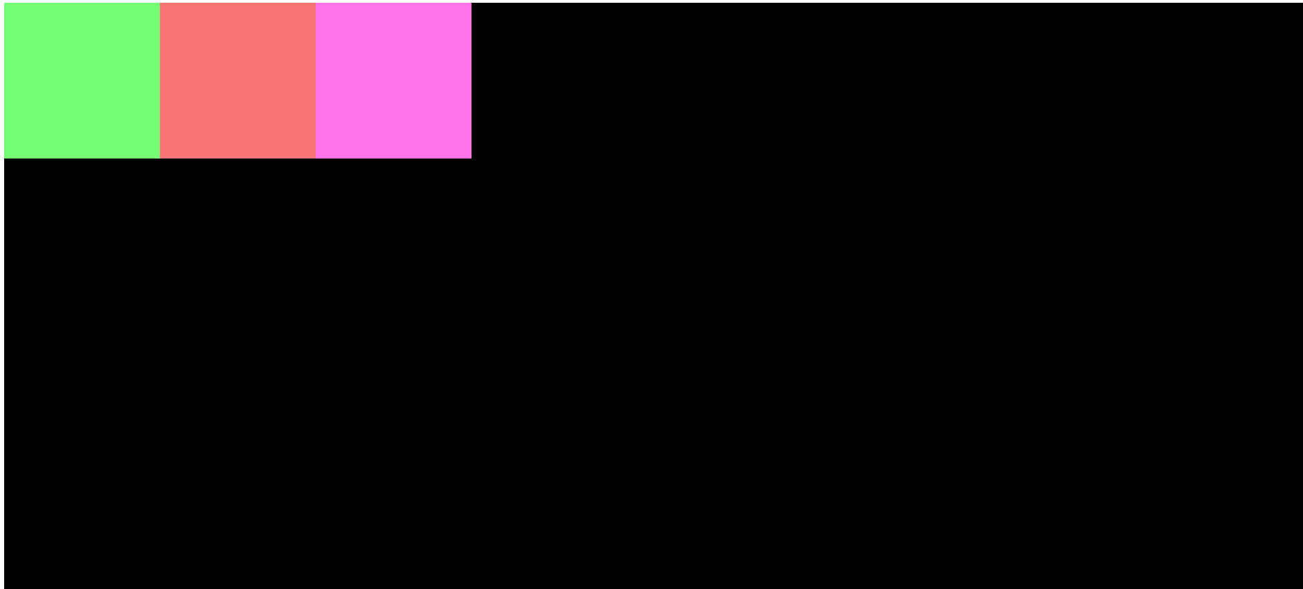
As you can see, we have the arrangement in a horizontal row.
Column arranges items vertically, like this:

The squares are now arranged in a vertical column.
Row Reverse works exactly like row, but the position of elements will be reversed. The first element will be the last, and the last element will move to the first. The arrangement of items will be opposite of flex-direction: row.
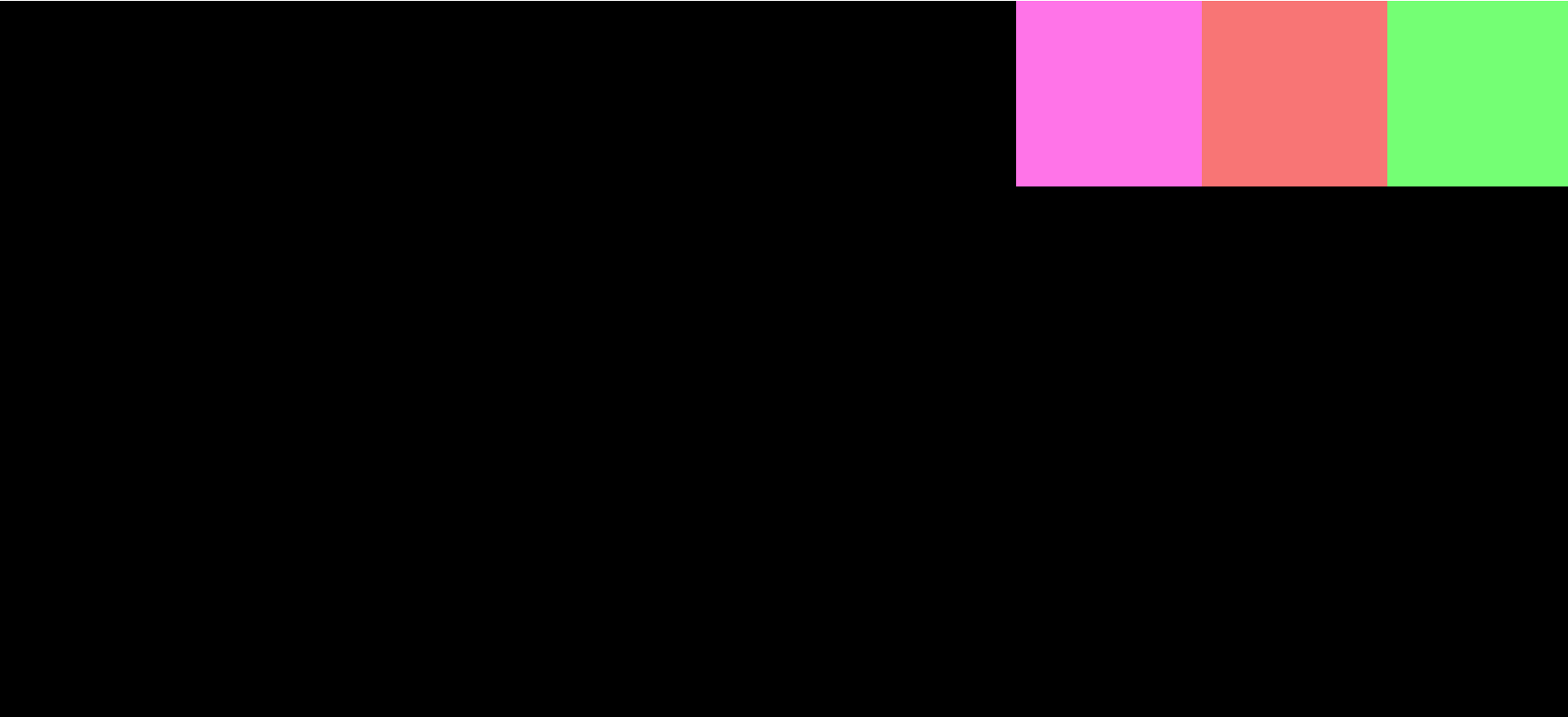
Column Reverse works exactly like column, but the elements will be reversed. The first element will be the last, and the last element will move to first.
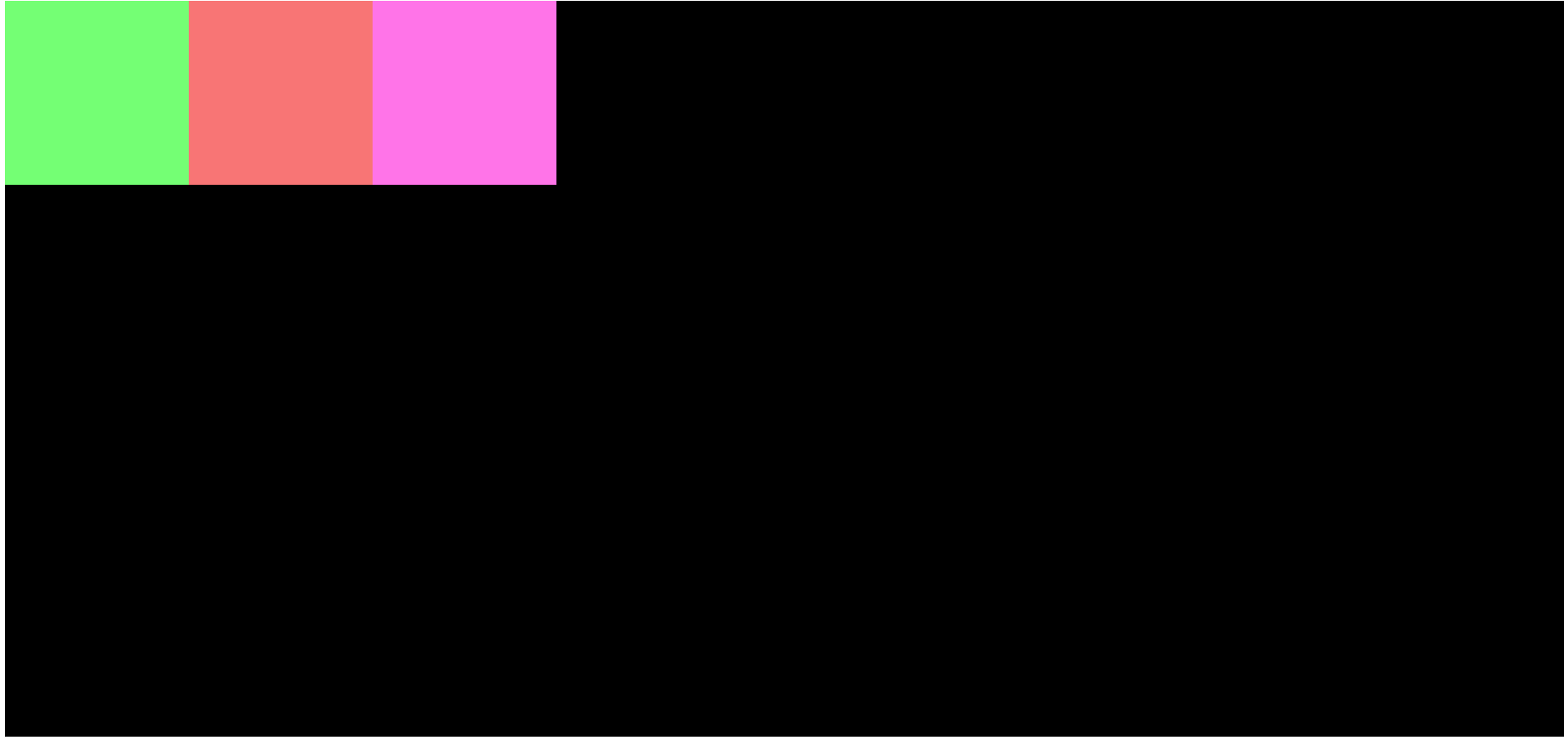
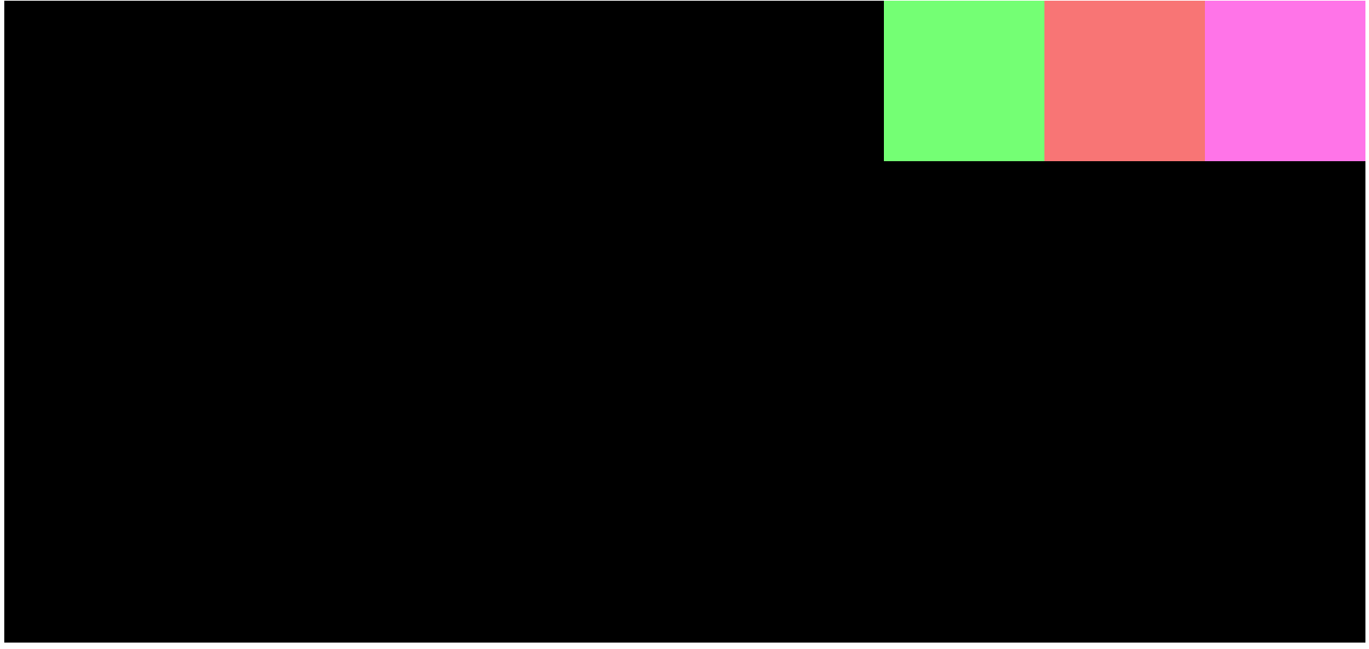
Justify Content
This property determines the alignment of the elements in a horizontal manner.
Center sets the elements to the horizontal center of the page.
Flex Start positions element at the start of the page.
Flex End sets the element to the end of the page.
Space Around arranges the items evenly but with spaces between them. The spaces will be equal among all the elements inside a flex-box container, but not outside them.
Here, the spaces between child-one, child-two, and child-three are equal, but not on the outside.
Space Between maximizes the spaces between child elements (it's a Justify Content Property).
Space Evenly distributes equal spaces between the child elements and the space outside the FlexBox container.
Align Items
Align items is used to align items vertically inside a flex container. But this only works if there is a fixed height.
Center sets the elements to the center of the page, vertically.
Flex Start is the same as the Justify Content to Center, but it arranges elements vertically. In our case, the elements will be at the top left corner of the screen.

Flex End is the same as Flex Start, but this will align-items to the bottom left corner of the screen.
Now you know some basics of Flexbox.
How to Align Items in the Center of the Screen.
These Flexbox properties can also be used together. For example, if we want to arrange the items in the very center, we can use both align-items: center and justify-content: center.

You can find the code on Github if you want to experiment some more.
That's all folks – thanks for reading.
Keep Experimenting. Keep Learning!