
In this tutorial, we're going to talk about spacing in CSS spacing – sounds so basic, right? Well, it's not as basic as you might think.
Take, for instance, when you visit your favorite e-commerce site to scout for products. The first thing that welcomes you to the platform is an intuitive design with a clear presentation of products. This gives you a great browsing experience.
Now take a second to imagine how your favorite e-commerce website would look if all the space separating products, descriptions, reviews, and other related items were eliminated. Trust me, it would only be a matter of time before you'd find a new favorite e-commerce website.
If navigating through a website becomes a hassle, people will go elsewhere. Efficiently scanning through a website would be nearly impossible if there wasn't a clear visual distinction between different products, important text, and images.
In this article, I will teach you how to better create a highly accessible and visually appealing website. I'll cover all you need to know about spacing in CSS and how you can implement it effectively. Without further ado, let’s dive right in.
What is CSS Spacing?
CSS spacing is an essential feature that helps you arrange and organize every other element of your web application in a neat and sensible manner. This helps improve web accessibility and creates a better user experience.
To go more in-depth, CSS spacing refers to how you insert space within and between CSS elements on a web page. It plays a very important role in web design and is used to enhance readability, usability, and the overall aesthetic of a webpage.
Spacing consists of various parts, which include padding, margins, and borders. Each of these contributes to the spatial relationship between elements.
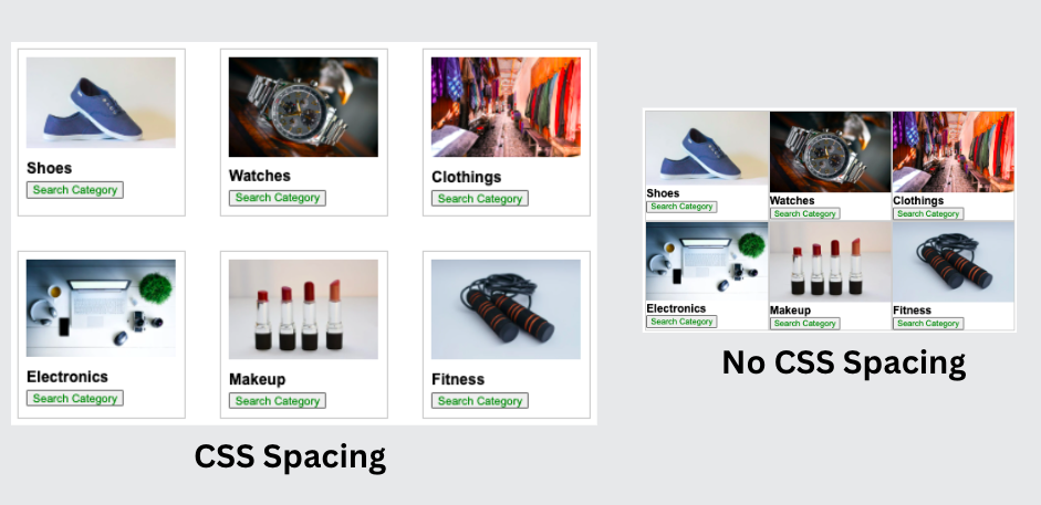 Image showing the difference between elements spaced properly and elements squished together.
In the image above, you can distinguish between the example with CSS spacing and the one without, given the definition I gave of what CSS spacing is. You can also likely see which of the two images is better structured, more aesthetically pleasing, and more readable.
This shows you how important CSS spacing is. With that being said, let’s talk more in-depth about the importance of CSS spacing.
Importance of CSS Spacing
We have already seen some benefits of CSS spacing and why it is important, but here are the main reasons why you should always consider CSS spacing whenever you are building a webpage:
- Enhancing Readability: With thoughtful CSS Spacing, there is a clear distinction between various elements and segments of your web page, which improves readability. You can make sure everything is spaced properly by adjusting margins, padding, and many other CSS properties.
- Increasing User Engagement and Navigation: With proper CSS spacing, you can avoid cluttered web pages which discourage users from engaging with your webpage contents. It also directs the flow of information on a webpage, which gives users a sense of where their attention should be focused.
- Facilitating Responsive Design: With good CSS spacing, you can account for minor changes when it comes to responsive designs. For instance, with a decent amount of padding, you can ensure your web page's elements don't overlap on different devices.
- Emphasizing Important Elements: You can use CSS spacing to highlight key information on your web page. By having a little bit more than the regular amount of space, the user’s attention will simply be drawn to certain elements.
- Adding Professional Aesthetics: In minimalist design, spacing is very important. It gives a more elegant and luxurious feeling to your webpage, giving attention to only the vital information on the page.
Types of CSS Spacing
When talking about the types of spacing in CSS, there are a lot of properties associated with it. They include, margin, padding, and borders. But overall, there are two main types of spacing:
- Internal Spacing
- External spacing
To completely understand each of these types of spacing, let’s consider this example:
<!DOCTYPE html>
<html>
  <head>
    <style>
      .box {
        padding: 2rem;
        border: 2px solid black;
      }

      #box1 {
        margin-bottom: 2rem;
      }

      #box2 {
        background-color: #9b59b6;
        color: white;
        margin-left: 2rem;
      }
    </style>
  </head>
  <body>
    <div class="box" id="box1">Box 1</div>
    <div class="box" id="box2">Box 2</div>
  </body>
</html>
Given the code above, we have two boxes that illustrate both internal and external spacing. As you can see, we added padding: 2 rem. This added 2 rem of internal space to our boxes.
Also, to separate one box from the other, we added a margin-bottom to the first box. This results in that external space you see below our first box in the image below. We also added 2rem worth of external space to the left side of our second box.
If you've noticed, the internal spacing increases the size of our element, while the external spacing either adjusts or changes the position of either the parent element or surrounding elements.
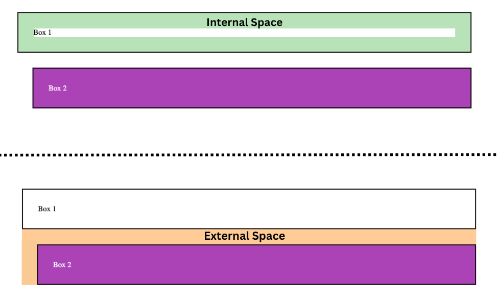 Illustration of internal space vs external space based on the above code.
Difference between Internal and External CSS Spacing
Internal space is usually created with padding, and external space is usually created with margins. Here are a few differences between the two types of spacing:
| Padding (Internal Spacing) | Margin (External Spacing) | |
|---|---|---|
| Purpose | Creates space within the borders of an element, between the content and the border. | Creates space outside the borders of an element, between the element and other surrounding elements. |
| Effect on Size | Increases the total width/height of an element. | Does not increase the size of the element itself. It affects the space around the element. |
| Interaction with Border | Lies within the border of an element. If a border is defined, padding extends from the inside edge of the border. | Lies outside the border of an element. If a border is defined, the margin starts from the outside edge of the border. |
| Background | Extends the background color/image of the element. | Does not extend the background color/image of the element; it’s always transparent. |
| Usage | To increase the readability and visual separation between the content and the border. | To control the position and layout of an element relative to others, and to create space between elements. |
The CSS Box Model
To fully understand CSS spacing, you must understand the CSS box model. This is a fundamental concept in CSS that shows the layout of elements. Every element follows the box model, so it is essential that you know how it works.
There are four components that make up the box model, and they include:
- Content
- Padding
- Border
- Margin
The content is the core of the box model, and it is where the text, image, and so on of the element reside.
Padding is the internal space that surrounds the content. It's used to provide spacing between the content and the border. It also increases the dimension of the background of an element.
The border is the bridge between internal space and external space. It goes all around the padding, and its shape, size, and color are controlled by the border property. The main aim of the border property is to create a boundary around the element. It also adds aesthetics to the element.
The margin is the external space, and its main purpose is to create space between different elements. This is used to enhance readability and visual organization.
To estimate the total size of an element, you'll need to consider all these components. Full knowledge of the box model will give you the power to control the CSS spacing and alignment of elements on the page.
Let’s consider this code to illustrate how the box model works:
<!DOCTYPE html>
<html>
  <head>
    <style>
      body {
        display: flex;
        justify-content: center;
        align-items: center;
        height: 100vh;
        background-color: #f2f2f2;
        font-family: Arial, sans-serif;
        color: #333;
      }

      .box {
        /* Content */
        width: 100px;
        height: 100px;
        display: flex;
        align-items: center;
        justify-content: center;

        /* Padding */
        padding: 20px;

        /* Border */
        border: 10px solid #3498db;

        /* Margin */
        margin: 30px;

        background-color: #b65975;
        color: white;
      }
    </style>
  </head>
  <body>
    <div class="box">Box Model</div>
  </body>
</html>
Seems like pretty self-explanatory code, right? As you can see, we tried as much as possible to use all the components of the box model.
We started off by defining the dimensions of the content component, giving it a width and height of 100px. Using the Flexbox layout model, we aligned the content to the center.
Next, we added a padding of 20px. This increased the inner spacing, which increased the dimension of the box, making the background larger.
You can see the blueish border, which goes around the padding. It separates the inner spacing from the outer spacing. It was set using the border property and has a size of 10px.
Lastly, we have the margin set to 30px. This is responsible for creating outer spacing that separates elements from each other.
Here is what our result looks like:
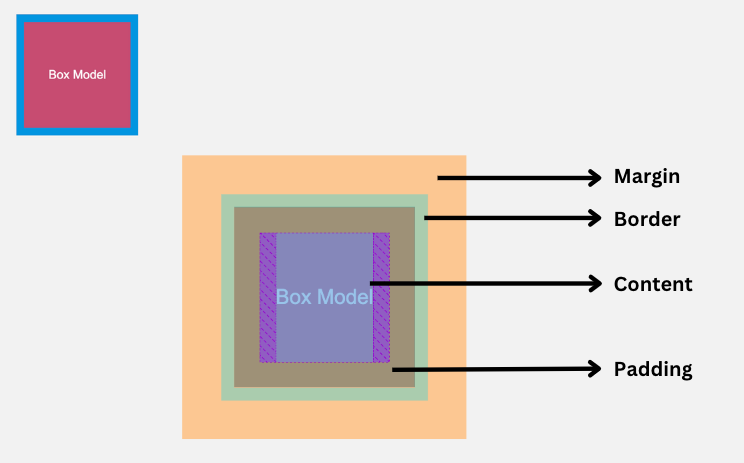 Illustration of CSS box model
As you can see in the image above, we have all the elements of a box model present. This may not always be the case, as most of these components can be manually assigned values or can also be totally removed.
CSS Spacing in Other CSS Layout Models
There are several other layout models you can use when designing your websites. And keep in mind that CSS spacing works a bit differently in these other models.
Firstly, let’s look at the other major layout models that are widely in use and how CSS spacing works when you're using them. They include:
- CSS Flexbox
- CSS Grid
CSS Flexbox
Explaining in detail how CSS Flexbox works is beyond the scope of this article – but if you want to learn more about it, you can read the documentation. You can also check out this crash course on freeCodeCamp's YouTube channel.
Our main focus here will be on the gap property. You can use this property for both CSS Flexbox and CSS Grid. In CSS Flexbox, you use it to create space between each flex item, which lets you control the space between items.
Let’s take for instance this code:
<!DOCTYPE html>
<html>
  <head>
    <style>
      .container {
        display: flex;
        gap: 20px;
      }

      .item {
        background-color: lightblue;
        padding: 10px;
      }
    </style>
  </head>
  <body>
    <div class="container">
      <div class="item">Item 1</div>
      <div class="item">Item 2</div>
      <div class="item">Item 3</div>
    </div>
  </body>
</html>
In the code above, we have three flex items. We set a gap property of 20px, which places a 20px space in between each child.
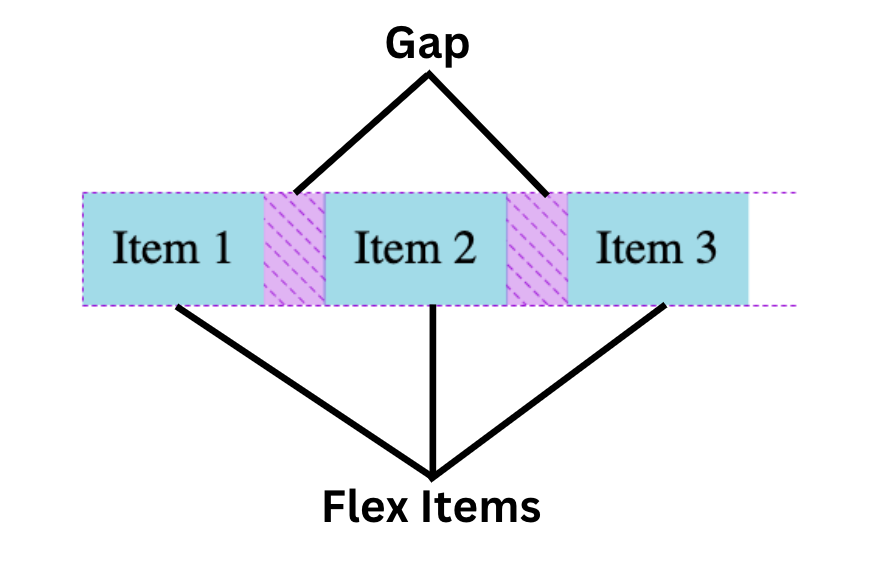 Illustration showing the gap between flex items
You can also use various other CSS properties in the CSS Flexbox model for CSS spacing. They include:
- Justify-content: This controls the spacing along the main-axis. The kind of spacing is determined by the value set on this property, such as
flex-start,flex-end,center,space-between,space-around, andspace-evenly. - Align content: This is kind of similar to the justify-content property, but it controls the spacing along the cross-axis instead. Here are some of the values we can use on the Align-content property:
flex-start,flex-end,center,space-between,space-around,space-evenly, andstretch. - Flex-basis: This is used to determine the initial size of flex items, which allows you to create flex items of equal size.
Here is an image that shows some of these properties and how their values function:
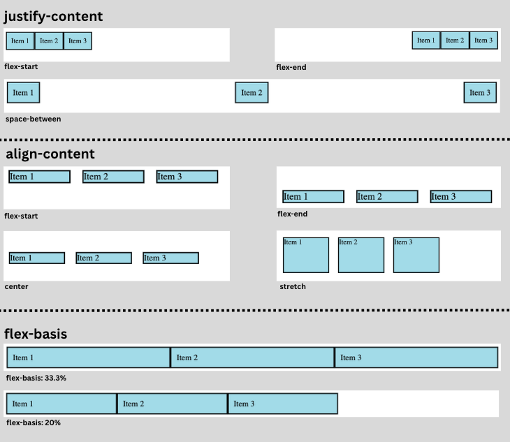 Illustration showing justify-content, align-content, and flex-basis properties
CSS Grid
Spacing in the Grid model isn’t so different from the Flexbox model. Let’s explore some of the properties that control spacing in CSS grid.
- grid-gap: This property performs the same job as the gap property, which is to space the rows and columns of CSS grids. You can also use the gap property to perform this function, as it’s the newer way.
- grid-row-gap and grid-column-gap: some times you don’t want a uniform gap between rows and columns. Instead, you can use these properties to define the size of the gap between grid rows and columns, respectively.
To illustrate, consider this code:
.container {
      display: grid;
      grid-template-columns: 1fr 1fr 1fr;
      grid-column-gap: 50px;
      grid-row-gap: 20px;
      background: #6c1697;
    }
Here we set the display property to grid. The grid is then set to have three equal-sized columns using grid-template-columns: 1fr 1fr 1fr.
We then used the grid-column-gap property to create a gap of 50px between the columns, while grid-row-gap creates a gap of 20px between the rows.
Below is the result we get from having six grid items:
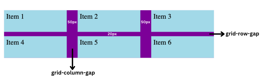 Illustration showing grid-row-gap and grid-column-gap properties
Spacing in Text
When we discussed the box model, we classified text as part of the content component of the box model. Well, there are several properties you can use on text to add spacing in order to meet your specific needs. Some of these properties include:
- letter-spacing: This property is used to create space between each character in the text.
- word-spacing: This property is used to create space between each word in the text.
- line-height: This property is used to create vertical spacing between lines of text.
- text-align: This property is used to control how text is positioned horizontally. The default value is
leftand the most-used value iscenter. - text-indent: This property is used to indent the first line of the block element, which simply creates a space at the start of the text.
- white-space: This property defines how the text within your elements is displayed. The default value for this property is
normalbut when set tono-wrapthe text just flows horizontally without wrapping up to begin a new line.
Here is some code that shows how each of these properties operates:
<!DOCTYPE html>
<html>
  <head>
    <style>
      .text {
        background-color: lightblue;
      }
      p {
        font-size: 18px;
        margin-bottom: 20px;
      }

      .letter-spacing-example {
        letter-spacing: 5px;
      }

      .word-spacing-example {
        word-spacing: 20px;
      }

      .line-height-example {
        line-height: 10rem;
      }
      .text-align-example {
        text-align: center;
      }

      .text-indent-example {
        text-indent: 50px;
      }

      .white-space-example {
        white-space: nowrap;
      }
    </style>
  </head>
  <body>
    <div class="text">
      <p class="letter-spacing-example">
        This is an example of letter-spacing property. It adds space between
        each character.
      </p>
    </div>
    <div class="text">
      <p class="word-spacing-example">
        This is an example of word-spacing property. It adds space between each
        word.
      </p>
    </div>
    <div class="text">
      <p class="line-height-example">
        This is an example of line-height property. It creates vertical spacing
        between lines of text.
      </p>
    </div>
    <div class="text">
      <p class="text-align-example">
        This is an example of text-align property. It controls the horizontal
        alignment of text within an element.
      </p>
    </div>
    <div class="text">
      <p class="text-indent-example">
        This is an example of text-indent property. It indents the first line of
        the block element.
      </p>
    </div>
    <div class="text">
      <p class="white-space-example">
        This is an example of white-space property. It prevents the wrapping of text
        and causes it to overflow horizontally. Lorem ipsum dolor sit amet,
        consectetur adipisicing elit. Accusamus dolorem provident pariatur
        recusandae nulla numquam?
      </p>
    </div>
  </body>
</html>
In the code above, we created several divs with a class of text, each having a p tag with a class name that describes the property that the text will have.
The first p tag is used to illustrate the letter-spacing property, and we set a 5px space between each letter.
Next, we have the word-spacing property, and with this property, we gave a 20px gap between each word.
The line-height property here gives the p tag a 10rem vertical gap.
And for the p tag with the text-align property value set to center, we have equal space on the left and right sides of the text.
Another property we illustrated was the text-indent property. We set its value to 50px, and this well indents the text, giving it a 50px space at the start of the first line of the text.
Last but not least, we set the last p tag to have a white-space property value of no-wrap," which makes the text flow in a horizontal line without ever wrapping to the next line.
Here is a screenshot of what this code produces when it appears in the browser:
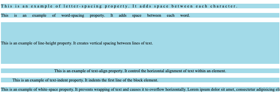 Example of text spacing properties in action
Use Case: How to Create a Review Form
We have discussed a lot of details about CSS spacing. Now to wrap it up, let’s build a simple review form so you see CSS spacing in action.
<!DOCTYPE html>
<html>
  <head>
    <style>
      * {
        margin: 0;
        padding: 0;
        box-sizing: border-box;
        font-family: Arial, sans-serif;
      }
      body {
        background-color: #f6f6f6;
      }
      .feedback-container {
        width: 400px;
        margin: auto;
        padding: 20px;
        border-radius: 8px;
        background-color: #ffffff;
        box-shadow: 0px 0px 15px rgba(0, 0, 0, 0.1);
        margin-top: 50px;
      }
      .feedback-title {
        text-align: center;
        margin-bottom: 20px;
        color: #333333;
        letter-spacing: 2.3px;
        font-size: 24px;
      }
      .feedback-description {
        text-align: center;
        margin-bottom: 20px;
        color: #666666;
        line-height: 1.6;
      }
      .feedback-input {
        width: 100%;
        padding: 15px;
        margin-bottom: 20px;
        border: 1px solid #dddddd;
        border-radius: 4px;
      }
      .feedback-button {
        width: 100%;
        padding: 15px;
        background-color: #4caf50;
        color: white;
        border: none;
        cursor: pointer;
        border-radius: 4px;
        font-size: 18px;
        font-weight: bold;
      }
      .feedback-button:hover {
        background-color: #45a049;
      }
    </style>
  </head>
  <body>
    <div class="feedback-container">
      <h2 class="feedback-title">REVIEW FORM</h2>
      <p class="feedback-description">
        We value your feedback! Your comments help us to understand your needs
        better and improve our services. Please take a few moments to share your
        thoughts.
      </p>
      <form>
        <input
          type="text"
          class="feedback-input"
          placeholder="Your Name"
          name="name"
          required
        />
        <input
          type="email"
          class="feedback-input"
          placeholder="Your Email"
          name="email"
          required
        />
        <textarea
          class="feedback-input"
          placeholder="Your Feedback"
          name="feedback"
          required
        ></textarea>
        <button type="submit" class="feedback-button">Submit</button>
      </form>
    </div>
  </body>
</html>
The code above shows our review form. We have h2 which holds the form title. Next, we have the description in a p tag. Last but not least, we have our form, which holds the input fields and a submit button.
In the code above, we have added our CSS spacing. You can see the properties such as the margin, padding, line-height, letter-spacing, and some other properties we talked about earlier and the values we gave to them.
If we run our code and view it in the browser, this is the result we get:
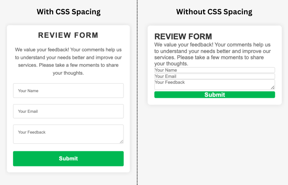 Image showing the form with and without proper spacing
With our CSS Spacing, we have been able to align the h2 and p to the center, and we have been able to make our input fields look presentable with the padding in the input fields. By applying margin, we have been able to separate elements from each other, like the h2, p, form, and the submit button.
From the image above, you can clearly tell which is the better version. CSS spacing makes the review form look better and is also easier to understand.
Conclusion
In conclusion, CSS spacing is a fundamental aspect of web development, and mastering these concepts is essential for every front-end developer.
With proper use of padding, margin, and all the other spacing properties we talked about, you can create designs that are both intuitive and comfortable, guiding your user’s eyes smoothly from one element to another.
While CSS spacing may appear to be a simple concept at first glance, it requires a bit of practice to comfortably choose between spacing properties and use them correctly.
Always remember that good spacing breathes life into your pages, making them more readable, engaging, classy, and intuitive. Happy coding!
Contact Information
Feel free to connect with me on the following platforms:
- Twitter: @Clintonjoy10
- LinkedIn: Clinton joy
- Email: clintonjoyfimie@gmail.com