CSS transitions and animations provide smooth, gradual ways to change an element's style. But they work in different ways.
Here are the main distinctions between them:
| CSS Transition | CSS Animation |
|---|---|
|
|
This handbook uses examples to explain the two animating techniques so that you can understand their similarities and differences.
Table of Contents
- What Are CSS Transitions?
- Categories of CSS Transition Properties
- What Are the Required CSS Transition Properties?
- What is the CSS
transition-property? - What is the CSS
transition-durationProperty? - Examples of the Required CSS Transition Properties
- What Are the Optional CSS Transition Properties?
- What is the CSS
transition-timing-functionProperty? - What is the CSS
transition-delayProperty? - Examples of the Optional CSS Transition Properties
- Shorthand for Defining the CSS Transition Properties
- What is CSS Animation?
- What Are CSS Animation Properties?
- What is the CSS
animation-nameProperty? - What is the CSS
animation-durationProperty? - What is the CSS
animation-timing-functionProperty? - What is the CSS
animation-delayProperty? - What is the CSS
animation-iteration-countProperty? - What is the CSS
animation-directionProperty? - What is the CSS
animation-play-stateProperty? - What is the CSS
animation-fill-modeProperty?
- What is the CSS
- What is the CSS
animationProperty? - Important Stuff to Know about CSS Transitions and Animations
- Wrapping up
Without further ado, let's discuss CSS transitions.
What Are CSS Transitions?
CSS transitions provide a smooth and gradual way to change a specific CSS property's value.
So, instead of allowing browsers to change a property's value immediately, CSS transitions cause the change to happen smoothly over a specified period of time.
For instance, suppose you wish to change an element's size on hover. In that case, you have two options:
- Implement the change without CSS transitions.
- Use CSS transitions to transition smoothly from the element's initial size to its new state.
Let's see some examples of the two options.
How to change an image's size on mouse hover without using CSS transitions
img {
  width: 40%;
}

img:hover {
  width: 100%;
}
The code above instantaneously changes the image's size from its initial width (40%) to its new dimension (100%) because we did not use CSS transitions.
With CSS transitions, you will get a much more pleasing experience. Let's see an example below.
How to change an image's size on mouse hover with CSS transitions
img {
  width: 40%;
  transition: width 3s ease-out 0.4s;
}

img:hover {
  width: 100%;
}
The transition property applied a smooth and gradual transition from width: 40% to width: 100% on the image.
Categories of CSS Transition Properties
We have two categories of CSS transition properties:
- Required transition properties
- Optional transition properties
Let's discuss the two.
What Are the Required CSS Transition Properties?
The two required properties you need to create CSS transitions are:
transition-propertytransition-duration
What is the CSS transition-property?
The CSS transition-property specifies the CSS property you wish to transition from its initial to its new state.
What is the CSS transition-duration Property?
The CSS transition-duration property defines the length of time in which browsers should complete the selected element's transition. In other words, transition-duration sets the total start-to-finish time.
Note the following:
- The
transition-durationproperty only accepts time in milliseconds (ms) or seconds (s). - Zero seconds (
0s) is thetransition-duration's default value. Therefore, no transition event will occur if you do not define atransition-durationproperty. transition-durationaccepts only a zero (0) or a positive numeric value. Browsers will ignore the duration declaration if you provide anything else.
Examples of the Required CSS Transition Properties
Below are some examples of the two required CSS transition properties.
How to transition an element's width within three seconds
img {
  width: 40%;
  transition-property: width;
  transition-duration: 3s;
}

img:hover {
  width: 100%;
}
Here's what we did in the snippet above:
- The
transition-propertytells browsers to transition theimg'swidthfrom its initial value (40%) to its new state (100%). - We used the
transition-durationproperty to define three seconds (3s) duration from the start to the end of the transition.
Therefore, instead of an instantaneous change from the image's initial width (40%) to its new size (100%), browsers will transition smoothly between the old and new state in three seconds (3s).
How to transition a font's size within five seconds
p {
  font-size: 1rem;
  transition-property: font-size;
  transition-duration: 5s;
}

p:hover {
  font-size: 7rem;
}
Here's what we did in the snippet above:
- The
transition-propertyinforms browsers to transition thepelement'sfont-size. - We used the
transition-durationproperty to define a five-second (5s) duration from the start to the end of the transition.
Therefore, instead of an immediate change from the paragraph's initial font size (1rem) to its new size (7rem), browsers will transition smoothly between the old and new state in five seconds (5s).
Let's now discuss the optional CSS transition properties.
What Are the Optional CSS Transition Properties?
The two optional CSS transition properties are:
transition-timing-functiontransition-delay
What is the CSS transition-timing-function Property?
The CSS transition-timing-function property defines the implementation timing (speed) of the selected element's transition.
In other words, the transition-timing-function specifies the speed for implementing the transition at various intervals of its duration.
The values the transition-timing-function property accepts are:
ease: Starts the transition slowly. Then, speeds it up and ends it slowly.easeis thetransition-timing-functionproperty's default value. It is equivalent tocubic-bezier(0.25,0.1,0.25,1).ease-in: Starts the transition slowly with a gradual increase in speed. It is equal tocubic-bezier(0.42,0,1,1).ease-out: Starts fast and ends the transition slowly. It is equivalent tocubic-bezier(0,0,0.58,1).ease-in-out: Starts and ends the transition slowly. It is equal tocubic-bezier(0.42,0,0.58,1).linear: Starts and ends the transition using a consistent speed throughout the transition's duration. It is equivalent tocubic-bezier(0,0,1,1).cubic-bezier(p1, p2, p3, p4): Allows you to define the values of the cubic-bezier curve.
What is the CSS transition-delay Property?
The CSS transition-delay property defines how long the browser should wait before it starts the transition.
Note the following:
- The
transition-delayproperty must be in milliseconds (ms) or seconds (s). 0sis thetransition-delay's default value. It causes the transition to start immediately from the moment browsers apply it to an HTML element.- A negative value causes the transition to begin immediately from the specified time. For instance, suppose an element's
transition-delayvalue is-3s. In that case, the transition will start immediately at 3 seconds. - A positive value causes the transition to begin after the specified delay time has elapsed. For instance, suppose an element's
transition-delayvalue is3s. In that case, the transition will start after a 3-second delay.
Examples of the Optional CSS Transition Properties
Below are some examples of the two optional CSS transition properties.
How to transition an element's width with an ease-out speed
img {
  width: 40%;
  transition-property: width;
  transition-duration: 3s;
  transition-timing-function: ease-out;
}

img:hover {
  width: 100%;
}
Here's what we did in the snippet above:
- The
transition-propertyinforms browsers to transition theimgelement's width. - We used the
transition-durationproperty to define three seconds (3s) duration from the start to the end of the transition. - We used the
transition-timing-functionproperty to begin the transition quickly and end it slowly.
How to transition an element's width with a linear speed
img {
  width: 40%;
  transition-property: width;
  transition-duration: 3s;
  transition-timing-function: linear;
}

img:hover {
  width: 100%;
}
Here's what we did in the snippet above:
- The
transition-propertyinforms browsers to transition theimgelement's width. - We used the
transition-durationproperty to define three seconds (3s) duration from the start to the end of the transition. - The
transition-timing-functionproperty tells browsers to transition from the element's initial width to its new size using a consistent transition speed throughout.
How to transition an element's width with a two-second delay
img {
  width: 40%;
  transition-property: width;
  transition-duration: 3s;
  transition-timing-function: linear;
  transition-delay: 2s;
}

img:hover {
  width: 100%;
}
Here's what we did in the snippet above:
- The
transition-propertyinforms browsers to transition theimgelement'swidthproperty. - We used the
transition-durationproperty to define three seconds (3s) duration from the start to the end of the transition. - The
transition-timing-functionproperty transitions theimgelement's width using a consistent transition speed. - We used the
transition-delayproperty to apply a two-second (2s) delay to the starting time of the transition.
Now that we know the CSS transition properties, we can discuss defining them with a shorthand syntax.
Shorthand for Defining the CSS Transition Properties
We use the transition property as shorthand for the transition-property, transition-duration, transition-timing-function, and transition-delay properties.
In other words, instead of writing:
img {
  transition-property: width;
  transition-duration: 3s;
  transition-timing-function: linear;
  transition-delay: 2s;
}
You can alternatively use the transition property to shorten your code like so:
img {
  transition: width 3s linear 2s;
}
Here is the transition property's syntax:
transition: <property-name> <duration> <timing-function> <delay>;
Note that you can use the transition property to transition the state of multiple CSS properties.
Here's an example:
img {
  width: 40%;
  opacity: 0.4;
  transition: width 3s linear, opacity 4s ease-out, transform 5s;
}

img:hover {
  width: 100%;
  opacity: 1;
  transform: rotate(45deg);
}
The snippet above used commas (,) to separate each of the transitional properties we are applying to the img element.
So, now that we know what CSS transitions are and how they work, we can discuss CSS animations.
What is CSS Animation?
CSS animations provide a smooth and gradual way to animate an element's style changes from one keyframe to another.
Components of CSS Animations
CSS animations consist of two components:
- Keyframes
- Animation properties
What are CSS @keyframes?
@keyframes define the styles you want browsers to apply smoothly to an element at some specified key moments (frames).
Syntax of CSS @keyframes
A CSS @keyframes at-rule consists of the following:
- An
@keyframeskeyword - The
@keyframes' name - A block of zero or more keyframes
- The animation's key moment selector
- The key moment's style declarations
Here's an illustration:
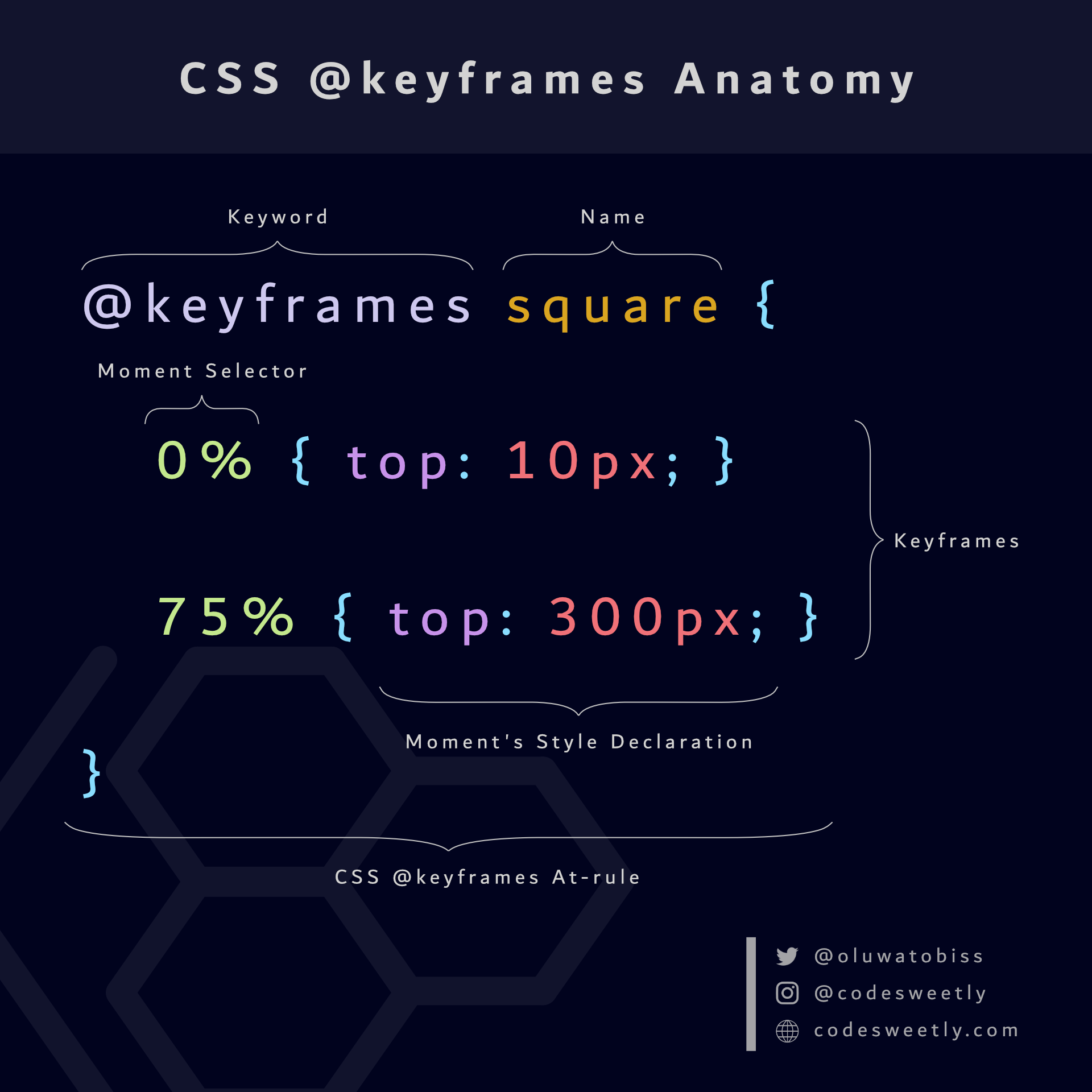 A CSS @keyframes at-rule consists of a keyword, a name, and a block of keyframes
Examples of CSS @keyframes
Below are examples of the CSS @keyframes.
How to define change-color's keyframes
@keyframes change-color {
  /* The first keyframe */
  0% {background-color: purple;}
  /* The last keyframe */
  100% {background-color: yellow;}
}
Here's what we did in the snippet above:
- We created the
@keyframesat-rule namedchange-color. - We defined a keyframe for browsers to apply when an associated element's animation is at its zero percent (
0%) duration. - We defined a keyframe for browsers to apply when an associated element's animation is at its one hundred percent (
100%) duration.
Note:
- You can name your
@keyframesanything you wish. 0%is equivalent to the keywordfrom. And100%is the same as the keywordto. In other words, the snippet above is equal to the following:
@keyframes change-color {
  /* The first keyframe */
  from {background-color: purple;}
  /* The last keyframe */
  to {background-color: yellow;}
}
- An animation's start and end states (
fromandto) are optional. - Suppose you omit an
@keyframes' start (0%) or end (100%) state. In that case, browsers will default to the element's existing styles for either state. - The important rule (
!important) does not work in keyframes. Browsers will ignore any keyframe declaration with an!importantrule.
Let's see another example.
How to define shape-image's keyframes
@keyframes shape-image {
  0% { width: 40%; border: 5px solid blue;}
  40% { width: 70%; border: 1px solid red; border-radius: 50%;}
  75% { width: 50%; border: 30px solid green;}
  100% { width: 100%; border: 7px solid purple;}
}
Here's what we did in the snippet above:
- We created the
@keyframesruleset namedshape-image. - We defined four keyframes for browsers to apply when an associated element's animation is at the specified key moments.
Tip: Use the CSSKeyframesRule interface in JavaScript to access the CSS @keyframes at-rules.
So, now that we know the CSS @keyframes ruleset, we can discuss the other component of CSS animations—animation properties.
What Are CSS Animation Properties?
CSS animation properties inform browsers about the animation you wish to apply to a specific element.
In other words, CSS animation properties describe the animation's attributes, such as its name, duration, direction, and iteration.
The nine (9) types of CSS animation properties are:
animation-nameanimation-durationanimation-timing-functionanimation-delayanimation-iteration-countanimation-directionanimation-play-stateanimation-fill-modeanimation
Let's discuss each one now.
What is the CSS animation-name property?
The CSS animation-name property defines the name of the @keyframes at-rules containing the styles you wish to apply to a specific element.
Here's an example:
div {
  width: 150px;
  height: 150px;
  animation-name: change-color;
}

@keyframes change-color {
  from {background-color: purple;}
  to {background-color: yellow;}
}
Here's what we did in the snippet above:
- The
animation-nameproperty specifies the@keyframeswe wish to apply to thedivelement. - We created
change-color's@keyframesruleset. - We defined two keyframes for browsers to use when the
divelement's animation is at its zero percent (0%) and one hundred percent (100%) duration.
Tip: You can use the keyword none to deactivate an animation.
What is the CSS animation-duration property?
The CSS animation-duration property defines the time to complete one animation cycle.
Note the following:
- The
animation-durationproperty must be in milliseconds (ms) or seconds (s) units. animation-duration's value must be zero or positive. Otherwise, browsers will ignore the duration declaration.- Zero seconds (
0s) isanimation-duration's default value. - Suppose
0sisanimation-duration's value. In that case, browsers will still execute the animation by firing theanimationStartandanimationEndevents. But theanimation-fill-mode's value will determine whether the animation is visible. For instance, if you set theanimation-fill-modetonone, the animation will be invisible.
Let's see some examples of the animation-duration property.
How to animate an element's color change within three seconds
div {
  width: 150px;
  height: 150px;
  animation-name: change-color;
  animation-duration: 3s;
}

@keyframes change-color {
  from {background-color: purple;}
  to {background-color: yellow;}
}
Here's what we did in the snippet above:
- The
animation-nameproperty specifies the@keyframeswe wish to apply to thedivelement. - The
animation-durationproperty sets the animation's runtime for one cycle to three seconds (3s). - We created
change-color's @keyframes ruleset. - We defined two keyframes for browsers to apply when the
divelement's animation is at zero percent (0%) and one hundred percent (100%) duration.
Therefore, browsers will create a smooth three-second animation from change-color's first keyframe to its last.
How to animate an image's border and width changes within seven seconds
img {
  animation-name: shape-image;
  animation-duration: 7s;
}

@keyframes shape-image {
  0% { width: 40%; border: 5px solid blue;}
  40% { width: 70%; border: 1px solid red; border-radius: 50%;}
  75% { width: 50%; border: 30px solid green;}
  100% { width: 100%; border: 7px solid purple;}
}
Here's what we did in the snippet above:
- The
animation-nameproperty specifies the@keyframeswe wish to apply to theimgelement. - The
animation-durationproperty sets the animation's runtime for one cycle to seven seconds (7s). - We created
shape-image's @keyframes ruleset. - We defined four keyframes for browsers to apply when the image's animation is at the specified key moments.
Therefore, browsers will create a smooth seven-second animation from shape-image's first keyframe to its last.
What is the CSS animation-timing-function property?
The CSS animation-timing-function property defines an animation's implementation timing (speed) throughout its duration.
In other words, the animation-timing-function property specifies the speed for implementing the animation at various intervals of its duration.
The values the animation-timing-function property accepts are:
ease: Starts the animation slowly. Then speeds it up and ends it slowly.easeis theanimation-timing-functionproperty's default value. It is equivalent tocubic-bezier(0.25, 0.1, 0.25, 1).ease-in: Starts the animation slowly with a gradual increase in speed. It is equivalent tocubic-bezier(0.42, 0, 1, 1).ease-out: Starts fast and ends the animation slowly. It is equivalent tocubic-bezier(0, 0, 0.58, 1).ease-in-out: Starts and ends the animation slowly. It is equivalent tocubic-bezier(0.42, 0, 0.58, 1).linear: Starts and ends the animation using a consistent speed throughout the animation's duration. It is equivalent tocubic-bezier(0, 0, 1, 1).cubic-bezier(p1, p2, p3, p4): Allows you to define the values of the cubic-Bezier curve.
Let's see some examples of the animation-timing-function property.
How to animate an element's width change using a linear speed
div {
  width: 150px;
  height: 150px;
  background-color: purple;
  animation-name: change-width;
  animation-duration: 7s;
  animation-timing-function: linear;
}

@keyframes change-width {
  from {width: 50px;}
  to {width: 100%;}
}
Here's what we did in the snippet above:
- The
animation-nameproperty specifies the@keyframeswe wish to apply to thedivelement. - The
animation-durationproperty sets the animation's runtime for one cycle to seven seconds (7s). - The
lineartiming function applied a consistent speed to thediv's animation. - We created
change-width's @keyframes ruleset. - We defined two keyframes for browsers to apply when the
div's animation is at zero percent (0%) and one hundred percent (100%) duration.
Therefore, browsers will create a smooth seven-second animation from change-width's first keyframe to its last.
Let's see another example.
How to animate an element's width change using an ease-in-out and a linear speed
div {
  width: 150px;
  height: 150px;
  color: white;
  animation-name: change-width;
  animation-duration: 7s;
}

.first-div {
  background-color: purple;
  animation-timing-function: ease-in-out;
}

.second-div {
  background-color: orange;
  animation-timing-function: linear;
}

@keyframes change-width {
  from {width: 50px;}
  to {width: 100%;}
}
Here's what we did in the snippet above:
- The
animation-nameproperty specifies the@keyframeswe wish to apply to thedivelement. - The
animation-durationproperty sets the animation's runtime for one cycle to seven seconds (7s). - We used the
ease-in-outtiming function to apply a slow start and slow end speed to thefirst-div's animation. - The
lineartiming function applied a consistent speed to thesecond-div's animation. - We created
change-width's @keyframes ruleset. - We defined two keyframes for browsers to apply when the
divelements' animations are at their zero percent (0%) and one hundred percent (100%) durations.
Therefore, browsers will create a smooth seven-second animation from change-width's first keyframe to its last.
What is the CSS animation-delay property?
The CSS animation-delay property defines how long browsers should wait before starting an animation.
In other words, use animation-delay to specify whether the animation should start immediately from the beginning, immediately from a specific time, or later (after some delay).
Note the following:
- The
animation-delayproperty must be in milliseconds (ms) or seconds (s) units. 0sisanimation-delay's default value. It causes the animation to start once browsers apply it to an HTML element.- A negative value causes the animation to start immediately from the specified time. For instance, suppose an element's
animation-delayvalue is-3s. In that case, the animation will begin immediately at 3 seconds. - A positive value causes the animation to start after the specified delay time has elapsed. For instance, suppose an element's
animation-delayvalue is3s. In that case, the animation will begin after a 3-second delay.
Let's see some examples of the animation-delay property.
How to animate an element's width change with a four-second delay
div {
  width: 150px;
  height: 150px;
  color: white;
  animation-name: change-width;
  animation-duration: 7s;
}

.first-div {
  background-color: purple;
  animation-timing-function: ease-in-out;
}

.second-div {
  background-color: orange;
  animation-timing-function: linear;
  animation-delay: 4s;
}

@keyframes change-width {
  from {width: 50px;}
  to {width: 100%;}
}
Here's what we did in the snippet above:
- The
animation-nameproperty specifies the@keyframeswe wish to apply to thedivelements. - The
animation-durationproperty sets the animation's runtime for one cycle to seven seconds (7s). - We used the
ease-in-outtiming function to apply a slow start and slow end speed to thefirst-div's animation. - The
lineartiming function applied a consistent speed to thesecond-div's animation. - The
animation-delayproperty applied a four-second (4s) delay to the starting time of thesecond-div's animation. - We created
change-width's @keyframes ruleset. - We defined two keyframes for browsers to apply when the
divelements' animations are at their zero percent (0%) and one hundred percent (100%) durations.
Therefore, browsers will delay the second-div's animation for four seconds while starting the first-div's animation immediately.
Below is another example of the animation-delay property.
How to animate an element's width change from the fourth-second mark of the animation sequence
div {
  width: 150px;
  height: 150px;
  color: white;
  animation-name: change-width;
  animation-duration: 7s;
}

.first-div {
  background-color: purple;
  animation-timing-function: ease-in-out;
}

.second-div {
  background-color: orange;
  animation-timing-function: linear;
  animation-delay: -4s;
}

@keyframes change-width {
  from {width: 50px;}
  to {width: 100%;}
}
Here's what we did in the snippet above:
- The
animation-nameproperty specifies the@keyframeswe wish to apply to thedivelements. - The
animation-durationproperty sets the animation's runtime for one cycle to seven seconds (7s). - We used the
ease-in-outtiming function to apply a slow start and slow end speed to thefirst-div's animation. - The
lineartiming function applied a consistent speed to thesecond-div's animation. - The
animation-delayproperty makes thesecond-div's animation start from the fourth-second mark of the animation sequence. - We created
change-width's @keyframes ruleset. - We defined two keyframes for browsers to apply when the
divelements' animations are at their zero percent (0%) and one hundred percent (100%) durations.
Therefore, browsers will start the second-div's animation immediately at the fourth-second mark.
What is the CSS animation-iteration-count property?
The CSS animation-iteration-count property defines the number of times browsers should repeat an animation.
Note the following:
1isanimation-iteration-count's default value.- The
animation-iteration-countproperty accepts non-integer values—for instance,0.5tells browsers to play half of a single animation cycle. animation-iteration-countdoes not accept negative values.- An
infinitevalue means browsers should repeat the animation forever.
Below are some examples.
How to animate an element's width change with a two-cycle iteration
div {
  width: 70px;
  height: 50px;
  background-color: purple;
  animation-name: change-width;
  animation-duration: 5s;
  animation-timing-function: ease-in-out;
  animation-iteration-count: 2;
}

@keyframes change-width {
  from {width: 70px;}
  to {width: 100%;}
}
Here's what we did in the snippet above:
- The
animation-nameproperty specifies the@keyframeswe wish to apply to thedivelement. - The
animation-durationproperty sets the animation's runtime for one cycle to five seconds (5s). - We used the
ease-in-outtiming function to apply a slow start and slow end speed to thediv's animation. - The
animation-iteration-countproperty tells browsers to run the animation twice. - We created
change-width's @keyframes ruleset. - We defined two keyframes for browsers to apply when the
divelement's animation is at zero percent (0%) and one hundred percent (100%) duration.
Therefore, browsers will run the div's animation in two cycles.
Below is another example of the animation-iteration-count property.
How to animate an element's width change with an infinite iteration
div {
  width: 70px;
  height: 50px;
  animation-name: change-width;
  animation-duration: 5s;
  animation-timing-function: ease-in-out;
  animation-iteration-count: infinite;
}

@keyframes change-width {
  from {width: 70px; background-color: purple;}
  to {width: 100%; background-color: orange;}
}
Here's what we did in the snippet above:
- The
animation-nameproperty specifies the@keyframeswe wish to apply to thedivelement. - The
animation-durationproperty sets the animation's runtime for one cycle to five seconds (5s). - We used the
ease-in-outtiming function to apply a slow start and slow end speed to thediv's animation. - The
animation-iteration-countproperty tells browsers to run the animation infinitely. - We created
change-width's @keyframes ruleset. - We defined two keyframes for browsers to apply when the
divelement's animation is at its zero percent (0%) and one hundred percent (100%) duration.
Therefore, browsers will run the div's animation infinitely.
What is the CSS animation-direction property?
The CSS animation-direction property specifies whether the animation's first iteration should run forward or backward. It also defines whether browsers should alternate the direction of subsequent iterations.
The values animation-direction accepts are:
normal: Play the animation in the normal direction (that is, forward).normalisanimation-direction's default value.reverse: Play the animation in the reverse direction (backward).alternate: Play the first animation cycle in the normal direction. Then, alternates the subsequent iterations between the backward and forward directions.alternate-reverse: Play the first animation cycle in the reverse direction. Then, alternates the subsequent iterations between the forward and backward directions.
Below are some examples.
How to animate an element's width change while starting each animation cycle backward
div {
  width: 70px;
  height: 50px;
  animation-name: change-width;
  animation-duration: 5s;
  animation-timing-function: ease-in-out;
  animation-iteration-count: infinite;
  animation-direction: reverse;
}

@keyframes change-width {
  from {width: 70px; background-color: purple;}
  to {width: 100%; background-color: orange;}
}
Here's what we did in the snippet above:
- The
animation-nameproperty specifies the@keyframeswe wish to apply to thedivelement. - The
animation-durationproperty sets the animation's runtime for one cycle to five seconds (5s). - We used the
ease-in-outtiming function to apply a slow start and slow end speed to thediv's animation. - The
animation-iteration-countproperty tells browsers to run the animation infinitely. - The
animation-directionproperty starts each animation cycle in reverse (backward). - We created
change-width's @keyframes ruleset. - We defined two keyframes for browsers to apply when the
divelement's animation is at zero percent (0%) and one hundred percent (100%) duration.
Below is another example of the animation-direction property.
How to animate an element's width change while alternating the animation's direction
div {
  width: 70px;
  height: 50px;
  animation-name: change-width;
  animation-duration: 5s;
  animation-timing-function: ease-in-out;
  animation-iteration-count: infinite;
  animation-direction: alternate;
}

@keyframes change-width {
  from {width: 70px; background-color: purple;}
  to {width: 100%; background-color: orange;}
}
Here's what we did in the snippet above:
- The
animation-nameproperty specifies the@keyframeswe wish to apply to thedivelement. - The
animation-durationproperty sets the animation's runtime for one cycle to five seconds (5s). - We used the
ease-in-outtiming function to apply a slow start and slow end speed to thediv's animation. - The
animation-iteration-countproperty tells browsers to run the animation infinitely. - The
animation-directionproperty alternates the direction of each cycle's animation. - We created
change-width's @keyframes ruleset. - We defined two keyframes for browsers to apply when the
divelement's animation is at zero percent (0%) and one hundred percent (100%) duration.
What is the CSS animation-play-state property?
The CSS animation-play-state property specifies whether the browser is running or has paused a specific animation.
The values the animation-play-state property accepts are:
running: Specifies that the browser is running the animation.runningisanimation-play-state's default value.paused: Specifies that the browser has paused the animation.
Here's an example:
div {
  width: 70px;
  height: 50px;
  animation-name: change-width;
  animation-duration: 5s;
  animation-timing-function: ease-in-out;
  animation-iteration-count: infinite;
  animation-direction: alternate;
}

div:hover {
  animation-play-state: paused;
}

@keyframes change-width {
  from {width: 70px; background-color: purple;}
  to {width: 100%; background-color: orange;}
}
Here's what we did in the snippet above:
- The
animation-nameproperty specifies the@keyframeswe wish to apply to thedivelement. - The
animation-durationproperty sets the animation's runtime for one cycle to five seconds (5s). - We used the
ease-in-outtiming function to apply a slow start and slow end speed to thediv's animation. - The
animation-iteration-countproperty tells browsers to run the animation infinitely. - The
animation-directionproperty alternates the direction of each cycle's animation. - We used the
animation-play-stateon thediv's hover pseudo-class to pause the animation whenever users move their mouse over thedivelement. - We created
change-width's @keyframes ruleset. - We defined two keyframes for browsers to apply when the
divelement's animation is at zero percent (0%) and one hundred percent (100%) duration.
What is the CSS animation-fill-mode property?
The CSS animation-fill-mode property defines the styles browsers should apply to an element before (or after) its animation runs.
The values the animation-fill-mode property accepts are:
none: Browsers will apply no style to the element before or after the animation runs.noneisanimation-fill-mode's default value.forwards: The element will retain the last keyframe's style declarations when the animation ends. (Note: Theanimation-directionandanimation-iteration-countproperties determine the last keyframe.)backwards: The element will retain the first keyframe's style declarations during theanimation-delayperiod. (Note: Theanimation-directionproperty determines the first keyframe.)both: Browsers will apply both the forwards and backwards rules. Therefore, the animation properties will extend in both directions.
Below are some examples.
How to style an element after its animation ends
div {
  width: 70px;
  height: 50px;
  background-color: green;
  animation-name: change-width;
  animation-duration: 5s;
  animation-timing-function: ease-in-out;
  animation-fill-mode: forwards;
}

@keyframes change-width {
  from {width: 70px; background-color: purple;}
  to {width: 100%; background-color: orange;}
}
Here's what we did in the snippet above:
- The
animation-nameproperty specifies the@keyframeswe wish to apply to thedivelement. - The
animation-durationproperty sets the animation's runtime for one cycle to five seconds (5s). - We used the
ease-in-outtiming function to apply a slow start and slow end speed to thediv's animation. - The
animation-fill-modeproperty tells browsers to retain the last keyframe's style declarations when the animation ends. - We created
change-width's @keyframes ruleset. - We defined two keyframes for browsers to apply when the
divelement's animation is at zero percent (0%) and one hundred percent (100%) duration.
Below is another example of the animation-fill-mode property.
How to style an element during its animation delay period
div {
  width: 70px;
  height: 50px;
  background-color: green;
  animation-name: change-width;
  animation-duration: 5s;
  animation-timing-function: ease-in-out;
  animation-delay: 3s;
  animation-fill-mode: backwards;
}

@keyframes change-width {
  from {width: 70px; background-color: purple;}
  to {width: 100%; background-color: orange;}
}
Here's what we did in the snippet above:
- The
animation-nameproperty specifies the@keyframeswe wish to apply to thedivelement. - The
animation-durationproperty sets the animation's runtime for one cycle to five seconds (5s). - We used the
ease-in-outtiming function to apply a slow start and slow end speed to thediv's animation. - The
animation-fill-modeproperty tells browsers to retain the first keyframe's style declarations during theanimation-delayperiod. - We created
change-width's @keyframes ruleset. - We defined two keyframes for browsers to apply when the
divelement's animation is at zero percent (0%) and one hundred percent (100%) duration.
Let's see a third example of the animation-fill-mode property.
How to style an element during its animation delay and after the animation
div {
  width: 70px;
  height: 50px;
  background-color: green;
  animation-name: change-width;
  animation-duration: 5s;
  animation-timing-function: ease-in-out;
  animation-delay: 3s;
  animation-fill-mode: both;
}

@keyframes change-width {
  from {width: 70px; background-color: purple;}
  to {width: 100%; background-color: orange;}
}
Here's what we did in the snippet above:
- The
animation-nameproperty specifies the@keyframeswe wish to apply to thedivelement. - The
animation-durationproperty sets the animation's runtime for one cycle to five seconds (5s). - We used the
ease-in-outtiming function to apply a slow start and slow end speed to thediv's animation. - The
animation-fill-modeproperty tells browsers to apply both the forwards and backwards rules. - We created
change-width's @keyframes ruleset. - We defined two keyframes for browsers to use when the
divelement's animation is at zero percent (0%) and one hundred percent (100%) duration.
What is the CSS animation Property?
We use the animation property as a shorthand for:
animation-nameanimation-durationanimation-timing-functionanimation-delayanimation-iteration-countanimation-directionanimation-play-stateanimation-fill-mode
In other words, instead of writing:
div {
  animation-name: change-width;
  animation-duration: 5s;
  animation-timing-function: ease-in-out;
  animation-delay: 2s;
  animation-iteration-count: 3;
  animation-direction: alternate;
  animation-play-state: running;
  animation-fill-mode: both;
}
You can alternatively use the animation property to shorten your code like so:
div {
  animation: 5s ease-in-out 2s 3 alternate both running change-width;
}
Here is the animation property's syntax:
animation: animation-duration animation-timing-function animation-delay animation-iteration-count animation-direction animation-fill-mode animation-play-state animation-name;
Note:
- The way you arrange the time values is essential. Browsers read the first time-value as
animation-duration. And they assign the second one toanimation-delay. - It is best to list
animation-namelast. Otherwise, browsers may assign theanimation-name's value to other properties. - You can apply multiple
@keyframesrulesets to an element using theanimationproperty. Here's an example:
div {
  width: 70px;
  height: 70px;
  background-color: green;
  animation:
    5s ease-in-out 3s 3 alternate both change-width,
    5s 3s infinite alternate both change-shape,
    5s 3s infinite rotate-hue;
}

@keyframes change-width {
  from {width: 70px; background-color: purple;}
  to {width: 100%; background-color: orange;}
}

@keyframes change-shape {
  from {border-radius: 0%; border: 1px solid blue;}
  to {border-radius: 50%; border: 7px solid green;}
}

@keyframes rotate-hue {
  from {filter: hue-rotate(0deg);}
  to {filter: hue-rotate(360deg);}
}
The snippet above applied three @keyframes rulesets to the div element using commas (,) to separate each @keyframes' configurations.
Note: We used the hue-rotate() function to rotate the div's colors.
Important Stuff to Know about CSS Transitions and Animations
- You can't animate all CSS properties. Have a look at MDN's Animatable CSS properties article to see the ones you can animate.
- CSS transitions and animations are expensive operations for most CSS properties—except
opacityandtransform. In other words, applying transitions (or animations) to any CSS box model property is inherently a CPU-intensive task. Therefore, animate onlyopacity, andtransformproperties if you are concerned about your page's performance. - Be mindful of the layout repainting issues that CSS transitions may cause through your elements' stacking order.
Wrapping up
In this article, we discuss the differences between CSS transitions and animations. We also used examples to discuss how to use them.
Thanks for reading.
And here's a useful React TypeScript resource:
I wrote a book about Creating NPM Packages!
It is a beginner-friendly book that takes you from zero to creating, testing, and publishing NPM packages like a pro.