By Patrik Krupař
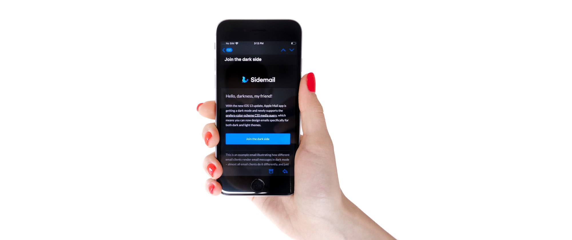
With the new iOS 13 update, Apple Mail is getting a dark theme. That means it's the first major email client that supports the prefers-color-scheme CSS media query. So you can now design emails specifically for both dark and light themes.
I’m a massive dark mode fan, and blindingly-bright email is my nemesis. So when I learned about dark mode in iOS 13, I did the only obvious thing and ordered a brand new iPhone to test things out.
While I was at it, I also tested how dark mode works in almost all email clients, including the troublemaker Outlook. Here’s what I found.
But first, what is prefers-color-scheme?**
The prefers-color-scheme CSS media query is used to detect whether the user prefers a light or dark theme, making it possible to design email specifically for both.
With the iOS 13 update, the support in most popular email clients jumped from 2.3% to 38.4%! A huge step thanks to Apple Mail's popularity. Surprisingly, Outlook was the only email client that supported this before Apple Mail.
How dark mode works in popular email clients
To render the email message dark itself, email clients invert the email’s colors automatically behind the scenes. For regular user-to-user emails, this works well and consistently in all email clients.
However, it’s not that simple for custom HTML emails — those that fill most of our inboxes. I’m talking transactional and promotional.
Here’re the differences I found in how email clients handle dark mode email rendering:
| Email client | Popularity | Dark UI | Auto-invert email colors | Supports @media (prefers-color-scheme) | |
| Apple Mail iPhone + iPad | 36.1% | ✔ Yes | ✔ Yes | ✔ Yes | (Show screenshot) |
| Gmail Android 10 | 27.8% * | ✔ Yes | ✔ Yes | ✖ No | (Show screenshot) |
| Gmail iOS 13 | 27.8% * | ✖ No | ✖ No | ✖ No | (Show screenshot) |
| Gmail webmail | 27.8% * | ✔ Yes | ✖ No | ✖ No | (Show screenshot) |
| Outlook iOS 13 | 9.1% * | ✔ Yes | ✔ Yes | ✖ No | (Show screenshot) |
| Outlook Android 10 | 9.1% * | ✔ Yes | ✔ Yes | ✖ No | (Show screenshot) |
| Outlook Windows 10 | 9.1% * | ✔ Yes | ✔ Yes | ✖ No | (Show screenshot) |
| Outlook macOS | 9.1% * | ✔ Yes | ✔ Yes | ✔ Yes | (Show screenshot) |
| Apple Mail macOS | 7.5% | ✔ Yes | ✔ Yes | ✖ No | (Show screenshot) |
| Yahoo! webmail | 6.3% * | ✔ Yes | ✖ No | ✖ No | (Show screenshot) |
| AOL webmail | 6.3% * | ✖ No | ✖ No | ✖ No | (Show screenshot) |
| Outlook.com webmail | 2.3% | ✔ Yes | ✔ Yes | ✔ Yes | (Show screenshot) |
| Windows 10 Mail Windows 10 | 0.5% | ✔ Yes | ✔ Yes | ✖ No | (Show screenshot) |
| Zoho Mail webmail | less than 0.5% | ✔ Yes | ✔ Yes | ✖ No | (Show screenshot) |
| Mozilla Thunderbird Windows 10 | less than 0.5% | ✔ Yes | ✖ No | ✔ Yes | (Show screenshot) |
| Spark macOS | less than 0.5% | ✔ Yes | ✔ Yes | ✔ Yes | (Show screenshot) |
| Spark iOS 13 | less than 0.5% | ✔ Yes | ✔ Yes | ✔ Yes | (Show screenshot) |
| Spark Android 9 | less than 0.5% | ✔ Yes | ✔ Yes | ✔ Yes | (Show screenshot) |
* Popularity is shared across all platforms for the same email client because it cannot be reliably distinguished. Popularity source: Litmus, the 2019 email client market share.
(Visit the original post to view my notes from the testing, and to see the latest tests as I gradually test more email clients and update the article there first.)
How to make HTML emails dark mode friendly
I already put the data to use, and a few Outlook related challenges later, I made our emails dark mode friendly. Here’s how you can do the same:
What the data say:
More than 55% of emails might be opened with dark mode enabled. Once Gmail joins the dark side, emails that might be opened with dark mode enabled will skyrocket to 83%!
1) Adjusting colors
Look out for Apple Mail, as it inverts colors only if the background color is transparent or unspecified — white background won’t do. The easiest way to make sure your emails won’t blind anybody is to check whether a background color is specified. For more control over the design, this is where prefers-color-scheme comes in handy.
Syntax (@media prefers-color-scheme):
<style>
    /* Your light mode (default) styles: */
    body {
        background: white;
        color: #393939;
    }

    @media (prefers-color-scheme: dark) {
        /* Your dark mode styles: */

        body {
            background: black;
            color: #ccc;
        }
    }
</style>
A design tip: Avoid pure white #fff as the text color. I found that contrast ratio around 11.5 for the main text is a nice compromise between not too bright and not too dim. Check the contrast ratio here: https://contrast-ratio.com or use Chrome dev tools.
![]()
2) Switching between light and dark logo
A dark text on a dark background is pretty much invisible, and that’s precisely what happens to a logo if viewed in an email client with enabled dark mode.
Nowadays, a typical logo usually has a transparent background, colorful icon, and dark copy. See the problem? Because email clients don’t invert image colors, you need to handle it yourself.
To tackle this, you can either:
- save the logo with a white background instead of a transparent background (the easiest way to fix this). But I wouldn’t recommend this approach — dark mode users won’t be happy.
- put a light logo on a dark background, and keep the rest of the email on a white background (see how Litmus does it).
- make dark mode email your default. A good candidate for this would be Spotify as they only offer a dark theme in their apps.
- include both light and dark versions of your logo and switch between with
prefers-color-schememedia query
My favorite is the last approach, so here’s how you do it:
A simple "display: none" on the dark logo works just fine in all modern email clients. But to everyone's surprise, it doesn't work in Outlook and Windows 10 Mail.
In CSS styles:
<style>
    @media (prefers-color-scheme: dark) {
        .darkLogo {
            display: none !important;
        }

        .lightLogoWrapper,
        .lightLogo {
            display: block !important;
        }
    }
</style>
…and the HTML structure:
<image src="dark-logo.png" class="darkLogo" />

<!--
    To hide the light logo perfectly in Outlook and Windows 10 Mail,
    you need to wrap the light logo image tag with a div.
-->
<div class="lightLogoWrapper" style="mso-hide: all; display: none">
    <image src="light-logo.png" class="lightLogo" style="display: none" />
</div>
This approach works pretty well, but it still won’t work correctly across the board. The dark text on dark background issue will happen with email clients that do support dark mode but don't support prefers-color-scheme. That is Outlook, Windows 10 Mail, Zoho, and potentially Gmail.
![]()
So, to make the logo in email fully bulletproof, I’ll combine methods 1 and 4 from above. Method 1 will cover all email clients that support dark mode, but not the prefers-color-scheme. And method 4 will cover Apple Mail, Outlook on MacOS, and Outlook.com, which does support both.
Also, instead of saving the logo on a white background, I’ll add a 3-pixel wide background-matching border and save it on a transparent background as usual.
It’s starting look pretty complex (just for a logo), so let’s see the HTML markup first:
<!-- Default logo with 3-pixel wide background-matching border -->
<image src="dark-logo-with-background.png" class="darkLogoDefault" />

<!-- Light theme (so dark logo):
This is for Apple Mail, Outlook on macOS, Outlook.com -->
<div class="darkLogoWrapper" style="mso-hide: all; display: none">
    <image src="dark-logo.png" class="darkLogo" style="display: none" />
</div>

<!-- Dark theme (so light logo):
This is for Apple Mail, Outlook on macOS, Outlook.com -->
<div class="lightLogoWrapper" style="mso-hide: all; display: none">
    <image src="light-logo.png" class="lightLogo" style="display: none" />
</div>
…and CSS styles:
<style>
    @media (prefers-color-scheme: light) {
        .darkLogoDefault,
        .lightLogo {
            display: none !important;
        }

        .darkLogoWrapper,
        .darkLogo {
            display: block !important;
        }
    }

    @media (prefers-color-scheme: dark) {
        .darkLogoDefault,
        .darkLogo {
            display: none !important;
        }

        .lightLogoWrapper,
        .lightLogo {
            display: block !important;
        }
    }
</style>
Dark mode in Gmail is coming
Dark mode is coming to Android in the new Android 10, and Gmail should go completely dark too, finally. All you need is Android 10 and the newest Gmail (at least version 2019.09.01.268168002). However, Google tends to enable new features (a dark theme in this case) for users gradually with a server-side push, and I haven’t had luck with it for now.
I’m curious to see if support for @media prefers-color-scheme is coming to Gmail. From what I read, it doesn’t seem promising. I guess we have to wait to find out. I’ll update the article once I get the dark theme in Gmail enabled.
Wrapping up
Dark mode is coming to HTML email, and I love it! But, it’s another thing to worry about – like using HTML tables for layout wasn’t enough.
Stay up-to-date about the dark mode in email by joining our mailing list. We also share there insights and challenges we face while building and growing our SaaS product — Sidemail.
Thanks for reading!