
By Mina Demian
This is an introductory guide on how to produce the beginnings of a piece of data journalism. We’re going to walk through it together, as I outline the key things to consider before starting. We’ll cover:
- how to structure your work
- a basic process to follow
- a real-world case study to show how this process works
Data journalism is still about stories
The glitz and glamour of data journalism (the animations, the striking maps, and those great infographics) are all over the Internet. It’s easy to think, then, that it’s about the data and how cool you can make it look, sing, or dance. My wise friends at OpenUp, Raymond, and Adi keep reminding me (and the salivating Internet-at-large) that the focus should be on data journalism, and not data journalism.
Data journalism is no different from the journalism we know and consume every day. Where traditional journalism relies on human sources (e.g., insiders, experts, scholars, and scientists), data journalism treats data sources (e.g., spreadsheets, websites, and databases) with the rigor and scrutiny that journalists treat human sources.
The animations and snazzy work help to communicate the final product — the story — but they will never replace the actual story.
The grand start
A data journalism story can start from an important event or it can simply be a question. You may see a breaking headline and wonder how much x did it take for y to happen? Or, you are thinking about food and wonder how much the average shopper spends on dog food. Both questions are valid and great starting points when evaluating a piece for data journalism.
What I’ve learned so far in my work is that there is little difference between doing the work of basic science and that of data journalism. You make an observation, come up with a question (hypothesis for purists), and then you go about trying to answer that question. Your work will show either that your initial hypothesis was indeed incorrect or that, yes, it was indeed correct.
So, as I mentioned earlier, it’s not about the fancy graphics or how much data you trawled through, it’s about knowing what is your question and did you answer it?
Don’t believe the hype.
“Who’s your data and what does he do?”
This guide is based on data from South Africa’s statistics agency. (The results of the quarterly survey released in the summer of 2015 shows the official unemployment rate at a grim 25%.) The agency was kind enough to release the data in an Excel spreadsheet. I will write posts that address how to manage sources of data that are not released in an easy-to-use format.
You can explore the dataset here, and there are enough sheets to warrant exploration. This exploration is important because without knowing what it’s about, what it covers, and so on, you may look at the wrong data. It may lead you to answer the wrong question or — the nightmare of every data journalist — waste hours while achieving very little.
So, before we talk about the process, let’s look at the data and see what it tells us. We don’t usually work with all the data (unless our initial idea or question requires this). It’s better to first look at all the data and then focus on a particular section that catches your attention.
The spreadsheets from the statistics agency looks at different characteristics of the workforce (broken down by province, age, gender, and demographic). Even if this is your first time, quickly look over each sheet. It will help to develop a methodical work ethic that is invaluable to data journalism.
An important side note: you only need a basic working knowledge of Excel. I don’t wield magic on the worksheets, so anyone can follow them. For the sake of brevity (and so you don’t go into a catatonic stupor), I will leave you to figure out how to do the basic manipulations in Excel.
Now the journey begins
We’ve talked about what it means to produce a work of data journalism, how to evaluate if an idea will lead to a piece, and how to look at a dataset. Finally. We get to the process, the good stuff. How does it work?
Step 1: Take a bite out of the data
For this guide, I want to know the size of the workforce of each province in South Africa, and how it fared between 2013 and the 2nd quarter of 2015. This data is displayed in the first worksheet. (You’re welcome to look through the other spreadsheets to see what interesting insights you can mine from them.)
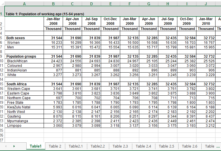
So we went from working with the original spreadsheet, which has more than 20 worksheets, as shown below:
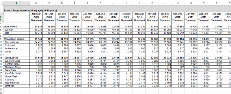
To working with just one worksheet, titled “Table 1: Population of working age (15–64 years),” as shown below.
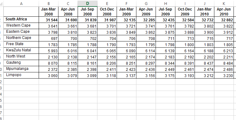
Now, let’s copy the data at the bottom of the sheet, since it’s the data we want, and paste it into a new worksheet. To move towards a clean dataset, delete the row with the Thousands heading and delete the cell labelled South Africa. Also, delete the Totals row so that it doesn’t confuse us later. (I will adjust all the values to reflect millions in a minute.)
It now should look like this:
Now, let’s change all the cells to show values in millions. Create a new column beside each existing column, and multiply the value by 1000. It now looks like this:
Remove all borders and decimal places, and make the thousand separator a comma. This helps to make our chart easier to read and more accessible. At this point, this table should be ready to be analysed.
Not quite yet. Although it is cleaner, the data structure we need is not there. Why does this matter? Because the data needs to be organized in a way that we can aggregate or group them. The old sages of data journalism say that if your data is not summarized (or aggregated), it is not ready to be analyzed.
Step 2: Transform the data into an analysis-/visualization-ready structure
What factors are we looking to expose from this data set? They are province, year, and the total number of workers. But before that, we’re going to create this new data structure with the following columns:
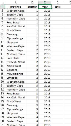
If you studied database design, you would fail your database design test for presenting this dataset design. Or if you are a programmer, your boss would chide you for proposing this dataset design. Your lecturer or boss would be in the right to do so. It’s not a normalized (computer science speak for optimized) dataset. However, this is data analysis for a piece of data journalism, so you may scorn those rules! We need to have duplicate rows in order to aggregate the data later (remember?).
Step 3: Produce the final dataset
In the screenshot above, I entered the relevant years into the structure. Next, paste the totals for 2013, 2014 and 2015. The dataset now looks like this. (Medium doesn’t allow iframe embeds, so instead I have provided a link to the dataset.) It should have 91 rows, and only quarter 1 and quarter 2 are indicated for 2015.
We’re almost there!
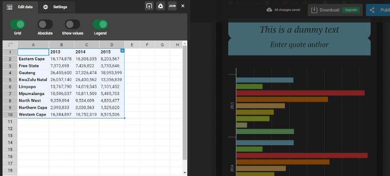
The last step is to aggregate the data. So, take a deep breath and create a PivotTable in a new sheet. Our summarized data looks like this:
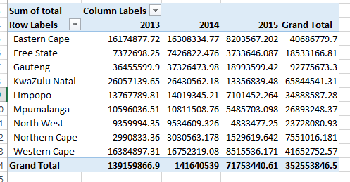
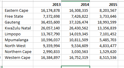
Clean up the table. Enter the thousands separator, remove the decimal places, and delete the cell labelled Sum of Total Row Labels. The table now looks like this:
Step 4: Produce the visualization
Congratulations! You have a dataset that is ready to be visualized.
We’re going to use Infogr.am to produce an infographic. This guide doesn’t cover how to sign up with and use Infogr.am, so (as with Excel) you’ll need to get acquainted with the tool on your own. I assure you that it’s straightforward and intuitive! You’ll be using it like a professional in no time! You’ll see.
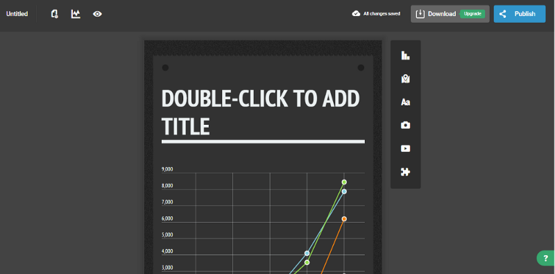
To create a new infographic, choose any template you like. The blank work area looks like this:
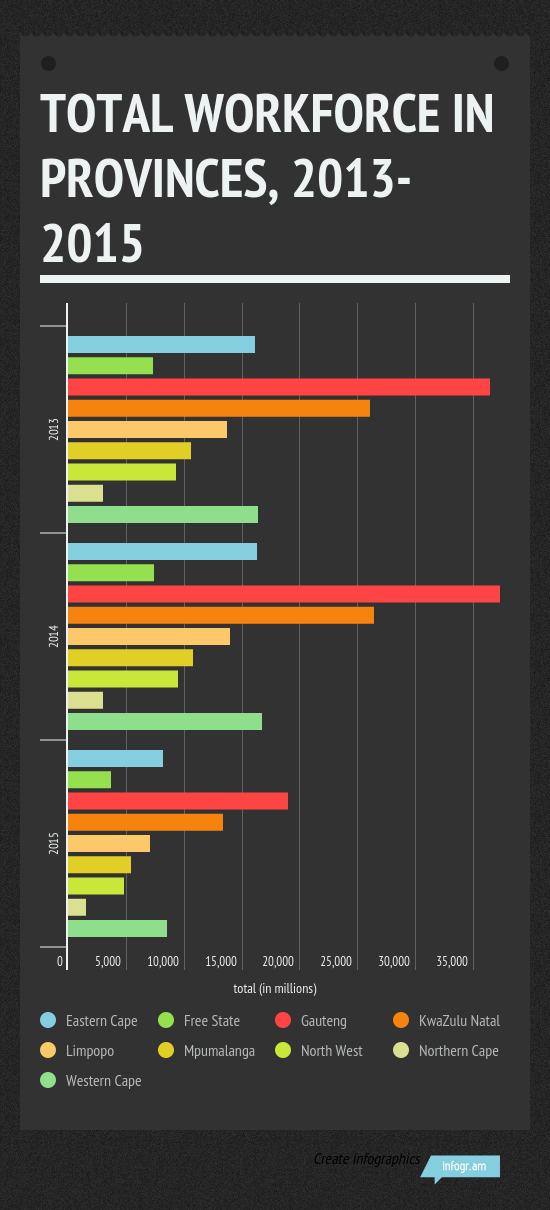
Give the infographic a title like “Total workforce in provinces, 2013–2015” or something similar, as you see fit. Then add a grouped bar chart from the popup wizard. You should see the new chart in the work area. (Delete the existing chart that comes with the template, which now appears below the one you just created.)
Double-click on the new chart, and an interface similar to Excel will appear on the screen. Delete the data from this screen, and copy the data from the Excel worksheet used in the PivotTable, and paste it into the Infogr.am spreadsheet interface. It should look like this:
When you paste the data, the graphic automatically updates itself.
It’s starting to look great!
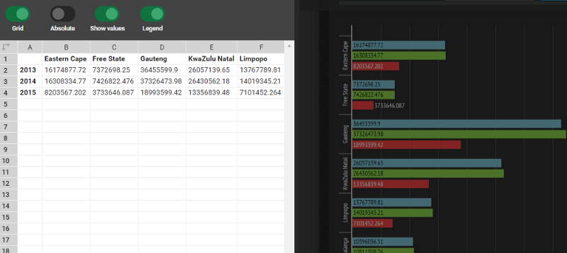
Have a look at the infographic. Everything is in there, but you may not understand the infographic immediately. You have to scroll down to read the legend to see which color refers to which province. So, instead of re-formatting the data, click on the two-directional arrows icon on the top right-hand corner of the spreadsheet. This nifty feature will switch the rows and columns so that the provinces now appear in the rows and the years in the columns.
Always aim to show the values on the chart, where appropriate. So click the Show values switch and the totals will reflect on the chart. Also, click on the Settings button and scroll down to add “total (in millions)” in the X-axis textbox. This helps the reader (and you) to better understand the chart.
Click the Publish button to give your graphic a title. Then decide whether you want the graphic to be interactive or to be an image. This is how the final image would look like:
And you have produced your first visualization. Pat yourself on the back, have a coffee or beer, and get ready because you’ve just started the process.
Before we look at the rest of the work, let’s review what we’ve done:
- We looked at a data source and extracted the data we want. In this case, we asked, “What was the size of the workforce in South Africa between 2013 and 2015?”
- We followed a basic process of cleaning, formatting, transforming, and summarizing the data until we produced a table that shows the data we need.
- We then inserted the data into our visualization tool and produced an infographic, as shown above.
At this point, you’re so excited that you jump on Twitter or your email, and send your work to everyone you know.
Hold on! Not yet.
What do your findings really mean?
Yes, you analyzed the data and you answered your question. Gauteng province had the largest workforce within the period we selected, but it’s been decreasing since 2013. The workforce for the Northern Cape has been consistently below 5 million since 2013. But why?
That’s why the first paragraph in this piece had this naughty qualification — “the beginnings of a story” — because now starts journalism as you know or were trained to do. At this point, do the following:
- contact analysts, experts, or academics to interpret and comment on the data.
- look at other datasets or ask experts to explain the context of the findings, depending on the scope of the story or your editor’s instructions.
- analyze/visualize other datasets to test and refine your findings.
- do anything else required to make sure that the piece is balanced and fair.
After you complete one or more of these steps, write the final article. Include the infographic produced above, and submit it for publication. If you run your own blog or website, publish it live.
There’s no place like the end!
And the end it is. I hope that you’ve come this far and your appetite has been whetted to do more (and sophisticated) work in data journalism.
If something hasn’t worked for you, or you’d like some help with a section, follow me on Twitter and we can figure it out together.
Resources
I’ve included below all spreadsheets, tools, and links so that you can pick up this guide at any time and see how I arrived at the final infographic.
- Original spreadsheet from the national statistics agency in South Africa
- My spreadsheet with a worksheet for each step shown in the above screenshots
- Infogr.am
Mina Demian is a front-end engineer living in Stockholm, Sweden. This piece was originally posted in his personal blog, during his time as a working journalist and fact-checker. He dabbles still in data analysis and visualization.