
Have you ever had issues with replicating a particular user interface from a Figma design? Do you find it difficult displaying elements in different sections of your browser screen?
A major cause of rift between user interface (UI) designers and frontend developers is the issue of having an awesome UI design being difficult to translate into real life features.
Almost every frontend developer has faced similar fears at certain points during their coding journey. This article will help you understand how CSS displays work with regards to flexbox and grid layout.
Table of Contents:
- Origin of CSS
- Basic Structure of CSS
- CSS Layout (Flex and Grid)
- How to Use the Flex Layout in CSS
- How to Use the Grid Layout in CSS
- Similarities between Flex and Grid
- When to Use Flex
- When to Use Grid
- Conclusion
Origin of CSS
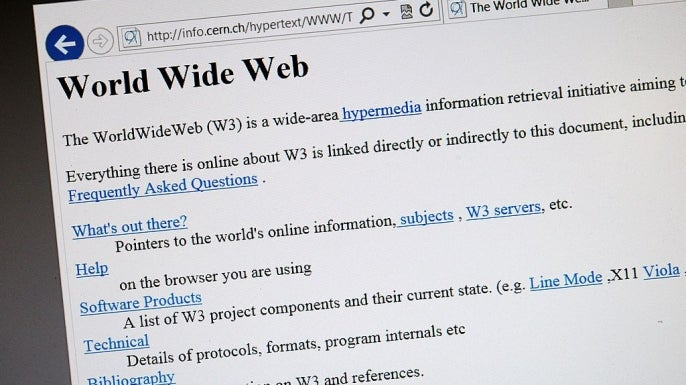
The earliest websites were not only static, but were also text-based. During the early years of the World Wide Web, web pages were written in markup languages such as XHTML and the like.
This is what they looked like:
With advancements in various technologies, technology enthusiasts were interested in making websites look more pleasant by adding some design. This led to the development of Cascading Style Sheets, better known as CSS.
Although CSS has gone through several evolutions, it is responsible for the aesthetics of websites. Imagine a website or a software application with just text and no design.
Hey! This article is not about history, so let’s get straight to business.
As a software developer majoring in client side applications (often referred to as front-end development), you’d agree with me that CSS is that lovely fellow who looks simple yet sophisticated.
CSS can keep you awake at night while trying to find out why your page is not aligning as expected or the reason your page content is chopped off on certain screens and not responsive too.
One of the reasons why beginners in software development often abandon front-end to major in back-end is the “stress” that comes with writing CSS code, especially with vanilla CSS where you have to manually input virtually every style rule. This is because CSS requires some level of calculation mixed with attention to the most minimal detail.
A major aspect of CSS that often creates confusion is the CSS layout — writing the CSS rule for the page layout can be a bit confusing as a beginner.
In the sections that follow, we'll focus on:
- The similarities between flex and grid displays.
- When to use flex or grid.
Basic Structure of CSS
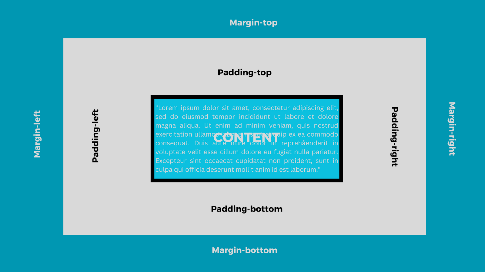
Before discussing the CSS display in detail, let’s take a brief look at the CSS structure.
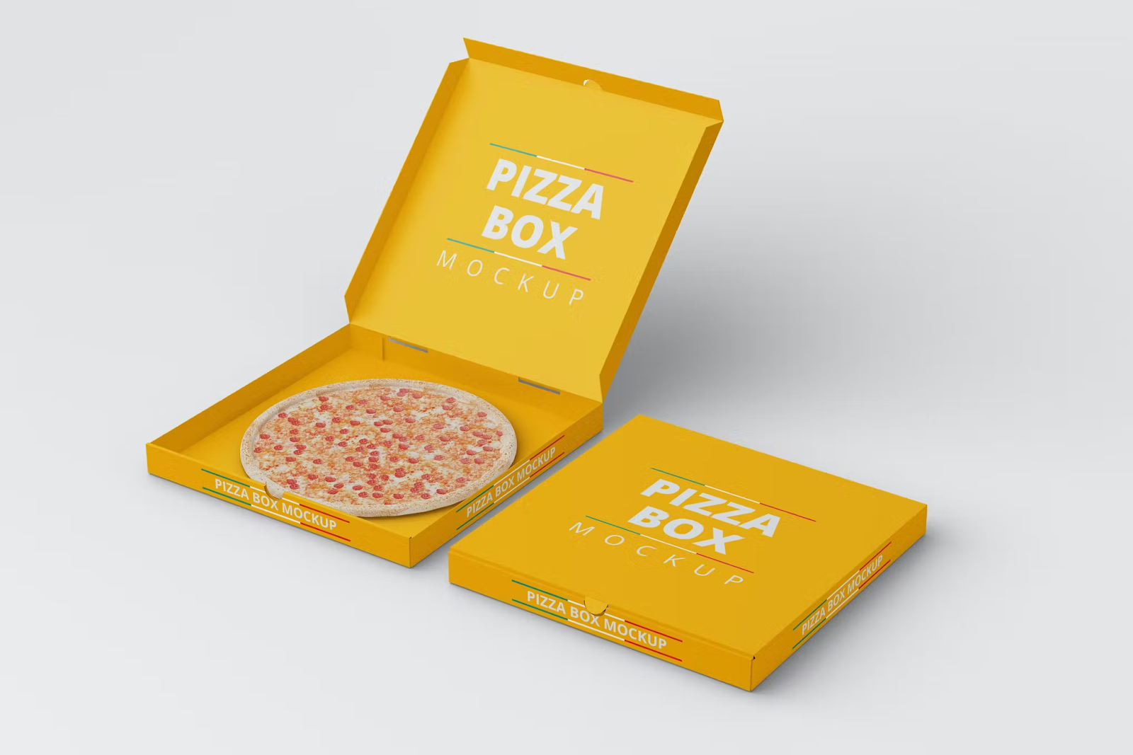
For starters, the CSS structure is a box-model. This means that every webpage is treated like a box, similar to having a pizza in a pizza box.
The pizza box here represents the browser page while the pizza represents the content of your website or application, which can be text, graphics, or multimedia.
CSS Layout (Flex and Grid)
Now that you know how CSS structures the content of every web or application page, a vital aspect of CSS which you should get a grasp of is the layout, which is the crux of this article.
In architecture, every building has its structure. The structure for a commercial building might differ from that of a residential building. Same goes for front-end development.
The purpose of the application goes a long way in the selecting a layout for the. For instance, an e-commerce website would opt for a grid layout for proper arrangement and display of their products.
The layout of every website or application determines how the content on the page will be arranged: either in stacks of rows and columns or just columns across various screen-sizes.
It is also worthy to note that you can use more than one display on a particular webpage. This means that you can display a particular div as a grid and another div as a flexbox. It all boils down to the content of each div and how you want them to appear.
There are two ways to design the layout of a web page’s content in CSS:
- Flex
- Grid
How to Use the Flex Layout in CSS
The flex layout uses a method of arranging the web content in rows (main axis) or columns (perpendicular axis). This implies that it is a one-dimensional layout. The main axis can move in reverse order, from right to left.
The flex direction can be set to:
- Row
- Row-reverse
- Column
- Column-reverse
Using flexbox does not split the screen or content into equal parts. It is worthy to note that, flexbox doesn’t consider splitting content into equal columns across the row or stacking columns in the same alignment. Rather, it expands or shrinks the content to contain the available screen space.
Below is a diagram of a flex display using rows:
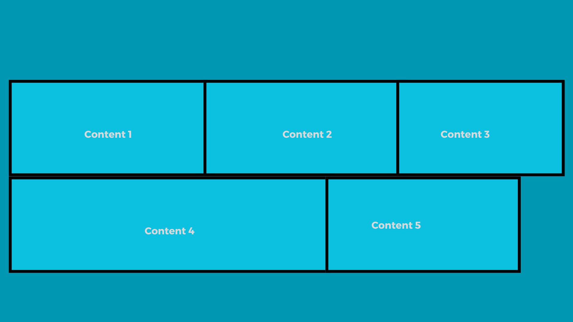 A graphical representation of a display set to flex
How to Set Display to Flex
To create a flex layout:
- Give the parent element a style rule of flex display
- Give the children element some margin and padding for a better look
- Specify the direction of the flex if there is a need to
<!DOCTYPE html>
<html lang="en">
<head>
<meta charset="UTF-8">
<meta name="viewport" content="width=device-width, initial-scale=1.0">
<title> Setting Display to Flex</title>
<style>
    .fl{
        display: flex;
        flex-wrap: wrap;
    }
    .ex {
        flex-direction:row;
        flex: 1 0 100px;
        margin: 5px;
        padding: 10px;
        background-color: #0000FF;
        border: 1px solid #ffff; /* I added a border all round each column for better visibility and separation of the columns */
    }
</style>
</head>
<body>

<div class="fl">
    <div class="ex">Content 1</div>
    <div class="ex">Content 2</div>
    <div class="ex">Content 3</div>
    <div class="ex">Content 4</div>
    <div class="ex">Content 5</div>
</div>

</body>
</html>
The code above styles the body by selecting the parent container and assigning it a layout of flex. Then the direction of the children element is set to row using the flex-direction rule.
How to Use the Grid Layout in CSS
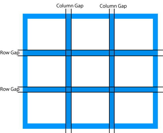
The grid layout, on the other hand, divides a web-page into 12 equal columns. These columns can be further split into the desired rows and columns.
The entire screen (100%) divided into 12 gives about 3.33% per column. The screen can also be styled using the number of columns in multiples of 2. That is: 2,4,6,8,10 and 12 with each number specifying the number of columns or width the element is expected to occupy.
How to Set Display to Grid
- Set the parent element's display to grid
- Specify the dimension(i.e rows or columns) of the grid using the grid-template property
- Give some spacing(margin,padding, row-gap, etc) to the child element so the grid can be more visible
<!DOCTYPE html>
<html lang="en">
<head>
<meta charset="UTF-8">
<meta name="viewport" content="width=device-width, initial-scale=1.0">
<title>Setting Display to Grid</title>
<style>
    .fl{
        display: grid;
        grid-template-columns: repeat(3, 1fr); /* This would display the children elements in  three equal columns with equal width */
        gap: 5px; /* To set a gap between  thegrid items */
    }
    .gr {
        padding: 20px;
        background-color: #0000FF;
        border: 1px solid #ffff; /* I added a border all round each column for better visibility and separation of the columns */
    }
</style>
</head>
<body>

<div class="gr">
    <div class="gr">Content 1</div>
    <div class="gr">Content 2</div>
    <div class="gr">Content 3</div>
    <div class="gr">Content 4</div>
    <div class="gr">Content 5</div>
</div>

</body>
</html>
Similarities between Flex and Grid
They are both responsive layouts: Irrespective of which layout you decide to use for your application, provided that you style the properties correctly, both layout types are responsive to different screen sizes.
Setting the parent element's layout first: In styling a flex or grid layout, the parent element is the one styled with the exact layout in question.
When to Use Flex
CSS flex is popular for its order ability (row-reverse, column-reverse), which enables the developer to reorder content without having to change the HTML content manually. There are several uses cases of the CSS flex, such as:
- Building One-dimensional Layouts: For web-pages or sections with a single layout, it is best to use flex as it helps in proper arrangement of the content.
- Alignment and Distribution of Content: Thanks to justify-content,
align-selfand other properties, alignment and distribution of content is made easy using flex. - Displaying Columns in Equal heights: Using the
align-itemsproperty and setting it to a value ofstretch, that is:align-items:stretch, CSS flex ensures that columns within a flexbox are of equal heights. This implies that if there is a higher column, other columns will be stretched to meet up with the highest column. You can use CSS flex to display your columns in equal height irrespective of the height of the content.
When to Use Grid
The grid layout is the most commonly used by frontend developers because it allows you to place elements on different sections of the browser page while maintaining proper alignment. You can use the grid layout when:
- Building a Responsive Design: Often times, user interfaces are developed to be adaptable to whatever screen they're being displayed on. In such cases, the grid layout is your best bet because it gives room to flexibility and resizing of the element.
- Control of whitespace: Unlike the flex display that leaves some white space at the extreme, the CSS grid controls white space by distributing elements equally along the row and also based on the allocated column space.
- Consistency in Design Layout: The CSS grid offers a consistent pattern in the structure of a web page. This arrangement of elements makes future editing of the page easier.
Conclusion
One tip that comes very handy when styling a page is to choose which of the display modes to employ.
Once that is settled, the various sections of the page can follow suit bearing in mind what the entire body holds.
Although not an advice, recent practices have seen developers use grid more often than flexbox. Whichever the case, ensure not to mix up the code for the respective displays so you do not run into errors.
Happy Coding!